rn_for_openharmony_一个参数的力量:showImage 如何让卡片变脸
React Native 组件条件渲染图片的实现 本文介绍了如何在 React Native 的 ArticleCard 组件中通过 showImage 参数实现图片的条件渲染。主要特点: 参数设计:通过可选参数 showImage(默认 false)控制是否显示图片,保持向后兼容性 双重条件:同时检查 showImage 为 true 和 item.envelopePic 存在才会渲染图片 图片
案例项目开源地址:https://atomgit.com/nutpi/wanandroid_rn_openharmony
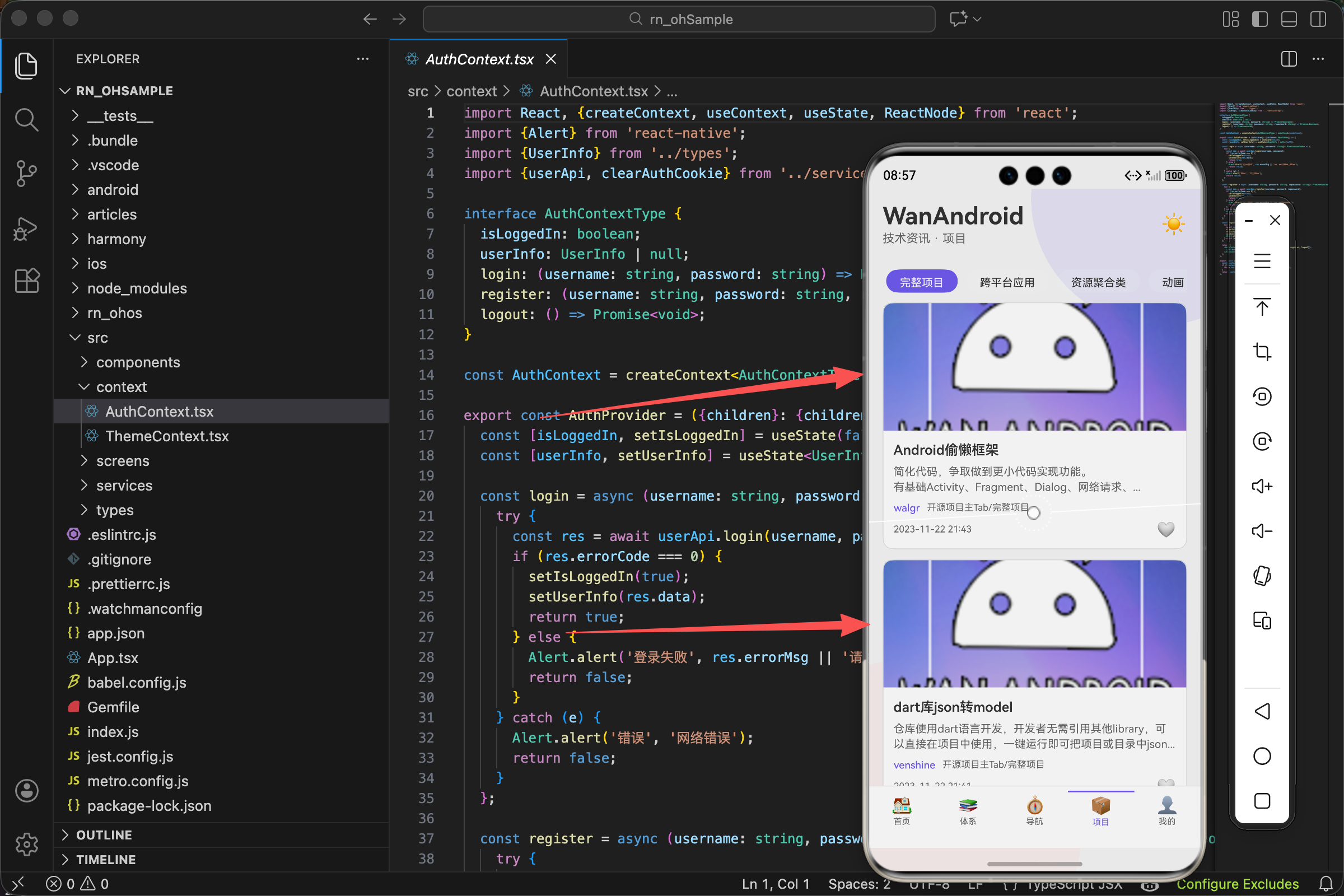
ArticleCard 组件在首页和项目页面都有使用,但长得不一样。首页的卡片只有文字,项目页面的卡片顶部多了一张封面图。
这个差异是怎么实现的?答案是一个布尔参数:showImage。
调用方式的差异
首页这样调用:
<ArticleCard item={item} />
项目页面这样调用:
<ArticleCard item={item} showImage />
就多了一个 showImage,卡片就从纯文字变成了带图片的。
showImage 不带值等同于 showImage={true},这是 JSX 的语法糖。
Props 的定义
interface Props {
  item: Article;
  showImage?: boolean;
  onCollectChange?: () => void;
}

export const ArticleCard = ({item, showImage = false, onCollectChange}: Props) => {
showImage?: boolean 后面的问号表示这是可选参数。
showImage = false 是默认值。不传这个参数时,默认是 false,不显示图片。
这种设计让组件向后兼容。之前所有调用 <ArticleCard item={item} /> 的地方都不需要改,行为和以前一样。
图片的条件渲染
{showImage && item.envelopePic ? (
  <Image source={{uri: item.envelopePic}} style={styles.image} />
) : null}
这行代码有两个条件:
showImage 要为 true。调用方明确说要显示图片。
item.envelopePic 要有值。文章数据里要有封面图 URL。
两个条件都满足才渲染 Image 组件。任何一个不满足就渲染 null(什么都不显示)。
为什么要判断 item.envelopePic?因为不是所有文章都有封面图。即使调用方传了 showImage,如果文章没有图,也不应该显示一个空白区域或加载失败的占位图。
Image 组件的使用
<Image source={{uri: item.envelopePic}} style={styles.image} />
source={{uri: item.envelopePic}} 指定图片来源。uri 表示这是一个网络图片,值是图片的 URL。
React Native 的 Image 组件支持多种图片来源:
- 网络图片:
source={{uri: 'https://...'}} - 本地图片:
source={require('./image.png')} - Base64:
source={{uri: 'data:image/png;base64,...'}}
我们用的是网络图片,URL 来自接口返回的 envelopePic 字段。
图片的样式
image: {
  width: '100%',
  height: 150,
  resizeMode: 'cover'
},
width: '100%' 让图片宽度撑满卡片。
height: 150 固定高度 150 像素。为什么要固定高度?因为网络图片的尺寸不确定,如果让高度自适应,不同卡片的图片区域高度不一样,列表看起来会很乱。
resizeMode: 'cover' 是关键。它决定了图片如何适应容器:
cover:保持比例,缩放到能覆盖整个容器,超出部分裁掉contain:保持比例,缩放到能完整显示,可能有留白stretch:拉伸填满,不保持比例,可能变形center:不缩放,居中显示
cover 最适合这种场景:图片填满区域,不变形,超出的部分裁掉。
图片和内容的布局
<TouchableOpacity style={[styles.card, ...]}>
  {showImage && item.envelopePic ? (
    <Image source={{uri: item.envelopePic}} style={styles.image} />
  ) : null}
  <View style={styles.content}>
    {/* 标题、描述、元信息等 */}
  </View>
</TouchableOpacity>
图片在上,内容在下。这是 React Native 默认的纵向布局,不需要额外设置。
图片和内容都在 TouchableOpacity 里面,点击任何位置都能触发跳转。
overflow: hidden 的作用
card: {
  borderRadius: 12,
  borderWidth: 1,
  marginBottom: 12,
  overflow: 'hidden'
},
overflow: 'hidden' 很重要。卡片有 12 像素的圆角,但图片是矩形的。如果不设置 overflow: 'hidden',图片的四个角会超出圆角边界,破坏圆角效果。
设置后,超出卡片边界的部分会被裁掉,图片的角也变成圆的了。
数据结构
export interface Article {
  id: number;
  title: string;
  author: string;
  shareUser: string;
  niceDate: string;
  link: string;
  superChapterName: string;
  chapterName: string;
  collect: boolean;
  fresh: boolean;
  envelopePic: string;  // 封面图 URL
  desc: string;
  originId?: number;
}
envelopePic 是封面图的 URL。WanAndroid 的项目类文章通常有这个字段,普通文章可能没有或者是空字符串。
项目页面的使用
<FlatList
  data={articles}
  keyExtractor={(item, index) => `${item.id}-${index}`}
  renderItem={({item}) => <ArticleCard item={item} showImage />}
  // ...
/>
renderItem 里传了 showImage,所以项目列表的每个卡片都会尝试显示封面图。
如果某个项目没有封面图(envelopePic 为空),那个卡片就只显示文字,和首页的卡片一样。这是组件内部的容错处理,调用方不需要关心。
首页为什么不显示图片
首页调用时没传 showImage:
<ArticleCard item={item} />
默认值是 false,所以不显示图片。
为什么首页不显示?几个原因:
- 首页文章大多是技术博客,没有封面图
- 即使有,封面图质量参差不齐,显示出来可能不好看
- 首页信息密度要高,一屏要能看到更多文章,图片会占空间
项目页面不同,项目通常有精心设计的封面图,展示出来能吸引用户点击。
图片加载的体验
网络图片需要时间加载。在图片加载完成之前,用户会看到什么?
默认情况下是空白。图片区域会显示卡片的背景色,等图片加载完才显示。
如果想优化体验,可以加一个占位图或加载动画:
const [imageLoading, setImageLoading] = useState(true);

<View>
  {imageLoading && <ActivityIndicator style={styles.imagePlaceholder} />}
  <Image
    source={{uri: item.envelopePic}}
    style={styles.image}
    onLoad={() => setImageLoading(false)}
  />
</View>
不过对于我们这个项目,图片通常很快就能加载完,不加也行。
图片加载失败的处理
如果图片 URL 无效或网络问题导致加载失败怎么办?
可以用 onError 回调处理:
const [imageError, setImageError] = useState(false);

{showImage && item.envelopePic && !imageError ? (
  <Image
    source={{uri: item.envelopePic}}
    style={styles.image}
    onError={() => setImageError(true)}
  />
) : null}
加载失败时设置 imageError 为 true,图片就不显示了,卡片退化成纯文字版本。
当前代码没有这个处理,因为 WanAndroid 的图片链接通常是有效的。如果你的项目图片来源不可靠,建议加上。
完整的图片相关代码
interface Props {
  item: Article;
  showImage?: boolean;
  onCollectChange?: () => void;
}

export const ArticleCard = ({item, showImage = false, onCollectChange}: Props) => {
  const {theme} = useTheme();

  return (
    <TouchableOpacity
      style={[styles.card, {backgroundColor: theme.card, borderColor: theme.border}]}
      onPress={() => openLink(item.link)}
      activeOpacity={0.7}
    >
      {showImage && item.envelopePic ? (
        <Image source={{uri: item.envelopePic}} style={styles.image} />
      ) : null}
      <View style={styles.content}>
        {/* 其他内容 */}
      </View>
    </TouchableOpacity>
  );
};

const styles = StyleSheet.create({
  card: {borderRadius: 12, borderWidth: 1, marginBottom: 12, overflow: 'hidden'},
  image: {width: '100%', height: 150, resizeMode: 'cover'},
  content: {padding: 12},
});
图片与内容区域的视觉层次
有了封面图之后,卡片的视觉层次就变了。我们来看内容区域的样式:
content: {padding: 12},
只有 12 像素的内边距,看起来很简单。但这个数值是经过考量的。
图片高度 150 像素,内容区域内边距 12 像素。如果内边距太大,比如 20 像素,内容区域会显得很空旷,和图片的紧凑感不协调。如果太小,比如 8 像素,文字会贴着边缘,看起来很拥挤。
12 像素是一个平衡点:既不会太空,也不会太挤。
标题的处理
<Text style={[styles.title, {color: theme.text}]} numberOfLines={2}>
  {item.title.replace(/<[^>]+>/g, '')}
</Text>
numberOfLines={2} 限制标题最多显示两行。超出的部分会用省略号截断。
为什么是两行?一行太短,很多标题会被截断得看不出意思。三行太长,卡片会变得很高,一屏能看到的卡片数量就少了。两行是个折中。
item.title.replace(/<[^>]+>/g, '') 这个正则是在干嘛?WanAndroid 的接口返回的标题有时候会包含 HTML 标签,比如 <em>关键词</em>。这个正则把所有 HTML 标签都去掉,只保留纯文本。
/<[^>]+>/g 的意思是:匹配以 < 开头、以 > 结尾、中间是任意非 > 字符的内容。g 表示全局匹配,替换所有匹配项。
描述文字的条件渲染
{item.desc ? (
  <Text style={[styles.desc, {color: theme.subText}]} numberOfLines={2}>
    {item.desc.replace(/<[^>]+>/g, '')}
  </Text>
) : null}
描述文字不是每篇文章都有。没有描述的文章,item.desc 是空字符串或 undefined。
如果不做判断直接渲染,会出现一个空的 Text 组件,虽然看不见,但会占用一点空间,影响布局。所以要判断一下,没有描述就不渲染。
描述的样式:
desc: {fontSize: 13, lineHeight: 18, marginBottom: 8},
字号 13 比标题的 16 小,颜色用 theme.subText(次要文字颜色),视觉上比标题弱。这是信息层级的体现:标题最重要,描述次之。
lineHeight: 18 是行高。字号 13,行高 18,行间距就是 5 像素。适当的行间距让多行文字更易读。
元信息区域
<View style={styles.meta}>
  <Text style={[styles.author, {color: theme.accent}]}>
    {item.author || item.shareUser || '匿名'}
  </Text>
  <Text style={[styles.chapter, {color: theme.subText}]}>
    {item.superChapterName}/{item.chapterName}
  </Text>
</View>
元信息包括作者和分类。
item.author || item.shareUser || '匿名' 是一个容错处理。有些文章有作者(author),有些是用户分享的(shareUser),有些两个都没有。用 || 运算符依次取值,都没有就显示"匿名"。
分类用斜杠分隔父分类和子分类:{item.superChapterName}/{item.chapterName}。
元信息的样式:
meta: {flexDirection: 'row', alignItems: 'center', marginBottom: 8, flexWrap: 'wrap', gap: 8},
author: {fontSize: 12, fontWeight: '500'},
chapter: {fontSize: 11},
flexDirection: 'row' 让作者和分类横向排列。
flexWrap: 'wrap' 允许换行。如果作者名和分类名都很长,一行放不下,会自动换到下一行。
gap: 8 是元素之间的间距。这是 React Native 0.71 引入的属性,比用 marginRight 更方便。
作者用 theme.accent(强调色),分类用 theme.subText(次要色)。作者比分类重要一点,所以颜色更醒目。
底部区域
<View style={styles.footer}>
  <Text style={[styles.date, {color: theme.subText}]}>{item.niceDate}</Text>
  <TouchableOpacity onPress={handleCollect}>
    <Text style={{fontSize: 18}}>{item.collect ? '❤️' : '🤍'}</Text>
  </TouchableOpacity>
</View>
底部左边是日期,右边是收藏按钮。
item.niceDate 是接口返回的友好时间格式,比如"2天前"、“2024-01-15”。
收藏按钮用 emoji 实现:已收藏显示红心 ❤️,未收藏显示白心 🤍。简单直观。
底部样式:
footer: {flexDirection: 'row', justifyContent: 'space-between', alignItems: 'center'},
justifyContent: 'space-between' 让日期和收藏按钮分别靠左和靠右,中间的空间自动分配。
收藏功能的实现
const handleCollect = async () => {
  if (!isLoggedIn) {
    Alert.alert('提示', '请先登录');
    return;
  }
  try {
    if (item.collect) {
      const res = await collectApi.uncollect(item.id);
      if (res.errorCode === 0) {
        Alert.alert('成功', '已取消收藏');
        onCollectChange?.();
      }
    } else {
      const res = await collectApi.collect(item.id);
      if (res.errorCode === 0) {
        Alert.alert('成功', '收藏成功');
        onCollectChange?.();
      }
    }
  } catch (e) {}
};
收藏功能需要登录。isLoggedIn 来自 AuthContext,表示当前是否已登录。
未登录时点击收藏,弹窗提示"请先登录",然后 return,不执行后面的逻辑。
已登录时,根据当前收藏状态决定是收藏还是取消收藏:
item.collect为 true,说明已收藏,调用collectApi.uncollect取消item.collect为 false,说明未收藏,调用collectApi.collect收藏
操作成功后调用 onCollectChange?.()。这个回调是父组件传进来的,用于刷新列表数据。问号表示可选链调用,如果父组件没传这个回调,就不执行。
点击跳转的实现
const openLink = (url: string) => {
  Linking.openURL(url).catch(() => Alert.alert('错误', '无法打开链接'));
};

<TouchableOpacity
  style={[styles.card, {backgroundColor: theme.card, borderColor: theme.border}]}
  onPress={() => openLink(item.link)}
  activeOpacity={0.7}
>
点击卡片会打开文章链接。Linking.openURL 是 React Native 提供的 API,可以打开网页、拨打电话、发送邮件等。
item.link 是文章的原始链接,通常是一个网页 URL。调用 Linking.openURL 会用系统浏览器打开这个链接。
.catch() 处理打开失败的情况,比如 URL 格式不对或者系统不支持。失败时弹窗提示用户。
activeOpacity={0.7} 设置点击时的透明度。点击时卡片会变成 70% 透明度,给用户一个视觉反馈,表示"我点到了"。
主题适配
整个卡片都支持深色/浅色主题切换:
const {theme} = useTheme();

<TouchableOpacity
  style={[styles.card, {backgroundColor: theme.card, borderColor: theme.border}]}
>
  <Text style={[styles.title, {color: theme.text}]}>
  <Text style={[styles.desc, {color: theme.subText}]}>
  <Text style={[styles.author, {color: theme.accent}]}>
  <Text style={[styles.chapter, {color: theme.subText}]}>
  <Text style={[styles.date, {color: theme.subText}]}>
所有颜色都从 theme 对象取,不写死。切换主题时,这些颜色会自动变化。
theme.card 是卡片背景色,浅色主题是白色,深色主题是深灰色。
theme.text 是主要文字颜色,浅色主题是黑色,深色主题是白色。
theme.subText 是次要文字颜色,比主要文字颜色淡一些。
theme.accent 是强调色,用于作者名等需要突出的地方。
完整组件代码
import React from 'react';
import {View, Text, TouchableOpacity, Image, StyleSheet, Linking, Alert} from 'react-native';
import {Article} from '../types';
import {useTheme} from '../context/ThemeContext';
import {useAuth} from '../context/AuthContext';
import {collectApi} from '../services/api';

interface Props {
  item: Article;
  showImage?: boolean;
  onCollectChange?: () => void;
}

export const ArticleCard = ({item, showImage = false, onCollectChange}: Props) => {
  const {theme} = useTheme();
  const {isLoggedIn} = useAuth();

  const openLink = (url: string) => {
    Linking.openURL(url).catch(() => Alert.alert('错误', '无法打开链接'));
  };

  const handleCollect = async () => {
    if (!isLoggedIn) {
      Alert.alert('提示', '请先登录');
      return;
    }
    try {
      if (item.collect) {
        const res = await collectApi.uncollect(item.id);
        if (res.errorCode === 0) {
          Alert.alert('成功', '已取消收藏');
          onCollectChange?.();
        }
      } else {
        const res = await collectApi.collect(item.id);
        if (res.errorCode === 0) {
          Alert.alert('成功', '收藏成功');
          onCollectChange?.();
        }
      }
    } catch (e) {}
  };

  return (
    <TouchableOpacity
      style={[styles.card, {backgroundColor: theme.card, borderColor: theme.border}]}
      onPress={() => openLink(item.link)}
      activeOpacity={0.7}
    >
      {showImage && item.envelopePic ? (
        <Image source={{uri: item.envelopePic}} style={styles.image} />
      ) : null}
      <View style={styles.content}>
        {item.fresh && (
          <View style={[styles.freshTag, {backgroundColor: theme.danger}]}>
            <Text style={styles.freshText}>新</Text>
          </View>
        )}
        <Text style={[styles.title, {color: theme.text}]} numberOfLines={2}>
          {item.title.replace(/<[^>]+>/g, '')}
        </Text>
        {item.desc ? (
          <Text style={[styles.desc, {color: theme.subText}]} numberOfLines={2}>
            {item.desc.replace(/<[^>]+>/g, '')}
          </Text>
        ) : null}
        <View style={styles.meta}>
          <Text style={[styles.author, {color: theme.accent}]}>
            {item.author || item.shareUser || '匿名'}
          </Text>
          <Text style={[styles.chapter, {color: theme.subText}]}>
            {item.superChapterName}/{item.chapterName}
          </Text>
        </View>
        <View style={styles.footer}>
          <Text style={[styles.date, {color: theme.subText}]}>{item.niceDate}</Text>
          <TouchableOpacity onPress={handleCollect}>
            <Text style={{fontSize: 18}}>{item.collect ? '❤️' : '🤍'}</Text>
          </TouchableOpacity>
        </View>
      </View>
    </TouchableOpacity>
  );
};

const styles = StyleSheet.create({
  card: {borderRadius: 12, borderWidth: 1, marginBottom: 12, overflow: 'hidden'},
  image: {width: '100%', height: 150, resizeMode: 'cover'},
  content: {padding: 12},
  freshTag: {position: 'absolute', top: 8, right: 8, paddingHorizontal: 6, paddingVertical: 2, borderRadius: 4},
  freshText: {color: '#fff', fontSize: 10, fontWeight: 'bold'},
  title: {fontSize: 16, fontWeight: '600', lineHeight: 22, marginBottom: 6},
  desc: {fontSize: 13, lineHeight: 18, marginBottom: 8},
  meta: {flexDirection: 'row', alignItems: 'center', marginBottom: 8, flexWrap: 'wrap', gap: 8},
  author: {fontSize: 12, fontWeight: '500'},
  chapter: {fontSize: 11},
  footer: {flexDirection: 'row', justifyContent: 'space-between', alignItems: 'center'},
  date: {fontSize: 11},
});
新文章标签
差点忘了这个细节:
{item.fresh && (
  <View style={[styles.freshTag, {backgroundColor: theme.danger}]}>
    <Text style={styles.freshText}>新</Text>
  </View>
)}
如果文章是新发布的(item.fresh 为 true),右上角会显示一个红色的"新"标签。
样式:
freshTag: {position: 'absolute', top: 8, right: 8, paddingHorizontal: 6, paddingVertical: 2, borderRadius: 4},
freshText: {color: '#fff', fontSize: 10, fontWeight: 'bold'},
position: 'absolute' 让标签脱离文档流,可以用 top 和 right 精确定位。
top: 8, right: 8 让标签距离右上角各 8 像素。
这个标签在有图片和没图片的情况下位置不同:有图片时在图片右上角,没图片时在内容区域右上角。因为它是相对于 content 容器定位的,而 content 在图片下面。
如果想让标签始终在卡片右上角(不管有没有图片),可以把它移到 content 外面,直接放在 TouchableOpacity 里面。
总结
一个布尔参数 showImage,让同一个组件能适应两种场景。这就是组件设计的魅力:通过参数控制行为,而不是写两个组件。
关键点:
- 可选参数配合默认值,保证向后兼容
- 双重条件判断,既检查参数也检查数据
resizeMode: 'cover'保证图片不变形overflow: 'hidden'保证圆角效果- 主题色从 Context 获取,支持深色/浅色切换
- 收藏功能需要登录状态判断
- 点击跳转用 Linking API 打开外部链接
小功能,大学问。
欢迎加入开源鸿蒙跨平台社区:https://openharmonycrossplatform.csdn.net

开源鸿蒙跨平台开发社区汇聚开发者与厂商,共建“一次开发,多端部署”的开源生态,致力于降低跨端开发门槛,推动万物智联创新。
更多推荐
 11
11 0
0- 0


 已为社区贡献27条内容

所有评论(0)