Flutter for OpenHarmony 教育百科实战:图书列表
本文介绍了教育百科图书列表页面的设计与实现。针对Open Library封面图片加载慢的问题,作者采用渐变色背景替代方案,提升了视觉效果。页面使用三个状态变量(加载状态、图书数据、错误信息)管理不同场景,通过GridView展示两列图书卡片,每张卡片包含封面和信息区域。关键实现包括:加载状态显示骨架屏、错误处理、下拉刷新功能,以及封面使用渐变背景替代网络图片的优化方案。整体设计注重用户体验,解决了
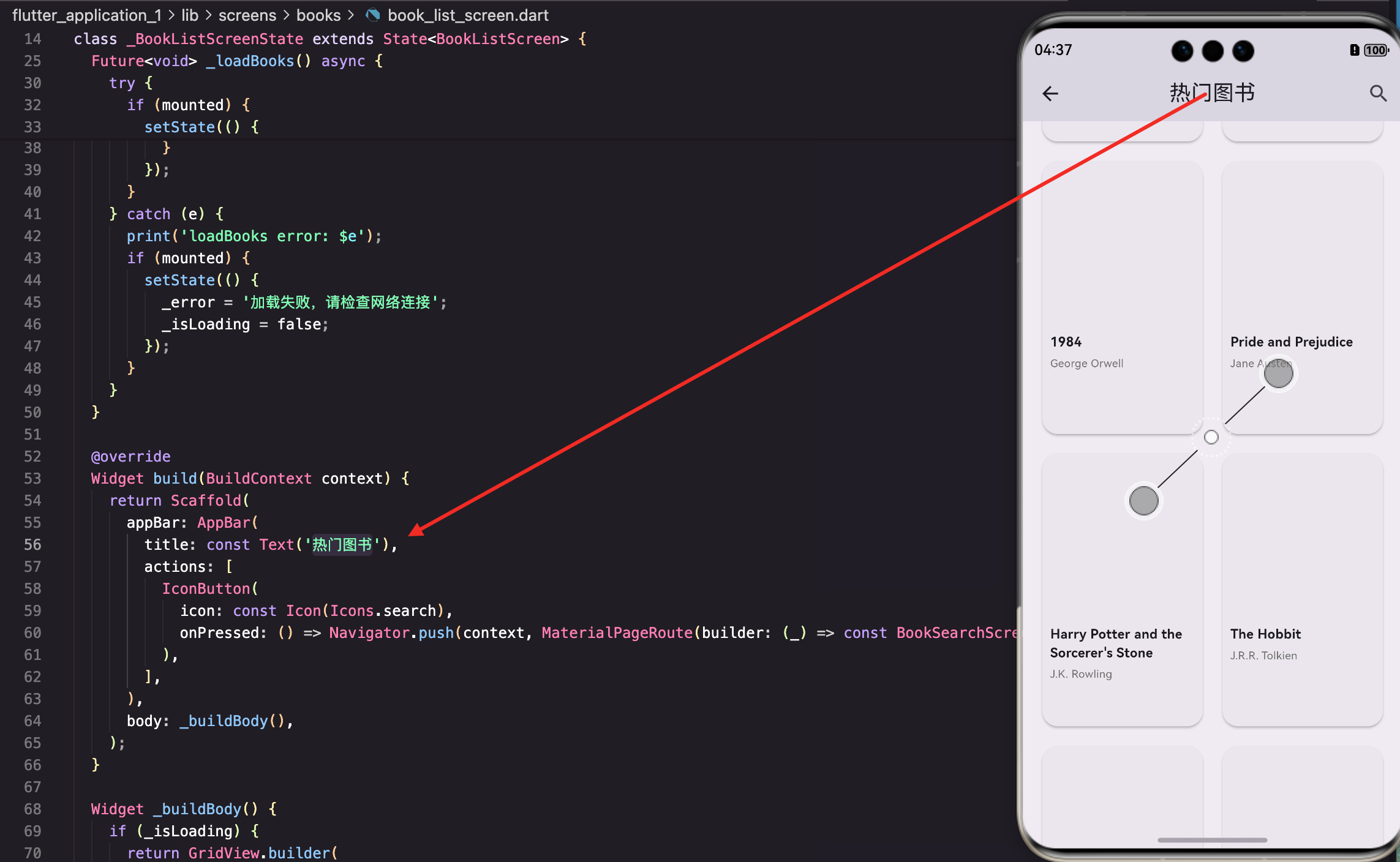
图书列表页面展示热门图书,用户可以浏览和搜索感兴趣的书籍。这个页面是我做得比较用心的一个,因为图书是教育百科的核心内容之一,展示效果直接影响用户体验。
做这个页面的时候遇到了一个问题:Open Library的封面图片加载很慢,有时候甚至加载不出来。最后我决定用渐变色背景代替封面图片,效果反而更好看了。下面来看看具体实现。
状态变量设计
图书列表页面需要管理图书数据、加载状态和错误信息:
class BookListScreen extends StatefulWidget {
const BookListScreen({super.key});
State<BookListScreen> createState() => _BookListScreenState();
}
class _BookListScreenState extends State<BookListScreen> {
List<dynamic> _books = [];
bool _isLoading = true;
String? _error;
void initState() {
super.initState();
_loadBooks();
}
}
三个状态变量覆盖了页面的所有可能状态:加载中、加载成功、加载失败。
_error用可空类型,null表示没有错误。
为什么要单独存储错误信息? 因为错误信息需要显示给用户看,而且不同的错误可能有不同的提示。比如网络错误提示"请检查网络连接",数据为空提示"暂无数据"。
加载图书数据
从Open Library API获取热门图书:
Future<void> _loadBooks() async {
  setState(() {
    _isLoading = true;
    _error = null;
  });
  try {
    final books = await ApiService.getTrendingBooks();
    if (mounted) {
      setState(() {
        _books = books;
        _isLoading = false;
        if (books.isEmpty) {
          _error = '暂无数据,请稍后重试';
        }
      });
    }
  } catch (e) {
    print('loadBooks error: $e');
    if (mounted) {
      setState(() {
        _error = '加载失败,请检查网络连接';
        _isLoading = false;
      });
    }
  }
}
加载开始时重置错误信息,这样用户重试时不会看到旧的错误提示。即使请求成功但返回空数据,也要设置错误信息提示用户。
两种错误的区分:
- 网络错误(catch块):提示"请检查网络连接"
- 数据为空:提示"暂无数据,请稍后重试"
这两种情况对用户来说是不一样的,分开提示更友好。
页面结构
AppBar包含标题和搜索按钮:
Widget build(BuildContext context) {
return Scaffold(
appBar: AppBar(
title: const Text('热门图书'),
actions: [
IconButton(
icon: const Icon(Icons.search),
onPressed: () => Navigator.push(context, MaterialPageRoute(builder: (_) => const BookSearchScreen())),
),
],
),
body: _buildBody(),
);
}
搜索按钮点击后跳转到图书搜索页面,让用户可以按关键词查找图书。热门图书只是展示推荐内容,真正要找特定的书还是得用搜索。
内容区域构建
根据不同状态显示不同内容:
Widget _buildBody() {
  if (_isLoading) {
    return GridView.builder(
      padding: const EdgeInsets.all(16),
      gridDelegate: const SliverGridDelegateWithFixedCrossAxisCount(
        crossAxisCount: 2,
        childAspectRatio: 0.65,
        crossAxisSpacing: 12,
        mainAxisSpacing: 12,
      ),
      itemCount: 6,
      itemBuilder: (context, index) => const LoadingShimmer(height: 200),
    );
  }
加载中时显示6个骨架屏占位,让用户知道内容正在加载。骨架屏的布局和实际内容一致,这样加载完成后不会有明显的跳动。
  if (_error != null) {
    return AppErrorWidget(message: _error!, onRetry: _loadBooks);
  }

  return RefreshIndicator(
    onRefresh: _loadBooks,
    child: GridView.builder(
      padding: const EdgeInsets.all(16),
      gridDelegate: const SliverGridDelegateWithFixedCrossAxisCount(
        crossAxisCount: 2,
        childAspectRatio: 0.6,
        crossAxisSpacing: 12,
        mainAxisSpacing: 12,
      ),
      itemCount: _books.length,
      itemBuilder: (context, index) => _buildBookCard(_books[index]),
    ),
  );
}
错误状态显示错误信息和重试按钮。正常状态使用GridView展示图书卡片,RefreshIndicator支持下拉刷新。
为什么加载中和正常状态的childAspectRatio不一样? 加载中用0.65,正常状态用0.6。这是因为骨架屏没有文字部分,高度可以稍微矮一点。其实差别不大,保持一致也行。
GridView配置详解
SliverGridDelegateWithFixedCrossAxisCount的参数说明:
gridDelegate: const SliverGridDelegateWithFixedCrossAxisCount(
  crossAxisCount: 2,
  childAspectRatio: 0.6,
  crossAxisSpacing: 12,
  mainAxisSpacing: 12,
),
参数说明:
crossAxisCount: 2— 每行显示2个卡片,这是手机上比较合适的数量childAspectRatio: 0.6— 宽高比为0.6,即高度是宽度的1.67倍,适合展示书籍封面crossAxisSpacing: 12— 水平方向的间距mainAxisSpacing: 12— 垂直方向的间距
为什么用0.6的宽高比? 书籍封面通常是竖向的,高度大于宽度。0.6的比例接近常见书籍的比例,看起来比较自然。如果用1:1的正方形,封面会显得很奇怪。
图书卡片设计
每本图书用一个卡片展示:
Widget _buildBookCard(Map<String, dynamic> book) {
  final coverId = book['cover_i'] ?? book['cover_edition_key'];
  final coverUrl = coverId != null ? 'https://covers.openlibrary.org/b/id/$coverId-M.jpg' : null;

  return Card(
    clipBehavior: Clip.antiAlias,
    child: InkWell(
      onTap: () {
        final key = book['key'];
        if (key != null) {
          Navigator.push(context, MaterialPageRoute(builder: (_) => BookDetailScreen(bookKey: key)));
        }
      },
clipBehavior: Clip.antiAlias让Card的圆角能正确裁剪子内容。InkWell提供点击效果,点击后跳转到图书详情页。
关于封面URL的构建: Open Library的封面URL格式是https://covers.openlibrary.org/b/id/{cover_id}-{size}.jpg,size可以是S(小)、M(中)、L(大)。这里用M,在列表里显示刚好。
      child: Column(
        crossAxisAlignment: CrossAxisAlignment.start,
        children: [
          Expanded(
            flex: 3,
            child: _buildCover(book, coverUrl),
          ),
          Expanded(
            flex: 2,
            child: _buildBookInfo(book),
          ),
        ],
      ),
    ),
  );
}
卡片分为两部分:封面占3份,信息占2份。用Expanded和flex来分配空间,这样不管卡片多高,比例都是固定的。
封面区域
由于网络图片加载不稳定,我用渐变色背景代替:
Widget _buildCover(Map<String, dynamic> book, String? coverUrl) {
  final title = book['title'] ?? '未知标题';

  final colorSets = [
    [const Color(0xFF667eea), const Color(0xFF764ba2)],
    [const Color(0xFF4facfe), const Color(0xFF00f2fe)],
    [const Color(0xFF43e97b), const Color(0xFF38f9d7)],
    [const Color(0xFFfa709a), const Color(0xFFfee140)],
  ];
  final colorIndex = title.hashCode.abs() % colorSets.length;
  final isDark = Theme.of(context).brightness == Brightness.dark;
  final gradientColors = isDark
      ? [Colors.grey[800]!, Colors.grey[700]!]
      : colorSets[colorIndex];
根据书名的hashCode选择渐变色,这样同一本书每次显示的颜色都一样。深色模式统一用灰色渐变,避免颜色太花哨。
  return Container(
    width: double.infinity,
    decoration: BoxDecoration(
      gradient: LinearGradient(
        begin: Alignment.topLeft,
        end: Alignment.bottomRight,
        colors: gradientColors,
      ),
    ),
    child: Stack(
      children: [
        Positioned(
          right: -20,
          bottom: -20,
          child: Icon(
            Icons.auto_stories,
            size: 100,
            color: Colors.white.withOpacity(0.15),
          ),
        ),
        Center(
          child: Column(
            mainAxisAlignment: MainAxisAlignment.center,
            children: [
              Icon(
                Icons.menu_book_rounded,
                color: Colors.white.withOpacity(0.9),
                size: 40,
              ),
              const SizedBox(height: 8),
              Container(
                padding: const EdgeInsets.symmetric(horizontal: 12, vertical: 4),
                decoration: BoxDecoration(
                  color: Colors.white.withOpacity(0.25),
                  borderRadius: BorderRadius.circular(12),
                ),
                child: Text(
                  '图书',
                  style: TextStyle(
                    color: Colors.white.withOpacity(0.95),
                    fontSize: 12,
                    fontWeight: FontWeight.w500,
                  ),
                ),
              ),
            ],
          ),
        ),
      ],
    ),
  );
}
封面区域用渐变背景,中间放图书图标和"图书"标签,右下角放一个大的半透明装饰图标。这种设计即使没有真实封面也很好看。
图书信息区域
卡片下半部分显示图书信息:
Widget _buildBookInfo(Map<String, dynamic> book) {
  return Padding(
    padding: const EdgeInsets.all(8),
    child: Column(
      crossAxisAlignment: CrossAxisAlignment.start,
      children: [
        Text(
          book['title'] ?? '未知标题',
          maxLines: 2,
          overflow: TextOverflow.ellipsis,
          style: const TextStyle(fontWeight: FontWeight.w600, fontSize: 13),
        ),
        const SizedBox(height: 4),
        Text(
          (book['author_name'] as List?)?.join(', ') ?? '未知作者',
          maxLines: 1,
          overflow: TextOverflow.ellipsis,
          style: TextStyle(fontSize: 11, color: Colors.grey[600]),
        ),
        const Spacer(),
        if (book['first_publish_year'] != null)
          Text(
            '${book['first_publish_year']}年',
            style: TextStyle(fontSize: 10, color: Colors.grey[500]),
          ),
      ],
    ),
  );
}
标题最多显示两行,作者最多显示一行,超出部分用省略号。
Spacer()把出版年份推到底部,不管标题有几行,年份的位置都是固定的。
关于作者的处理: author_name是一个数组,可能有多个作者。用join(', ')把它们连接成字符串,比如"张三, 李四"。如果数组为空或字段不存在,显示"未知作者"。
骨架屏加载效果
LoadingShimmer是一个自定义的骨架屏组件:
class LoadingShimmer extends StatelessWidget {
final double height;
const LoadingShimmer({super.key, required this.height});
Widget build(BuildContext context) {
return Container(
height: height,
decoration: BoxDecoration(
color: Colors.grey[300],
borderRadius: BorderRadius.circular(12),
),
);
}
}
骨架屏就是一个灰色的圆角矩形,模拟内容的位置和大小。实际项目中可以加闪烁动画效果,让用户知道正在加载。
错误处理组件
AppErrorWidget显示错误信息和重试按钮:
class AppErrorWidget extends StatelessWidget {
final String message;
final VoidCallback onRetry;
const AppErrorWidget({super.key, required this.message, required this.onRetry});
Widget build(BuildContext context) {
return Center(
child: Column(
mainAxisAlignment: MainAxisAlignment.center,
children: [
Icon(Icons.error_outline, size: 64, color: Colors.grey[400]),
const SizedBox(height: 16),
Text(message, style: TextStyle(color: Colors.grey[600])),
const SizedBox(height: 16),
ElevatedButton(
onPressed: onRetry,
child: const Text('重试'),
),
],
),
);
}
}
错误图标、错误信息和重试按钮垂直居中显示。
onRetry回调让父组件可以传入重新加载的方法,点击重试按钮就会重新请求数据。
性能考虑
GridView.builder是懒加载的,只会渲染可见的卡片。对于长列表来说,这比GridView直接传children要高效得多。
GridView.builder(
  itemCount: _books.length,
  itemBuilder: (context, index) => _buildBookCard(_books[index]),
)
每次滚动时,Flutter只会调用可见项的itemBuilder,不可见的项会被回收。这样即使有几百本书,内存占用也不会太高。
小结
图书列表页面展示了如何处理网络数据的完整流程:加载中显示骨架屏,加载成功显示数据,加载失败显示错误信息和重试按钮。GridView的使用让图书以网格形式整齐排列,渐变色封面的设计解决了网络图片加载慢的问题。
下一篇我们来看图书搜索功能的实现,了解如何处理用户输入和分页加载。
本文是Flutter for OpenHarmony教育百科实战系列的第六篇。
欢迎加入开源鸿蒙跨平台社区:https://openharmonycrossplatform.csdn.net

开源鸿蒙跨平台开发社区汇聚开发者与厂商,共建“一次开发,多端部署”的开源生态,致力于降低跨端开发门槛,推动万物智联创新。
更多推荐
 9
9 0
0- 0


 已为社区贡献21条内容

所有评论(0)