RN for OpenHarmony 实战 TodoList 项目:搜索框
案例开源地址:https://atomgit.com/lqjmac/rn_openharmony_todolist
找东西这件事
任务列表一旦多起来,找任务就成了问题。你可能记得有个任务叫"买牛奶",但在几十条任务里翻找,眼睛都看花了。
搜索框就是解决这个问题的。输入几个字,列表立刻过滤,只显示匹配的任务。这是一个看似简单但非常实用的功能。
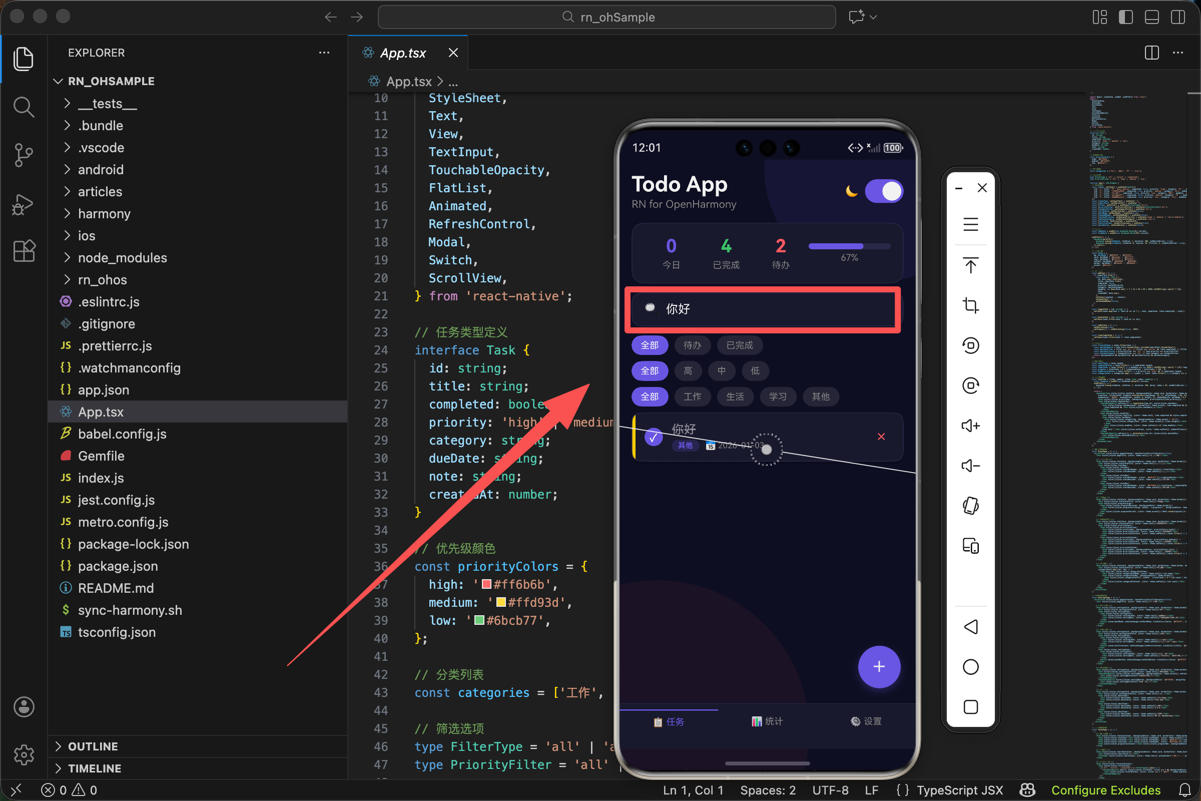
在我们的 TodoList 应用中,搜索框放在统计区域下方、筛选按钮上方。这个位置很讲究,用户的视线从上往下扫,先看到整体统计,然后是搜索框,最后是筛选和任务列表。
搜索框的结构
先看看我们的搜索框长什么样:
<View style={[styles.searchContainer, {backgroundColor: theme.card, borderColor: theme.border}]}>
  <Text style={styles.searchIcon}>🔍</Text>
  <TextInput style={[styles.searchInput, {color: theme.text}]} placeholder="搜索任务..." placeholderTextColor={theme.subText} value={searchText} onChangeText={setSearchText} />
</View>
结构很简单,一个容器里面放了两个东西:一个放大镜图标和一个输入框。放大镜是用 emoji 实现的,简单直接,不需要引入图标库。
搜索状态的管理
状态定义
搜索需要一个状态来存储用户输入的内容:
const [searchText, setSearchText] = useState('');
这是一个字符串状态,初始值是空字符串。当用户在输入框里打字时,这个状态会实时更新。
为什么用状态
为什么要用状态而不是直接读取输入框的值?因为 React 的数据流是单向的。状态变化触发重新渲染,重新渲染时根据状态过滤任务列表。这样数据流清晰,不会出现输入框显示的内容和实际搜索的内容不一致的情况。
输入框的属性解析
让我们仔细看看 TextInput 的每个属性:
<TextInput
  style={[styles.searchInput, {color: theme.text}]}
  placeholder="搜索任务..."
  placeholderTextColor={theme.subText}
  value={searchText}
  onChangeText={setSearchText}
/>
style 属性
设置输入框的样式,我们用了数组形式,把基础样式和主题相关的颜色分开。这样切换主题时只需要改变颜色,不需要重新定义整个样式。
placeholder 属性
占位符文字,在用户还没输入任何内容时显示。"搜索任务…"这几个字告诉用户这个输入框是干什么用的。
placeholderTextColor 属性
设置占位符的颜色。我们用 theme.subText 也就是次要文字颜色,比正文浅一些,这样用户能区分占位符和实际输入的内容。
value 属性
绑定到 searchText 状态,这让输入框成为一个受控组件。输入框显示的内容完全由状态决定。
onChangeText 属性
输入内容变化时的回调函数。每次用户输入或删除一个字符,这个函数都会被调用,参数是输入框的新内容。我们直接把它传给 setSearchText 来更新状态。
搜索框的样式设计
searchContainer: {flexDirection: 'row', alignItems: 'center', paddingHorizontal: 16, paddingVertical: 12, borderRadius: 12, borderWidth: 1, marginBottom: 12},
searchIcon: {fontSize: 16, marginRight: 8},
searchInput: {flex: 1, fontSize: 16, padding: 0},
searchContainer 容器样式
flexDirection: 'row'让图标和输入框水平排列alignItems: 'center'让它们垂直居中对齐paddingHorizontal和paddingVertical设置内边距,让内容不会贴着边框borderRadius: 12是圆角,让搜索框看起来更柔和borderWidth: 1是细边框,配合主题的边框颜色使用marginBottom: 12是与下方内容的间距
searchIcon 图标样式
fontSize: 16让图标大小适中marginRight: 8是图标和输入框之间的间距
searchInput 输入框样式
flex: 1让输入框占据剩余的所有空间fontSize: 16是正常的字体大小padding: 0去掉输入框默认的内边距,因为我们已经在容器上设置了内边距
搜索的过滤逻辑
搜索的核心是过滤任务列表。看看我们的实现:
const filteredTasks = tasks.filter(task => {
  const matchesSearch = task.title.toLowerCase().includes(searchText.toLowerCase());
  const matchesFilter = filter === 'all' || (filter === 'active' && !task.completed) || (filter === 'completed' && task.completed);
  const matchesPriority = priorityFilter === 'all' || task.priority === priorityFilter;
  const matchesCategory = categoryFilter === 'all' || task.category === categoryFilter;
  return matchesSearch && matchesFilter && matchesPriority && matchesCategory;
});
搜索匹配的核心代码
搜索只是多个筛选条件之一。matchesSearch 判断任务标题是否包含搜索关键词。
关键的一行是:
const matchesSearch = task.title.toLowerCase().includes(searchText.toLowerCase());
大小写不敏感匹配
这里做了大小写不敏感的匹配。task.title.toLowerCase() 把任务标题转成小写,searchText.toLowerCase() 把搜索关键词也转成小写,然后用 includes 方法判断标题是否包含关键词。
为什么要大小写不敏感?因为用户搜索时不会在意大小写。搜"react"应该能找到"React Native",搜"TODO"应该能找到"todo"。这是一个小细节,但能显著提升用户体验。
实时搜索的体验
我们的搜索是实时的,用户每输入一个字符,列表就会立即更新。这是通过 React 的响应式机制实现的。
数据流动过程
- 当用户输入时,
onChangeText被调用 setSearchText更新状态- 状态变化触发组件重新渲染
- 重新渲染时,
filteredTasks会重新计算,因为它依赖searchText FlatList接收到新的filteredTasks,显示过滤后的任务列表
整个过程是自动的,我们不需要手动触发搜索,不需要点击搜索按钮。这种即时反馈让用户感觉应用很"灵敏"。
空搜索的处理
当 searchText 是空字符串时会发生什么?
const matchesSearch = task.title.toLowerCase().includes('');
空字符串是任何字符串的子串,所以 includes('') 永远返回 true。这意味着当搜索框为空时,所有任务都匹配搜索条件,显示全部任务。
这是一个很自然的行为,不需要特殊处理。用户清空搜索框,就能看到所有任务。
搜索与其他筛选的配合
搜索不是孤立的,它和状态筛选、优先级筛选、分类筛选一起工作:
return matchesSearch && matchesFilter && matchesPriority && matchesCategory;
四个条件用 && 连接,只有全部满足的任务才会显示。
组合筛选的威力
这意味着用户可以组合使用这些筛选。比如搜索"学习",同时筛选"高优先级"和"待办",就能找到所有高优先级的、未完成的、标题包含"学习"的任务。
这种组合筛选非常强大,但实现起来很简单,就是多个布尔条件的与运算。
搜索框的交互细节
焦点状态
当用户点击搜索框时,输入框获得焦点,键盘弹出。用户可以开始输入。输入完成后,点击其他地方或按下键盘的完成键,输入框失去焦点,键盘收起。
清空功能
用户可能想快速清空搜索框。我们的实现中没有专门的清空按钮,用户需要手动删除输入的内容。如果要添加清空按钮,可以这样做:
<View style={[styles.searchContainer, {backgroundColor: theme.card, borderColor: theme.border}]}>
  <Text style={styles.searchIcon}>🔍</Text>
  <TextInput style={[styles.searchInput, {color: theme.text}]} placeholder="搜索任务..." placeholderTextColor={theme.subText} value={searchText} onChangeText={setSearchText} />
  {searchText.length > 0 && (
    <TouchableOpacity onPress={() => setSearchText('')}>
      <Text style={{color: theme.subText, fontSize: 16}}>✕</Text>
    </TouchableOpacity>
  )}
</View>
只有当搜索框有内容时才显示清空按钮,点击后把 searchText 设为空字符串。
搜索的性能考虑
每次用户输入一个字符,filteredTasks 都会重新计算。如果任务列表很长,这可能会有性能问题。
一般情况
对于我们的 TodoList 应用,几十条甚至几百条任务都不会有问题。JavaScript 的字符串操作很快,filter 方法也很高效。
防抖优化
但如果任务列表有几千条,可能需要考虑优化。一个常见的优化是防抖,延迟执行搜索:
const [searchText, setSearchText] = useState('');
const [debouncedSearchText, setDebouncedSearchText] = useState('');

useEffect(() => {
  const timer = setTimeout(() => {
    setDebouncedSearchText(searchText);
  }, 300);
  return () => clearTimeout(timer);
}, [searchText]);

const filteredTasks = tasks.filter(task => {
  const matchesSearch = task.title.toLowerCase().includes(debouncedSearchText.toLowerCase());
  // ...
});
用户输入时,searchText 立即更新,输入框显示最新内容。但 debouncedSearchText 会延迟 300 毫秒才更新,过滤逻辑使用 debouncedSearchText。这样用户快速输入时,过滤只会在用户停止输入后执行一次,而不是每个字符都执行。
不过对于大多数应用来说,这种优化是不必要的。过早优化是万恶之源,先让功能正常工作,有性能问题再优化。
搜索范围的扩展
目前我们只搜索任务标题。如果要搜索更多字段呢?
const matchesSearch =
  task.title.toLowerCase().includes(searchText.toLowerCase()) ||
  task.note.toLowerCase().includes(searchText.toLowerCase()) ||
  task.category.toLowerCase().includes(searchText.toLowerCase());
用 || 连接多个条件,任何一个字段匹配就算匹配。这样用户搜索"工作",不仅能找到标题包含"工作"的任务,也能找到分类是"工作"的任务,或者备注里提到"工作"的任务。
搜索范围越广,用户越容易找到想要的任务。但也要注意,范围太广可能会返回太多不相关的结果。需要根据实际情况权衡。
搜索结果的高亮
一个进阶的功能是高亮搜索结果中匹配的文字。比如搜索"学习",任务标题"学习 React Native"中的"学习"两个字用不同颜色显示。
实现思路
把标题拆分成匹配部分和非匹配部分,分别渲染:
const highlightText = (text: string, highlight: string) => {
  if (!highlight.trim()) {
    return <Text>{text}</Text>;
  }
  const parts = text.split(new RegExp(`(${highlight})`, 'gi'));
  return (
    <Text>
      {parts.map((part, index) =>
        part.toLowerCase() === highlight.toLowerCase() ? (
          <Text key={index} style={{backgroundColor: '#ffd93d'}}>{part}</Text>
        ) : (
          <Text key={index}>{part}</Text>
        )
      )}
    </Text>
  );
};
这个函数接收原始文本和要高亮的关键词,返回一个包含高亮效果的 Text 组件。匹配的部分用黄色背景显示。
在任务卡片中使用
<Text style={[styles.taskTitle, {color: theme.text}, item.completed && styles.completedText]}>
  {highlightText(item.title, searchText)}
</Text>
这个功能我们的应用中没有实现,但如果你想让搜索体验更好,可以考虑加上。
搜索框的可访问性
为了让搜索框对所有用户友好,可以添加可访问性属性:
<TextInput
  style={[styles.searchInput, {color: theme.text}]}
  placeholder="搜索任务..."
  placeholderTextColor={theme.subText}
  value={searchText}
  onChangeText={setSearchText}
  accessibilityLabel="搜索任务"
  accessibilityHint="输入关键词搜索任务列表"
/>
accessibilityLabel是屏幕阅读器会朗读的标签,告诉用户这是什么accessibilityHint是额外的提示,告诉用户怎么使用
搜索框的键盘配置
keyboardType 属性
TextInput 有一个 keyboardType 属性,可以指定弹出什么类型的键盘。对于搜索框,默认的键盘就可以了。但如果你的搜索框是用来搜索数字的,可以设置 keyboardType="numeric"。
returnKeyType 属性
还有一个 returnKeyType 属性,设置键盘右下角按钮的文字。对于搜索框,可以设置 returnKeyType="search",按钮会显示"搜索"而不是"换行"。
<TextInput
  style={[styles.searchInput, {color: theme.text}]}
  placeholder="搜索任务..."
  placeholderTextColor={theme.subText}
  value={searchText}
  onChangeText={setSearchText}
  returnKeyType="search"
/>
搜索框的焦点动画
可以给搜索框添加一些动画效果,让交互更生动。比如获得焦点时边框颜色变化:
const [isFocused, setIsFocused] = useState(false);

<View style={[
  styles.searchContainer,
  {
    backgroundColor: theme.card,
    borderColor: isFocused ? theme.accent : theme.border
  }
]}>
  <Text style={styles.searchIcon}>🔍</Text>
  <TextInput
    style={[styles.searchInput, {color: theme.text}]}
    placeholder="搜索任务..."
    placeholderTextColor={theme.subText}
    value={searchText}
    onChangeText={setSearchText}
    onFocus={() => setIsFocused(true)}
    onBlur={() => setIsFocused(false)}
  />
</View>
当输入框获得焦点时,边框颜色变成强调色,失去焦点时恢复默认颜色。这个小细节能让用户清楚地知道当前焦点在哪里。
空搜索结果的处理
当搜索没有匹配结果时,FlatList 会显示 ListEmptyComponent:
ListEmptyComponent={
  <View style={styles.emptyContainer}>
    <Text style={styles.emptyIcon}>📝</Text>
    <Text style={[styles.emptyText, {color: theme.subText}]}>暂无任务</Text>
    <Text style={[styles.emptySubText, {color: theme.subText}]}>点击下方按钮添加新任务</Text>
  </View>
}
区分空状态
这个空状态组件在任务列表为空时显示,不管是因为没有任务还是因为搜索没有结果。如果想区分这两种情况,可以根据 searchText 是否为空显示不同的提示:
ListEmptyComponent={
  <View style={styles.emptyContainer}>
    <Text style={styles.emptyIcon}>{searchText ? '🔍' : '📝'}</Text>
    <Text style={[styles.emptyText, {color: theme.subText}]}>
      {searchText ? '没有找到匹配的任务' : '暂无任务'}
    </Text>
    <Text style={[styles.emptySubText, {color: theme.subText}]}>
      {searchText ? '试试其他关键词' : '点击下方按钮添加新任务'}
    </Text>
  </View>
}
搜索无结果时显示"没有找到匹配的任务"和"试试其他关键词",比通用的"暂无任务"更有针对性。
搜索框的位置选择
我们把搜索框放在统计区域下方、筛选按钮上方。这个位置是经过考虑的。
为什么不放在最上方
用户打开应用首先看到的是搜索框,但大多数时候用户不需要搜索,这会浪费首屏空间。
为什么不放在筛选按钮下方
搜索和筛选是相关的功能,放在一起有道理。但搜索框比筛选按钮更常用,应该更容易触达。
当前位置的优势
放在统计区域下方、筛选按钮上方是一个平衡。用户先看到整体统计,了解任务的大致情况,然后是搜索框,可以快速找到特定任务,最后是筛选按钮,可以按条件浏览任务。
小结
搜索框是一个简单但重要的功能。在 React Native 中使用 TextInput 组件实现,通过状态管理实现受控输入,通过 filter 方法实现实时过滤。
我们的实现包括:放大镜图标提示用户这是搜索框,大小写不敏感的匹配让搜索更友好,与其他筛选条件的组合让搜索更强大。
好的搜索应该是"找得到、找得快、找得准"。找得到是基本要求,找得快需要实时响应,找得准需要合理的匹配逻辑。我们的搜索框在这三个方面都做得不错。
欢迎加入开源鸿蒙跨平台社区:https://openharmonycrossplatform.csdn.net

开源鸿蒙跨平台开发社区汇聚开发者与厂商,共建“一次开发,多端部署”的开源生态,致力于降低跨端开发门槛,推动万物智联创新。
更多推荐


 8
8 0
0- 0


 已为社区贡献23条内容

所有评论(0)