Flutter&OpenHarmony商城App优惠券组件开发
本文介绍了Flutter和OpenHarmony平台上优惠券组件的开发实现。首先设计了包含类型、面值、有效期等核心属性的优惠券数据模型,并提供了格式化显示方法。重点讲解了优惠券卡片组件的实现细节:左侧面值区采用醒目颜色突出显示优惠金额,右侧信息区展示优惠券标题和有效期,并根据优惠券状态调整UI样式。组件支持选中状态显示和点击交互,完整模拟了传统优惠券的票券效果,为用户提供直观的优惠信息展示和便捷的
#
前言
优惠券是商城应用中重要的营销工具,能够有效刺激用户消费和提升转化率。一个设计精良的优惠券组件需要清晰地展示优惠券的面额、使用条件、有效期等信息,并提供便捷的领取和使用交互。本文将详细介绍如何在Flutter和OpenHarmony平台上开发优惠券相关组件,包括优惠券卡片、优惠券列表、优惠券选择器等核心模块。
优惠券的视觉设计需要在吸引用户注意力和传达信息之间取得平衡。传统的优惠券采用票券形式,带有锯齿边缘和穿孔效果,这种设计已经成为用户对优惠券的认知符号。在数字化的移动应用中,我们可以通过视觉设计还原这种票券感,增强用户对优惠券价值的感知。
Flutter优惠券数据模型
首先定义优惠券的数据模型:
class Coupon {
  final String id;
  final CouponType type;
  final double value;
  final double minAmount;
  final String title;
  final DateTime startTime;
  final DateTime endTime;
  final CouponStatus status;

  const Coupon({
    required this.id,
    required this.type,
    required this.value,
    required this.minAmount,
    required this.title,
    required this.startTime,
    required this.endTime,
    required this.status,
  });
}
Coupon类包含了优惠券的核心属性。type是优惠券类型,区分满减券和折扣券。value是优惠券面值,满减券表示减免金额,折扣券表示折扣比例。minAmount是使用门槛,即满多少元可用。title是优惠券标题,描述适用范围。startTime和endTime定义有效期,status表示优惠券当前状态。这种数据模型的设计覆盖了优惠券的主要业务场景。
优惠券类型和状态枚举:
enum CouponType {
  discount,  // 满减券
  percent,   // 折扣券
}

enum CouponStatus {
  available,  // 可使用
  used,       // 已使用
  expired,    // 已过期
}

extension CouponTypeExtension on CouponType {
  String formatValue(double value) {
    switch (this) {
      case CouponType.discount:
        return '¥${value.toInt()}';
      case CouponType.percent:
        return '${(value * 10).toInt()}折';
    }
  }
}
CouponType枚举定义了满减券和折扣券两种类型,CouponStatus枚举定义了可使用、已使用、已过期三种状态。扩展方法formatValue根据优惠券类型格式化面值显示,满减券显示为"¥50"形式,折扣券显示为"8折"形式。这种设计将格式化逻辑封装在类型上,使用时更加方便,代码也更加清晰。
优惠券卡片组件
class CouponCard extends StatelessWidget {
final Coupon coupon;
final bool isSelected;
final VoidCallback? onTap;
const CouponCard({
Key? key,
required this.coupon,
this.isSelected = false,
this.onTap,
}) : super(key: key);
Widget build(BuildContext context) {
return GestureDetector(
onTap: coupon.status == CouponStatus.available ? onTap : null,
child: Container(
height: 100,
decoration: BoxDecoration(
borderRadius: BorderRadius.circular(8),
border: isSelected
? Border.all(color: const Color(0xFFE53935), width: 2)
: null,
),
child: Row(
children: [
_buildLeftPart(),
_buildRightPart(),
],
),
),
);
}
}
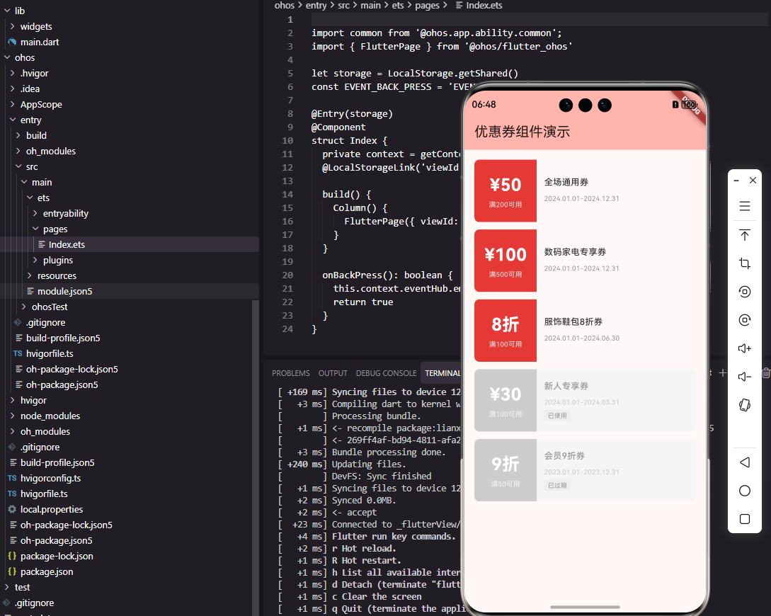
CouponCard组件展示单张优惠券的完整信息。组件接收优惠券数据、选中状态和点击回调作为参数。Container设置100像素固定高度和圆角边框,选中时显示红色边框。Row水平排列左侧面值区和右侧信息区,模拟传统优惠券的票券布局。只有可使用状态的优惠券才响应点击事件,已使用和已过期的优惠券点击无效。
左侧面值区实现:
Widget _buildLeftPart() {
  final isAvailable = coupon.status == CouponStatus.available;

  return Container(
    width: 100,
    decoration: BoxDecoration(
      color: isAvailable
        ? const Color(0xFFE53935)
        : const Color(0xFFCCCCCC),
      borderRadius: const BorderRadius.horizontal(
        left: Radius.circular(8),
      ),
    ),
    child: Column(
      mainAxisAlignment: MainAxisAlignment.center,
      children: [
        Text(
          coupon.type.formatValue(coupon.value),
          style: const TextStyle(
            fontSize: 28,
            fontWeight: FontWeight.bold,
            color: Colors.white,
          ),
        ),
        const SizedBox(height: 4),
        Text(
          '满${coupon.minAmount.toInt()}可用',
          style: TextStyle(
            fontSize: 11,
            color: Colors.white.withOpacity(0.8),
          ),
        ),
      ],
    ),
  );
}
左侧面值区使用醒目的红色背景突出显示优惠券价值,不可用状态时使用灰色背景。面值使用28像素的大字号和粗体,确保用户第一眼就能看到优惠力度。使用门槛使用较小字号显示在面值下方,作为辅助信息。borderRadius只设置左侧圆角,与右侧信息区拼接形成完整的圆角卡片。这种设计突出了优惠券最重要的信息——面值。
右侧信息区实现:
Widget _buildRightPart() {
  final isAvailable = coupon.status == CouponStatus.available;

  return Expanded(
    child: Container(
      padding: const EdgeInsets.all(12),
      decoration: BoxDecoration(
        color: isAvailable
          ? const Color(0xFFFFF8F8)
          : const Color(0xFFF5F5F5),
        borderRadius: const BorderRadius.horizontal(
          right: Radius.circular(8),
        ),
      ),
      child: Column(
        crossAxisAlignment: CrossAxisAlignment.start,
        mainAxisAlignment: MainAxisAlignment.center,
        children: [
          Text(
            coupon.title,
            style: TextStyle(
              fontSize: 14,
              fontWeight: FontWeight.w500,
              color: isAvailable
                ? const Color(0xFF333333)
                : const Color(0xFF999999),
            ),
            maxLines: 1,
            overflow: TextOverflow.ellipsis,
          ),
          const SizedBox(height: 8),
          Text(
            _formatValidPeriod(),
            style: TextStyle(
              fontSize: 11,
              color: isAvailable
                ? const Color(0xFF999999)
                : const Color(0xFFCCCCCC),
            ),
          ),
          const SizedBox(height: 4),
          _buildStatusTag(),
        ],
      ),
    ),
  );
}
右侧信息区展示优惠券标题、有效期和状态标签。Expanded使其占据剩余宽度,浅红色背景与左侧红色形成视觉呼应。标题使用14像素字号,限制单行显示避免布局溢出。有效期使用灰色小字号作为辅助信息。Column垂直排列这些元素,mainAxisAlignment设为center使内容垂直居中。不可用状态时所有文字颜色变浅,视觉上表明该优惠券不可使用。
有效期格式化
String _formatValidPeriod() {
  final dateFormat = DateFormat('yyyy.MM.dd');
  return '${dateFormat.format(coupon.startTime)}-${dateFormat.format(coupon.endTime)}';
}

Widget _buildStatusTag() {
  if (coupon.status == CouponStatus.available) {
    return const SizedBox.shrink();
  }

  final text = coupon.status == CouponStatus.used ? '已使用' : '已过期';

  return Container(
    padding: const EdgeInsets.symmetric(horizontal: 6, vertical: 2),
    decoration: BoxDecoration(
      color: const Color(0xFFEEEEEE),
      borderRadius: BorderRadius.circular(2),
    ),
    child: Text(
      text,
      style: const TextStyle(
        fontSize: 10,
        color: Color(0xFF999999),
      ),
    ),
  );
}
_formatValidPeriod方法将有效期格式化为"2024.01.01-2024.12.31"的形式,简洁明了。_buildStatusTag方法根据优惠券状态显示对应的标签,可使用状态不显示标签,已使用和已过期状态显示灰色标签。SizedBox.shrink()返回一个零尺寸的占位组件,不占用任何空间。这种设计让用户能够快速识别优惠券的当前状态。
OpenHarmony优惠券卡片实现
@Component
struct CouponCard {
  @Prop coupon: CouponInfo
  @Prop isSelected: boolean = false
  private onTap: () => void = () => {}

  build() {
    Row() {
      this.LeftPart()
      this.RightPart()
    }
    .width('100%')
    .height(100)
    .borderRadius(8)
    .border({
      width: this.isSelected ? 2 : 0,
      color: '#E53935'
    })
    .onClick(() => {
      if (this.coupon.status === 'available') {
        this.onTap()
      }
    })
  }
}
OpenHarmony的优惠券卡片使用Row水平排列左右两部分。@Prop装饰的属性从父组件接收数据,包括优惠券信息和选中状态。border属性根据选中状态设置边框宽度,选中时显示红色边框。onClick事件只在优惠券可用时触发回调。这种实现方式与Flutter版本结构一致,确保两个平台的功能和体验统一。
优惠券数据接口:
interface CouponInfo {
  id: string
  type: string
  value: number
  minAmount: number
  title: string
  startTime: string
  endTime: string
  status: string
}
TypeScript接口定义了优惠券的数据结构。type和status使用string类型存储枚举值,在实际使用时通过条件判断处理不同类型和状态。startTime和endTime使用string类型存储日期字符串,便于与后端API对接。接口定义为组件提供了类型安全保障。
左侧面值区ArkUI实现
@Builder
LeftPart() {
  Column() {
    Text(this.formatValue())
      .fontSize(28)
      .fontWeight(FontWeight.Bold)
      .fontColor(Color.White)

    Text('满' + this.coupon.minAmount + '可用')
      .fontSize(11)
      .fontColor('#CCFFFFFF')
      .margin({ top: 4 })
  }
  .width(100)
  .height('100%')
  .justifyContent(FlexAlign.Center)
  .backgroundColor(this.coupon.status === 'available'
    ? '#E53935'
    : '#CCCCCC')
  .borderRadius({
    topLeft: 8,
    bottomLeft: 8
  })
}
@Builder装饰器定义了左侧面值区的构建方法。Column垂直排列面值和使用门槛,justifyContent设为FlexAlign.Center使内容垂直居中。面值使用28像素粗体白色文字,使用门槛使用较小字号和半透明白色。backgroundColor根据优惠券状态设置不同颜色,borderRadius只设置左侧圆角。这种实现方式与Flutter版本的视觉效果完全一致。
面值格式化方法:
formatValue(): string {
  if (this.coupon.type === 'discount') {
    return '¥' + this.coupon.value
  } else {
    return (this.coupon.value * 10) + '折'
  }
}
formatValue方法根据优惠券类型返回格式化后的面值字符串。满减券返回"¥50"形式,折扣券返回"8折"形式。这种封装使面值的格式化逻辑集中在一处,便于维护和修改。方法的实现逻辑与Flutter版本的扩展方法完全一致。
优惠券列表组件
class CouponList extends StatelessWidget {
final List<Coupon> coupons;
final String? selectedId;
final ValueChanged<Coupon>? onSelect;
const CouponList({
Key? key,
required this.coupons,
this.selectedId,
this.onSelect,
}) : super(key: key);
Widget build(BuildContext context) {
if (coupons.isEmpty) {
return _buildEmptyState();
}
return ListView.separated(
padding: const EdgeInsets.all(16),
itemCount: coupons.length,
separatorBuilder: (_, __) => const SizedBox(height: 12),
itemBuilder: (context, index) {
final coupon = coupons[index];
return CouponCard(
coupon: coupon,
isSelected: coupon.id == selectedId,
onTap: () => onSelect?.call(coupon),
);
},
);
}
}
CouponList组件展示优惠券列表,支持选择功能。当列表为空时显示空状态提示,否则使用ListView.separated展示优惠券卡片。separatorBuilder在卡片之间添加12像素间距。selectedId用于标记当前选中的优惠券,在下单选择优惠券场景下使用。onSelect回调在用户选择优惠券时触发,将选中的优惠券数据传递给父组件。
空状态组件:
Widget _buildEmptyState() {
  return Center(
    child: Column(
      mainAxisAlignment: MainAxisAlignment.center,
      children: [
        Icon(
          Icons.card_giftcard_outlined,
          size: 64,
          color: Colors.grey[300],
        ),
        const SizedBox(height: 16),
        Text(
          '暂无优惠券',
          style: TextStyle(
            fontSize: 14,
            color: Colors.grey[500],
          ),
        ),
      ],
    ),
  );
}
空状态组件在没有优惠券时显示,提供友好的空状态提示。Center使内容居中显示,Column垂直排列图标和文字。图标使用礼品卡样式,灰色配色表明这是一个占位状态。文字简洁明了地告知用户当前没有优惠券。这种空状态设计避免了列表为空时的空白页面,提升了用户体验。
总结
本文详细介绍了Flutter和OpenHarmony平台上优惠券组件的开发过程。优惠券作为商城应用的重要营销工具,其设计质量直接影响用户的使用体验和营销效果。通过优惠券卡片、优惠券列表等组件的合理设计,我们为用户提供了清晰直观的优惠券展示和便捷的选择交互。在实际项目中,还可以进一步添加优惠券领取、优惠券分享等功能。
欢迎加入开源鸿蒙跨平台社区:https://openharmonycrossplatform.csdn.net

开源鸿蒙跨平台开发社区汇聚开发者与厂商,共建“一次开发,多端部署”的开源生态,致力于降低跨端开发门槛,推动万物智联创新。
更多推荐
 30
30 0
0- 0


 已为社区贡献28条内容

所有评论(0)