Flutter与OpenHarmony打卡倒计时组件
本文介绍了在Flutter和OpenHarmony平台上实现打卡倒计时组件的方法。Flutter版本使用Timer实现秒级更新,支持自定义样式和颜色警示效果;OpenHarmony版本采用setInterval定时器,同样提供时间格式化和UI组件。两个平台都实现了剩余时间计算、自动更新和完成回调功能,通过颜色变化增强时间紧迫感。组件设计考虑了内存管理和性能优化,适用于各类打卡应用场景。

前言
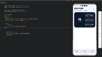
倒计时组件在打卡工具类应用中有着广泛的应用场景。它可以用于显示距离下次打卡的剩余时间、打卡窗口的截止时间、或者习惯养成的目标天数倒计时。一个设计精良的倒计时组件不仅能够准确显示时间,还能通过视觉效果传达紧迫感,激励用户及时完成打卡。本文将详细介绍如何在Flutter和OpenHarmony平台上实现功能完善的打卡倒计时组件。
倒计时组件的设计需要考虑时间精度、显示格式和视觉效果。对于打卡应用来说,通常需要显示到秒级精度,格式可以是"时:分:秒"或者更友好的文字描述。当剩余时间较少时,应该通过颜色变化或动画效果提醒用户抓紧时间。
Flutter倒计时组件实现
首先创建倒计时组件的基础结构:
class CountdownTimer extends StatefulWidget {
final DateTime targetTime;
final VoidCallback? onComplete;
final TextStyle? textStyle;
const CountdownTimer({
Key? key,
required this.targetTime,
this.onComplete,
this.textStyle,
}) : super(key: key);
State<CountdownTimer> createState() => _CountdownTimerState();
}
CountdownTimer组件接收目标时间、完成回调和文字样式三个参数。targetTime是倒计时的目标时间点,组件会计算当前时间与目标时间的差值并显示。onComplete回调在倒计时结束时触发,可以用于执行后续操作如显示提示或跳转页面。textStyle允许自定义文字样式,提供了灵活的视觉定制能力。
实现定时器逻辑:
class _CountdownTimerState extends State<CountdownTimer> {
late Timer _timer;
Duration _remaining = Duration.zero;
void initState() {
super.initState();
_calculateRemaining();
_timer = Timer.periodic(const Duration(seconds: 1), (_) {
_calculateRemaining();
if (_remaining.isNegative) {
_timer.cancel();
widget.onComplete?.call();
}
});
}
void _calculateRemaining() {
setState(() {
_remaining = widget.targetTime.difference(DateTime.now());
});
}
void dispose() {
_timer.cancel();
super.dispose();
}
}
倒计时使用Timer.periodic实现每秒更新。_calculateRemaining方法计算目标时间与当前时间的差值,并通过setState触发UI更新。当剩余时间变为负数时,取消定时器并调用完成回调。dispose方法中取消定时器是非常重要的,否则会造成内存泄漏和状态更新错误。
构建倒计时显示:
Widget build(BuildContext context) {
if (_remaining.isNegative) {
return Text('已结束', style: widget.textStyle);
}
final hours = _remaining.inHours;
final minutes = _remaining.inMinutes.remainder(60);
final seconds = _remaining.inSeconds.remainder(60);
return Row(
mainAxisSize: MainAxisSize.min,
children: [
_buildTimeBlock(hours.toString().padLeft(2, '0'), '时'),
_buildSeparator(),
_buildTimeBlock(minutes.toString().padLeft(2, '0'), '分'),
_buildSeparator(),
_buildTimeBlock(seconds.toString().padLeft(2, '0'), '秒'),
],
);
}
Widget _buildTimeBlock(String value, String label) {
return Column(
children: [
Container(
padding: const EdgeInsets.symmetric(horizontal: 12, vertical: 8),
decoration: BoxDecoration(
color: _getBackgroundColor(),
borderRadius: BorderRadius.circular(8),
),
child: Text(
value,
style: TextStyle(
fontSize: 24,
fontWeight: FontWeight.bold,
color: _getTextColor(),
),
),
),
const SizedBox(height: 4),
Text(label, style: const TextStyle(fontSize: 12, color: Colors.grey)),
],
);
}
倒计时显示采用时、分、秒三个独立的数字块,每个块包含数值和单位标签。padLeft确保数字始终显示两位,个位数前面补零。_getBackgroundColor和_getTextColor方法根据剩余时间返回不同的颜色,当时间紧迫时使用红色警示。这种分块显示的设计让倒计时更加醒目和易读。
实现紧迫感颜色变化:
Color _getBackgroundColor() {
  if (_remaining.inMinutes < 5) {
    return Colors.red.shade100;
  } else if (_remaining.inMinutes < 30) {
    return Colors.orange.shade100;
  }
  return Colors.blue.shade100;
}

Color _getTextColor() {
  if (_remaining.inMinutes < 5) {
    return Colors.red.shade700;
  } else if (_remaining.inMinutes < 30) {
    return Colors.orange.shade700;
  }
  return Colors.blue.shade700;
}
颜色变化是传达紧迫感的有效方式。当剩余时间少于5分钟时使用红色,少于30分钟时使用橙色,其他情况使用蓝色。背景色使用浅色调(shade100),文字使用深色调(shade700),形成良好的对比度。这种渐进式的颜色变化让用户能够直观感知时间的紧迫程度。
OpenHarmony倒计时组件实现
在鸿蒙系统中创建倒计时组件:
@Component
struct CountdownTimer {
  @Prop targetTime: number = 0  // 目标时间戳(毫秒)
  @State remaining: number = 0  // 剩余毫秒数
  private timerId: number = -1
  private onComplete: () => void = () => {}
}
鸿蒙的倒计时组件使用时间戳格式存储目标时间,这种格式便于计算和比较。@State装饰的remaining存储剩余毫秒数,当它变化时会自动触发UI更新。timerId用于存储定时器ID,以便在组件销毁时取消定时器。
启动倒计时:
aboutToAppear() {
  this.calculateRemaining()
  this.timerId = setInterval(() => {
    this.calculateRemaining()
    if (this.remaining <= 0) {
      clearInterval(this.timerId)
      this.onComplete()
    }
  }, 1000)
}

aboutToDisappear() {
  if (this.timerId !== -1) {
    clearInterval(this.timerId)
  }
}

calculateRemaining() {
  this.remaining = Math.max(0, this.targetTime - Date.now())
}
aboutToAppear生命周期方法在组件即将显示时调用,我们在这里启动定时器。setInterval每秒执行一次,更新剩余时间并检查是否结束。aboutToDisappear在组件即将销毁时调用,清除定时器防止内存泄漏。Math.max确保剩余时间不会变成负数,避免显示异常。
构建倒计时UI:
build() {
  Row() {
    this.TimeBlock(this.getHours(), '时')
    this.Separator()
    this.TimeBlock(this.getMinutes(), '分')
    this.Separator()
    this.TimeBlock(this.getSeconds(), '秒')
  }
}

getHours(): string {
  return Math.floor(this.remaining / 3600000).toString().padStart(2, '0')
}

getMinutes(): string {
  return Math.floor((this.remaining % 3600000) / 60000).toString().padStart(2, '0')
}

getSeconds(): string {
  return Math.floor((this.remaining % 60000) / 1000).toString().padStart(2, '0')
}
时间计算使用毫秒为单位进行。小时数通过除以3600000(一小时的毫秒数)得到,分钟数先取余再除以60000,秒数先取余再除以1000。padStart确保始终显示两位数字。这种计算方式准确且高效,能够正确处理各种时间范围。
实现时间块组件:
@Builder
TimeBlock(value: string, label: string) {
  Column() {
    Text(value)
      .fontSize(24)
      .fontWeight(FontWeight.Bold)
      .fontColor(this.getTextColor())
      .padding({ left: 12, right: 12, top: 8, bottom: 8 })
      .backgroundColor(this.getBackgroundColor())
      .borderRadius(8)

    Text(label)
      .fontSize(12)
      .fontColor('#999999')
      .margin({ top: 4 })
  }
}

@Builder
Separator() {
  Text(':')
    .fontSize(24)
    .fontWeight(FontWeight.Bold)
    .margin({ left: 8, right: 8 })
}
时间块使用Column垂直排列数值和标签。数值使用24号粗体字,背景色和文字色根据剩余时间动态变化。分隔符使用冒号,与数值保持相同的字体大小和粗细,视觉上协调统一。margin设置让各元素之间保持适当间距。
实现颜色动态变化:
getBackgroundColor(): string {
  const minutes = this.remaining / 60000
  if (minutes < 5) {
    return '#FFEBEE'  // 红色浅色
  } else if (minutes < 30) {
    return '#FFF3E0'  // 橙色浅色
  }
  return '#E3F2FD'  // 蓝色浅色
}

getTextColor(): string {
  const minutes = this.remaining / 60000
  if (minutes < 5) {
    return '#C62828'  // 红色深色
  } else if (minutes < 30) {
    return '#EF6C00'  // 橙色深色
  }
  return '#1565C0'  // 蓝色深色
}
颜色逻辑与Flutter版本保持一致,根据剩余分钟数返回不同的颜色。颜色值使用Material Design的色板,确保视觉效果的专业性和一致性。这种动态颜色变化能够有效传达时间紧迫感,提醒用户及时行动。
翻页动画效果
Flutter中实现数字翻页动画:
class FlipCountdownDigit extends StatefulWidget {
final String digit;
const FlipCountdownDigit({Key? key, required this.digit}) : super(key: key);
State<FlipCountdownDigit> createState() => _FlipCountdownDigitState();
}
class _FlipCountdownDigitState extends State<FlipCountdownDigit>
with SingleTickerProviderStateMixin {
late AnimationController _controller;
late Animation<double> _animation;
String _currentDigit = '';
String _nextDigit = '';
void initState() {
super.initState();
_currentDigit = widget.digit;
_controller = AnimationController(
duration: const Duration(milliseconds: 300),
vsync: this,
);
_animation = Tween<double>(begin: 0, end: pi / 2).animate(_controller);
}
void didUpdateWidget(FlipCountdownDigit oldWidget) {
super.didUpdateWidget(oldWidget);
if (oldWidget.digit != widget.digit) {
_nextDigit = widget.digit;
_controller.forward().then((_) {
setState(() => _currentDigit = _nextDigit);
_controller.reset();
});
}
}
}
翻页动画让倒计时更加生动有趣。当数字变化时,旧数字向下翻转消失,新数字从上方翻转出现。AnimationController控制翻转动画,didUpdateWidget检测数字变化并触发动画。这种动画效果模拟了传统翻页时钟的视觉效果,增添了复古和精致的感觉。
圆形进度倒计时
实现带进度环的倒计时:
class CircularCountdown extends StatelessWidget {
final Duration total;
final Duration remaining;
const CircularCountdown({
Key? key,
required this.total,
required this.remaining,
}) : super(key: key);
Widget build(BuildContext context) {
final progress = remaining.inSeconds / total.inSeconds;
return Stack(
alignment: Alignment.center,
children: [
SizedBox(
width: 120,
height: 120,
child: CircularProgressIndicator(
value: progress,
strokeWidth: 8,
backgroundColor: Colors.grey.shade200,
valueColor: AlwaysStoppedAnimation(_getProgressColor(progress)),
),
),
Text(
_formatDuration(remaining),
style: const TextStyle(fontSize: 20, fontWeight: FontWeight.bold),
),
],
);
}
}
圆形进度倒计时将进度环和时间显示结合在一起,视觉效果更加丰富。进度值通过剩余时间除以总时间计算得出,CircularProgressIndicator显示进度环,中心显示剩余时间文字。进度环的颜色也会根据剩余比例变化,提供额外的视觉提示。
总结
本文详细介绍了在Flutter和OpenHarmony平台上实现打卡倒计时组件的完整方案。倒计时组件通过精确的时间计算、清晰的数字显示和动态的颜色变化,有效传达时间信息和紧迫感。翻页动画和圆形进度等高级效果进一步提升了视觉体验。两个平台的实现都注重定时器的正确管理,确保组件销毁时释放资源,避免内存泄漏。
欢迎加入开源鸿蒙跨平台社区:https://openharmonycrossplatform.csdn.net

开源鸿蒙跨平台开发社区汇聚开发者与厂商,共建“一次开发,多端部署”的开源生态,致力于降低跨端开发门槛,推动万物智联创新。
更多推荐
 25
25 0
0- 0


 已为社区贡献25条内容

所有评论(0)