趋势分析页面 UI 设计-Cordova 与 OpenHarmony 混合开发实战
欢迎大家加入开源鸿蒙跨平台开发者社区,一起共建开源鸿蒙跨平台生态。
本文对应模块:
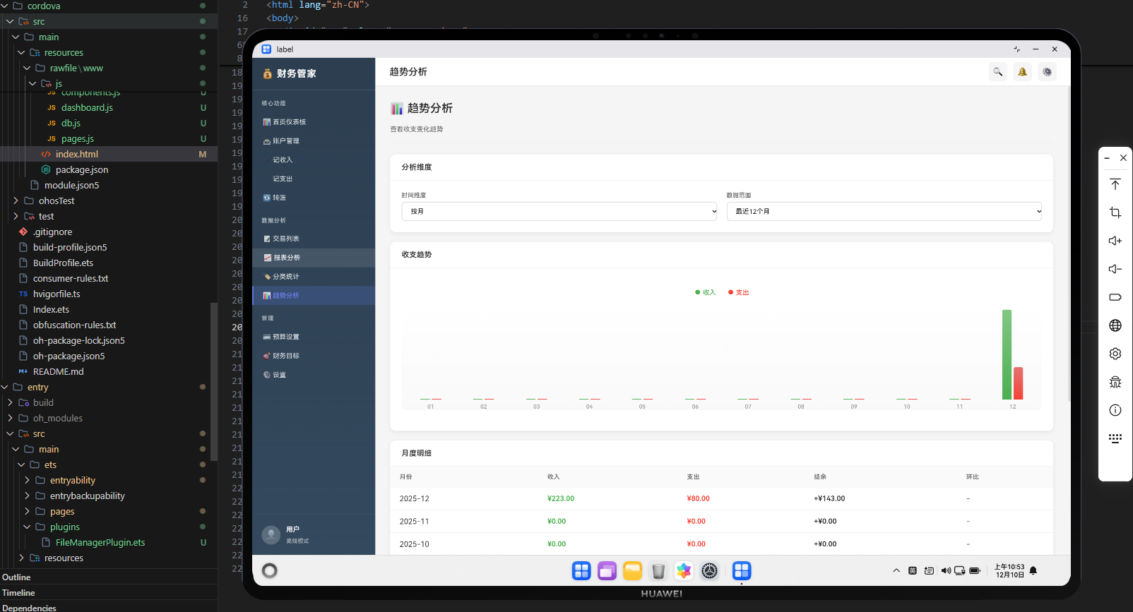
pages.js中“趋势分析”页面的 HTML 模板与 UI 结构,重点是时间序列图表(按日/周/月)、区间和粒度切换控件的布局设计;同时会给出一段鸿蒙 ArkTS 代码,说明 ArkTS 如何承载该页面并配合整体数据导出。
1. 模块定位:从“静态统计”到“看趋势变化”
报表和分类统计模块解决的是“这一段时间里整体情况怎样”,而趋势分析模块要解决的是:
在一段较长时间里,收入、支出和结余是如何变化的,是否存在周期性或趋势性的规律。
典型需求:
- 支持按日、按周、按月查看收支趋势;
- 支持选择时间范围(近 30 天、近半年、自定义);
- 同一张图上展示收入、支出和结余曲线;
- 可选:切换“仅支出趋势”、“仅结余趋势”等视图。
本模块只关注 UI 结构和操作控件的设计,具体的时间序列计算和趋势算法会在后续模块中展开。
2. 页面整体结构:过滤区 + 图表区 + 辅助说明
在 pages.js 中,“趋势分析”页面可以设计成:
// ==================== 趋势分析页面 ====================
'trend': () => `
  <div class="pc-page-container">
    <div class="pc-page-header">
      <h2>📉 趋势分析</h2>
      <p>按时间维度观察收入、支出与结余的变化趋势</p>
    </div>

    <!-- 过滤与粒度选择区域 -->
    <div class="pc-filter-bar">
      <div class="pc-filter-group">
        <label class="pc-label">开始日期</label>
        <input type="date" id="trend-start-date" class="pc-input">
      </div>
      <div class="pc-filter-group">
        <label class="pc-label">结束日期</label>
        <input type="date" id="trend-end-date" class="pc-input">
      </div>
      <div class="pc-filter-group">
        <label class="pc-label">粒度</label>
        <select id="trend-granularity" class="pc-input">
          <option value="day">按日</option>
          <option value="week">按周</option>
          <option value="month">按月</option>
        </select>
      </div>
      <div class="pc-filter-group">
        <label class="pc-label">预设</label>
        <select id="trend-preset" class="pc-input">
          <option value="last-30-days">近 30 天</option>
          <option value="last-90-days">近 90 天</option>
          <option value="this-year">今年以来</option>
          <option value="custom">自定义</option>
        </select>
      </div>
      <button id="trend-apply" class="pc-button pc-button-primary">生成趋势</button>
    </div>

    <!-- 趋势图区域 -->
    <div class="pc-card pc-trend-chart-card">
      <div class="pc-card-header">
        <h3>收支/结余趋势图</h3>
      </div>
      <div class="pc-card-body">
        <div id="trend-chart" class="pc-report-chart-placeholder">
          <!-- 后续可接入折线图,展示收入/支出/结余三条曲线 -->
        </div>
      </div>
    </div>

    <!-- 辅助说明和图例区域 -->
    <div class="pc-card pc-trend-legend-card">
      <div class="pc-card-header"><h3>图例与说明</h3></div>
      <div class="pc-card-body">
        <ul class="pc-trend-legend">
          <li><span class="legend-color legend-income"></span> 收入曲线</li>
          <li><span class="legend-color legend-expense"></span> 支出曲线</li>
          <li><span class="legend-color legend-balance"></span> 结余曲线</li>
        </ul>
        <p class="pc-text-muted">提示:你可以通过调整起止日期和粒度来观察不同时间尺度下的收支趋势。</p>
      </div>
    </div>
  </div>
`,
这里可以看到:
- 顶部
pc-filter-bar负责时间范围与粒度选择; - 中部大卡片
pc-trend-chart-card专门用于放趋势图; - 下方
pc-trend-legend-card为图例和说明预留空间,避免图表区域过于拥挤。
3. 时间与粒度选择 UI
3.1 起止日期
<div class="pc-filter-group">
  <label class="pc-label">开始日期</label>
  <input type="date" id="trend-start-date" class="pc-input">
</div>
<div class="pc-filter-group">
  <label class="pc-label">结束日期</label>
  <input type="date" id="trend-end-date" class="pc-input">
</div>
- 使用原生
input type="date"控件,与其他报表页面一致; - 将来在逻辑中可以根据预设自动填充这两个值(例如“近 30 天”)。
3.2 粒度选择
<div class="pc-filter-group">
  <label class="pc-label">粒度</label>
  <select id="trend-granularity" class="pc-input">
    <option value="day">按日</option>
    <option value="week">按周</option>
    <option value="month">按月</option>
  </select>
</div>
- 决定趋势图的时间分辨率:
- 按日:适合近 30 天左右的细节观察;
- 按周/按月:适合跨季度或跨年的宏观趋势;
- 在后续统计逻辑中,会根据该字段选择不同的聚合方式。
3.3 预设时间范围
<div class="pc-filter-group">
  <label class="pc-label">预设</label>
  <select id="trend-preset" class="pc-input">
    <option value="last-30-days">近 30 天</option>
    <option value="last-90-days">近 90 天</option>
    <option value="this-year">今年以来</option>
    <option value="custom">自定义</option>
  </select>
</div>
- 提供常用预设:近 30 天、近 90 天、今年以来;
- 选择
custom时允许用户完全自定义起止日期; - 在 JS 逻辑中可以监听
change事件,当选择非custom时自动填充起止日期。
3.4 生成趋势按钮
<button id="trend-apply" class="pc-button pc-button-primary">生成趋势</button>
- 与报表、分类统计模块相同的交互模式:配置好条件再一次性生成;
- 在
PageManager中可以为该按钮绑定点击事件,触发handleGenerateTrend()。
4. 趋势图区域与图例 UI
4.1 趋势图容器
<div class="pc-card pc-trend-chart-card">
  <div class="pc-card-header">
    <h3>收支/结余趋势图</h3>
  </div>
  <div class="pc-card-body">
    <div id="trend-chart" class="pc-report-chart-placeholder">
      <!-- 后续可接入折线图,展示收入/支出/结余三条曲线 -->
    </div>
  </div>
</div>
trend-chart是趋势图渲染的唯一 DOM 锚点;- 当前可以简单用文本或占位图展示,后续接入实际图表库;
- 使用单独的大卡片容器,让图表有足够的宽高空间,适合在 PC 端浏览。
4.2 图例与说明
<div class="pc-card pc-trend-legend-card">
  <div class="pc-card-header"><h3>图例与说明</h3></div>
  <div class="pc-card-body">
    <ul class="pc-trend-legend">
      <li><span class="legend-color legend-income"></span> 收入曲线</li>
      <li><span class="legend-color legend-expense"></span> 支出曲线</li>
      <li><span class="legend-color legend-balance"></span> 结余曲线</li>
    </ul>
    <p class="pc-text-muted">提示:你可以通过调整起止日期和粒度来观察不同时间尺度下的收支趋势。</p>
  </div>
</div>
legend-income/legend-expense/legend-balance可以在 CSS 中定义不同颜色,与实际图表线条颜色对应;- 文本说明给初次使用的用户一个简单引导,解释趋势图的用法和含义。
5. 与其他分析页面的 UI 一致性
趋势分析页面虽然增加了粒度选择等控件,但整体仍与报表、分类统计保持统一风格:
- 使用
pc-page-container+pc-page-header作为页面外壳; - 过滤区继续使用
pc-filter-bar、pc-filter-group和pc-input组件; - 图表卡片复用
pc-card结构,内部使用统一的pc-report-chart-placeholder作为图表占位; - 文本说明和图例使用统一的排版类(如
pc-text-muted、简单的ul/li结构)。
这种统一能显著降低用户的学习成本:
- 用户只需要学会“在过滤区设置条件 + 点击按钮生成”,就能使用多个分析模块;
- 图表和表格的布局习惯一致,便于快速理解不同模块展示的维度差异。
6. 鸿蒙 ArkTS 侧:趋势分析页面承载与数据导出
从 ArkTS 视角看,趋势分析页面和报表/分类统计类似,都是跑在统一的 Web 容器里,由 Index.ets 承载:
import {
  MainPage,
  PluginEntry,
} from '@magongshou/harmony-cordova/Index';
import { FileManagerPlugin } from '../plugins/FileManagerPlugin';

@Entry
@Component
struct Index {
  cordovaPlugs: Array<PluginEntry> = [
    { pluginName: 'FileManager', pluginObject: new FileManagerPlugin() }
  ];

  build() {
    // MainPage 内部加载 rawfile/www/index.html
    // 趋势分析页面是 pages.js 中的一个路由页面
    MainPage({
      cordovaPlugs: this.cordovaPlugs
    });
  }
}
趋势分析所依赖的数据主要是:
transactions表:用于按日/周/月聚合收入与支出;- 可选地,
accounts表:用于计算某些趋势中的结余或某账户的余额变化。
这些数据会在导出时通过 ArkTS FileManager 插件整体打包(代码风格与前面的模块相同):
import { CordovaPlugin, CallbackContext } from '@magongshou/harmony-cordova/Index';
import { PluginResult, MessageStatus } from '@magongshou/harmony-cordova/Index';
import { common } from '@kit.AbilityKit';
import { fileIo } from '@kit.CoreFileKit';

export class FileManagerPlugin extends CordovaPlugin {
  async exportData(callbackContext: CallbackContext, args: string[]): Promise<void> {
    try {
      const json = args[0]; // 包含趋势分析所需的 transactions 等表
      const context = getContext() as common.UIAbilityContext;
      const cacheDir: string = context.cacheDir;
      const filePath: string = `${cacheDir}/finance-backup.json`;

      const file = await fileIo.open(filePath, fileIo.OpenMode.WRITE_ONLY | fileIo.OpenMode.CREATE);
      await fileIo.write(file.fd, json);
      await fileIo.close(file.fd);

      const result = PluginResult.createByString(MessageStatus.OK, filePath);
      callbackContext.sendPluginResult(result);
    } catch (error) {
      const result = PluginResult.createByString(MessageStatus.ERROR, (error as Error).message);
      callbackContext.sendPluginResult(result);
    }
  }
}
从趋势分析模块的角度看:
- Web 层只要保证按选定区间和粒度正确聚合
transactions即可; - ArkTS 层负责将这些基础数据随整库一起导出/导入,保证在不同设备上可以重建同样的趋势视图。
7. 小结:趋势分析页面 UI 设计要点
-
过滤区支持时间+粒度双维度配置:
- 起止日期 + 粒度(按日/周/月)+ 预设组合,覆盖绝大多数趋势分析需求;
-
大尺寸趋势图搭配独立图例:
- 把图表和图例拆开,既保证图表展示空间,又给用户足够的文字说明;
-
与其他分析页面统一的 UI 体验:
- 过滤区、卡片结构、图表占位样式都与报表和分类统计模块保持一致;
-
为后续趋势算法预留挂载点:
- 使用语义化 ID(如
trend-chart、trend-start-date、trend-granularity),便于后续在 JS 中注入趋势计算逻辑;
- 使用语义化 ID(如
-
与鸿蒙 ArkTS 容器和 FileManager 插件解耦协作:
- ArkTS 负责承载 Web 页面和统一导出/导入数据;
- Web 层专注趋势 UI 与计算逻辑,两者边界清晰。
在下一模块中,我们会具体展开:如何在 JS 中按日/周/月聚合 transactions,生成收入/支出/结余三条时间序列,并将其渲染到趋势图上,让这个页面真正用“走势”讲述账本故事。

开源鸿蒙跨平台开发社区汇聚开发者与厂商,共建“一次开发,多端部署”的开源生态,致力于降低跨端开发门槛,推动万物智联创新。
更多推荐
 11
11 0
0- 0


 已为社区贡献20条内容

所有评论(0)