Flutter与OpenHarmony打卡成就徽章组件
本文介绍了在Flutter和OpenHarmony平台上实现打卡成就徽章组件的方法。通过定义徽章数据模型,根据稀有度设置不同视觉效果,采用金属质感和光泽设计增强吸引力。Flutter版本使用RadialGradient创建光泽效果,OpenHarmony版本利用Stack组件实现层叠布局。两种实现都区分已解锁和未解锁徽章的视觉状态,激发用户收集欲望。该组件可有效提升打卡类应用的用户粘性,通过成就系

前言
成就徽章系统是打卡工具类应用中增强用户粘性的重要功能。通过设置各种成就目标并颁发相应的徽章,可以有效激励用户持续打卡,增加应用的趣味性和成就感。本文将详细介绍如何在Flutter和OpenHarmony平台上实现美观且富有吸引力的打卡成就徽章组件。
成就徽章的设计需要考虑视觉吸引力、稀缺性表达和收集欲望的激发。不同等级的徽章应该有明显的视觉差异,已获得和未获得的徽章也需要清晰区分。我们将采用金属质感的设计风格,配合光泽效果和动画,让徽章看起来更加珍贵和值得收集。
Flutter成就徽章基础结构
首先定义成就徽章数据模型:
enum BadgeRarity { bronze, silver, gold, platinum }

class AchievementBadge {
  final String id;
  final String name;
  final String description;
  final IconData icon;
  final BadgeRarity rarity;
  final bool isUnlocked;
  final DateTime? unlockedAt;
  final int requiredDays;

  const AchievementBadge({
    required this.id,
    required this.name,
    required this.description,
    required this.icon,
    required this.rarity,
    this.isUnlocked = false,
    this.unlockedAt,
    required this.requiredDays,
  });
}
成就徽章模型包含了完整的徽章信息。BadgeRarity枚举定义了四个稀有度等级:青铜、白银、黄金和铂金,不同等级对应不同的视觉效果和获取难度。isUnlocked标识徽章是否已解锁,unlockedAt记录解锁时间,requiredDays表示获得该徽章需要的连续打卡天数。这种数据结构为成就系统的业务逻辑提供了完整支持。
创建徽章组件:
class BadgeWidget extends StatelessWidget {
  final AchievementBadge badge;
  final VoidCallback? onTap;

  const BadgeWidget({
    Key? key,
    required this.badge,
    this.onTap,
  }) : super(key: key);

  Color get _primaryColor {
    switch (badge.rarity) {
      case BadgeRarity.bronze: return const Color(0xFFCD7F32);
      case BadgeRarity.silver: return const Color(0xFFC0C0C0);
      case BadgeRarity.gold: return const Color(0xFFFFD700);
      case BadgeRarity.platinum: return const Color(0xFFE5E4E2);
    }
  }
}
BadgeWidget组件根据徽章的稀有度返回对应的主题色。青铜色、银色、金色和铂金色分别代表不同的成就等级,这种颜色选择符合用户对贵金属价值的认知。getter方法_primaryColor使用switch表达式,代码简洁且类型安全。
构建徽章视觉效果:
Widget build(BuildContext context) {
return GestureDetector(
onTap: onTap,
child: Container(
width: 80,
height: 80,
decoration: BoxDecoration(
shape: BoxShape.circle,
gradient: badge.isUnlocked
? RadialGradient(
colors: [_primaryColor.withOpacity(0.8), _primaryColor],
center: const Alignment(-0.3, -0.3),
)
: null,
color: badge.isUnlocked ? null : Colors.grey.shade300,
boxShadow: badge.isUnlocked
? [BoxShadow(color: _primaryColor.withOpacity(0.5), blurRadius: 12)]
: null,
),
child: _buildBadgeContent(),
),
);
}
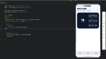
徽章使用圆形容器,已解锁的徽章使用RadialGradient创建金属光泽效果,渐变中心偏向左上方模拟光源照射。未解锁的徽章使用灰色表示,没有光泽和阴影,形成明显的视觉对比。这种设计让用户一眼就能区分已获得和未获得的徽章,同时激发收集欲望。
构建徽章内容:
Widget _buildBadgeContent() {
  return Stack(
    alignment: Alignment.center,
    children: [
      Icon(
        badge.icon,
        size: 32,
        color: badge.isUnlocked ? Colors.white : Colors.grey.shade500,
      ),
      if (!badge.isUnlocked)
        Positioned(
          bottom: 8,
          child: Icon(Icons.lock, size: 16, color: Colors.grey.shade600),
        ),
    ],
  );
}
徽章内容使用Stack实现层叠布局。中心是徽章图标,已解锁显示白色,未解锁显示灰色。未解锁的徽章底部还会显示一个小锁图标,进一步强调其锁定状态。这种视觉提示清晰明了,用户无需阅读文字就能理解徽章的状态。
OpenHarmony成就徽章实现
在鸿蒙系统中定义徽章数据结构:
type BadgeRarity = 'bronze' | 'silver' | 'gold' | 'platinum'

interface AchievementBadge {
  id: string
  name: string
  description: string
  icon: Resource
  rarity: BadgeRarity
  isUnlocked: boolean
  requiredDays: number
}

@Component
struct BadgeWidget {
  @Prop badge: AchievementBadge
  private onTap: () => void = () => {}
}
鸿蒙使用联合类型定义BadgeRarity,这与TypeScript的语法一致。interface定义徽章的数据结构,icon使用Resource类型引用应用内的图片资源。@Prop装饰器标识badge是从父组件传入的属性,当父组件更新这个属性时,BadgeWidget会自动重新渲染。
获取稀有度对应的颜色:
getPrimaryColor(): string {
  switch (this.badge.rarity) {
    case 'bronze': return '#CD7F32'
    case 'silver': return '#C0C0C0'
    case 'gold': return '#FFD700'
    case 'platinum': return '#E5E4E2'
    default: return '#CD7F32'
  }
}
getPrimaryColor方法根据徽章稀有度返回对应的颜色值。颜色值使用十六进制格式,与Flutter版本保持一致。switch语句处理所有可能的稀有度类型,default分支作为兜底处理,确保方法总是返回有效的颜色值。这种防御性编程可以避免运行时错误。
构建徽章UI:
build() {
  Column() {
    Stack() {
      Circle()
        .width(80)
        .height(80)
        .fill(this.badge.isUnlocked ? this.getPrimaryColor() : '#E0E0E0')
        .shadow({
          radius: this.badge.isUnlocked ? 12 : 0,
          color: this.badge.isUnlocked ? this.getPrimaryColor() + '80' : 'transparent'
        })

      Image(this.badge.icon)
        .width(32)
        .height(32)
        .fillColor(this.badge.isUnlocked ? Color.White : '#9E9E9E')

      if (!this.badge.isUnlocked) {
        Image($r('app.media.lock'))
          .width(16)
          .height(16)
          .fillColor('#757575')
          .position({ y: 56 })
      }
    }
    .width(80)
    .height(80)
  }
  .onClick(() => this.onTap())
}
鸿蒙使用Stack组件实现层叠布局,Circle作为徽章背景,Image显示徽章图标。已解锁的徽章使用主题色填充并添加发光阴影效果,未解锁的徽章使用灰色且没有阴影。条件渲染通过if语句实现,未解锁时显示锁图标。position属性精确控制锁图标的位置,使其显示在徽章底部。
创建徽章网格展示:
@Component
struct BadgeGrid {
  @Prop badges: AchievementBadge[] = []

  build() {
    Grid() {
      ForEach(this.badges, (badge: AchievementBadge) => {
        GridItem() {
          BadgeWidget({ badge: badge })
        }
      })
    }
    .columnsTemplate('1fr 1fr 1fr')
    .rowsGap(20)
    .columnsGap(20)
    .padding(16)
  }
}
BadgeGrid组件使用Grid布局展示徽章网格。columnsTemplate设置为三列等宽布局,适合在手机屏幕上展示徽章。rowsGap和columnsGap设置网格间距,让徽章之间保持适当的视觉间隔。ForEach遍历徽章数组,为每个徽章创建一个GridItem。这种网格布局是展示收集类内容的经典方式。
徽章解锁动画
Flutter中实现徽章解锁动画:
class UnlockAnimationWidget extends StatefulWidget {
final AchievementBadge badge;
final VoidCallback onComplete;
const UnlockAnimationWidget({
Key? key,
required this.badge,
required this.onComplete,
}) : super(key: key);
State<UnlockAnimationWidget> createState() => _UnlockAnimationWidgetState();
}
徽章解锁是一个重要的时刻,需要通过动画来强化用户的成就感。UnlockAnimationWidget组件专门用于播放解锁动画,接收要解锁的徽章和动画完成回调。这种将动画逻辑独立封装的做法,使得代码结构更加清晰,也便于在不同场景复用。
实现缩放和旋转动画:
class _UnlockAnimationWidgetState extends State<UnlockAnimationWidget>
with TickerProviderStateMixin {
late AnimationController _scaleController;
late AnimationController _rotateController;
late Animation<double> _scaleAnimation;
late Animation<double> _rotateAnimation;
void initState() {
super.initState();
_scaleController = AnimationController(
duration: const Duration(milliseconds: 800),
vsync: this,
);
_scaleAnimation = TweenSequence<double>([
TweenSequenceItem(tween: Tween(begin: 0.0, end: 1.2), weight: 60),
TweenSequenceItem(tween: Tween(begin: 1.2, end: 1.0), weight: 40),
]).animate(CurvedAnimation(parent: _scaleController, curve: Curves.easeOut));
_scaleController.forward().then((_) => widget.onComplete());
}
}
解锁动画使用TweenSequence实现弹性缩放效果:徽章先从0放大到1.2倍,然后回弹到正常大小。这种过冲效果(overshoot)能够增强动画的活力和趣味性。动画时长800毫秒,足够让用户注意到但不会感到拖沓。动画完成后调用onComplete回调,通知父组件进行后续处理。
徽章详情弹窗
展示徽章详细信息:
void _showBadgeDetail(BuildContext context, AchievementBadge badge) {
  showModalBottomSheet(
    context: context,
    backgroundColor: Colors.transparent,
    builder: (context) => Container(
      padding: const EdgeInsets.all(24),
      decoration: const BoxDecoration(
        color: Colors.white,
        borderRadius: BorderRadius.vertical(top: Radius.circular(20)),
      ),
      child: Column(
        mainAxisSize: MainAxisSize.min,
        children: [
          BadgeWidget(badge: badge),
          const SizedBox(height: 16),
          Text(badge.name, style: const TextStyle(fontSize: 20, fontWeight: FontWeight.bold)),
          const SizedBox(height: 8),
          Text(badge.description, textAlign: TextAlign.center),
        ],
      ),
    ),
  );
}
点击徽章时弹出底部详情面板,展示徽章的名称和描述。showModalBottomSheet是Flutter提供的底部弹窗组件,backgroundColor设为透明以便自定义圆角效果。弹窗内容包括徽章图标、名称和描述,让用户了解徽章的获取条件和意义。这种交互方式既不打断用户的浏览流程,又能提供详细信息。
总结
本文详细介绍了在Flutter和OpenHarmony平台上实现打卡成就徽章组件的完整方案。成就徽章通过视觉设计和动画效果,有效激励用户持续打卡。不同稀有度的徽章使用不同的颜色和光泽效果,已解锁和未解锁的徽章有明显的视觉区分。解锁动画和详情弹窗进一步增强了用户的成就感和参与度。两个平台的实现都注重视觉效果和用户体验,为打卡应用增添了游戏化元素。
欢迎加入开源鸿蒙跨平台社区:https://openharmonycrossplatform.csdn.net

开源鸿蒙跨平台开发社区汇聚开发者与厂商,共建“一次开发,多端部署”的开源生态,致力于降低跨端开发门槛,推动万物智联创新。
更多推荐
 23
23 0
0- 0


 已为社区贡献25条内容

所有评论(0)