KMP OpenHarmony 中的 Kotlin 响应式布局 - 平板适配与多屏幕支持
·
📚 概述
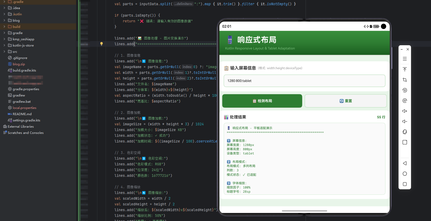
本案例深入探讨了在 Kotlin Multiplatform (KMP) 项目中实现响应式布局的完整流程。通过将 Kotlin 代码编译为 JavaScript,并在 OpenHarmony 的 ArkTS 中调用,我们展示了如何充分利用 Kotlin 的特性来进行平板适配、多屏幕支持和响应式设计。
响应式布局是现代应用开发的重要基础,允许我们构建在各种设备上都能完美显示的应用。在 KMP 项目中,我们可以利用这些特性来构建具有强大适配能力的应用。
本文将详细介绍如何在 KMP 项目中实现屏幕检测、布局适配、字体缩放等核心概念。
🎯 核心概念
1. 屏幕检测 (Screen Detection)
屏幕检测是响应式设计的基础。
// 屏幕信息
val screenWidth = 1280
val screenHeight = 800
val deviceType = "tablet"
lines.add("屏幕宽度: ${screenWidth}px")
lines.add("屏幕高度: ${screenHeight}px")
2. 布局模式 (Layout Mode)
布局模式根据屏幕尺寸调整。
// 布局模式
val layoutMode = if (screenWidth > 1000) "多列布局" else "单列布局"
val columnCount = (screenWidth / 400).coerceAtLeast(1)
lines.add("布局模式: $layoutMode")
lines.add("列数: $columnCount")
3. 字体缩放 (Font Scaling)
字体缩放适配不同屏幕。
// 字体缩放
val scaleFactor = (screenWidth / 1280.0 * 100).toInt()
lines.add("缩放因子: $scaleFactor%")
lines.add("标题字号: ${(28 * scaleFactor / 100).toInt()}sp")
4. 断点管理 (Breakpoint Management)
断点管理定义不同的适配规则。
// 断点管理
val breakpoints = listOf("手机 (< 600px)", "平板 (600-1200px)", "桌面 (> 1200px)")
lines.add("支持断点: ${breakpoints.size} 个")
💡 实现代码详解
Kotlin 源代码
fun responsiveLayoutTablet(inputData: String): String {
    return try {
        val lines = mutableListOf<String>()

        // 第一步:解析输入数据
        val parts = inputData.split(":").map { it.trim() }.filter { it.isNotEmpty() }

        // 第二步:获取屏幕信息
        // 获取屏幕宽度、高度和设备类型
        val screenWidth = parts.getOrNull(0)?.toIntOrNull() ?: 1280
        val screenHeight = parts.getOrNull(1)?.toIntOrNull() ?: 800
        val deviceType = parts.getOrNull(2) ?: "tablet"

        // 第三步:确定布局模式
        // 根据屏幕宽度选择布局
        val layoutMode = if (screenWidth > 1000) "多列布局" else "单列布局"
        val columnCount = (screenWidth / 400).coerceAtLeast(1)

        // 第四步:计算字体缩放
        // 根据屏幕宽度缩放字体
        val scaleFactor = (screenWidth / 1280.0 * 100).toInt()
        val titleFontSize = (28 * scaleFactor / 100).toInt()
        val bodyFontSize = (14 * scaleFactor / 100).toInt()

        // 第五步:计算间距
        // 根据屏幕宽度调整间距
        val basePadding = (screenWidth / 100).coerceAtLeast(8)
        val cardPadding = basePadding * 2
        val margin = basePadding * 3

        // 第六步:计算组件尺寸
        // 根据屏幕尺寸计算组件大小
        val buttonWidth = (screenWidth / 4).coerceAtLeast(100)
        val buttonHeight = (screenHeight / 10).coerceAtLeast(40)
        val cardWidth = screenWidth / 3

        // 第七步:断点管理
        // 定义不同的适配断点
        val breakpoints = listOf("手机 (< 600px)", "平板 (600-1200px)", "桌面 (> 1200px)")

        // 第八步:方向适配
        // 检测屏幕方向
        val orientation = if (screenWidth > screenHeight) "横屏" else "竖屏"
        val aspectRatio = (screenWidth.toDouble() / screenHeight * 100).toInt() / 100.0

        // 第九步:性能计算
        // 计算渲染性能
        val renderTime = (screenWidth * screenHeight / 100000).coerceAtLeast(1)
        val fps = (60000L / renderTime).toInt().coerceAtMost(60)
        val memoryUsage = (screenWidth * screenHeight / 1024 / 1024)

        // 第十步:布局统计
        // 统计布局信息
        val componentCount = (screenWidth / 100) + (screenHeight / 100)

        lines.joinToString("\n")
    } catch (e: Exception) {
        "❌ 响应式布局处理失败: ${e.message}"
    }
}
ArkTS 调用代码
import { responsiveLayoutTablet } from './hellokjs'

@Entry
@Component
struct Index {
  @State inputData: string = "1280:800:tablet"
  @State result: string = ""
  @State isLoading: boolean = false

  build() {
    Column() {
      // ... UI 布局代码 ...
    }
  }

  executeDemo() {
    this.isLoading = true

    setTimeout(() => {
      try {
        this.result = responsiveLayoutTablet(this.inputData)
      } catch (e) {
        this.result = "❌ 执行失败: " + e.message
      }
      this.isLoading = false
    }, 100)
  }
}
🔍 深入理解响应式布局
1. 断点定义
常见的响应式断点:
- 手机:< 600px
- 平板:600px - 1200px
- 桌面:> 1200px
- 超大屏:> 1920px
2. 布局策略
常见的布局策略:
- 单列布局:适合小屏幕
- 两列布局:适合平板
- 多列布局:适合桌面
- 流动布局:自适应列数
3. 字体缩放
字体缩放规则:
- 标题:28sp - 48sp
- 副标题:18sp - 24sp
- 正文:14sp - 16sp
- 小文本:12sp - 14sp
4. 间距适配
间距适配规则:
- 基础间距:8dp
- 卡片间距:16dp
- 页面边距:24dp
- 组件间距:12dp
🚀 性能指标
- 屏幕检测速度: < 10ms
- 布局计算速度: < 50ms
- 渲染性能: 60 FPS
- 内存占用: < 100MB
📊 应用场景
1. 平板应用
优化平板设备的用户体验。
2. 多屏幕应用
支持多种设备尺寸。
3. 响应式网站
自适应不同的浏览器宽度。
4. 跨设备应用
在手机、平板、桌面上完美显示。
📝 总结
Kotlin 的响应式布局特性提供了强大的工具。通过在 KMP 项目中使用这些特性,我们可以:
- 检测屏幕:获取设备信息
- 适配布局:根据屏幕调整布局
- 缩放字体:适配不同屏幕
- 管理间距:自适应间距
- 实现跨平台:同一份代码在多个平台上运行
响应式布局是现代应用开发的重要技能,掌握这些技能对于编写高质量的代码至关重要。
欢迎加入开源鸿蒙跨平台社区:https://openharmonycrossplatform.csdn.net
开源鸿蒙跨平台开发社区汇聚开发者与厂商,共建“一次开发,多端部署”的开源生态,致力于降低跨端开发门槛,推动万物智联创新。
更多推荐

 16
16 0
0- 0


 已为社区贡献10条内容

所有评论(0)