Flutter for OpenHarmony音乐播放器App实战14:专辑详情实现
可以在歌曲列表前添加专辑简介。'专辑简介',),'这是一张非常棒的专辑,收录了歌手的多首经典作品。'专辑风格多样,既有抒情慢歌,也有动感快歌,值得细细品味。',),'展开',),),],),),简介默认显示3行,点击"展开"可以查看完整内容。专辑详情页的实现使用了CustomScrollView和多个Sliver组件的组合:SliverAppBar实现可折叠的头部,SliverToBoxAdapt
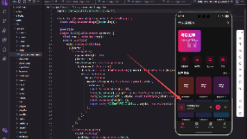
专辑详情页是展示专辑完整信息的页面,用户可以查看专辑封面、歌手信息、发行时间以及专辑内的所有歌曲。本篇文章将详细介绍如何使用CustomScrollView和Sliver组件实现一个美观实用的专辑详情页面。
页面基础结构
专辑详情页使用StatelessWidget,因为页面状态相对简单。
import 'package:flutter/material.dart';
import 'package:get/get.dart';

class AlbumDetailPage extends StatelessWidget {
  final int id;
  const AlbumDetailPage({super.key, required this.id});
页面通过构造函数接收专辑ID,用于加载对应的专辑数据。如果需要管理收藏状态等,可以改为StatefulWidget。
CustomScrollView结构
使用CustomScrollView组合多个Sliver组件。
Widget build(BuildContext context) {
return Scaffold(
body: CustomScrollView(
slivers: [
_buildSliverAppBar(),
_buildActionBar(),
_buildSongList(),
],
),
);
}
CustomScrollView允许将多个Sliver组件组合在一起滚动。页面包含三个部分:可折叠的头部、操作按钮栏和歌曲列表。
SliverAppBar头部设计
SliverAppBar实现可折叠的专辑信息头部。
  Widget _buildSliverAppBar() {
    return SliverAppBar(
      expandedHeight: 300,
      pinned: true,
      flexibleSpace: FlexibleSpaceBar(
        background: Container(
          decoration: BoxDecoration(
            gradient: LinearGradient(
              begin: Alignment.topCenter,
              end: Alignment.bottomCenter,
              colors: [
                Colors.primaries[id % Colors.primaries.length],
                Colors.black,
              ],
            ),
          ),
expandedHeight设置展开高度为300,pinned为true让AppBar收起后固定在顶部。背景使用渐变色,从专辑主题色过渡到黑色。
专辑封面与信息
头部展示专辑封面和基本信息。
          child: SafeArea(
            child: Padding(
              padding: const EdgeInsets.all(20),
              child: Row(
                crossAxisAlignment: CrossAxisAlignment.end,
                children: [
                  Container(
                    width: 150,
                    height: 150,
                    decoration: BoxDecoration(
                      borderRadius: BorderRadius.circular(12),
                      color: Colors.white24,
                      boxShadow: [
                        BoxShadow(
                          color: Colors.black.withOpacity(0.3),
                          blurRadius: 20,
                          offset: const Offset(0, 10),
                        ),
                      ],
                    ),
                    child: const Icon(Icons.album, size: 70, color: Colors.white70),
                  ),
封面使用圆角矩形,添加阴影增加立体感。实际项目中会使用网络图片替换Icon。
专辑文字信息
封面右侧显示专辑名称、歌手和发行时间。
                  const SizedBox(width: 16),
                  Expanded(
                    child: Column(
                      mainAxisAlignment: MainAxisAlignment.end,
                      crossAxisAlignment: CrossAxisAlignment.start,
                      children: [
                        Text(
                          '专辑 ${id + 1}',
                          style: const TextStyle(
                            color: Colors.white,
                            fontSize: 22,
                            fontWeight: FontWeight.bold,
                          ),
                        ),
                        const SizedBox(height: 8),
                        GestureDetector(
                          onTap: () => Get.toNamed('/artist/$id'),
                          child: const Text(
                            '歌手名称',
                            style: TextStyle(color: Colors.white70),
                          ),
                        ),
                        const SizedBox(height: 4),
                        Text(
                          '发行时间: ${2020 + id % 5}年',
                          style: const TextStyle(color: Colors.white54, fontSize: 12),
                        ),
                      ],
                    ),
                  ),
                ],
              ),
            ),
          ),
        ),
      ),
    );
  }
歌手名称可点击跳转到歌手详情页。使用不同透明度的白色区分信息层级。
操作按钮栏
操作栏包含播放全部、收藏和分享按钮。
  Widget _buildActionBar() {
    return SliverToBoxAdapter(
      child: Padding(
        padding: const EdgeInsets.all(16),
        child: Row(
          children: [
            Expanded(
              child: ElevatedButton.icon(
                onPressed: () => _playAll(),
                icon: const Icon(Icons.play_arrow),
                label: const Text('播放全部'),
                style: ElevatedButton.styleFrom(
                  backgroundColor: const Color(0xFFE91E63),
                  foregroundColor: Colors.white,
                  padding: const EdgeInsets.symmetric(vertical: 12),
                  shape: RoundedRectangleBorder(
                    borderRadius: BorderRadius.circular(25),
                  ),
                ),
              ),
            ),
            const SizedBox(width: 12),
            IconButton(
              icon: const Icon(Icons.favorite_border),
              onPressed: () => _toggleFavorite(),
            ),
            IconButton(
              icon: const Icon(Icons.share),
              onPressed: () => _shareAlbum(),
            ),
          ],
        ),
      ),
    );
  }
播放全部按钮使用主题色,占据大部分宽度。收藏和分享使用图标按钮,节省空间。
歌曲列表
使用SliverList构建歌曲列表。
  Widget _buildSongList() {
    return SliverList(
      delegate: SliverChildBuilderDelegate(
        (context, index) => _buildSongItem(index),
        childCount: 10,
      ),
    );
  }
SliverChildBuilderDelegate实现懒加载,只构建可见的列表项。childCount设置歌曲总数。
歌曲列表项
每首歌曲显示序号、名称、歌手和时长。
  Widget _buildSongItem(int index) {
    return ListTile(
      leading: Container(
        width: 32,
        alignment: Alignment.center,
        child: Text(
          '${index + 1}',
          style: TextStyle(
            color: index < 3 ? const Color(0xFFE91E63) : Colors.grey,
            fontWeight: index < 3 ? FontWeight.bold : FontWeight.normal,
          ),
        ),
      ),
      title: Text(
        '歌曲 ${index + 1}',
        maxLines: 1,
        overflow: TextOverflow.ellipsis,
      ),
      subtitle: const Text(
        '歌手名称',
        style: TextStyle(color: Colors.grey, fontSize: 12),
      ),
      trailing: Row(
        mainAxisSize: MainAxisSize.min,
        children: [
          const Text(
            '04:32',
            style: TextStyle(color: Colors.grey, fontSize: 12),
          ),
          IconButton(
            icon: const Icon(Icons.more_vert, color: Colors.grey),
            onPressed: () => _showSongOptions(index),
          ),
        ],
      ),
      onTap: () => _playSong(index),
    );
  }
前三首歌曲的序号使用主题色突出显示。trailing包含时长和更多操作按钮。
歌曲操作菜单
点击更多按钮显示操作菜单。
  void _showSongOptions(int index) {
    Get.bottomSheet(
      Container(
        decoration: const BoxDecoration(
          color: Color(0xFF1E1E1E),
          borderRadius: BorderRadius.vertical(top: Radius.circular(16)),
        ),
        child: Column(
          mainAxisSize: MainAxisSize.min,
          children: [
            ListTile(
              leading: Container(
                width: 50,
                height: 50,
                decoration: BoxDecoration(
                  borderRadius: BorderRadius.circular(8),
                  color: Colors.grey.withOpacity(0.3),
                ),
                child: const Icon(Icons.music_note, color: Colors.white70),
              ),
              title: Text('歌曲 ${index + 1}'),
              subtitle: const Text('歌手名称', style: TextStyle(color: Colors.grey)),
            ),
            const Divider(),
            ListTile(
              leading: const Icon(Icons.play_circle_outline),
              title: const Text('下一首播放'),
              onTap: () => Get.back(),
            ),
            ListTile(
              leading: const Icon(Icons.playlist_add),
              title: const Text('添加到歌单'),
              onTap: () => Get.back(),
            ),
            ListTile(
              leading: const Icon(Icons.download_outlined),
              title: const Text('下载'),
              onTap: () => Get.back(),
            ),
            ListTile(
              leading: const Icon(Icons.share_outlined),
              title: const Text('分享'),
              onTap: () => Get.back(),
            ),
            const SizedBox(height: 16),
          ],
        ),
      ),
    );
  }
菜单顶部显示歌曲信息,下方是各种操作选项。这种设计让用户在操作前可以确认选中的歌曲。
播放全部方法
点击播放全部按钮后播放专辑内所有歌曲。
  void _playAll() {
    Get.toNamed('/player', arguments: {
      'albumId': id,
      'startIndex': 0,
    });
    Get.snackbar(
      '播放',
      '开始播放专辑',
      snackPosition: SnackPosition.BOTTOM,
    );
  }
跳转到播放器页面,传递专辑ID和起始索引。
播放单曲方法
点击单曲后从该歌曲开始播放。
  void _playSong(int index) {
    Get.toNamed('/player', arguments: {
      'albumId': id,
      'startIndex': index,
    });
  }
传递起始索引,播放器会从该歌曲开始播放专辑。
收藏专辑方法
收藏按钮的点击处理。
  void _toggleFavorite() {
    // 实际项目中需要调用API并更新状态
    Get.snackbar(
      '收藏',
      '已添加到收藏',
      snackPosition: SnackPosition.BOTTOM,
    );
  }
实际项目中需要调用API更新收藏状态,并使用状态管理更新UI。
分享专辑方法
分享按钮的点击处理。
  void _shareAlbum() {
    Get.bottomSheet(
      Container(
        decoration: const BoxDecoration(
          color: Color(0xFF1E1E1E),
          borderRadius: BorderRadius.vertical(top: Radius.circular(16)),
        ),
        child: Column(
          mainAxisSize: MainAxisSize.min,
          children: [
            const Padding(
              padding: EdgeInsets.all(16),
              child: Text('分享到', style: TextStyle(fontSize: 18, fontWeight: FontWeight.bold)),
            ),
            Row(
              mainAxisAlignment: MainAxisAlignment.spaceEvenly,
              children: [
                _buildShareItem(Icons.chat, '微信'),
                _buildShareItem(Icons.people, '朋友圈'),
                _buildShareItem(Icons.message, '微博'),
                _buildShareItem(Icons.link, '复制链接'),
              ],
            ),
            const SizedBox(height: 24),
          ],
        ),
      ),
    );
  }

  Widget _buildShareItem(IconData icon, String label) {
    return GestureDetector(
      onTap: () {
        Get.back();
        Get.snackbar('分享', '分享到$label');
      },
      child: Column(
        children: [
          Container(
            width: 50,
            height: 50,
            decoration: BoxDecoration(
              color: Colors.grey.withOpacity(0.3),
              shape: BoxShape.circle,
            ),
            child: Icon(icon, color: Colors.white70),
          ),
          const SizedBox(height: 8),
          Text(label, style: const TextStyle(fontSize: 12)),
        ],
      ),
    );
  }
分享菜单显示常用的分享渠道,点击后执行对应的分享操作。
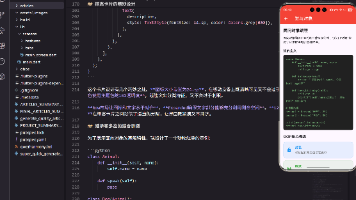
专辑简介区域
可以在歌曲列表前添加专辑简介。
  Widget _buildAlbumDescription() {
    return SliverToBoxAdapter(
      child: Padding(
        padding: const EdgeInsets.all(16),
        child: Column(
          crossAxisAlignment: CrossAxisAlignment.start,
          children: [
            const Text(
              '专辑简介',
              style: TextStyle(fontSize: 16, fontWeight: FontWeight.bold),
            ),
            const SizedBox(height: 8),
            const Text(
              '这是一张非常棒的专辑,收录了歌手的多首经典作品。'
              '专辑风格多样,既有抒情慢歌,也有动感快歌,值得细细品味。',
              style: TextStyle(color: Colors.grey, height: 1.6),
              maxLines: 3,
              overflow: TextOverflow.ellipsis,
            ),
            GestureDetector(
              onTap: () => _showFullDescription(),
              child: const Text(
                '展开',
                style: TextStyle(color: Color(0xFFE91E63)),
              ),
            ),
          ],
        ),
      ),
    );
  }
简介默认显示3行,点击"展开"可以查看完整内容。
歌曲列表头部
在歌曲列表前添加头部信息。
  Widget _buildSongListHeader() {
    return SliverToBoxAdapter(
      child: Padding(
        padding: const EdgeInsets.symmetric(horizontal: 16, vertical: 8),
        child: Row(
          children: [
            const Text(
              '歌曲列表',
              style: TextStyle(fontSize: 16, fontWeight: FontWeight.bold),
            ),
            const SizedBox(width: 8),
            Text(
              '共10首',
              style: TextStyle(color: Colors.grey.withOpacity(0.8), fontSize: 14),
            ),
          ],
        ),
      ),
    );
  }
显示"歌曲列表"标题和歌曲总数,让用户了解专辑包含多少首歌。
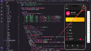
评论入口
可以添加评论入口让用户查看和发表评论。
  Widget _buildCommentEntry() {
    return SliverToBoxAdapter(
      child: ListTile(
        leading: const Icon(Icons.comment_outlined, color: Colors.grey),
        title: const Text('评论'),
        subtitle: const Text('1234条评论', style: TextStyle(color: Colors.grey, fontSize: 12)),
        trailing: const Icon(Icons.chevron_right, color: Colors.grey),
        onTap: () => Get.toNamed('/comment', arguments: {'albumId': id}),
      ),
    );
  }
显示评论数量,点击跳转到评论页面。
总结
专辑详情页的实现使用了CustomScrollView和多个Sliver组件的组合:SliverAppBar实现可折叠的头部,SliverToBoxAdapter包装普通Widget,SliverList构建歌曲列表。通过合理的布局和交互设计,为用户提供了清晰的专辑信息展示和便捷的操作入口。在实际项目中,还需要对接后端接口获取真实的专辑数据。
欢迎加入开源鸿蒙跨平台社区:https://openharmonycrossplatform.csdn.net

开源鸿蒙跨平台开发社区汇聚开发者与厂商,共建“一次开发,多端部署”的开源生态,致力于降低跨端开发门槛,推动万物智联创新。
更多推荐
 1
1 0
0- 0


 已为社区贡献54条内容

所有评论(0)