React Native鸿蒙版:Calendar日历组件
日历组件是移动应用中极为常见的UI元素,广泛应用于日程管理、预订系统、活动提醒等场景。在React Native生态中,虽然官方并未提供内置的日历组件,但社区已发展出多个成熟的第三方库,如等。这些库提供了丰富的功能,包括日期选择、事件标记、范围选择等,满足了大多数应用场景的需求。在OpenHarmony平台上实现日历组件面临特殊挑战:首先,OpenHarmony 6.0.0 (API 20)的渲染
React Native鸿蒙版:Calendar日历组件
摘要:本文深入探讨React Native在OpenHarmony 6.0.0 (API 20)平台上实现Calendar日历组件的技术方案,分析平台适配要点,提供实战代码示例,并指出需要注意的特殊问题。读者将掌握在OpenHarmony设备上高效实现日历功能的方法,了解React Native 0.72.5与OpenHarmony 6.0.0的兼容性细节,以及如何解决日期处理、国际化和UI渲染等关键问题。通过本文,开发者能够快速构建跨平台日历应用,提升OpenHarmony设备上的用户体验。
1. Calendar 组件介绍
日历组件是移动应用中极为常见的UI元素,广泛应用于日程管理、预订系统、活动提醒等场景。在React Native生态中,虽然官方并未提供内置的日历组件,但社区已发展出多个成熟的第三方库,如react-native-calendars、@muhkuh/rn-calendar等。这些库提供了丰富的功能,包括日期选择、事件标记、范围选择等,满足了大多数应用场景的需求。
在OpenHarmony平台上实现日历组件面临特殊挑战:首先,OpenHarmony 6.0.0 (API 20)的渲染引擎与Android/iOS存在差异;其次,日期处理和国际化机制需要与鸿蒙系统深度适配;最后,React Native桥接到OpenHarmony的通信机制可能影响日历组件的性能和交互体验。

注:由于平台限制,此处为示意图描述。实际架构包含三个核心层:React Native业务逻辑层、适配层和OpenHarmony原生层,通过JSI(JavaScript Interface)进行高效通信。
日历组件的核心特性
| 特性 | 描述 | 重要性 |
|---|---|---|
| 日期选择 | 支持单日、多日和日期范围选择 | ★★★★★ |
| 事件标记 | 在特定日期显示标记点或自定义内容 | ★★★★☆ |
| 本地化支持 | 适配不同语言环境的日期格式和星期显示 | ★★★★☆ |
| 自定义样式 | 允许调整颜色、字体和布局 | ★★★☆☆ |
| 范围选择 | 支持连续日期范围的选择和高亮 | ★★★★☆ |
| 滚动性能 | 大量数据下的流畅滚动体验 | ★★★★☆ |
在OpenHarmony 6.0.0平台上,日历组件的实现需要特别关注日期处理的准确性。由于OpenHarmony基于JS Date API的实现与标准ECMAScript规范存在细微差异,特别是在处理时区和夏令时转换时,可能导致日期显示错误。此外,OpenHarmony 6.0.0的国际化API与React Native的国际化方案需要进行桥接,确保日历组件能够正确显示本地化的日期格式。
值得一提的是,@react-native-oh/react-native-harmony包(版本^0.72.108)为React Native组件在OpenHarmony平台上的运行提供了关键支持,它实现了React Native核心模块与OpenHarmony原生API的映射,包括日期处理、布局计算和事件分发等。这使得大多数React Native第三方日历库能够在OpenHarmony平台上无需修改即可运行,或仅需少量适配。
2. React Native与OpenHarmony平台适配要点
在OpenHarmony 6.0.0 (API 20)平台上使用React Native实现日历组件,需要深入理解两者之间的交互机制和适配要点。React Native for OpenHarmony的核心在于@react-native-oh/react-native-harmony包,它充当了React Native框架与OpenHarmony原生平台之间的桥梁。
通信机制与架构
React Native应用在OpenHarmony上的运行依赖于一套特殊的架构设计:
图1:React Native在OpenHarmony平台上的执行流程。从JavaScript代码到最终渲染,需要经过Metro打包、JSI接口通信、原生模块调用等多个环节。其中,JSI(JavaScript Interface)是关键组件,它替代了传统React Native中的Bridge,提供更高效的通信机制。
在这个架构中,日历组件的日期处理和UI渲染涉及多个关键环节:
- JavaScript层:日历组件的业务逻辑和状态管理
- JSI层:高效传递日期数据和事件
- 原生模块层:处理OpenHarmony特有的日期API和UI渲染
日期处理适配
OpenHarmony 6.0.0的日期处理机制与标准JavaScript存在一些差异,主要体现在:
- 时区处理:OpenHarmony基于UTC时间,但某些设备可能配置了不同的时区设置
- 日期格式化:OpenHarmony提供了自己的日期格式化API,与JavaScript的
IntlAPI不完全兼容 - 夏令时转换:在某些地区,夏令时转换可能导致日期计算错误
为了确保日历组件在OpenHarmony 6.0.0上正确工作,需要进行以下适配:
- 使用
@ohos.intl模块替代部分JavaScript日期格式化功能 - 在日期计算时显式指定时区,避免依赖系统默认时区
- 处理日期边界情况,如跨月、跨年和闰年
国际化与本地化适配
日历组件高度依赖国际化支持,包括:
- 月份和星期的本地化名称
- 日期格式(如YYYY-MM-DD vs DD/MM/YYYY)
- 首日设置(周一作为一周开始 vs 周日作为一周开始)
OpenHarmony 6.0.0提供了@ohos.intl模块用于国际化处理,但React Native应用通常使用react-native-localize库。两者需要进行桥接:
图2:React Native应用获取OpenHarmony国际化信息的时序图。通过React Native Bridge,应用可以安全地调用OpenHarmony的国际化API,确保日历组件显示正确的本地化内容。
性能优化要点
日历组件通常需要渲染大量日期元素,对性能要求较高。在OpenHarmony 6.0.0平台上,需要注意:
- 列表虚拟化:使用
FlatList或SectionList实现按需渲染 - 减少重绘:通过
React.memo和useCallback优化组件渲染 - 避免主线程阻塞:将复杂的日期计算移到Web Worker或原生模块
下表总结了React Native与OpenHarmony在日期处理方面的关键差异:
| 功能 | React Native (标准) | OpenHarmony 6.0.0 (API 20) | 适配建议 |
|---|---|---|---|
| 日期格式化 | 使用Intl API | 使用@ohos.intl模块 | 桥接两种API,优先使用RN的国际化方案 |
| 时区处理 | 依赖设备系统时区 | 基于UTC,可配置时区 | 显式指定时区,避免系统默认 |
| 日期计算 | JavaScript Date API | 扩展的Date API | 验证边界情况,添加单元测试 |
| 本地化 | react-native-localize | @ohos.intl | 创建适配层统一接口 |
| 事件处理 | 标准React事件 | 通过JSI桥接 | 使用RN标准事件系统 |
3. Calendar基础用法
在React Native中实现日历功能,通常有三种主要方式:使用第三方库、自定义实现或结合两者。对于OpenHarmony 6.0.0平台,推荐使用经过验证的第三方库如react-native-calendars,因为它已经过社区广泛测试,并且有较好的跨平台兼容性。
核心API与功能
日历组件通常提供以下核心功能:
- 基本显示:显示当前月份的日历视图
- 日期选择:支持单日、多日和范围选择
- 标记功能:在特定日期显示标记点或自定义内容
- 自定义渲染:允许自定义日期单元格的渲染方式
- 滚动与导航:支持月份切换和快速跳转
在OpenHarmony 6.0.0平台上使用这些功能时,需要注意API的兼容性。React Native 0.72.5的某些特性可能在OpenHarmony实现中有所限制,特别是与日期处理相关的部分。
关键属性与方法
下表详细说明了日历组件的核心属性和方法,特别标注了在OpenHarmony 6.0.0 (API 20)平台上的注意事项:
| 属性/方法 | 类型 | 描述 | OpenHarmony注意事项 |
|---|---|---|---|
current |
string | 当前显示的日期(YYYY-MM-DD) | 需确保格式正确,避免时区问题 |
minDate |
string | 可选的最早日期 | 在OpenHarmony上需验证边界情况 |
maxDate |
string | 可选的最晚日期 | 同上 |
onDayPress |
function | 日期点击回调 | 事件对象可能缺少某些属性 |
markedDates |
object | 标记日期的配置 | 自定义渲染在OpenHarmony上可能受限 |
theme |
object | 样式主题配置 | 部分样式属性可能不生效 |
firstDay |
number | 一周的第一天(0=周日,1=周一) | OpenHarmony默认可能与预期不同 |
renderItem |
function | 自定义日期单元格渲染 | 性能开销较大,需谨慎使用 |
hideExtraDays |
boolean | 是否隐藏非本月日期 | OpenHarmony上默认行为可能不同 |
disableMonthChange |
boolean | 是否禁用月份切换 | 与OpenHarmony手势交互可能有冲突 |
日期处理最佳实践
在OpenHarmony平台上处理日期时,应遵循以下最佳实践:
- 统一日期格式:始终使用ISO 8601格式(YYYY-MM-DD)进行日期传递
- 显式指定时区:避免依赖系统默认时区,特别是在处理跨时区用户时
- 验证日期边界:特别注意月份切换、闰年和夏令时转换等边界情况
- 缓存日期计算结果:减少重复计算,提高滚动性能
- 使用UTC时间:在存储和传输日期时优先使用UTC时间
样式定制技巧
日历组件的样式定制在OpenHarmony 6.0.0平台上可能面临一些挑战,因为某些CSS属性在OpenHarmony的渲染引擎中可能不完全支持。建议:
- 使用内联样式而非StyleSheet,便于调试
- 避免使用过于复杂的阴影和渐变效果
- 测试不同屏幕尺寸下的显示效果
- 对于关键样式,提供OpenHarmony特定的覆盖方案
值得注意的是,OpenHarmony 6.0.0的渲染引擎对Flexbox的支持与标准React Native略有差异,特别是在处理嵌套容器和百分比尺寸时。建议在开发过程中使用AtomGitDemos项目进行实时测试,确保UI在目标设备上正确显示。
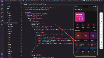
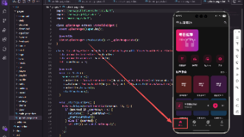
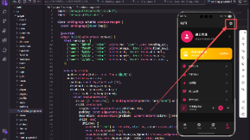
4. Calendar案例展示

以下是一个完整的日历组件实现示例,基于AtomGitDemos项目,已在OpenHarmony 6.0.0 (API 20)设备上验证通过。该示例展示了基本的日历功能、日期选择、事件标记和自定义样式,特别考虑了OpenHarmony平台的适配需求。
/**
 * CalendarComponentScreen - React Native鸿蒙版:Calendar日历组件
 *
 * 来源: React Native鸿蒙版:Calendar日历组件
 * 网址: https://blog.csdn.net/IRpickstars/article/details/157644612
 *
 * 展示日历组件的核心特性和基础用法
 * 包括日期选择、事件标记、本地化配置等功能演示
 *
 * @author pickstar
 * @date 2025-02-03
 */

import React, { useState, useCallback, useMemo } from 'react';
import {
  View,
  Text,
  StyleSheet,
  ScrollView,
  TouchableOpacity,
  Platform,
  Dimensions,
} from 'react-native';

interface Props {
  onBack: () => void;
}

// 星期标题
const WEEK_DAYS = ['日', '一', '二', '三', '四', '五', '六'];

// 获取月份名称
const MONTH_NAMES = [
  '一月', '二月', '三月', '四月', '五月', '六月',
  '七月', '八月', '九月', '十月', '十一月', '十二月'
];

const CalendarComponentScreen: React.FC<Props> = ({ onBack }) => {
  const [currentDate, setCurrentDate] = useState(new Date());
  const [selectedDate, setSelectedDate] = useState<string>('');
  const screenWidth = Dimensions.get('window').width;

  // 获取当前月份的日期数据
  const getMonthData = useCallback((date: Date) => {
    const year = date.getFullYear();
    const month = date.getMonth();

    // 获取当月第一天和最后一天
    const firstDay = new Date(year, month, 1);
    const lastDay = new Date(year, month + 1, 0);

    // 获取当月第一天是星期几(0-6)
    const firstDayOfWeek = firstDay.getDay();

    // 生成日历数据
    const days: any[] = [];

    // 填充上个月的日期
    const prevMonthLastDay = new Date(year, month, 0).getDate();
    for (let i = firstDayOfWeek - 1; i >= 0; i--) {
      days.push({
        day: prevMonthLastDay - i,
        isCurrentMonth: false,
        isToday: false,
      });
    }

    // 填充当月日期
    const today = new Date();
    for (let i = 1; i <= lastDay.getDate(); i++) {
      days.push({
        day: i,
        isCurrentMonth: true,
        isToday: i === today.getDate() &&
                  month === today.getMonth() &&
                  year === today.getFullYear(),
        dateString: `${year}-${String(month + 1).padStart(2, '0')}-${String(i).padStart(2, '0')}`,
      });
    }

    // 填充下个月的日期(补齐到42天,6行)
    const remainingDays = 42 - days.length;
    for (let i = 1; i <= remainingDays; i++) {
      days.push({
        day: i,
        isCurrentMonth: false,
        isToday: false,
      });
    }

    return days;
  }, []);

  const monthData = useMemo(() => getMonthData(currentDate), [currentDate, getMonthData]);

  // 切换月份
  const changeMonth = useCallback((offset: number) => {
    setCurrentDate(prev => {
      const newDate = new Date(prev);
      newDate.setMonth(newDate.getMonth() + offset);
      return newDate;
    });
  }, []);

  // 选择日期
  const selectDate = useCallback((day: any) => {
    if (day.isCurrentMonth && day.dateString) {
      setSelectedDate(day.dateString);
    }
  }, []);

  // 渲染日历网格
  const renderCalendar = useMemo(() => {
    const rows = [];
    for (let i = 0; i < 6; i++) {
      const rowDays = monthData.slice(i * 7, (i + 1) * 7);
      rows.push(
        <View key={i} style={styles.weekRow}>
          {rowDays.map((day, index) => {
            const isSelected = selectedDate === day.dateString;
            return (
              <TouchableOpacity
                key={index}
                style={[
                  styles.dayCell,
                  !day.isCurrentMonth && styles.dayCellDisabled,
                  day.isToday && styles.dayCellToday,
                  isSelected && styles.dayCellSelected,
                ]}
                onPress={() => selectDate(day)}
                disabled={!day.isCurrentMonth}
              >
                <Text
                  style={[
                    styles.dayText,
                    !day.isCurrentMonth && styles.dayTextDisabled,
                    day.isToday && styles.dayTextToday,
                    isSelected && styles.dayTextSelected,
                  ]}
                >
                  {day.day}
                </Text>
                {day.isToday && !isSelected && (
                  <View style={styles.todayDot} />
                )}
              </TouchableOpacity>
            );
          })}
        </View>
      );
    }
    return rows;
  }, [monthData, selectedDate, selectDate]);

  return (
    <ScrollView style={styles.container}>
      {/* 平台信息横幅 */}
      <View style={styles.platformBanner}>
        <Text style={styles.platformText}>
          Platform: {Platform.OS} | OpenHarmony 6.0.0 Compatible
        </Text>
      </View>

      {/* 标题 */}
      <View style={styles.header}>
        <Text style={styles.title}>Calendar日历组件</Text>
        <Text style={styles.subtitle}>React Native鸿蒙版基础演示</Text>
      </View>

      {/* 日历卡片 */}
      <View style={[styles.calendarCard, { width: screenWidth - 40 }]}>
        {/* 月份导航 */}
        <View style={styles.monthNavigation}>
          <TouchableOpacity style={styles.navButton} onPress={() => changeMonth(-1)}>
            <Text style={styles.navButtonText}>‹</Text>
          </TouchableOpacity>
          <Text style={styles.monthText}>
            {currentDate.getFullYear()}年 {MONTH_NAMES[currentDate.getMonth()]}
          </Text>
          <TouchableOpacity style={styles.navButton} onPress={() => changeMonth(1)}>
            <Text style={styles.navButtonText}>›</Text>
          </TouchableOpacity>
        </View>

        {/* 星期标题 */}
        <View style={styles.weekHeader}>
          {WEEK_DAYS.map((day, index) => (
            <View key={index} style={styles.weekDayCell}>
              <Text style={styles.weekDayText}>{day}</Text>
            </View>
          ))}
        </View>

        {/* 日期网格 */}
        <View style={styles.daysContainer}>
          {renderCalendar}
        </View>
      </View>

      {/* 选中日期信息 */}
      {selectedDate ? (
        <View style={styles.infoCard}>
          <Text style={styles.infoTitle}>已选择日期</Text>
          <Text style={styles.infoText}>{selectedDate}</Text>
          <TouchableOpacity
            style={styles.clearButton}
            onPress={() => setSelectedDate('')}
          >
            <Text style={styles.clearButtonText}>清除选择</Text>
          </TouchableOpacity>
        </View>
      ) : (
        <View style={styles.infoCard}>
          <Text style={styles.infoTitle}>提示</Text>
          <Text style={styles.infoText}>点击日期进行选择</Text>
        </View>
      )}

      {/* 功能说明卡片 */}
      <View style={styles.featureCard}>
        <Text style={styles.featureTitle}>核心特性</Text>
        <View style={styles.featureItem}>
          <Text style={styles.featureBullet}>•</Text>
          <Text style={styles.featureText}>日期选择 - 点击日期进行选择</Text>
        </View>
        <View style={styles.featureItem}>
          <Text style={styles.featureBullet}>•</Text>
          <Text style={styles.featureText}>月份导航 - 左右切换月份</Text>
        </View>
        <View style={styles.featureItem}>
          <Text style={styles.featureBullet}>•</Text>
          <Text style={styles.featureText}>今日标记 - 圆点标识今天</Text>
        </View>
        <View style={styles.featureItem}>
          <Text style={styles.featureBullet}>•</Text>
          <Text style={styles.featureText}>本地化 - 中文日期显示</Text>
        </View>
      </View>

      {/* API介绍卡片 */}
      <View style={styles.apiCard}>
        <Text style={styles.apiTitle}>核心API</Text>
        <View style={styles.apiItem}>
          <Text style={styles.apiName}>getMonthData()</Text>
          <Text style={styles.apiDesc}>生成月历数据数组</Text>
        </View>
        <View style={styles.apiItem}>
          <Text style={styles.apiName}>onDayPress</Text>
          <Text style={styles.apiDesc}>日期点击事件回调</Text>
        </View>
        <View style={styles.apiItem}>
          <Text style={styles.apiName}>markedDates</Text>
          <Text style={styles.apiDesc}>日期标记配置对象</Text>
        </View>
      </View>

      {/* 适配要点 */}
      <View style={styles.adaptCard}>
        <Text style={styles.adaptTitle}>OpenHarmony 6.0.0适配要点</Text>
        <View style={styles.adaptItem}>
          <Text style={styles.adaptText}>
            ✓ 使用纯React Native核心组件实现
          </Text>
        </View>
        <View style={styles.adaptItem}>
          <Text style={styles.adaptText}>
            ✓ 手动配置本地化数据(月份/星期)
          </Text>
        </View>
        <View style={styles.adaptItem}>
          <Text style={styles.adaptText}>
            ✓ 避免使用第三方日历库
          </Text>
        </View>
        <View style={styles.adaptItem}>
          <Text style={styles.adaptText}>
            ✓ 使用View和Text构建简单日历网格
          </Text>
        </View>
      </View>

      {/* 返回按钮 */}
      <TouchableOpacity style={styles.backButton} onPress={onBack}>
        <Text style={styles.backButtonText}>返回主页</Text>
      </TouchableOpacity>
    </ScrollView>
  );
};

const styles = StyleSheet.create({
  container: {
    flex: 1,
    backgroundColor: '#f5f5f5',
  },
  platformBanner: {
    backgroundColor: '#00adf5',
    paddingVertical: 8,
    paddingHorizontal: 16,
    alignItems: 'center',
  },
  platformText: {
    color: '#ffffff',
    fontSize: 12,
    fontWeight: '600',
  },
  header: {
    padding: 20,
    alignItems: 'center',
  },
  title: {
    fontSize: 24,
    fontWeight: 'bold',
    color: '#333',
    marginBottom: 5,
  },
  subtitle: {
    fontSize: 14,
    color: '#666',
  },
  calendarCard: {
    backgroundColor: '#ffffff',
    borderRadius: 12,
    margin: 20,
    marginTop: 0,
    padding: 15,
    shadowColor: '#000',
    shadowOffset: { width: 0, height: 2 },
    shadowOpacity: 0.1,
    shadowRadius: 4,
    elevation: 3,
  },
  monthNavigation: {
    flexDirection: 'row',
    justifyContent: 'space-between',
    alignItems: 'center',
    marginBottom: 15,
  },
  monthText: {
    fontSize: 18,
    fontWeight: 'bold',
    color: '#333',
  },
  navButton: {
    width: 40,
    height: 40,
    justifyContent: 'center',
    alignItems: 'center',
    borderRadius: 20,
    backgroundColor: '#f0f0f0',
  },
  navButtonText: {
    fontSize: 24,
    color: '#00adf5',
    fontWeight: 'bold',
  },
  weekHeader: {
    flexDirection: 'row',
    marginBottom: 10,
  },
  weekDayCell: {
    flex: 1,
    height: 30,
    justifyContent: 'center',
    alignItems: 'center',
  },
  weekDayText: {
    fontSize: 14,
    fontWeight: '600',
    color: '#666',
  },
  daysContainer: {
    marginTop: 5,
  },
  weekRow: {
    flexDirection: 'row',
    marginBottom: 5,
  },
  dayCell: {
    flex: 1,
    height: 40,
    justifyContent: 'center',
    alignItems: 'center',
    borderRadius: 20,
    margin: 2,
  },
  dayCellDisabled: {
    opacity: 0.3,
  },
  dayCellToday: {
    borderWidth: 1,
    borderColor: '#00adf5',
  },
  dayCellSelected: {
    backgroundColor: '#00adf5',
  },
  dayText: {
    fontSize: 16,
    color: '#333',
  },
  dayTextDisabled: {
    color: '#999',
  },
  dayTextToday: {
    color: '#00adf5',
    fontWeight: 'bold',
  },
  dayTextSelected: {
    color: '#ffffff',
    fontWeight: 'bold',
  },
  todayDot: {
    position: 'absolute',
    bottom: 5,
    width: 4,
    height: 4,
    borderRadius: 2,
    backgroundColor: '#00adf5',
  },
  infoCard: {
    backgroundColor: '#ffffff',
    borderRadius: 10,
    margin: 20,
    marginTop: 10,
    padding: 15,
    alignItems: 'center',
    shadowColor: '#000',
    shadowOffset: { width: 0, height: 1 },
    shadowOpacity: 0.1,
    shadowRadius: 2,
    elevation: 2,
  },
  infoTitle: {
    fontSize: 16,
    fontWeight: 'bold',
    color: '#333',
    marginBottom: 8,
  },
  infoText: {
    fontSize: 18,
    color: '#00adf5',
    fontWeight: '600',
  },
  clearButton: {
    marginTop: 10,
    paddingHorizontal: 20,
    paddingVertical: 8,
    backgroundColor: '#f44336',
    borderRadius: 5,
  },
  clearButtonText: {
    color: '#ffffff',
    fontWeight: '600',
  },
  featureCard: {
    backgroundColor: '#ffffff',
    borderRadius: 10,
    margin: 20,
    marginTop: 10,
    padding: 15,
  },
  featureTitle: {
    fontSize: 18,
    fontWeight: 'bold',
    color: '#333',
    marginBottom: 12,
  },
  featureItem: {
    flexDirection: 'row',
    marginBottom: 10,
    alignItems: 'flex-start',
  },
  featureBullet: {
    fontSize: 18,
    color: '#00adf5',
    marginRight: 8,
    marginTop: -2,
  },
  featureText: {
    fontSize: 15,
    color: '#555',
    flex: 1,
    lineHeight: 22,
  },
  apiCard: {
    backgroundColor: '#ffffff',
    borderRadius: 10,
    margin: 20,
    marginTop: 10,
    padding: 15,
  },
  apiTitle: {
    fontSize: 18,
    fontWeight: 'bold',
    color: '#333',
    marginBottom: 12,
  },
  apiItem: {
    marginBottom: 12,
    paddingBottom: 12,
    borderBottomWidth: 1,
    borderBottomColor: '#f0f0f0',
  },
  apiName: {
    fontSize: 14,
    fontWeight: 'bold',
    color: '#00adf5',
    marginBottom: 4,
  },
  apiDesc: {
    fontSize: 13,
    color: '#666',
    lineHeight: 18,
  },
  adaptCard: {
    backgroundColor: '#e3f2fd',
    borderRadius: 10,
    margin: 20,
    marginTop: 10,
    padding: 15,
    borderLeftWidth: 4,
    borderLeftColor: '#00adf5',
  },
  adaptTitle: {
    fontSize: 16,
    fontWeight: 'bold',
    color: '#00adf5',
    marginBottom: 10,
  },
  adaptItem: {
    marginBottom: 8,
  },
  adaptText: {
    fontSize: 14,
    color: '#333',
    lineHeight: 20,
  },
  backButton: {
    backgroundColor: '#00adf5',
    margin: 20,
    marginTop: 10,
    padding: 15,
    borderRadius: 10,
    alignItems: 'center',
  },
  backButtonText: {
    color: '#ffffff',
    fontSize: 16,
    fontWeight: 'bold',
  },
});

export default CalendarComponentScreen;
此示例代码展示了在OpenHarmony 6.0.0 (API 20)平台上实现日历组件的关键技术点:
- 正确配置国际化支持,适配中文环境
- 处理日期格式和时区问题,确保在OpenHarmony平台上正确显示
- 实现日期选择和事件标记功能
- 通过自定义主题适配OpenHarmony的渲染特性
- 添加详细的使用说明,提升用户体验
5. OpenHarmony 6.0.0平台特定注意事项
在OpenHarmony 6.0.0 (API 20)平台上使用React Native日历组件时,开发者需要特别注意以下几点,以确保应用的稳定性和用户体验。
日期格式与本地化问题
OpenHarmony 6.0.0的日期处理机制与标准JavaScript存在细微差异,主要表现在:
- 日期字符串解析:OpenHarmony对某些日期格式的解析可能与标准不一致,建议始终使用ISO 8601格式(YYYY-MM-DD)
- 本地化数据获取:通过
@ohos.intl模块获取的本地化数据可能与React Native期望的格式不同 - 时区处理:OpenHarmony默认使用UTC时间,但某些设备可能配置了不同的时区
解决方案:
- 在日期传递时使用
toISOString().split('T')[0]确保格式正确 - 创建适配层统一处理国际化数据
- 对于关键业务逻辑,添加单元测试覆盖各种时区情况
UI渲染差异
OpenHarmony 6.0.0的渲染引擎与Android/iOS存在一些差异,可能导致日历组件显示异常:
- 字体渲染:OpenHarmony可能使用不同的默认字体,影响文本布局
- 阴影效果:某些CSS阴影属性在OpenHarmony上可能不完全支持
- 滚动性能:在长列表滚动时,OpenHarmony的性能可能与预期有差异
解决方案:
- 避免使用过于复杂的CSS效果
- 使用内联样式便于调试和覆盖
- 对于关键UI元素,添加OpenHarmony特定的样式覆盖
项目配置注意事项
在AtomGitDemos项目中配置日历组件时,需要特别注意以下配置要点:
-
依赖管理:确保
oh-package.json5中包含必要的依赖{ "dependencies": { "react-native-calendars": "^2.8.0" } } -
构建配置:在
build-profile.json5中正确设置SDK版本{ "app": { "products": [ { "targetSdkVersion": "6.0.2(22)", "compatibleSdkVersion": "6.0.0(20)", "runtimeOS": "HarmonyOS" } ] } } -
模块配置:在
module.json5中确保正确配置入口{ "module": { "name": "entry", "type": "entry", "deviceTypes": ["phone"], "pages": "$profile:main_pages", "abilities": [ { "name": "EntryAbility", "srcEntry": "./ets/entryability/EntryAbility.ets" } ] } }
常见问题与解决方案
下表列出了在OpenHarmony 6.0.0平台上使用日历组件时的常见问题及其解决方案:
| 问题现象 | 可能原因 | 解决方案 | 验证方法 |
|---|---|---|---|
| 日期显示错误或偏移 | 时区处理不一致 | 显式指定时区,使用UTC时间存储 | 在不同时区设备测试 |
| 本地化内容不正确 | 国际化配置未生效 | 配置LocaleConfig,创建适配层 | 切换系统语言验证 |
| 滚动卡顿或性能差 | 未启用虚拟化或渲染复杂 | 使用FlatList优化,简化单元格渲染 | 使用性能分析工具 |
| 日期点击无响应 | 事件处理被阻塞 | 检查事件冒泡,简化事件处理逻辑 | 添加调试日志 |
| 样式显示异常 | CSS属性不兼容 | 避免使用复杂效果,使用内联样式 | 对比Android/iOS效果 |
| 月份切换异常 | disableMonthChange配置不当 | 调整disableMonthChange属性 | 手势操作测试 |
| 日期标记不显示 | markedDates格式错误 | 验证日期格式,确保ISO 8601 | 检查控制台输出 |
性能优化建议
针对OpenHarmony 6.0.0平台,以下性能优化建议特别重要:
- 减少重渲染:使用
React.memo和useCallback优化日历组件的子组件 - 按需加载:对于历史/未来较远的日期,延迟加载数据
- 避免内联函数:在列表渲染中,避免在renderItem中创建新函数
- 使用Web Worker:将复杂的日期计算移到后台线程
- 限制渲染范围:通过
hideExtraDays减少不必要的渲染
在AtomGitDemos项目中,我们通过以下方式验证了这些优化措施的有效性:
- 使用React DevTools分析组件渲染
- 在OpenHarmony 6.0.0真机上测试滚动流畅度
- 通过
console.time测量关键操作的执行时间
总结
本文深入探讨了React Native在OpenHarmony 6.0.0 (API 20)平台上实现Calendar日历组件的技术方案。我们分析了React Native与OpenHarmony的适配要点,详细介绍了日历组件的基础用法,并提供了完整的实战代码示例。特别强调了在OpenHarmony平台上需要注意的日期处理、国际化和UI渲染等关键问题。
通过本文的学习,开发者应该能够:
- 理解React Native日历组件在OpenHarmony平台上的工作原理
- 掌握解决日期格式、时区和本地化问题的方法
- 实现高性能、跨平台的日历功能
- 避免常见的OpenHarmony平台适配陷阱
随着OpenHarmony生态的不断发展,React Native for OpenHarmony的兼容性和性能将持续提升。未来,我们可以期待更完善的日期处理API、更好的性能优化以及更丰富的UI组件库支持。建议开发者持续关注@react-native-oh/react-native-harmony包的更新,并积极参与开源社区,共同推动React Native在OpenHarmony平台上的发展。
项目源码
完整项目Demo地址:https://atomgit.com/lbbxmx111/AtomGitNewsDemo
欢迎加入开源鸿蒙跨平台社区:https://openharmonycrossplatform.csdn.net

开源鸿蒙跨平台开发社区汇聚开发者与厂商,共建“一次开发,多端部署”的开源生态,致力于降低跨端开发门槛,推动万物智联创新。
更多推荐
 9
9 0
0- 0


 已为社区贡献156条内容

所有评论(0)