Flutter for OpenHarmony衣橱管家App实战:预算管理实现
本文介绍了衣橱管家App中预算管理功能的实现方法。该功能通过四个主要模块帮助用户合理控制服装开支:1)预算概览模块使用圆环进度条直观展示预算使用情况;2)设置预算模块提供输入和预设金额选项;3)记录支出模块让用户随时添加消费记录;4)智能提示模块根据预算使用程度给出不同建议。文章详细讲解了Flutter实现过程中的页面布局、状态管理、数据计算和UI交互设计,重点展示了CircularPercent
买衣服是件开心的事,但如果不控制预算,月底看账单就不那么开心了。衣橱管家App里的预算管理功能,就是帮用户管好买衣服的钱袋子。
今天这篇文章,我来详细讲讲预算管理功能的实现。这个功能包括设置月预算、记录支出、查看预算使用情况等,涉及到数据展示、用户输入、状态管理等多个方面。
功能需求分析
预算管理功能需要实现以下几点:
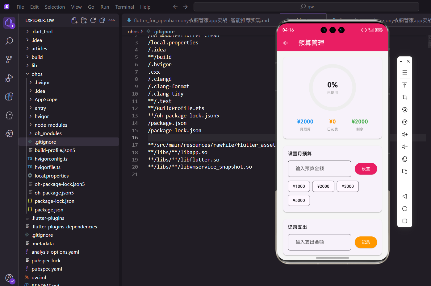
第一,展示预算概览,包括月预算、已花费、剩余金额、使用百分比。
第二,设置月预算,用户可以输入具体金额或选择预设金额。
第三,记录支出,每次买衣服后记录花了多少钱。
第四,智能提示,根据预算使用情况给出不同的建议。
页面基础结构
先看BudgetScreen的定义:
import 'package:flutter/material.dart';
import 'package:provider/provider.dart';
import 'package:flutter_screenutil/flutter_screenutil.dart';
import 'package:percent_indicator/circular_percent_indicator.dart';
import '../../providers/wardrobe_provider.dart';
class BudgetScreen extends StatefulWidget {
const BudgetScreen({super.key});
State<BudgetScreen> createState() => _BudgetScreenState();
}
class _BudgetScreenState extends State<BudgetScreen> {
final _budgetController = TextEditingController();
final _expenseController = TextEditingController();
void dispose() {
_budgetController.dispose();
_expenseController.dispose();
super.dispose();
}
}
用StatefulWidget是因为需要维护两个输入框的状态。
_budgetController控制预算输入框,_expenseController控制支出输入框。
dispose里释放Controller,避免内存泄漏。
percent_indicator包提供圆环进度条组件,用来可视化展示预算使用情况。
页面布局
build方法构建整个页面:
Widget build(BuildContext context) {
return Scaffold(
appBar: AppBar(title: const Text('预算管理')),
body: Consumer<WardrobeProvider>(
builder: (context, provider, child) {
final budget = provider.budget;
final monthly = budget['monthly'] ?? 2000;
final spent = budget['spent'] ?? 0;
final remaining = monthly - spent;
final percent = monthly > 0 ? (spent / monthly).clamp(0.0, 1.0) : 0.0;
return SingleChildScrollView(
padding: EdgeInsets.all(16.w),
child: Column(
children: [
_buildBudgetOverview(monthly, spent, remaining, percent),
SizedBox(height: 16.h),
_buildSetBudgetCard(provider, monthly),
SizedBox(height: 16.h),
_buildAddExpenseCard(provider),
SizedBox(height: 16.h),
_buildTipsCard(percent),
],
),
);
},
),
);
}
Consumer监听WardrobeProvider,预算数据变化时自动更新UI。
从provider.budget里取出月预算和已花费金额,计算剩余金额和使用百分比。
clamp(0.0, 1.0)确保百分比在0到1之间,避免进度条显示异常。
页面分四个部分:预算概览、设置预算、记录支出、智能提示。
预算概览区域
用圆环进度条展示预算使用情况:
Widget _buildBudgetOverview(int monthly, int spent, int remaining, double percent) {
  return Card(
    child: Padding(
      padding: EdgeInsets.all(24.w),
      child: Column(
        children: [
          CircularPercentIndicator(
            radius: 80.r,
            lineWidth: 12.w,
            percent: percent,
            center: Column(
              mainAxisAlignment: MainAxisAlignment.center,
              children: [
                Text('${(percent * 100).toInt()}%', style: TextStyle(fontSize: 24.sp, fontWeight: FontWeight.bold)),
                Text('已使用', style: TextStyle(fontSize: 12.sp, color: Colors.grey)),
              ],
            ),
            progressColor: percent > 0.8 ? Colors.red : (percent > 0.5 ? Colors.orange : const Color(0xFFE91E63)),
            backgroundColor: Colors.grey.shade200,
            circularStrokeCap: CircularStrokeCap.round,
          ),
          SizedBox(height: 24.h),
          Row(
            mainAxisAlignment: MainAxisAlignment.spaceAround,
            children: [
              _buildBudgetItem('月预算', '¥$monthly', Colors.blue),
              _buildBudgetItem('已花费', '¥$spent', Colors.orange),
              _buildBudgetItem('剩余', '¥$remaining', remaining >= 0 ? Colors.green : Colors.red),
            ],
          ),
        ],
      ),
    ),
  );
}
CircularPercentIndicator是圆环进度条,radius是半径,lineWidth是线宽。
center属性可以在圆环中间放置Widget,这里放百分比数字和"已使用"文字。
progressColor根据使用百分比变化:超过80%是红色警告,超过50%是橙色提醒,否则是主题色。
circularStrokeCap.round让进度条两端是圆角,看起来更柔和。
下方三个数据项横向排列,展示月预算、已花费、剩余金额。
预算数据项的构建方法:
Widget _buildBudgetItem(String label, String value, Color color) {
  return Column(
    children: [
      Text(value, style: TextStyle(fontSize: 18.sp, fontWeight: FontWeight.bold, color: color)),
      SizedBox(height: 4.h),
      Text(label, style: TextStyle(fontSize: 12.sp, color: Colors.grey)),
    ],
  );
}
数值在上,标签在下,数值用大字体粗体,标签用小字体灰色。
每个数据项有自己的颜色,月预算蓝色,已花费橙色,剩余绿色或红色。
剩余金额为负数时用红色,提醒用户已经超支了。
设置预算卡片
用户可以输入金额或选择预设金额:
Widget _buildSetBudgetCard(WardrobeProvider provider, int currentBudget) {
  return Card(
    child: Padding(
      padding: EdgeInsets.all(16.w),
      child: Column(
        crossAxisAlignment: CrossAxisAlignment.start,
        children: [
          Text('设置月预算', style: TextStyle(fontSize: 16.sp, fontWeight: FontWeight.bold)),
          SizedBox(height: 12.h),
          Row(
            children: [
              Expanded(
                child: TextField(
                  controller: _budgetController,
                  keyboardType: TextInputType.number,
                  decoration: InputDecoration(
                    hintText: '输入预算金额',
                    prefixText: '¥ ',
                    border: OutlineInputBorder(borderRadius: BorderRadius.circular(8.r)),
                  ),
                ),
              ),
              SizedBox(width: 12.w),
              ElevatedButton(
                onPressed: () {
                  final amount = int.tryParse(_budgetController.text);
                  if (amount != null && amount > 0) {
                    provider.updateBudget(amount);
                    _budgetController.clear();
                    ScaffoldMessenger.of(context).showSnackBar(const SnackBar(content: Text('预算已更新')));
                  }
                },
                style: ElevatedButton.styleFrom(backgroundColor: const Color(0xFFE91E63)),
                child: const Text('设置', style: TextStyle(color: Colors.white)),
              ),
            ],
          ),
          SizedBox(height: 8.h),
          Wrap(
            spacing: 8.w,
            children: [1000, 2000, 3000, 5000].map((amount) {
              return ActionChip(
                label: Text('¥$amount'),
                onPressed: () {
                  provider.updateBudget(amount);
                  ScaffoldMessenger.of(context).showSnackBar(SnackBar(content: Text('预算已设置为¥$amount')));
                },
              );
            }).toList(),
          ),
        ],
      ),
    ),
  );
}
输入框和设置按钮横向排列,用Row和Expanded实现。
keyboardType: TextInputType.number弹出数字键盘,方便输入金额。
prefixText: '¥ '在输入框前面显示人民币符号,用户知道输入的是金额。
int.tryParse安全地把字符串转成整数,转换失败返回null而不是抛异常。
下方的ActionChip是预设金额快捷按钮,点击直接设置对应金额,省去输入的麻烦。
记录支出卡片
每次买衣服后记录花费:
Widget _buildAddExpenseCard(WardrobeProvider provider) {
  return Card(
    child: Padding(
      padding: EdgeInsets.all(16.w),
      child: Column(
        crossAxisAlignment: CrossAxisAlignment.start,
        children: [
          Text('记录支出', style: TextStyle(fontSize: 16.sp, fontWeight: FontWeight.bold)),
          SizedBox(height: 12.h),
          Row(
            children: [
              Expanded(
                child: TextField(
                  controller: _expenseController,
                  keyboardType: TextInputType.number,
                  decoration: InputDecoration(
                    hintText: '输入支出金额',
                    prefixText: '¥ ',
                    border: OutlineInputBorder(borderRadius: BorderRadius.circular(8.r)),
                  ),
                ),
              ),
              SizedBox(width: 12.w),
              ElevatedButton(
                onPressed: () {
                  final amount = int.tryParse(_expenseController.text);
                  if (amount != null && amount > 0) {
                    provider.addExpense(amount);
                    _expenseController.clear();
                    ScaffoldMessenger.of(context).showSnackBar(const SnackBar(content: Text('支出已记录')));
                  }
                },
                style: ElevatedButton.styleFrom(backgroundColor: Colors.orange),
                child: const Text('记录', style: TextStyle(color: Colors.white)),
              ),
            ],
          ),
        ],
      ),
    ),
  );
}
结构和设置预算卡片类似,但按钮颜色用橙色,和设置按钮区分开。
记录支出后清空输入框,显示SnackBar提示。
provider.addExpense方法会把支出金额加到已花费里。
智能提示卡片
根据预算使用情况给出不同的建议:
Widget _buildTipsCard(double percent) {
  String tip;
  IconData icon;
  Color color;

  if (percent < 0.5) {
    tip = '预算使用良好,继续保持理性消费!';
    icon = Icons.thumb_up;
    color = Colors.green;
  } else if (percent < 0.8) {
    tip = '预算已过半,建议控制后续支出。';
    icon = Icons.info;
    color = Colors.orange;
  } else {
    tip = '预算即将用完,请谨慎消费!';
    icon = Icons.warning;
    color = Colors.red;
  }

  return Card(
    color: color.withOpacity(0.1),
    child: Padding(
      padding: EdgeInsets.all(16.w),
      child: Row(
        children: [
          Icon(icon, color: color, size: 32.sp),
          SizedBox(width: 12.w),
          Expanded(child: Text(tip, style: TextStyle(fontSize: 14.sp, color: color))),
        ],
      ),
    ),
  );
}
根据使用百分比分三档:50%以下是绿色鼓励,50%-80%是橙色提醒,80%以上是红色警告。
每档有对应的图标、颜色、提示文字,视觉上很直观。
卡片背景色是提示颜色的浅色版本,和文字颜色呼应。
Expanded包裹Text,防止文字太长时溢出。
Provider里的预算方法
WardrobeProvider里需要实现预算相关的方法:
// WardrobeProvider里的预算相关代码
Map<String, int> _budget = {'monthly': 2000, 'spent': 0};

Map<String, int> get budget => _budget;

void updateBudget(int amount) {
  _budget['monthly'] = amount;
  notifyListeners();
}

void addExpense(int amount) {
  _budget['spent'] = (_budget['spent'] ?? 0) + amount;
  notifyListeners();
}

void resetMonthlySpent() {
  _budget['spent'] = 0;
  notifyListeners();
}
_budget用Map存储,包含monthly(月预算)和spent(已花费)两个字段。
updateBudget更新月预算金额。
addExpense把新支出加到已花费里。
resetMonthlySpent重置已花费为0,可以在每月初调用。
每个方法最后都调用notifyListeners(),通知UI更新。
数据持久化
实际项目中,预算数据应该保存到本地存储:
// 使用shared_preferences保存预算数据
import 'package:shared_preferences/shared_preferences.dart';

Future<void> _saveBudget() async {
  final prefs = await SharedPreferences.getInstance();
  await prefs.setInt('budget_monthly', _budget['monthly'] ?? 2000);
  await prefs.setInt('budget_spent', _budget['spent'] ?? 0);
}

Future<void> _loadBudget() async {
  final prefs = await SharedPreferences.getInstance();
  _budget = {
    'monthly': prefs.getInt('budget_monthly') ?? 2000,
    'spent': prefs.getInt('budget_spent') ?? 0,
  };
  notifyListeners();
}
shared_preferences是Flutter常用的本地存储插件。
每次更新预算后调用_saveBudget保存到本地。
App启动时调用_loadBudget加载之前保存的数据。
默认月预算2000元,已花费0元。
输入验证
用户输入需要做验证:
final amount = int.tryParse(_budgetController.text);
if (amount != null && amount > 0) {
  provider.updateBudget(amount);
  _budgetController.clear();
  ScaffoldMessenger.of(context).showSnackBar(const SnackBar(content: Text('预算已更新')));
}
int.tryParse把字符串转成整数,如果输入的不是数字,返回null。
amount > 0确保金额是正数,不能设置0或负数的预算。
验证通过后才执行更新操作,否则什么都不做。
可以考虑加个else分支,提示用户输入无效。
更完善的验证:
void _setBudget(WardrobeProvider provider) {
  final text = _budgetController.text.trim();
  if (text.isEmpty) {
    ScaffoldMessenger.of(context).showSnackBar(
      const SnackBar(content: Text('请输入预算金额')),
    );
    return;
  }

  final amount = int.tryParse(text);
  if (amount == null) {
    ScaffoldMessenger.of(context).showSnackBar(
      const SnackBar(content: Text('请输入有效的数字')),
    );
    return;
  }

  if (amount <= 0) {
    ScaffoldMessenger.of(context).showSnackBar(
      const SnackBar(content: Text('预算金额必须大于0')),
    );
    return;
  }

  provider.updateBudget(amount);
  _budgetController.clear();
  ScaffoldMessenger.of(context).showSnackBar(
    const SnackBar(content: Text('预算已更新')),
  );
}
分步验证,每种错误情况给出不同的提示。
trim()去掉首尾空格,避免用户不小心输入空格。
这样用户知道为什么操作没有成功,体验更好。
进度条颜色的设计
进度条颜色根据使用百分比变化:
progressColor: percent > 0.8 ? Colors.red : (percent > 0.5 ? Colors.orange : const Color(0xFFE91E63))
80%以上用红色,表示预算快用完了,需要警惕。
50%-80%用橙色,表示预算已过半,需要注意。
50%以下用主题色,表示预算使用正常。
这种颜色变化让用户一眼就能看出预算使用情况。
总结
预算管理功能的实现涉及到数据展示、用户输入、状态管理、数据持久化等多个方面。关键点在于:
用圆环进度条直观展示预算使用情况。
提供输入框和快捷按钮两种设置方式,满足不同用户的习惯。
根据使用百分比给出智能提示,帮助用户控制消费。
在OpenHarmony平台上,这套实现方式完全适用。预算管理是一个很实用的功能,能帮助用户养成理性消费的习惯。
欢迎加入开源鸿蒙跨平台社区:https://openharmonycrossplatform.csdn.net

开源鸿蒙跨平台开发社区汇聚开发者与厂商,共建“一次开发,多端部署”的开源生态,致力于降低跨端开发门槛,推动万物智联创新。
更多推荐

 11
11 0
0- 0


 已为社区贡献27条内容

所有评论(0)