Flutter for OpenHarmony衣橱管家App实战:意见反馈功能实现
摘要:本文介绍了如何为衣橱管家App实现意见反馈功能,重点阐述了反馈系统的价值、页面状态管理以及UI设计要点。通过StatefulWidget管理反馈类型、内容和联系方式状态,采用表单式布局包含类型选择器(ChoiceChip)、多行输入框(maxLines:6)和联系方式输入。提交按钮使用醒目设计,提交逻辑包含内容验证和成功提示。该实现注重用户体验,通过清晰的视觉层次和交互反馈,建立高效的用户沟
用户反馈是产品迭代的重要依据。一个好的反馈系统不仅能收集用户的意见和建议,还能让用户感受到被重视。今天我们来实现衣橱管家App的意见反馈功能,打造一个简洁高效的反馈渠道。
反馈功能的价值
很多开发者不重视反馈功能,觉得用户不会用。但实际上,愿意给你反馈的用户都是真爱粉。他们花时间告诉你问题在哪,说明他们希望你的产品变得更好。
我之前做的一个App,就是通过用户反馈发现了一个隐藏很深的Bug。如果没有这个反馈渠道,可能要等到大量用户流失才能发现问题。
页面状态管理
反馈页面需要管理多个状态:反馈类型、反馈内容、联系方式。我们使用StatefulWidget来处理这些状态。
import 'package:flutter/material.dart';
import 'package:flutter_screenutil/flutter_screenutil.dart';
class FeedbackScreen extends StatefulWidget {
const FeedbackScreen({super.key});
State<FeedbackScreen> createState() => _FeedbackScreenState();
}
class _FeedbackScreenState extends State<FeedbackScreen> {
String _feedbackType = '功能建议';
final _contentController = TextEditingController();
final _contactController = TextEditingController();
final List<String> _types = ['功能建议', 'Bug反馈', '界面优化', '其他问题'];
void dispose() {
_contentController.dispose();
_contactController.dispose();
super.dispose();
}
}
定义了三个状态变量:_feedbackType存储当前选中的反馈类型,两个TextEditingController分别管理内容和联系方式输入框。
_types列表定义了四种反馈类型,覆盖了用户反馈的主要场景。dispose方法中释放控制器,这是使用TextEditingController的标准做法,避免内存泄漏。
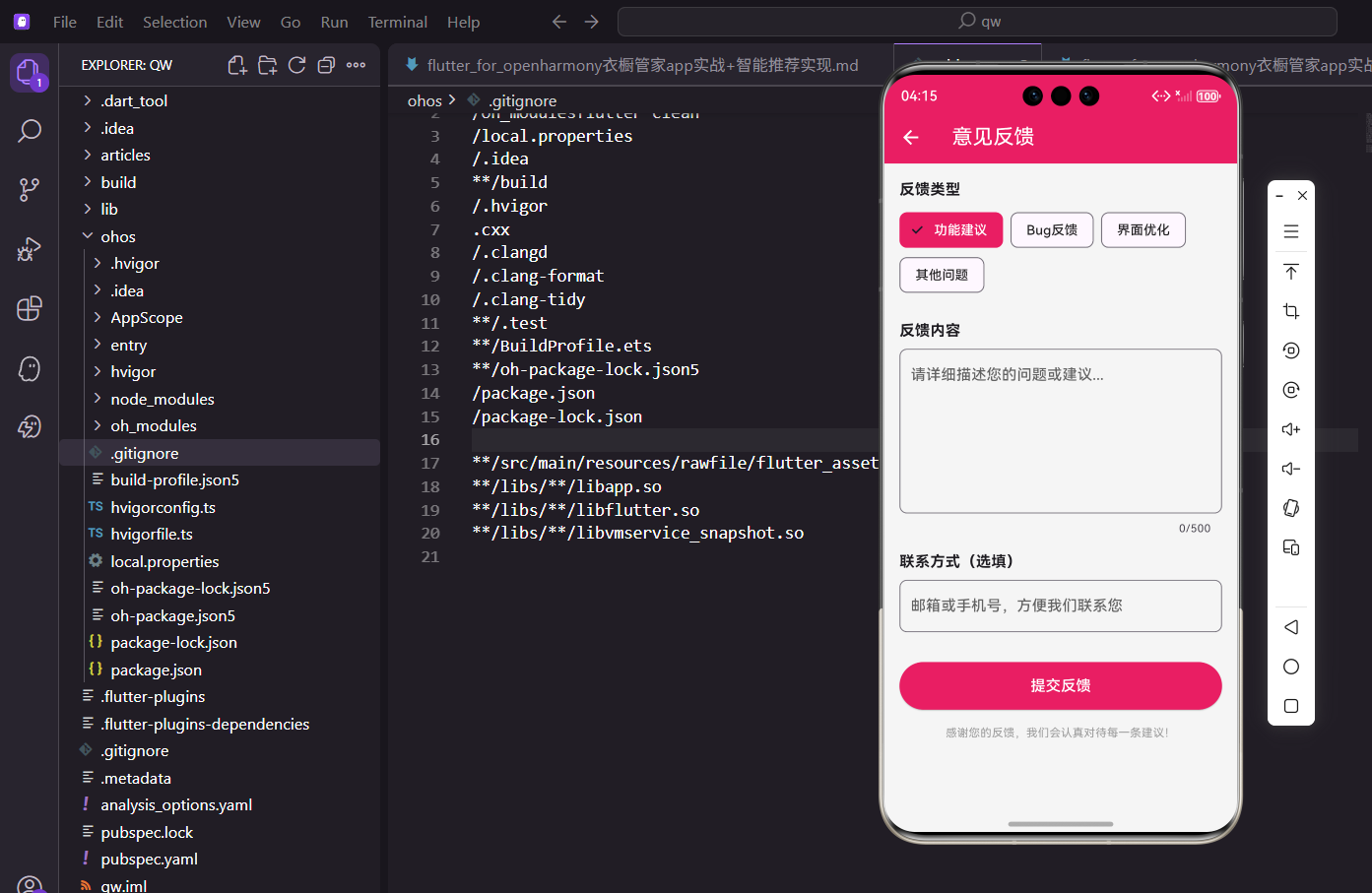
页面整体布局
反馈页面采用表单式布局,从上到下依次是反馈类型选择、内容输入、联系方式输入和提交按钮。
Widget build(BuildContext context) {
return Scaffold(
appBar: AppBar(title: const Text('意见反馈')),
body: SingleChildScrollView(
padding: EdgeInsets.all(16.w),
child: Column(
crossAxisAlignment: CrossAxisAlignment.start,
children: [
Text('反馈类型', style: TextStyle(fontSize: 16.sp, fontWeight: FontWeight.bold)),
SizedBox(height: 8.h),
Wrap(
  spacing: 8.w,
  children: _types.map((type) {
    return ChoiceChip(
      label: Text(type),
      selected: _feedbackType == type,
      selectedColor: const Color(0xFFE91E63),
      labelStyle: TextStyle(color: _feedbackType == type ? Colors.white : Colors.black87),
      onSelected: (s) => setState(() => _feedbackType = type),
    );
  }).toList(),
),
SizedBox(height: 24.h),
// 后续内容
],
),
),
);
}
Column的crossAxisAlignment设为start,让所有子元素左对齐。每个区块都有一个粗体标题,下面跟着对应的输入组件。
反馈类型使用Wrap包裹的ChoiceChip实现,Wrap组件会自动换行,适应不同屏幕宽度。选中状态使用品牌色,未选中使用默认样式,视觉区分明显。
反馈类型选择器
ChoiceChip是Material Design提供的选择芯片组件,非常适合做单选场景。我们用它来实现反馈类型的选择。
Wrap(
spacing: 8.w,
children: _types.map((type) {
return ChoiceChip(
label: Text(type),
selected: _feedbackType == type,
selectedColor: const Color(0xFFE91E63),
labelStyle: TextStyle(color: _feedbackType == type ? Colors.white : Colors.black87),
onSelected: (s) => setState(() => _feedbackType = type),
);
}).toList(),
),
spacing属性设置芯片之间的水平间距,8.w是一个比较舒适的值。map方法遍历类型列表,为每个类型生成一个ChoiceChip。
selected属性通过比较当前类型和选中类型来确定是否选中。onSelected回调中调用setState更新状态,触发界面重建。labelStyle根据选中状态动态设置文字颜色。
反馈内容输入框
反馈内容是整个表单的核心,我们使用多行TextField来接收用户输入,并设置字数限制。
Text('反馈内容', style: TextStyle(fontSize: 16.sp, fontWeight: FontWeight.bold)),
SizedBox(height: 8.h),
TextField(
  controller: _contentController,
  maxLines: 6,
  maxLength: 500,
  decoration: InputDecoration(
    hintText: '请详细描述您的问题或建议...',
    border: OutlineInputBorder(borderRadius: BorderRadius.circular(8.r)),
  ),
),
maxLines设为6,给用户足够的输入空间。maxLength设为500,既能让用户充分表达,又不会收到过长的无效反馈。
hintText使用引导性文案,告诉用户应该输入什么内容。OutlineInputBorder配合圆角,让输入框看起来更加柔和。Flutter会自动在右下角显示字数统计。
联系方式输入
联系方式是选填项,方便开发者在需要时联系用户了解更多细节。
SizedBox(height: 16.h),
Text('联系方式(选填)', style: TextStyle(fontSize: 16.sp, fontWeight: FontWeight.bold)),
SizedBox(height: 8.h),
TextField(
  controller: _contactController,
  decoration: InputDecoration(
    hintText: '邮箱或手机号,方便我们联系您',
    border: OutlineInputBorder(borderRadius: BorderRadius.circular(8.r)),
  ),
),
标题中明确标注"选填",降低用户的填写压力。hintText说明可以填邮箱或手机号,给用户选择的自由。
这个输入框不设置maxLines,默认为单行输入。也不设置maxLength,因为邮箱和手机号长度都不会太长。
提交按钮设计
提交按钮要醒目,让用户一眼就能找到。我们使用全宽的ElevatedButton,配合品牌色。
SizedBox(height: 32.h),
SizedBox(
  width: double.infinity,
  child: ElevatedButton(
    onPressed: _submitFeedback,
    style: ElevatedButton.styleFrom(
      backgroundColor: const Color(0xFFE91E63),
      padding: EdgeInsets.symmetric(vertical: 14.h),
    ),
    child: const Text('提交反馈', style: TextStyle(color: Colors.white, fontSize: 16)),
  ),
),
SizedBox的width设为double.infinity,让按钮占满整行。vertical padding设为14,让按钮有足够的点击区域。
按钮文字使用白色,与品牌色背景形成对比。fontSize设为16,比默认值稍大,更加醒目。onPressed指向_submitFeedback方法处理提交逻辑。
提交逻辑实现
提交前需要验证用户是否填写了反馈内容,提交成功后显示感谢弹窗并返回上一页。
void _submitFeedback() {
  if (_contentController.text.isEmpty) {
    ScaffoldMessenger.of(context).showSnackBar(const SnackBar(content: Text('请输入反馈内容')));
    return;
  }
  showDialog(
    context: context,
    builder: (context) => AlertDialog(
      title: const Text('提交成功'),
      content: const Text('感谢您的反馈!我们会尽快处理。'),
      actions: [
        TextButton(
          onPressed: () {
            Navigator.pop(context);
            Navigator.pop(context);
          },
          child: const Text('确定'),
        ),
      ],
    ),
  );
}
首先检查内容是否为空,为空则显示SnackBar提示并return。这里不检查联系方式,因为它是选填的。
提交成功后显示AlertDialog,点击确定按钮时连续pop两次,先关闭弹窗再返回上一页。实际项目中,这里应该先调用API提交数据,成功后再显示弹窗。
底部感谢文案
在提交按钮下方加一句感谢语,让用户感受到被重视。
SizedBox(height: 16.h),
Center(
  child: Text(
    '感谢您的反馈,我们会认真对待每一条建议!',
    style: TextStyle(fontSize: 12.sp, color: Colors.grey),
  ),
),
使用Center组件让文字居中显示,与上面左对齐的表单形成区分。灰色小字不抢眼,但能传达诚意。
文案强调"认真对待每一条建议",让用户知道他们的反馈不会石沉大海。这种小细节能提升用户的反馈意愿。
表单验证增强
除了检查内容是否为空,还可以添加更多验证逻辑,比如内容长度、联系方式格式等。
void _submitFeedback() {
  final content = _contentController.text.trim();
  final contact = _contactController.text.trim();

  if (content.isEmpty) {
    _showError('请输入反馈内容');
    return;
  }

  if (content.length < 10) {
    _showError('反馈内容至少10个字');
    return;
  }

  if (contact.isNotEmpty && !_isValidContact(contact)) {
    _showError('请输入正确的邮箱或手机号');
    return;
  }

  _doSubmit(content, contact);
}

void _showError(String message) {
  ScaffoldMessenger.of(context).showSnackBar(SnackBar(content: Text(message)));
}

bool _isValidContact(String contact) {
  final emailRegex = RegExp(r'^[\w-\.]+@([\w-]+\.)+[\w-]{2,4}$');
  final phoneRegex = RegExp(r'^1[3-9]\d{9}$');
  return emailRegex.hasMatch(contact) || phoneRegex.hasMatch(contact);
}
trim()方法去除首尾空格,避免用户只输入空格通过验证。内容长度检查确保用户提供有意义的反馈。
联系方式验证使用正则表达式,支持邮箱和国内手机号两种格式。只有在用户填写了联系方式时才验证,空值直接跳过。
网络请求封装
实际项目中需要将反馈数据提交到服务器,这里展示一个简单的封装。
Future<void> _doSubmit(String content, String contact) async {
  // 显示加载指示器
  showDialog(
    context: context,
    barrierDismissible: false,
    builder: (context) => const Center(child: CircularProgressIndicator()),
  );

  try {
    // 模拟网络请求
    await Future.delayed(const Duration(seconds: 1));

    // 构建反馈数据
    final feedbackData = {
      'type': _feedbackType,
      'content': content,
      'contact': contact,
      'timestamp': DateTime.now().toIso8601String(),
      'appVersion': '1.0.0',
      'platform': 'OpenHarmony',
    };

    // 这里调用实际的API
    // await api.submitFeedback(feedbackData);

    Navigator.pop(context); // 关闭加载指示器
    _showSuccessDialog();
  } catch (e) {
    Navigator.pop(context);
    _showError('提交失败,请稍后重试');
  }
}
提交前显示加载指示器,barrierDismissible设为false防止用户点击外部关闭。try-catch捕获可能的网络异常。
反馈数据包含类型、内容、联系方式、时间戳、App版本和平台信息,这些信息对于分析和处理反馈都很有用。
成功弹窗优化
成功弹窗可以做得更精致一些,加入图标和更友好的文案。
void _showSuccessDialog() {
  showDialog(
    context: context,
    builder: (context) => AlertDialog(
      content: Column(
        mainAxisSize: MainAxisSize.min,
        children: [
          Container(
            width: 60.w,
            height: 60.w,
            decoration: BoxDecoration(
              color: Colors.green.withOpacity(0.1),
              shape: BoxShape.circle,
            ),
            child: Icon(Icons.check, color: Colors.green, size: 32.sp),
          ),
          SizedBox(height: 16.h),
          Text('提交成功', style: TextStyle(fontSize: 18.sp, fontWeight: FontWeight.bold)),
          SizedBox(height: 8.h),
          Text('感谢您的反馈!', style: TextStyle(fontSize: 14.sp, color: Colors.grey)),
          Text('我们会尽快处理', style: TextStyle(fontSize: 14.sp, color: Colors.grey)),
        ],
      ),
      actions: [
        SizedBox(
          width: double.infinity,
          child: TextButton(
            onPressed: () {
              Navigator.pop(context);
              Navigator.pop(context);
            },
            child: const Text('好的'),
          ),
        ),
      ],
    ),
  );
}
弹窗内容使用Column布局,顶部是绿色对勾图标,下面是标题和说明文字。mainAxisSize设为min让Column只占用必要的高度。
按钮使用全宽设计,与表单页面的提交按钮风格一致。点击后关闭弹窗并返回上一页。
键盘处理优化
当用户点击输入框时,键盘弹出可能会遮挡内容。SingleChildScrollView已经能处理大部分情况,但还可以做一些优化。
Widget build(BuildContext context) {
return GestureDetector(
onTap: () => FocusScope.of(context).unfocus(),
child: Scaffold(
appBar: AppBar(title: const Text('意见反馈')),
body: SingleChildScrollView(
padding: EdgeInsets.all(16.w),
child: Column(
// ...
),
),
),
);
}
GestureDetector包裹整个Scaffold,点击空白区域时调用unfocus()收起键盘。这是一个常见的用户体验优化。
SingleChildScrollView会自动处理键盘弹出时的滚动,确保当前输入框可见。如果内容较多,用户也可以手动滚动查看。
输入框焦点管理
可以使用FocusNode来管理输入框的焦点,实现更精细的控制。
class _FeedbackScreenState extends State<FeedbackScreen> {
final _contentFocus = FocusNode();
final _contactFocus = FocusNode();
void dispose() {
_contentFocus.dispose();
_contactFocus.dispose();
_contentController.dispose();
_contactController.dispose();
super.dispose();
}
}
FocusNode可以用来监听焦点变化、主动请求焦点或取消焦点。比如提交失败时,可以让内容输入框重新获得焦点。
同样需要在dispose中释放FocusNode,避免内存泄漏。多个资源的释放顺序一般不影响,但建议按创建的相反顺序释放。
草稿保存功能
用户可能写到一半被打断,可以考虑自动保存草稿,下次进入时恢复。
void initState() {
super.initState();
_loadDraft();
}
Future<void> _loadDraft() async {
final prefs = await SharedPreferences.getInstance();
final draft = prefs.getString('feedback_draft');
if (draft != null && draft.isNotEmpty) {
_contentController.text = draft;
}
}
void _saveDraft() async {
final prefs = await SharedPreferences.getInstance();
await prefs.setString('feedback_draft', _contentController.text);
}
initState中加载草稿,如果有保存的内容就填充到输入框。可以在内容变化时自动保存,或者在页面退出时保存。
提交成功后记得清除草稿,避免下次进入时显示已提交的内容。SharedPreferences是Flutter常用的本地存储方案。
图片上传功能扩展
有些反馈需要配图说明,可以添加图片上传功能。
List<String> _images = [];

Widget _buildImageSection() {
  return Column(
    crossAxisAlignment: CrossAxisAlignment.start,
    children: [
      Text('添加图片(选填)', style: TextStyle(fontSize: 16.sp, fontWeight: FontWeight.bold)),
      SizedBox(height: 8.h),
      Wrap(
        spacing: 8.w,
        runSpacing: 8.h,
        children: [
          ..._images.map((path) => _buildImageItem(path)),
          if (_images.length < 3) _buildAddImageButton(),
        ],
      ),
    ],
  );
}

Widget _buildAddImageButton() {
  return GestureDetector(
    onTap: _pickImage,
    child: Container(
      width: 80.w,
      height: 80.w,
      decoration: BoxDecoration(
        border: Border.all(color: Colors.grey.shade300),
        borderRadius: BorderRadius.circular(8.r),
      ),
      child: Icon(Icons.add_photo_alternate, color: Colors.grey, size: 32.sp),
    ),
  );
}
限制最多上传3张图片,避免用户上传过多图片增加服务器压力。Wrap组件让图片自动换行排列。
添加按钮使用虚线边框样式,与已添加的图片区分。点击后调用_pickImage方法打开图片选择器。
反馈历史记录
可以让用户查看自己提交过的反馈和处理状态。
Widget _buildHistoryButton() {
  return TextButton.icon(
    onPressed: () {
      Navigator.push(
        context,
        MaterialPageRoute(builder: (_) => const FeedbackHistoryScreen()),
      );
    },
    icon: const Icon(Icons.history),
    label: const Text('查看反馈历史'),
  );
}
在页面顶部或底部添加一个查看历史的入口,让用户可以追踪自己反馈的处理进度。
这个功能需要后端支持,记录每条反馈的状态(待处理、处理中、已解决等)并提供查询接口。
完整代码整合
把所有功能整合在一起,形成完整的反馈页面。
import 'package:flutter/material.dart';
import 'package:flutter_screenutil/flutter_screenutil.dart';
class FeedbackScreen extends StatefulWidget {
const FeedbackScreen({super.key});
State<FeedbackScreen> createState() => _FeedbackScreenState();
}
class _FeedbackScreenState extends State<FeedbackScreen> {
String _feedbackType = '功能建议';
final _contentController = TextEditingController();
final _contactController = TextEditingController();
final List<String> _types = ['功能建议', 'Bug反馈', '界面优化', '其他问题'];
void dispose() {
_contentController.dispose();
_contactController.dispose();
super.dispose();
}
Widget build(BuildContext context) {
return GestureDetector(
onTap: () => FocusScope.of(context).unfocus(),
child: Scaffold(
appBar: AppBar(title: const Text('意见反馈')),
body: SingleChildScrollView(
padding: EdgeInsets.all(16.w),
child: Column(
crossAxisAlignment: CrossAxisAlignment.start,
children: [
_buildTypeSection(),
SizedBox(height: 24.h),
_buildContentSection(),
SizedBox(height: 16.h),
_buildContactSection(),
SizedBox(height: 32.h),
_buildSubmitButton(),
SizedBox(height: 16.h),
_buildFooterText(),
],
),
),
),
);
}
Widget _buildTypeSection() {
return Column(
crossAxisAlignment: CrossAxisAlignment.start,
children: [
Text('反馈类型', style: TextStyle(fontSize: 16.sp, fontWeight: FontWeight.bold)),
SizedBox(height: 8.h),
Wrap(
spacing: 8.w,
children: _types.map((type) {
return ChoiceChip(
label: Text(type),
selected: _feedbackType == type,
selectedColor: const Color(0xFFE91E63),
labelStyle: TextStyle(color: _feedbackType == type ? Colors.white : Colors.black87),
onSelected: (s) => setState(() => _feedbackType = type),
);
}).toList(),
),
],
);
}
Widget _buildContentSection() {
return Column(
crossAxisAlignment: CrossAxisAlignment.start,
children: [
Text('反馈内容', style: TextStyle(fontSize: 16.sp, fontWeight: FontWeight.bold)),
SizedBox(height: 8.h),
TextField(
controller: _contentController,
maxLines: 6,
maxLength: 500,
decoration: InputDecoration(
hintText: '请详细描述您的问题或建议...',
border: OutlineInputBorder(borderRadius: BorderRadius.circular(8.r)),
),
),
],
);
}
Widget _buildContactSection() {
return Column(
crossAxisAlignment: CrossAxisAlignment.start,
children: [
Text('联系方式(选填)', style: TextStyle(fontSize: 16.sp, fontWeight: FontWeight.bold)),
SizedBox(height: 8.h),
TextField(
controller: _contactController,
decoration: InputDecoration(
hintText: '邮箱或手机号,方便我们联系您',
border: OutlineInputBorder(borderRadius: BorderRadius.circular(8.r)),
),
),
],
);
}
Widget _buildSubmitButton() {
return SizedBox(
width: double.infinity,
child: ElevatedButton(
onPressed: _submitFeedback,
style: ElevatedButton.styleFrom(
backgroundColor: const Color(0xFFE91E63),
padding: EdgeInsets.symmetric(vertical: 14.h),
),
child: const Text('提交反馈', style: TextStyle(color: Colors.white, fontSize: 16)),
),
);
}
Widget _buildFooterText() {
return Center(
child: Text(
'感谢您的反馈,我们会认真对待每一条建议!',
style: TextStyle(fontSize: 12.sp, color: Colors.grey),
),
);
}
void _submitFeedback() {
if (_contentController.text.isEmpty) {
ScaffoldMessenger.of(context).showSnackBar(const SnackBar(content: Text('请输入反馈内容')));
return;
}
showDialog(
context: context,
builder: (context) => AlertDialog(
title: const Text('提交成功'),
content: const Text('感谢您的反馈!我们会尽快处理。'),
actions: [
TextButton(
onPressed: () {
Navigator.pop(context);
Navigator.pop(context);
},
child: const Text('确定'),
),
],
),
);
}
}
把页面拆分成多个私有方法,每个方法负责一个独立的UI模块。_buildTypeSection负责类型选择,_buildContentSection负责内容输入,以此类推。
这种结构让代码更易读,也方便后期维护和修改。如果某个模块需要调整,只需要修改对应的方法即可。
写在最后
意见反馈功能看似简单,但要做好需要考虑很多细节。从表单设计到验证逻辑,从网络请求到用户体验,每一个环节都值得认真对待。
记住,每一条用户反馈都是宝贵的产品改进建议。建立一个好的反馈渠道,认真对待每一条反馈,你的产品才能越做越好。
欢迎加入开源鸿蒙跨平台社区:https://openharmonycrossplatform.csdn.net

开源鸿蒙跨平台开发社区汇聚开发者与厂商,共建“一次开发,多端部署”的开源生态,致力于降低跨端开发门槛,推动万物智联创新。
更多推荐

 25
25 0
0- 0


 已为社区贡献27条内容

所有评论(0)