Flutter for OpenHarmony PUBG游戏助手App实战:装备搭配方案
合理的装备搭配能大幅提升战斗力。
合理的装备搭配能大幅提升战斗力。这个小功能我在项目里一般当作“工具页”来做:
- 新手直接抄作业:点开就能看到几套成熟方案
- 老玩家快速切换:远程/近战/通用几种思路,一眼能切
- 可扩展:后面想加“地图/模式/身法偏好”的过滤,不需要推翻重来
装备搭配模型
enum PlayStyle {
  sniper,
  aggressive,
  balanced,
}
思路:先把“玩法倾向”独立成枚举,后面做筛选、埋点统计都会更顺手。
class EquipmentLoadout {
  final String id;
  final String name;
  final PlayStyle playStyle;
  final String primaryWeapon;
  final String secondaryWeapon;
  final List<String> attachments;
  final String description;
  final String useCase;

  const EquipmentLoadout({
    required this.id,
    required this.name,
    required this.playStyle,
    required this.primaryWeapon,
    required this.secondaryWeapon,
    required this.attachments,
    required this.description,
    required this.useCase,
  });
}
为什么加 id:列表页点进去做详情、收藏、最近使用时,都需要一个稳定标识;用 name 当主键很容易踩坑(后面改标题就全乱了)。
class LoadoutRepository {
const LoadoutRepository();
List<EquipmentLoadout> all() {
return const [
EquipmentLoadout(
id: 'sniper_awm_m16',
name: '远程狙击',
playStyle: PlayStyle.sniper,
primaryWeapon: 'AWM',
secondaryWeapon: 'M16A4',
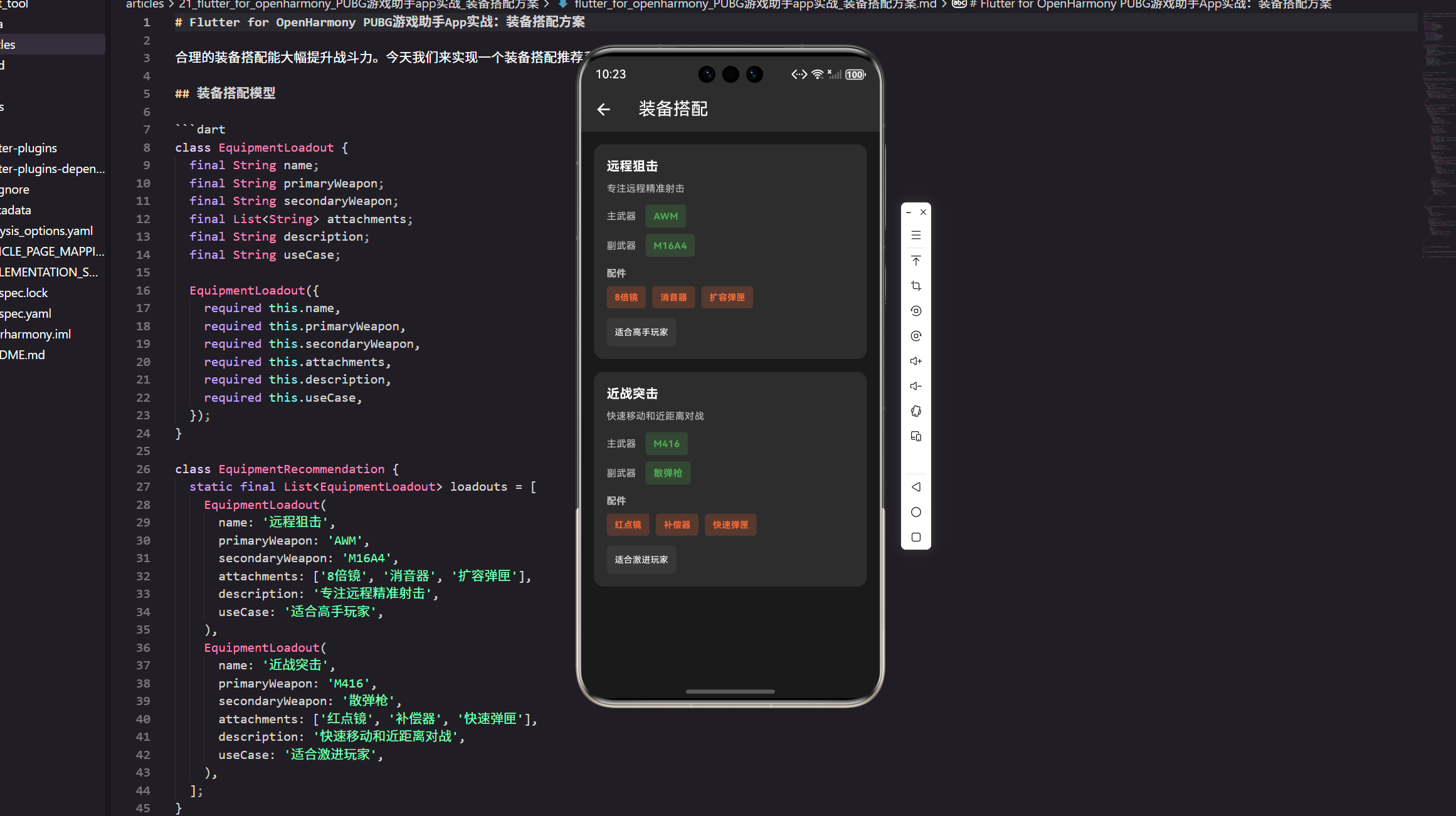
attachments: ['8倍镜', '消音器', '扩容弹匣'],
description: '专注远程精准射击,优先保证第一枪质量。',
useCase: '适合中远距离对枪、占点架枪。',
),
EquipmentLoadout(
id: 'aggressive_m416_sg',
name: '近战突击',
playStyle: PlayStyle.aggressive,
primaryWeapon: 'M416',
secondaryWeapon: '散弹枪',
attachments: ['红点镜', '补偿器', '快速弹匣'],
description: '贴脸压枪 + 快速补枪,容错靠走位。',
useCase: '适合楼战、近距离拉枪线。',
),
];
}
List<EquipmentLoadout> byStyle(PlayStyle style) {
return all().where((e) => e.playStyle == style).toList();
}
}
放到仓库类的原因:
- 一开始用静态列表也行,但静态字段很快会变成“到处 import 的全局变量”。
- 抽成
LoadoutRepository后,后续要换成本地 JSON、接口下发、甚至 A/B 配置,都只动这一层。
装备搭配页面
class EquipmentLoadoutPage extends StatelessWidget {
const EquipmentLoadoutPage({Key? key}) : super(key: key);
LoadoutRepository get _repo => const LoadoutRepository();
Widget build(BuildContext context) {
return Scaffold(
appBar: AppBar(
title: const Text('装备搭配'),
backgroundColor: const Color(0xFF2D2D2D),
),
backgroundColor: const Color(0xFF1A1A1A),
body: _buildLoadoutList(),
);
}
}
这里我习惯先把骨架搭出来:Scaffold 的底色、AppBar 的深色主题定下来,后面卡片怎么调都不会“跑偏”。
extension on EquipmentLoadoutPage {
  Widget _buildLoadoutList() {
    final items = _repo.all();

    return ListView.builder(
      padding: EdgeInsets.all(16.w),
      itemCount: items.length,
      itemBuilder: (context, index) {
        return _LoadoutCard(loadout: items[index]);
      },
    );
  }
}
把卡片抽成独立 Widget 的收益:
- 列表滚动时更容易做性能优化(比如以后加
const、或者用RepaintBoundary) - 事件处理(点击、收藏)不会堆在一个
StatelessWidget里越写越大
class _LoadoutCard extends StatelessWidget {
const _LoadoutCard({required this.loadout});
final EquipmentLoadout loadout;
Widget build(BuildContext context) {
return Card(
margin: EdgeInsets.only(bottom: 16.h),
color: const Color(0xFF2D2D2D),
child: Padding(
padding: EdgeInsets.all(16.w),
child: Column(
crossAxisAlignment: CrossAxisAlignment.start,
children: [
_Title(loadout: loadout),
SizedBox(height: 8.h),
_Description(loadout: loadout),
SizedBox(height: 12.h),
_WeaponRow(label: '主武器', weapon: loadout.primaryWeapon),
SizedBox(height: 8.h),
_WeaponRow(label: '副武器', weapon: loadout.secondaryWeapon),
SizedBox(height: 12.h),
_Attachments(attachments: loadout.attachments),
SizedBox(height: 12.h),
_UseCase(text: loadout.useCase),
],
),
),
);
}
}
为什么拆这么细:真实项目里 UI 迭代很频繁。
比如产品突然要“标题右侧加一个玩法标签”,“描述最多两行超出省略”,这种需求如果全塞在一个
_buildLoadoutCard里,会特别难改。
class _Title extends StatelessWidget {
const _Title({required this.loadout});
final EquipmentLoadout loadout;
Widget build(BuildContext context) {
return Text(
loadout.name,
style: TextStyle(
color: Colors.white,
fontSize: 16.sp,
fontWeight: FontWeight.bold,
),
);
}
}
标题部分保持“纯展示”:不要在这里塞业务判断,最多就是换个样式(比如稀有方案加个高亮色)。
class _Description extends StatelessWidget {
const _Description({required this.loadout});
final EquipmentLoadout loadout;
Widget build(BuildContext context) {
return Text(
loadout.description,
maxLines: 2,
overflow: TextOverflow.ellipsis,
style: TextStyle(
color: Colors.white70,
fontSize: 12.sp,
),
);
}
}
加上两行省略是个小细节:方案描述后面通常会越来越长,不控一下很容易把卡片撑得“每条都像详情页”。
class _WeaponRow extends StatelessWidget {
const _WeaponRow({required this.label, required this.weapon});
final String label;
final String weapon;
Widget build(BuildContext context) {
return Row(
children: [
Text(
label,
style: TextStyle(
color: Colors.white70,
fontSize: 12.sp,
),
),
SizedBox(width: 12.w),
Container(
padding: EdgeInsets.symmetric(horizontal: 10.w, vertical: 6.h),
decoration: BoxDecoration(
color: const Color(0xFF4CAF50).withOpacity(0.2),
borderRadius: BorderRadius.circular(4.r),
),
child: Text(
weapon,
style: TextStyle(
color: const Color(0xFF4CAF50),
fontSize: 12.sp,
fontWeight: FontWeight.bold,
),
),
),
],
);
}
}
武器用“胶囊块”展示:比纯文字更像标签,也更符合工具类页面的视觉(用户扫一眼就知道主副武器是什么)。
class _Attachments extends StatelessWidget {
const _Attachments({required this.attachments});
final List<String> attachments;
Widget build(BuildContext context) {
return Column(
crossAxisAlignment: CrossAxisAlignment.start,
children: [
Text(
'配件',
style: TextStyle(
color: Colors.white70,
fontSize: 12.sp,
fontWeight: FontWeight.bold,
),
),
SizedBox(height: 8.h),
Wrap(
spacing: 8.w,
runSpacing: 8.h,
children: attachments.map((e) => _AttachmentChip(text: e)).toList(),
),
],
);
}
}
Wrap 的好处:配件数量不固定,用 Row 很容易溢出;Wrap 在不同屏幕宽度下会更稳。
class _AttachmentChip extends StatelessWidget {
const _AttachmentChip({required this.text});
final String text;
Widget build(BuildContext context) {
return Container(
padding: EdgeInsets.symmetric(horizontal: 10.w, vertical: 6.h),
decoration: BoxDecoration(
color: const Color(0xFFFF6B35).withOpacity(0.2),
borderRadius: BorderRadius.circular(4.r),
),
child: Text(
text,
style: TextStyle(
color: const Color(0xFFFF6B35),
fontSize: 11.sp,
fontWeight: FontWeight.bold,
),
),
);
}
}
配件颜色我一般用偏橙:跟武器的绿色区分开,读起来更清楚(而且暗色背景下对比度不错)。
class _UseCase extends StatelessWidget {
const _UseCase({required this.text});
final String text;
Widget build(BuildContext context) {
return Container(
padding: EdgeInsets.all(10.w),
decoration: BoxDecoration(
color: Colors.white.withOpacity(0.05),
borderRadius: BorderRadius.circular(6.r),
),
child: Text(
text,
style: TextStyle(
color: Colors.white,
fontSize: 11.sp,
),
),
);
}
}
useCase 单独包一层:相当于“阅读引导”。很多用户其实不想看一堆参数,只想知道“我这种打法适不适合”。
可选:加一个简单的玩法筛选
class EquipmentLoadoutFilterBar extends StatelessWidget {
const EquipmentLoadoutFilterBar({required this.value});
final ValueNotifier<PlayStyle> value;
Widget build(BuildContext context) {
return ValueListenableBuilder<PlayStyle>(
valueListenable: value,
builder: (context, style, _) {
return Wrap(
spacing: 8.w,
children: [
_FilterChip(
text: '狙击',
selected: style == PlayStyle.sniper,
onTap: () => value.value = PlayStyle.sniper,
),
_FilterChip(
text: '激进',
selected: style == PlayStyle.aggressive,
onTap: () => value.value = PlayStyle.aggressive,
),
_FilterChip(
text: '均衡',
selected: style == PlayStyle.balanced,
onTap: () => value.value = PlayStyle.balanced,
),
],
);
},
);
}
}
为什么这里用 ValueNotifier:这类小页面的状态很轻,没必要一上来就 Provider/BLoC;等后面接入收藏、搜索、接口加载时再升级状态管理也不迟。
class _FilterChip extends StatelessWidget {
const _FilterChip({
required this.text,
required this.selected,
required this.onTap,
});
final String text;
final bool selected;
final VoidCallback onTap;
Widget build(BuildContext context) {
final bg = selected
? const Color(0xFFFF6B35).withOpacity(0.25)
: Colors.white.withOpacity(0.06);
return InkWell(
borderRadius: BorderRadius.circular(999),
onTap: onTap,
child: Container(
padding: EdgeInsets.symmetric(horizontal: 12.w, vertical: 8.h),
decoration: BoxDecoration(
color: bg,
borderRadius: BorderRadius.circular(999),
),
child: Text(
text,
style: TextStyle(
color: selected ? const Color(0xFFFF6B35) : Colors.white70,
fontSize: 12.sp,
fontWeight: FontWeight.w600,
),
),
),
);
}
}
手感:InkWell 的点击反馈在暗色背景下比 GestureDetector 更“像个按钮”,这块用户主观感受会明显好一点。
小结
装备搭配页这种功能,做得“能用”很快,但要做得“好用”通常靠这些细节:
- 数据结构要能扩展:别一上来就全局静态列表
- UI 组件拆开:未来加筛选/收藏/详情页时不会推倒重来
- 信息层级要清晰:主副武器一眼看懂,配件用标签,最后再给一句“适用场景”做结论
后面你要继续往“真实项目”走的话,最自然的两个方向:
- 接入收藏/最近使用:用
id做本地存储 key - 接入远端配置:把
LoadoutRepository改成读 JSON 或接口下发即可
欢迎加入开源鸿蒙跨平台社区:https://openharmonycrossplatform.csdn.net

开源鸿蒙跨平台开发社区汇聚开发者与厂商,共建“一次开发,多端部署”的开源生态,致力于降低跨端开发门槛,推动万物智联创新。
更多推荐


 17
17 0
0- 0


 已为社区贡献23条内容

所有评论(0)