Flutter for OpenHarmony 实战:图片预览与手势缩放(PhotoView)
是Google开发的开源UI工具包,支持用一套代码构建和六大平台应用,实现"一次编写,多处运行"。是由开放原子开源基金会运营的分布式操作系统,为全场景智能设备提供统一底座,具有多设备支持、模块化设计、分布式能力和开源开放等特性。
欢迎加入开源鸿蒙跨平台社区: https://openharmonycrossplatform.csdn.net
前言
Flutter是Google开发的开源UI工具包,支持用一套代码构建iOS、Android、Web、Windows、macOS和Linux六大平台应用,实现"一次编写,多处运行"。
OpenHarmony是由开放原子开源基金会运营的分布式操作系统,为全场景智能设备提供统一底座,具有多设备支持、模块化设计、分布式能力和开源开放等特性。
Flutter for OpenHarmony技术方案使开发者能够:
- 复用Flutter现有代码(Skia渲染引擎、热重载、丰富组件库)
- 快速构建符合OpenHarmony规范的UI
- 降低多端开发成本
- 利用Dart生态插件资源加速生态建设
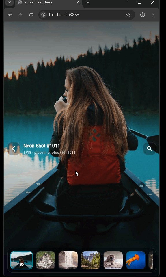
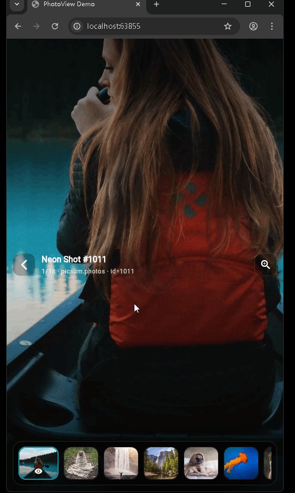
先看效果
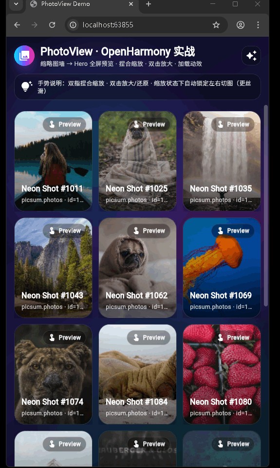
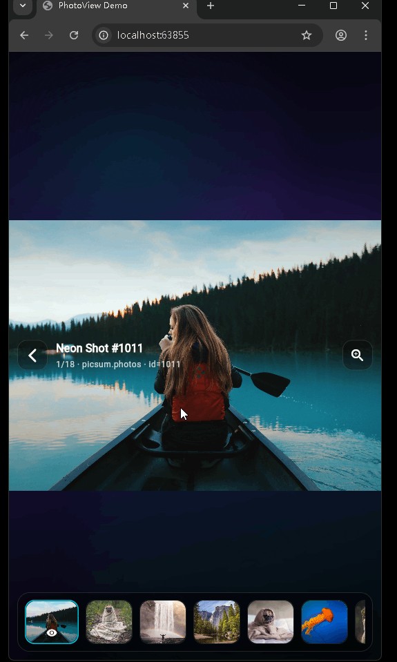
在鸿蒙真机 上模拟器上成功运行后的效果
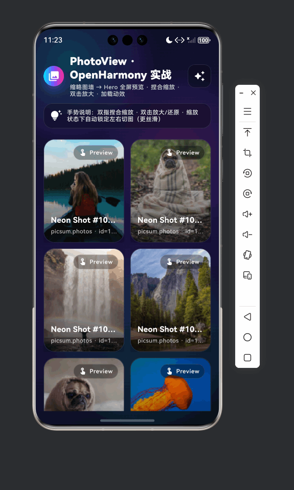
图片预览 支持集成 HarmonyOS(ohos),包含拖拽排序演示与照片预览/查看器两套能力,采用组件化组织,便于扩展与维护。
📋 目录
项目结构说明
当前功能模块
开发与集成说明
项目结构说明
文件目录结构
demo/
├── lib/
│   ├── main.dart                    # 应用入口(拖拽排序演示)
│   ├── app/
│   │   └── app.dart                 # 备用 App 壳(照片预览 Demo)
│   ├── demo/
│   │   ├── photo_preview_demo_page.dart   # 照片网格列表页
│   │   └── photo_viewer_page.dart         # 照片全屏查看页
│   ├── models/
│   │   └── photo_item.dart          # 照片项数据模型
│   └── widgets/
│       ├── aurora_background.dart   # 极光动画背景
│       ├── glass_panel.dart         # 玻璃面板
│       ├── neon_loader.dart         # 霓虹加载指示
│       └── photo_grid.dart          # 照片网格
├── ohos/                            # HarmonyOS 原生工程
│   ├── AppScope/
│   ├── entry/
│   │   └── src/main/ets/
│   │       ├── entryability/EntryAbility.ets
│   │       └── pages/Index.ets
│   └── ...
├── pubspec.yaml
└── 说明.md
入口与核心文件
| 文件 | 说明 |
|---|---|
lib/main.dart |
默认入口,runApp(MyApp),首页为拖拽排序页 ReorderableListPage。依赖 list_item_model、reorderable_list_item(若缺失需自行实现或从别处引入)。 |
lib/app/app.dart |
备用入口,MaterialApp 首页为 PhotoPreviewDemoPage,用于照片网格 + 全屏查看演示。 |
lib/demo/photo_preview_demo_page.dart |
照片列表页:极光背景、网格、点击进入查看器。 |
lib/demo/photo_viewer_page.dart |
照片查看器:全屏、左右滑动、缩放、预加载等。 |
lib/models/photo_item.dart |
照片项模型:id、title、subtitle、thumbUrl、fullUrl。 |
lib/widgets/photo_grid.dart |
响应式照片网格,根据宽度决定列数,点击回调 index。 |
lib/widgets/aurora_background.dart |
极光渐变动画背景(CustomPainter + AnimationController)。 |
lib/widgets/glass_panel.dart |
玻璃态面板。 |
lib/widgets/neon_loader.dart |
霓虹风格加载动画。 |
组件依赖关系
main.dart
  └── ReorderableListPage
      ├── models/list_item_model.dart
      └── widgets/reorderable_list_item.dart

app.dart
  └── PhotoPreviewDemoPage
      ├── models/photo_item.dart
      ├── widgets/aurora_background.dart
      ├── widgets/glass_panel.dart
      ├── widgets/photo_grid.dart
      └── demo/photo_viewer_page.dart
          ├── models/photo_item.dart
          ├── widgets/aurora_background.dart
          └── widgets/neon_loader.dart
当前功能模块
main 入口:拖拽排序
main.dart 启动后显示拖拽排序列表:长按拖拽调整顺序,带淡入动画与拖拽时缩放/旋转/阴影的 proxyDecorator。
// 入口
void main() {
runApp(const MyApp());
}
// 主题 + 首页
class MyApp extends StatelessWidget {
Widget build(BuildContext context) {
return MaterialApp(
title: '拖拽排序演示',
theme: ThemeData(
colorScheme: ColorScheme.fromSeed(
seedColor: Colors.deepPurple,
brightness: Brightness.dark,
),
useMaterial3: true,
),
home: const ReorderableListPage(), // 拖拽排序页
);
}
}
列表数据在 _initializeItems() 中构造多条 ListItemModel(id、title、subtitle、emoji、colorValue)。排序逻辑在 _onReorder 中:根据 oldIndex/newIndex 调整后执行 removeAt + insert,并触发触觉反馈。
void _onReorder(int oldIndex, int newIndex) {
  setState(() {
    if (newIndex > oldIndex) newIndex -= 1;
    final item = _items.removeAt(oldIndex);
    _items.insert(newIndex, item);
    HapticFeedback.mediumImpact();
  });
}
列表使用 ReorderableListView.builder,每项为 ReorderableListItem(需配合 ListItemModel);proxyDecorator 对拖拽中的项做缩放、旋转和阴影,使拖拽更有反馈感。
App 入口:照片预览与查看器
通过 app.dart 可将首页设为照片 Demo:网格列表 + 全屏查看。
// app/app.dart
class DemoApp extends StatelessWidget {
Widget build(BuildContext context) {
return MaterialApp(
title: 'PhotoView Demo',
theme: ThemeData(
brightness: Brightness.dark,
colorScheme: ColorScheme.fromSeed(
seedColor: const Color(0xFF7C4DFF),
brightness: Brightness.dark,
),
scaffoldBackgroundColor: Colors.black,
),
home: const PhotoPreviewDemoPage(), // 照片网格页
);
}
}
PhotoPreviewDemoPage:使用 AuroraBackground 作为背景,内部放标题、PhotoGrid 和底部提示等;点击网格项调用 _openViewer(index),以 PageRouteBuilder 做淡入+缩放跳转到 PhotoViewerPage。
void _openViewer(int initialIndex) {
  Navigator.of(context).push(
    PageRouteBuilder<void>(
      transitionDuration: const Duration(milliseconds: 280),
      pageBuilder: (_, __, ___) {
        return PhotoViewerPage(
          items: _items,
          initialIndex: initialIndex,
        );
      },
      transitionsBuilder: (_, animation, __, child) {
        final fade = CurvedAnimation(parent: animation, curve: Curves.easeOut);
        return FadeTransition(
          opacity: fade,
          child: ScaleTransition(
            scale: Tween<double>(begin: 0.985, end: 1).animate(fade),
            child: child,
          ),
        );
      },
    ),
  );
}
PhotoViewerPage:全屏查看,PageController 管理左右滑动,支持缩放等;对当前及前后页做 precacheImage 以预加载大图;使用 AuroraBackground 与 NeonLoader 等增强视觉效果。
数据模型与通用组件
PhotoItem(models/photo_item.dart):
class PhotoItem {
  const PhotoItem({
    required this.id,
    required this.title,
    required this.subtitle,
    required this.thumbUrl,
    required this.fullUrl,
  });
  final String id, title, subtitle, thumbUrl, fullUrl;
}
PhotoGrid:根据 MediaQuery 宽度选择 2~5 列,GridView.builder + _PhotoTile,点击通过 onTap(index) 回调。
AuroraBackground:SingleTickerProviderStateMixin + AnimationController 循环驱动,CustomPaint 中根据动画进度绘制极光风格渐变,子组件通过 child 传入。
NeonLoader / GlassPanel:分别提供霓虹加载动画和玻璃面板样式,在照片 Demo 中按需使用。
开发与集成说明
Flutter 开发注意点
- 入口二选一:默认用
main.dart(拖拽排序);若要做照片 Demo,可改为runApp(DemoApp())并确保PhotoPreviewDemoPage等依赖存在。 - 拖拽排序依赖:
main.dart依赖list_item_model.dart与reorderable_list_item.dart,若工程中暂无,需在models/、widgets/下补全或从其他模块拷贝。 - 列表与性能:大列表用
ListView.builder/GridView.builder,并为项设置稳定Key(如ValueKey(item.id))。 - 动画:使用
AnimationController时在dispose()中dispose(),且需要vsync时使用SingleTickerProviderStateMixin。
HarmonyOS 集成要点
- 入口:
ohos/entry/src/main/ets/entryability/EntryAbility.ets继承FlutterAbility,在configureFlutterEngine中注册插件;Index.ets使用FlutterPage嵌入 Flutter 页面。 - 实时预览:预览环境下
want.parameters可能为undefined,在onCreate中做空判断并赋默认值,避免TypeError: Cannot read property parameters of undefined。 - 构建:使用 hvigor 构建 ohos 工程;Flutter 侧
flutter pub get,必要时flutter clean再构建。
使用示例
仅运行拖拽排序(当前 main.dart):
void main() {
  runApp(const MyApp());  // 首页 ReorderableListPage
}
仅运行照片预览 Demo:
import 'package:demo/app/app.dart';

void main() {
  runApp(const DemoApp());  // 首页 PhotoPreviewDemoPage
}
按需在 main.dart 中切换上面二者之一即可。
以上为根据当前功能整理的项目说明,便于快速了解结构、入口与主要模块,并按既有规则在文档开头提供目录与简要说明。
欢迎加入开源鸿蒙跨平台社区: https://openharmonycrossplatform.csdn.net

开源鸿蒙跨平台开发社区汇聚开发者与厂商,共建“一次开发,多端部署”的开源生态,致力于降低跨端开发门槛,推动万物智联创新。
更多推荐
 12
12 0
0- 0


 已为社区贡献27条内容

所有评论(0)