构建环保之旅:基于 Flutter × OpenHarmony 的垃圾回收个人成就应用
随着城市化进程的加快,垃圾分类与环保意识逐渐成为社会热点话题。作为开发者,我们不仅可以在日常生活中践行环保,还可以通过技术手段激励用户形成持续环保行为。本文将分享一个基于 Flutter × OpenHarmony 跨端开发的环保应用示例,核心功能是记录个人垃圾回收成就,包括分类次数、正确率、连续参与天数和徽章获取情况。通过可视化界面,让用户直观了解自己的环保贡献。
文章目录
构建环保之旅:基于 Flutter × OpenHarmony 的垃圾回收个人成就应用
前言
随着城市化进程的加快,垃圾分类与环保意识逐渐成为社会热点话题。作为开发者,我们不仅可以在日常生活中践行环保,还可以通过技术手段激励用户形成持续环保行为。本文将分享一个基于 Flutter × OpenHarmony 跨端开发的环保应用示例,核心功能是记录个人垃圾回收成就,包括分类次数、正确率、连续参与天数和徽章获取情况。通过可视化界面,让用户直观了解自己的环保贡献。
本篇文章将详细解析应用核心代码,实现思路与 Flutter × OpenHarmony 跨端开发的结合,让你可以复现并扩展功能。
背景
垃圾分类与环保行为的养成往往依赖于持续的反馈和激励机制。传统应用往往只提供列表记录,但缺乏直观的成就展示和跨端体验。
Flutter 提供了一次开发、多端运行的能力,而 OpenHarmony 则为 IoT 设备和多终端环境提供原生支持。结合二者,可以打造一个既能在手机端,也能在平板或智能家居设备上运行的环保应用,从而扩大用户触达和参与度。
应用核心目标:
- 可视化个人环保成就:分类次数、正确率、连续参与天数、徽章等。
- 跨端一致体验:支持 Android、HarmonyOS 设备,甚至桌面。
- 简单可扩展:后续可接入云端统计、成就排行榜等功能。
Flutter × OpenHarmony 跨端开发介绍
Flutter 是 Google 推出的 UI 框架,支持高性能渲染和跨平台运行。其特点包括:
- 声明式 UI:界面通过 Widget 树构建,易于维护和复用。
- 高性能渲染:自绘 UI,保证一致体验。
- 丰富生态:插件和第三方库丰富,可快速实现网络、数据库、动画等功能。
OpenHarmony 是华为开源的跨设备操作系统,支持:
- 多端部署:手机、平板、电视、IoT。
- 分布式能力:跨设备调用和状态同步。
- 原生 API:可与 Flutter 插件对接,实现高性能硬件访问。
结合两者,可以在 Flutter 中使用原生 OpenHarmony 插件,实现跨端数据同步、通知和本地存储。
开发核心代码(详细解析)
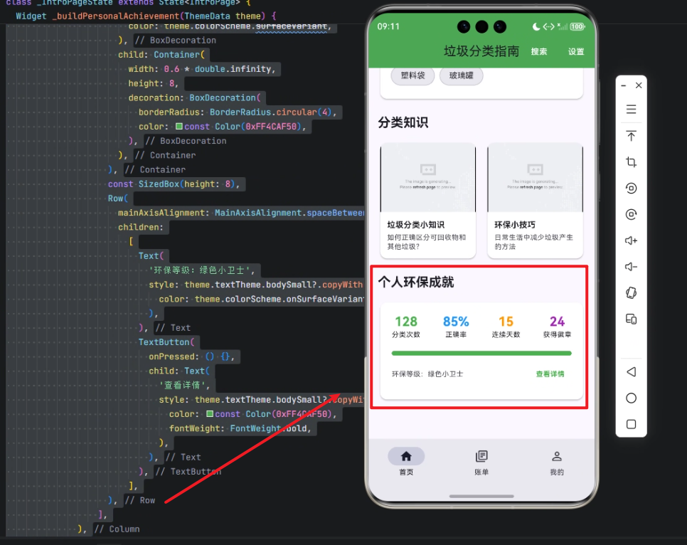
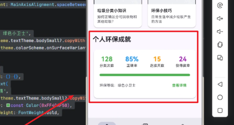
下面以 个人环保成就展示卡片 为例,逐行解析实现逻辑。
/// 构建个人环保成就
Widget _buildPersonalAchievement(ThemeData theme) {
  // 使用 Column 布局,将标题和成就卡片垂直排列
  return Column(
    crossAxisAlignment: CrossAxisAlignment.start, // 左对齐
    children: [
      // 标题
      Text(
        '个人环保成就',
        style: theme.textTheme.titleLarge?.copyWith(
          fontWeight: FontWeight.bold, // 字体加粗
        ),
      ),
      const SizedBox(height: 16), // 间距

      // 成就卡片
      Card(
        elevation: 2, // 阴影高度
        shape: RoundedRectangleBorder(
          borderRadius: BorderRadius.circular(12), // 圆角
        ),
        child: Padding(
          padding: const EdgeInsets.all(20), // 内边距
          child: Column(
            children: [
              // 数据行:分类次数、正确率、连续天数、徽章
              Row(
                mainAxisAlignment: MainAxisAlignment.spaceBetween, // 平均分布
                children: [
                  Column(
                    children: [
                      Text(
                        '128',
                        style: theme.textTheme.titleLarge?.copyWith(
                          fontWeight: FontWeight.bold,
                          color: const Color(0xFF4CAF50), // 绿色
                        ),
                      ),
                      Text(
                        '分类次数',
                        style: theme.textTheme.bodySmall,
                      ),
                    ],
                  ),
                  Column(
                    children: [
                      Text(
                        '85%',
                        style: theme.textTheme.titleLarge?.copyWith(
                          fontWeight: FontWeight.bold,
                          color: const Color(0xFF2196F3), // 蓝色
                        ),
                      ),
                      Text(
                        '正确率',
                        style: theme.textTheme.bodySmall,
                      ),
                    ],
                  ),
                  Column(
                    children: [
                      Text(
                        '15',
                        style: theme.textTheme.titleLarge?.copyWith(
                          fontWeight: FontWeight.bold,
                          color: const Color(0xFFFF9800), // 橙色
                        ),
                      ),
                      Text(
                        '连续天数',
                        style: theme.textTheme.bodySmall,
                      ),
                    ],
                  ),
                  Column(
                    children: [
                      Text(
                        '24',
                        style: theme.textTheme.titleLarge?.copyWith(
                          fontWeight: FontWeight.bold,
                          color: const Color(0xFF9C27B0), // 紫色
                        ),
                      ),
                      Text(
                        '获得徽章',
                        style: theme.textTheme.bodySmall,
                      ),
                    ],
                  ),
                ],
              ),
              const SizedBox(height: 20), // 分隔

              // 进度条,显示环保等级进度
              Container(
                width: double.infinity, // 横向撑满
                height: 8,
                decoration: BoxDecoration(
                  borderRadius: BorderRadius.circular(4),
                  color: theme.colorScheme.surfaceVariant, // 背景灰色
                ),
                child: Container(
                  width: 0.6 * double.infinity, // 60% 完成度
                  height: 8,
                  decoration: BoxDecoration(
                    borderRadius: BorderRadius.circular(4),
                    color: const Color(0xFF4CAF50), // 绿色进度条
                  ),
                ),
              ),
              const SizedBox(height: 8),

              // 等级和详情按钮
              Row(
                mainAxisAlignment: MainAxisAlignment.spaceBetween,
                children: [
                  Text(
                    '环保等级:绿色小卫士',
                    style: theme.textTheme.bodySmall?.copyWith(
                      color: theme.colorScheme.onSurfaceVariant,
                    ),
                  ),
                  TextButton(
                    onPressed: () {},
                    child: Text(
                      '查看详情',
                      style: theme.textTheme.bodySmall?.copyWith(
                        color: const Color(0xFF4CAF50),
                        fontWeight: FontWeight.bold,
                      ),
                    ),
                  ),
                ],
              ),
            ],
          ),
        ),
      ),
    ],
  );
}
逐行解析
-
Column + crossAxisAlignment:使用垂直布局,并左对齐标题和卡片。
-
Text(‘个人环保成就’):标题文本,使用
theme.textTheme.titleLarge并加粗。 -
Card:卡片容器,提供阴影、圆角和内边距。
-
Row (数据行):四个 Column 平均分布,分别显示:
- 分类次数
- 正确率
- 连续天数
- 获得徽章
每个 Column 内部使用数字 + 描述文本。
-
Container (进度条):背景灰色 + 内部绿色表示完成比例。
-
Row (等级与详情按钮):左侧显示等级文本,右侧提供查看详情按钮。
-
样式统一使用 theme:保证跨端一致性,可适配暗色模式和不同屏幕。
此组件的设计理念:
- 信息清晰:数字 + 描述,用户一眼获取成就。
- 视觉分层:颜色和进度条突出关键数据。
- 可扩展:可增加更多成就、动画或交互功能。
Widget _buildPersonalAchievement(ThemeData theme) {
- 定义一个返回
Widget的方法_buildPersonalAchievement。 - 接收
ThemeData theme参数,用于统一应用主题风格(字体、颜色等)。 - 方法名下划线开头
_表示 私有方法,只能在同一个 Dart 文件中使用。
return Column(
  crossAxisAlignment: CrossAxisAlignment.start, // 左对齐
  children: [
- 使用 Column 将标题和卡片垂直排列。
crossAxisAlignment: CrossAxisAlignment.start:列内内容左对齐。children中放置标题、间距和卡片等子 Widget。
// 标题
Text(
  '个人环保成就',
  style: theme.textTheme.titleLarge?.copyWith(
    fontWeight: FontWeight.bold, // 字体加粗
  ),
),
Text显示模块标题 “个人环保成就”。theme.textTheme.titleLarge获取主题的标题大号字体。copyWith(fontWeight: FontWeight.bold):在原有主题基础上加粗。- 使用
?避免titleLarge为 null 时崩溃。
const SizedBox(height: 16), // 间距
SizedBox用于添加垂直间距 16 像素,使标题和卡片有空隙。
Card(
  elevation: 2, // 阴影高度
  shape: RoundedRectangleBorder(
    borderRadius: BorderRadius.circular(12), // 圆角
  ),
  child: Padding(
    padding: const EdgeInsets.all(20), // 内边距
    child: Column(
      children: [
-
使用 Card 组件展示“成就卡片”,提供阴影和圆角。
elevation: 2:阴影高度为 2,轻微浮起效果。shape: RoundedRectangleBorder:卡片圆角半径 12。
-
Padding包裹卡片内容,内边距 20 px,防止内容贴边。 -
内部再用
Column垂直排列卡片中的数据行、进度条和底部按钮。
Row(
  mainAxisAlignment: MainAxisAlignment.spaceBetween, // 平均分布
  children: [
- 第一行是 数据展示行:分类次数、正确率、连续天数、获得徽章。
Row水平布局四个模块。mainAxisAlignment: MainAxisAlignment.spaceBetween:四列平均分布,左右间距自适应。
Column(
  children: [
    Text(
      '128',
      style: theme.textTheme.titleLarge?.copyWith(
        fontWeight: FontWeight.bold,
        color: const Color(0xFF4CAF50), // 绿色
      ),
    ),
    Text(
      '分类次数',
      style: theme.textTheme.bodySmall,
    ),
  ],
),
-
每一列使用
Column包含两行:- 数值(加粗 + 彩色,突出视觉重点)。
- 描述(小号字体,说明数值意义)。
-
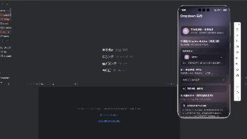
上例展示 分类次数 128,绿色强调环保主题。
-
其他三列分别是 正确率、连续天数、获得徽章,颜色分别为蓝色、橙色、紫色。
const SizedBox(height: 20), // 分隔
- 数据行和进度条之间的垂直间距 20 px。
Container(
  width: double.infinity, // 横向撑满
  height: 8,
  decoration: BoxDecoration(
    borderRadius: BorderRadius.circular(4),
    color: theme.colorScheme.surfaceVariant, // 背景灰色
  ),
  child: Container(
    width: 0.6 * double.infinity, // 60% 完成度
    height: 8,
    decoration: BoxDecoration(
      borderRadius: BorderRadius.circular(4),
      color: const Color(0xFF4CAF50), // 绿色进度条
    ),
  ),
),
-
进度条实现:
- 外层
Container:灰色背景,表示总进度。 - 内层
Container:绿色条,表示当前完成度(此例假设为 60%)。 width: double.infinity:撑满父容器。borderRadius保持圆角,视觉更柔和。
- 外层
-
这种手写进度条比
LinearProgressIndicator可自定义颜色和圆角。
const SizedBox(height: 8),
- 进度条和底部信息之间间距 8 px。
Row(
  mainAxisAlignment: MainAxisAlignment.spaceBetween,
  children: [
- 底部一行展示 环保等级 和 查看详情按钮。
mainAxisAlignment: MainAxisAlignment.spaceBetween:左右两端对齐。
Text(
  '环保等级:绿色小卫士',
  style: theme.textTheme.bodySmall?.copyWith(
    color: theme.colorScheme.onSurfaceVariant,
  ),
),
- 左侧显示等级文字。
- 使用
bodySmall小号字体,并配合主题色。
TextButton(
  onPressed: () {},
  child: Text(
    '查看详情',
    style: theme.textTheme.bodySmall?.copyWith(
      color: const Color(0xFF4CAF50),
      fontWeight: FontWeight.bold,
    ),
  ),
),
- 右侧按钮,可点击查看详细成就。
onPressed: () {}可后续绑定跳转逻辑。- 按钮文字使用绿色,呼应环保主题。
],
- 结束底部 Row children。
],
- 结束 Card 内 Column children。
),
),
- 结束 Card Padding 和 Column。
],
);
- 结束最外层 Column children。
}
- 方法结束,返回整个 Widget。
心得
在 Flutter × OpenHarmony 跨端开发中,我体会到:
- 主题和样式复用的重要性:通过
ThemeData,可以保证多端 UI 一致性。 - 组件化设计:将成就卡封装为
_buildPersonalAchievement方法,易于复用和扩展。 - 跨端注意事项:OpenHarmony 设备可能屏幕尺寸多样,布局需自适应,Flutter Flex 布局提供了便利。
- 数据驱动 UI:未来可以接入云端,实时更新用户环保数据,保持用户参与感。
总结
本文展示了一个基于 Flutter × OpenHarmony 的环保应用核心模块——个人环保成就展示。通过清晰的数据可视化和卡片式设计,让用户直观了解自己的环保行为成果。文章从前言、背景、跨端开发介绍,到详细代码解析和心得总结,提供了一个完整的复现方案。
该方法不仅适用于环保应用,也可以推广到健身、学习、任务完成等领域,通过跨端统一 UI 和可视化成就激励用户长期参与。
欢迎加入开源鸿蒙跨平台社区:https://openharmonycrossplatform.csdn.net

开源鸿蒙跨平台开发社区汇聚开发者与厂商,共建“一次开发,多端部署”的开源生态,致力于降低跨端开发门槛,推动万物智联创新。
更多推荐
 1
1 0
0- 0


 已为社区贡献10条内容

所有评论(0)