Flutter for OpenHarmony 实战:文本输入框(TextField)的样式与交互增强
/ 选中的日期TimeOfDay?// 选中的时间DateTime?// 选中的日期时间// 淡入动画@overrideduration: const Duration(milliseconds: 800), // 800ms 淡入// 启动淡入动画@override提供动画控制器所需的vsync。管理三种选择器的状态,使用淡入动画提升用户体验。firstDate;lastDate;label;
欢迎加入开源鸿蒙跨平台社区: https://openharmonycrossplatform.csdn.net
前言
Flutter是Google开发的开源UI工具包,支持用一套代码构建iOS、Android、Web、Windows、macOS和Linux六大平台应用,实现"一次编写,多处运行"。
OpenHarmony是由开放原子开源基金会运营的分布式操作系统,为全场景智能设备提供统一底座,具有多设备支持、模块化设计、分布式能力和开源开放等特性。
Flutter for OpenHarmony技术方案使开发者能够:
- 复用Flutter现有代码(Skia渲染引擎、热重载、丰富组件库)
- 快速构建符合OpenHarmony规范的UI
- 降低多端开发成本
- 利用Dart生态插件资源加速生态建设
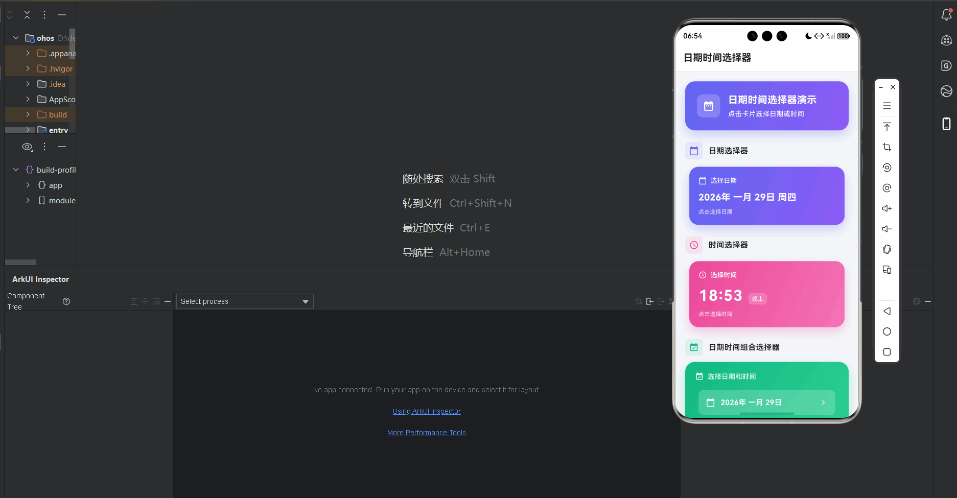
本文详细解析了一个完整的 Flutter 日期时间选择器应用的开发过程。这个应用展示了如何实现三种常见的日期时间选择交互:日期选择、时间选择和日期时间组合选择,包含自定义选择器组件、动画效果、格式化显示、结果展示等,使用 RepaintBoundary 优化性能。
先看效果
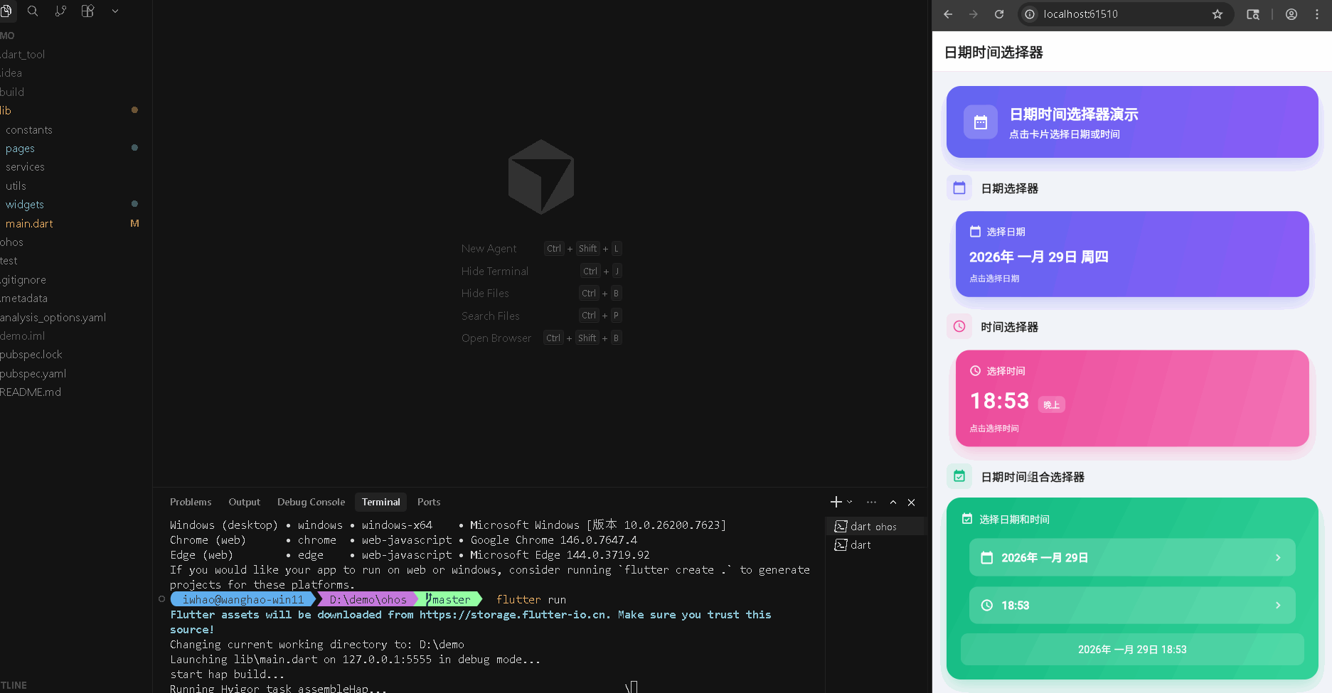
在鸿蒙真机 上模拟器上成功运行后的效果
📋 目录
项目结构说明
应用入口
演示页面 (PickerDemoPage)
DatePickerWidget 组件
TimePickerWidget 组件
DateTimePickerWidget 组件
📁 项目结构说明
文件目录结构
lib/
├── main.dart                           # 应用入口文件
├── pages/                              # 页面目录
│   └── picker_demo_page.dart          # 日期时间选择器演示页面
└── widgets/                            # 组件目录
    ├── date_picker_widget.dart         # 日期选择器组件
    ├── time_picker_widget.dart         # 时间选择器组件
    └── datetime_picker_widget.dart     # 日期时间组合选择器组件
文件说明
入口文件
lib/main.dart
- 应用入口点,包含
main()函数 - 定义
MyApp类,配置应用主题 - 设置应用标题和主题样式
页面文件
lib/pages/picker_demo_page.dart
PickerDemoPage类:日期时间选择器演示页面主类- 管理三种选择器的状态(日期、时间、日期时间)
- 使用
SingleTickerProviderStateMixin实现淡入动画 - 展示选择结果
组件文件
lib/widgets/date_picker_widget.dart
DatePickerWidget组件:日期选择器组件- 调用系统日期选择器
- 实现点击动画效果
- 格式化日期显示(中文格式)
lib/widgets/time_picker_widget.dart
TimePickerWidget组件:时间选择器组件- 调用系统时间选择器
- 实现点击动画效果
- 格式化时间显示(包含时段提示)
lib/widgets/datetime_picker_widget.dart
DateTimePickerWidget组件:日期时间组合选择器组件- 分别选择日期和时间
- 组合显示完整的日期时间
- 使用多个动画控制器
组件依赖关系
main.dart
  └── pages/picker_demo_page.dart       (导入演示页面)
      ├── widgets/date_picker_widget.dart      (导入日期选择器)
      ├── widgets/time_picker_widget.dart      (导入时间选择器)
      └── widgets/datetime_picker_widget.dart   (导入日期时间选择器)
数据流向
- 页面初始化:
PickerDemoPage初始化状态和动画控制器 - 用户交互:用户点击选择器卡片
- 显示选择器:调用系统
showDatePicker或showTimePicker - 选择完成:用户选择后触发回调
- 状态更新:更新页面状态并显示结果
- 动画反馈:播放选择动画,显示
SnackBar提示
应用入口
1. main() 函数
import 'package:flutter/material.dart';
import 'pages/picker_demo_page.dart';

void main() {
  runApp(const MyApp());
}
应用入口,导入演示页面。
2. MyApp 类 - 主题配置
class MyApp extends StatelessWidget {
const MyApp({super.key});
Widget build(BuildContext context) {
return MaterialApp(
title: '日期时间选择器',
debugShowCheckedModeBanner: false,
theme: ThemeData(
colorScheme: ColorScheme.fromSeed(
seedColor: Colors.blue, // 蓝色主题
brightness: Brightness.light, // 浅色模式
),
useMaterial3: true,
),
home: const PickerDemoPage(),
);
}
}
配置浅色主题,使用蓝色作为种子颜色。
演示页面 (PickerDemoPage)
1. 类定义和状态管理
class PickerDemoPage extends StatefulWidget {
const PickerDemoPage({super.key});
State<PickerDemoPage> createState() => _PickerDemoPageState();
}
class _PickerDemoPageState extends State<PickerDemoPage>
with SingleTickerProviderStateMixin {
DateTime? _selectedDate; // 选中的日期
TimeOfDay? _selectedTime; // 选中的时间
DateTime? _selectedDateTime; // 选中的日期时间
late AnimationController _fadeController;
late Animation<double> _fadeAnimation; // 淡入动画
void initState() {
super.initState();
_fadeController = AnimationController(
vsync: this,
duration: const Duration(milliseconds: 800), // 800ms 淡入
);
_fadeAnimation = CurvedAnimation(
parent: _fadeController,
curve: Curves.easeIn,
);
_fadeController.forward(); // 启动淡入动画
}
void dispose() {
_fadeController.dispose();
super.dispose();
}
SingleTickerProviderStateMixin 提供动画控制器所需的 vsync。管理三种选择器的状态,使用淡入动画提升用户体验。
2. 日期时间选择处理
void _onDateSelected(DateTime date) {
  setState(() {
    _selectedDate = date;  // 更新日期状态
  });
  _showSnackBar('已选择日期: ${_formatDate(date)}');
}

void _onTimeSelected(TimeOfDay time) {
  setState(() {
    _selectedTime = time;  // 更新时间状态
  });
  _showSnackBar('已选择时间: ${_formatTime(time)}');
}

void _onDateTimeSelected(DateTime dateTime) {
  setState(() {
    _selectedDateTime = dateTime;  // 更新日期时间状态
  });
  _showSnackBar('已选择日期时间: ${_formatDateTime(dateTime)}');
}

void _showSnackBar(String message) {
  ScaffoldMessenger.of(context).showSnackBar(
    SnackBar(
      content: Text(message),
      duration: const Duration(seconds: 2),
      behavior: SnackBarBehavior.floating,  // 浮动显示
      shape: RoundedRectangleBorder(
        borderRadius: BorderRadius.circular(10),
      ),
      backgroundColor: const Color(0xFF6366F1),
    ),
  );
}
选择回调更新状态并显示提示。_showSnackBar 显示浮动提示信息。
3. 格式化方法
String _formatDate(DateTime date) {
  return '${date.year}-${date.month.toString().padLeft(2, '0')}-${date.day.toString().padLeft(2, '0')}';
}

String _formatTime(TimeOfDay time) {
  return '${time.hour.toString().padLeft(2, '0')}:${time.minute.toString().padLeft(2, '0')}';
}

String _formatDateTime(DateTime dateTime) {
  return '${_formatDate(dateTime)} ${_formatTime(TimeOfDay.fromDateTime(dateTime))}';
}
格式化方法将日期时间转换为字符串显示。使用 padLeft 确保两位数格式。
4. 页面布局结构
Widget build(BuildContext context) {
return Scaffold(
backgroundColor: const Color(0xFFF5F7FA),
appBar: AppBar(
elevation: 0,
backgroundColor: Colors.white,
title: const Text(
'日期时间选择器',
style: TextStyle(
color: Color(0xFF1A1A1A),
fontWeight: FontWeight.bold,
fontSize: 20,
),
),
centerTitle: false,
bottom: PreferredSize(
preferredSize: const Size.fromHeight(1),
child: Container(
height: 1,
color: Colors.grey[200], // 底部边框
),
),
),
body: FadeTransition(
opacity: _fadeAnimation, // 淡入动画
child: SingleChildScrollView(
padding: const EdgeInsets.all(20),
child: Column(
crossAxisAlignment: CrossAxisAlignment.stretch,
children: [
_buildTitleCard(), // 标题卡片
const SizedBox(height: 24),
_buildSection(
title: '日期选择器',
icon: Icons.calendar_today,
color: const Color(0xFF6366F1),
child: DatePickerWidget(
label: '选择日期',
initialDate: _selectedDate,
onDateSelected: _onDateSelected,
),
),
const SizedBox(height: 20),
_buildSection(
title: '时间选择器',
icon: Icons.access_time,
color: const Color(0xFFEC4899),
child: TimePickerWidget(
label: '选择时间',
initialTime: _selectedTime,
onTimeSelected: _onTimeSelected,
),
),
const SizedBox(height: 20),
_buildSection(
title: '日期时间组合选择器',
icon: Icons.event_available,
color: const Color(0xFF10B981),
child: DateTimePickerWidget(
label: '选择日期和时间',
initialDateTime: _selectedDateTime,
onDateTimeSelected: _onDateTimeSelected,
),
),
const SizedBox(height: 20),
if (_selectedDate != null ||
_selectedTime != null ||
_selectedDateTime != null)
_buildResultCard(), // 结果展示卡片
],
),
),
),
);
}
页面使用 FadeTransition 实现淡入效果,SingleChildScrollView 支持滚动。三个选择器使用 _buildSection 统一布局。
5. 结果展示
Widget _buildResultCard() {
  return Container(
    padding: const EdgeInsets.all(20),
    decoration: BoxDecoration(
      color: Colors.white,
      borderRadius: BorderRadius.circular(20),
      boxShadow: [
        BoxShadow(
          color: Colors.grey.withOpacity(0.1),
          blurRadius: 20,
          offset: const Offset(0, 5),
        ),
      ],
    ),
    child: Column(
      crossAxisAlignment: CrossAxisAlignment.start,
      children: [
        Row(
          children: [
            Container(
              padding: const EdgeInsets.all(8),
              decoration: BoxDecoration(
                color: const Color(0xFF10B981).withOpacity(0.1),
                borderRadius: BorderRadius.circular(8),
              ),
              child: const Icon(
                Icons.check_circle,
                color: Color(0xFF10B981),
                size: 20,
              ),
            ),
            const SizedBox(width: 12),
            const Text(
              '选择结果',
              style: TextStyle(
                color: Color(0xFF1A1A1A),
                fontSize: 16,
                fontWeight: FontWeight.w600,
              ),
            ),
          ],
        ),
        const SizedBox(height: 16),
        if (_selectedDate != null)
          _buildResultItem(
            icon: Icons.calendar_today,
            label: '日期',
            value: _formatDate(_selectedDate!),
            color: const Color(0xFF6366F1),
          ),
        if (_selectedTime != null) ...[
          if (_selectedDate != null) const SizedBox(height: 12),
          _buildResultItem(
            icon: Icons.access_time,
            label: '时间',
            value: _formatTime(_selectedTime!),
            color: const Color(0xFFEC4899),
          ),
        ],
        if (_selectedDateTime != null) ...[
          if (_selectedDate != null || _selectedTime != null)
            const SizedBox(height: 12),
          _buildResultItem(
            icon: Icons.event_available,
            label: '日期时间',
            value: _formatDateTime(_selectedDateTime!),
            color: const Color(0xFF10B981),
          ),
        ],
      ],
    ),
  );
}
结果卡片在有选择结果时显示,使用 _buildResultItem 展示各项结果。
DatePickerWidget 组件
1. 类定义和动画
class DatePickerWidget extends StatefulWidget {
final DateTime? initialDate;
final DateTime? firstDate;
final DateTime? lastDate;
final ValueChanged<DateTime>? onDateSelected;
final String? label;
const DatePickerWidget({
super.key,
this.initialDate,
this.firstDate,
this.lastDate,
this.onDateSelected,
this.label,
});
State<DatePickerWidget> createState() => _DatePickerWidgetState();
}
class _DatePickerWidgetState extends State<DatePickerWidget>
with SingleTickerProviderStateMixin {
DateTime? _selectedDate;
late AnimationController _animationController;
late Animation<double> _scaleAnimation; // 缩放动画
void initState() {
super.initState();
_selectedDate = widget.initialDate ?? DateTime.now(); // 默认今天
_animationController = AnimationController(
vsync: this,
duration: const Duration(milliseconds: 200),
);
_scaleAnimation = Tween<double>(begin: 0.95, end: 1.0).animate(
CurvedAnimation(
parent: _animationController,
curve: Curves.easeOut,
),
);
}
void dispose() {
_animationController.dispose();
super.dispose();
}
组件管理选中日期和缩放动画。initialDate 设置初始日期,默认为今天。
2. 日期选择
Future<void> _selectDate(BuildContext context) async {
  final DateTime? picked = await showDatePicker(
    context: context,
    initialDate: _selectedDate ?? DateTime.now(),
    firstDate: widget.firstDate ?? DateTime(1900),  // 最早日期
    lastDate: widget.lastDate ?? DateTime(2100),    // 最晚日期
    builder: (context, child) {
      return Theme(
        data: Theme.of(context).copyWith(
          colorScheme: ColorScheme.light(
            primary: const Color(0xFF6366F1),  // 主题色
            onPrimary: Colors.white,
            surface: Colors.white,
            onSurface: const Color(0xFF1A1A1A),
          ),
          dialogBackgroundColor: Colors.white,
        ),
        child: child!,
      );
    },
  );

  if (picked != null && picked != _selectedDate) {
    setState(() {
      _selectedDate = picked;  // 更新选中日期
    });
    _animationController.forward(from: 0.0);  // 播放动画
    widget.onDateSelected?.call(picked);  // 触发回调
  }
}
调用系统 showDatePicker 显示日期选择器。选择后更新状态、播放动画并触发回调。
3. 日期格式化
String _formatDate(DateTime date) {
  final months = [
    '一月', '二月', '三月', '四月', '五月', '六月',
    '七月', '八月', '九月', '十月', '十一月', '十二月'
  ];
  final weekdays = ['周一', '周二', '周三', '周四', '周五', '周六', '周日'];
  return '${date.year}年 ${months[date.month - 1]} ${date.day}日 ${weekdays[date.weekday - 1]}';
}
格式化日期为中文格式,包含年月日和周几。
4. 组件构建
Widget build(BuildContext context) {
return RepaintBoundary(
child: GestureDetector(
onTap: () => _selectDate(context), // 点击选择日期
child: ScaleTransition(
scale: _scaleAnimation, // 缩放动画
child: Container(
padding: const EdgeInsets.all(20),
decoration: BoxDecoration(
gradient: LinearGradient(
begin: Alignment.topLeft,
end: Alignment.bottomRight,
colors: [
const Color(0xFF6366F1),
const Color(0xFF8B5CF6),
],
),
borderRadius: BorderRadius.circular(20),
boxShadow: [
BoxShadow(
color: const Color(0xFF6366F1).withOpacity(0.3),
blurRadius: 20,
offset: const Offset(0, 10),
),
],
),
child: Column(
crossAxisAlignment: CrossAxisAlignment.start,
children: [
if (widget.label != null) ...[
Row(
children: [
Icon(
Icons.calendar_today,
color: Colors.white.withOpacity(0.9),
size: 18,
),
const SizedBox(width: 8),
Text(
widget.label!,
style: TextStyle(
color: Colors.white.withOpacity(0.9),
fontSize: 14,
fontWeight: FontWeight.w500,
),
),
],
),
const SizedBox(height: 12),
],
Text(
_formatDate(_selectedDate!),
style: const TextStyle(
color: Colors.white,
fontSize: 20,
fontWeight: FontWeight.bold,
),
),
const SizedBox(height: 8),
Text(
'点击选择日期',
style: TextStyle(
color: Colors.white.withOpacity(0.8),
fontSize: 12,
),
),
],
),
),
),
),
);
}
使用 RepaintBoundary 优化性能,GestureDetector 处理点击,ScaleTransition 实现缩放动画。渐变背景和阴影增强视觉效果。
TimePickerWidget 组件
1. 类定义和动画
class TimePickerWidget extends StatefulWidget {
final TimeOfDay? initialTime;
final ValueChanged<TimeOfDay>? onTimeSelected;
final String? label;
const TimePickerWidget({
super.key,
this.initialTime,
this.onTimeSelected,
this.label,
});
State<TimePickerWidget> createState() => _TimePickerWidgetState();
}
class _TimePickerWidgetState extends State<TimePickerWidget>
with SingleTickerProviderStateMixin {
TimeOfDay? _selectedTime;
late AnimationController _animationController;
late Animation<double> _scaleAnimation;
void initState() {
super.initState();
_selectedTime = widget.initialTime ?? TimeOfDay.now(); // 默认当前时间
_animationController = AnimationController(
vsync: this,
duration: const Duration(milliseconds: 200),
);
_scaleAnimation = Tween<double>(begin: 0.95, end: 1.0).animate(
CurvedAnimation(
parent: _animationController,
curve: Curves.easeOut,
),
);
}
组件管理选中时间和缩放动画。initialTime 设置初始时间,默认为当前时间。
2. 时间选择
Future<void> _selectTime(BuildContext context) async {
  final TimeOfDay? picked = await showTimePicker(
    context: context,
    initialTime: _selectedTime ?? TimeOfDay.now(),
    builder: (context, child) {
      return Theme(
        data: Theme.of(context).copyWith(
          colorScheme: ColorScheme.light(
            primary: const Color(0xFFEC4899),  // 粉色主题
            onPrimary: Colors.white,
            surface: Colors.white,
            onSurface: const Color(0xFF1A1A1A),
          ),
          dialogBackgroundColor: Colors.white,
        ),
        child: child!,
      );
    },
  );

  if (picked != null && picked != _selectedTime) {
    setState(() {
      _selectedTime = picked;
    });
    _animationController.forward(from: 0.0);
    widget.onTimeSelected?.call(picked);
  }
}
调用系统 showTimePicker 显示时间选择器。选择后更新状态、播放动画并触发回调。
3. 时间格式化
String _formatTime(TimeOfDay time) {
  final hour = time.hour.toString().padLeft(2, '0');
  final minute = time.minute.toString().padLeft(2, '0');
  return '$hour:$minute';
}

String _getTimePeriod(TimeOfDay time) {
  if (time.hour < 6) return '凌晨';
  if (time.hour < 12) return '上午';
  if (time.hour < 14) return '中午';
  if (time.hour < 18) return '下午';
  if (time.hour < 22) return '晚上';
  return '深夜';
}
格式化时间为 HH:mm 格式,_getTimePeriod 根据小时返回时段提示。
4. 组件构建
Widget build(BuildContext context) {
return RepaintBoundary(
child: GestureDetector(
onTap: () => _selectTime(context),
child: ScaleTransition(
scale: _scaleAnimation,
child: Container(
padding: const EdgeInsets.all(20),
decoration: BoxDecoration(
gradient: LinearGradient(
begin: Alignment.topLeft,
end: Alignment.bottomRight,
colors: [
const Color(0xFFEC4899),
const Color(0xFFF472B6),
],
),
borderRadius: BorderRadius.circular(20),
boxShadow: [
BoxShadow(
color: const Color(0xFFEC4899).withOpacity(0.3),
blurRadius: 20,
offset: const Offset(0, 10),
),
],
),
child: Column(
crossAxisAlignment: CrossAxisAlignment.start,
children: [
if (widget.label != null) ...[
Row(
children: [
Icon(
Icons.access_time,
color: Colors.white.withOpacity(0.9),
size: 18,
),
const SizedBox(width: 8),
Text(
widget.label!,
style: TextStyle(
color: Colors.white.withOpacity(0.9),
fontSize: 14,
fontWeight: FontWeight.w500,
),
),
],
),
const SizedBox(height: 12),
],
Row(
crossAxisAlignment: CrossAxisAlignment.baseline,
textBaseline: TextBaseline.alphabetic,
children: [
Text(
_formatTime(_selectedTime!),
style: const TextStyle(
color: Colors.white,
fontSize: 32,
fontWeight: FontWeight.bold,
letterSpacing: 2,
),
),
const SizedBox(width: 12),
Container(
padding: const EdgeInsets.symmetric(
horizontal: 8,
vertical: 4,
),
decoration: BoxDecoration(
color: Colors.white.withOpacity(0.2),
borderRadius: BorderRadius.circular(8),
),
child: Text(
_getTimePeriod(_selectedTime!),
style: const TextStyle(
color: Colors.white,
fontSize: 12,
fontWeight: FontWeight.w500,
),
),
),
],
),
const SizedBox(height: 8),
Text(
'点击选择时间',
style: TextStyle(
color: Colors.white.withOpacity(0.8),
fontSize: 12,
),
),
],
),
),
),
),
);
}
时间选择器显示大号时间文字和时段标签,使用粉色渐变背景。
DateTimePickerWidget 组件
1. 类定义和动画
class DateTimePickerWidget extends StatefulWidget {
final DateTime? initialDateTime;
final ValueChanged<DateTime>? onDateTimeSelected;
final String? label;
const DateTimePickerWidget({
super.key,
this.initialDateTime,
this.onDateTimeSelected,
this.label,
});
State<DateTimePickerWidget> createState() => _DateTimePickerWidgetState();
}
class _DateTimePickerWidgetState extends State<DateTimePickerWidget>
with TickerProviderStateMixin {
DateTime? _selectedDateTime;
late AnimationController _dateAnimationController; // 日期动画
late AnimationController _timeAnimationController; // 时间动画
late Animation<double> _dateScaleAnimation;
late Animation<double> _timeScaleAnimation;
void initState() {
super.initState();
_selectedDateTime = widget.initialDateTime ?? DateTime.now();
_dateAnimationController = AnimationController(
vsync: this,
duration: const Duration(milliseconds: 200),
);
_timeAnimationController = AnimationController(
vsync: this,
duration: const Duration(milliseconds: 200),
);
_dateScaleAnimation = Tween<double>(begin: 0.95, end: 1.0).animate(
CurvedAnimation(
parent: _dateAnimationController,
curve: Curves.easeOut,
),
);
_timeScaleAnimation = Tween<double>(begin: 0.95, end: 1.0).animate(
CurvedAnimation(
parent: _timeAnimationController,
curve: Curves.easeOut,
),
);
}
void dispose() {
_dateAnimationController.dispose();
_timeAnimationController.dispose();
super.dispose();
}
使用 TickerProviderStateMixin 支持多个动画控制器。分别控制日期和时间的动画。
2. 日期时间选择
Future<void> _selectDate(BuildContext context) async {
  final DateTime? picked = await showDatePicker(
    context: context,
    initialDate: _selectedDateTime ?? DateTime.now(),
    firstDate: DateTime(1900),
    lastDate: DateTime(2100),
    builder: (context, child) {
      return Theme(
        data: Theme.of(context).copyWith(
          colorScheme: ColorScheme.light(
            primary: const Color(0xFF10B981),  // 绿色主题
            onPrimary: Colors.white,
            surface: Colors.white,
            onSurface: const Color(0xFF1A1A1A),
          ),
          dialogBackgroundColor: Colors.white,
        ),
        child: child!,
      );
    },
  );

  if (picked != null) {
    setState(() {
      // 保留原有时间,只更新日期部分
      _selectedDateTime = DateTime(
        picked.year,
        picked.month,
        picked.day,
        _selectedDateTime?.hour ?? 0,
        _selectedDateTime?.minute ?? 0,
      );
    });
    _dateAnimationController.forward(from: 0.0);
    widget.onDateTimeSelected?.call(_selectedDateTime!);
  }
}

Future<void> _selectTime(BuildContext context) async {
  final TimeOfDay? picked = await showTimePicker(
    context: context,
    initialTime: TimeOfDay.fromDateTime(_selectedDateTime ?? DateTime.now()),
    builder: (context, child) {
      return Theme(
        data: Theme.of(context).copyWith(
          colorScheme: ColorScheme.light(
            primary: const Color(0xFF10B981),
            onPrimary: Colors.white,
            surface: Colors.white,
            onSurface: const Color(0xFF1A1A1A),
          ),
          dialogBackgroundColor: Colors.white,
        ),
        child: child!,
      );
    },
  );

  if (picked != null) {
    setState(() {
      // 保留原有日期,只更新时间部分
      _selectedDateTime = DateTime(
        _selectedDateTime?.year ?? DateTime.now().year,
        _selectedDateTime?.month ?? DateTime.now().month,
        _selectedDateTime?.day ?? DateTime.now().day,
        picked.hour,
        picked.minute,
      );
    });
    _timeAnimationController.forward(from: 0.0);
    widget.onDateTimeSelected?.call(_selectedDateTime!);
  }
}
分别选择日期和时间,选择日期时保留时间,选择时间时保留日期,最后组合成完整的日期时间。
3. 组件构建
Widget build(BuildContext context) {
return RepaintBoundary(
child: Container(
padding: const EdgeInsets.all(20),
decoration: BoxDecoration(
gradient: LinearGradient(
begin: Alignment.topLeft,
end: Alignment.bottomRight,
colors: [
const Color(0xFF10B981),
const Color(0xFF34D399),
],
),
borderRadius: BorderRadius.circular(20),
boxShadow: [
BoxShadow(
color: const Color(0xFF10B981).withOpacity(0.3),
blurRadius: 20,
offset: const Offset(0, 10),
),
],
),
child: Column(
crossAxisAlignment: CrossAxisAlignment.start,
children: [
if (widget.label != null) ...[
Row(
children: [
Icon(
Icons.event_available,
color: Colors.white.withOpacity(0.9),
size: 18,
),
const SizedBox(width: 8),
Text(
widget.label!,
style: TextStyle(
color: Colors.white.withOpacity(0.9),
fontSize: 14,
fontWeight: FontWeight.w500,
),
),
],
),
const SizedBox(height: 16),
],
// 日期选择
GestureDetector(
onTap: () => _selectDate(context),
child: ScaleTransition(
scale: _dateScaleAnimation,
child: Container(
padding: const EdgeInsets.all(16),
decoration: BoxDecoration(
color: Colors.white.withOpacity(0.2),
borderRadius: BorderRadius.circular(12),
),
child: Row(
children: [
Icon(Icons.calendar_today, color: Colors.white, size: 20),
const SizedBox(width: 12),
Expanded(
child: Text(
_formatDate(_selectedDateTime!),
style: const TextStyle(
color: Colors.white,
fontSize: 16,
fontWeight: FontWeight.w600,
),
),
),
Icon(Icons.chevron_right, color: Colors.white.withOpacity(0.8), size: 20),
],
),
),
),
),
const SizedBox(height: 12),
// 时间选择
GestureDetector(
onTap: () => _selectTime(context),
child: ScaleTransition(
scale: _timeScaleAnimation,
child: Container(
padding: const EdgeInsets.all(16),
decoration: BoxDecoration(
color: Colors.white.withOpacity(0.2),
borderRadius: BorderRadius.circular(12),
),
child: Row(
children: [
Icon(Icons.access_time, color: Colors.white, size: 20),
const SizedBox(width: 12),
Expanded(
child: Text(
_formatTime(_selectedDateTime!),
style: const TextStyle(
color: Colors.white,
fontSize: 16,
fontWeight: FontWeight.w600,
),
),
),
Icon(Icons.chevron_right, color: Colors.white.withOpacity(0.8), size: 20),
],
),
),
),
),
const SizedBox(height: 12),
// 完整日期时间显示
Container(
padding: const EdgeInsets.all(12),
decoration: BoxDecoration(
color: Colors.white.withOpacity(0.15),
borderRadius: BorderRadius.circular(10),
),
child: Row(
mainAxisAlignment: MainAxisAlignment.center,
children: [
Text(
'${_formatDate(_selectedDateTime!)} ${_formatTime(_selectedDateTime!)}',
style: const TextStyle(
color: Colors.white,
fontSize: 14,
fontWeight: FontWeight.w500,
),
),
],
),
),
],
),
),
);
}
日期时间组合选择器包含两个可点击区域(日期和时间)和一个完整日期时间显示区域。使用绿色渐变背景。
使用示例
在页面中使用日期时间选择器
class MyPage extends StatefulWidget {
State<MyPage> createState() => _MyPageState();
}
class _MyPageState extends State<MyPage> {
DateTime? _selectedDate;
TimeOfDay? _selectedTime;
DateTime? _selectedDateTime;
Widget build(BuildContext context) {
return Scaffold(
appBar: AppBar(title: Text('日期时间选择')),
body: SingleChildScrollView(
padding: const EdgeInsets.all(20),
child: Column(
children: [
// 日期选择器
DatePickerWidget(
label: '选择日期',
initialDate: _selectedDate,
onDateSelected: (date) {
setState(() {
_selectedDate = date;
});
},
),
const SizedBox(height: 20),
// 时间选择器
TimePickerWidget(
label: '选择时间',
initialTime: _selectedTime,
onTimeSelected: (time) {
setState(() {
_selectedTime = time;
});
},
),
const SizedBox(height: 20),
// 日期时间组合选择器
DateTimePickerWidget(
label: '选择日期和时间',
initialDateTime: _selectedDateTime,
onDateTimeSelected: (dateTime) {
setState(() {
_selectedDateTime = dateTime;
});
},
),
],
),
),
);
}
}
使用步骤:
- 导入选择器组件
- 在页面中创建选择器实例
- 实现回调函数处理选择结果
- 更新状态并显示结果
欢迎加入开源鸿蒙跨平台社区: https://openharmonycrossplatform.csdn.net

开源鸿蒙跨平台开发社区汇聚开发者与厂商,共建“一次开发,多端部署”的开源生态,致力于降低跨端开发门槛,推动万物智联创新。
更多推荐


 28
28 0
0- 0


 已为社区贡献22条内容

所有评论(0)