Flutter for OpenHarmony 实战:单选框(Radio)、复选框(Checkbox)与开关(Switch)
override// 单选框状态String?// 复选框状态// 开关状态页面管理三种控件的状态:单选框使用String?存储选中的 ID,复选框和开关使用存储每个选项的状态。// 当前选项的值final T?groupValue;// 组内选中的值onChanged;label;@override// 缩放动画// 淡入淡出动画@override// 如果已选中,直接设置为完成状态是泛型组件,
欢迎加入开源鸿蒙跨平台社区: https://openharmonycrossplatform.csdn.net
前言
Flutter是Google开发的开源UI工具包,支持用一套代码构建iOS、Android、Web、Windows、macOS和Linux六大平台应用,实现"一次编写,多处运行"。
OpenHarmony是由开放原子开源基金会运营的分布式操作系统,为全场景智能设备提供统一底座,具有多设备支持、模块化设计、分布式能力和开源开放等特性。
Flutter for OpenHarmony技术方案使开发者能够:
- 复用Flutter现有代码(Skia渲染引擎、热重载、丰富组件库)
- 快速构建符合OpenHarmony规范的UI
- 降低多端开发成本
- 利用Dart生态插件资源加速生态建设
本文详细解析了一个完整的 Flutter 表单控件应用的开发过程。这个应用展示了如何实现三种常见的表单控件:单选框、复选框和开关,包含自定义动画、渐变效果、状态管理、实时状态汇总等核心特性。
先看效果
Flutter web端预览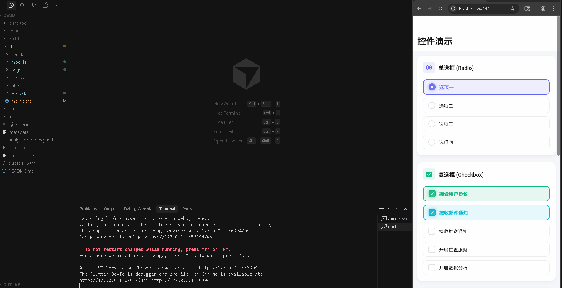
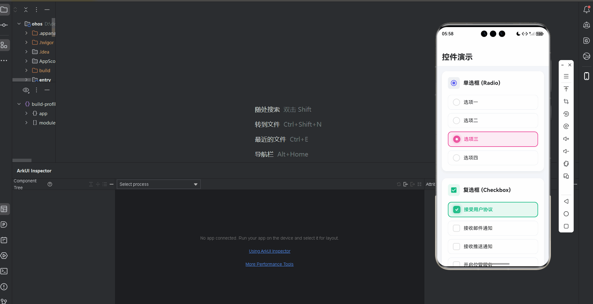
在鸿蒙真机 上模拟器上成功运行后的效果
📋 目录
项目结构说明
应用入口
演示页面 (ControlsDemoPage)
CustomRadio 组件
CustomCheckbox 组件
CustomSwitch 组件
数据模型 (DemoData)
📁 项目结构说明
文件目录结构
lib/
├── main.dart                           # 应用入口文件
├── models/                             # 数据模型目录
│   └── demo_data.dart                 # 演示数据模型
├── pages/                              # 页面目录
│   └── controls_demo_page.dart        # 表单控件演示页面
└── widgets/                            # 组件目录
    ├── custom_radio.dart              # 自定义单选框组件
    ├── custom_checkbox.dart            # 自定义复选框组件
    └── custom_switch.dart             # 自定义开关组件
文件说明
入口文件
lib/main.dart
- 应用入口点,包含
main()函数 - 定义
MyApp类,配置应用主题 - 注意:当前
main.dart显示的是拖拽排序功能,表单控件功能在ControlsDemoPage中
页面文件
lib/pages/controls_demo_page.dart
ControlsDemoPage类:表单控件演示页面主类- 管理单选框、复选框、开关的状态
- 使用
SliverAppBar和CustomScrollView实现滚动布局 - 包含状态汇总卡片
组件文件
lib/widgets/custom_radio.dart
CustomRadio组件:自定义单选框组件- 实现单选逻辑和动画效果
- 支持自定义颜色和标签
lib/widgets/custom_checkbox.dart
CustomCheckbox组件:自定义复选框组件- 实现多选逻辑和动画效果
- 包含对勾绘制动画
lib/widgets/custom_switch.dart
CustomSwitch组件:自定义开关组件- 实现开关切换逻辑和滑动动画
- 支持自定义文字提示
数据模型
lib/models/demo_data.dart
RadioOption类:单选框选项数据模型CheckboxOption类:复选框选项数据模型SwitchOption类:开关选项数据模型DemoData类:演示数据生成器
组件依赖关系
main.dart
  └── pages/controls_demo_page.dart     (导入演示页面)
      ├── models/demo_data.dart         (导入数据模型)
      ├── widgets/custom_radio.dart      (导入单选框组件)
      ├── widgets/custom_checkbox.dart  (导入复选框组件)
      └── widgets/custom_switch.dart     (导入开关组件)
数据流向
- 数据生成:
DemoData类提供静态方法生成选项数据 - 状态初始化:
ControlsDemoPage初始化各控件的默认状态 - 控件渲染:遍历选项数据,创建对应的控件组件
- 状态更新:用户操作控件时,更新状态并触发
setState - 状态汇总:实时计算并显示当前所有控件的状态
应用入口
1. main() 函数
import 'package:flutter/material.dart';
import 'pages/controls_demo_page.dart';

void main() {
  runApp(const MyApp());
}
应用入口,导入表单控件演示页面。
2. MyApp 类 - 主题配置
class MyApp extends StatelessWidget {
const MyApp({super.key});
Widget build(BuildContext context) {
return MaterialApp(
title: '表单控件演示',
debugShowCheckedModeBanner: false,
theme: ThemeData(
colorScheme: ColorScheme.fromSeed(
seedColor: Colors.blue, // 蓝色主题
brightness: Brightness.light, // 浅色模式
),
useMaterial3: true,
),
home: const ControlsDemoPage(),
);
}
}
配置浅色主题,使用蓝色作为种子颜色。
演示页面 (ControlsDemoPage)
1. 类定义和状态管理
class ControlsDemoPage extends StatefulWidget {
const ControlsDemoPage({super.key});
State<ControlsDemoPage> createState() => _ControlsDemoPageState();
}
class _ControlsDemoPageState extends State<ControlsDemoPage> {
// 单选框状态
String? _selectedRadio;
// 复选框状态
final Map<String, bool> _checkboxStates = {};
// 开关状态
final Map<String, bool> _switchStates = {};
页面管理三种控件的状态:单选框使用 String? 存储选中的 ID,复选框和开关使用 Map<String, bool> 存储每个选项的状态。
2. 状态初始化
void initState() {
super.initState();
_initializeStates();
}
void _initializeStates() {
// 初始化单选框(默认选中第一个)
final radioOptions = DemoData.getRadioOptions();
if (radioOptions.isNotEmpty) {
_selectedRadio = radioOptions.first.id;
}
// 初始化复选框(默认选中前两个)
final checkboxOptions = DemoData.getCheckboxOptions();
for (int i = 0; i < checkboxOptions.length; i++) {
_checkboxStates[checkboxOptions[i].id] = i < 2;
}
// 初始化开关(默认开启前两个)
final switchOptions = DemoData.getSwitchOptions();
for (int i = 0; i < switchOptions.length; i++) {
_switchStates[switchOptions[i].id] = i < 2;
}
}
初始化时设置默认状态:单选框默认选中第一个,复选框和开关默认开启前两个。
3. 页面布局结构
Widget build(BuildContext context) {
return Scaffold(
backgroundColor: const Color(0xFFF5F7FA),
body: CustomScrollView(
slivers: [
// AppBar
SliverAppBar(
expandedHeight: 120,
floating: false,
pinned: true, // 固定到顶部
backgroundColor: Colors.white,
elevation: 0,
flexibleSpace: FlexibleSpaceBar(
title: const Text(
'控件演示',
style: TextStyle(
color: Color(0xFF1A1A1A),
fontWeight: FontWeight.bold,
fontSize: 20,
),
),
centerTitle: false,
titlePadding: const EdgeInsets.only(left: 16, bottom: 16),
),
bottom: PreferredSize(
preferredSize: const Size.fromHeight(1),
child: Container(
height: 1,
color: Colors.grey[200],
),
),
),
// 内容
SliverPadding(
padding: const EdgeInsets.all(16),
sliver: SliverList(
delegate: SliverChildListDelegate([
_buildRadioSection(), // 单选框区域
const SizedBox(height: 24),
_buildCheckboxSection(), // 复选框区域
const SizedBox(height: 24),
_buildSwitchSection(), // 开关区域
const SizedBox(height: 24),
_buildSummaryCard(), // 状态汇总卡片
]),
),
),
],
),
);
}
使用 CustomScrollView 和 SliverAppBar 实现可滚动的固定标题栏。SliverList 包含三个控件区域和状态汇总卡片。
4. 单选框区域
Widget _buildRadioSection() {
  final options = DemoData.getRadioOptions();
  final colors = [
    const Color(0xFF6366F1), // Indigo
    const Color(0xFF8B5CF6), // Purple
    const Color(0xFFEC4899), // Pink
    const Color(0xFFEF4444), // Red
  ];

  return _SectionCard(
    title: '单选框 (Radio)',
    icon: Icons.radio_button_checked,
    iconColor: colors[0],
    child: Column(
      children: options.asMap().entries.map((entry) {
        final index = entry.key;
        final option = entry.value;
        return Padding(
          padding: EdgeInsets.only(bottom: index < options.length - 1 ? 12 : 0),
          child: CustomRadio<String>(
            value: option.id,
            groupValue: _selectedRadio,  // 当前选中的值
            onChanged: (value) {
              setState(() {
                _selectedRadio = value;  // 更新选中状态
              });
            },
            label: option.label,
            activeColor: colors[index % colors.length],  // 每个选项不同颜色
          ),
        );
      }).toList(),
    ),
  );
}
遍历单选框选项,为每个选项创建 CustomRadio。使用 groupValue 实现单选逻辑,每个选项使用不同颜色。
5. 复选框区域
Widget _buildCheckboxSection() {
  final options = DemoData.getCheckboxOptions();
  final colors = [
    const Color(0xFF10B981), // Emerald
    const Color(0xFF06B6D4), // Cyan
    const Color(0xFF3B82F6), // Blue
    const Color(0xFFF59E0B), // Amber
    const Color(0xFF8B5CF6), // Purple
  ];

  return _SectionCard(
    title: '复选框 (Checkbox)',
    icon: Icons.check_box,
    iconColor: colors[0],
    child: Column(
      children: options.asMap().entries.map((entry) {
        final index = entry.key;
        final option = entry.value;
        return Padding(
          padding: EdgeInsets.only(bottom: index < options.length - 1 ? 12 : 0),
          child: CustomCheckbox(
            value: _checkboxStates[option.id] ?? false,  // 获取当前状态
            onChanged: (value) {
              setState(() {
                _checkboxStates[option.id] = value ?? false;  // 更新状态
              });
            },
            label: option.label,
            activeColor: colors[index % colors.length],
          ),
        );
      }).toList(),
    ),
  );
}
遍历复选框选项,为每个选项创建 CustomCheckbox。使用 Map 存储每个选项的独立状态,支持多选。
6. 开关区域
Widget _buildSwitchSection() {
  final options = DemoData.getSwitchOptions();
  final colors = [
    const Color(0xFF6366F1), // Indigo
    const Color(0xFF10B981), // Emerald
    const Color(0xFFEC4899), // Pink
    const Color(0xFFF59E0B), // Amber
    const Color(0xFF06B6D4), // Cyan
  ];

  return _SectionCard(
    title: '开关 (Switch)',
    icon: Icons.toggle_on,
    iconColor: colors[0],
    child: Column(
      children: options.asMap().entries.map((entry) {
        final index = entry.key;
        final option = entry.value;
        return Padding(
          padding: EdgeInsets.only(bottom: index < options.length - 1 ? 12 : 0),
          child: CustomSwitch(
            value: _switchStates[option.id] ?? false,
            onChanged: (value) {
              setState(() {
                _switchStates[option.id] = value;  // 更新开关状态
              });
            },
            label: option.label,
            activeText: option.activeText,      // 开启时显示的文字
            inactiveText: option.inactiveText,  // 关闭时显示的文字
            activeColor: colors[index % colors.length],
          ),
        );
      }).toList(),
    ),
  );
}
遍历开关选项,为每个选项创建 CustomSwitch。支持自定义开启/关闭时的文字提示。
7. 状态汇总卡片
Widget _buildSummaryCard() {
  final selectedRadioLabel = DemoData.getRadioOptions()
      .firstWhere((opt) => opt.id == _selectedRadio, orElse: () => DemoData.getRadioOptions().first)
      .label;

  final checkedCount = _checkboxStates.values.where((v) => v).length;  // 已选中的复选框数量
  final totalCheckboxes = _checkboxStates.length;

  final activeSwitches = _switchStates.values.where((v) => v).length;  // 开启的开关数量
  final totalSwitches = _switchStates.length;

  return Container(
    padding: const EdgeInsets.all(20),
    decoration: BoxDecoration(
      gradient: LinearGradient(
        begin: Alignment.topLeft,
        end: Alignment.bottomRight,
        colors: [
          const Color(0xFF6366F1),
          const Color(0xFF8B5CF6),
        ],
      ),
      borderRadius: BorderRadius.circular(16),
      boxShadow: [
        BoxShadow(
          color: const Color(0xFF6366F1).withOpacity(0.3),
          blurRadius: 20,
          offset: const Offset(0, 10),
        ),
      ],
    ),
    child: Column(
      crossAxisAlignment: CrossAxisAlignment.start,
      children: [
        const Text(
          '当前状态',
          style: TextStyle(
            color: Colors.white,
            fontSize: 18,
            fontWeight: FontWeight.bold,
          ),
        ),
        const SizedBox(height: 16),
        _SummaryItem(
          icon: Icons.radio_button_checked,
          label: '选中单选框',
          value: selectedRadioLabel,
        ),
        const SizedBox(height: 12),
        _SummaryItem(
          icon: Icons.check_box,
          label: '已选复选框',
          value: '$checkedCount / $totalCheckboxes',
        ),
        const SizedBox(height: 12),
        _SummaryItem(
          icon: Icons.toggle_on,
          label: '开启开关',
          value: '$activeSwitches / $totalSwitches',
        ),
      ],
    ),
  );
}
状态汇总卡片实时显示当前所有控件的状态:选中的单选框、已选的复选框数量和开启的开关数量。
CustomRadio 组件
1. 类定义和动画
class CustomRadio<T> extends StatefulWidget {
final T value; // 当前选项的值
final T? groupValue; // 组内选中的值
final ValueChanged<T?>? onChanged;
final String? label;
final Color? activeColor;
final Color? inactiveColor;
final bool showLabel;
const CustomRadio({
super.key,
required this.value,
required this.groupValue,
this.onChanged,
this.label,
this.activeColor,
this.inactiveColor,
this.showLabel = true,
});
State<CustomRadio<T>> createState() => _CustomRadioState<T>();
}
class _CustomRadioState<T> extends State<CustomRadio<T>>
with SingleTickerProviderStateMixin {
late AnimationController _controller;
late Animation<double> _scaleAnimation; // 缩放动画
late Animation<double> _fadeAnimation; // 淡入淡出动画
void initState() {
super.initState();
_controller = AnimationController(
duration: const Duration(milliseconds: 200),
vsync: this,
);
_scaleAnimation = Tween<double>(begin: 0.8, end: 1.0).animate(
CurvedAnimation(parent: _controller, curve: Curves.easeOut),
);
_fadeAnimation = Tween<double>(begin: 0.0, end: 1.0).animate(
CurvedAnimation(parent: _controller, curve: Curves.easeOut),
);
if (_isSelected) {
_controller.value = 1.0; // 如果已选中,直接设置为完成状态
}
}
CustomRadio 是泛型组件,支持任意类型的值。groupValue 实现单选逻辑:只有 value == groupValue 时才选中。动画控制器控制选中时的缩放和淡入效果。
2. 状态更新
void didUpdateWidget(CustomRadio<T> oldWidget) {
super.didUpdateWidget(oldWidget);
if (_isSelected != (oldWidget.value == oldWidget.groupValue)) {
if (_isSelected) {
_controller.forward(); // 选中时播放动画
} else {
_controller.reverse(); // 取消选中时反向播放
}
}
}
bool get _isSelected => widget.value == widget.groupValue;
void _handleTap() {
if (widget.onChanged != null && !_isSelected) {
widget.onChanged!(widget.value); // 只有未选中时才触发
_controller.forward(from: 0.0);
}
}
didUpdateWidget 监听选中状态变化,自动播放或反向播放动画。_handleTap 处理点击,只有未选中时才触发回调。
3. 控件构建
Widget build(BuildContext context) {
return RepaintBoundary(
child: GestureDetector(
onTap: _handleTap,
child: Container(
padding: const EdgeInsets.symmetric(vertical: 12, horizontal: 16),
decoration: BoxDecoration(
color: _isSelected
? _activeColor.withOpacity(0.1) // 选中时显示背景色
: Colors.transparent,
borderRadius: BorderRadius.circular(12),
border: Border.all(
color: _isSelected ? _activeColor : Colors.grey[200]!,
width: _isSelected ? 2 : 1,
),
),
child: Row(
children: [
// 单选框
AnimatedBuilder(
animation: _controller,
builder: (context, child) {
return Container(
width: 24,
height: 24,
decoration: BoxDecoration(
shape: BoxShape.circle,
border: Border.all(
color: _isSelected ? _activeColor : _inactiveColor,
width: 2,
),
gradient: _isSelected
? LinearGradient(
begin: Alignment.topLeft,
end: Alignment.bottomRight,
colors: [
_activeColor,
_activeColor.withOpacity(0.7),
],
)
: null,
color: _isSelected ? null : Colors.transparent,
boxShadow: _isSelected
? [
BoxShadow(
color: _activeColor.withOpacity(0.4),
blurRadius: 8,
spreadRadius: 1,
),
]
: null,
),
child: Center(
child: ScaleTransition(
scale: _scaleAnimation,
child: FadeTransition(
opacity: _fadeAnimation,
child: Container(
width: 8,
height: 8,
decoration: const BoxDecoration(
shape: BoxShape.circle,
color: Colors.white,
),
),
),
),
),
);
},
),
if (widget.showLabel && widget.label != null) ...[
const SizedBox(width: 12),
Expanded(
child: Text(
widget.label!,
style: TextStyle(
fontSize: 16,
fontWeight: _isSelected ? FontWeight.w600 : FontWeight.normal,
color: _isSelected
? _activeColor
: const Color(0xFF1A1A1A),
),
),
),
],
],
),
),
),
);
}
单选框使用圆形边框,选中时显示渐变背景和内部白点。ScaleTransition 和 FadeTransition 实现选中动画。选中时标签文字加粗并变色。
CustomCheckbox 组件
1. 类定义和动画
class CustomCheckbox extends StatefulWidget {
final bool value;
final ValueChanged<bool?>? onChanged;
final String? label;
final Color? activeColor;
final Color? inactiveColor;
final bool showLabel;
final bool tristate; // 三态复选框
const CustomCheckbox({
super.key,
required this.value,
this.onChanged,
this.label,
this.activeColor,
this.inactiveColor,
this.showLabel = true,
this.tristate = false,
});
State<CustomCheckbox> createState() => _CustomCheckboxState();
}
class _CustomCheckboxState extends State<CustomCheckbox>
with SingleTickerProviderStateMixin {
late AnimationController _controller;
late Animation<double> _scaleAnimation; // 缩放动画
late Animation<double> _checkAnimation; // 对勾动画
void initState() {
super.initState();
_controller = AnimationController(
duration: const Duration(milliseconds: 300),
vsync: this,
);
_scaleAnimation = Tween<double>(begin: 0.0, end: 1.0).animate(
CurvedAnimation(
parent: _controller,
curve: const Interval(0.0, 0.5, curve: Curves.easeOut), // 前50%时间
),
);
_checkAnimation = Tween<double>(begin: 0.0, end: 1.0).animate(
CurvedAnimation(
parent: _controller,
curve: const Interval(0.3, 1.0, curve: Curves.easeOut), // 30%-100%时间
),
);
if (widget.value) {
_controller.value = 1.0;
}
}
复选框使用两个动画:_scaleAnimation 控制整体缩放,_checkAnimation 控制对勾绘制。使用 Interval 实现动画序列:先缩放,再绘制对勾。
2. 状态更新
void didUpdateWidget(CustomCheckbox oldWidget) {
super.didUpdateWidget(oldWidget);
if (widget.value != oldWidget.value) {
if (widget.value) {
_controller.forward(); // 选中时播放动画
} else {
_controller.reverse(); // 取消选中时反向播放
}
}
}
void _handleTap() {
if (widget.onChanged != null) {
if (widget.tristate && widget.value) {
widget.onChanged!(null); // 三态:true -> null
} else {
widget.onChanged!(!widget.value); // 普通:切换状态
}
}
}
didUpdateWidget 监听值变化,自动播放动画。_handleTap 处理点击,支持三态复选框(true -> null -> false)。
3. 控件构建
Widget build(BuildContext context) {
return RepaintBoundary(
child: GestureDetector(
onTap: _handleTap,
child: Container(
padding: const EdgeInsets.symmetric(vertical: 12, horizontal: 16),
decoration: BoxDecoration(
color: widget.value
? _activeColor.withOpacity(0.1)
: Colors.transparent,
borderRadius: BorderRadius.circular(12),
border: Border.all(
color: widget.value ? _activeColor : Colors.grey[200]!,
width: widget.value ? 2 : 1,
),
),
child: Row(
children: [
// 复选框
AnimatedBuilder(
animation: _controller,
builder: (context, child) {
return Container(
width: 24,
height: 24,
decoration: BoxDecoration(
borderRadius: BorderRadius.circular(6),
border: Border.all(
color: widget.value ? _activeColor : _inactiveColor,
width: 2,
),
gradient: widget.value
? LinearGradient(
begin: Alignment.topLeft,
end: Alignment.bottomRight,
colors: [
_activeColor,
_activeColor.withOpacity(0.7),
],
)
: null,
color: widget.value ? null : Colors.transparent,
boxShadow: widget.value
? [
BoxShadow(
color: _activeColor.withOpacity(0.4),
blurRadius: 8,
spreadRadius: 1,
),
]
: null,
),
child: Center(
child: ScaleTransition(
scale: _scaleAnimation,
child: RotationTransition(
turns: _checkAnimation,
child: FadeTransition(
opacity: _checkAnimation,
child: CustomPaint(
size: const Size(12, 12),
painter: _CheckmarkPainter(
color: Colors.white,
progress: _checkAnimation.value, // 对勾绘制进度
),
),
),
),
),
),
);
},
),
if (widget.showLabel && widget.label != null) ...[
const SizedBox(width: 12),
Expanded(
child: Text(
widget.label!,
style: TextStyle(
fontSize: 16,
fontWeight: widget.value ? FontWeight.w600 : FontWeight.normal,
color: widget.value
? _activeColor
: const Color(0xFF1A1A1A),
),
),
),
],
],
),
),
),
);
}
复选框使用圆角矩形,选中时显示渐变背景。对勾使用 CustomPaint 绘制,通过 progress 控制绘制进度,实现动画效果。
4. 对勾绘制器
class _CheckmarkPainter extends CustomPainter {
final Color color;
final double progress; // 绘制进度 0.0-1.0
_CheckmarkPainter({
required this.color,
required this.progress,
});
void paint(Canvas canvas, Size size) {
final paint = Paint()
..color = color
..strokeWidth = 2.5
..style = PaintingStyle.stroke
..strokeCap = StrokeCap.round
..strokeJoin = StrokeJoin.round;
final path = Path();
path.moveTo(size.width * 0.2, size.height * 0.5);
path.lineTo(size.width * 0.45, size.height * 0.75);
path.lineTo(size.width * 0.8, size.height * 0.25);
// 根据进度绘制路径
final metrics = path.computeMetrics().first;
final length = metrics.length * progress; // 计算已绘制长度
final extractPath = metrics.extractPath(0, length); // 提取部分路径
canvas.drawPath(extractPath, paint);
}
bool shouldRepaint(_CheckmarkPainter oldDelegate) {
return oldDelegate.progress != progress || oldDelegate.color != color;
}
}
对勾绘制器使用 Path 定义对勾形状,通过 extractPath 根据 progress 绘制部分路径,实现动画效果。
CustomSwitch 组件
1. 类定义和动画
class CustomSwitch extends StatefulWidget {
final bool value;
final ValueChanged<bool>? onChanged;
final String? label;
final String? activeText; // 开启时显示的文字
final String? inactiveText; // 关闭时显示的文字
final Color? activeColor;
final Color? inactiveColor;
final bool showLabel;
const CustomSwitch({
super.key,
required this.value,
this.onChanged,
this.label,
this.activeText,
this.inactiveText,
this.activeColor,
this.inactiveColor,
this.showLabel = true,
});
State<CustomSwitch> createState() => _CustomSwitchState();
}
class _CustomSwitchState extends State<CustomSwitch>
with SingleTickerProviderStateMixin {
late AnimationController _controller;
late Animation<double> _slideAnimation; // 滑块滑动动画
late Animation<Color?> _colorAnimation; // 颜色渐变动画
void initState() {
super.initState();
_controller = AnimationController(
duration: const Duration(milliseconds: 300),
vsync: this,
);
_slideAnimation = Tween<double>(
begin: 0.0,
end: 1.0,
).animate(CurvedAnimation(
parent: _controller,
curve: Curves.easeInOut,
));
final activeColor = widget.activeColor ?? const Color(0xFF6366F1);
final inactiveColor = widget.inactiveColor ?? Colors.grey[300]!;
_colorAnimation = ColorTween(
begin: inactiveColor,
end: activeColor,
).animate(CurvedAnimation(
parent: _controller,
curve: Curves.easeInOut,
));
if (widget.value) {
_controller.value = 1.0;
}
}
开关使用两个动画:_slideAnimation 控制滑块位置,_colorAnimation 控制背景颜色渐变。
2. 状态更新
void didUpdateWidget(CustomSwitch oldWidget) {
super.didUpdateWidget(oldWidget);
if (widget.value != oldWidget.value) {
if (widget.value) {
_controller.forward(); // 开启时播放动画
} else {
_controller.reverse(); // 关闭时反向播放
}
}
}
void _handleTap() {
if (widget.onChanged != null) {
widget.onChanged!(!widget.value); // 切换状态
}
}
didUpdateWidget 监听值变化,自动播放动画。_handleTap 切换开关状态。
3. 控件构建
Widget build(BuildContext context) {
return RepaintBoundary(
child: GestureDetector(
onTap: _handleTap,
child: Container(
padding: const EdgeInsets.symmetric(vertical: 12, horizontal: 16),
decoration: BoxDecoration(
color: widget.value
? _activeColor.withOpacity(0.1)
: Colors.transparent,
borderRadius: BorderRadius.circular(12),
border: Border.all(
color: widget.value ? _activeColor : Colors.grey[200]!,
width: widget.value ? 2 : 1,
),
),
child: Row(
children: [
if (widget.showLabel && widget.label != null) ...[
Expanded(
child: Text(
widget.label!,
style: TextStyle(
fontSize: 16,
fontWeight: widget.value ? FontWeight.w600 : FontWeight.normal,
color: widget.value
? _activeColor
: const Color(0xFF1A1A1A),
),
),
),
const SizedBox(width: 16),
],
// 开关
AnimatedBuilder(
animation: _controller,
builder: (context, child) {
return Container(
width: 56,
height: 32,
decoration: BoxDecoration(
borderRadius: BorderRadius.circular(16),
gradient: LinearGradient(
begin: Alignment.topLeft,
end: Alignment.bottomRight,
colors: [
_colorAnimation.value ?? _inactiveColor,
(_colorAnimation.value ?? _inactiveColor).withOpacity(0.8),
],
),
boxShadow: widget.value
? [
BoxShadow(
color: _activeColor.withOpacity(0.4),
blurRadius: 8,
spreadRadius: 1,
),
]
: null,
),
child: Stack(
children: [
// 文字提示
if (widget.activeText != null || widget.inactiveText != null)
Center(
child: AnimatedDefaultTextStyle(
duration: const Duration(milliseconds: 200),
style: TextStyle(
fontSize: 10,
fontWeight: FontWeight.bold,
color: Colors.white.withOpacity(0.8),
),
child: Text(
widget.value
? (widget.activeText ?? 'ON')
: (widget.inactiveText ?? 'OFF'),
),
),
),
// 滑块
AnimatedPositioned(
duration: const Duration(milliseconds: 300),
curve: Curves.easeInOut,
left: widget.value ? 26.0 : 2.0, // 开启时在右侧,关闭时在左侧
top: 2.0,
child: Container(
width: 28,
height: 28,
decoration: BoxDecoration(
shape: BoxShape.circle,
color: Colors.white,
boxShadow: [
BoxShadow(
color: Colors.black.withOpacity(0.2),
blurRadius: 4,
offset: const Offset(0, 2),
),
],
),
child: Center(
child: AnimatedSwitcher(
duration: const Duration(milliseconds: 200),
child: Icon(
widget.value ? Icons.check : Icons.close,
key: ValueKey(widget.value),
size: 16,
color: _colorAnimation.value,
),
),
),
),
),
],
),
);
},
),
],
),
),
),
);
}
开关使用 Stack 布局,背景显示渐变和文字提示,滑块使用 AnimatedPositioned 实现滑动动画。滑块内部图标根据状态切换(开启显示对勾,关闭显示叉号)。
数据模型 (DemoData)
1. RadioOption 类
class RadioOption {
  final String id;          // 选项 ID
  final String label;        // 选项标签
  final String description;  // 选项描述

  const RadioOption({
    required this.id,
    required this.label,
    required this.description,
  });
}
单选框选项数据模型,包含 ID、标签和描述。
2. CheckboxOption 类
class CheckboxOption {
  final String id;
  final String label;
  final String description;

  const CheckboxOption({
    required this.id,
    required this.label,
    required this.description,
  });
}
复选框选项数据模型,结构与单选框相同。
3. SwitchOption 类
class SwitchOption {
  final String id;
  final String label;
  final String description;
  final String? activeText;    // 开启时显示的文字
  final String? inactiveText;  // 关闭时显示的文字

  const SwitchOption({
    required this.id,
    required this.label,
    required this.description,
    this.activeText,
    this.inactiveText,
  });
}
开关选项数据模型,额外包含开启/关闭时的文字提示。
4. DemoData 类
class DemoData {
  static List<RadioOption> getRadioOptions() {
    return const [
      RadioOption(
        id: 'option1',
        label: '选项一',
        description: '这是第一个选项的描述信息',
      ),
      RadioOption(
        id: 'option2',
        label: '选项二',
        description: '这是第二个选项的描述信息',
      ),
      RadioOption(
        id: 'option3',
        label: '选项三',
        description: '这是第三个选项的描述信息',
      ),
      RadioOption(
        id: 'option4',
        label: '选项四',
        description: '这是第四个选项的描述信息',
      ),
    ];
  }

  static List<CheckboxOption> getCheckboxOptions() {
    return const [
      CheckboxOption(
        id: 'check1',
        label: '接受用户协议',
        description: '我已阅读并同意用户服务协议',
      ),
      CheckboxOption(
        id: 'check2',
        label: '接收邮件通知',
        description: '允许系统向我发送邮件通知',
      ),
      // ... 更多选项
    ];
  }

  static List<SwitchOption> getSwitchOptions() {
    return const [
      SwitchOption(
        id: 'switch1',
        label: 'Wi-Fi',
        description: '开启或关闭Wi-Fi连接',
        activeText: '开',
        inactiveText: '关',
      ),
      SwitchOption(
        id: 'switch2',
        label: '蓝牙',
        description: '开启或关闭蓝牙功能',
        activeText: 'ON',
        inactiveText: 'OFF',
      ),
      // ... 更多选项
    ];
  }
}
数据生成器提供静态方法,返回演示用的选项数据。
使用示例
在页面中使用表单控件
class MyFormPage extends StatefulWidget {
State<MyFormPage> createState() => _MyFormPageState();
}
class _MyFormPageState extends State<MyFormPage> {
String? _selectedOption;
final Map<String, bool> _checkboxes = {};
final Map<String, bool> _switches = {};
Widget build(BuildContext context) {
return Scaffold(
appBar: AppBar(title: Text('表单页面')),
body: ListView(
padding: EdgeInsets.all(16),
children: [
// 单选框
CustomRadio<String>(
value: 'option1',
groupValue: _selectedOption,
onChanged: (value) {
setState(() {
_selectedOption = value;
});
},
label: '选项一',
activeColor: Colors.blue,
),
// 复选框
CustomCheckbox(
value: _checkboxes['check1'] ?? false,
onChanged: (value) {
setState(() {
_checkboxes['check1'] = value ?? false;
});
},
label: '接受协议',
activeColor: Colors.green,
),
// 开关
CustomSwitch(
value: _switches['switch1'] ?? false,
onChanged: (value) {
setState(() {
_switches['switch1'] = value;
});
},
label: 'Wi-Fi',
activeText: '开',
inactiveText: '关',
activeColor: Colors.purple,
),
],
),
);
}
}
使用步骤:
- 定义状态变量(单选框使用单个值,复选框和开关使用 Map)
- 创建控件组件,传入当前值和回调
- 在回调中更新状态并调用
setState - 自定义颜色和文字提示
欢迎加入开源鸿蒙跨平台社区: https://openharmonycrossplatform.csdn.net

开源鸿蒙跨平台开发社区汇聚开发者与厂商,共建“一次开发,多端部署”的开源生态,致力于降低跨端开发门槛,推动万物智联创新。
更多推荐

 9
9 0
0- 0


 已为社区贡献27条内容

所有评论(0)