Flutter for OpenHarmony PUBG游戏助手App实战:战术技巧分享
战术是赢得比赛的关键。不同的游戏阶段需要不同的战术。今天我们来实现一个战术技巧分享页面。
战术是赢得比赛的关键。不同的游戏阶段(落地发育/控圈转点/决赛圈处理)需要不同的打法。这个小节我按“真实项目落地”的方式,把战术技巧列表页 + 详情页 + 简单分享做出来。
我会刻意避免贴一整坨页面代码:每段代码都尽量短一点,并且在代码后面补上我在项目里通常会写的解释(方便你照着改成自己的业务)。
这一页在项目里的位置(我一般这么拆)
lib/features/tactics/models/tactic.dart:模型与解析lib/features/tactics/data/tactic_repository.dart:数据入口(本地/远端都可以从这换)lib/features/tactics/pages/tactic_sharing_page.dart:列表与筛选lib/features/tactics/pages/tactic_detail_page.dart:详情与“复制分享”
上面只是常见拆法,不强制;但拆开后最大的好处是:页面不会变成“上千行 StatefulWidget”。
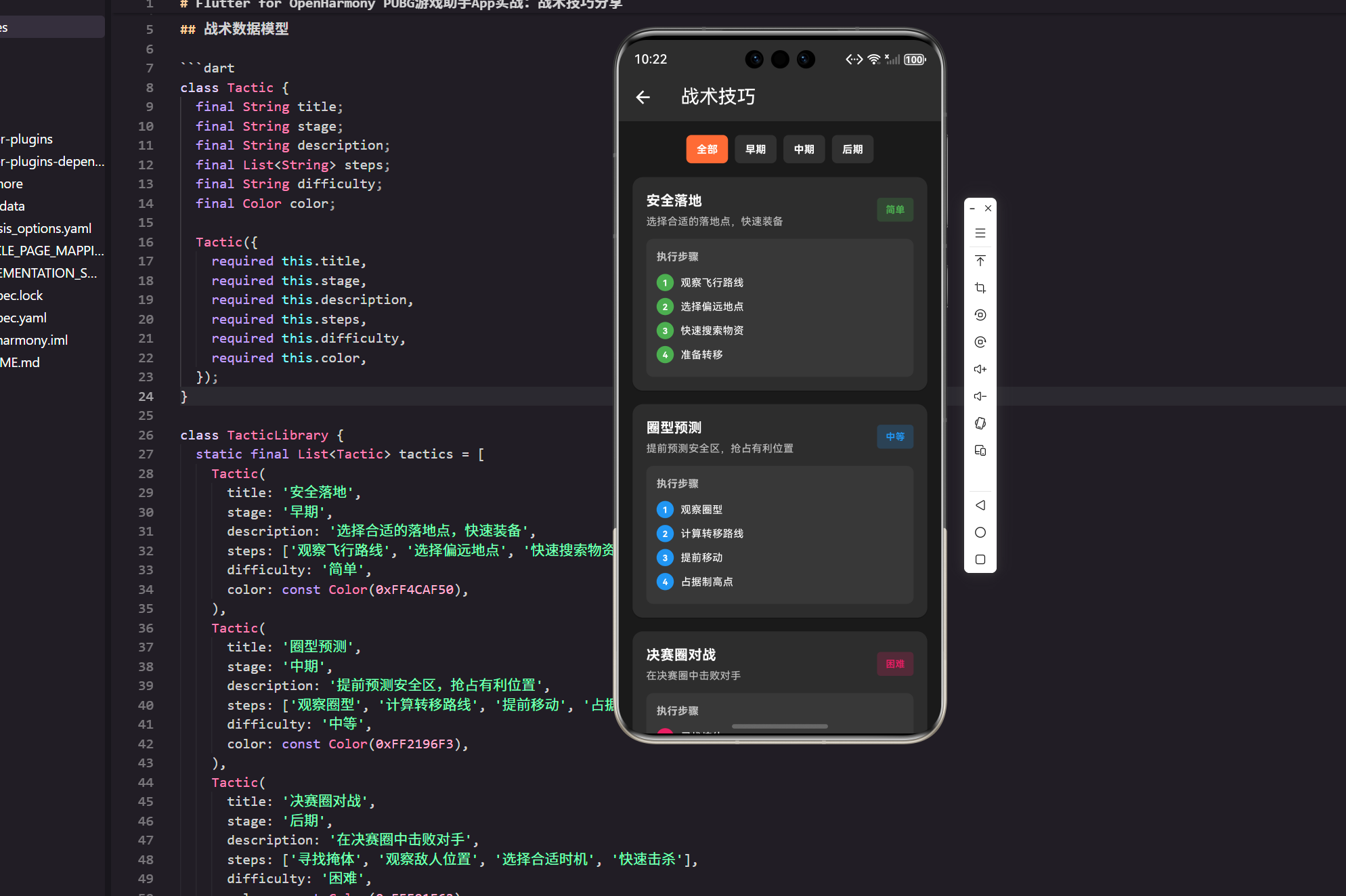
战术数据模型
enum TacticStage {
  early,
  mid,
  late,
}

extension TacticStageX on TacticStage {
  String get label {
    switch (this) {
      case TacticStage.early:
        return '早期';
      case TacticStage.mid:
        return '中期';
      case TacticStage.late:
        return '后期';
    }
  }
}
说明(为什么要用 enum)
- 可控:你后面做筛选、埋点、排序时,
enum比字符串稳得多,不容易出现“写错字导致筛选失效”。 - 展示与业务分离:通过
extension把展示文案集中起来,页面里就不用到处写'早期'/'中期'。
接下来是核心模型,我会把“解析/序列化”也一起放上,方便你以后接接口。
class Tactic {
  final String id;
  final String title;
  final TacticStage stage;
  final String description;
  final List<String> steps;
  final String difficulty;
  final int colorHex;

  const Tactic({
    required this.id,
    required this.title,
    required this.stage,
    required this.description,
    required this.steps,
    required this.difficulty,
    required this.colorHex,
  });

  factory Tactic.fromJson(Map<String, dynamic> json) {
    return Tactic(
      id: (json['id'] as String?) ?? '',
      title: (json['title'] as String?) ?? '',
      stage: _parseStage((json['stage'] as String?) ?? ''),
      description: (json['description'] as String?) ?? '',
      steps: (json['steps'] as List? ?? const [])
          .whereType<String>()
          .where((e) => e.trim().isNotEmpty)
          .toList(growable: false),
      difficulty: (json['difficulty'] as String?) ?? '未知',
      colorHex: (json['colorHex'] as int?) ?? 0xFFFF6B35,
    );
  }

  static TacticStage _parseStage(String value) {
    switch (value) {
      case '早期':
        return TacticStage.early;
      case '中期':
        return TacticStage.mid;
      case '后期':
        return TacticStage.late;
      default:
        return TacticStage.early;
    }
  }
}
说明(这里我刻意加了 id 和 colorHex)
id:做详情页跳转、收藏、分享链接时需要一个稳定标识。colorHex:模型层存纯数据(int),UI 层再转成Color。这样数据来源从本地 JSON 换成接口时更顺。steps的清洗:我习惯在模型入口就把空字符串过滤掉,避免 UI 层到处判空。
数据来源(先本地,后面再换接口)
真实项目里我一般不会把数据写死在页面文件里;哪怕是 Demo,也建议走一层 repository。下面这个 repository 先从 assets 读本地 JSON,你未来换成网络请求只需要改这里。
import '../models/tactic.dart';
说明(repository 的 import 我一般保持“只依赖模型层”)
- 依赖方向明确:data 层依赖 model 层,页面依赖 data + model。
- 后续好拆包:你要把数据层提成单独 module 时,不容易互相缠住。
import 'dart:convert';

import 'package:flutter/services.dart';

class TacticRepository {
  const TacticRepository();

  Future<List<Tactic>> loadTactics() async {
    final raw = await rootBundle.loadString('assets/data/tactics.json');
    final decoded = jsonDecode(raw);
    final list = (decoded as List? ?? const [])
        .whereType<Map<String, dynamic>>()
        .map(Tactic.fromJson)
        .toList(growable: false);

    return list;
  }
}
说明(为什么要多这一层)
- 可测试:页面只管展示,数据怎么来不关心。
- 可替换:你要接 OpenHarmony 上的能力或者自己后台接口,都在 repository 里换。
- 更贴近真实协作:UI 和数据同学可以并行。
战术分享页面
页面这块我会拆成三段:
- 加载数据 + 维护筛选状态
- 阶段筛选按钮(你原来的 Wrap)
- 卡片/步骤展示
先放一个“文件头部”的真实写法(很短,但能减少很多新手照抄时的报错):
import 'package:flutter/material.dart';
import 'package:flutter_screenutil/flutter_screenutil.dart';

import '../data/tactic_repository.dart';
import '../models/tactic.dart';
import 'tactic_detail_page.dart';
说明(如果你项目没用 flutter_screenutil)
- 你可以把代码里的
16.w / 8.h / 12.sp直接替换成普通数字,例如16 / 8 / 12。 - 我这里保留
ScreenUtil写法,是因为很多实战项目确实会用它做适配。
class TacticSharingPage extends StatefulWidget {
const TacticSharingPage({Key? key}) : super(key: key);
State<TacticSharingPage> createState() => _TacticSharingPageState();
}
class _TacticSharingPageState extends State<TacticSharingPage> {
final _repo = const TacticRepository();
late Future<List<Tactic>> _tacticsFuture;
TacticStage? _selectedStage;
void initState() {
super.initState();
_tacticsFuture = _repo.loadTactics();
}
Widget build(BuildContext context) {
return Scaffold(
appBar: AppBar(
title: const Text('战术技巧'),
backgroundColor: const Color(0xFF2D2D2D),
),
backgroundColor: const Color(0xFF1A1A1A),
body: FutureBuilder<List<Tactic>>(
future: _tacticsFuture,
builder: (context, snapshot) {
if (snapshot.connectionState == ConnectionState.waiting) {
return const Center(child: CircularProgressIndicator());
}
if (snapshot.hasError) {
return _ErrorView(
message: '战术数据加载失败,请稍后再试',
onRetry: () => setState(() {
_tacticsFuture = _repo.loadTactics();
}),
);
}
final tactics = snapshot.data ?? const <Tactic>[];
final filtered = _selectedStage == null
? tactics
: tactics.where((t) => t.stage == _selectedStage).toList();
if (filtered.isEmpty) {
return const _EmptyView(message: '当前筛选条件下没有战术');
}
return Column(
children: [
Padding(
padding: EdgeInsets.all(16.w),
child: _StageFilter(
selected: _selectedStage,
onChanged: (value) => setState(() => _selectedStage = value),
),
),
Expanded(
child: ListView.builder(
padding: EdgeInsets.symmetric(horizontal: 16.w),
itemCount: filtered.length,
itemBuilder: (context, index) {
return _TacticCard(tactic: filtered[index]);
},
),
),
],
);
},
),
);
}
}
说明(列表页我加了 Loading/错误/空态)
- Loading:真实项目里“白屏一下”很伤体验,
FutureBuilder先顶住。 - 错误态:本地资源丢了、JSON 写坏了都可能发生,给一个重试入口更像线上产品。
- 空态:筛选条件过窄时,不要展示空 ListView。
接下来把筛选控件单拎出来,这样主页面 build 逻辑更干净。
class _StageFilter extends StatelessWidget {
final TacticStage? selected;
final ValueChanged<TacticStage?> onChanged;
const _StageFilter({
required this.selected,
required this.onChanged,
});
Widget build(BuildContext context) {
final stages = <TacticStage?>[null, ...TacticStage.values];
return Wrap(
spacing: 8.w,
runSpacing: 8.h,
children: stages.map((stage) {
final isSelected = selected == stage;
final label = stage == null ? '全部' : stage.label;
return GestureDetector(
onTap: () => onChanged(stage),
child: Container(
padding: EdgeInsets.symmetric(horizontal: 12.w, vertical: 8.h),
decoration: BoxDecoration(
color: isSelected ? const Color(0xFFFF6B35) : Colors.white10,
borderRadius: BorderRadius.circular(6.r),
),
child: Text(
label,
style: TextStyle(
color: Colors.white,
fontSize: 12.sp,
fontWeight: FontWeight.bold,
),
),
),
);
}).toList(growable: false),
);
}
}
说明(这里我用 null 表示“全部”)
- 少一个枚举值:不用额外定义
TacticStage.all,筛选逻辑更直。 - UI 逻辑更清楚:选中态就是
selected == stage。
下面是卡片组件。我会在这里加一个“点进去看详情”的跳转,顺手做个轻量的详情页。
class _TacticCard extends StatelessWidget {
final Tactic tactic;
const _TacticCard({required this.tactic});
Widget build(BuildContext context) {
final color = Color(tactic.colorHex);
return Card(
margin: EdgeInsets.only(bottom: 16.h),
color: const Color(0xFF2D2D2D),
child: InkWell(
onTap: () {
Navigator.of(context).push(
MaterialPageRoute(
builder: (_) => TacticDetailPage(tactic: tactic),
),
);
},
child: Padding(
padding: EdgeInsets.all(16.w),
child: Row(
children: [
Expanded(
child: Column(
crossAxisAlignment: CrossAxisAlignment.start,
children: [
Text(
tactic.title,
style: TextStyle(
color: Colors.white,
fontSize: 16.sp,
fontWeight: FontWeight.bold,
),
),
SizedBox(height: 4.h),
Text(
tactic.description,
maxLines: 2,
overflow: TextOverflow.ellipsis,
style: TextStyle(
color: Colors.white70,
fontSize: 12.sp,
),
),
],
),
),
SizedBox(width: 10.w),
Container(
padding: EdgeInsets.symmetric(horizontal: 10.w, vertical: 6.h),
decoration: BoxDecoration(
color: color.withOpacity(0.2),
borderRadius: BorderRadius.circular(4.r),
),
child: Text(
tactic.difficulty,
style: TextStyle(
color: color,
fontSize: 11.sp,
fontWeight: FontWeight.bold,
),
),
),
],
),
),
),
);
}
}
说明(卡片里加跳转的几个小细节)
InkWell:比GestureDetector更像“可点元素”,并且自带水波纹反馈。maxLines + ellipsis:描述文案一长就会把卡片撑得不齐,这个是线上常见的小坑。- 颜色从
colorHex转:模型保持纯数据,UI 再决定怎么渲染。
详情页与“复制分享”
详情页我不会再塞很复杂的布局,重点是:
- 把步骤读起来清晰
- 一键复制战术到剪贴板(分享最简单的实现方式,且不引入第三方包)
import 'package:flutter/material.dart';
import 'package:flutter/services.dart';
import 'package:flutter_screenutil/flutter_screenutil.dart';
import '../models/tactic.dart';
class TacticDetailPage extends StatelessWidget {
final Tactic tactic;
const TacticDetailPage({Key? key, required this.tactic}) : super(key: key);
Widget build(BuildContext context) {
final color = Color(tactic.colorHex);
return Scaffold(
appBar: AppBar(
title: Text(tactic.title),
backgroundColor: const Color(0xFF2D2D2D),
actions: [
IconButton(
onPressed: () async {
final text = _buildShareText(tactic);
await Clipboard.setData(ClipboardData(text: text));
if (context.mounted) {
ScaffoldMessenger.of(context).showSnackBar(
const SnackBar(content: Text('已复制到剪贴板')),
);
}
},
icon: const Icon(Icons.copy),
),
],
),
backgroundColor: const Color(0xFF1A1A1A),
body: Padding(
padding: EdgeInsets.all(16.w),
child: Column(
crossAxisAlignment: CrossAxisAlignment.start,
children: [
Text(
'${tactic.stage.label} · ${tactic.difficulty}',
style: TextStyle(color: color, fontSize: 12.sp),
),
SizedBox(height: 10.h),
Text(
tactic.description,
style: TextStyle(color: Colors.white70, fontSize: 13.sp),
),
SizedBox(height: 16.h),
_StepList(color: color, steps: tactic.steps),
],
),
),
);
}
String _buildShareText(Tactic tactic) {
final buffer = StringBuffer();
buffer.writeln('【${tactic.title}】');
buffer.writeln('${tactic.stage.label}|难度:${tactic.difficulty}');
buffer.writeln(tactic.description);
buffer.writeln('');
for (var i = 0; i < tactic.steps.length; i++) {
buffer.writeln('${i + 1}. ${tactic.steps[i]}');
}
return buffer.toString().trim();
}
}
说明(为什么我用“复制”而不是直接接分享 SDK)
- 依赖更少:不引入第三方包,适合你在 OpenHarmony/跨端环境先把流程跑通。
- 用户能用:复制到群里/笔记里,实际上就已经解决了 80% 的分享需求。
ScaffoldMessenger:给一个明确反馈,避免用户“点了没反应”。
步骤列表也单独抽出来,避免详情页堆太多 UI 代码:
class _StepList extends StatelessWidget {
final Color color;
final List<String> steps;
const _StepList({required this.color, required this.steps});
Widget build(BuildContext context) {
return Container(
padding: EdgeInsets.all(12.w),
decoration: BoxDecoration(
color: Colors.white.withOpacity(0.05),
borderRadius: BorderRadius.circular(8.r),
),
child: Column(
crossAxisAlignment: CrossAxisAlignment.start,
children: [
Text(
'执行步骤',
style: TextStyle(
color: Colors.white70,
fontSize: 12.sp,
fontWeight: FontWeight.bold,
),
),
SizedBox(height: 8.h),
...List.generate(steps.length, (index) {
return Padding(
padding: EdgeInsets.symmetric(vertical: 4.h),
child: Row(
crossAxisAlignment: CrossAxisAlignment.start,
children: [
Container(
width: 20.w,
height: 20.w,
decoration: BoxDecoration(
color: color,
borderRadius: BorderRadius.circular(10.r),
),
alignment: Alignment.center,
child: Text(
'${index + 1}',
style: TextStyle(
color: Colors.white,
fontSize: 10.sp,
fontWeight: FontWeight.bold,
),
),
),
SizedBox(width: 8.w),
Expanded(
child: Text(
steps[index],
style: TextStyle(color: Colors.white, fontSize: 12.sp),
),
),
],
),
);
}),
],
),
);
}
}
说明(步骤列表里我处理了一个“小但常见”的体验点)
crossAxisAlignment: CrossAxisAlignment.start:步骤文字一旦换行,数字圆点能对齐到第一行,看着更整。
兜底视图(空态/错误态)
这两块不是“炫技”,而是为了让页面在真实环境下更抗打。代码也很短,通常我会直接放同文件底部或抽到 widgets/:
class _EmptyView extends StatelessWidget {
final String message;
const _EmptyView({required this.message});
Widget build(BuildContext context) {
return Center(
child: Text(
message,
style: const TextStyle(color: Colors.white54),
),
);
}
}
class _ErrorView extends StatelessWidget {
final String message;
final VoidCallback onRetry;
const _ErrorView({required this.message, required this.onRetry});
Widget build(BuildContext context) {
return Center(
child: Column(
mainAxisSize: MainAxisSize.min,
children: [
Text(message, style: const TextStyle(color: Colors.white54)),
const SizedBox(height: 12),
ElevatedButton(
onPressed: onRetry,
child: const Text('重试'),
),
],
),
);
}
}
说明(这两个组件为什么值得写)
- 降低线上问题定位成本:你至少能知道用户是不是“没数据/加载失败”。
- 视觉统一:后面你有更多页面时,这套空态/错误态可以复用。
小结
战术技巧分享这个功能看着简单,但想做得像“项目”,关键不在 UI 花活,而在结构和兜底:
- 数据入口可替换:先 assets,后面接接口不痛苦(repository 是关键)。
- 筛选与展示解耦:筛选控件、卡片、步骤列表都拆成小组件,页面可读性直接上来。
- 空态/错误态要有:这类“看似多余”的代码,往往才是上线后最值的部分。
- 分享先做最小闭环:复制到剪贴板比接复杂分享能力更快闭环,后面再升级。
欢迎加入开源鸿蒙跨平台社区:https://openharmonycrossplatform.csdn.net

开源鸿蒙跨平台开发社区汇聚开发者与厂商,共建“一次开发,多端部署”的开源生态,致力于降低跨端开发门槛,推动万物智联创新。
更多推荐


 1
1 0
0- 0


 已为社区贡献23条内容

所有评论(0)