Flutter for OpenHarmony 实战:列表项拖拽排序(ReorderableListView)功能
override// 列表数据// 动画控制器// 淡入动画提供动画控制器所需的vsync。_items存储列表数据,控制淡入动画。列表项组件接收数据和索引,使用实现。
前言
Flutter是Google开发的开源UI工具包,支持用一套代码构建iOS、Android、Web、Windows、macOS和Linux六大平台应用,实现"一次编写,多处运行"。
OpenHarmony是由开放原子开源基金会运营的分布式操作系统,为全场景智能设备提供统一底座,具有多设备支持、模块化设计、分布式能力和开源开放等特性。
Flutter for OpenHarmony技术方案使开发者能够:
- 复用Flutter现有代码(Skia渲染引擎、热重载、丰富组件库)
- 快速构建符合OpenHarmony规范的UI
- 降低多端开发成本
- 利用Dart生态插件资源加速生态建设
本文详细解析了一个完整的 Flutter 拖拽排序应用的开发过程。实现了一个功能完整的拖拽排序系统,包含 ReorderableListView 的使用、自定义拖拽动画效果、触觉反馈、渐入动画等核心特性。使用 RepaintBoundary 优化性能,交互体验流畅自然。
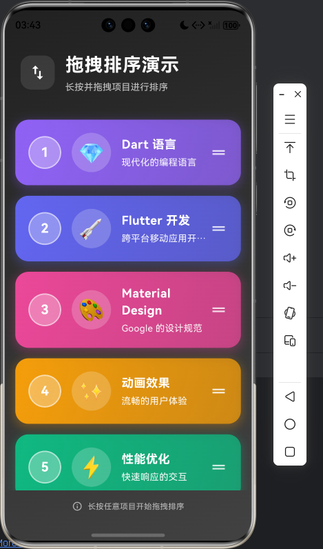
先看效果
在鸿蒙真机 上模拟器上成功运行后的效果
📋 目录
项目结构说明
应用入口
拖拽排序页面 (ReorderableListPage)
ReorderableListItem 组件
数据模型 (ListItemModel)
📁 项目结构说明
文件目录结构
lib/
├── main.dart                           # 应用入口文件
├── models/                             # 数据模型目录
│   └── list_item_model.dart          # 列表项数据模型
└── widgets/                            # 组件目录
    └── reorderable_list_item.dart     # 可拖拽排序的列表项组件
文件说明
入口文件
lib/main.dart
- 应用入口点,包含
main()函数 - 定义
MyApp类,配置应用主题(深色模式) - 定义
ReorderableListPage类,实现拖拽排序功能
组件文件
lib/widgets/reorderable_list_item.dart
ReorderableListItem组件:可拖拽排序的列表项组件- 使用
RepaintBoundary优化性能 - 显示序号、emoji 图标、标题、副标题
- 支持点击触觉反馈
- 使用
数据模型
lib/models/list_item_model.dart
ListItemModel类:列表项数据模型- 包含 id、标题、副标题、emoji、颜色值
- 提供
copyWith方法用于创建副本
组件依赖关系
main.dart
  ├── models/list_item_model.dart        (导入数据模型)
  └── widgets/reorderable_list_item.dart  (导入列表项组件)
      └── models/list_item_model.dart     (导入数据模型)
数据流向
- 数据初始化:
ReorderableListPage在initState中初始化列表数据 - 列表渲染:
ReorderableListView.builder遍历数据,创建ReorderableListItem - 拖拽操作:用户长按并拖拽列表项
- 排序更新:
onReorder回调更新列表顺序 - 触觉反馈:拖拽开始、结束和排序时提供触觉反馈
应用入口
1. main() 函数
import 'package:flutter/material.dart';
import 'package:flutter/services.dart';
import 'models/list_item_model.dart';
import 'widgets/reorderable_list_item.dart';

void main() {
  runApp(const MyApp());
}
应用入口,导入数据模型和列表项组件。
2. MyApp 类 - 主题配置
class MyApp extends StatelessWidget {
const MyApp({super.key});
Widget build(BuildContext context) {
return MaterialApp(
title: '拖拽排序演示',
debugShowCheckedModeBanner: false,
theme: ThemeData(
colorScheme: ColorScheme.fromSeed(
seedColor: Colors.deepPurple, // 紫色主题
brightness: Brightness.dark, // 深色模式
),
useMaterial3: true,
),
home: const ReorderableListPage(),
);
}
}
配置深色主题,使用紫色作为种子颜色。
拖拽排序页面 (ReorderableListPage)
1. 类定义和状态管理
class ReorderableListPage extends StatefulWidget {
const ReorderableListPage({super.key});
State<ReorderableListPage> createState() => _ReorderableListPageState();
}
class _ReorderableListPageState extends State<ReorderableListPage>
with SingleTickerProviderStateMixin {
late List<ListItemModel> _items; // 列表数据
late AnimationController _animationController; // 动画控制器
late Animation<double> _fadeAnimation; // 淡入动画
SingleTickerProviderStateMixin 提供动画控制器所需的 vsync。_items 存储列表数据,_animationController 控制淡入动画。
2. 数据初始化
void _initializeItems() {
  _items = [
    const ListItemModel(
      id: '1',
      title: 'Flutter 开发',
      subtitle: '跨平台移动应用开发框架',
      emoji: '🚀',
      colorValue: 0xFF6366F1,
    ),
    const ListItemModel(
      id: '2',
      title: 'Dart 语言',
      subtitle: '现代化的编程语言',
      emoji: '💎',
      colorValue: 0xFF8B5CF6,
    ),
    // ... 更多数据
  ];
}
初始化列表数据,每个项包含 id、标题、副标题、emoji 和颜色值。
3. 动画控制器
void initState() {
super.initState();
_initializeItems();
_animationController = AnimationController(
vsync: this,
duration: const Duration(milliseconds: 300), // 300ms 动画
);
_fadeAnimation = CurvedAnimation(
parent: _animationController,
curve: Curves.easeInOut, // 缓入缓出曲线
);
_animationController.forward(); // 启动动画
}
void dispose() {
_animationController.dispose();
super.dispose();
}
创建动画控制器和淡入动画,在 initState 中启动,在 dispose 中释放资源。
4. 拖拽回调处理
void _onReorder(int oldIndex, int newIndex) {
  setState(() {
    if (newIndex > oldIndex) {
      newIndex -= 1;  // 向下拖拽时调整索引
    }
    final item = _items.removeAt(oldIndex);  // 移除原位置
    _items.insert(newIndex, item);  // 插入新位置
    // 触觉反馈
    HapticFeedback.mediumImpact();
  });
}

void _onReorderStart(int index) {
  // 开始拖拽时的反馈
  HapticFeedback.lightImpact();
}

void _onReorderEnd(int index) {
  // 结束拖拽时的反馈
  HapticFeedback.mediumImpact();
}
_onReorder 处理排序逻辑:调整索引、移动项、提供触觉反馈。_onReorderStart 和 _onReorderEnd 在拖拽开始和结束时提供反馈。
5. 页面布局结构
Widget build(BuildContext context) {
return Scaffold(
body: Container(
decoration: BoxDecoration(
gradient: LinearGradient(
begin: Alignment.topLeft,
end: Alignment.bottomRight,
colors: [
Colors.grey[900]!,
Colors.grey[800]!,
],
),
),
child: SafeArea(
child: Column(
children: [
// 顶部标题栏
_buildHeader(),
// 列表内容
Expanded(
child: FadeTransition(
opacity: _fadeAnimation, // 淡入动画
child: ReorderableListView.builder(
padding: const EdgeInsets.symmetric(vertical: 8),
onReorder: _onReorder,
onReorderStart: _onReorderStart,
onReorderEnd: _onReorderEnd,
itemCount: _items.length,
itemBuilder: (context, index) {
return ReorderableListItem(
key: ValueKey(_items[index].id), // 使用 id 作为 key
item: _items[index],
index: index,
);
},
proxyDecorator: (child, index, animation) {
// 拖拽时的动画装饰器
// ... 见下一节
},
),
),
),
// 底部提示
_buildFooter(),
],
),
),
),
);
}
页面使用 Column 布局,顶部是标题栏,中间是可拖拽列表,底部是提示信息。FadeTransition 实现列表淡入效果。ReorderableListView.builder 构建可拖拽列表。
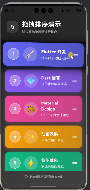
6. 拖拽动画装饰器
proxyDecorator: (child, index, animation) {
  return AnimatedBuilder(
    animation: animation,
    builder: (context, child) {
      final animValue = animation.value;
      return Transform.scale(
        scale: 1.0 + (animValue * 0.05),  // 放大 5%
        child: Transform.rotate(
          angle: animValue * 0.02,  // 轻微旋转
          child: Material(
            elevation: 8 + (animValue * 4),  // 动态阴影高度
            shadowColor: Colors.black54,
            borderRadius: BorderRadius.circular(20),
            child: Container(
              decoration: BoxDecoration(
                borderRadius: BorderRadius.circular(20),
                boxShadow: [
                  BoxShadow(
                    color: Colors.black.withOpacity(0.3 + animValue * 0.2),  // 动态阴影透明度
                    blurRadius: 20 + (animValue * 10),  // 动态模糊半径
                    spreadRadius: 5 + (animValue * 3),  // 动态扩散半径
                  ),
                ],
              ),
              child: Opacity(
                opacity: 0.9 + (animValue * 0.1),  // 动态透明度
                child: child,
              ),
            ),
          ),
        ),
      );
    },
    child: child,
  );
}
proxyDecorator 自定义拖拽时的视觉效果:缩放、旋转、动态阴影和透明度。AnimatedBuilder 监听动画值,实时更新视觉效果。
7. 头部和底部构建
Widget _buildHeader() {
  return Container(
    padding: const EdgeInsets.all(24),
    child: Column(
      children: [
        Row(
          children: [
            Container(
              padding: const EdgeInsets.all(12),
              decoration: BoxDecoration(
                color: Colors.white.withOpacity(0.1),
                borderRadius: BorderRadius.circular(16),
              ),
              child: const Icon(
                Icons.swap_vert,
                color: Colors.white,
                size: 28,
              ),
            ),
            const SizedBox(width: 16),
            const Expanded(
              child: Column(
                crossAxisAlignment: CrossAxisAlignment.start,
                children: [
                  Text(
                    '拖拽排序演示',
                    style: TextStyle(
                      color: Colors.white,
                      fontSize: 28,
                      fontWeight: FontWeight.bold,
                      letterSpacing: 1,
                    ),
                  ),
                  SizedBox(height: 4),
                  Text(
                    '长按并拖拽项目进行排序',
                    style: TextStyle(
                      color: Colors.white70,
                      fontSize: 14,
                    ),
                  ),
                ],
              ),
            ),
          ],
        ),
      ],
    ),
  );
}

Widget _buildFooter() {
  return Container(
    padding: const EdgeInsets.all(16),
    child: Row(
      mainAxisAlignment: MainAxisAlignment.center,
      children: [
        Icon(
          Icons.info_outline,
          color: Colors.white.withOpacity(0.6),
          size: 16,
        ),
        const SizedBox(width: 8),
        Text(
          '长按任意项目开始拖拽排序',
          style: TextStyle(
            color: Colors.white.withOpacity(0.6),
            fontSize: 12,
          ),
        ),
      ],
    ),
  );
}
头部显示标题和说明,底部显示操作提示。使用半透明白色文字,与深色背景形成对比。
ReorderableListItem 组件
1. 类定义和属性
class ReorderableListItem extends StatelessWidget {
  final ListItemModel item;
  final int index;

  const ReorderableListItem({
    super.key,
    required this.item,
    required this.index,
  });
列表项组件接收数据和索引,使用 StatelessWidget 实现。
2. 列表项布局
Widget build(BuildContext context) {
final color = Color(item.colorValue);
final gradientColors = [
color,
color.withOpacity(0.7), // 渐变色
];
return RepaintBoundary(
child: Container(
margin: const EdgeInsets.symmetric(horizontal: 16, vertical: 8),
decoration: BoxDecoration(
gradient: LinearGradient(
begin: Alignment.topLeft,
end: Alignment.bottomRight,
colors: gradientColors,
),
borderRadius: BorderRadius.circular(20),
boxShadow: [
BoxShadow(
color: color.withOpacity(0.3),
blurRadius: 12,
offset: const Offset(0, 4),
spreadRadius: 2,
),
],
),
child: Material(
color: Colors.transparent,
child: InkWell(
borderRadius: BorderRadius.circular(20),
onTap: () {
// 点击反馈
HapticFeedback.mediumImpact();
},
child: Padding(
padding: const EdgeInsets.all(20),
child: Row(
children: [
// 序号徽章
Container(
width: 50,
height: 50,
decoration: BoxDecoration(
color: Colors.white.withOpacity(0.3),
shape: BoxShape.circle,
border: Border.all(
color: Colors.white.withOpacity(0.5),
width: 2,
),
),
child: Center(
child: Text(
'${index + 1}',
style: const TextStyle(
color: Colors.white,
fontSize: 20,
fontWeight: FontWeight.bold,
),
),
),
),
const SizedBox(width: 16),
// Emoji 图标
Container(
width: 60,
height: 60,
decoration: BoxDecoration(
color: Colors.white.withOpacity(0.2),
shape: BoxShape.circle,
),
child: Center(
child: Text(
item.emoji,
style: const TextStyle(fontSize: 32),
),
),
),
const SizedBox(width: 16),
// 文本内容
Expanded(
child: Column(
crossAxisAlignment: CrossAxisAlignment.start,
mainAxisSize: MainAxisSize.min,
children: [
Text(
item.title,
style: const TextStyle(
color: Colors.white,
fontSize: 18,
fontWeight: FontWeight.bold,
letterSpacing: 0.5,
),
),
const SizedBox(height: 4),
Text(
item.subtitle,
style: TextStyle(
color: Colors.white.withOpacity(0.9),
fontSize: 14,
letterSpacing: 0.3,
),
maxLines: 1,
overflow: TextOverflow.ellipsis,
),
],
),
),
// 拖拽手柄图标
Icon(
Icons.drag_handle,
color: Colors.white.withOpacity(0.8),
size: 28,
),
],
),
),
),
),
),
);
}
列表项使用 RepaintBoundary 优化性能。包含:
- 渐变背景和阴影
- 序号徽章(圆形,显示索引+1)
- Emoji 图标(圆形背景)
- 标题和副标题
- 拖拽手柄图标
使用 InkWell 提供点击反馈,点击时触发触觉反馈。
数据模型 (ListItemModel)
1. ListItemModel 类
class ListItemModel {
  final String id;          // 唯一标识
  final String title;       // 标题
  final String subtitle;   // 副标题
  final String emoji;      // Emoji 图标
  final int colorValue;    // 颜色值(ARGB)

  const ListItemModel({
    required this.id,
    required this.title,
    required this.subtitle,
    required this.emoji,
    required this.colorValue,
  });

  ListItemModel copyWith({
    String? id,
    String? title,
    String? subtitle,
    String? emoji,
    int? colorValue,
  }) {
    return ListItemModel(
      id: id ?? this.id,
      title: title ?? this.title,
      subtitle: subtitle ?? this.subtitle,
      emoji: emoji ?? this.emoji,
      colorValue: colorValue ?? this.colorValue,
    );
  }
}
列表项数据模型,包含所有显示所需的信息。copyWith 方法用于创建副本并修改部分属性,常用于不可变数据更新。
使用示例
在页面中使用拖拽排序
class MyPage extends StatefulWidget {
State<MyPage> createState() => _MyPageState();
}
class _MyPageState extends State<MyPage> {
List<ListItemModel> _items = [];
void initState() {
super.initState();
_items = [
const ListItemModel(
id: '1',
title: '项目1',
subtitle: '描述1',
emoji: '📱',
colorValue: 0xFF6366F1,
),
// ... 更多数据
];
}
void _onReorder(int oldIndex, int newIndex) {
setState(() {
if (newIndex > oldIndex) {
newIndex -= 1;
}
final item = _items.removeAt(oldIndex);
_items.insert(newIndex, item);
});
}
Widget build(BuildContext context) {
return Scaffold(
appBar: AppBar(title: Text('拖拽排序')),
body: ReorderableListView.builder(
onReorder: _onReorder,
itemCount: _items.length,
itemBuilder: (context, index) {
return ReorderableListItem(
key: ValueKey(_items[index].id),
item: _items[index],
index: index,
);
},
),
);
}
}
使用步骤:
- 准备列表数据(
ListItemModel列表) - 使用
ReorderableListView.builder构建列表 - 实现
onReorder回调处理排序逻辑 - 为每个项创建
ReorderableListItem组件 - 使用
ValueKey确保列表项正确识别
欢迎加入开源鸿蒙跨平台社区: https://openharmonycrossplatform.csdn.net

开源鸿蒙跨平台开发社区汇聚开发者与厂商,共建“一次开发,多端部署”的开源生态,致力于降低跨端开发门槛,推动万物智联创新。
更多推荐
 6
6 0
0- 0


 已为社区贡献2条内容

所有评论(0)