Flutter for OpenHarmony衣橱管家App实战:天气穿搭实现
文章摘要: 本文介绍了一款衣橱管家App中天气穿搭功能的实现方案。该功能根据用户选择的天气类型(晴天、多云、雨天、雪天)和温度范围(-10°C至40°C),智能推荐适合的衣物和穿搭建议。文章详细解析了功能设计思路、页面结构布局,以及天气选择卡片、温度滑块和穿搭推荐三个核心组件的实现方法。通过颜色变化直观展示温度差异,并基于温度区间自动筛选推荐衣物,帮助用户解决日常穿搭困扰。
每天早上出门前,很多人都会纠结今天穿什么。天气热了怕穿多,天气冷了怕穿少。如果App能根据天气给出穿搭建议,那就太贴心了。
今天这篇文章,我来聊聊衣橱管家App里天气穿搭功能的实现。这个功能让用户选择天气和温度,App会给出相应的穿搭建议,并推荐适合的衣物。
功能设计思路
天气穿搭功能的核心逻辑是:根据天气类型和温度,推荐适合的衣物和穿搭建议。
天气类型包括晴天、多云、雨天、雪天等。
温度范围从零下10度到40度,覆盖一年四季。
根据温度划分季节,然后从衣橱里筛选出对应季节的衣物推荐给用户。
页面基础结构
先看WeatherOutfitScreen的定义:
import 'package:flutter/material.dart';
import 'package:provider/provider.dart';
import 'package:flutter_screenutil/flutter_screenutil.dart';
import '../../providers/wardrobe_provider.dart';
import '../../models/clothing_item.dart';
class WeatherOutfitScreen extends StatefulWidget {
const WeatherOutfitScreen({super.key});
State<WeatherOutfitScreen> createState() => _WeatherOutfitScreenState();
}
class _WeatherOutfitScreenState extends State<WeatherOutfitScreen> {
String _selectedWeather = '晴天';
int _temperature = 25;
Widget build(BuildContext context) {
return Scaffold(
appBar: AppBar(title: const Text('天气穿搭')),
body: SingleChildScrollView(
child: Column(
children: [
_buildWeatherCard(),
_buildTemperatureSlider(),
_buildRecommendations(),
],
),
),
);
}
}
用StatefulWidget是因为需要维护天气选择和温度滑块的状态。
_selectedWeather存储当前选中的天气类型,默认是晴天。
_temperature存储当前温度,默认25度,是个比较舒适的温度。
页面分三个部分:天气选择卡片、温度滑块、穿搭推荐。
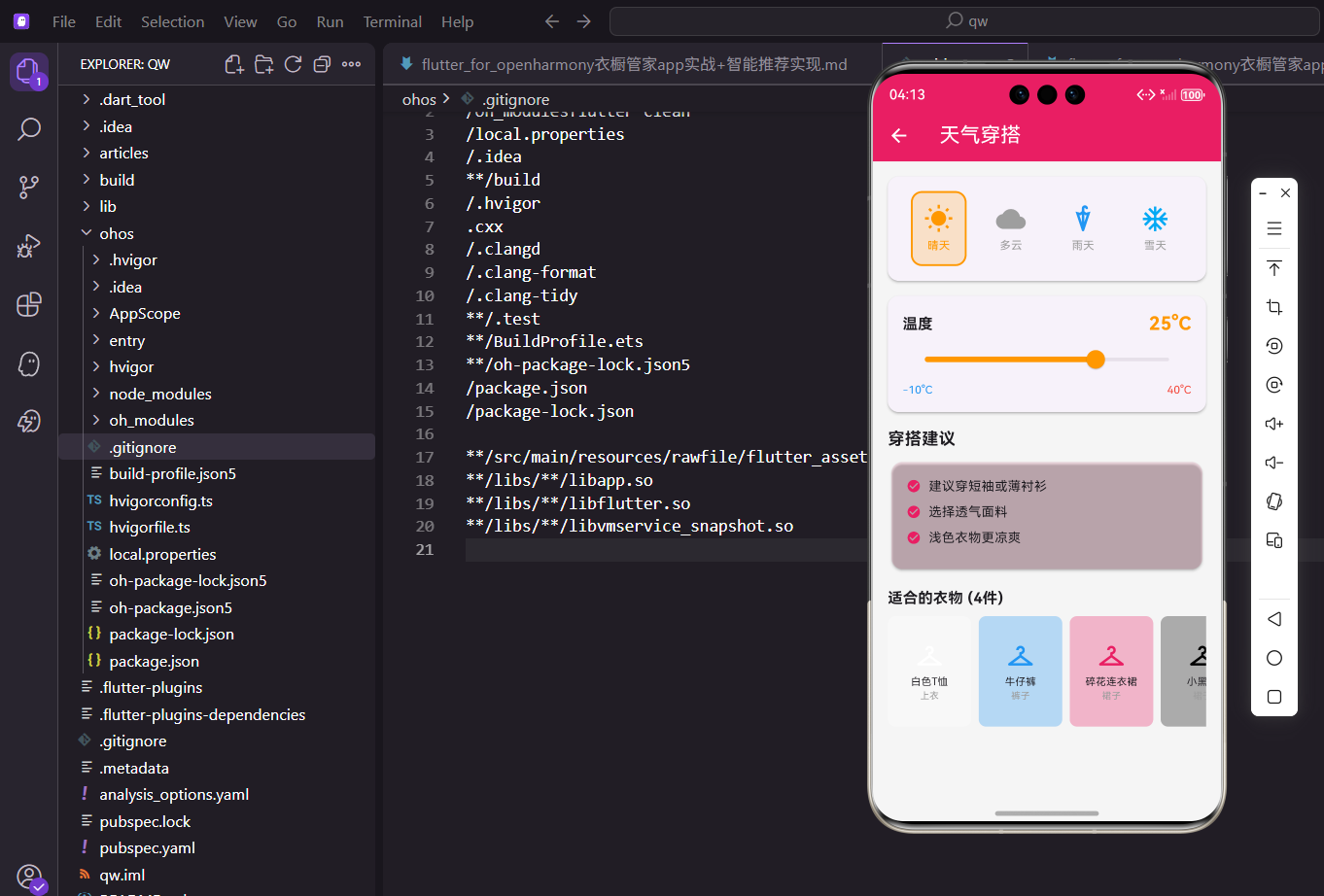
天气选择卡片
天气选择用图标按钮的形式展示:
Widget _buildWeatherCard() {
  return Card(
    margin: EdgeInsets.all(16.w),
    child: Padding(
      padding: EdgeInsets.all(16.w),
      child: Column(
        children: [
          Row(
            mainAxisAlignment: MainAxisAlignment.spaceAround,
            children: [
              _buildWeatherOption('晴天', Icons.wb_sunny, Colors.orange),
              _buildWeatherOption('多云', Icons.cloud, Colors.grey),
              _buildWeatherOption('雨天', Icons.umbrella, Colors.blue),
              _buildWeatherOption('雪天', Icons.ac_unit, Colors.lightBlue),
            ],
          ),
        ],
      ),
    ),
  );
}
四种天气类型横向排列,用Row和spaceAround实现等间距分布。
每种天气有对应的图标和颜色,晴天是橙色太阳,多云是灰色云朵,雨天是蓝色雨伞,雪天是浅蓝色雪花。
Card包裹让这个区域看起来是一个独立的模块。
天气选项的构建方法:
Widget _buildWeatherOption(String weather, IconData icon, Color color) {
  final isSelected = _selectedWeather == weather;
  return GestureDetector(
    onTap: () => setState(() => _selectedWeather = weather),
    child: Container(
      padding: EdgeInsets.all(12.w),
      decoration: BoxDecoration(
        color: isSelected ? color.withOpacity(0.2) : Colors.transparent,
        borderRadius: BorderRadius.circular(12.r),
        border: Border.all(color: isSelected ? color : Colors.transparent, width: 2),
      ),
      child: Column(
        children: [
          Icon(icon, color: color, size: 32.sp),
          SizedBox(height: 4.h),
          Text(weather, style: TextStyle(fontSize: 12.sp, color: isSelected ? color : Colors.grey)),
        ],
      ),
    ),
  );
}
isSelected判断当前选项是否被选中,选中的选项有背景色和边框。
GestureDetector包裹整个Container,点击任意位置都能触发选择。
选中时背景色是天气颜色的20%透明度,边框是天气颜色,文字也变成天气颜色。
未选中时背景透明,无边框,文字灰色。
温度滑块
温度选择用Slider实现:
Widget _buildTemperatureSlider() {
  return Card(
    margin: EdgeInsets.symmetric(horizontal: 16.w),
    child: Padding(
      padding: EdgeInsets.all(16.w),
      child: Column(
        crossAxisAlignment: CrossAxisAlignment.start,
        children: [
          Row(
            mainAxisAlignment: MainAxisAlignment.spaceBetween,
            children: [
              Text('温度', style: TextStyle(fontSize: 16.sp, fontWeight: FontWeight.bold)),
              Text('$_temperature°C', style: TextStyle(fontSize: 20.sp, fontWeight: FontWeight.bold, color: _getTemperatureColor())),
            ],
          ),
          Slider(
            value: _temperature.toDouble(),
            min: -10,
            max: 40,
            divisions: 50,
            activeColor: _getTemperatureColor(),
            onChanged: (v) => setState(() => _temperature = v.toInt()),
          ),
          Row(
            mainAxisAlignment: MainAxisAlignment.spaceBetween,
            children: [
              Text('-10°C', style: TextStyle(fontSize: 12.sp, color: Colors.blue)),
              Text('40°C', style: TextStyle(fontSize: 12.sp, color: Colors.red)),
            ],
          ),
        ],
      ),
    ),
  );
}
顶部显示"温度"标签和当前温度值,温度值的颜色根据温度高低变化。
Slider的范围是-10到40度,divisions: 50表示有50个刻度,每个刻度1度。
底部显示最小值和最大值,蓝色表示冷,红色表示热,直观易懂。
onChanged每次滑动都更新_temperature,页面实时刷新。
温度颜色的计算方法:
Color _getTemperatureColor() {
  if (_temperature < 10) return Colors.blue;
  if (_temperature < 20) return Colors.green;
  if (_temperature < 30) return Colors.orange;
  return Colors.red;
}
10度以下是蓝色,表示冷。
10到20度是绿色,表示凉爽舒适。
20到30度是橙色,表示温暖。
30度以上是红色,表示炎热。
这种颜色变化让用户对温度有更直观的感受。
穿搭推荐区域
根据温度给出穿搭建议和推荐衣物:
Widget _buildRecommendations() {
  return Consumer<WardrobeProvider>(
    builder: (context, provider, child) {
      String season;
      List<String> tips = [];

      if (_temperature < 10) {
        season = '冬季';
        tips = ['建议穿羽绒服或厚外套', '搭配保暖内衣', '可以戴围巾和手套'];
      } else if (_temperature < 20) {
        season = '春秋';
        tips = ['建议穿薄外套或卫衣', '可以叠穿搭配', '早晚温差大注意保暖'];
      } else if (_temperature < 30) {
        season = '夏季';
        tips = ['建议穿短袖或薄衬衫', '选择透气面料', '浅色衣物更凉爽'];
      } else {
        season = '夏季';
        tips = ['建议穿轻薄透气衣物', '避免深色吸热', '注意防晒'];
      }

      final clothes = provider.getClothingBySeason(season);

      return Padding(
        padding: EdgeInsets.all(16.w),
        child: Column(
          crossAxisAlignment: CrossAxisAlignment.start,
          children: [
            Text('穿搭建议', style: TextStyle(fontSize: 18.sp, fontWeight: FontWeight.bold)),
            SizedBox(height: 8.h),
            _buildTipsCard(tips),
            SizedBox(height: 16.h),
            Text('适合的衣物 (${clothes.length}件)', style: TextStyle(fontSize: 16.sp, fontWeight: FontWeight.bold)),
            SizedBox(height: 8.h),
            _buildClothingList(clothes),
          ],
        ),
      );
    },
  );
}
Consumer监听WardrobeProvider,当衣物数据变化时自动更新推荐。
根据温度判断季节:10度以下是冬季,10-20度是春秋,20度以上是夏季。
每个季节有对应的穿搭建议tips,都是实用的穿衣技巧。
调用provider.getClothingBySeason获取对应季节的衣物列表。
穿搭建议卡片:
Widget _buildTipsCard(List<String> tips) {
  return Card(
    color: const Color(0xFFE91E63).withOpacity(0.1),
    child: Padding(
      padding: EdgeInsets.all(16.w),
      child: Column(
        crossAxisAlignment: CrossAxisAlignment.start,
        children: tips.map((tip) => Padding(
          padding: EdgeInsets.only(bottom: 8.h),
          child: Row(
            children: [
              const Icon(Icons.check_circle, color: Color(0xFFE91E63), size: 16),
              SizedBox(width: 8.w),
              Expanded(child: Text(tip)),
            ],
          ),
        )).toList(),
      ),
    ),
  );
}
卡片背景用主题色的浅色版本,和页面其他元素区分开。
每条建议前面有个对勾图标,表示这是推荐的做法。
Expanded包裹Text,防止文字太长时溢出。
推荐衣物列表
用横向滚动列表展示推荐的衣物:
Widget _buildClothingList(List<ClothingItem> clothes) {
  return SizedBox(
    height: 120.h,
    child: clothes.isEmpty
        ? Center(child: Text('暂无适合的衣物', style: TextStyle(color: Colors.grey)))
        : ListView.builder(
            scrollDirection: Axis.horizontal,
            itemCount: clothes.length,
            itemBuilder: (context, index) {
              final item = clothes[index];
              return Container(
                width: 90.w,
                margin: EdgeInsets.only(right: 8.w),
                decoration: BoxDecoration(
                  color: ClothingItem.getColorFromName(item.color).withOpacity(0.3),
                  borderRadius: BorderRadius.circular(8.r),
                ),
                child: Column(
                  mainAxisAlignment: MainAxisAlignment.center,
                  children: [
                    Icon(Icons.checkroom, size: 32.sp, color: ClothingItem.getColorFromName(item.color)),
                    SizedBox(height: 4.h),
                    Text(item.name, style: TextStyle(fontSize: 11.sp), textAlign: TextAlign.center, maxLines: 2),
                    Text(item.category, style: TextStyle(fontSize: 10.sp, color: Colors.grey)),
                  ],
                ),
              );
            },
          ),
  );
}
scrollDirection: Axis.horizontal让列表横向滚动,节省纵向空间。
如果没有适合的衣物,显示"暂无适合的衣物"提示。
每件衣物用一个小卡片展示,背景色是衣物颜色的浅色版本。
卡片里显示衣物图标、名称、分类,信息简洁但足够。
季节筛选的实现
Provider里的getClothingBySeason方法:
// WardrobeProvider里的方法
List<ClothingItem> getClothingBySeason(String season) {
  return clothes.where((item) {
    if (item.season == '四季') return true;
    if (season == '春秋') {
      return item.season == '春季' || item.season == '秋季' || item.season == '春秋';
    }
    return item.season == season;
  }).toList();
}
"四季"的衣物在任何季节都会被推荐。
“春秋"季节会匹配"春季”、“秋季”、"春秋"三种标签的衣物。
其他季节直接匹配对应的季节标签。
天气对穿搭的影响
不同天气类型也会影响穿搭建议,可以进一步优化:
List<String> _getTips() {
  List<String> tips = [];

  // 根据温度的基础建议
  if (_temperature < 10) {
    tips.add('建议穿羽绒服或厚外套');
    tips.add('搭配保暖内衣');
  } else if (_temperature < 20) {
    tips.add('建议穿薄外套或卫衣');
    tips.add('可以叠穿搭配');
  } else if (_temperature < 30) {
    tips.add('建议穿短袖或薄衬衫');
    tips.add('选择透气面料');
  } else {
    tips.add('建议穿轻薄透气衣物');
    tips.add('避免深色吸热');
  }

  // 根据天气的额外建议
  switch (_selectedWeather) {
    case '雨天':
      tips.add('记得带伞,穿防水鞋');
      break;
    case '雪天':
      tips.add('注意防滑,穿厚底鞋');
      break;
    case '晴天':
      if (_temperature > 25) {
        tips.add('注意防晒,可戴帽子');
      }
      break;
  }

  return tips;
}
先根据温度给出基础建议,再根据天气类型补充额外建议。
雨天提醒带伞和穿防水鞋,雪天提醒防滑。
晴天高温时提醒防晒。
这样的建议更加全面和实用。
温度和颜色的对应关系
温度颜色的设计遵循人们的直觉:
Color _getTemperatureColor() {
  if (_temperature < 10) return Colors.blue;      // 冷 - 蓝色
  if (_temperature < 20) return Colors.green;     // 凉爽 - 绿色
  if (_temperature < 30) return Colors.orange;    // 温暖 - 橙色
  return Colors.red;                               // 炎热 - 红色
}
蓝色让人联想到冰冷,红色让人联想到火热,这是很自然的颜色联想。
绿色和橙色作为过渡色,表示舒适和温暖的温度区间。
这种颜色设计让用户不用看数字就能感知温度高低。
Slider的细节处理
Slider组件有几个重要的属性:
Slider(
  value: _temperature.toDouble(),  // 当前值,必须是double
  min: -10,                         // 最小值
  max: 40,                          // 最大值
  divisions: 50,                    // 刻度数量
  activeColor: _getTemperatureColor(),  // 已滑过部分的颜色
  onChanged: (v) => setState(() => _temperature = v.toInt()),
)
value必须是double类型,所以要用toDouble()转换。
divisions决定了滑块的精度,50个刻度意味着每个刻度1度。
activeColor是滑块左边(已滑过)部分的颜色,这里用温度颜色,很直观。
onChanged里用toInt()把double转回int,因为温度不需要小数。
用户体验的考量
天气穿搭页面的几个用户体验细节:
第一,天气选择用图标而不是文字,更直观。
第二,温度滑块实时显示当前值,用户知道自己选的是多少度。
第三,温度颜色随温度变化,增加视觉反馈。
第四,穿搭建议用对勾图标,表示这是推荐的做法。
第五,推荐衣物横向滚动,不占用太多纵向空间。
// 温度值实时显示
Text('$_temperature°C', style: TextStyle(
  fontSize: 20.sp,
  fontWeight: FontWeight.bold,
  color: _getTemperatureColor()  // 颜色随温度变化
))
温度值用大字体粗体显示,很醒目。
颜色随温度变化,用户滑动滑块时能看到颜色渐变,体验很好。
总结
天气穿搭功能的实现涉及到状态管理、条件渲染、数据筛选等多个方面。关键点在于:
根据温度划分季节,给出对应的穿搭建议。
从衣橱里筛选出适合当前季节的衣物推荐给用户。
用颜色变化增强温度的视觉反馈。
在OpenHarmony平台上,这套实现方式完全适用。如果能接入真实的天气API,自动获取当前位置的天气和温度,用户体验会更好。
欢迎加入开源鸿蒙跨平台社区:https://openharmonycrossplatform.csdn.net

开源鸿蒙跨平台开发社区汇聚开发者与厂商,共建“一次开发,多端部署”的开源生态,致力于降低跨端开发门槛,推动万物智联创新。
更多推荐

 12
12 0
0- 0


 已为社区贡献23条内容

所有评论(0)