Flutter for OpenHarmony 实战:实现下拉刷新与上拉加载更多
override// 是否正在加载// 是否还有更多数据// 当前页码// 每页数量使用管理列表状态。控制滚动,_items存储数据,_isLoading和_hasMore控制加载状态。@overrideonRefresh: onRefresh, // 刷新回调color: Colors.white, // 指示器颜色backgroundColor: Theme.of(context).color
欢迎加入开源鸿蒙跨平台社区: https://openharmonycrossplatform.csdn.net
前言
Flutter是Google开发的开源UI工具包,支持用一套代码构建iOS、Android、Web、Windows、macOS和Linux六大平台应用,实现"一次编写,多处运行"。
OpenHarmony是由开放原子开源基金会运营的分布式操作系统,为全场景智能设备提供统一底座,具有多设备支持、模块化设计、分布式能力和开源开放等特性。
Flutter for OpenHarmony技术方案使开发者能够:
- 复用Flutter现有代码(Skia渲染引擎、热重载、丰富组件库)
- 快速构建符合OpenHarmony规范的UI
- 降低多端开发成本
- 利用Dart生态插件资源加速生态建设
本文详细解析了一个完整的 Flutter 上拉加载和下拉刷新应用的开发过程并成功运行到鸿蒙的完整的分页加载应用功能,包含 RefreshIndicator 下拉刷新、ScrollController 滚动监听、加载状态管理、固定表头、入场动画等核心特性。
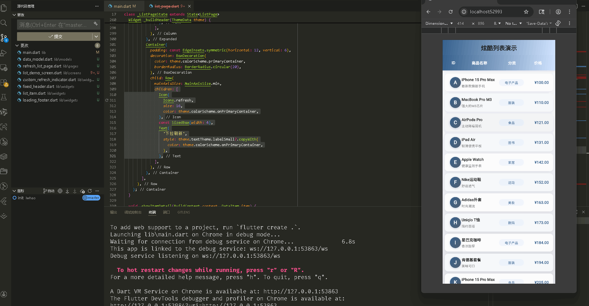
先看效果
Flutte实现的 web端实时预览 完整效果
在真机模拟器上成功运行后的效果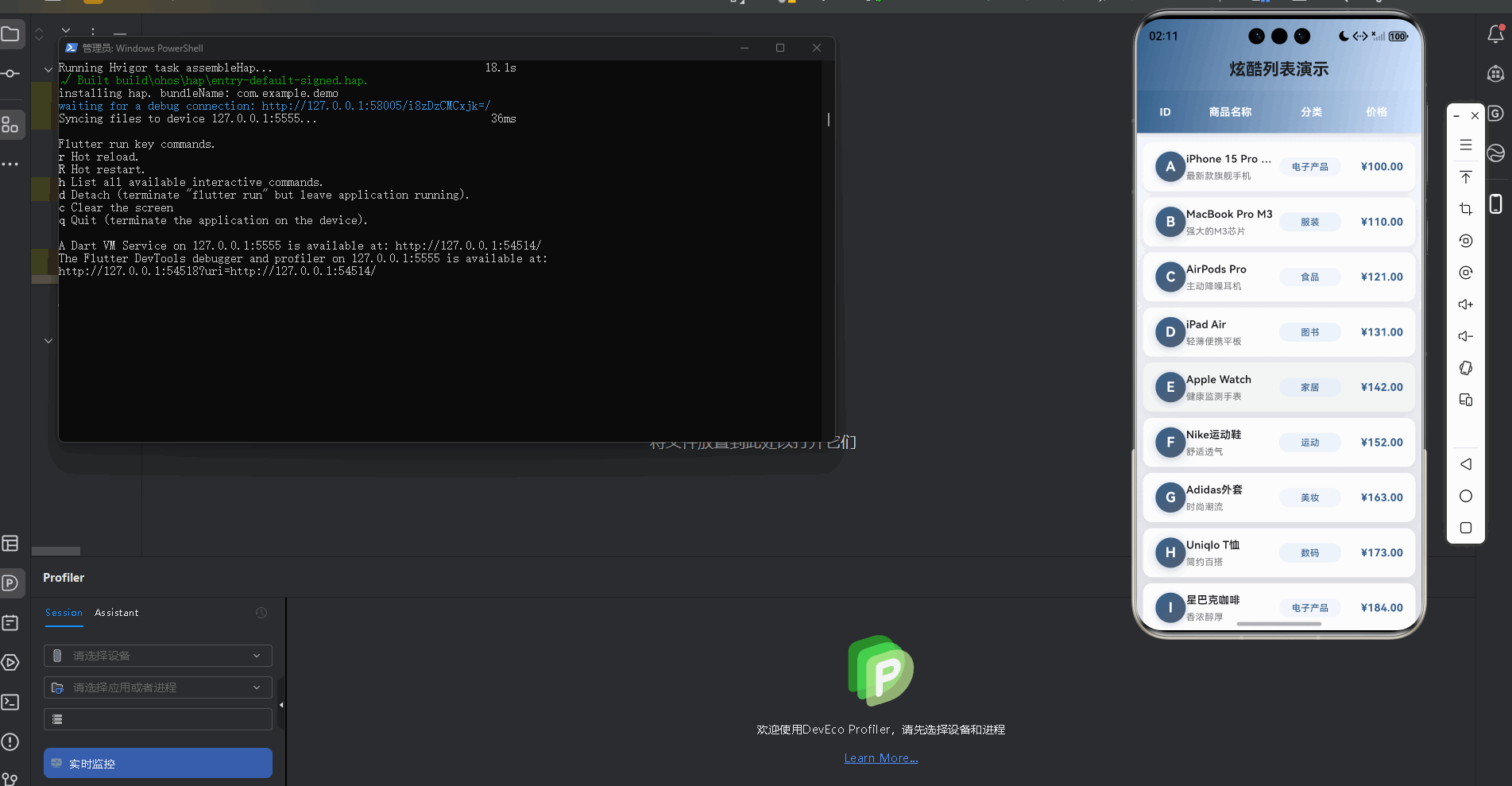
📋 目录
项目结构说明
应用入口
列表页面 (RefreshListPage)
自定义刷新指示器 (CustomRefreshIndicator)
加载底部组件 (LoadingFooter)
列表项组件 (ListItem)
固定表头组件 (FixedHeader)
数据模型 (DataItem)
📁 项目结构说明
文件目录结构
lib/
├── main.dart                    # 应用入口文件
├── models/                      # 数据模型目录
│   └── data_model.dart         # 数据项模型
├── pages/                       # 页面目录
│   └── refresh_list_page.dart  # 上拉加载下拉刷新页面
└── widgets/                     # 组件目录
    ├── custom_refresh_indicator.dart  # 自定义刷新指示器
    ├── loading_footer.dart           # 加载底部组件
    ├── list_item.dart                # 列表项组件
    └── fixed_header.dart             # 固定表头组件
文件说明
入口文件
lib/main.dart
- 应用入口点,包含
main()函数 - 定义
MyApp类,配置应用主题(浅色/深色) - 设置应用标题为"高性能长列表演示"
数据模型
lib/models/data_model.dart
DataItem类:列表项数据模型- 包含 id、title、subtitle、category、price、avatar
- 提供
generateItems()静态方法生成模拟数据
页面文件
lib/pages/refresh_list_page.dart
RefreshListPage类:上拉加载下拉刷新页面- 管理列表数据和分页状态
- 实现下拉刷新和上拉加载更多逻辑
- 使用
ScrollController监听滚动
组件文件
lib/widgets/custom_refresh_indicator.dart
CustomRefreshIndicator组件:自定义刷新指示器- 封装
RefreshIndicator,配置样式
- 封装
CoolRefreshIndicator组件:炫酷刷新指示器(可选)- 自定义刷新动画效果
lib/widgets/loading_footer.dart
LoadingFooter组件:加载底部组件- 显示加载中状态
- 显示"没有更多数据"提示
lib/widgets/list_item.dart
ListItem组件:列表项组件- 实现入场动画效果
- 显示商品信息(ID、名称、分类、价格)
lib/widgets/fixed_header.dart
FixedHeader组件:固定表头组件- 显示表头列(ID、商品名称、分类、价格)
- 使用渐变背景
组件依赖关系
main.dart
  └── pages/refresh_list_page.dart
      ├── models/data_model.dart
      ├── widgets/custom_refresh_indicator.dart
      ├── widgets/loading_footer.dart
      ├── widgets/list_item.dart
      └── widgets/fixed_header.dart
数据流向
- 初始化:页面初始化时加载第一页数据
- 下拉刷新:用户下拉触发
_onRefresh(),重置页码并重新加载 - 滚动监听:滚动到底部附近时触发
_onScroll(),加载更多数据 - 数据加载:
_loadMoreData()模拟网络请求,添加新数据到列表 - 状态更新:更新
_isLoading和_hasMore状态,控制 UI 显示
应用入口
1. main() 函数
import 'package:flutter/material.dart';

import 'screens/list_demo_screen.dart';

void main() {
  runApp(const MyApp());
}
应用入口,导入列表演示页面。
2. MyApp 类 - 主题配置
class MyApp extends StatelessWidget {
const MyApp({super.key});
Widget build(BuildContext context) {
return MaterialApp(
title: '高性能长列表演示',
debugShowCheckedModeBanner: false,
theme: ThemeData(
colorScheme: ColorScheme.fromSeed(
seedColor: const Color(0xFF6750A4),
brightness: Brightness.light,
primary: const Color(0xFF6750A4),
secondary: const Color(0xFF625B71),
tertiary: const Color(0xFF7D5260),
),
useMaterial3: true,
fontFamily: 'Roboto',
appBarTheme: const AppBarTheme(
centerTitle: true,
elevation: 0,
),
cardTheme: CardTheme(
elevation: 2,
shape: RoundedRectangleBorder(
borderRadius: BorderRadius.circular(16),
),
),
),
darkTheme: ThemeData(
colorScheme: ColorScheme.fromSeed(
seedColor: const Color(0xFFD0BCFF),
brightness: Brightness.dark,
),
useMaterial3: true,
),
themeMode: ThemeMode.light,
home: const ListDemoScreen(),
);
}
}
配置浅色和深色主题,使用 Material 3 设计。
列表页面 (RefreshListPage)
1. 类定义和状态管理
class RefreshListPage extends StatefulWidget {
const RefreshListPage({super.key});
State<RefreshListPage> createState() => _RefreshListPageState();
}
class _RefreshListPageState extends State<RefreshListPage> {
final ScrollController _scrollController = ScrollController();
final List<DataItem> _items = [];
bool _isLoading = false; // 是否正在加载
bool _hasMore = true; // 是否还有更多数据
int _currentPage = 0; // 当前页码
static const int _pageSize = 20; // 每页数量
使用 StatefulWidget 管理列表状态。_scrollController 控制滚动,_items 存储数据,_isLoading 和 _hasMore 控制加载状态。
2. 滚动监听
void initState() {
super.initState();
_loadMoreData(); // 初始化时加载第一页
_scrollController.addListener(_onScroll); // 添加滚动监听
}
void dispose() {
_scrollController.dispose();
super.dispose();
}
/// 滚动监听,实现上拉加载更多
void _onScroll() {
if (_scrollController.position.pixels >=
_scrollController.position.maxScrollExtent - 200 && // 距离底部 200px
!_isLoading && // 不在加载中
_hasMore) { // 还有更多数据
_loadMoreData();
}
}
监听滚动位置,当距离底部 200px 时触发加载更多。检查 _isLoading 和 _hasMore 避免重复加载。
3. 下拉刷新
/// 下拉刷新
Future<void> _onRefresh() async {
  setState(() {
    _currentPage = 0;    // 重置页码
    _hasMore = true;     // 重置加载状态
  });
  await Future.delayed(const Duration(milliseconds: 800));  // 模拟网络延迟
  _items.clear();        // 清空列表
  _loadMoreData();       // 重新加载第一页
}
下拉刷新时重置页码和状态,清空列表并重新加载第一页数据。
4. 上拉加载更多
/// 加载更多数据
Future<void> _loadMoreData() async {
  if (_isLoading) return;  // 防止重复加载

  setState(() {
    _isLoading = true;  // 设置加载状态
  });

  // 模拟网络请求延迟
  await Future.delayed(const Duration(milliseconds: 500));

  final newItems = DataItem.generateItems(
    _pageSize,
    startId: _currentPage * _pageSize,  // 计算起始 ID
  );

  setState(() {
    _items.addAll(newItems);  // 添加新数据
    _currentPage++;           // 页码加 1
    _isLoading = false;       // 取消加载状态
    // 模拟数据加载完毕(实际项目中应该根据API返回判断)
    if (_items.length >= 100) {
      _hasMore = false;  // 没有更多数据
    }
  });
}
加载更多时设置加载状态,模拟网络请求,添加新数据到列表,更新页码和状态。
5. 页面布局
Widget build(BuildContext context) {
return Scaffold(
appBar: AppBar(
title: const Text(
'炫酷列表演示',
style: TextStyle(fontWeight: FontWeight.bold),
),
centerTitle: true,
elevation: 0,
flexibleSpace: Container(
decoration: BoxDecoration(
gradient: LinearGradient(
colors: [
Theme.of(context).colorScheme.primary,
Theme.of(context).colorScheme.primaryContainer,
],
begin: Alignment.topLeft,
end: Alignment.bottomRight,
),
),
),
),
body: Container(
decoration: BoxDecoration(
gradient: LinearGradient(
begin: Alignment.topCenter,
end: Alignment.bottomCenter,
colors: [
Theme.of(context).colorScheme.surface,
Theme.of(context).colorScheme.surfaceContainerHighest,
],
),
),
child: Column(
children: [
// 固定表头
const FixedHeader(),
// 列表内容
Expanded(
child: CustomRefreshIndicator(
onRefresh: _onRefresh, // 下拉刷新回调
child: ListView.builder(
controller: _scrollController, // 滚动控制器
padding: const EdgeInsets.symmetric(vertical: 8),
itemCount: _items.length + 1, // +1 for footer
cacheExtent: 500, // 预加载范围,提升滚动性能
itemBuilder: (context, index) {
if (index == _items.length) {
// 最后一项显示加载底部
return LoadingFooter(
isLoading: _isLoading,
hasMore: _hasMore,
);
}
return ListItem(
key: ValueKey(_items[index].id), // 使用key优化重建
item: _items[index],
index: index,
);
},
),
),
),
],
),
),
);
}
页面包含 AppBar、固定表头和列表。CustomRefreshIndicator 包裹 ListView.builder 实现下拉刷新。itemCount 加 1 用于显示加载底部。cacheExtent 设置预加载范围。
自定义刷新指示器 (CustomRefreshIndicator)
1. 组件定义
class CustomRefreshIndicator extends StatelessWidget {
final Widget child;
final Future<void> Function() onRefresh;
const CustomRefreshIndicator({
super.key,
required this.child,
required this.onRefresh,
});
Widget build(BuildContext context) {
return RefreshIndicator(
onRefresh: onRefresh, // 刷新回调
color: Colors.white, // 指示器颜色
backgroundColor: Theme.of(context).colorScheme.primary, // 背景色
strokeWidth: 3.0, // 线条宽度
displacement: 60, // 距离顶部的距离
child: child,
);
}
}
封装 RefreshIndicator,配置颜色、宽度和位置。
2. 刷新配置
RefreshIndicator(
  onRefresh: onRefresh,  // 必须返回 Future<void>
  color: Colors.white,   // 刷新指示器的颜色
  backgroundColor: Theme.of(context).colorScheme.primary,  // 背景颜色
  strokeWidth: 3.0,      // 圆形进度条的线条宽度
  displacement: 60,      // 指示器距离顶部的距离(像素)
  child: child,          // 可滚动的子组件
)
onRefresh 必须返回 Future<void>,完成后指示器自动隐藏。displacement 控制指示器位置。
加载底部组件 (LoadingFooter)
1. 组件定义
class LoadingFooter extends StatelessWidget {
  final bool isLoading;
  final bool hasMore;
  final String? message;

  const LoadingFooter({
    super.key,
    required this.isLoading,
    required this.hasMore,
    this.message,
  });
接收加载状态和是否还有更多数据。
2. 状态显示
Widget build(BuildContext context) {
if (!hasMore && !isLoading) {
// 没有更多数据
return Container(
padding: const EdgeInsets.all(16),
child: Center(
child: Text(
message ?? '没有更多数据了',
style: TextStyle(
color: Colors.grey.shade600,
fontSize: 14,
),
),
),
);
}
if (isLoading) {
// 正在加载
return Container(
padding: const EdgeInsets.all(16),
child: Center(
child: Row(
mainAxisAlignment: MainAxisAlignment.center,
children: [
SizedBox(
width: 20,
height: 20,
child: CircularProgressIndicator(
strokeWidth: 2,
valueColor: AlwaysStoppedAnimation<Color>(
Theme.of(context).colorScheme.primary,
),
),
),
const SizedBox(width: 12),
Text(
'加载中...',
style: TextStyle(
color: Colors.grey.shade600,
fontSize: 14,
),
),
],
),
),
);
}
return const SizedBox.shrink(); // 隐藏
}
根据 isLoading 和 hasMore 显示不同状态:加载中显示进度条,没有更多数据显示提示文字。
列表项组件 (ListItem)
1. 类定义和动画
class ListItem extends StatefulWidget {
final DataItem item;
final int index;
const ListItem({
super.key,
required this.item,
required this.index,
});
State<ListItem> createState() => _ListItemState();
}
class _ListItemState extends State<ListItem>
with SingleTickerProviderStateMixin {
late AnimationController _controller;
late Animation<double> _animation;
void initState() {
super.initState();
_controller = AnimationController(
vsync: this,
duration: const Duration(milliseconds: 500),
);
_animation = CurvedAnimation(
parent: _controller,
curve: Curves.easeOutCubic, // 缓出曲线
);
// 延迟显示动画,创建交错效果
Future.delayed(Duration(milliseconds: widget.index * 30), () {
if (mounted) {
_controller.forward();
}
});
}
void dispose() {
_controller.dispose();
super.dispose();
}
使用 SingleTickerProviderStateMixin 提供动画控制器。根据索引延迟启动动画,实现交错效果。
2. 入场动画
Widget build(BuildContext context) {
return RepaintBoundary(
child: FadeTransition(
opacity: _animation, // 淡入动画
child: SlideTransition(
position: Tween<Offset>(
begin: const Offset(0.3, 0), // 从右侧滑入
end: Offset.zero,
).animate(_animation),
child: Container(
// ... 列表项内容
),
),
),
);
}
RepaintBoundary 隔离重绘。FadeTransition 和 SlideTransition 实现淡入和滑入动画。
3. 列表项布局
Container(
  margin: const EdgeInsets.symmetric(horizontal: 8, vertical: 4),
  decoration: BoxDecoration(
    color: widget.index % 2 == 0
        ? Colors.white
        : Colors.grey.shade50,  // 交替背景色
    borderRadius: BorderRadius.circular(12),
    boxShadow: [
      BoxShadow(
        color: Colors.black.withValues(alpha: 0.05),
        blurRadius: 8,
        offset: const Offset(0, 2),
      ),
    ],
  ),
  child: Material(
    color: Colors.transparent,
    child: InkWell(
      onTap: () {
        // 点击反馈动画
        _controller.reset();
        _controller.forward();
      },
      borderRadius: BorderRadius.circular(12),
      child: Padding(
        padding: const EdgeInsets.symmetric(vertical: 12, horizontal: 16),
        child: Row(
          children: [
            // ID列
            Expanded(
              flex: 1,
              child: _buildAvatar(),  // 头像
            ),
            // 商品名称列
            Expanded(
              flex: 3,
              child: Column(
                crossAxisAlignment: CrossAxisAlignment.start,
                children: [
                  Text(
                    widget.item.title,
                    style: const TextStyle(
                      fontSize: 14,
                      fontWeight: FontWeight.w600,
                    ),
                    maxLines: 1,
                    overflow: TextOverflow.ellipsis,
                  ),
                  const SizedBox(height: 4),
                  Text(
                    widget.item.subtitle,
                    style: TextStyle(
                      fontSize: 12,
                      color: Colors.grey.shade600,
                    ),
                    maxLines: 1,
                    overflow: TextOverflow.ellipsis,
                  ),
                ],
              ),
            ),
            // 分类列
            Expanded(
              flex: 2,
              child: _buildCategoryChip(),  // 分类标签
            ),
            // 价格列
            Expanded(
              flex: 2,
              child: _buildPrice(),  // 价格
            ),
          ],
        ),
      ),
    ),
  ),
)
使用 Row 布局,Expanded 按比例分配空间。交替背景色区分行。点击时触发动画反馈。
固定表头组件 (FixedHeader)
1. 组件定义
class FixedHeader extends StatelessWidget {
const FixedHeader({super.key});
Widget build(BuildContext context) {
return Container(
height: 56,
decoration: BoxDecoration(
gradient: LinearGradient(
colors: [
Theme.of(context).colorScheme.primary,
Theme.of(context).colorScheme.primaryContainer,
],
begin: Alignment.topLeft,
end: Alignment.bottomRight,
),
boxShadow: [
BoxShadow(
color: Colors.black.withValues(alpha: 0.1),
blurRadius: 8,
offset: const Offset(0, 2),
),
],
),
固定高度 56,使用渐变背景和阴影。
2. 表头布局
child: Row(
  children: [
    const SizedBox(width: 16),
    _buildHeaderCell('ID', flex: 1),
    _buildHeaderCell('商品名称', flex: 3),
    _buildHeaderCell('分类', flex: 2),
    _buildHeaderCell('价格', flex: 2),
    const SizedBox(width: 16),
  ],
),
使用 Row 布局,flex 比例与列表项一致。
数据模型 (DataItem)
1. 类定义
class DataItem {
  final int id;
  final String title;
  final String subtitle;
  final String category;
  final double price;
  final String avatar;

  DataItem({
    required this.id,
    required this.title,
    required this.subtitle,
    required this.category,
    required this.price,
    required this.avatar,
  });
数据模型包含列表项的所有信息。
2. 数据生成
static List<DataItem> generateItems(int count, {int startId = 0}) {
  final categories = ['电子产品', '服装', '食品', '图书', '家居', '运动', '美妆', '数码'];
  final titles = [
    'iPhone 15 Pro Max',
    'MacBook Pro M3',
    // ... 更多标题
  ];
  final subtitles = [
    '最新款旗舰手机',
    '强大的M3芯片',
    // ... 更多副标题
  ];

  return List.generate(count, (index) {
    final id = startId + index;
    return DataItem(
      id: id,
      title: titles[id % titles.length],  // 循环使用标题
      subtitle: subtitles[id % subtitles.length],
      category: categories[id % categories.length],
      price: (99.99 + (id * 10.5)).roundToDouble(),  // 计算价格
      avatar: String.fromCharCode(65 + (id % 26)),    // A-Z 字母
    );
  });
}
使用 List.generate 生成指定数量的数据。通过取模运算循环使用预设数据。startId 用于分页加载。
使用示例
创建上拉加载下拉刷新列表
class MyRefreshListPage extends StatefulWidget {
State<MyRefreshListPage> createState() => _MyRefreshListPageState();
}
class _MyRefreshListPageState extends State<MyRefreshListPage> {
final ScrollController _scrollController = ScrollController();
final List<MyItem> _items = [];
bool _isLoading = false;
bool _hasMore = true;
int _currentPage = 0;
static const int _pageSize = 20;
void initState() {
super.initState();
_loadMoreData();
_scrollController.addListener(_onScroll);
}
void dispose() {
_scrollController.dispose();
super.dispose();
}
void _onScroll() {
if (_scrollController.position.pixels >=
_scrollController.position.maxScrollExtent - 200 &&
!_isLoading &&
_hasMore) {
_loadMoreData();
}
}
Future<void> _onRefresh() async {
setState(() {
_currentPage = 0;
_hasMore = true;
});
await Future.delayed(const Duration(milliseconds: 800));
_items.clear();
_loadMoreData();
}
Future<void> _loadMoreData() async {
if (_isLoading) return;
setState(() {
_isLoading = true;
});
// 实际项目中这里应该是网络请求
await Future.delayed(const Duration(milliseconds: 500));
final newItems = await fetchData(_currentPage, _pageSize);
setState(() {
_items.addAll(newItems);
_currentPage++;
_isLoading = false;
_hasMore = newItems.length == _pageSize; // 根据返回数据判断
});
}
Widget build(BuildContext context) {
return Scaffold(
body: RefreshIndicator(
onRefresh: _onRefresh,
child: ListView.builder(
controller: _scrollController,
itemCount: _items.length + 1,
itemBuilder: (context, index) {
if (index == _items.length) {
return LoadingFooter(
isLoading: _isLoading,
hasMore: _hasMore,
);
}
return MyListItem(item: _items[index]);
},
),
),
);
}
}
关键点:
- 使用
ScrollController监听滚动 - 距离底部一定距离时触发加载更多
RefreshIndicator实现下拉刷新- 管理
_isLoading和_hasMore状态 itemCount加 1 用于显示加载底部
欢迎加入开源鸿蒙跨平台社区: https://openharmonycrossplatform.csdn.net

开源鸿蒙跨平台开发社区汇聚开发者与厂商,共建“一次开发,多端部署”的开源生态,致力于降低跨端开发门槛,推动万物智联创新。
更多推荐
 21
21 0
0- 0


 已为社区贡献28条内容

所有评论(0)