flutter_for_openharmony手语学习app实战+学习中心实现
本文介绍了学习中心页面的实现方法,包含四个核心功能区域: 学习路径展示区:采用渐变背景和步骤指示器,清晰展示学习进度 分类网格导航:使用Grid布局展示8个分类入口,每个分类包含图标和课程数量 最近学习列表:横向滚动展示最近学习的课程卡片 全部课程区域:支持筛选和分页加载 页面采用SingleChildScrollView实现整体滚动,各部分通过间距和标题清晰分隔。关键UI组件包括: 路径步骤指示

学习中心是应用的核心页面,汇集了学习路径、分类导航、最近学习和全部课程。本文介绍如何实现一个功能完善的学习中心,包括学习路径展示、分类网格、横向滚动列表和筛选功能。
页面基础结构
定义学习中心页面:
class LearnScreen extends StatelessWidget {
const LearnScreen({super.key});
Widget build(BuildContext context) {
return Scaffold(
appBar: AppBar(
title: const Text('学习中心'),
actions: [
IconButton(
icon: const Icon(Icons.filter_list),
onPressed: () => _showFilterDialog(context),
),
],
),
使用StatelessWidget构建页面,AppBar右侧放置筛选按钮,点击弹出筛选对话框。这种快捷入口设计让用户可以快速筛选课程。
页面布局
构建整体的滚动布局:
      body: SingleChildScrollView(
        child: Column(
          crossAxisAlignment: CrossAxisAlignment.start,
          children: [
            _buildLearningPath(context),
            _buildCategoryGrid(context),
            _buildRecentLessons(context),
            _buildAllLessons(context),
          ],
        ),
      ),
    );
  }
用SingleChildScrollView包裹,内容可以滚动。Column纵向排列四个区域:学习路径、分类网格、最近学习和全部课程。crossAxisAlignment.start让内容左对齐。这种分区设计让学习中心功能丰富且层次清晰。
学习路径卡片
构建顶部的学习路径展示:
  Widget _buildLearningPath(BuildContext context) {
    return Container(
      margin: EdgeInsets.all(16.w),
      padding: EdgeInsets.all(16.w),
      decoration: BoxDecoration(
        gradient: const LinearGradient(
          colors: [Color(0xFF00897B), Color(0xFF4DB6AC)],
        ),
        borderRadius: BorderRadius.circular(16.r),
      ),
      child: Column(
        crossAxisAlignment: CrossAxisAlignment.start,
        children: [
          Text(
            '学习路径',
            style: TextStyle(
              fontSize: 18.sp,
              fontWeight: FontWeight.bold,
              color: Colors.white,
            ),
          ),
          SizedBox(height: 8.h),
          Text(
            '按照推荐路径学习,循序渐进掌握手语',
            style: TextStyle(fontSize: 13.sp, color: Colors.white70),
          ),
          SizedBox(height: 16.h),
用渐变色背景和圆角装饰容器,标题和说明文字用白色显示。渐变色从深到浅,营造立体感。这种设计让学习路径成为页面的视觉焦点,引导用户按路径学习。
路径步骤
显示学习路径的各个阶段:
          Row(
            children: [
              _buildPathStep('基础', true, true),
              _buildPathLine(true),
              _buildPathStep('进阶', true, false),
              _buildPathLine(false),
              _buildPathStep('高级', false, false),
              _buildPathLine(false),
              _buildPathStep('精通', false, false),
            ],
          ),
          SizedBox(height: 16.h),
用Row横向排列4个步骤和3条连接线,步骤和连线交替出现。第一个参数是标签,第二个参数是是否完成,第三个参数是是否当前。这种路径可视化让用户清楚学习进度。
继续学习按钮
底部的操作按钮:
          SizedBox(
            width: double.infinity,
            child: ElevatedButton(
              onPressed: () {},
              style: ElevatedButton.styleFrom(
                backgroundColor: Colors.white,
                foregroundColor: const Color(0xFF00897B),
              ),
              child: const Text('继续学习'),
            ),
          ),
        ],
      ),
    );
  }
按钮用白色背景和主题色文字,与渐变背景形成对比。width: double.infinity让按钮占满宽度。这种反色设计让按钮在渐变背景上更醒目。
路径步骤构建
封装步骤的构建逻辑:
  Widget _buildPathStep(String label, bool isCompleted, bool isCurrent) {
    return Column(
      children: [
        Container(
          width: 32.w,
          height: 32.w,
          decoration: BoxDecoration(
            color: isCompleted ? Colors.white : Colors.white.withOpacity(0.3),
            shape: BoxShape.circle,
            border: isCurrent ? Border.all(color: Colors.amber, width: 3) : null,
          ),
          child: Icon(
            isCompleted ? Icons.check : Icons.lock,
            color: isCompleted ? const Color(0xFF00897B) : Colors.white,
            size: 18.sp,
          ),
        ),
        SizedBox(height: 4.h),
        Text(
          label,
          style: TextStyle(fontSize: 10.sp, color: Colors.white),
        ),
      ],
    );
  }
步骤用圆形容器包裹,已完成显示白色背景和对勾图标,未完成显示半透明背景和锁图标。当前步骤用金色边框突出。这种状态驱动的UI让学习进度一目了然。
路径连接线
构建步骤之间的连接线:
  Widget _buildPathLine(bool isCompleted) {
    return Expanded(
      child: Container(
        height: 2.h,
        margin: EdgeInsets.only(bottom: 16.h),
        color: isCompleted ? Colors.white : Colors.white.withOpacity(0.3),
      ),
    );
  }
连接线用Expanded占据剩余空间,已完成显示白色,未完成显示半透明白色。margin向下偏移让连接线与步骤圆圈对齐。这种连接线设计形成完整的路径图。
分类网格
构建学习分类导航:
  Widget _buildCategoryGrid(BuildContext context) {
    final categories = [
      {'name': '基础问候', 'icon': Icons.waving_hand, 'count': 15},
      {'name': '数字手语', 'icon': Icons.looks_one, 'count': 20},
      {'name': '日常用语', 'icon': Icons.chat, 'count': 30},
      {'name': '情感表达', 'icon': Icons.favorite, 'count': 25},
      {'name': '家庭成员', 'icon': Icons.family_restroom, 'count': 12},
      {'name': '时间日期', 'icon': Icons.calendar_today, 'count': 18},
      {'name': '颜色形状', 'icon': Icons.palette, 'count': 16},
      {'name': '紧急求助', 'icon': Icons.warning, 'count': 10},
    ];
定义8个分类,每个包含名称、图标和课程数量。图标语义化,挥手代表问候,数字1代表数字,对话气泡代表日常用语。这种数据驱动的方式便于添加或删除分类。
分类标题行
显示标题和查看全部按钮:
    return Padding(
      padding: EdgeInsets.symmetric(horizontal: 16.w),
      child: Column(
        crossAxisAlignment: CrossAxisAlignment.start,
        children: [
          Row(
            mainAxisAlignment: MainAxisAlignment.spaceBetween,
            children: [
              Text(
                '学习分类',
                style: TextStyle(fontSize: 18.sp, fontWeight: FontWeight.bold),
              ),
              TextButton(
                onPressed: () => Navigator.push(
                  context,
                  MaterialPageRoute(builder: (_) => const CategoryScreen()),
                ),
                child: const Text('全部'),
              ),
            ],
          ),
          SizedBox(height: 8.h),
标题和按钮用Row横向排列,mainAxisAlignment.spaceBetween让它们分布在两端。"全部"按钮跳转到分类列表页。这种标题+操作的布局是常见设计模式。
分类网格布局
使用GridView显示分类:
          GridView.builder(
            shrinkWrap: true,
            physics: const NeverScrollableScrollPhysics(),
            gridDelegate: SliverGridDelegateWithFixedCrossAxisCount(
              crossAxisCount: 4,
              crossAxisSpacing: 8.w,
              mainAxisSpacing: 8.h,
              childAspectRatio: 0.85,
            ),
            itemCount: categories.length,
            itemBuilder: (context, index) {
              final category = categories[index];
GridView.builder创建网格布局,crossAxisCount: 4表示每行4列。shrinkWrap: true让GridView高度自适应,NeverScrollableScrollPhysics禁用滚动。这种嵌套滚动的处理让整个页面统一滚动。
分类项
构建单个分类项:
              return GestureDetector(
                onTap: () => Navigator.push(
                  context,
                  MaterialPageRoute(
                    builder: (_) => LessonListScreen(category: category['name'] as String),
                  ),
                ),
                child: Column(
                  children: [
                    Container(
                      width: 50.w,
                      height: 50.w,
                      decoration: BoxDecoration(
                        color: const Color(0xFF00897B).withOpacity(0.1),
                        borderRadius: BorderRadius.circular(12.r),
                      ),
                      child: Icon(
                        category['icon'] as IconData,
                        color: const Color(0xFF00897B),
                        size: 24.sp,
                      ),
                    ),
                    SizedBox(height: 4.h),
                    Text(
                      category['name'] as String,
                      style: TextStyle(fontSize: 11.sp),
                      textAlign: TextAlign.center,
                      maxLines: 1,
                      overflow: TextOverflow.ellipsis,
                    ),
                  ],
                ),
              );
            },
          ),
        ],
      ),
    );
  }
用GestureDetector处理点击,点击跳转到课程列表页。图标用主题色半透明背景的圆角方块包裹,下方显示分类名称。maxLines: 1和overflow: TextOverflow.ellipsis防止文字过长。这种图标+文字的设计清晰易懂。
最近学习
构建横向滚动的最近学习列表:
  Widget _buildRecentLessons(BuildContext context) {
    return Padding(
      padding: EdgeInsets.all(16.w),
      child: Column(
        crossAxisAlignment: CrossAxisAlignment.start,
        children: [
          Text(
            '最近学习',
            style: TextStyle(fontSize: 18.sp, fontWeight: FontWeight.bold),
          ),
          SizedBox(height: 12.h),
          SizedBox(
            height: 100.h,
            child: ListView.builder(
              scrollDirection: Axis.horizontal,
              itemCount: 5,
              itemBuilder: (context, index) {
                final lessons = ['你好', '谢谢', '数字1-5', '我爱你', '帮助'];
标题用粗体显示,下方用ListView.builder构建横向滚动列表。scrollDirection: Axis.horizontal设置横向滚动,height: 100.h固定高度。这种横向列表节省垂直空间,适合展示最近项目。
最近学习卡片
构建单个最近学习项:
                return Container(
                  width: 140.w,
                  margin: EdgeInsets.only(right: 12.w),
                  child: Card(
                    child: InkWell(
                      onTap: () => Navigator.push(
                        context,
                        MaterialPageRoute(builder: (_) => LessonDetailScreen(lessonId: 'basic_$index')),
                      ),
                      borderRadius: BorderRadius.circular(12.r),
                      child: Padding(
                        padding: EdgeInsets.all(12.w),
                        child: Column(
                          crossAxisAlignment: CrossAxisAlignment.start,
                          children: [
                            Icon(Icons.sign_language, color: const Color(0xFF00897B)),
                            const Spacer(),
                            Text(
                              lessons[index],
                              style: TextStyle(fontWeight: FontWeight.bold, fontSize: 14.sp),
                            ),
                            Text(
                              '进度: ${(index + 1) * 20}%',
                              style: TextStyle(fontSize: 11.sp, color: Colors.grey),
                            ),
                          ],
                        ),
                      ),
                    ),
                  ),
                );
              },
            ),
          ),
        ],
      ),
    );
  }
卡片固定宽度140.w,用Card和InkWell包裹。顶部显示图标,底部显示课程名称和进度。Spacer让图标和文字分布在上下两端。这种卡片设计紧凑且信息完整。
全部课程
构建全部课程列表:
  Widget _buildAllLessons(BuildContext context) {
    final learningProvider = Provider.of<LearningProvider>(context);

    return Padding(
      padding: EdgeInsets.symmetric(horizontal: 16.w),
      child: Column(
        crossAxisAlignment: CrossAxisAlignment.start,
        children: [
          Text(
            '全部课程',
            style: TextStyle(fontSize: 18.sp, fontWeight: FontWeight.bold),
          ),
          SizedBox(height: 12.h),
从Provider获取课程数据,标题用粗体显示。这个区域展示所有可用课程,让用户可以浏览和选择感兴趣的内容。
课程列表项
使用map生成课程项:
          ...learningProvider.lessons.map((lesson) => Card(
            margin: EdgeInsets.only(bottom: 8.h),
            child: ListTile(
              leading: Container(
                width: 48.w,
                height: 48.w,
                decoration: BoxDecoration(
                  color: const Color(0xFF00897B).withOpacity(0.1),
                  borderRadius: BorderRadius.circular(8.r),
                ),
                child: Icon(Icons.sign_language, color: const Color(0xFF00897B)),
              ),
              title: Text(lesson.title),
              subtitle: Text('${lesson.category} · ${lesson.duration}分钟'),
用...展开运算符将map结果插入列表。每个课程用Card和ListTile展示,左侧显示图标,中间显示标题和副标题。副标题用·分隔分类和时长。这种列表设计信息密度高且易读。
难度标签
右侧显示难度标签:
              trailing: Container(
                padding: EdgeInsets.symmetric(horizontal: 8.w, vertical: 4.h),
                decoration: BoxDecoration(
                  color: _getDifficultyColor(lesson.difficulty).withOpacity(0.1),
                  borderRadius: BorderRadius.circular(8.r),
                ),
                child: Text(
                  lesson.difficulty,
                  style: TextStyle(
                    fontSize: 11.sp,
                    color: _getDifficultyColor(lesson.difficulty),
                  ),
                ),
              ),
              onTap: () => Navigator.push(
                context,
                MaterialPageRoute(builder: (_) => LessonDetailScreen(lessonId: lesson.id)),
              ),
            ),
          )).toList(),
          SizedBox(height: 80.h),
        ],
      ),
    );
  }
难度标签用彩色背景和文字,颜色根据难度动态变化。点击课程跳转到详情页。底部留80.h的间距,避免被底部导航栏遮挡。这种颜色编码让用户快速识别难度。
难度颜色映射
根据难度返回对应颜色:
  Color _getDifficultyColor(String difficulty) {
    switch (difficulty) {
      case '初级':
        return Colors.green;
      case '中级':
        return Colors.orange;
      case '高级':
        return Colors.red;
      default:
        return Colors.grey;
    }
  }
初级绿色,中级橙色,高级红色。这种颜色语义化符合用户认知:绿色代表简单,橙色代表中等,红色代表困难。
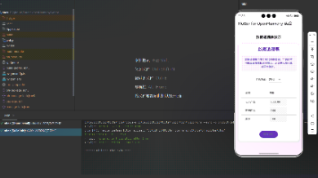
筛选对话框
弹出筛选选项:
  void _showFilterDialog(BuildContext context) {
    showModalBottomSheet(
      context: context,
      shape: RoundedRectangleBorder(
        borderRadius: BorderRadius.vertical(top: Radius.circular(20.r)),
      ),
      builder: (context) => Container(
        padding: EdgeInsets.all(20.w),
        child: Column(
          mainAxisSize: MainAxisSize.min,
          crossAxisAlignment: CrossAxisAlignment.start,
          children: [
            Text('筛选课程', style: TextStyle(fontSize: 18.sp, fontWeight: FontWeight.bold)),
            SizedBox(height: 16.h),
            Text('难度等级', style: TextStyle(fontSize: 14.sp, fontWeight: FontWeight.w500)),
            SizedBox(height: 8.h),
            Wrap(
              spacing: 8.w,
              children: ['全部', '初级', '中级', '高级'].map((level) {
                return FilterChip(
                  label: Text(level),
                  selected: level == '全部',
                  onSelected: (selected) {},
                );
              }).toList(),
            ),
使用showModalBottomSheet从底部弹出筛选对话框,用Wrap横向排列筛选芯片。FilterChip是Flutter提供的筛选芯片组件,自带选中状态。这种筛选交互让用户可以快速找到目标课程。
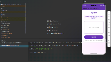
时长筛选
添加时长筛选选项:
            SizedBox(height: 16.h),
            Text('课程时长', style: TextStyle(fontSize: 14.sp, fontWeight: FontWeight.w500)),
            SizedBox(height: 8.h),
            Wrap(
              spacing: 8.w,
              children: ['全部', '5分钟内', '5-10分钟', '10分钟以上'].map((duration) {
                return FilterChip(
                  label: Text(duration),
                  selected: duration == '全部',
                  onSelected: (selected) {},
                );
              }).toList(),
            ),
            SizedBox(height: 20.h),
          ],
        ),
      ),
    );
  }
}
时长筛选提供4个选项,用户可以根据可用时间选择合适的课程。Wrap自动换行,适应不同屏幕宽度。这种多维度筛选提高了课程查找效率。
响应式布局
使用flutter_screenutil适配屏幕:
fontSize: 18.sp,
padding: EdgeInsets.all(16.w),
width: 50.w,
height: 100.h,
.sp用于字号,.w和.h用于尺寸和间距。这些单位会根据屏幕尺寸自动缩放,确保在不同设备上比例一致。一套代码适配所有屏幕。
小结
学习中心页面通过学习路径引导用户循序渐进,分类网格提供快速导航。最近学习横向滚动展示学习历史,全部课程列表提供完整的课程浏览。筛选功能帮助用户快速找到目标课程。整体设计注重信息架构和用户体验,打造高效的学习中心。
欢迎加入开源鸿蒙跨平台社区:https://openharmonycrossplatform.csdn.net

开源鸿蒙跨平台开发社区汇聚开发者与厂商,共建“一次开发,多端部署”的开源生态,致力于降低跨端开发门槛,推动万物智联创新。
更多推荐

 16
16 0
0- 0


 已为社区贡献30条内容

所有评论(0)