Flutter for OpenHarmony 个人理财管理App实战 - 账户编辑页面
账户编辑页面支持添加和编辑账户,提供名称、余额、类型、图标和颜色等个性化设置。页面采用卡片式布局,包含预览卡片、基本信息卡片、类型选择卡片、图标选择卡片和颜色选择卡片。用户可实时预览账户效果,编辑时支持删除功能。通过状态管理实现表单验证和交互,使用响应式布局适配不同屏幕。该设计让用户能灵活管理现金、银行卡、电子钱包等多种账户类型。
账户编辑页面支持添加新账户和编辑已有账户。用户可以设置账户名称、类型、初始余额、图标和颜色,实现个性化的账户管理。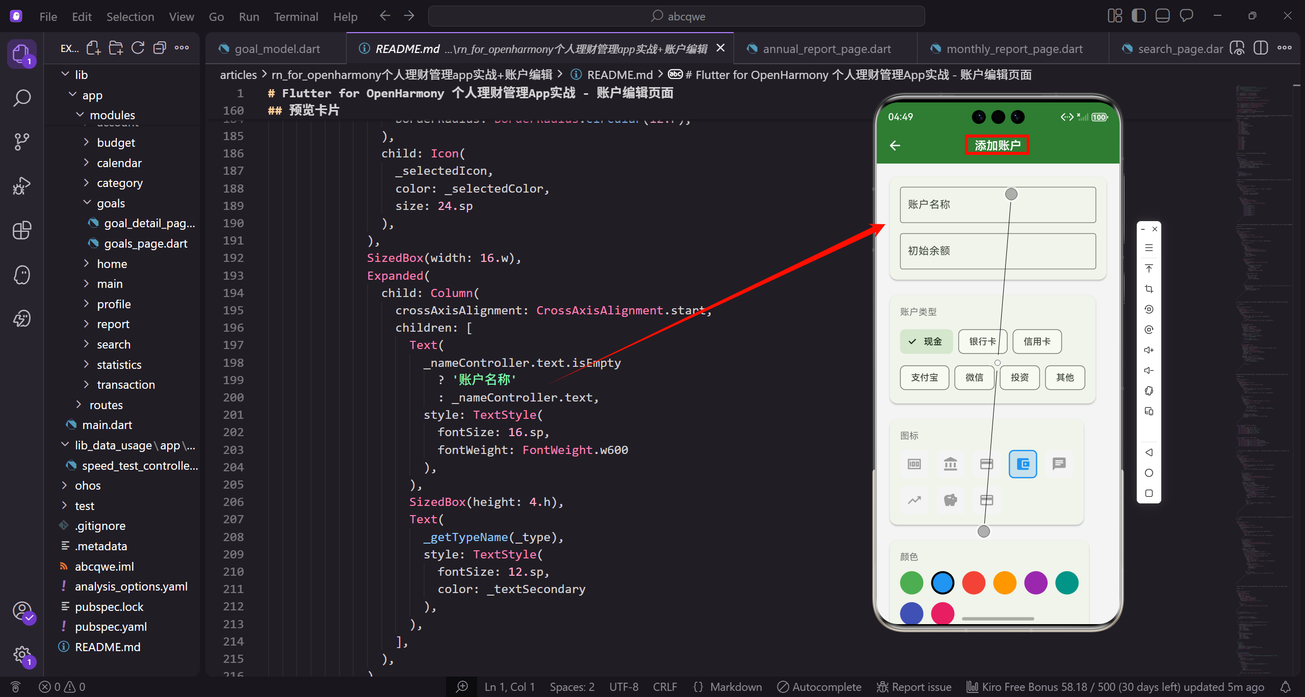
功能需求分析
账户编辑页面需要满足以下需求:
- 支持添加新账户和编辑已有账户
- 账户名称输入,支持自定义命名
- 初始余额输入,支持小数
- 账户类型选择,覆盖常见的账户类型
- 图标选择,让账户更有辨识度
- 颜色选择,个性化账户外观
- 删除功能,编辑时可以删除账户
这些功能让用户可以灵活管理自己的各种账户,从现金到银行卡,从支付宝到投资账户。
页面状态设计
账户编辑页面需要管理多个状态,使用 StatefulWidget:
import 'package:flutter/material.dart';
import 'package:flutter_screenutil/flutter_screenutil.dart';
import 'package:get/get.dart';
import '../../core/services/account_service.dart';
import '../../data/models/account_model.dart';

const _primaryColor = Color(0xFF2E7D32);
const _expenseColor = Color(0xFFE53935);
const _textSecondary = Color(0xFF757575);
导入必要的包和定义常量颜色。flutter_screenutil 用于响应式布局,Get 用于状态管理和路由。定义了三个主题色:_primaryColor 是主题绿色,_expenseColor 是支出红色,_textSecondary 是次要文字灰色。这些颜色在整个页面中保持一致的视觉风格。
class AccountEditPage extends StatefulWidget {
const AccountEditPage({super.key});
State<AccountEditPage> createState() => _AccountEditPageState();
}
class _AccountEditPageState extends State<AccountEditPage> {
final _nameController = TextEditingController();
final _balanceController = TextEditingController();
final _accountService = Get.find<AccountService>();
final _formKey = GlobalKey<FormState>();
AccountEditPage 使用 StatefulWidget 因为需要管理表单状态。_nameController 和 _balanceController 分别控制名称和余额输入框的内容。_accountService 通过 Get.find 获取账户服务实例,用于保存和删除账户。_formKey 用于表单验证,可以统一触发所有字段的验证逻辑。
  AccountModel? _editingAccount;
  AccountType _type = AccountType.cash;
  IconData _selectedIcon = Icons.account_balance_wallet;
  Color _selectedColor = Colors.blue;
_editingAccount 存储正在编辑的账户对象,如果是新建账户则为 null。_type 存储选中的账户类型,默认为现金类型。_selectedIcon 存储选中的图标,默认为钱包图标。_selectedColor 存储选中的颜色,默认为蓝色。这些状态变量会根据用户的选择实时更新,并反映在预览卡片中。
预定义的图标和颜色列表:
  final _icons = [
    Icons.money,
    Icons.account_balance,
    Icons.credit_card,
    Icons.account_balance_wallet,
    Icons.chat,
    Icons.trending_up,
    Icons.savings,
    Icons.payment,
    Icons.card_giftcard,
    Icons.attach_money,
_icons 列表定义了 12 个可选图标,涵盖了常见的账户类型。money 代表现金,account_balance 代表银行,credit_card 代表信用卡,account_balance_wallet 代表电子钱包,chat 代表微信,trending_up 代表投资账户。这些图标都是 Material Design 的标准图标,用户容易理解其含义。
    Icons.monetization_on,
    Icons.currency_exchange,
  ];

  final _colors = [
    Colors.green,
    Colors.blue,
    Colors.red,
    Colors.orange,
    Colors.purple,
    Colors.teal,
    Colors.indigo,
    Colors.pink,
    Colors.amber,
    Colors.cyan,
    Colors.brown,
    Colors.grey,
  ];
_colors 列表定义了 12 种可选颜色,提供丰富的个性化选择。包含了常见的基础色(红绿蓝)、暖色调(橙黄粉)、冷色调(青蓝紫)和中性色(棕灰)。这些颜色搭配预定义的图标,可以创建出视觉上易于区分的账户卡片,帮助用户快速识别不同账户。
初始化和资源释放
void initState() {
super.initState();
_editingAccount = Get.arguments as AccountModel?;
if (_editingAccount != null) {
_nameController.text = _editingAccount!.name;
_balanceController.text = _editingAccount!.balance.toString();
_type = _editingAccount!.type;
_selectedIcon = _editingAccount!.icon;
_selectedColor = _editingAccount!.color;
}
}
void dispose() {
_nameController.dispose();
_balanceController.dispose();
super.dispose();
}
initState 中从路由参数获取要编辑的账户,如果有就填充到各个表单字段中。dispose 中释放两个 controller 的资源。
页面主体结构
Widget build(BuildContext context) {
return Scaffold(
appBar: AppBar(
title: Text(_editingAccount == null ? '添加账户' : '编辑账户'),
actions: [
if (_editingAccount != null)
IconButton(
icon: const Icon(Icons.delete),
onPressed: _showDeleteDialog
),
build 方法构建页面主体。AppBar 的标题根据 _editingAccount 是否为 null 显示"添加账户"或"编辑账户"。actions 中使用条件判断,只有在编辑模式(_editingAccount 不为 null)时才显示删除按钮。点击删除按钮调用 _showDeleteDialog 方法弹出确认对话框。这种动态标题和按钮的设计让同一个页面可以处理新建和编辑两种场景。
        ],
      ),
      body: Form(
        key: _formKey,
        child: SingleChildScrollView(
          padding: EdgeInsets.all(16.w),
          child: Column(
            crossAxisAlignment: CrossAxisAlignment.start,
            children: [
              _buildPreviewCard(),
body 使用 Form 包裹所有表单字段,通过 _formKey 可以统一触发验证。SingleChildScrollView 让内容可以滚动,避免键盘弹出时遮挡输入框。padding 设置 16 的内边距让内容不贴边。Column 垂直排列所有卡片,crossAxisAlignment.start 让卡片左对齐。第一个是预览卡片,让用户实时看到账户的最终效果。
              SizedBox(height: 16.h),
              _buildBasicInfoCard(),
              SizedBox(height: 16.h),
              _buildTypeCard(),
              SizedBox(height: 16.h),
              _buildIconCard(),
              SizedBox(height: 16.h),
              _buildColorCard(),
              SizedBox(height: 32.h),
              _buildSaveButton(),
            ],
          ),
        ),
      ),
    );
  }
各个卡片之间用 SizedBox 添加 16 高度的间距,让布局更清晰。依次是基本信息卡片(名称和余额)、类型选择卡片、图标选择卡片、颜色选择卡片。最后是保存按钮,上方留 32 的间距让它更突出。这种卡片式布局将不同功能分组,用户可以逐步完成账户的配置。
预览卡片
预览卡片让用户实时看到账户的外观效果:
Widget _buildPreviewCard() {
  return Card(
    child: Padding(
      padding: EdgeInsets.all(16.w),
      child: Column(
        crossAxisAlignment: CrossAxisAlignment.start,
        children: [
          Text(
            '预览效果',
            style: TextStyle(fontSize: 12.sp, color: _textSecondary),
_buildPreviewCard 方法构建预览卡片。Card 组件提供阴影和圆角效果,Padding 设置 16 的内边距。Column 垂直排列标题和预览内容,crossAxisAlignment.start 让内容左对齐。第一个 Text 显示"预览效果"标签,字号 12.sp 比较小,颜色用次要文字色,表示这是辅助说明。
          ),
          SizedBox(height: 12.h),
          Row(
            children: [
              Container(
                width: 48.w,
                height: 48.w,
                decoration: BoxDecoration(
                  color: _selectedColor.withOpacity(0.2),
                  borderRadius: BorderRadius.circular(12.r),
                ),
SizedBox 添加 12 高度的间距。Row 横向排列图标、名称和余额。Container 作为图标容器,宽高都是 48,形成正方形。decoration 设置背景色为选中颜色的 20% 透明度,borderRadius 设置 12 的圆角。这种带背景的图标设计比纯图标更醒目,颜色的透明度让背景不会太抢眼。
                child: Icon(
                  _selectedIcon,
                  color: _selectedColor,
                  size: 24.sp
                ),
              ),
              SizedBox(width: 16.w),
              Expanded(
                child: Column(
                  crossAxisAlignment: CrossAxisAlignment.start,
                  children: [
Icon 显示选中的图标,颜色使用选中的颜色,尺寸 24.sp。SizedBox 添加 16 宽度的间距让图标和文字分开。Expanded 让中间的文字区域占据剩余空间,这样右侧的余额可以靠右对齐。Column 垂直排列账户名称和类型,crossAxisAlignment.start 让文字左对齐。
                    Text(
                      _nameController.text.isEmpty
                        ? '账户名称'
                        : _nameController.text,
                      style: TextStyle(
                        fontSize: 16.sp,
                        fontWeight: FontWeight.w600
                      ),
                    ),
                    SizedBox(height: 4.h),
第一个 Text 显示账户名称,如果输入框为空则显示占位文字"账户名称"。字号 16.sp,字重 w600(半粗体),是预览卡片的主要信息。SizedBox 添加 4 高度的小间距,让名称和类型之间有适当的留白。这种实时预览让用户在输入时就能看到效果。
                    Text(
                      _getTypeName(_type),
                      style: TextStyle(
                        fontSize: 12.sp,
                        color: _textSecondary
                      ),
                    ),
                  ],
                ),
              ),
              Text(
                '¥${_balanceController.text.isEmpty ? "0.00" : double.tryParse(_balanceController.text)?.toStringAsFixed(2) ?? "0.00"}',
第二个 Text 显示账户类型名称,调用 _getTypeName 方法将枚举转换为中文。字号 12.sp 比名称小,颜色用次要文字色,表示这是辅助信息。右侧的 Text 显示余额,如果输入框为空显示 0.00,否则尝试解析输入的数字并格式化为两位小数。使用 tryParse 和 ?? 运算符确保即使输入无效也能显示 0.00。
                style: TextStyle(
                  fontSize: 18.sp,
                  fontWeight: FontWeight.bold,
                  color: _selectedColor,
                ),
              ),
            ],
          ),
        ],
      ),
    ),
  );
}
余额的样式设置字号 18.sp 比较大,字重 bold(粗体),颜色使用选中的颜色。这让余额成为视觉焦点,用户可以清楚地看到账户的金额。整个预览卡片的布局和样式与账户列表中的卡片一致,让用户在编辑时就能看到最终效果,提供了即时的视觉反馈。
基本信息卡片
Widget _buildBasicInfoCard() {
  return Card(
    child: Padding(
      padding: EdgeInsets.all(16.w),
      child: Column(
        crossAxisAlignment: CrossAxisAlignment.start,
        children: [
          Row(
            children: [
              Icon(Icons.edit, size: 20.sp, color: _primaryColor),
_buildBasicInfoCard 方法构建基本信息卡片。Card 和 Padding 的用法与预览卡片一致。Column 垂直排列标题和输入框。Row 横向排列图标和标题文字,Icon 使用编辑图标,尺寸 20.sp,颜色用主题绿色。这个图标帮助用户理解这个卡片的功能是编辑基本信息。
              SizedBox(width: 8.w),
              Text(
                '基本信息',
                style: TextStyle(fontSize: 14.sp, color: _textSecondary),
              ),
            ],
          ),
          SizedBox(height: 16.h),
          TextFormField(
            controller: _nameController,
            decoration: InputDecoration(
SizedBox 添加 8 宽度的间距让图标和文字分开。Text 显示"基本信息"标题,字号 14.sp,颜色用次要文字色。SizedBox 添加 16 高度的间距让标题和输入框分开。TextFormField 是带验证功能的输入框,controller 绑定 _nameController 控制输入内容。decoration 配置输入框的外观。
              labelText: '账户名称',
              border: const OutlineInputBorder(),
              prefixIcon: const Icon(Icons.label),
              hintText: '例如:工商银行储蓄卡',
            ),
            onChanged: (_) => setState(() {}),
            validator: (value) {
              if (value == null || value.isEmpty) {
                return '请输入账户名称';
              }
labelText 显示字段标签"账户名称",border 使用 OutlineInputBorder 显示边框样式。prefixIcon 在输入框左侧显示标签图标,hintText 提供示例文字引导用户输入。onChanged 回调在输入改变时触发 setState 更新预览卡片。validator 验证输入,如果为空返回错误提示"请输入账户名称"。
              if (value.length > 20) {
                return '名称不能超过20个字符';
              }
              return null;
            },
          ),
          SizedBox(height: 16.h),
          TextFormField(
            controller: _balanceController,
            keyboardType: const TextInputType.numberWithOptions(decimal: true),
如果名称长度超过 20 个字符,返回错误提示。返回 null 表示验证通过。SizedBox 添加 16 高度的间距让两个输入框分开。第二个 TextFormField 输入余额,controller 绑定 _balanceController。keyboardType 设为 numberWithOptions(decimal: true),弹出支持小数的数字键盘,方便用户输入金额。
            decoration: InputDecoration(
              labelText: '初始余额',
              border: const OutlineInputBorder(),
              prefixIcon: const Icon(Icons.attach_money),
              prefixText: '¥ ',
              hintText: '0.00',
            ),
            onChanged: (_) => setState(() {}),
            validator: (value) {
decoration 配置余额输入框的外观。labelText 显示"初始余额",prefixIcon 显示金钱图标,prefixText 显示货币符号 ¥,hintText 显示占位文字 0.00。这些配置让用户清楚地知道这是输入金额的字段。onChanged 同样触发 setState 更新预览。validator 验证余额输入。
              if (value != null && value.isNotEmpty) {
                final balance = double.tryParse(value);
                if (balance == null) {
                  return '请输入有效的金额';
                }
              }
              return null;
            },
          ),
        ],
      ),
    ),
  );
}
如果输入不为空,尝试用 tryParse 将字符串转换为 double。如果转换失败(返回 null),说明输入的不是有效数字,返回错误提示"请输入有效的金额"。如果输入为空或转换成功,返回 null 表示验证通过。余额字段允许为空,会默认为 0。这种验证逻辑确保用户输入的数据是有效的,避免保存无效数据。
账户类型选择
Widget _buildTypeCard() {
  return Card(
    child: Padding(
      padding: EdgeInsets.all(16.w),
      child: Column(
        crossAxisAlignment: CrossAxisAlignment.start,
        children: [
          Row(
            children: [
              Icon(Icons.category, size: 20.sp, color: _primaryColor),
_buildTypeCard 方法构建账户类型选择卡片。结构与基本信息卡片类似,使用 Card 和 Padding。Column 垂直排列标题和类型选择器。Row 横向排列图标和标题,Icon 使用分类图标,表示这是选择账户类型的区域。
              SizedBox(width: 8.w),
              Text(
                '账户类型',
                style: TextStyle(fontSize: 14.sp, color: _textSecondary),
              ),
            ],
          ),
          SizedBox(height: 12.h),
          Wrap(
            spacing: 8.w,
            runSpacing: 8.h,
            children: AccountType.values.map((type) => ChoiceChip(
Text 显示"账户类型"标题。SizedBox 添加 12 高度的间距。Wrap 是流式布局组件,子组件会自动换行。spacing 设置水平间距 8,runSpacing 设置垂直间距 8。children 使用 AccountType.values 获取所有账户类型枚举值,map 方法将每个类型转换为 ChoiceChip 组件。
              label: Row(
                mainAxisSize: MainAxisSize.min,
                children: [
                  Icon(
                    _getTypeIcon(type),
                    size: 16.sp,
                    color: _type == type ? Colors.white : _textSecondary,
                  ),
                  SizedBox(width: 4.w),
ChoiceChip 是选择芯片组件,适合单选场景。label 是芯片的内容,使用 Row 横向排列图标和文字。mainAxisSize.min 让 Row 的宽度自适应内容。Icon 调用 _getTypeIcon 方法根据类型获取对应图标,尺寸 16.sp。颜色根据是否选中变化:选中时显示白色,未选中时显示次要文字色。
                  Text(_getTypeName(type)),
                ],
              ),
              selected: _type == type,
              selectedColor: _primaryColor,
              onSelected: (_) => setState(() => _type = type),
            )).toList(),
          ),
        ],
      ),
    ),
  );
}
Text 调用 _getTypeName 方法显示类型的中文名称。selected 属性判断当前芯片是否被选中,通过比较 _type 和 type 是否相等。selectedColor 设置选中时的背景色为主题绿色。onSelected 回调在点击时触发,调用 setState 更新 _type 状态。map 返回的是 Iterable,需要调用 toList() 转换为 List。
辅助方法实现:
String _getTypeName(AccountType type) {
  switch (type) {
    case AccountType.cash: return '现金';
    case AccountType.bank: return '银行卡';
    case AccountType.creditCard: return '信用卡';
    case AccountType.alipay: return '支付宝';
    case AccountType.wechat: return '微信';
    case AccountType.investment: return '投资';
    case AccountType.other: return '其他';
  }
}
_getTypeName 方法将账户类型枚举转换为中文名称。使用 switch 语句匹配每个枚举值,返回对应的中文字符串。这 7 种类型覆盖了用户日常使用的主要账户:现金、银行卡、信用卡、支付宝、微信、投资账户和其他。中文名称让用户更容易理解和选择。
IconData _getTypeIcon(AccountType type) {
  switch (type) {
    case AccountType.cash: return Icons.money;
    case AccountType.bank: return Icons.account_balance;
    case AccountType.creditCard: return Icons.credit_card;
    case AccountType.alipay: return Icons.account_balance_wallet;
    case AccountType.wechat: return Icons.chat;
    case AccountType.investment: return Icons.trending_up;
    case AccountType.other: return Icons.more_horiz;
  }
}
_getTypeIcon 方法将账户类型枚举转换为对应的图标。每个类型都有一个语义化的图标:现金用钞票图标,银行卡用银行建筑图标,信用卡用卡片图标,支付宝用钱包图标,微信用聊天图标,投资用上升趋势图标,其他用更多图标。这些图标配合文字,让用户可以快速识别和选择账户类型。
图标选择
Widget _buildIconCard() {
  return Card(
    child: Padding(
      padding: EdgeInsets.all(16.w),
      child: Column(
        crossAxisAlignment: CrossAxisAlignment.start,
        children: [
          Row(
            children: [
              Icon(Icons.emoji_emotions, size: 20.sp, color: _primaryColor),
_buildIconCard 方法构建图标选择卡片。结构与前面的卡片一致。Row 横向排列标题图标和文字,使用笑脸图标表示这是选择图标的区域,让界面更友好。
              SizedBox(width: 8.w),
              Text(
                '选择图标',
                style: TextStyle(fontSize: 14.sp, color: _textSecondary),
              ),
            ],
          ),
          SizedBox(height: 12.h),
          GridView.builder(
            shrinkWrap: true,
            physics: const NeverScrollableScrollPhysics(),
            gridDelegate: SliverGridDelegateWithFixedCrossAxisCount(
Text 显示"选择图标"标题。SizedBox 添加间距。GridView.builder 构建网格布局展示图标。shrinkWrap 设为 true 让 GridView 高度自适应内容,不占据无限高度。physics 设为 NeverScrollableScrollPhysics 禁用 GridView 自身的滚动,使用外层 SingleChildScrollView 的滚动。gridDelegate 配置网格布局参数。
              crossAxisCount: 6,
              crossAxisSpacing: 12.w,
              mainAxisSpacing: 12.h,
            ),
            itemCount: _icons.length,
            itemBuilder: (_, index) {
              final icon = _icons[index];
              final isSelected = _selectedIcon == icon;
              return GestureDetector(
SliverGridDelegateWithFixedCrossAxisCount 创建固定列数的网格。crossAxisCount 设为 6,每行显示 6 个图标。crossAxisSpacing 设置水平间距 12,mainAxisSpacing 设置垂直间距 12。itemCount 设为图标列表的长度。itemBuilder 构建每个网格项,获取当前图标和判断是否选中。GestureDetector 处理点击事件。
                onTap: () => setState(() => _selectedIcon = icon),
                child: AnimatedContainer(
                  duration: const Duration(milliseconds: 200),
                  decoration: BoxDecoration(
                    color: isSelected
                      ? _selectedColor.withOpacity(0.2)
                      : Colors.grey[100],
                    borderRadius: BorderRadius.circular(8.r),
onTap 点击时调用 setState 更新 _selectedIcon 状态。AnimatedContainer 是带动画的容器,duration 设为 200 毫秒,状态改变时会有平滑的过渡动画。decoration 配置容器外观,背景色根据是否选中变化:选中时用选中颜色的 20% 透明度,未选中时用浅灰色。borderRadius 设置 8 的圆角。
                    border: Border.all(
                      color: isSelected ? _selectedColor : Colors.transparent,
                      width: 2
                    ),
                  ),
                  child: Icon(
                    icon,
                    color: isSelected ? _selectedColor : Colors.grey,
                    size: 24.sp
                  ),
                ),
              );
            },
          ),
        ],
      ),
    ),
  );
}
border 设置边框,选中时显示选中颜色的 2 像素边框,未选中时边框透明。Icon 显示图标,颜色根据是否选中变化:选中时用选中颜色,未选中时用灰色。尺寸 24.sp。这种设计让选中的图标有明显的视觉反馈:彩色图标、彩色边框和彩色背景,用户可以清楚地看到当前选择。AnimatedContainer 的动画让选择过程更流畅。
颜色选择
Widget _buildColorCard() {
  return Card(
    child: Padding(
      padding: EdgeInsets.all(16.w),
      child: Column(
        crossAxisAlignment: CrossAxisAlignment.start,
        children: [
          Row(
            children: [
              Icon(Icons.palette, size: 20.sp, color: _primaryColor),
_buildColorCard 方法构建颜色选择卡片。结构与图标选择卡片类似。Row 横向排列标题图标和文字,使用调色板图标表示这是选择颜色的区域,图标语义清晰。
              SizedBox(width: 8.w),
              Text(
                '选择颜色',
                style: TextStyle(fontSize: 14.sp, color: _textSecondary),
              ),
            ],
          ),
          SizedBox(height: 12.h),
          GridView.builder(
            shrinkWrap: true,
            physics: const NeverScrollableScrollPhysics(),
            gridDelegate: SliverGridDelegateWithFixedCrossAxisCount(
Text 显示"选择颜色"标题。SizedBox 添加间距。GridView.builder 构建网格布局展示颜色,配置与图标选择相同:shrinkWrap 为 true,physics 禁用滚动,gridDelegate 配置网格参数。
              crossAxisCount: 6,
              crossAxisSpacing: 12.w,
              mainAxisSpacing: 12.h,
            ),
            itemCount: _colors.length,
            itemBuilder: (_, index) {
              final color = _colors[index];
              final isSelected = _selectedColor == color;
              return GestureDetector(
同样是 6 列布局,水平和垂直间距都是 12。itemCount 设为颜色列表的长度。itemBuilder 构建每个颜色块,获取当前颜色和判断是否选中。GestureDetector 处理点击事件。
                onTap: () => setState(() => _selectedColor = color),
                child: AnimatedContainer(
                  duration: const Duration(milliseconds: 200),
                  decoration: BoxDecoration(
                    color: color,
                    shape: BoxShape.circle,
                    border: Border.all(
                      color: isSelected ? Colors.white : Colors.transparent,
                      width: 3
onTap 点击时调用 setState 更新 _selectedColor 状态。AnimatedContainer 提供 200 毫秒的过渡动画。decoration 配置容器外观,color 直接使用颜色列表中的颜色作为背景。shape 设为 BoxShape.circle 让容器显示为圆形。border 设置边框,选中时显示白色 3 像素边框,未选中时边框透明。白色边框在彩色背景上很醒目。
                    ),
                    boxShadow: isSelected ? [
                      BoxShadow(
                        color: color.withOpacity(0.5),
                        blurRadius: 8,
                        spreadRadius: 2,
                      ),
                    ] : null,
                  ),
                  child: isSelected
                    ? Icon(Icons.check, color: Colors.white, size: 20.sp)
                    : null,
                ),
              );
            },
          ),
        ],
      ),
    ),
  );
}
boxShadow 设置阴影效果,只有选中时才显示。阴影颜色使用当前颜色的 50% 透明度,blurRadius 设为 8 让阴影模糊,spreadRadius 设为 2 让阴影扩散。这个阴影让选中的颜色块有浮起的效果。child 根据是否选中显示内容:选中时显示白色对勾图标,未选中时为 null 不显示。这种设计让选中状态非常明显:白色边框、彩色阴影和白色对勾,三重视觉反馈确保用户清楚地看到当前选择。
保存和删除
Widget _buildSaveButton() {
  return SizedBox(
    width: double.infinity,
    height: 48.h,
    child: ElevatedButton(
      onPressed: _saveAccount,
      style: ElevatedButton.styleFrom(
        backgroundColor: _primaryColor,
        shape: RoundedRectangleBorder(
          borderRadius: BorderRadius.circular(8.r),
_buildSaveButton 方法构建保存按钮。SizedBox 设置宽度为 double.infinity 让按钮占满整行,高度 48。ElevatedButton 是凸起按钮,onPressed 绑定 _saveAccount 方法。style 配置按钮样式,backgroundColor 设为主题绿色,shape 设置圆角矩形,borderRadius 为 8。
        ),
      ),
      child: Text(
        '保存',
        style: TextStyle(fontSize: 16.sp, color: Colors.white)
      ),
    ),
  );
}

void _saveAccount() {
  if (!_formKey.currentState!.validate()) {
    return;
  }
child 显示"保存"文字,字号 16.sp,颜色白色。_saveAccount 方法处理保存逻辑。首先调用 _formKey.currentState!.validate() 触发所有表单字段的验证。如果验证失败(返回 false),直接返回不继续执行。这确保只有在所有字段都有效时才能保存。
  if (_nameController.text.isEmpty) {
    Get.snackbar('提示', '请输入账户名称');
    return;
  }

  final balance = double.tryParse(_balanceController.text) ?? 0;

  if (_editingAccount != null) {
    _accountService.updateAccount(_editingAccount!.copyWith(
再次检查名称是否为空,如果为空显示提示并返回。这是双重验证,确保数据有效。解析余额输入,如果解析失败或为空则默认为 0。判断是编辑还是新建:如果 _editingAccount 不为 null 说明是编辑模式。调用 _accountService.updateAccount 更新账户,使用 copyWith 方法创建修改后的账户对象。
      name: _nameController.text,
      type: _type,
      balance: balance,
      icon: _selectedIcon,
      color: _selectedColor
    ));
  } else {
    _accountService.addAccount(
      name: _nameController.text,
      type: _type,
      balance: balance,
copyWith 传入新的名称、类型、余额、图标和颜色,其他字段(如 id、createdAt)保持不变。如果是新建模式(_editingAccount 为 null),调用 _accountService.addAccount 添加新账户。传入名称、类型、余额、图标和颜色参数,服务会自动生成 id 和创建时间。
      icon: _selectedIcon,
      color: _selectedColor
    );
  }

  Get.back();
  Get.snackbar(
    '成功',
    '账户已保存',
    snackPosition: SnackPosition.BOTTOM,
    backgroundColor: _primaryColor.withOpacity(0.9),
    colorText: Colors.white,
  );
}
保存完成后调用 Get.back() 返回上一页。显示成功提示"账户已保存",snackPosition 设为 BOTTOM 从底部弹出,backgroundColor 设为主题绿色 90% 透明度,colorText 设为白色。这个提示给用户明确的反馈,确认操作成功。
删除功能实现:
void _showDeleteDialog() {
  Get.dialog(AlertDialog(
    title: const Text('删除账户'),
    content: const Text('确定要删除这个账户吗?删除后相关的交易记录不会被删除。'),
    actions: [
      TextButton(
        onPressed: () => Get.back(),
        child: const Text('取消')
      ),
_showDeleteDialog 方法显示删除确认对话框。Get.dialog 显示 AlertDialog,title 显示"删除账户",content 显示警告信息,明确告知用户删除的影响。actions 是对话框底部的按钮,第一个 TextButton 是取消按钮,点击调用 Get.back() 关闭对话框。
      TextButton(
        onPressed: () {
          _accountService.deleteAccount(_editingAccount!.id);
          Get.back();
          Get.back();
          Get.snackbar(
            '成功',
            '账户已删除',
            snackPosition: SnackPosition.BOTTOM,
          );
        },
        child: Text('删除', style: TextStyle(color: _expenseColor)),
      ),
    ],
  ));
}
第二个 TextButton 是删除按钮,文字颜色用支出红色表示危险操作。点击时调用 _accountService.deleteAccount 删除账户,传入账户 id。调用两次 Get.back():第一次关闭确认对话框,第二次返回账户列表页。显示成功提示"账户已删除"。这种二次确认的设计防止用户误删除重要数据,是删除操作的最佳实践。
小结
账户编辑页面让用户可以灵活管理自己的账户,核心要点包括:
- 预览卡片实时展示账户效果
- 表单验证确保数据有效
- 账户类型覆盖常见场景
- 图标和颜色选择支持个性化
- 编辑模式支持删除操作
- 动画效果提升交互体验
这些功能组合在一起,让账户管理变得简单直观。下一篇将实现预算管理页面,帮助用户控制支出。
欢迎加入开源鸿蒙跨平台社区:https://openharmonycrossplatform.csdn.net

开源鸿蒙跨平台开发社区汇聚开发者与厂商,共建“一次开发,多端部署”的开源生态,致力于降低跨端开发门槛,推动万物智联创新。
更多推荐

 13
13 0
0- 0


 已为社区贡献30条内容

所有评论(0)