Flutter for OpenHarmony 个人理财管理App实战 - 月度报告页面
月度报告功能为用户提供当月财务概览,包括收支总额、每日支出图表、TOP5支出分类和记账统计。通过月份选择器可查看历史数据,核心模块包括:收支概览卡片展示收入、支出和结余;柱状图呈现每日支出分布;分类支出TOP5帮助识别主要消费方向;统计数据显示记账天数、笔数和日均支出。页面采用状态管理跟踪选中月份,数据计算涵盖交易汇总、分类排序等处理,确保用户获得全面的月度财务分析。
月度报告页面提供当月的完整财务报告,包括收支概览、每日支出图表、支出TOP5和统计数据。这是帮助用户回顾和分析月度财务状况的重要功能。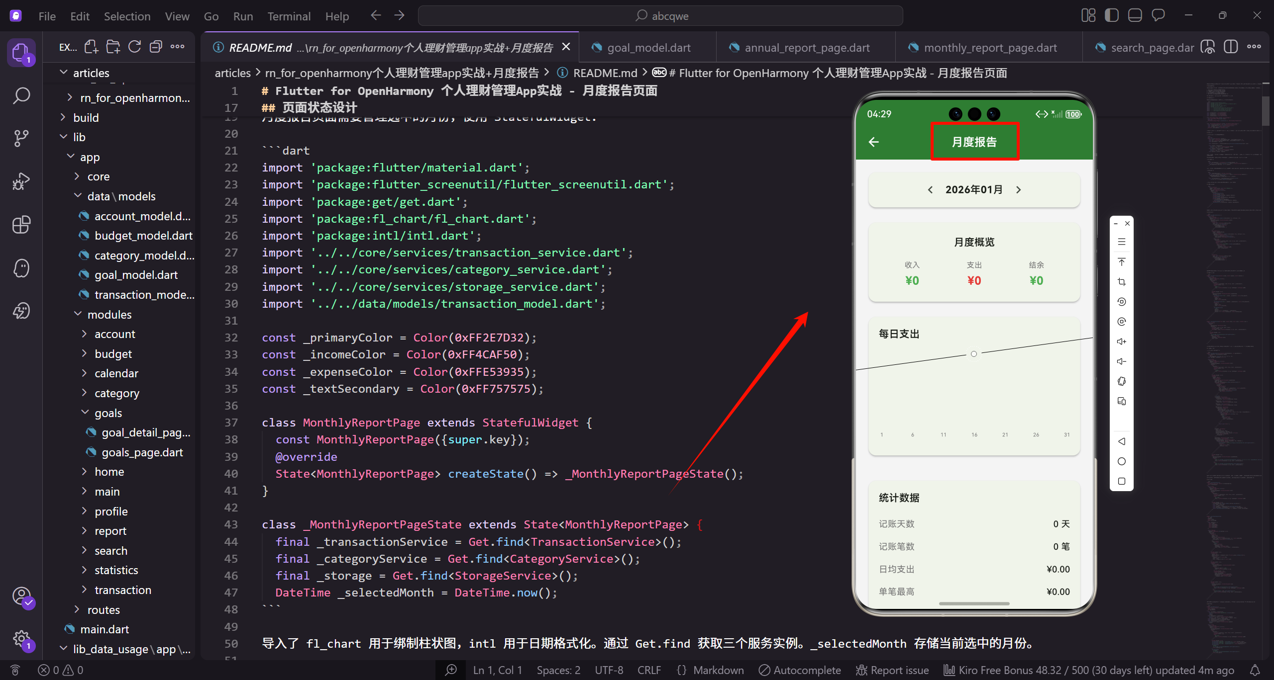
功能需求分析
月度报告需要回答用户几个核心问题:这个月整体收支如何?每天的支出分布怎样?哪些分类花费最多?记账习惯如何?基于这些需求,页面需要包含以下功能:
- 月份选择器,支持查看历史月份的报告
- 月度收支概览,显示收入、支出、结余
- 每日支出柱状图,展示支出的时间分布
- 支出TOP5分类,找出花费最多的地方
- 统计数据,包括记账天数、笔数、日均支出等
这些数据组合在一起,能给用户一个全面的月度财务画像。
页面状态设计
月度报告页面需要管理选中的月份,使用 StatefulWidget:
import 'package:flutter/material.dart';
import 'package:flutter_screenutil/flutter_screenutil.dart';
import 'package:get/get.dart';
import 'package:fl_chart/fl_chart.dart';
import 'package:intl/intl.dart';
导入必要的依赖包。flutter/material.dart 是 Flutter 的核心 UI 库。flutter_screenutil 用于屏幕适配,让界面在不同尺寸设备上保持一致。GetX 用于依赖注入和状态管理。fl_chart 是图表库,用于绘制柱状图展示每日支出。intl 是国际化库,用于日期格式化。
import '../../core/services/transaction_service.dart';
import '../../core/services/category_service.dart';
import '../../core/services/storage_service.dart';
import '../../data/models/transaction_model.dart';

const _primaryColor = Color(0xFF2E7D32);
const _incomeColor = Color(0xFF4CAF50);
const _expenseColor = Color(0xFFE53935);
const _textSecondary = Color(0xFF757575);
导入三个核心服务类。TransactionService 用于获取交易数据,CategoryService 用于获取分类信息,StorageService 用于获取货币设置。TransactionModel 是交易数据模型。定义四个颜色常量:主题绿色、收入绿色、支出红色、次要文本灰色。这些颜色在整个页面中复用,保持视觉一致性。
class MonthlyReportPage extends StatefulWidget {
const MonthlyReportPage({super.key});
State<MonthlyReportPage> createState() => _MonthlyReportPageState();
}
class _MonthlyReportPageState extends State<MonthlyReportPage> {
final _transactionService = Get.find<TransactionService>();
final _categoryService = Get.find<CategoryService>();
MonthlyReportPage 是有状态组件,因为需要管理选中的月份状态。createState 方法创建状态对象。_MonthlyReportPageState 是状态类,管理页面的可变状态。通过 Get.find 获取已注册的服务实例,这是依赖注入的方式。开始获取交易服务和分类服务。
  final _storage = Get.find<StorageService>();
  DateTime _selectedMonth = DateTime.now();
获取存储服务实例,用于获取货币设置等配置信息。_selectedMonth 存储当前选中的月份,默认为当前月份。这是页面的核心状态变量,当它改变时会触发页面重建,显示对应月份的报告数据。用户可以通过月份选择器切换到其他月份,查看历史报告。
数据计算
在 build 方法中计算当月的各项数据:
Widget build(BuildContext context) {
final start = DateTime(_selectedMonth.year, _selectedMonth.month, 1);
final end = DateTime(_selectedMonth.year, _selectedMonth.month + 1, 0);
final daysInMonth = end.day;
final transactions = _transactionService.getTransactionsByDateRange(start, end);
final income = transactions
.where((t) => t.type == TransactionType.income)
build 方法在每次状态改变时被调用,重新计算并显示数据。start 是选中月份的第一天,end 是最后一天。DateTime 构造函数中月份加 1、日期设为 0,会自动计算出上个月的最后一天,这是一个常用的技巧。daysInMonth 获取当月天数。从交易服务获取选中月份的所有交易记录。开始计算收入总额,筛选收入类型的交易。
      .fold(0.0, (sum, t) => sum + t.amount);
    final expense = transactions
      .where((t) => t.type == TransactionType.expense)
      .fold(0.0, (sum, t) => sum + t.amount);
    final balance = income - expense;
使用 fold 方法累加所有收入金额,初始值为 0.0。同样的方式计算支出总额,筛选支出类型的交易并累加。balance 是结余,用收入减去支出。这三个核心数据将在概览卡片中展示,让用户快速了解本月的财务状况。
计算每日支出:
    final dailyExpenses = List<double>.filled(daysInMonth, 0);
    for (var t in transactions.where((t) => t.type == TransactionType.expense)) {
      dailyExpenses[t.date.day - 1] += t.amount;
    }
创建一个长度为当月天数的列表,初始值都是 0。List.filled 方法创建指定长度和初始值的列表。遍历所有支出交易,将金额累加到对应日期的位置。t.date.day 返回日期(1-31),减 1 转换为列表索引(0-30)。这个数组将用于绘制每日支出柱状图,展示支出的时间分布。
计算分类支出:
    final expenseByCategory = <String, double>{};
    for (var t in transactions.where((t) => t.type == TransactionType.expense)) {
      expenseByCategory[t.categoryId] =
        (expenseByCategory[t.categoryId] ?? 0) + t.amount;
    }
    final sortedCategories = expenseByCategory.entries.toList()
      ..sort((a, b) => b.value.compareTo(a.value));
创建 Map 按分类 ID 汇总支出金额。遍历所有支出交易,使用 ?? 运算符处理首次出现的分类,初始值为 0。将 Map 的条目转换为列表并按金额降序排序,级联运算符 … 让排序直接在列表上执行。sortedCategories 将用于展示支出 TOP5,帮助用户找出主要支出方向。
页面主体结构
    return Scaffold(
      appBar: AppBar(title: const Text('月度报告')),
      body: SingleChildScrollView(
        padding: EdgeInsets.all(16.w),
        child: Column(
          children: [
            _buildMonthSelector(),
            SizedBox(height: 16.h),
            _buildOverviewCard(income, expense, balance),
            SizedBox(height: 16.h),
            _buildDailyChart(dailyExpenses, daysInMonth),
            SizedBox(height: 16.h),
            if (sortedCategories.isNotEmpty)
              _buildTopCategories(sortedCategories, expense),
            SizedBox(height: 16.h),
            _buildStatistics(transactions, expense, daysInMonth),
          ],
        ),
      ),
    );
  }
页面分为五个部分:月份选择器、概览卡片、每日支出图表、TOP5分类、统计数据。如果没有支出数据,TOP5 部分不显示。
月份选择器
Widget _buildMonthSelector() {
  return Card(
    child: Padding(
      padding: EdgeInsets.symmetric(horizontal: 8.w, vertical: 4.h),
      child: Row(
        mainAxisAlignment: MainAxisAlignment.center,
        children: [
          IconButton(
            icon: const Icon(Icons.chevron_left),
            onPressed: () => setState(() {
_buildMonthSelector 方法构建月份选择器。Card 组件提供卡片样式。Padding 添加水平 8 像素、垂直 4 像素的内边距。Row 水平居中排列左箭头、月份显示和右箭头。IconButton 显示左箭头图标,点击时调用 setState 更新状态。
              _selectedMonth = DateTime(
                _selectedMonth.year,
                _selectedMonth.month - 1
              );
            })
          ),
          GestureDetector(
            onTap: _showMonthPicker,
            child: Container(
              padding: EdgeInsets.symmetric(horizontal: 20.w, vertical: 8.h),
创建新的 DateTime 对象,月份减 1,切换到上一个月。DateTime 构造函数会自动处理跨年情况。setState 触发页面重建,显示上月的报告数据。GestureDetector 包裹月份显示区域,点击时调用 _showMonthPicker 方法弹出月份选择器。Container 添加水平 20 像素、垂直 8 像素的内边距。
              decoration: BoxDecoration(
                color: _primaryColor.withOpacity(0.1),
                borderRadius: BorderRadius.circular(8.r),
              ),
              child: Row(
                children: [
                  Icon(Icons.calendar_month, size: 18.sp, color: _primaryColor),
                  SizedBox(width: 8.w),
BoxDecoration 定义装饰样式,背景色为主题绿色的 10% 透明度,圆角半径 8 像素。这个圆角矩形背景让月份显示区域更突出,提示用户可以点击。Row 水平排列日历图标和月份文字。日历图标大小 18 像素,颜色为主题绿色。SizedBox 添加 8 像素间距。
                  Text(
                    DateFormat('yyyy年MM月').format(_selectedMonth),
                    style: TextStyle(
                      fontSize: 16.sp,
                      fontWeight: FontWeight.w600,
                      color: _primaryColor,
                    )
                  ),
                ],
              ),
            ),
          ),
Text 使用 DateFormat 格式化显示月份,格式为"yyyy年MM月",例如"2024年01月"。字体大小 16 像素,中等粗细,颜色为主题绿色。这种格式化显示让日期更易读,符合中文习惯。完成月份显示区域的构建。
          IconButton(
            icon: const Icon(Icons.chevron_right),
            onPressed: () => setState(() {
              _selectedMonth = DateTime(
                _selectedMonth.year,
                _selectedMonth.month + 1
              );
            })
          ),
        ],
      ),
    ),
  );
}
IconButton 显示右箭头图标,点击时调用 setState 更新状态。创建新的 DateTime 对象,月份加 1,切换到下一个月。完成月份选择器的构建。这个设计让用户可以通过左右箭头快速切换月份,也可以点击中间区域打开选择器跳转到任意月份,操作灵活方便。
左右箭头切换上下月,中间显示当前选中的月份。点击月份可以弹出选择器快速跳转。
月度概览卡片
Widget _buildOverviewCard(double income, double expense, double balance) {
  return Card(
    child: Padding(
      padding: EdgeInsets.all(20.w),
      child: Column(
        children: [
          Row(
            children: [
              Icon(Icons.assessment, size: 20.sp, color: _primaryColor),
              SizedBox(width: 8.w),
              Text(
                '月度概览',
                style: TextStyle(fontSize: 16.sp, fontWeight: FontWeight.w600)
              ),
            ],
          ),
          SizedBox(height: 20.h),
          Row(
            mainAxisAlignment: MainAxisAlignment.spaceAround,
            children: [
              _buildSummaryItem('收入', income, _incomeColor, Icons.arrow_upward),
              Container(
                width: 1,
                height: 40.h,
                color: Colors.grey[300],
              ),
              _buildSummaryItem('支出', expense, _expenseColor, Icons.arrow_downward),
              Container(
                width: 1,
                height: 40.h,
                color: Colors.grey[300],
              ),
              _buildSummaryItem(
                '结余',
                balance,
                balance >= 0 ? _incomeColor : _expenseColor,
                balance >= 0 ? Icons.trending_up : Icons.trending_down,
              ),
            ],
          ),
        ],
      ),
    ),
  );
}

Widget _buildSummaryItem(String label, double value, Color color, IconData icon) {
  return Column(
    children: [
      Row(
        mainAxisSize: MainAxisSize.min,
        children: [
          Icon(icon, size: 14.sp, color: color),
          SizedBox(width: 4.w),
          Text(label, style: TextStyle(fontSize: 12.sp, color: _textSecondary)),
        ],
      ),
      SizedBox(height: 8.h),
      Text(
        '${_storage.currency}${value.toStringAsFixed(0)}',
        style: TextStyle(
          fontSize: 18.sp,
          fontWeight: FontWeight.bold,
          color: color
        )
      ),
    ],
  );
}
三个数据项并排显示,用竖线分隔。每个数据项有图标、标签和金额。结余的颜色和图标根据正负值变化。
每日支出图表
使用 fl_chart 绘制柱状图:
Widget _buildDailyChart(List<double> dailyExpenses, int daysInMonth) {
  final maxValue = dailyExpenses.isEmpty
    ? 100.0
    : dailyExpenses.reduce((a, b) => a > b ? a : b);
  final chartMax = maxValue * 1.2 + 1;

  return Card(
    child: Padding(
      padding: EdgeInsets.all(16.w),
      child: Column(
_buildDailyChart 方法构建每日支出柱状图。接收每日支出数组和当月天数两个参数。maxValue 计算最大支出值,如果数组为空则默认 100,否则使用 reduce 方法找出最大值。chartMax 是图表的 Y 轴最大值,设置为最大值的 1.2 倍加 1,留出一些空间让图表更美观。Card 组件提供卡片样式,Padding 添加 16 像素内边距。
        crossAxisAlignment: CrossAxisAlignment.start,
        children: [
          Row(
            children: [
              Icon(Icons.bar_chart, size: 20.sp, color: _primaryColor),
              SizedBox(width: 8.w),
              Text(
                '每日支出',
                style: TextStyle(fontSize: 16.sp, fontWeight: FontWeight.w600)
              ),
            ],
          ),
Column 垂直排列标题、图表和统计信息,crossAxisAlignment 设置为 start 让内容左对齐。Row 水平排列柱状图图标和标题文字。图标大小 20 像素,颜色为主题绿色。SizedBox 添加 8 像素间距。Text 显示"每日支出"标题,字体大小 16 像素,中等粗细。
          SizedBox(height: 16.h),
          SizedBox(
            height: 180.h,
            child: BarChart(
              BarChartData(
                alignment: BarChartAlignment.spaceAround,
                maxY: chartMax,
                barGroups: dailyExpenses.asMap().entries.map((e) =>
                  BarChartGroupData(
SizedBox 添加 16 像素间距。第二个 SizedBox 设置图表容器高度为 180 像素。BarChart 是 fl_chart 库提供的柱状图组件。BarChartData 定义图表数据和样式。alignment 设置为 spaceAround,柱子之间均匀分布。maxY 设置 Y 轴最大值。barGroups 定义所有柱子,使用 asMap().entries 获取带索引的数组条目。
                    x: e.key,
                    barRods: [
                      BarChartRodData(
                        toY: e.value,
                        color: e.value > 0 ? _expenseColor : Colors.grey[300]!,
                        width: daysInMonth > 28 ? 4.w : 6.w,
                        borderRadius: BorderRadius.vertical(
                          top: Radius.circular(2.r)
                        )
                      )
BarChartGroupData 定义一组柱子(这里每组只有一根)。x 是横坐标,使用数组索引。barRods 定义柱子列表。BarChartRodData 定义单根柱子。toY 是柱子高度,使用当天的支出金额。color 根据金额设置颜色:有支出用红色,无支出用浅灰色。width 根据当月天数调整:天数多时柱子细一点(4像素),天数少时粗一点(6像素)。borderRadius 设置顶部圆角。
                    ],
                  )
                ).toList(),
                titlesData: FlTitlesData(
                  leftTitles: const AxisTitles(
                    sideTitles: SideTitles(showTitles: false)
                  ),
                  rightTitles: const AxisTitles(
                    sideTitles: SideTitles(showTitles: false)
                  ),
                  topTitles: const AxisTitles(
完成柱子数据定义,toList 转换为列表。titlesData 配置坐标轴标题。leftTitles 配置左侧 Y 轴,showTitles 设为 false 不显示。rightTitles 配置右侧 Y 轴,也不显示。topTitles 配置顶部标题,不显示。这样图表更简洁,只保留底部的日期标签。
                    sideTitles: SideTitles(showTitles: false)
                  ),
                  bottomTitles: AxisTitles(
                    sideTitles: SideTitles(
                      showTitles: true,
                      getTitlesWidget: (value, meta) {
                        final day = value.toInt() + 1;
                        if (day == 1 || day == 10 || day == 20 || day == daysInMonth) {
                          return Padding(
                            padding: EdgeInsets.only(top: 4.h),
bottomTitles 配置底部 X 轴标题。showTitles 设为 true 显示标题。getTitlesWidget 自定义标题组件。value 是横坐标值(0-30),加 1 转换为日期(1-31)。只在 1日、10日、20日和月末显示标签,避免过于拥挤。Padding 添加顶部 4 像素间距。
                            child: Text(
                              '$day',
                              style: TextStyle(
                                fontSize: 10.sp,
                                color: _textSecondary
                              )
                            ),
                          );
                        }
                        return const Text('');
                      }
                    )
                  ),
Text 显示日期数字,字体大小 10 像素,颜色为次要文本灰色。如果不是关键日期,返回空 Text 不显示。完成底部标题配置。这种选择性显示让图表既清晰又不拥挤。
                ),
                gridData: FlGridData(
                  show: true,
                  drawVerticalLine: false,
                  horizontalInterval: chartMax / 4,
                  getDrawingHorizontalLine: (value) => FlLine(
                    color: Colors.grey[200]!,
                    strokeWidth: 1,
                  ),
                ),
gridData 配置网格线。show 设为 true 显示网格。drawVerticalLine 设为 false 不显示垂直网格线。horizontalInterval 设置水平网格线间隔为最大值的四分之一,这样会有 4 条水平线。getDrawingHorizontalLine 自定义网格线样式,颜色为浅灰色,宽度 1 像素。网格线帮助用户估算金额。
                borderData: FlBorderData(show: false),
                barTouchData: BarTouchData(
                  touchTooltipData: BarTouchTooltipData(
                    getTooltipItem: (group, groupIndex, rod, rodIndex) {
                      return BarTooltipItem(
                        '${groupIndex + 1}日\n${_storage.currency}${rod.toY.toStringAsFixed(0)}',
                        TextStyle(
                          color: Colors.white,
                          fontSize: 12.sp,
borderData 配置边框,show 设为 false 不显示边框。barTouchData 配置触摸交互。touchTooltipData 配置触摸提示。getTooltipItem 自定义提示内容。groupIndex 是柱子索引,加 1 得到日期。rod.toY 是柱子高度即支出金额。BarTooltipItem 定义提示样式,显示"X日"和金额,白色文字,字体大小 12 像素。
                        ),
                      );
                    },
                  ),
                ),
              ),
            ),
          ),
          SizedBox(height: 8.h),
          Row(
            mainAxisAlignment: MainAxisAlignment.spaceBetween,
            children: [
完成触摸提示配置。完成图表配置。SizedBox 添加 8 像素间距。Row 水平排列日均支出和最高支出两个统计数据,mainAxisAlignment 设置为 spaceBetween 让两者分别靠左右两端。
              Text(
                '日均: ${_storage.currency}${(dailyExpenses.fold(0.0, (a, b) => a + b) / daysInMonth).toStringAsFixed(0)}',
                style: TextStyle(fontSize: 12.sp, color: _textSecondary),
              ),
              Text(
                '最高: ${_storage.currency}${maxValue.toStringAsFixed(0)}',
                style: TextStyle(fontSize: 12.sp, color: _textSecondary),
              ),
            ],
          ),
        ],
      ),
    ),
  );
}
Text 显示日均支出,使用 fold 方法累加所有支出除以天数,保留整数。字体大小 12 像素,颜色为次要文本灰色。Text 显示最高单日支出,使用之前计算的 maxValue,保留整数。完成每日支出图表的构建。这个图表直观展示了支出的时间分布,帮助用户发现消费规律。
柱状图展示每天的支出金额。底部只显示 1、10、20 和月末几个关键日期,避免过于拥挤。柱子宽度根据当月天数调整,天数多时柱子细一点。
barTouchData 配置触摸交互,点击柱子会显示具体日期和金额的提示。底部显示日均支出和最高单日支出。
支出TOP5
Widget _buildTopCategories(
  List<MapEntry<String, double>> sortedCategories,
  double totalExpense
) {
  return Card(
    child: Padding(
      padding: EdgeInsets.all(16.w),
      child: Column(
        crossAxisAlignment: CrossAxisAlignment.start,
        children: [
          Row(
            children: [
              Icon(Icons.leaderboard, size: 20.sp, color: _primaryColor),
              SizedBox(width: 8.w),
              Text(
                '支出TOP5',
                style: TextStyle(fontSize: 16.sp, fontWeight: FontWeight.w600)
              ),
            ],
          ),
          SizedBox(height: 12.h),
          ...sortedCategories.take(5).asMap().entries.map((entry) {
            final index = entry.key;
            final e = entry.value;
            final category = _categoryService.getCategoryById(e.key);
            final percentage = totalExpense > 0 ? e.value / totalExpense : 0.0;
            return _buildTopCategoryItem(index + 1, category, e.value, percentage);
          }),
        ],
      ),
    ),
  );
}

Widget _buildTopCategoryItem(
  int rank,
  category,
  double value,
  double percentage
) {
  final rankColors = [
    Colors.amber,
    Colors.grey[400]!,
    Colors.brown[300]!,
    Colors.grey[300]!,
    Colors.grey[300]!,
  ];

  return Padding(
    padding: EdgeInsets.only(bottom: 12.h),
    child: Row(
      children: [
        Container(
          width: 24.w,
          height: 24.w,
          decoration: BoxDecoration(
            color: rank <= 3 ? rankColors[rank - 1] : Colors.grey[200],
            borderRadius: BorderRadius.circular(4.r),
          ),
          child: Center(
            child: Text(
              '$rank',
              style: TextStyle(
                fontSize: 12.sp,
                fontWeight: FontWeight.bold,
                color: rank <= 3 ? Colors.white : _textSecondary,
              ),
            ),
          ),
        ),
        SizedBox(width: 12.w),
        CircleAvatar(
          radius: 16.r,
          backgroundColor: (category?.color ?? Colors.grey).withOpacity(0.2),
          child: Icon(
            category?.icon ?? Icons.help,
            size: 16.sp,
            color: category?.color ?? Colors.grey
          )
        ),
        SizedBox(width: 12.w),
        Expanded(
          child: Column(
            crossAxisAlignment: CrossAxisAlignment.start,
            children: [
              Text(
                category?.name ?? '未知',
                style: TextStyle(fontSize: 14.sp)
              ),
              SizedBox(height: 4.h),
              LinearProgressIndicator(
                value: percentage,
                backgroundColor: Colors.grey[200],
                valueColor: AlwaysStoppedAnimation(
                  category?.color ?? Colors.grey
                )
              ),
            ],
          )
        ),
        SizedBox(width: 12.w),
        Column(
          crossAxisAlignment: CrossAxisAlignment.end,
          children: [
            Text(
              '${_storage.currency}${value.toStringAsFixed(0)}',
              style: TextStyle(fontSize: 14.sp, fontWeight: FontWeight.w500)
            ),
            Text(
              '${(percentage * 100).toStringAsFixed(1)}%',
              style: TextStyle(fontSize: 10.sp, color: _textSecondary),
            ),
          ],
        ),
      ],
    ),
  );
}
TOP5 列表显示排名、分类图标、名称、进度条、金额和百分比。前三名有特殊的排名标识颜色:金、银、铜。
统计数据
Widget _buildStatistics(
  List<TransactionModel> transactions,
  double expense,
  int daysInMonth
) {
  final recordDays = transactions
    .map((t) => DateFormat('yyyy-MM-dd').format(t.date))
    .toSet()
    .length;
  final maxExpense = transactions
    .where((t) => t.type == TransactionType.expense)
    .fold(0.0, (max, t) => t.amount > max ? t.amount : max);
  final avgExpense = expense / daysInMonth;
  final transactionCount = transactions.length;
  final expenseCount = transactions
    .where((t) => t.type == TransactionType.expense)
    .length;

  return Card(
    child: Padding(
      padding: EdgeInsets.all(16.w),
      child: Column(
        crossAxisAlignment: CrossAxisAlignment.start,
        children: [
          Row(
            children: [
              Icon(Icons.analytics, size: 20.sp, color: _primaryColor),
              SizedBox(width: 8.w),
              Text(
                '统计数据',
                style: TextStyle(fontSize: 16.sp, fontWeight: FontWeight.w600)
              ),
            ],
          ),
          SizedBox(height: 12.h),
          _buildStatRow('记账天数', '$recordDays 天', Icons.calendar_today),
          _buildStatRow('记账笔数', '$transactionCount 笔', Icons.receipt_long),
          _buildStatRow('支出笔数', '$expenseCount 笔', Icons.shopping_cart),
          _buildStatRow(
            '日均支出',
            '${_storage.currency}${avgExpense.toStringAsFixed(2)}',
            Icons.trending_flat,
          ),
          _buildStatRow(
            '单笔最高',
            '${_storage.currency}${maxExpense.toStringAsFixed(2)}',
            Icons.arrow_upward,
          ),
        ],
      ),
    ),
  );
}

Widget _buildStatRow(String label, String value, IconData icon) {
  return Padding(
    padding: EdgeInsets.symmetric(vertical: 8.h),
    child: Row(
      children: [
        Icon(icon, size: 16.sp, color: _textSecondary),
        SizedBox(width: 8.w),
        Text(label, style: TextStyle(fontSize: 14.sp, color: _textSecondary)),
        const Spacer(),
        Text(
          value,
          style: TextStyle(fontSize: 14.sp, fontWeight: FontWeight.w500)
        ),
      ],
    ),
  );
}
统计数据包括记账天数、记账笔数、支出笔数、日均支出、单笔最高。每行有图标、标签和数值,布局整齐清晰。
记账天数用 Set 去重计算,统计有多少天有记账记录。这个数据可以反映用户的记账习惯。
小结
月度报告页面提供了全面的月度财务分析,核心要点包括:
- 月份选择器支持查看历史报告
- 概览卡片一目了然展示收支结余
- 柱状图展示每日支出分布,支持触摸查看详情
- TOP5 分类帮助用户找出主要支出方向
- 统计数据反映记账习惯和消费特征
这些功能组合在一起,帮助用户全面回顾和分析月度财务状况。下一篇将实现年度报告页面,提供更长周期的财务分析。
欢迎加入开源鸿蒙跨平台社区:https://openharmonycrossplatform.csdn.net

开源鸿蒙跨平台开发社区汇聚开发者与厂商,共建“一次开发,多端部署”的开源生态,致力于降低跨端开发门槛,推动万物智联创新。
更多推荐
 11
11 0
0- 0


 已为社区贡献26条内容

所有评论(0)