flutter_for_openharmony家庭药箱管理app实战+用药知识详情实现
用药知识详情页实现解析 本文介绍了家庭药箱应用中用药知识详情页的实现方案。该页面采用类似Markdown的格式存储内容,通过解析器动态渲染标题、列表等富文本元素。主要技术点包括: 页面结构采用ScrollView+Markdown解析器,支持长文本滚动浏览 实现标题分级显示,一级标题22sp粗体,二级标题18sp主题色 特殊处理带加粗的列表项,使用RichText实现混合样式 支持普通无序列表和有
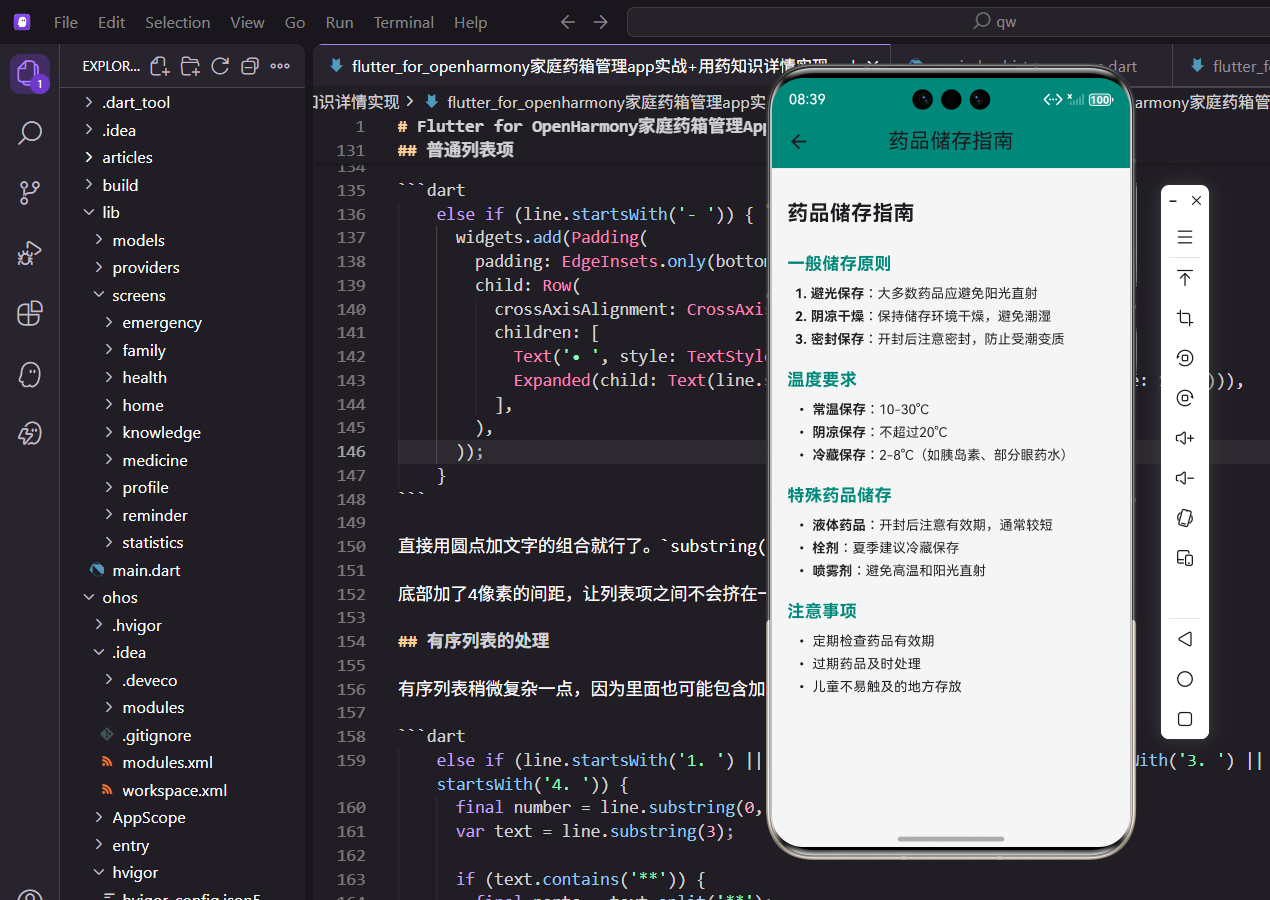
用药知识是家庭药箱管理应用中很重要的一个模块,毕竟很多人对药品的正确使用方法并不太了解。比如哪些药不能空腹吃,哪些药不能和牛奶一起服用,这些知识如果能在应用里方便地查阅,对用户来说还是挺有帮助的。
这个详情页面需要展示的内容比较长,而且格式也比较丰富,有标题、列表、加粗文字等。所以我选择用类似Markdown的格式来存储内容,然后在页面里解析渲染出来。这样做的好处是内容维护起来方便,后期想加新的知识文章也不用改代码。
页面基本结构
页面结构很简单,就是一个带标题的滚动页面。
class KnowledgeDetailScreen extends StatelessWidget {
  final String title;
  final String content;

  const KnowledgeDetailScreen({
    super.key,
    required this.title,
    required this.content,
  });
这里用StatelessWidget就够了,因为页面只负责展示传进来的数据,不需要维护什么状态。构造函数接收title和content两个参数,分别是知识文章的标题和正文内容。
这两个参数都是必需的,用required关键字标注,调用的时候必须传值,不然编译就报错。
Widget build(BuildContext context) {
return Scaffold(
appBar: AppBar(title: Text(title)),
body: SingleChildScrollView(
padding: EdgeInsets.all(16.w),
child: _buildMarkdownContent(content),
),
);
}
}
build方法里面,AppBar直接显示传进来的标题。主体部分用SingleChildScrollView包裹,因为文章内容可能比较长,需要支持滚动。
padding设置成16像素,让内容和屏幕边缘有一定的间距,看起来不会太挤。_buildMarkdownContent方法负责把Markdown格式的文本解析成Flutter的Widget树。
内容解析的实现思路
解析器的核心逻辑是按行遍历,根据每行的开头特征来判断它是什么类型的元素。
Widget _buildMarkdownContent(String content) {
  final lines = content.split('\n');
  List<Widget> widgets = [];

  for (var line in lines) {
    if (line.startsWith('# ')) {
      widgets.add(Padding(
        padding: EdgeInsets.only(top: 16.h, bottom: 8.h),
        child: Text(
          line.substring(2),
          style: TextStyle(fontSize: 22.sp, fontWeight: FontWeight.bold),
        ),
      ));
    }
先用split('\n')把内容按行分割成数组,然后逐行判断。一级标题以# 开头,用22号粗体字显示。substring(2)用来去掉行首的# ,只保留实际的文字内容。
上面加了16像素的间距,下面加了8像素,这样标题和上下内容之间都有适当的留白,阅读起来更舒服。
    else if (line.startsWith('## ')) {
      widgets.add(Padding(
        padding: EdgeInsets.only(top: 16.h, bottom: 8.h),
        child: Text(
          line.substring(3),
          style: TextStyle(fontSize: 18.sp, fontWeight: FontWeight.bold, color: const Color(0xFF00897B)),
        ),
      ));
    }
二级标题以## 开头,用18号粗体字并且是主题绿色。这样在视觉上能和一级标题区分开,用户扫一眼就知道这是小节标题。
颜色用的是应用的主题色0xFF00897B,和整体风格保持一致。
带加粗的列表项处理
用药知识里经常会有这种格式:- **药品名称**:具体说明,需要把药品名称加粗显示。
    else if (line.startsWith('- **')) {
      final boldEnd = line.indexOf('**', 4);
      if (boldEnd != -1) {
        final boldText = line.substring(4, boldEnd);
        final normalText = line.substring(boldEnd + 2);
        widgets.add(Padding(
          padding: EdgeInsets.only(bottom: 4.h, left: 8.w),
          child: Row(
            crossAxisAlignment: CrossAxisAlignment.start,
            children: [
              Text('• ', style: TextStyle(fontSize: 14.sp)),
这段代码先找到第二个**的位置,然后把加粗部分和普通部分分别提取出来。indexOf('**', 4)从第4个字符开始找,跳过开头的- **。
左边加了8像素的缩进,让列表看起来有层次感。crossAxisAlignment: CrossAxisAlignment.start确保圆点和文字第一行对齐。
              Expanded(
                child: RichText(
                  text: TextSpan(
                    style: TextStyle(fontSize: 14.sp, color: Colors.black87),
                    children: [
                      TextSpan(text: boldText, style: const TextStyle(fontWeight: FontWeight.bold)),
                      TextSpan(text: normalText),
                    ],
                  ),
                ),
              ),
            ],
          ),
        ));
      }
    }
用RichText和TextSpan来实现同一行文字的不同样式。加粗部分用fontWeight: FontWeight.bold,普通部分保持默认样式。
Expanded包裹RichText,让它自动占满剩余空间并支持换行,不会因为文字太长而溢出屏幕。
普通列表项
没有加粗的普通列表项处理起来就简单多了。
    else if (line.startsWith('- ')) {
      widgets.add(Padding(
        padding: EdgeInsets.only(bottom: 4.h, left: 8.w),
        child: Row(
          crossAxisAlignment: CrossAxisAlignment.start,
          children: [
            Text('• ', style: TextStyle(fontSize: 14.sp)),
            Expanded(child: Text(line.substring(2), style: TextStyle(fontSize: 14.sp))),
          ],
        ),
      ));
    }
直接用圆点加文字的组合就行了。substring(2)去掉开头的- ,只保留实际内容。
底部加了4像素的间距,让列表项之间不会挤在一起,但也不会太松散。
有序列表的处理
有序列表稍微复杂一点,因为里面也可能包含加粗文字。
    else if (line.startsWith('1. ') || line.startsWith('2. ') || line.startsWith('3. ') || line.startsWith('4. ')) {
      final number = line.substring(0, 2);
      var text = line.substring(3);

      if (text.contains('**')) {
        final parts = text.split('**');
        widgets.add(Padding(
          padding: EdgeInsets.only(bottom: 4.h, left: 8.w),
          child: Row(
            crossAxisAlignment: CrossAxisAlignment.start,
            children: [
              Text('$number ', style: TextStyle(fontSize: 14.sp, fontWeight: FontWeight.bold)),
这里先判断是不是以数字开头,然后把序号和内容分开处理。序号部分单独提取出来用粗体显示,和后面的内容区分开。
如果内容里包含**,说明有需要加粗的部分,就要做进一步处理。
              Expanded(
                child: RichText(
                  text: TextSpan(
                    style: TextStyle(fontSize: 14.sp, color: Colors.black87),
                    children: parts.asMap().entries.map((entry) {
                      return TextSpan(
                        text: entry.value,
                        style: entry.key % 2 == 1 ? const TextStyle(fontWeight: FontWeight.bold) : null,
                      );
                    }).toList(),
                  ),
                ),
              ),
            ],
          ),
        ));
      }
这里用了个小技巧,把文字按**分割后,奇数位置的就是需要加粗的部分。asMap().entries可以同时拿到索引和内容,然后根据索引的奇偶性来决定是否加粗。
比如这是**加粗**文字分割后是['这是', '加粗', '文字'],索引1的"加粗"就需要加粗显示。
普通段落
最后是普通文本的处理,不匹配任何特殊格式的非空行都当作普通段落。
    else if (line.trim().isNotEmpty) {
      widgets.add(Padding(
        padding: EdgeInsets.only(bottom: 8.h),
        child: Text(line, style: TextStyle(fontSize: 14.sp, color: Colors.grey[700])),
      ));
    }
  }

  return Column(
    crossAxisAlignment: CrossAxisAlignment.start,
    children: widgets,
  );
}
普通段落用灰色字体显示,和标题、列表形成对比,让重要信息更突出。trim().isNotEmpty过滤掉空行,避免产生多余的空白间距。
最后把所有解析出来的Widget放到Column里返回,crossAxisAlignment: CrossAxisAlignment.start让内容左对齐。整个页面就渲染出来了,这个解析器虽然简单,但对于用药知识这种结构化的内容已经够用了。
欢迎加入开源鸿蒙跨平台社区:https://openharmonycrossplatform.csdn.net

开源鸿蒙跨平台开发社区汇聚开发者与厂商,共建“一次开发,多端部署”的开源生态,致力于降低跨端开发门槛,推动万物智联创新。
更多推荐

 25
25 0
0- 0


 已为社区贡献30条内容

所有评论(0)