Flutter for OpenHarmony 美食烹饪助手 App 实战:菜谱库主界面实现
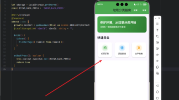
菜谱库主界面设计摘要: 该界面采用分区布局,顶部为统计卡片展示收藏菜谱数量,中间设置4个快速入口(收藏、历史、创建、搜索),底部显示最近菜谱列表。设计亮点包括: 使用渐变橙色背景的头部卡片增强视觉吸引力 图标按钮采用统一设计语言(60x60圆角容器+30sp图标) 右下角浮动按钮提供快捷创建入口 右上角设置搜索按钮符合用户习惯 通过GetX实现便捷的页面跳转 整体采用层次分明的三区布局,确保功能入

菜谱库是整个应用的核心模块,用户在这里管理自己的菜谱收藏、创作和浏览历史。今天我们要实现菜谱库的主界面,它需要整合多个功能入口,让用户能够快速访问各种菜谱相关的功能。
菜谱库的功能规划
菜谱库主界面要承载很多功能:我的收藏、浏览历史、创建菜谱、搜索菜谱等。如何在一个页面中合理组织这些功能,是设计的关键。
我采用了分区布局的方式。顶部是一个醒目的头部卡片,展示菜谱库的统计信息。中间是快速入口区,用图标按钮的形式展示主要功能。底部是菜谱列表,展示用户最近的菜谱。
这种布局的好处是层次清晰,用户一眼就能看到所有功能。头部卡片吸引注意力,快速入口方便操作,菜谱列表提供内容预览。三个区域各司其职,互不干扰。
创建无状态组件
菜谱库主界面的内容相对固定,使用 StatelessWidget 就够了。
import 'package:flutter/material.dart';
import 'package:flutter_screenutil/flutter_screenutil.dart';
import 'package:get/get.dart';
import 'my_recipes_page.dart';
import 'favorite_recipes_page.dart';
import 'browse_history_page.dart';
import 'recipe_search_page.dart';
import 'create_recipe_page.dart';

class RecipeLibraryPage extends StatelessWidget {
  const RecipeLibraryPage({super.key});
导入了所有需要跳转的页面。使用 GetX 的路由管理,可以很方便地进行页面跳转。
构建页面结构
页面使用 SingleChildScrollView 包裹,让内容可以滚动。
Widget build(BuildContext context) {
return Scaffold(
appBar: AppBar(
title: const Text('菜谱库'),
actions: [
IconButton(
icon: const Icon(Icons.search),
onPressed: () => Get.to(() => const RecipeSearchPage()),
),
],
),
body: SingleChildScrollView(
child: Column(
children: [
_buildHeader(),
SizedBox(height: 20.h),
_buildQuickActions(),
SizedBox(height: 20.h),
_buildMyRecipes(),
SizedBox(height: 20.h),
],
),
),
AppBar 右侧放了一个搜索按钮,点击后跳转到搜索页面。这是一个常见的设计,用户习惯在右上角找搜索功能。
body 使用 SingleChildScrollView 包裹 Column,让整个页面可以滚动。Column 中依次排列三个区域,用 SizedBox 分隔,让布局更透气。
      floatingActionButton: FloatingActionButton(
        onPressed: () => Get.to(() => const CreateRecipePage()),
        backgroundColor: Colors.orange,
        child: const Icon(Icons.add),
      ),
    );
  }
右下角放了一个浮动按钮,用于创建新菜谱。这是一个很直观的设计,加号图标让用户一看就知道是创建功能。
浮动按钮使用橙色背景,和应用的主题色保持一致。图标是白色的加号,对比度很好,非常醒目。
实现头部卡片
头部卡片展示菜谱库的统计信息,使用渐变背景让它更醒目。
  Widget _buildHeader() {
    return Container(
      margin: EdgeInsets.all(16.w),
      padding: EdgeInsets.all(20.w),
      decoration: BoxDecoration(
        gradient: LinearGradient(
          colors: [Colors.orange.shade400, Colors.orange.shade600],
        ),
        borderRadius: BorderRadius.circular(12.r),
      ),
margin 设置为 16.w,让卡片不要紧贴屏幕边缘。padding 设置为 20.w,让内容有足够的空间。
渐变背景使用两种橙色,从浅到深。这种渐变效果比纯色更有层次感,也更吸引眼球。圆角设置为 12.r,和应用的其他卡片保持一致。
      child: Row(
        children: [
          Expanded(
            child: Column(
              crossAxisAlignment: CrossAxisAlignment.start,
              children: [
                Text(
                  '我的菜谱库',
                  style: TextStyle(
                    color: Colors.white,
                    fontSize: 20.sp,
                    fontWeight: FontWeight.bold,
                  ),
                ),
                SizedBox(height: 8.h),
                Text(
                  '已收藏 50 道菜谱',
                  style: TextStyle(color: Colors.white, fontSize: 14.sp),
                ),
              ],
            ),
          ),
          Icon(Icons.book, size: 60.sp, color: Colors.white.withOpacity(0.5)),
        ],
      ),
    );
  }
左侧是文字信息,右侧是一个大图标。使用 Expanded 让文字部分占据剩余空间,图标固定大小。
标题使用白色粗体,字号 20.sp,这是一级标题的标准大小。副标题也是白色,字号 14.sp,表示这是次要信息。
右侧的图标使用半透明的白色,这样既能看到图标,又不会抢了文字的风头。图标大小 60.sp,比较大,起到装饰作用。
实现快速入口
快速入口使用图标按钮的形式,四个按钮平均分布。
  Widget _buildQuickActions() {
    final actions = [
      {'icon': Icons.favorite, 'title': '我的收藏', 'page': const FavoriteRecipesPage()},
      {'icon': Icons.history, 'title': '浏览历史', 'page': const BrowseHistoryPage()},
      {'icon': Icons.create, 'title': '创建菜谱', 'page': const CreateRecipePage()},
      {'icon': Icons.search, 'title': '搜索菜谱', 'page': const RecipeSearchPage()},
    ];
使用 Map 列表来定义所有的快速入口。每个入口包含图标、标题和目标页面。这种数据驱动的方式让代码更简洁,添加新入口也很方便。
图标的选择很有讲究。收藏用心形图标,历史用时钟图标,创建用笔图标,搜索用放大镜图标。这些都是通用的图标语言,用户一看就懂。
    return Padding(
      padding: EdgeInsets.symmetric(horizontal: 16.w),
      child: Row(
        mainAxisAlignment: MainAxisAlignment.spaceAround,
        children: actions.map((action) {
          return GestureDetector(
            onTap: () => Get.to(() => action['page'] as Widget),
            child: Column(
              children: [
                Container(
                  width: 60.w,
                  height: 60.w,
                  decoration: BoxDecoration(
                    color: Colors.orange.shade50,
                    borderRadius: BorderRadius.circular(12.r),
                  ),
                  child: Icon(
                    action['icon'] as IconData,
                    color: Colors.orange,
                    size: 30.sp,
                  ),
                ),
                SizedBox(height: 8.h),
                Text(
                  action['title'] as String,
                  style: TextStyle(fontSize: 12.sp),
                ),
              ],
            ),
          );
        }).toList(),
      ),
    );
  }
使用 Row 水平排列所有按钮,mainAxisAlignment 设置为 spaceAround,让按钮平均分布。
每个按钮包含一个图标容器和一个文字标签。图标容器是正方形,宽高都是 60.w,背景色是橙色的浅色版本,圆角 12.r。
图标颜色是橙色,大小 30.sp。文字标签在图标下方,字号 12.sp,颜色是默认的黑色。
点击按钮时,使用 Get.to 跳转到对应的页面。这里需要做类型转换,因为 Map 的值类型是 dynamic。
实现菜谱列表
底部展示用户最近的菜谱,使用横向滚动的卡片列表。
  Widget _buildMyRecipes() {
    return Column(
      crossAxisAlignment: CrossAxisAlignment.start,
      children: [
        Padding(
          padding: EdgeInsets.symmetric(horizontal: 16.w),
          child: Row(
            mainAxisAlignment: MainAxisAlignment.spaceBetween,
            children: [
              Text(
                '我的菜谱',
                style: TextStyle(fontSize: 18.sp, fontWeight: FontWeight.bold),
              ),
              TextButton(
                onPressed: () => Get.to(() => const MyRecipesPage()),
                child: const Text('查看全部'),
              ),
            ],
          ),
        ),
标题和"查看全部"按钮水平排列,标题在左,按钮在右。标题使用粗体,字号 18.sp,这是二级标题的标准大小。
"查看全部"按钮使用 TextButton,点击后跳转到我的菜谱页面。这是一个常见的设计模式,让用户知道这里只是预览,完整内容在另一个页面。
        SizedBox(height: 12.h),
        SizedBox(
          height: 200.h,
          child: ListView.builder(
            scrollDirection: Axis.horizontal,
            padding: EdgeInsets.symmetric(horizontal: 16.w),
            itemCount: 10,
            itemBuilder: (context, index) {
              return _buildRecipeCard(index);
            },
          ),
        ),
      ],
    );
  }
列表使用 ListView.builder,scrollDirection 设置为 horizontal,让列表横向滚动。高度固定为 200.h,这样卡片大小就确定了。
itemCount 现在是固定的 10,实际开发中应该根据数据动态设置。padding 设置为水平 16.w,让列表内容不要紧贴屏幕边缘。
实现菜谱卡片
每个菜谱卡片包含图片、名称和时间信息。
  Widget _buildRecipeCard(int index) {
    return Container(
      width: 150.w,
      margin: EdgeInsets.only(right: 12.w),
      decoration: BoxDecoration(
        color: Colors.white,
        borderRadius: BorderRadius.circular(12.r),
        boxShadow: [
          BoxShadow(
            color: Colors.grey.withOpacity(0.1),
            blurRadius: 5,
            offset: const Offset(0, 2),
          ),
        ],
      ),
卡片宽度固定为 150.w,这样在手机屏幕上大约能显示两个半卡片,用户会知道可以横向滚动。
margin 设置为 right: 12.w,让卡片之间有间距。卡片使用白色背景、圆角和轻微阴影,这是应用的统一风格。
      child: Column(
        crossAxisAlignment: CrossAxisAlignment.start,
        children: [
          Container(
            height: 120.h,
            decoration: BoxDecoration(
              color: Colors.orange.shade100,
              borderRadius: BorderRadius.vertical(top: Radius.circular(12.r)),
            ),
            child: Center(
              child: Icon(Icons.restaurant, size: 50.sp, color: Colors.orange),
            ),
          ),
顶部是菜谱图片的占位符。实际开发中应该显示真实的图片,这里用图标代替。容器高度 120.h,背景色是橙色的浅色版本。
borderRadius 只设置顶部的圆角,让图片和卡片的圆角对齐。图标居中显示,大小 50.sp,颜色是橙色。
          Padding(
            padding: EdgeInsets.all(8.w),
            child: Column(
              crossAxisAlignment: CrossAxisAlignment.start,
              children: [
                Text(
                  '我的菜谱 ${index + 1}',
                  style: TextStyle(fontSize: 14.sp, fontWeight: FontWeight.bold),
                  maxLines: 1,
                  overflow: TextOverflow.ellipsis,
                ),
                SizedBox(height: 4.h),
                Row(
                  children: [
                    Icon(Icons.timer, size: 12.sp, color: Colors.grey),
                    SizedBox(width: 4.w),
                    Text('30分钟', style: TextStyle(fontSize: 11.sp, color: Colors.grey)),
                  ],
                ),
              ],
            ),
          ),
        ],
      ),
    );
  }
}
底部是菜谱信息。padding 设置为 8.w,让内容不要紧贴边缘。菜谱名称使用粗体,字号 14.sp。
maxLines 设置为 1,overflow 设置为 ellipsis,这样如果名称太长,会显示省略号。这是处理长文本的标准方式。
时间信息使用图标和文字组合。图标大小 12.sp,颜色是灰色,表示这是次要信息。文字也是灰色,字号 11.sp。
添加下拉刷新
菜谱库的内容可能会变化,可以添加下拉刷新功能:
RefreshIndicator(
  onRefresh: () async {
    // 刷新数据
    await Future.delayed(Duration(seconds: 1));
  },
  child: SingleChildScrollView(
    // ...
  ),
)
RefreshIndicator 包裹 SingleChildScrollView,用户下拉时会触发 onRefresh 回调。在回调中重新加载数据,然后返回一个 Future。
这里用 Future.delayed 模拟网络请求。实际开发中应该调用真实的数据接口。
添加骨架屏
数据加载时,可以显示骨架屏,让用户知道内容正在加载:
if (isLoading) {
  return _buildSkeleton();
}
骨架屏使用灰色的占位块,模拟真实内容的布局。这比显示一个转圈的加载指示器要好,因为用户能看到页面的大致结构。
总结
菜谱库主界面整合了多个功能入口,使用分区布局让页面层次清晰。头部卡片展示统计信息,快速入口方便操作,菜谱列表提供内容预览。
通过合理的布局和交互设计,我们让菜谱库主界面既美观又实用。用户可以快速访问各种功能,也能预览最近的菜谱。
下一篇文章我们将实现我的菜谱管理功能,让用户能够管理自己创建的菜谱。
欢迎加入开源鸿蒙跨平台社区:https://openharmonycrossplatform.csdn.net

开源鸿蒙跨平台开发社区汇聚开发者与厂商,共建“一次开发,多端部署”的开源生态,致力于降低跨端开发门槛,推动万物智联创新。
更多推荐


 17
17 0
0- 0


 已为社区贡献16条内容

所有评论(0)