Flutter for OpenHarmony 个人理财管理App实战 - 添加交易记录
本文介绍了一个记账应用的交易记录添加页面设计。该页面采用单页表单形式,包含类型切换、金额输入、分类选择、账户选择、日期选择和备注输入等功能模块。页面设计强调操作流畅性,通过默认值、Tab切换和醒目的大字号金额输入框优化用户体验。代码实现采用Flutter框架,使用StatefulWidget管理多个表单状态,并遵循Material Design规范进行布局设计。核心功能包括:金额输入突出显示、分类
记账是理财应用的核心功能,添加交易记录页面的设计直接影响用户的使用体验。这个页面需要收集金额、类型、分类、账户、日期、备注等信息,同时要保证操作流畅,不能让用户觉得繁琐。一个好的记账页面应该让用户在几秒钟内完成一笔记录。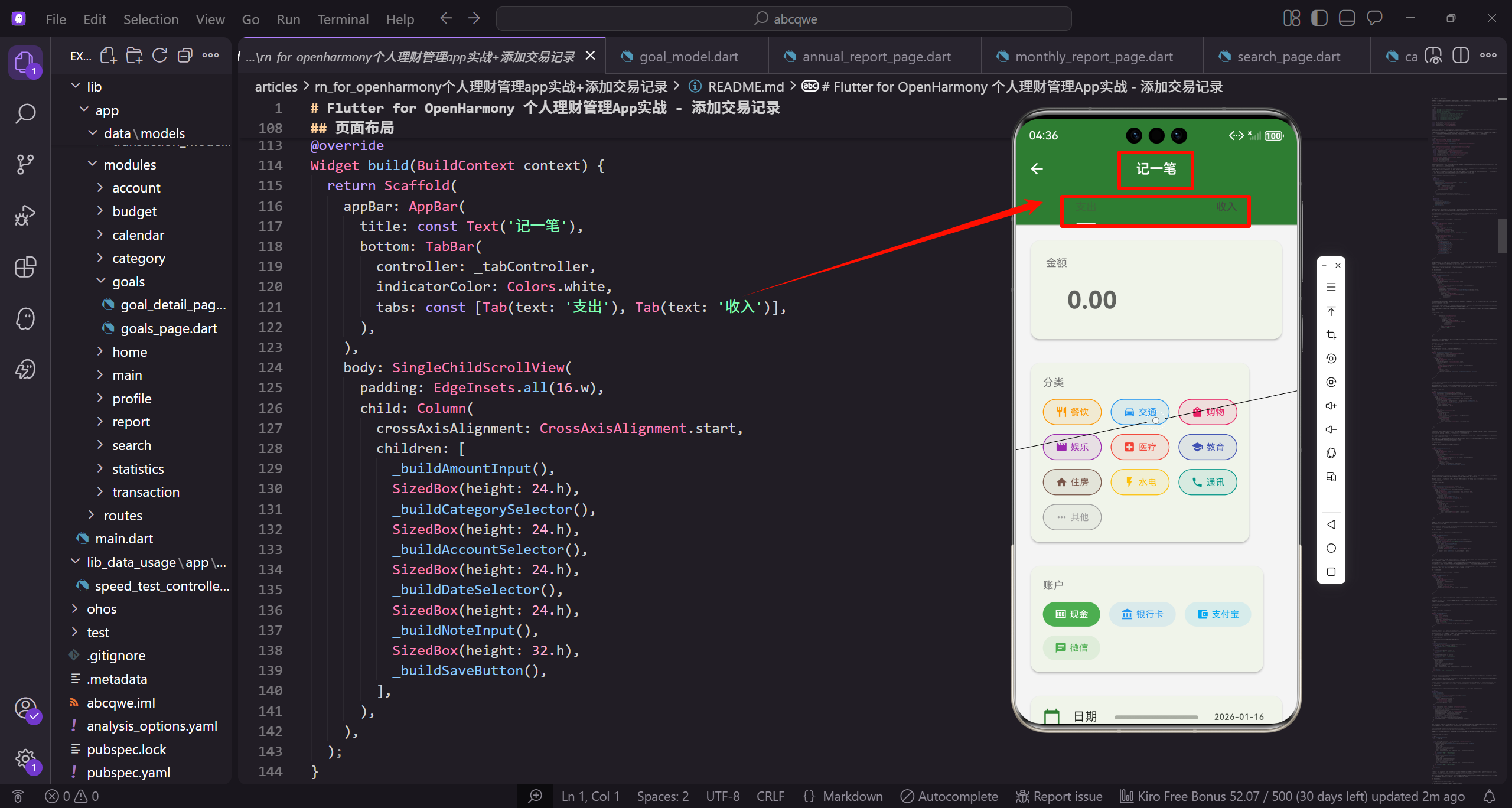
页面设计思路
添加交易记录页面采用单页表单的形式,从上到下依次是:
- 类型切换 Tab - 支出/收入
- 金额输入卡片 - 大字号输入框,突出金额
- 分类选择 - 网格布局的分类标签
- 账户选择 - 横向排列的账户标签
- 日期选择 - 点击弹出日期选择器
- 备注输入 - 可选的文字备注
- 保存按钮 - 固定在底部
这种布局让用户从上往下依次填写,逻辑清晰。金额和分类是必填项,其他都有默认值或可选。用户最常见的操作路径是:输入金额、选分类、点保存,三步完成记账。
页面基础结构
AddTransactionPage 使用 StatefulWidget,因为需要管理多个表单状态:
import 'package:flutter/material.dart';
import 'package:flutter_screenutil/flutter_screenutil.dart';
import 'package:get/get.dart';
import 'package:intl/intl.dart';
import '../../core/services/transaction_service.dart';
import '../../core/services/category_service.dart';
import '../../core/services/account_service.dart';
import '../../data/models/transaction_model.dart';
import '../../data/models/category_model.dart';
import '../../data/models/account_model.dart';

const _primaryColor = Color(0xFF2E7D32);
const _incomeColor = Color(0xFF4CAF50);
const _expenseColor = Color(0xFFE53935);
const _textSecondary = Color(0xFF757575);
导入部分包含了 Flutter 核心库、屏幕适配库、GetX、日期格式化库,以及项目内部的服务和模型。这些依赖各司其职,TransactionService 负责交易数据的增删改查,CategoryService 提供分类列表,AccountService 提供账户列表。
颜色常量定义在文件顶部,和其他页面保持一致。_incomeColor 用绿色表示收入,_expenseColor 用红色表示支出,这种配色方案贯穿整个应用。_textSecondary 用于标签等次要文字,灰色调不会抢主要内容的风头。_primaryColor 是主题色,用于按钮和强调元素。
页面类定义和状态变量:
class AddTransactionPage extends StatefulWidget {
const AddTransactionPage({super.key});
State<AddTransactionPage> createState() => _AddTransactionPageState();
}
class _AddTransactionPageState extends State<AddTransactionPage>
with SingleTickerProviderStateMixin {
late TabController _tabController;
final _amountController = TextEditingController();
final _noteController = TextEditingController();
final _transactionService = Get.find<TransactionService>();
final _categoryService = Get.find<CategoryService>();
final _accountService = Get.find<AccountService>();
TransactionType _type = TransactionType.expense;
String? _selectedCategoryId;
String? _selectedAccountId;
DateTime _selectedDate = DateTime.now();
AddTransactionPage 继承自 StatefulWidget,因为页面有多个需要管理的状态。SingleTickerProviderStateMixin 是 TabController 需要的,它提供动画的 vsync 信号,确保动画和屏幕刷新同步。
_tabController 控制支出/收入的 Tab 切换,_amountController 和 _noteController 分别管理金额和备注输入框的内容。通过 Get.find 获取三个服务的实例,这些服务在应用启动时已经注册到 GetX 的依赖注入容器中。
_type 记录当前选择的交易类型,默认是支出,因为大多数记账场景都是记录支出。_selectedCategoryId 和 _selectedAccountId 记录选中的分类和账户,初始为 null 表示未选择。_selectedDate 默认是今天,用户可以修改为其他日期。
initState 方法初始化各种控制器和默认值:
void initState() {
super.initState();
_tabController = TabController(length: 2, vsync: this);
_tabController.addListener(() {
setState(() {
_type = _tabController.index == 0
? TransactionType.expense
: TransactionType.income;
_selectedCategoryId = null;
});
});
if (_accountService.allAccounts.isNotEmpty) {
_selectedAccountId = _accountService.allAccounts.first.id;
}
}
void dispose() {
_tabController.dispose();
_amountController.dispose();
_noteController.dispose();
super.dispose();
}
TabController 的 length 设为 2,对应支出和收入两个 Tab。addListener 监听 Tab 切换事件,当用户切换类型时,更新 _type 并清空已选的分类。清空分类是因为收入和支出的分类是不同的,切换后之前选的分类可能不适用。
如果账户列表不为空,默认选中第一个账户,减少用户的操作步骤。大多数用户只有一两个常用账户,默认选中可以省去一次点击。dispose 方法释放所有 Controller,这是 StatefulWidget 的标准做法,避免内存泄漏。
页面布局
build 方法构建整体布局,包括 AppBar 和表单内容:
Widget build(BuildContext context) {
return Scaffold(
appBar: AppBar(
title: const Text('记一笔'),
bottom: TabBar(
controller: _tabController,
indicatorColor: Colors.white,
tabs: const [Tab(text: '支出'), Tab(text: '收入')],
),
),
body: SingleChildScrollView(
padding: EdgeInsets.all(16.w),
child: Column(
crossAxisAlignment: CrossAxisAlignment.start,
children: [
_buildAmountInput(),
SizedBox(height: 24.h),
_buildCategorySelector(),
SizedBox(height: 24.h),
_buildAccountSelector(),
SizedBox(height: 24.h),
_buildDateSelector(),
SizedBox(height: 24.h),
_buildNoteInput(),
SizedBox(height: 32.h),
_buildSaveButton(),
],
),
),
);
}
AppBar 的 title 设为"记一笔",简洁明了。TabBar 放在 AppBar 的 bottom 位置,这是 Material Design 的标准做法。indicatorColor 设为白色,和 AppBar 背景形成对比,让用户清楚当前选中的是哪个 Tab。
页面内容用 SingleChildScrollView 包裹,确保在小屏设备上也能滚动查看全部内容。各个组件之间用 SizedBox 留出 24.h 的间距,比首页的 16.h 稍大一些,因为表单需要更多的呼吸空间。保存按钮前面用 32.h 的间距,和其他内容拉开距离,突出其重要性。
金额输入组件
金额是最重要的信息,用大字号和醒目的颜色突出显示:
Widget _buildAmountInput() {
  return Card(
    child: Padding(
      padding: EdgeInsets.all(20.w),
      child: Column(
        crossAxisAlignment: CrossAxisAlignment.start,
        children: [
          Text('金额',
            style: TextStyle(fontSize: 14.sp, color: _textSecondary)),
          SizedBox(height: 8.h),
          TextField(
            controller: _amountController,
            keyboardType: const TextInputType.numberWithOptions(decimal: true),
            style: TextStyle(
              fontSize: 32.sp,
              fontWeight: FontWeight.bold,
              color: _type == TransactionType.expense
                ? _expenseColor
                : _incomeColor
            ),
Card 组件包裹金额输入区域,和页面其他卡片保持一致的视觉风格。Padding 设为 20.w,比普通卡片稍大一些,让金额输入区域更突出。"金额"标签用灰色小字,起到说明作用但不会喧宾夺主。
TextField 的 keyboardType 设为 numberWithOptions(decimal: true),弹出数字键盘并支持小数点输入。这个设置很重要,如果用普通键盘,用户输入金额会很麻烦。字号设为 32.sp,是页面上最大的文字,强调金额的重要性。
金额颜色根据交易类型变化,支出用红色,收入用绿色。这种视觉反馈让用户清楚当前在记录什么类型的交易,避免记错。fontWeight 设为 bold,让金额数字更醒目。
输入框的装饰配置:
            decoration: InputDecoration(
              prefixText: '¥ ',
              prefixStyle: TextStyle(
                fontSize: 32.sp,
                fontWeight: FontWeight.bold,
                color: _type == TransactionType.expense
                  ? _expenseColor
                  : _incomeColor
              ),
              border: InputBorder.none,
              hintText: '0.00',
            ),
          ),
        ],
      ),
    ),
  );
}
prefixText 显示货币符号"¥",和金额用相同的样式,看起来是一个整体。prefixStyle 的颜色也根据交易类型变化,保持视觉一致性。border 设为 none,去掉输入框的边框,让界面更简洁。
hintText 设为"0.00",提示用户输入格式。当输入框为空时显示这个占位文字,用户开始输入后自动消失。这种设计比单独的说明文字更直观,用户一看就知道应该输入什么格式的内容。
分类选择组件
分类用 Wrap 布局,自动换行,适应不同数量的分类:
Widget _buildCategorySelector() {
  final categories = _type == TransactionType.expense
    ? _categoryService.expenseCategories
    : _categoryService.incomeCategories;
  return Card(
    child: Padding(
      padding: EdgeInsets.all(16.w),
      child: Column(
        crossAxisAlignment: CrossAxisAlignment.start,
        children: [
          Text('分类',
            style: TextStyle(fontSize: 14.sp, color: _textSecondary)),
          SizedBox(height: 12.h),
          Wrap(
            spacing: 12.w,
            runSpacing: 12.h,
            children: categories.map((c) => _buildCategoryChip(c)).toList(),
          ),
        ],
      ),
    ),
  );
}
根据当前交易类型从 CategoryService 获取对应的分类列表。支出和收入的分类是分开管理的,切换类型时分类列表会自动更新。这种设计避免了用户在支出时看到收入分类,减少困惑。
Wrap 组件让分类标签自动换行,spacing 控制水平间距,runSpacing 控制垂直间距,都设为 12 是一个舒适的值。map 方法遍历分类列表,为每个分类创建一个标签组件。toList() 将 Iterable 转为 List,因为 Wrap 的 children 需要 List 类型。
单个分类标签的实现:
Widget _buildCategoryChip(CategoryModel category) {
  final isSelected = _selectedCategoryId == category.id;
  return GestureDetector(
    onTap: () => setState(() => _selectedCategoryId = category.id),
    child: Container(
      padding: EdgeInsets.symmetric(horizontal: 16.w, vertical: 8.h),
      decoration: BoxDecoration(
        color: isSelected ? category.color : category.color.withOpacity(0.1),
        borderRadius: BorderRadius.circular(20.r),
        border: Border.all(
          color: category.color,
          width: isSelected ? 0 : 1
        ),
      ),
      child: Row(
        mainAxisSize: MainAxisSize.min,
        children: [
          Icon(category.icon,
            size: 16.sp,
            color: isSelected ? Colors.white : category.color),
          SizedBox(width: 4.w),
          Text(category.name,
            style: TextStyle(
              fontSize: 12.sp,
              color: isSelected ? Colors.white : category.color
            )),
        ],
      ),
    ),
  );
}
isSelected 判断当前分类是否被选中,用于控制样式变化。GestureDetector 处理点击事件,点击时更新 _selectedCategoryId 并通过 setState 刷新界面。Container 的 padding 设置水平和垂直内边距,让标签有合适的大小。
选中状态用实心背景色,未选中用 10% 透明度的背景加描边。这种设计让选中状态一目了然,用户不需要仔细看就能知道选了哪个分类。borderRadius 设为 20.r 形成圆角矩形,视觉上更柔和。
Row 组件让图标和文字水平排列,mainAxisSize: MainAxisSize.min 让标签宽度自适应内容。图标和文字的颜色都根据选中状态变化,选中时用白色,未选中时用分类自身的颜色。这种颜色变化提供了清晰的视觉反馈。
账户选择组件
账户选择和分类选择的结构类似,但样式略有不同:
Widget _buildAccountSelector() {
  return Card(
    child: Padding(
      padding: EdgeInsets.all(16.w),
      child: Column(
        crossAxisAlignment: CrossAxisAlignment.start,
        children: [
          Text('账户',
            style: TextStyle(fontSize: 14.sp, color: _textSecondary)),
          SizedBox(height: 12.h),
          Wrap(
            spacing: 12.w,
            runSpacing: 12.h,
            children: _accountService.allAccounts
              .map((a) => _buildAccountChip(a)).toList(),
          ),
        ],
      ),
    ),
  );
}
账户选择区域的结构和分类选择完全一致,都是 Card 包裹、标签加 Wrap 布局。这种一致性让用户形成操作习惯,不需要重新学习。_accountService.allAccounts 获取所有账户,不像分类那样区分类型,因为账户对收入和支出都适用。
Wrap 的 spacing 和 runSpacing 设置和分类选择一样,保持视觉一致性。map 方法为每个账户创建标签,toList() 转换类型。这种函数式的写法简洁明了,比 for 循环更易读。
单个账户标签的实现:
Widget _buildAccountChip(AccountModel account) {
  final isSelected = _selectedAccountId == account.id;
  return GestureDetector(
    onTap: () => setState(() => _selectedAccountId = account.id),
    child: Container(
      padding: EdgeInsets.symmetric(horizontal: 16.w, vertical: 8.h),
      decoration: BoxDecoration(
        color: isSelected
          ? account.color
          : account.color.withOpacity(0.1),
        borderRadius: BorderRadius.circular(20.r),
      ),
      child: Row(
        mainAxisSize: MainAxisSize.min,
        children: [
          Icon(account.icon,
            size: 16.sp,
            color: isSelected ? Colors.white : account.color),
          SizedBox(width: 4.w),
          Text(account.name,
            style: TextStyle(
              fontSize: 12.sp,
              color: isSelected ? Colors.white : account.color
            )),
        ],
      ),
    ),
  );
}
账户标签和分类标签的主要区别是没有边框。分类标签未选中时有描边,账户标签只用背景色区分。这是一个细微的设计差异,让分类和账户在视觉上有所区别,用户更容易分辨当前在选择什么。
GestureDetector 处理点击,更新 _selectedAccountId。Container 的装饰只有背景色和圆角,没有 border 属性。Row 组件让图标和文字水平排列,样式和分类标签一致。这种一致性减少了用户的认知负担。
日期选择组件
日期选择用 ListTile 实现,点击弹出系统日期选择器:
Widget _buildDateSelector() {
  return Card(
    child: ListTile(
      leading: Icon(Icons.calendar_today, color: _primaryColor),
      title: const Text('日期'),
      trailing: Text(DateFormat('yyyy-MM-dd').format(_selectedDate)),
      onTap: () async {
        final date = await showDatePicker(
          context: context,
          initialDate: _selectedDate,
          firstDate: DateTime(2020),
          lastDate: DateTime.now().add(const Duration(days: 365)),
        );
        if (date != null) setState(() => _selectedDate = date);
      },
    ),
  );
}
ListTile 是 Material Design 的列表项组件,自带 leading、title、trailing 三个位置,非常适合这种"标签-值"的展示形式。leading 放日历图标,用主题色突出显示。title 是"日期"标签,trailing 显示当前选中的日期。
showDatePicker 是 Flutter 内置的日期选择器,会根据平台显示对应的样式。initialDate 设为当前选中的日期,用户打开选择器时会定位到这个日期。firstDate 设为 2020 年,足够覆盖大部分用户的需求。lastDate 设为一年后,允许用户预记未来的交易。
返回值是 Future<DateTime?>,用户取消选择时返回 null。所以要先判断 date != null 再更新状态。async/await 语法让异步代码看起来像同步代码,更易读。DateFormat 来自 intl 包,‘yyyy-MM-dd’ 格式化为标准的日期格式。
备注输入组件
备注是可选的,用多行文本框让用户添加额外信息:
Widget _buildNoteInput() {
  return Card(
    child: Padding(
      padding: EdgeInsets.all(16.w),
      child: TextField(
        controller: _noteController,
        maxLines: 2,
        decoration: InputDecoration(
          hintText: '添加备注...',
          border: InputBorder.none,
          prefixIcon: Icon(Icons.note, color: _primaryColor),
        ),
      ),
    ),
  );
}
备注输入框用 Card 包裹,和其他组件保持一致的视觉风格。maxLines 设为 2,限制最多两行,避免备注过长影响页面布局。如果用户输入超过两行,文本会在框内滚动。
hintText 设为"添加备注…",提示用户这是可选的备注输入区域。border 设为 none 去掉边框,让界面更简洁。prefixIcon 放一个笔记图标,用主题色显示,提示这是备注输入区域。
TextField 的 controller 绑定 _noteController,可以通过 _noteController.text 获取用户输入的内容。这种设计让表单数据的获取变得简单,不需要在 onChanged 回调中手动管理状态。
保存按钮
保存按钮占满宽度,放在页面底部:
Widget _buildSaveButton() {
  return SizedBox(
    width: double.infinity,
    height: 48.h,
    child: ElevatedButton(
      onPressed: _saveTransaction,
      style: ElevatedButton.styleFrom(backgroundColor: _primaryColor),
      child: Text('保存',
        style: TextStyle(fontSize: 16.sp, color: Colors.white)),
    ),
  );
}
SizedBox 的 width 设为 double.infinity,让按钮占满可用宽度。height 设为 48.h,这是 Material Design 推荐的按钮高度,足够大方便点击。ElevatedButton 是 Material Design 的凸起按钮,有阴影效果,视觉上更突出。
backgroundColor 设为主题色,和 AppBar 保持一致。文字用白色,和背景形成对比。fontSize 设为 16.sp,比普通文字稍大,强调按钮的重要性。onPressed 绑定 _saveTransaction 方法,点击时执行保存逻辑。
保存逻辑和验证
_saveTransaction 方法验证数据并保存交易记录:
void _saveTransaction() {
  final amount = double.tryParse(_amountController.text);
  if (amount == null || amount <= 0) {
    Get.snackbar('提示', '请输入有效金额');
    return;
  }
  if (_selectedCategoryId == null) {
    Get.snackbar('提示', '请选择分类');
    return;
  }
  if (_selectedAccountId == null) {
    Get.snackbar('提示', '请选择账户');
    return;
  }
  _transactionService.addTransaction(
    amount: amount,
    type: _type,
    categoryId: _selectedCategoryId!,
    accountId: _selectedAccountId!,
    date: _selectedDate,
    note: _noteController.text.isEmpty ? null : _noteController.text,
  );
  Get.back();
  Get.snackbar('成功', '记录已保存');
}
验证逻辑检查三个必填项:金额、分类、账户。double.tryParse 尝试解析金额字符串,解析失败返回 null。这比 double.parse 更安全,不会抛异常。金额还要大于 0,防止用户输入负数或零。
任何一个验证不通过就显示提示并 return,不执行后续的保存操作。Get.snackbar 是 GetX 提供的便捷方法,可以快速显示一个 Snackbar 提示,不需要 BuildContext,在任何地方都可以调用。
验证通过后调用 _transactionService.addTransaction 保存数据。_selectedCategoryId! 和 _selectedAccountId! 使用 ! 操作符,因为前面已经验证过不为 null。note 参数判断是否为空,空字符串传 null。保存成功后调用 Get.back() 返回上一页,然后显示成功提示。
编辑模式支持
这个页面也可以用于编辑已有的交易记录,只需要在 initState 中检查是否有传入的交易数据:
void initState() {
super.initState();
_tabController = TabController(length: 2, vsync: this);
_tabController.addListener(() {
setState(() {
_type = _tabController.index == 0
? TransactionType.expense
: TransactionType.income;
_selectedCategoryId = null;
});
});
final transaction = Get.arguments as TransactionModel?;
if (transaction != null) {
_amountController.text = transaction.amount.toString();
_type = transaction.type;
_tabController.index = _type == TransactionType.expense ? 0 : 1;
_selectedCategoryId = transaction.categoryId;
_selectedAccountId = transaction.accountId;
_selectedDate = transaction.date;
_noteController.text = transaction.note ?? '';
} else if (_accountService.allAccounts.isNotEmpty) {
_selectedAccountId = _accountService.allAccounts.first.id;
}
}
Get.arguments 获取路由传递的参数,类型转换为 TransactionModel?。如果有传入的交易数据,说明是编辑模式,需要用已有数据填充表单。_amountController.text 设置金额,_type 设置交易类型,_tabController.index 同步 Tab 选中状态。
_selectedCategoryId、_selectedAccountId、_selectedDate 分别设置分类、账户、日期。_noteController.text 设置备注,如果原备注为 null 就设为空字符串。如果没有传入数据,说明是新增模式,只设置默认账户。
这种设计让一个页面同时支持新增和编辑两种场景,减少了代码重复。用户从交易详情页点击编辑按钮时,会把交易对象作为参数传递过来,页面自动切换到编辑模式。
保存时判断是新增还是更新:
void _saveTransaction() {
  // ... 验证逻辑 ...

  final existingTransaction = Get.arguments as TransactionModel?;
  if (existingTransaction != null) {
    _transactionService.updateTransaction(existingTransaction.copyWith(
      amount: amount,
      type: _type,
      categoryId: _selectedCategoryId!,
      accountId: _selectedAccountId!,
      date: _selectedDate,
      note: _noteController.text.isEmpty ? null : _noteController.text,
    ));
    Get.snackbar('成功', '记录已更新');
  } else {
    _transactionService.addTransaction(
      amount: amount,
      type: _type,
      categoryId: _selectedCategoryId!,
      accountId: _selectedAccountId!,
      date: _selectedDate,
      note: _noteController.text.isEmpty ? null : _noteController.text,
    );
    Get.snackbar('成功', '记录已保存');
  }
  Get.back();
}
再次通过 Get.arguments 获取传入的交易对象,判断是编辑还是新增。如果是编辑模式,调用 updateTransaction 方法,使用 copyWith 创建修改后的副本。copyWith 是数据模型的常用方法,可以只修改指定的字段,其他字段保持原值。
如果是新增模式,调用 addTransaction 方法创建新记录。两种模式的提示信息不同,编辑显示"记录已更新",新增显示"记录已保存"。最后都调用 Get.back() 返回上一页。这种统一的处理方式让代码更简洁,也让用户体验更一致。
交互优化建议
几个提升用户体验的细节可以考虑添加:
- 金额输入框自动获取焦点,用户打开页面就能直接输入
- 切换类型时清空分类选择,避免选错
- 默认选中第一个账户,减少操作步骤
- 保存后自动返回,不需要用户手动关闭
- 输入金额时实时格式化,比如自动添加千分位
自动聚焦可以在 initState 中添加:
void initState() {
super.initState();
// ... 其他初始化代码 ...
WidgetsBinding.instance.addPostFrameCallback((_) {
FocusScope.of(context).requestFocus(FocusNode());
});
}
addPostFrameCallback 在第一帧渲染完成后执行,这时候 context 已经可用。requestFocus 请求焦点,会自动弹出键盘。不过这个优化要谨慎,有些用户可能不喜欢自动弹出键盘,可以做成可配置的选项。
小结
添加交易记录页面的核心是让用户快速完成记账操作。设计要点包括:
- 金额输入突出显示,是页面的视觉焦点
- 分类和账户用标签选择,比下拉框更直观
- 必填项验证清晰,错误提示友好
- 默认值合理,减少用户操作步骤
- 同时支持新增和编辑两种模式
整个页面的交互流程是:用户输入金额、选择分类、点击保存。账户有默认值,日期默认今天,备注可选。这种设计让最常见的记账场景只需要三步操作,大大提升了效率。
下一篇会介绍交易记录列表页面,包括按日期分组、筛选、月度汇总等功能。
欢迎加入开源鸿蒙跨平台社区:https://openharmonycrossplatform.csdn.net

开源鸿蒙跨平台开发社区汇聚开发者与厂商,共建“一次开发,多端部署”的开源生态,致力于降低跨端开发门槛,推动万物智联创新。
更多推荐

 16
16 0
0- 0


 已为社区贡献30条内容

所有评论(0)