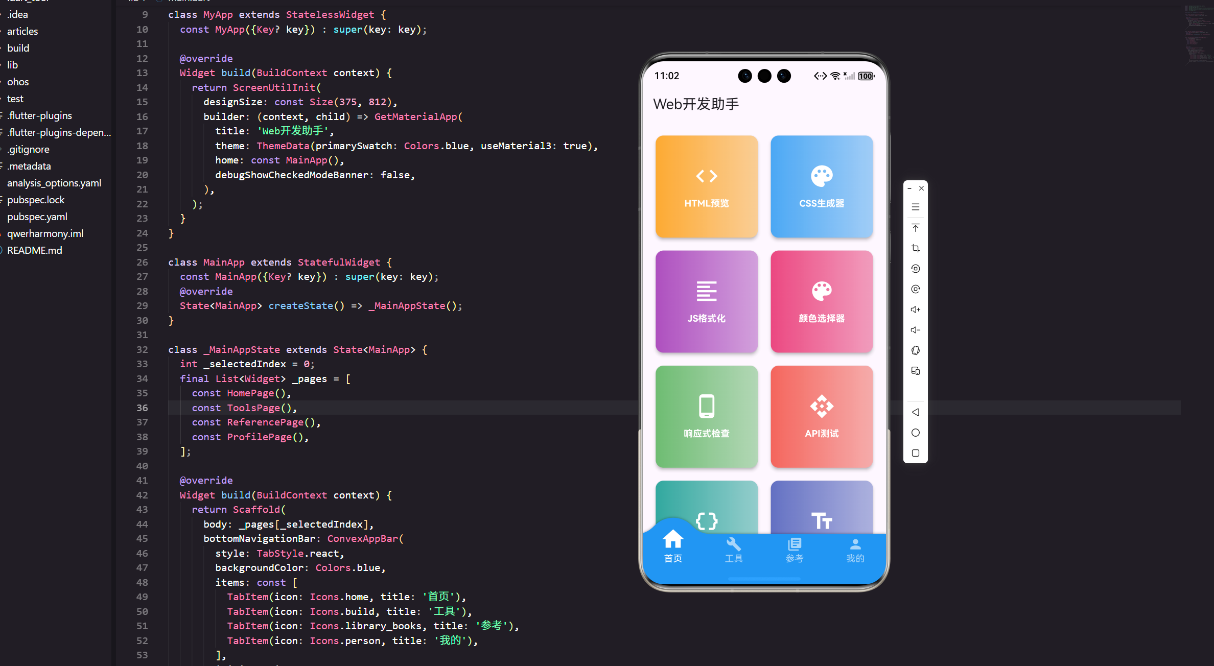
Flutter for OpenHarmony Web开发助手App实战:响应式检查
用户可以输入任意宽高。
现在的网站都要适配各种屏幕尺寸,从手机到平板到桌面。今天我们来实现一个响应式检查工具,帮助开发者快速测试不同设备下的显示效果。
功能设计思路
响应式检查器的核心是模拟不同设备的屏幕尺寸。我们需要:
预设设备列表:常见的手机、平板、桌面尺寸。
自定义尺寸:用户可以输入任意宽高。
横竖屏切换:一键旋转屏幕方向。
URL输入:输入网址进行预览(简化版)。
完整代码实现
import 'package:flutter/material.dart';
import 'package:flutter_screenutil/flutter_screenutil.dart';
import 'package:get/get.dart';
class ResponsiveCheckerPage extends StatefulWidget {
const ResponsiveCheckerPage({Key? key}) : super(key: key);
State<ResponsiveCheckerPage> createState() => _ResponsiveCheckerPageState();
}
class _ResponsiveCheckerPageState extends State<ResponsiveCheckerPage> {
final TextEditingController _urlController = TextEditingController();
// 当前选中的设备
DevicePreset _selectedDevice = DevicePreset.iphone13;
// 是否横屏
bool _isLandscape = false;
// 自定义尺寸
double _customWidth = 375;
double _customHeight = 812;
void initState() {
super.initState();
_urlController.text = 'https://example.com';
}
void dispose() {
_urlController.dispose();
super.dispose();
}
Widget build(BuildContext context) {
return Scaffold(
appBar: AppBar(
title: const Text('响应式检查'),
actions: [
IconButton(
icon: Icon(_isLandscape ? Icons.stay_current_portrait : Icons.stay_current_landscape),
onPressed: () {
setState(() => _isLandscape = !_isLandscape);
},
tooltip: '旋转屏幕',
),
],
),
body: Column(
children: [
// 工具栏
_buildToolbar(),
// 预览区域
Expanded(
child: Container(
color: Colors.grey[200],
child: Center(
child: _buildDeviceFrame(),
),
),
),
// 设备信息栏
_buildInfoBar(),
],
),
);
}
Widget _buildToolbar() {
return Container(
padding: EdgeInsets.all(12.w),
color: Colors.white,
child: Column(
children: [
// URL输入
Row(
children: [
Expanded(
child: TextField(
controller: _urlController,
decoration: InputDecoration(
hintText: '输入网址',
prefixIcon: const Icon(Icons.language),
border: OutlineInputBorder(
borderRadius: BorderRadius.circular(8.r),
),
contentPadding: EdgeInsets.symmetric(horizontal: 12.w, vertical: 8.h),
),
),
),
SizedBox(width: 8.w),
ElevatedButton(
onPressed: () {
// 这里可以加载URL
Get.snackbar('提示', '预览功能需要WebView支持',
snackPosition: SnackPosition.BOTTOM);
},
child: const Text('加载'),
),
],
),
SizedBox(height: 12.h),
// 设备选择
SingleChildScrollView(
scrollDirection: Axis.horizontal,
child: Row(
children: DevicePreset.values.map((device) {
return Padding(
padding: EdgeInsets.only(right: 8.w),
child: ChoiceChip(
label: Text(device.name),
selected: _selectedDevice == device,
onSelected: (selected) {
if (selected) {
setState(() {
_selectedDevice = device;
_isLandscape = false;
});
}
},
),
);
}).toList(),
),
),
],
),
);
}
Widget _buildDeviceFrame() {
final size = _getCurrentSize();
final width = size.width;
final height = size.height;
// 计算缩放比例以适应屏幕
final screenSize = MediaQuery.of(context).size;
final availableWidth = screenSize.width - 40.w;
final availableHeight = screenSize.height - 300.h;
double scale = 1.0;
if (width > availableWidth || height > availableHeight) {
final scaleX = availableWidth / width;
final scaleY = availableHeight / height;
scale = scaleX < scaleY ? scaleX : scaleY;
}
return Transform.scale(
scale: scale,
child: Container(
width: width,
height: height,
decoration: BoxDecoration(
color: Colors.white,
borderRadius: BorderRadius.circular(12.r),
border: Border.all(color: Colors.black, width: 8),
boxShadow: [
BoxShadow(
color: Colors.black26,
blurRadius: 20,
offset: const Offset(0, 10),
),
],
),
child: ClipRRect(
borderRadius: BorderRadius.circular(4.r),
child: _buildPreviewContent(),
),
),
);
}
Widget _buildPreviewContent() {
// 简化的预览内容
return Container(
color: Colors.grey[50],
child: Column(
children: [
// 模拟浏览器地址栏
Container(
padding: EdgeInsets.all(8.w),
color: Colors.grey[200],
child: Row(
children: [
Icon(Icons.lock, size: 16.sp, color: Colors.grey[600]),
SizedBox(width: 8.w),
Expanded(
child: Text(
_urlController.text,
style: TextStyle(fontSize: 12.sp, color: Colors.grey[700]),
overflow: TextOverflow.ellipsis,
),
),
],
),
),
// 模拟网页内容
Expanded(
child: SingleChildScrollView(
padding: EdgeInsets.all(16.w),
child: Column(
crossAxisAlignment: CrossAxisAlignment.start,
children: [
Container(
height: 100,
color: Colors.blue[100],
child: Center(
child: Text(
'Header',
style: TextStyle(fontSize: 20.sp, fontWeight: FontWeight.bold),
),
),
),
SizedBox(height: 16.h),
Text(
'这是一个响应式布局示例',
style: TextStyle(fontSize: 18.sp, fontWeight: FontWeight.bold),
),
SizedBox(height: 8.h),
Text(
'当前设备: ${_selectedDevice.name}',
style: TextStyle(fontSize: 14.sp, color: Colors.grey[600]),
),
SizedBox(height: 16.h),
GridView.builder(
shrinkWrap: true,
physics: const NeverScrollableScrollPhysics(),
gridDelegate: SliverGridDelegateWithFixedCrossAxisCount(
crossAxisCount: _getCurrentSize().width > 600 ? 3 : 2,
crossAxisSpacing: 8,
mainAxisSpacing: 8,
),
itemCount: 6,
itemBuilder: (context, index) {
return Container(
color: Colors.primaries[index % Colors.primaries.length][100],
child: Center(
child: Text('Item ${index + 1}'),
),
);
},
),
],
),
),
),
],
),
);
}
Widget _buildInfoBar() {
final size = _getCurrentSize();
return Container(
padding: EdgeInsets.all(12.w),
color: Colors.grey[800],
child: Row(
mainAxisAlignment: MainAxisAlignment.spaceAround,
children: [
_buildInfoItem('设备', _selectedDevice.name),
_buildInfoItem('宽度', '${size.width.toInt()}px'),
_buildInfoItem('高度', '${size.height.toInt()}px'),
_buildInfoItem('方向', _isLandscape ? '横屏' : '竖屏'),
_buildInfoItem('比例', '${(size.width / size.height).toStringAsFixed(2)}'),
],
),
);
}
Widget _buildInfoItem(String label, String value) {
return Column(
mainAxisSize: MainAxisSize.min,
children: [
Text(
label,
style: TextStyle(
fontSize: 12.sp,
color: Colors.grey[400],
),
),
SizedBox(height: 4.h),
Text(
value,
style: TextStyle(
fontSize: 14.sp,
color: Colors.white,
fontWeight: FontWeight.bold,
),
),
],
);
}
Size _getCurrentSize() {
double width = _selectedDevice.width;
double height = _selectedDevice.height;
if (_selectedDevice == DevicePreset.custom) {
width = _customWidth;
height = _customHeight;
}
if (_isLandscape) {
return Size(height, width);
}
return Size(width, height);
}
}
// 设备预设
enum DevicePreset {
iphone13('iPhone 13', 390, 844),
iphone13ProMax('iPhone 13 Pro Max', 428, 926),
iphone8('iPhone 8', 375, 667),
ipadPro('iPad Pro 12.9"', 1024, 1366),
ipadAir('iPad Air', 820, 1180),
galaxyS21('Galaxy S21', 360, 800),
pixel5('Pixel 5', 393, 851),
desktop('Desktop', 1920, 1080),
laptop('Laptop', 1366, 768),
custom('自定义', 375, 812);
const DevicePreset(this.name, this.width, this.height);
final String name;
final double width;
final double height;
}
设备预设设计
我们定义了一个枚举来存储常见设备的尺寸:
enum DevicePreset {
  iphone13('iPhone 13', 390, 844),
  ipadPro('iPad Pro 12.9"', 1024, 1366),
  desktop('Desktop', 1920, 1080),
  // ...
}
这种方式很优雅,设备信息和名称绑定在一起,使用时直接访问属性即可。
包含了主流的iPhone、iPad、Android手机、桌面等设备,基本覆盖了常见的使用场景。
横竖屏切换
通过一个布尔值控制屏幕方向:
Size _getCurrentSize() {
  double width = _selectedDevice.width;
  double height = _selectedDevice.height;

  if (_isLandscape) {
    return Size(height, width);
  }
  return Size(width, height);
}
横屏时把宽高互换,非常简单直接。
AppBar上的旋转按钮会根据当前状态显示不同的图标,给用户清晰的反馈。
自适应缩放
不同设备的尺寸差异很大,桌面分辨率可能是手机的好几倍。如果按实际尺寸显示,大屏幕会超出应用窗口。
所以我们需要计算缩放比例:
final availableWidth = screenSize.width - 40.w;
final availableHeight = screenSize.height - 300.h;

double scale = 1.0;
if (width > availableWidth || height > availableHeight) {
  final scaleX = availableWidth / width;
  final scaleY = availableHeight / height;
  scale = scaleX < scaleY ? scaleX : scaleY;
}

Transform.scale(
  scale: scale,
  child: Container(width: width, height: height),
)
计算出宽度和高度的缩放比例,取较小的那个,确保整个设备框都能显示在屏幕内。
设备框样式
用Container模拟设备的外框:
Container(
  decoration: BoxDecoration(
    color: Colors.white,
    borderRadius: BorderRadius.circular(12.r),
    border: Border.all(color: Colors.black, width: 8),
    boxShadow: [
      BoxShadow(
        color: Colors.black26,
        blurRadius: 20,
        offset: const Offset(0, 10),
      ),
    ],
  ),
)
黑色边框模拟设备边框,阴影让设备看起来有立体感。
预览内容实现
我们用简化的布局来模拟网页内容:
Column(
  children: [
    // 地址栏
    Container(
      color: Colors.grey[200],
      child: Row(
        children: [
          Icon(Icons.lock),
          Text(_urlController.text),
        ],
      ),
    ),

    // 网页内容
    Expanded(
      child: SingleChildScrollView(
        child: Column(
          children: [
            Container(height: 100, color: Colors.blue[100]),
            GridView.builder(...),
          ],
        ),
      ),
    ),
  ],
)
包含了地址栏、标题、网格布局等常见元素。网格的列数会根据屏幕宽度自动调整,展示响应式效果。
响应式网格
网格的列数根据设备宽度动态调整:
GridView.builder(
  gridDelegate: SliverGridDelegateWithFixedCrossAxisCount(
    crossAxisCount: _getCurrentSize().width > 600 ? 3 : 2,
  ),
)
宽度大于600px时显示3列,否则显示2列。这是一个简单但有效的响应式规则。
信息栏设计
底部的信息栏显示当前设备的详细参数:
Row(
  mainAxisAlignment: MainAxisAlignment.spaceAround,
  children: [
    _buildInfoItem('设备', _selectedDevice.name),
    _buildInfoItem('宽度', '${size.width.toInt()}px'),
    _buildInfoItem('高度', '${size.height.toInt()}px'),
    _buildInfoItem('方向', _isLandscape ? '横屏' : '竖屏'),
    _buildInfoItem('比例', '${(size.width / size.height).toStringAsFixed(2)}'),
  ],
)
显示设备名称、尺寸、方向、宽高比等信息,方便开发者了解当前的测试环境。
设备选择器
使用ChoiceChip实现设备选择:
ChoiceChip(
  label: Text(device.name),
  selected: _selectedDevice == device,
  onSelected: (selected) {
    if (selected) {
      setState(() {
        _selectedDevice = device;
        _isLandscape = false;
      });
    }
  },
)
ChoiceChip是单选场景的最佳选择,自带选中状态的视觉反馈。
切换设备时自动重置为竖屏,因为大部分时候我们先测试竖屏效果。
性能优化
预览内容使用SingleChildScrollView,支持滚动查看完整页面。
使用shrinkWrap和NeverScrollableScrollPhysics让GridView不可滚动,避免嵌套滚动的冲突。
Transform.scale不会触发子Widget的重新布局,性能很好。
功能扩展建议
WebView集成:真正加载网页进行预览。
WebView(
  initialUrl: _urlController.text,
  javascriptMode: JavascriptMode.unrestricted,
)
截图功能:保存当前预览效果为图片。
自定义设备:让用户添加自己的设备预设。
断点预览:设置CSS断点,快速切换不同的响应式断点。
触摸模拟:模拟移动设备的触摸交互。
实战经验
做这个功能时,最大的挑战是如何让不同尺寸的设备都能合理显示。
一开始我没有做缩放,结果桌面尺寸的设备完全显示不下。后来加入了自适应缩放,问题就解决了。
还有一个细节:信息栏的设计。一开始我只显示了宽高,但测试时发现还想知道宽高比、当前方向等信息。所以又加了几个字段,现在信息就很完整了。
响应式设计原则
通过这个工具,我们可以更好地理解响应式设计:
移动优先:先设计手机版,再扩展到大屏幕。
断点设置:常见的断点是480px、768px、1024px、1200px。
弹性布局:使用百分比、flex等相对单位。
媒体查询:根据屏幕尺寸应用不同的样式。
触摸友好:移动端的按钮要足够大,至少44x44px。
小结
响应式检查器让我们可以快速测试网站在不同设备上的表现。通过预设设备、横竖屏切换、自适应缩放等功能,大大提高了测试效率。
虽然当前版本使用的是模拟内容,但已经能展示响应式布局的基本原理。如果集成WebView,就能成为一个真正实用的测试工具。
记住:响应式设计不是可选项,而是现代Web开发的必备技能。
欢迎加入开源鸿蒙跨平台社区:https://openharmonycrossplatform.csdn.net

开源鸿蒙跨平台开发社区汇聚开发者与厂商,共建“一次开发,多端部署”的开源生态,致力于降低跨端开发门槛,推动万物智联创新。
更多推荐
 19
19 0
0- 0


 已为社区贡献13条内容

所有评论(0)