Flutter for OpenHarmony移动数据使用监管助手App实战 - 提醒设置实现
本文介绍了流量监控App中提醒设置页面的设计与实现。该页面采用模块化设计,分为日流量提醒、套餐提醒和后台流量提醒三个功能区块。通过响应式编程实现开关和滑块控件的实时交互,其中日流量提醒可设置0.5-5GB阈值,套餐提醒支持50%-95%范围调节。界面采用卡片式布局,包含统一风格的标题栏、分割线和交互组件,并运用主色调、阴影等视觉元素提升用户体验。整体设计简洁直观,满足用户对流量使用的多样化监控需求
流量监控App的核心价值之一就是在用户流量即将超标时及时提醒。提醒设置页面让用户自定义各种提醒规则,包括日流量提醒、套餐提醒、后台流量提醒等。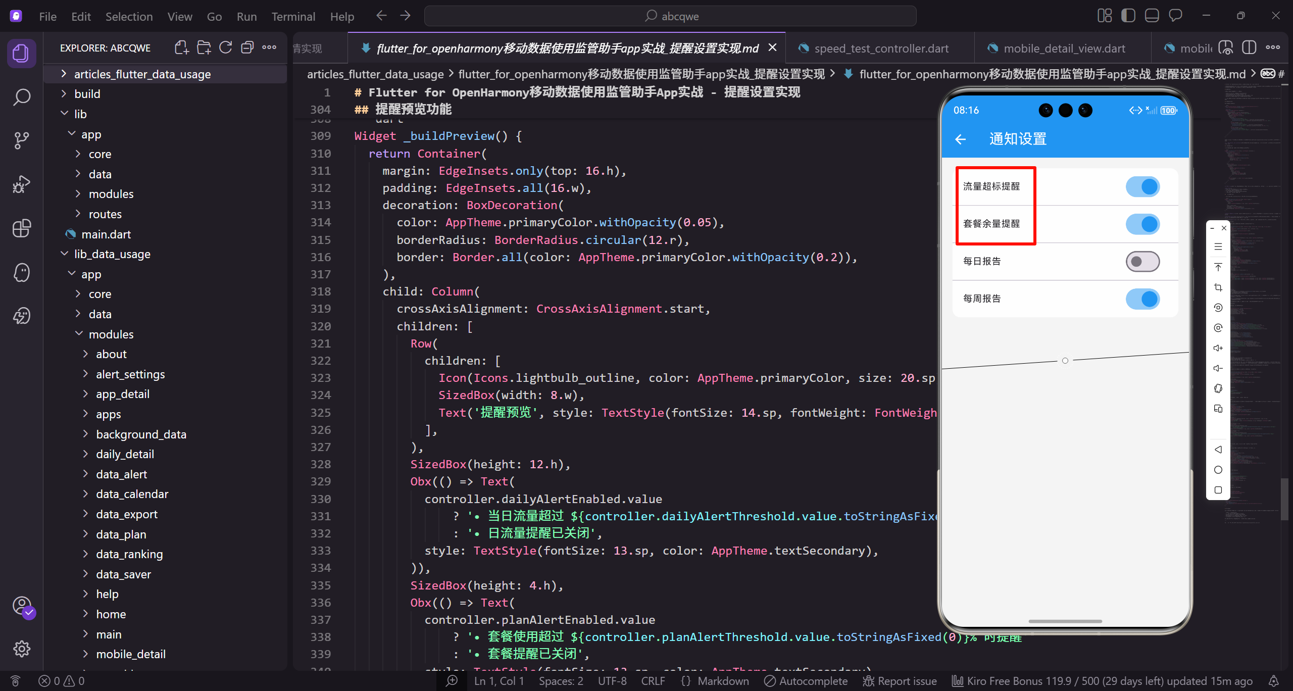
需求分析
用户对流量提醒的需求其实挺多样的:
- 有人希望每天用超过1GB就提醒,控制日常消耗
- 有人只关心套餐用了多少,快用完时提醒一下
- 有人担心后台偷跑流量,想知道哪个App在后台用了很多流量
基于这些需求,把提醒设置分成三个区块:日流量提醒、套餐提醒、后台流量提醒。
页面整体结构
先看页面的骨架代码:
class AlertSettingsView extends GetView<AlertSettingsController> {
const AlertSettingsView({super.key});
Widget build(BuildContext context) {
return Scaffold(
继承GetView自动注入AlertSettingsController控制器。
const构造函数优化widget重建性能。
build方法返回页面的完整UI结构。
      backgroundColor: AppTheme.backgroundColor,
      appBar: AppBar(title: const Text('提醒设置')),
      body: SingleChildScrollView(
        padding: EdgeInsets.all(16.w),
        child: Column(
Scaffold提供Material Design页面框架。
统一背景色保持视觉一致性。
SingleChildScrollView让内容可滚动。
          children: [
            _buildSection('日流量提醒', [
              _buildSwitchTile('启用日流量提醒', controller.dailyAlertEnabled),
              _buildSliderTile('提醒阈值', controller.dailyAlertThreshold, 0.5, 5.0, 'GB'),
            ]),
Column垂直排列三个设置区块。
_buildSection构建设置区块。
_buildSwitchTile构建开关设置项。
            SizedBox(height: 16.h),
            _buildSection('套餐提醒', [
              _buildSwitchTile('启用套餐提醒', controller.planAlertEnabled),
              _buildSliderTile('提醒阈值', controller.planAlertThreshold, 50, 95, '%'),
            ]),
间距16.h分隔各区块。
套餐提醒阈值范围50%-95%。
_buildSliderTile构建滑块设置项。
            SizedBox(height: 16.h),
            _buildSection('后台流量提醒', [
              _buildSwitchTile('启用后台流量提醒', controller.backgroundAlertEnabled),
            ]),
          ],
        ),
      ),
    );
  }
}
后台流量提醒只有开关没有阈值。
闭合所有括号完成页面结构。
整体布局清晰直观。
设置区块封装
每个设置区块用统一的样式包装:
Widget _buildSection(String title, List<Widget> children) {
  return Container(
    decoration: BoxDecoration(
      color: Colors.white,
      borderRadius: BorderRadius.circular(12.r),
接收标题和子组件列表两个参数。
Container作为区块的容器。
白色背景与页面灰色背景对比。
      boxShadow: [
        BoxShadow(
          color: Colors.black.withOpacity(0.03),
          blurRadius: 8.r,
          offset: Offset(0, 2.h),
        ),
      ],
    ),
轻微阴影让卡片有悬浮感。
透明度0.03的阴影非常柔和。
向下偏移2.h模拟光照效果。
    child: Column(
      crossAxisAlignment: CrossAxisAlignment.start,
      children: [
        Padding(
          padding: EdgeInsets.all(16.w),
          child: Text(
Column垂直排列标题和设置项。
crossAxisAlignment让标题左对齐。
Padding包裹标题区域。
            title,
            style: TextStyle(
              fontSize: 16.sp,
              fontWeight: FontWeight.w600,
              color: AppTheme.textPrimary,
            ),
          ),
        ),
标题用16.sp字号,w600加粗。
主要文字颜色确保可读性。
闭合Padding完成标题区域。
        Divider(height: 1, color: Colors.grey.shade100),
        ...children,
      ],
    ),
  );
}
Divider分隔标题和设置项。
展开运算符…将子组件添加到Column。
整体设计让区块结构清晰。
开关设置项实现
开关类型的设置用SwitchListTile实现:
Widget _buildSwitchTile(String title, RxBool value) {
  return Obx(() => SwitchListTile(
    title: Text(
      title,
      style: TextStyle(fontSize: 14.sp, color: AppTheme.textPrimary),
    ),
接收标题和响应式布尔值两个参数。
Obx监听value实现响应式更新。
SwitchListTile是带开关的列表项。
    value: value.value,
    onChanged: (v) => value.value = v,
    activeColor: AppTheme.primaryColor,
    contentPadding: EdgeInsets.symmetric(horizontal: 16.w),
  ));
}
value.value读取响应式变量的值。
onChanged直接更新响应式变量。
主色调作为开关激活颜色。
滑块设置项实现
阈值设置用滑块实现,比输入框更直观:
Widget _buildSliderTile(String title, RxDouble value, double min, double max, String unit) {
  return Padding(
    padding: EdgeInsets.symmetric(horizontal: 16.w, vertical: 8.h),
    child: Column(
      crossAxisAlignment: CrossAxisAlignment.start,
接收标题、值、最小值、最大值、单位五个参数。
Padding添加内边距。
Column垂直排列标签和滑块。
      children: [
        Row(
          mainAxisAlignment: MainAxisAlignment.spaceBetween,
          children: [
            Text(title, style: TextStyle(fontSize: 14.sp, color: AppTheme.textPrimary)),
Row两端对齐标签和数值。
spaceBetween让两端对齐。
标签用14.sp字号。
            Obx(() => Container(
              padding: EdgeInsets.symmetric(horizontal: 12.w, vertical: 4.h),
              decoration: BoxDecoration(
                color: AppTheme.primaryColor.withOpacity(0.1),
                borderRadius: BorderRadius.circular(12.r),
              ),
Obx监听value实现响应式更新。
Container作为数值标签的容器。
浅色背景让数值标签突出。
              child: Text(
                '${value.value.toStringAsFixed(1)} $unit',
                style: TextStyle(
                  fontSize: 14.sp,
                  fontWeight: FontWeight.w600,
                  color: AppTheme.primaryColor,
                ),
              ),
            )),
          ],
        ),
显示当前值和单位。
toStringAsFixed(1)保留一位小数。
主色调文字与浅色背景协调。
        SizedBox(height: 8.h),
        Obx(() => SliderTheme(
          data: SliderThemeData(
            activeTrackColor: AppTheme.primaryColor,
            inactiveTrackColor: AppTheme.primaryColor.withOpacity(0.2),
间距8.h后显示滑块。
SliderTheme自定义滑块样式。
activeTrackColor设置激活轨道颜色。
            thumbColor: AppTheme.primaryColor,
            overlayColor: AppTheme.primaryColor.withOpacity(0.1),
            trackHeight: 4.h,
          ),
          child: Slider(
            value: value.value,
thumbColor设置滑块颜色。
overlayColor设置点击时的光晕颜色。
trackHeight设置轨道高度。
            min: min,
            max: max,
            onChanged: (v) => value.value = v,
          ),
        )),
        Padding(
          padding: EdgeInsets.symmetric(horizontal: 4.w),
min和max设置滑块范围。
onChanged更新响应式变量。
Padding包裹范围提示。
          child: Row(
            mainAxisAlignment: MainAxisAlignment.spaceBetween,
            children: [
              Text('$min $unit', style: TextStyle(fontSize: 11.sp, color: AppTheme.textSecondary)),
              Text('$max $unit', style: TextStyle(fontSize: 11.sp, color: AppTheme.textSecondary)),
            ],
          ),
        ),
      ],
    ),
  );
}
显示最小值和最大值。
11.sp小字号作为辅助信息。
让用户知道可调范围。
Controller层实现
Controller负责管理所有设置项的状态:
class AlertSettingsController extends GetxController {
  final dailyAlertEnabled = true.obs;
  final dailyAlertThreshold = 1.0.obs;
  final planAlertEnabled = true.obs;
  final planAlertThreshold = 80.0.obs;
  final backgroundAlertEnabled = false.obs;
定义所有设置项的响应式变量。
dailyAlertEnabled控制日流量提醒开关。
dailyAlertThreshold存储日流量阈值。
void onInit() {
super.onInit();
loadSettings();
setupAutoSave();
}
void loadSettings() async {
onInit初始化时加载设置和设置自动保存。
loadSettings从本地存储加载设置。
async标记异步方法。
    final prefs = await SharedPreferences.getInstance();
    dailyAlertEnabled.value = prefs.getBool('dailyAlertEnabled') ?? true;
    dailyAlertThreshold.value = prefs.getDouble('dailyAlertThreshold') ?? 1.0;
    planAlertEnabled.value = prefs.getBool('planAlertEnabled') ?? true;
SharedPreferences获取本地存储实例。
getBool和getDouble读取存储的值。
??提供默认值。
    planAlertThreshold.value = prefs.getDouble('planAlertThreshold') ?? 80.0;
    backgroundAlertEnabled.value = prefs.getBool('backgroundAlertEnabled') ?? false;
  }

  void setupAutoSave() {
继续加载其他设置项。
setupAutoSave设置自动保存监听。
任何设置变化都会自动保存。
    ever(dailyAlertEnabled, (_) => saveSettings());
    ever(dailyAlertThreshold, (_) => saveSettings());
    ever(planAlertEnabled, (_) => saveSettings());
    ever(planAlertThreshold, (_) => saveSettings());
    ever(backgroundAlertEnabled, (_) => saveSettings());
  }
ever监听响应式变量变化。
任何变化都调用saveSettings。
实现自动保存功能。
  void saveSettings() async {
    final prefs = await SharedPreferences.getInstance();
    prefs.setBool('dailyAlertEnabled', dailyAlertEnabled.value);
    prefs.setDouble('dailyAlertThreshold', dailyAlertThreshold.value);
saveSettings保存所有设置到本地。
setBool和setDouble写入存储。
异步操作不阻塞UI。
    prefs.setBool('planAlertEnabled', planAlertEnabled.value);
    prefs.setDouble('planAlertThreshold', planAlertThreshold.value);
    prefs.setBool('backgroundAlertEnabled', backgroundAlertEnabled.value);

    notifyMonitorService();
  }
保存所有设置项。
notifyMonitorService通知监控服务更新规则。
新的阈值才能生效。
  void notifyMonitorService() {
    // 通知监控服务更新提醒规则
  }
}
notifyMonitorService通知后台服务。
实际项目中调用系统API。
确保提醒规则实时生效。
提醒预览功能
让用户预览当前的提醒规则:
Widget _buildPreview() {
  return Container(
    margin: EdgeInsets.only(top: 16.h),
    padding: EdgeInsets.all(16.w),
    decoration: BoxDecoration(
      color: AppTheme.primaryColor.withOpacity(0.05),
Container作为预览区域的容器。
顶部margin与上方区块分隔。
浅蓝色背景突出预览区域。
      borderRadius: BorderRadius.circular(12.r),
      border: Border.all(color: AppTheme.primaryColor.withOpacity(0.2)),
    ),
    child: Column(
      crossAxisAlignment: CrossAxisAlignment.start,
12.r圆角保持视觉一致。
浅色边框增加区分度。
Column垂直排列预览内容。
      children: [
        Row(
          children: [
            Icon(Icons.lightbulb_outline, color: AppTheme.primaryColor, size: 20.sp),
            SizedBox(width: 8.w),
            Text('提醒预览', style: TextStyle(fontSize: 14.sp, fontWeight: FontWeight.w600)),
          ],
        ),
Row横向排列图标和标题。
灯泡图标表示提示信息。
标题用14.sp字号,w600加粗。
        SizedBox(height: 12.h),
        Obx(() => Text(
          controller.dailyAlertEnabled.value
              ? '• 当日流量超过 ${controller.dailyAlertThreshold.value.toStringAsFixed(1)} GB 时提醒'
              : '• 日流量提醒已关闭',
          style: TextStyle(fontSize: 13.sp, color: AppTheme.textSecondary),
        )),
间距12.h后显示预览内容。
Obx监听设置变化实时更新预览。
根据开关状态显示不同文字。
        SizedBox(height: 4.h),
        Obx(() => Text(
          controller.planAlertEnabled.value
              ? '• 套餐使用超过 ${controller.planAlertThreshold.value.toStringAsFixed(0)}% 时提醒'
              : '• 套餐提醒已关闭',
          style: TextStyle(fontSize: 13.sp, color: AppTheme.textSecondary),
        )),
      ],
    ),
  );
}
显示套餐提醒的预览。
用户可以直观看到当前规则。
整体设计让设置效果一目了然。
测试提醒功能
让用户测试提醒是否正常工作:
Widget _buildTestButton() {
  return Container(
    margin: EdgeInsets.only(top: 24.h),
    width: double.infinity,
    child: OutlinedButton.icon(
Container作为按钮的容器。
顶部margin与上方内容分隔。
width: double.infinity让按钮占满宽度。
      onPressed: () => controller.sendTestNotification(),
      icon: Icon(Icons.notifications_active_outlined, size: 20.sp),
      label: Text('发送测试提醒', style: TextStyle(fontSize: 14.sp)),
      style: OutlinedButton.styleFrom(
OutlinedButton.icon是带图标的边框按钮。
点击发送测试通知。
notifications_active_outlined图标表示通知。
        foregroundColor: AppTheme.primaryColor,
        side: BorderSide(color: AppTheme.primaryColor),
        padding: EdgeInsets.symmetric(vertical: 14.h),
        shape: RoundedRectangleBorder(borderRadius: BorderRadius.circular(12.r)),
      ),
    ),
  );
}
主色调作为按钮颜色。
side设置边框颜色。
12.r圆角保持视觉一致。
void sendTestNotification() {
  Get.snackbar(
    '测试提醒',
    '这是一条测试通知,说明提醒功能正常工作',
    snackPosition: SnackPosition.TOP,
    backgroundColor: AppTheme.primaryColor,
    colorText: Colors.white,
    duration: const Duration(seconds: 3),
  );
}
Get.snackbar显示测试通知。
snackPosition设置显示位置。
3秒后自动消失。
写在最后
提醒设置页面虽然功能不复杂,但细节很多。好的设置页面应该让用户一看就懂,改完就生效,不需要额外的学习成本。
可以继续优化的方向:
- 增加提醒时间段设置
- 支持不同的提醒方式
- 记录历史提醒
- 智能推荐阈值
欢迎加入开源鸿蒙跨平台社区:https://openharmonycrossplatform.csdn.net

开源鸿蒙跨平台开发社区汇聚开发者与厂商,共建“一次开发,多端部署”的开源生态,致力于降低跨端开发门槛,推动万物智联创新。
更多推荐

 27
27 0
0- 0


 已为社区贡献31条内容

所有评论(0)