Flutter for OpenHarmony移动数据使用监管助手App实战 - 套餐历史实现
套餐历史页面帮助用户查看过往套餐使用情况,通过数据可视化展示流量消耗规律。页面采用列表形式展示历史套餐,每个套餐项包含使用百分比、进度条、起止日期等关键信息。数据模型定义完整套餐属性,包括流量总量、已用量、有效期等,并提供格式化显示方法。UI设计采用卡片式布局,最新套餐高亮显示,支持加载状态和空状态处理。功能上支持用户根据历史数据评估当前套餐合理性,为调整套餐提供决策依据。
套餐历史页面让用户回顾过去几个月的套餐使用情况,了解自己的流量消费规律。通过历史数据,用户可以判断当前套餐是否合适,是否需要升级或降级。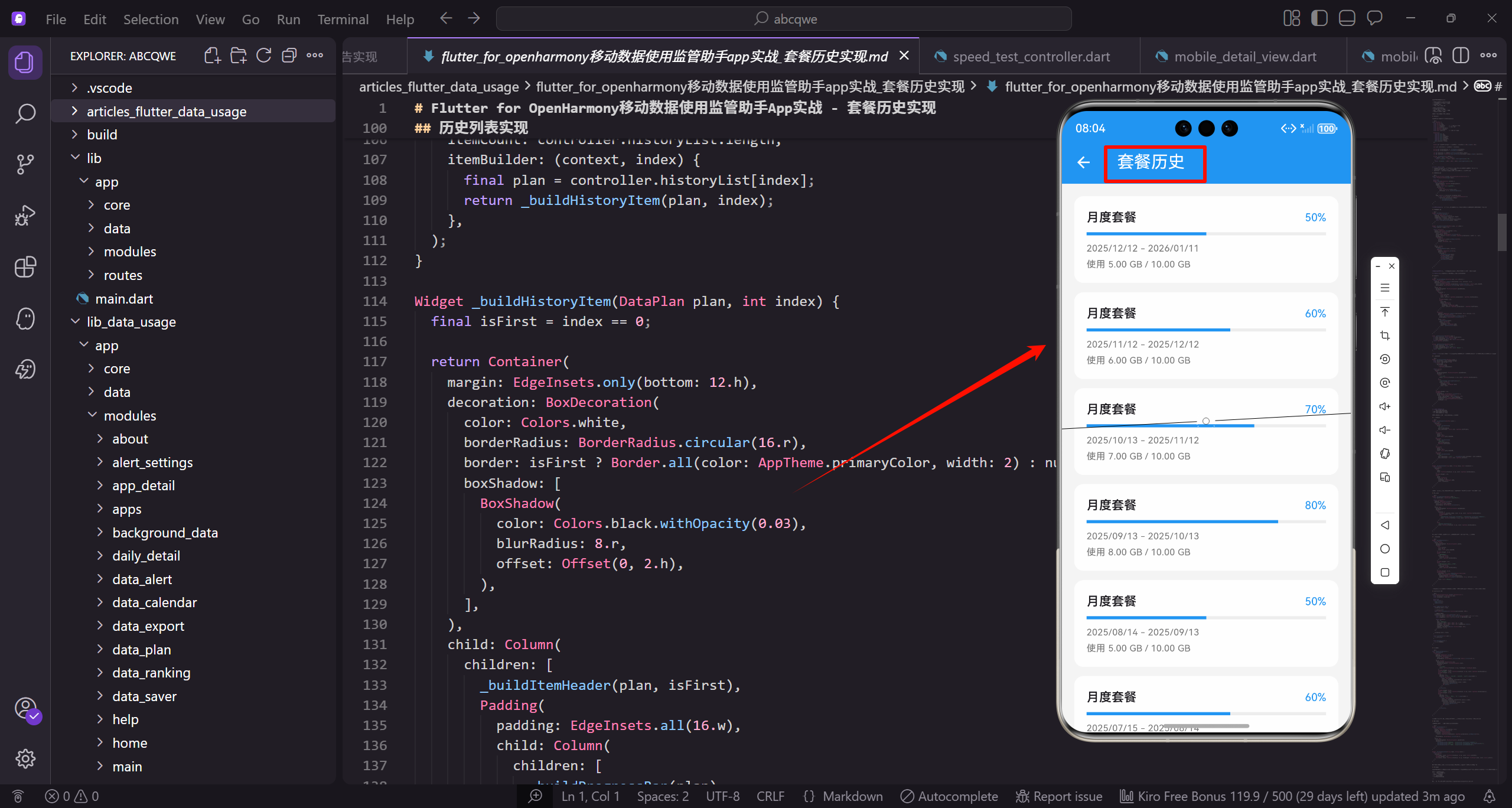
功能需求
套餐历史页面需要展示:
- 历史套餐列表,按时间倒序排列
- 每个套餐的使用百分比和进度条
- 套餐的起止日期
- 实际使用量和套餐总量
数据模型
套餐数据模型需要包含完整的套餐信息:
class DataPlan {
  final String id;
  final String name;
  final int totalData;
  final int usedData;
  final DateTime startDate;
  final DateTime endDate;
id是套餐的唯一标识。
name是套餐名称如"月度套餐"。
totalData和usedData分别是总流量和已用流量。
  final bool isActive;

  DataPlan({
    required this.id,
    required this.name,
    required this.totalData,
isActive标记是否是当前套餐。
构造函数使用required标记必需参数。
确保创建对象时提供所有必要数据。
    required this.usedData,
    required this.startDate,
    required this.endDate,
    this.isActive = false,
  });
startDate和endDate是套餐有效期。
isActive默认为false。
可选参数使用默认值。
  double get usagePercentage => (usedData / totalData * 100).clamp(0, 100);

  bool get isOverUsed => usedData > totalData;

  String get formattedTotal => _formatBytes(totalData);
usagePercentage计算使用百分比。
clamp限制在0-100之间避免异常显示。
isOverUsed判断是否超标。
  String get formattedUsed => _formatBytes(usedData);

  int get daysTotal => endDate.difference(startDate).inDays;
  int get daysUsed => DateTime.now().difference(startDate).inDays.clamp(0, daysTotal);
formattedTotal和formattedUsed格式化流量显示。
daysTotal计算套餐总天数。
daysUsed计算已用天数,clamp确保不超过总天数。
  String _formatBytes(int bytes) {
    if (bytes < 1024 * 1024 * 1024) {
      return '${(bytes / (1024 * 1024)).toStringAsFixed(0)} MB';
    }
    return '${(bytes / (1024 * 1024 * 1024)).toStringAsFixed(1)} GB';
  }
}
_formatBytes将字节数格式化为可读字符串。
小于1GB显示MB,否则显示GB。
toStringAsFixed控制小数位数。
页面整体结构
首先定义套餐历史页面的基本框架:
class PlanHistoryView extends GetView<PlanHistoryController> {
const PlanHistoryView({super.key});
Widget build(BuildContext context) {
return Scaffold(
继承GetView自动注入PlanHistoryController控制器。
const构造函数优化widget重建性能。
build方法返回页面的完整UI结构。
      backgroundColor: AppTheme.backgroundColor,
      appBar: AppBar(
        title: const Text('套餐历史'),
        actions: [
          IconButton(
            icon: Icon(Icons.filter_list),
Scaffold提供Material Design页面框架。
统一背景色保持视觉一致性。
AppBar右侧放置筛选按钮。
            onPressed: () => _showFilterOptions(),
          ),
        ],
      ),
      body: Obx(() => controller.isLoading.value
          ? const Center(child: CircularProgressIndicator())
点击筛选按钮显示筛选选项。
Obx监听状态变化自动更新UI。
加载中显示转圈动画。
          : controller.historyList.isEmpty
              ? _buildEmptyState()
              : _buildHistoryList()),
    );
  }
}
数据为空时显示空状态。
有数据时显示历史列表。
三种状态的标准处理模式。
历史列表实现
展示所有历史套餐:
Widget _buildHistoryList() {
  return ListView.builder(
    padding: EdgeInsets.all(16.w),
    itemCount: controller.historyList.length,
    itemBuilder: (context, index) {
ListView.builder懒加载列表项。
padding设置列表内边距。
itemCount是列表项总数。
      final plan = controller.historyList[index];
      return _buildHistoryItem(plan, index);
    },
  );
}
获取当前索引的套餐数据。
_buildHistoryItem构建单个历史项。
index用于判断是否是第一项。
历史项组件
单个套餐历史的展示卡片:
Widget _buildHistoryItem(DataPlan plan, int index) {
  final isFirst = index == 0;

  return Container(
    margin: EdgeInsets.only(bottom: 12.h),
    decoration: BoxDecoration(
isFirst判断是否是最新的套餐。
Container作为历史项的容器。
底部margin让列表项之间有间距。
      color: Colors.white,
      borderRadius: BorderRadius.circular(16.r),
      border: isFirst ? Border.all(color: AppTheme.primaryColor, width: 2) : null,
      boxShadow: [
白色背景与页面灰色背景对比。
16.r圆角保持视觉一致。
最新套餐用主色边框高亮。
        BoxShadow(
          color: Colors.black.withOpacity(0.03),
          blurRadius: 8.r,
          offset: Offset(0, 2.h),
        ),
      ],
    ),
轻微阴影让卡片有悬浮感。
透明度0.03的阴影非常柔和。
向下偏移2.h模拟光照效果。
    child: Column(
      children: [
        _buildItemHeader(plan, isFirst),
        Padding(
          padding: EdgeInsets.all(16.w),
          child: Column(
Column垂直排列头部和内容。
_buildItemHeader构建套餐头部。
Padding包裹内容区域。
            children: [
              _buildProgressBar(plan),
              SizedBox(height: 12.h),
              _buildUsageInfo(plan),
              SizedBox(height: 8.h),
              _buildDateInfo(plan),
_buildProgressBar构建进度条。
_buildUsageInfo构建使用量信息。
_buildDateInfo构建日期信息。
            ],
          ),
        ),
      ],
    ),
  );
}
不同间距让各区域视觉分隔清晰。
闭合Column和Container完成历史项。
整体设计信息层次分明。
套餐头部
显示套餐名称和状态标签:
Widget _buildItemHeader(DataPlan plan, bool isFirst) {
  return Container(
    padding: EdgeInsets.symmetric(horizontal: 16.w, vertical: 12.h),
    decoration: BoxDecoration(
      color: isFirst ? AppTheme.primaryColor.withOpacity(0.05) : Colors.grey.shade50,
Container作为头部的容器。
padding设置水平和垂直内边距。
最新套餐用浅蓝色背景,其他用浅灰色。
      borderRadius: BorderRadius.vertical(top: Radius.circular(14.r)),
    ),
    child: Row(
      mainAxisAlignment: MainAxisAlignment.spaceBetween,
      children: [
只有顶部有圆角,与卡片圆角衔接。
Row两端对齐套餐名称和状态标签。
spaceBetween让两端对齐。
        Row(
          children: [
            Icon(
              Icons.sim_card,
              size: 20.sp,
              color: isFirst ? AppTheme.primaryColor : AppTheme.textSecondary,
            ),
内层Row排列图标和名称。
sim_card图标表示套餐。
最新套餐用主色,其他用次要颜色。
            SizedBox(width: 8.w),
            Text(
              plan.name,
              style: TextStyle(
                fontSize: 16.sp,
                fontWeight: FontWeight.w600,
间距8.w让图标和名称不挤。
显示套餐名称。
16.sp字号,w600加粗。
                color: isFirst ? AppTheme.primaryColor : AppTheme.textPrimary,
              ),
            ),
          ],
        ),
        Container(
          padding: EdgeInsets.symmetric(horizontal: 10.w, vertical: 4.h),
最新套餐名称用主色。
Container作为状态标签的容器。
小内边距让标签紧凑。
          decoration: BoxDecoration(
            color: _getStatusColor(plan).withOpacity(0.1),
            borderRadius: BorderRadius.circular(12.r),
          ),
          child: Text(
            _getStatusText(plan),
状态标签背景用对应颜色的浅色版本。
12.r圆角让标签更圆润。
_getStatusText获取状态文字。
            style: TextStyle(
              fontSize: 12.sp,
              fontWeight: FontWeight.w500,
              color: _getStatusColor(plan),
            ),
          ),
        ),
      ],
    ),
  );
}
12.sp小字号适合标签。
文字颜色与背景色系一致。
_getStatusColor获取状态颜色。
状态颜色和文字
根据套餐状态返回对应的颜色和文字:
Color _getStatusColor(DataPlan plan) {
  if (plan.isActive) return AppTheme.primaryColor;
  if (plan.isOverUsed) return Colors.red;
  if (plan.usagePercentage >= 90) return Colors.orange;
  return AppTheme.wifiColor;
}
当前套餐用主色蓝色。
超标用红色警示。
接近超标用橙色警告,正常用绿色。
String _getStatusText(DataPlan plan) {
  if (plan.isActive) return '当前';
  if (plan.isOverUsed) return '已超标';
  if (plan.usagePercentage >= 90) return '接近超标';
  return '正常';
}
根据状态返回对应的中文文字。
当前、已超标、接近超标、正常四种状态。
让用户一眼看出套餐使用情况。
进度条组件
显示套餐使用进度:
Widget _buildProgressBar(DataPlan plan) {
  final percentage = plan.usagePercentage;
  final color = percentage >= 100
      ? Colors.red
      : percentage >= 80
          ? Colors.orange
          : AppTheme.primaryColor;
获取使用百分比。
根据百分比选择进度条颜色。
超过100%红色,80-100%橙色,其他蓝色。
  return Column(
    children: [
      Row(
        mainAxisAlignment: MainAxisAlignment.spaceBetween,
        children: [
          Text(
Column垂直排列标签和进度条。
Row两端对齐标签和百分比。
spaceBetween让两端对齐。
            '使用进度',
            style: TextStyle(fontSize: 13.sp, color: AppTheme.textSecondary),
          ),
          Text(
            '${percentage.toStringAsFixed(1)}%',
            style: TextStyle(
标签"使用进度"用13.sp小字号。
百分比保留一位小数。
toStringAsFixed控制小数位数。
              fontSize: 15.sp,
              fontWeight: FontWeight.bold,
              color: color,
            ),
          ),
        ],
      ),
      SizedBox(height: 8.h),
百分比用15.sp字号加粗。
颜色与进度条颜色一致。
间距8.h后显示进度条。
      ClipRRect(
        borderRadius: BorderRadius.circular(4.r),
        child: LinearProgressIndicator(
          value: (percentage / 100).clamp(0.0, 1.0),
          backgroundColor: Colors.grey.shade200,
ClipRRect给进度条添加圆角。
value是0-1的进度值。
灰色背景作为进度条底色。
          valueColor: AlwaysStoppedAnimation(color),
          minHeight: 8.h,
        ),
      ),
    ],
  );
}
进度条颜色根据百分比变化。
8.h的高度让进度条更醒目。
整体设计直观清晰。
使用量信息
显示已使用、总量、剩余三个数据:
Widget _buildUsageInfo(DataPlan plan) {
  return Row(
    children: [
      Expanded(
        child: _buildInfoItem(
          '已使用',
          plan.formattedUsed,
Row横向排列三个统计项。
Expanded让三项平分宽度。
_buildInfoItem构建单个统计项。
          plan.isOverUsed ? Colors.red : AppTheme.textPrimary,
        ),
      ),
      Container(
        width: 1,
        height: 30.h,
        color: Colors.grey.shade200,
      ),
超标时已使用量用红色显示。
竖线分隔各统计项。
30.h的高度适中。
      Expanded(
        child: _buildInfoItem(
          '套餐总量',
          plan.formattedTotal,
          AppTheme.textPrimary,
        ),
      ),
套餐总量用主要文字颜色。
formattedTotal格式化显示总流量。
Expanded让项目平分宽度。
      Container(
        width: 1,
        height: 30.h,
        color: Colors.grey.shade200,
      ),
      Expanded(
        child: _buildInfoItem(
竖线分隔总量和剩余。
第三项显示剩余流量。
同样使用Expanded平分宽度。
          '剩余',
          plan.isOverUsed ? '已超标' : _formatBytes(plan.totalData - plan.usedData),
          plan.isOverUsed ? Colors.red : AppTheme.wifiColor,
        ),
      ),
    ],
  );
}
超标时显示"已超标"文字。
正常时显示剩余流量数值。
剩余用绿色表示正面信息。
信息项组件
单个统计项的显示:
Widget _buildInfoItem(String label, String value, Color valueColor) {
  return Column(
    children: [
      Text(
        label,
        style: TextStyle(fontSize: 12.sp, color: AppTheme.textSecondary),
      ),
Column垂直排列标签和数值。
标签用12.sp小字号。
次要颜色作为辅助信息。
      SizedBox(height: 4.h),
      Text(
        value,
        style: TextStyle(
          fontSize: 14.sp,
          fontWeight: FontWeight.w600,
          color: valueColor,
        ),
      ),
    ],
  );
}
小间距4.h让标签和数值紧凑。
数值用14.sp字号,w600加粗。
颜色参数让不同项有不同颜色。
日期信息
显示套餐的起止日期:
Widget _buildDateInfo(DataPlan plan) {
  final dateFormat = DateFormat('yyyy/MM/dd');

  return Container(
    padding: EdgeInsets.all(12.w),
    decoration: BoxDecoration(
DateFormat定义日期格式。
Container作为日期信息的容器。
12.w内边距让内容不贴边。
      color: Colors.grey.shade50,
      borderRadius: BorderRadius.circular(8.r),
    ),
    child: Row(
      mainAxisAlignment: MainAxisAlignment.spaceBetween,
      children: [
浅灰色背景与白色卡片区分。
8.r圆角保持视觉一致。
Row两端对齐日期和天数。
        Row(
          children: [
            Icon(Icons.calendar_today, size: 14.sp, color: AppTheme.textSecondary),
            SizedBox(width: 6.w),
            Text(
内层Row排列图标和日期文字。
calendar_today图标表示日期。
14.sp小图标适合辅助信息。
              '${dateFormat.format(plan.startDate)} - ${dateFormat.format(plan.endDate)}',
              style: TextStyle(fontSize: 12.sp, color: AppTheme.textSecondary),
            ),
          ],
        ),
        Text(
显示起止日期,用-连接。
12.sp小字号作为辅助信息。
次要颜色让日期不会太突出。
          '共${plan.daysTotal}天',
          style: TextStyle(fontSize: 12.sp, color: AppTheme.textSecondary),
        ),
      ],
    ),
  );
}
显示套餐总天数。
与日期信息对齐显示。
整体设计简洁清晰。
空状态处理
当没有历史数据时显示引导界面:
Widget _buildEmptyState() {
  return Center(
    child: Column(
      mainAxisAlignment: MainAxisAlignment.center,
      children: [
        Icon(
          Icons.history,
Center让内容居中显示。
Column垂直排列图标和文字。
mainAxisAlignment让内容垂直居中。
          size: 80.sp,
          color: Colors.grey.shade300,
        ),
        SizedBox(height: 16.h),
        Text(
          '暂无历史记录',
history图标表示历史记录。
80.sp大图标作为视觉焦点。
浅灰色让图标不会太突兀。
          style: TextStyle(
            fontSize: 16.sp,
            color: AppTheme.textSecondary,
          ),
        ),
        SizedBox(height: 8.h),
        Text(
主提示文字用16.sp字号。
次要颜色作为提示信息。
间距8.h后显示副提示。
          '设置套餐后会自动记录使用历史',
          style: TextStyle(
            fontSize: 14.sp,
            color: AppTheme.textSecondary,
          ),
        ),
        SizedBox(height: 24.h),
副提示说明数据来源。
14.sp小字号作为辅助信息。
间距24.h后显示操作按钮。
        ElevatedButton(
          onPressed: () => Get.toNamed(Routes.DATA_PLAN),
          style: ElevatedButton.styleFrom(
            backgroundColor: AppTheme.primaryColor,
            padding: EdgeInsets.symmetric(horizontal: 24.w, vertical: 12.h),
          ),
          child: Text('设置套餐'),
        ),
      ],
    ),
  );
}
ElevatedButton引导用户设置套餐。
主色背景让按钮醒目。
点击跳转到套餐设置页面。
Controller实现
控制器管理套餐历史的状态和逻辑:
class PlanHistoryController extends GetxController {
final historyList = <DataPlan>[].obs;
final isLoading = false.obs;
void onInit() {
historyList存储历史套餐列表。
isLoading控制加载状态显示。
onInit在控制器初始化时调用。
    super.onInit();
    loadHistory();
  }

  void loadHistory() async {
    isLoading.value = true;

    await Future.delayed(const Duration(milliseconds: 500));
loadHistory加载历史数据。
设置加载状态为true。
模拟网络延迟500毫秒。
    historyList.value = List.generate(6, (i) {
      final startDate = DateTime.now().subtract(Duration(days: 30 * (i + 1)));
      final usageRatio = 0.5 + (i % 4) * 0.15;
List.generate生成6个月的模拟数据。
startDate计算每个套餐的开始日期。
usageRatio模拟不同的使用率。
      return DataPlan(
        id: '$i',
        name: '月度套餐',
        totalData: 1024 * 1024 * 1024 * 10,
        usedData: (1024 * 1024 * 1024 * 10 * usageRatio).toInt(),
创建DataPlan对象。
每个套餐10GB总流量。
usedData根据usageRatio计算。
        startDate: startDate,
        endDate: startDate.add(const Duration(days: 30)),
        isActive: i == 0,
      );
    });

    isLoading.value = false;
  }
}
每个套餐30天有效期。
第一个套餐标记为当前套餐。
加载完成后设置isLoading为false。
写在最后
套餐历史页面帮助用户了解自己的流量消费规律。通过清晰的列表展示、直观的进度条、醒目的状态标签,用户可以快速回顾过去的使用情况。
可以继续优化的方向:
- 添加图表展示历史趋势
- 支持导出历史数据
- 添加套餐对比功能
- 智能推荐合适的套餐
欢迎加入开源鸿蒙跨平台社区:https://openharmonycrossplatform.csdn.net

开源鸿蒙跨平台开发社区汇聚开发者与厂商,共建“一次开发,多端部署”的开源生态,致力于降低跨端开发门槛,推动万物智联创新。
更多推荐
 14
14 0
0- 0


 已为社区贡献31条内容

所有评论(0)