Flutter for OpenHarmony移动数据使用监管助手App实战 - 数据导出实现
本文介绍了数据导出功能的设计与实现,支持CSV、JSON、PDF三种格式,提供本周/本月/自定义时间范围选择。页面采用Material Design风格,包含格式选择、日期范围设置和内容筛选三个主要区域,通过单选按钮和下拉菜单实现交互。导出按钮突出显示,整体布局清晰合理,间距恰当,配色符合应用主题,为用户提供了便捷的数据导出体验。
数据导出功能让用户可以将流量使用数据导出为文件,方便备份、分析或分享。支持多种格式和时间范围选择,满足不同用户的需求。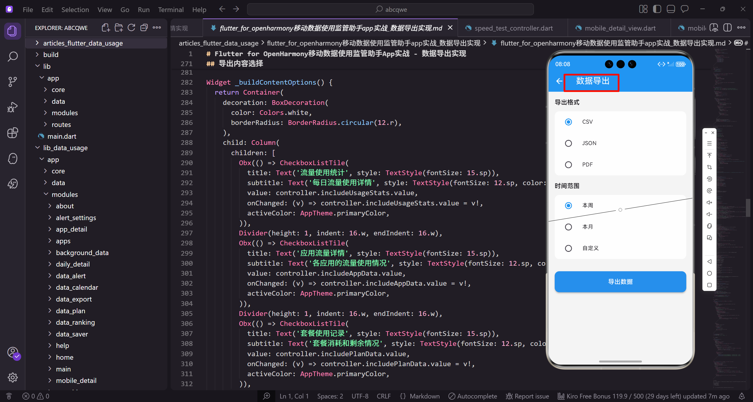
功能设计
数据导出页面需要实现:
- 选择导出格式(CSV、JSON、PDF)
- 选择时间范围(本周、本月、自定义)
- 选择导出内容(全部数据、应用数据、套餐数据)
- 导出进度显示
- 导出完成后的分享功能
页面整体结构
首先定义数据导出页面的基本框架:
class DataExportView extends GetView<DataExportController> {
const DataExportView({super.key});
Widget build(BuildContext context) {
继承GetView自动注入DataExportController。
const构造函数优化widget重建性能。
build方法返回页面的完整UI结构。
    return Scaffold(
      backgroundColor: AppTheme.backgroundColor,
      appBar: AppBar(
        title: const Text('数据导出'),
        actions: [
          IconButton(
Scaffold提供Material Design页面框架。
统一背景色保持视觉一致性。
AppBar设置页面标题为"数据导出"。
            icon: Icon(Icons.history),
            onPressed: () => _showExportHistory(),
          ),
        ],
      ),
      body: SingleChildScrollView(
history按钮查看导出历史记录。
点击弹出历史记录列表。
SingleChildScrollView让内容可滚动。
        padding: EdgeInsets.all(16.w),
        child: Column(
          crossAxisAlignment: CrossAxisAlignment.start,
          children: [
            _buildFormatSection(),
统一的内边距让内容不贴边。
Column垂直排列各个设置区域。
crossAxisAlignment让标题左对齐。
            SizedBox(height: 20.h),
            _buildDateRangeSection(),
            SizedBox(height: 20.h),
            _buildContentSection(),
20.h的间距比设置页面稍大。
因为每个Section内容较多,需要更明显的分隔。
三个选择区域依次排列。
            SizedBox(height: 32.h),
            _buildExportButton(),
          ],
        ),
      ),
    );
  }
}
导出按钮前的间距32.h更大。
与上方内容区分开,突出操作按钮。
闭合所有括号完成页面结构。
导出格式选择
让用户选择导出文件的格式:
Widget _buildFormatSection() {
  return _buildSection(
    '导出格式',
    '选择数据导出的文件格式',
    _buildFormatOptions(),
  );
}
调用通用的_buildSection方法。
传入标题、副标题和内容组件。
_buildFormatOptions构建格式选项列表。
Widget _buildSection(String title, String subtitle, Widget child) {
  return Column(
    crossAxisAlignment: CrossAxisAlignment.start,
    children: [
      Text(
        title,
通用的区域构建方法。
Column垂直排列标题、副标题和内容。
crossAxisAlignment让内容左对齐。
        style: TextStyle(
          fontSize: 18.sp,
          fontWeight: FontWeight.bold,
          color: AppTheme.textPrimary,
        ),
      ),
      SizedBox(height: 4.h),
标题用18.sp大字号,加粗显示。
主要文字颜色确保可读性。
小间距4.h让标题和副标题紧凑。
      Text(
        subtitle,
        style: TextStyle(fontSize: 13.sp, color: AppTheme.textSecondary),
      ),
      SizedBox(height: 12.h),
      child,
    ],
  );
}
副标题用13.sp小字号,次要颜色。
12.h间距后放置内容组件。
child是传入的具体内容。
Widget _buildFormatOptions() {
  final formats = [
    {'name': 'CSV', 'icon': Icons.table_chart, 'desc': '表格格式,可用Excel打开'},
    {'name': 'JSON', 'icon': Icons.code, 'desc': '结构化数据,适合开发者'},
    {'name': 'PDF', 'icon': Icons.picture_as_pdf, 'desc': '报告格式,适合打印分享'},
  ];
定义三种导出格式的配置数据。
每种格式包含名称、图标和描述。
描述帮助用户选择合适的格式。
  return Container(
    decoration: BoxDecoration(
      color: Colors.white,
      borderRadius: BorderRadius.circular(12.r),
      boxShadow: [
        BoxShadow(
Container作为选项列表的容器。
白色背景与页面灰色背景对比。
12.r圆角让容器更圆润。
          color: Colors.black.withOpacity(0.03),
          blurRadius: 8.r,
          offset: Offset(0, 2.h),
        ),
      ],
    ),
    child: Column(
轻微阴影让容器有悬浮感。
透明度0.03非常柔和。
Column垂直排列三个选项。
      children: List.generate(formats.length, (index) {
        final format = formats[index];
        return Obx(() => RadioListTile<int>(
          title: Row(
            children: [
List.generate动态生成选项列表。
Obx监听选中状态实现响应式更新。
RadioListTile实现单选效果。
              Icon(
                format['icon'] as IconData,
                size: 22.sp,
                color: controller.exportFormat.value == index
                    ? AppTheme.primaryColor
                    : AppTheme.textSecondary,
              ),
图标根据选中状态变色。
选中时用主色调,未选中用次要颜色。
22.sp的图标大小适中。
              SizedBox(width: 12.w),
              Column(
                crossAxisAlignment: CrossAxisAlignment.start,
                children: [
                  Text(
                    format['name'] as String,
间距12.w让图标和文字不会太挤。
Column垂直排列格式名称和描述。
crossAxisAlignment让文字左对齐。
                    style: TextStyle(
                      fontSize: 15.sp,
                      fontWeight: FontWeight.w500,
                    ),
                  ),
                  Text(
                    format['desc'] as String,
格式名称用15.sp字号,稍微加粗。
描述文字在名称下方显示。
帮助用户理解每种格式的用途。
                    style: TextStyle(
                      fontSize: 12.sp,
                      color: AppTheme.textSecondary,
                    ),
                  ),
                ],
              ),
            ],
          ),
描述用12.sp小字号,次要颜色。
作为辅助信息不会太突出。
闭合Column和Row。
          value: index,
          groupValue: controller.exportFormat.value,
          onChanged: (v) => controller.setExportFormat(v!),
          activeColor: AppTheme.primaryColor,
          contentPadding: EdgeInsets.symmetric(horizontal: 12.w, vertical: 4.h),
        ));
      }),
    ),
  );
}
value是当前选项的索引值。
groupValue绑定当前选中的值。
onChanged回调更新选中状态。
时间范围选择
让用户选择要导出的数据时间范围:
Widget _buildDateRangeSection() {
  return _buildSection(
    '时间范围',
    '选择要导出的数据时间范围',
    _buildDateRangeOptions(),
  );
}

Widget _buildDateRangeOptions() {
时间范围区域的标题和副标题。
_buildDateRangeOptions构建选项列表。
用户可以选择预设范围或自定义。
  final ranges = [
    {'name': '本周', 'days': 7},
    {'name': '本月', 'days': 30},
    {'name': '近三个月', 'days': 90},
    {'name': '自定义', 'days': -1},
  ];
定义四个时间范围选项。
days表示对应的天数。
-1表示自定义范围,需要用户选择。
  return Container(
    decoration: BoxDecoration(
      color: Colors.white,
      borderRadius: BorderRadius.circular(12.r),
    ),
    child: Column(
      children: [
白色背景容器包裹选项列表。
12.r圆角保持视觉一致。
Column垂直排列选项。
        ...List.generate(ranges.length, (index) {
          final range = ranges[index];
          return Obx(() => RadioListTile<int>(
            title: Text(
              range['name'] as String,
              style: TextStyle(fontSize: 15.sp),
            ),
展开运算符…将列表元素添加到Column。
RadioListTile实现单选效果。
选项名称用15.sp字号。
            value: index,
            groupValue: controller.dateRange.value,
            onChanged: (v) {
              controller.setDateRange(v!);
              if (v == 3) _showDatePicker();
            },
            activeColor: AppTheme.primaryColor,
          ));
        }),
选择自定义(索引3)时弹出日期选择器。
setDateRange更新选中状态。
activeColor设置选中时的颜色。
        Obx(() {
          if (controller.dateRange.value == 3) {
            return Container(
              padding: EdgeInsets.all(12.w),
              margin: EdgeInsets.fromLTRB(16.w, 0, 16.w, 12.h),
选择自定义时显示日期范围。
Obx监听dateRange状态。
Container显示选中的日期范围。
              decoration: BoxDecoration(
                color: AppTheme.primaryColor.withOpacity(0.05),
                borderRadius: BorderRadius.circular(8.r),
              ),
              child: Row(
                mainAxisAlignment: MainAxisAlignment.center,
浅色背景突出显示日期范围。
8.r圆角让容器更圆润。
Row居中排列图标和日期文字。
                children: [
                  Icon(Icons.calendar_today, size: 16.sp, color: AppTheme.primaryColor),
                  SizedBox(width: 8.w),
                  Text(
                    '${_formatDate(controller.startDate.value)} - ${_formatDate(controller.endDate.value)}',
日历图标表示日期相关。
显示开始日期到结束日期的范围。
_formatDate格式化日期显示。
                    style: TextStyle(
                      fontSize: 14.sp,
                      color: AppTheme.primaryColor,
                      fontWeight: FontWeight.w500,
                    ),
                  ),
                ],
              ),
            );
          }
          return SizedBox.shrink();
        }),
      ],
    ),
  );
}
日期文字用主色调显示。
未选择自定义时返回空组件。
SizedBox.shrink()不占用任何空间。
日期选择器
弹出系统日期范围选择器:
void _showDatePicker() async {
  final picked = await showDateRangePicker(
    context: Get.context!,
    firstDate: DateTime.now().subtract(const Duration(days: 365)),
    lastDate: DateTime.now(),
showDateRangePicker是Flutter内置的日期范围选择器。
firstDate限制最早可选日期为一年前。
lastDate限制最晚为今天,防止选择未来日期。
    initialDateRange: DateTimeRange(
      start: controller.startDate.value,
      end: controller.endDate.value,
    ),
    builder: (context, child) {
      return Theme(
initialDateRange设置初始选中范围。
builder参数用于自定义主题。
Theme包装器修改选择器样式。
        data: Theme.of(context).copyWith(
          colorScheme: ColorScheme.light(
            primary: AppTheme.primaryColor,
            onPrimary: Colors.white,
            surface: Colors.white,
            onSurface: AppTheme.textPrimary,
          ),
        ),
        child: child!,
      );
    },
  );
colorScheme自定义选择器颜色。
primary是主色调,用于选中日期。
让日期选择器与App主题一致。
  if (picked != null) {
    controller.startDate.value = picked.start;
    controller.endDate.value = picked.end;
  }
}
用户选择后更新开始和结束日期。
picked为null表示用户取消了选择。
更新Controller中的日期值触发UI更新。
导出内容选择
让用户选择要包含的数据类型:
Widget _buildContentSection() {
  return _buildSection(
    '导出内容',
    '选择要包含的数据类型',
    _buildContentOptions(),
  );
}

Widget _buildContentOptions() {
导出内容区域的标题和副标题。
用户可以选择导出哪些类型的数据。
支持多选,至少选择一项。
  return Container(
    decoration: BoxDecoration(
      color: Colors.white,
      borderRadius: BorderRadius.circular(12.r),
    ),
    child: Column(
      children: [
白色背景容器包裹选项列表。
Column垂直排列多个复选框。
CheckboxListTile实现多选效果。
        Obx(() => CheckboxListTile(
          title: Text('流量使用统计', style: TextStyle(fontSize: 15.sp)),
          subtitle: Text('每日流量使用详情', style: TextStyle(fontSize: 12.sp, color: AppTheme.textSecondary)),
          value: controller.includeUsageStats.value,
第一个选项:流量使用统计。
subtitle说明包含的具体内容。
value绑定响应式变量。
          onChanged: (v) => controller.includeUsageStats.value = v!,
          activeColor: AppTheme.primaryColor,
        )),
        Divider(height: 1, indent: 16.w, endIndent: 16.w),
onChanged更新选中状态。
Divider分隔各选项。
indent和endIndent让分隔线两端留白。
        Obx(() => CheckboxListTile(
          title: Text('应用流量详情', style: TextStyle(fontSize: 15.sp)),
          subtitle: Text('各应用的流量使用情况', style: TextStyle(fontSize: 12.sp, color: AppTheme.textSecondary)),
          value: controller.includeAppData.value,
          onChanged: (v) => controller.includeAppData.value = v!,
          activeColor: AppTheme.primaryColor,
        )),
第二个选项:应用流量详情。
包含每个应用的流量使用数据。
用户可以分析哪些应用消耗流量多。
        Divider(height: 1, indent: 16.w, endIndent: 16.w),
        Obx(() => CheckboxListTile(
          title: Text('套餐使用记录', style: TextStyle(fontSize: 15.sp)),
          subtitle: Text('套餐消耗和剩余情况', style: TextStyle(fontSize: 12.sp, color: AppTheme.textSecondary)),
          value: controller.includePlanData.value,
          onChanged: (v) => controller.includePlanData.value = v!,
          activeColor: AppTheme.primaryColor,
        )),
      ],
    ),
  );
}
第三个选项:套餐使用记录。
包含套餐的消耗和剩余情况。
三个选项可以任意组合选择。
导出按钮
底部的导出操作按钮:
Widget _buildExportButton() {
  return SizedBox(
    width: double.infinity,
    child: Obx(() => ElevatedButton(
      onPressed: controller.isExporting.value ? null : controller.exportData,
SizedBox设置宽度为infinity撑满整行。
Obx监听isExporting状态。
导出中时禁用按钮防止重复点击。
      style: ElevatedButton.styleFrom(
        backgroundColor: AppTheme.primaryColor,
        disabledBackgroundColor: AppTheme.primaryColor.withOpacity(0.5),
        padding: EdgeInsets.symmetric(vertical: 16.h),
主色调背景。
禁用时用半透明主色调。
垂直padding让按钮更高。
        shape: RoundedRectangleBorder(borderRadius: BorderRadius.circular(12.r)),
        elevation: 0,
      ),
      child: controller.isExporting.value
          ? Row(
              mainAxisAlignment: MainAxisAlignment.center,
12.r圆角与其他卡片一致。
elevation为0去掉阴影,风格更扁平。
导出中时显示加载动画。
              children: [
                SizedBox(
                  width: 20.w,
                  height: 20.w,
                  child: CircularProgressIndicator(
                    color: Colors.white,
                    strokeWidth: 2,
                  ),
                ),
CircularProgressIndicator显示转圈动画。
白色与按钮背景对比明显。
strokeWidth为2比默认值细,更精致。
                SizedBox(width: 12.w),
                Text(
                  '导出中...',
                  style: TextStyle(fontSize: 16.sp, color: Colors.white),
                ),
              ],
            )
间距12.w让动画和文字不会太挤。
"导出中…"文字提示用户正在处理。
白色文字确保可读性。
          : Row(
              mainAxisAlignment: MainAxisAlignment.center,
              children: [
                Icon(Icons.file_download, color: Colors.white, size: 22.sp),
                SizedBox(width: 8.w),
                Text(
                  '开始导出',
                  style: TextStyle(fontSize: 16.sp, color: Colors.white, fontWeight: FontWeight.w600),
                ),
              ],
            ),
    )),
  );
}
正常状态显示下载图标和"开始导出"文字。
图标和文字居中排列。
w600字重让按钮文字更醒目。
Controller实现
控制器管理导出相关的状态:
class DataExportController extends GetxController {
  final exportFormat = 0.obs;
  final dateRange = 0.obs;
  final startDate = DateTime.now().subtract(const Duration(days: 7)).obs;
  final endDate = DateTime.now().obs;
  final isExporting = false.obs;
exportFormat记录选中的导出格式索引。
dateRange记录选中的时间范围索引。
startDate和endDate存储实际的日期范围。
  final includeUsageStats = true.obs;
  final includeAppData = true.obs;
  final includePlanData = true.obs;

  void setExportFormat(int format) {
    exportFormat.value = format;
  }
三个include变量控制导出内容的选择。
默认全部选中,用户可以取消。
setExportFormat更新格式选择。
  void setDateRange(int range) {
    dateRange.value = range;
    final now = DateTime.now();
    switch (range) {
      case 0:
        startDate.value = now.subtract(const Duration(days: 7));
        endDate.value = now;
        break;
setDateRange更新时间范围选择。
根据选择自动计算日期范围。
本周是最近7天。
      case 1:
        startDate.value = now.subtract(const Duration(days: 30));
        endDate.value = now;
        break;
      case 2:
        startDate.value = now.subtract(const Duration(days: 90));
        endDate.value = now;
        break;
    }
  }
本月是最近30天。
近三个月是最近90天。
自定义范围由用户通过日期选择器设置。
  void exportData() async {
    if (!includeUsageStats.value && !includeAppData.value && !includePlanData.value) {
      Get.snackbar('提示', '请至少选择一项导出内容');
      return;
    }

    isExporting.value = true;
exportData执行导出操作。
首先检查是否至少选择了一项内容。
设置isExporting为true显示加载状态。
    try {
      await Future.delayed(const Duration(seconds: 2));
      final fileName = _generateFileName();
      final filePath = await _exportToFile(fileName);

      isExporting.value = false;
      _showExportSuccessDialog(fileName, filePath);
模拟导出过程的延迟。
生成文件名并执行导出。
完成后显示成功对话框。
    } catch (e) {
      isExporting.value = false;
      Get.snackbar('导出失败', '请稍后重试');
    }
  }

  String _generateFileName() {
    final formats = ['csv', 'json', 'pdf'];
    final format = formats[exportFormat.value];
    final timestamp = DateTime.now().millisecondsSinceEpoch;
    return 'data_usage_$timestamp.$format';
  }
}
catch捕获异常并提示用户。
_generateFileName根据格式和时间戳生成文件名。
时间戳确保文件名唯一,不会覆盖之前的导出。
导出成功对话框
导出完成后显示成功提示:
void _showExportSuccessDialog(String fileName, String filePath) {
  Get.dialog(
    AlertDialog(
      title: Row(
        children: [
          Icon(Icons.check_circle, color: AppTheme.wifiColor, size: 28.sp),
          SizedBox(width: 8.w),
          Text('导出成功'),
        ],
      ),
Get.dialog显示对话框。
标题栏包含绿色勾选图标和文字。
图标表示操作成功完成。
      content: Column(
        mainAxisSize: MainAxisSize.min,
        crossAxisAlignment: CrossAxisAlignment.start,
        children: [
          Text('文件已保存到下载目录', style: TextStyle(fontSize: 14.sp)),
          SizedBox(height: 12.h),
content显示文件保存位置。
mainAxisSize.min让Column高度自适应。
告知用户文件保存的位置。
          Container(
            padding: EdgeInsets.all(12.w),
            decoration: BoxDecoration(
              color: Colors.grey.shade100,
              borderRadius: BorderRadius.circular(8.r),
            ),
            child: Row(
              children: [
                Icon(Icons.insert_drive_file, color: AppTheme.primaryColor, size: 24.sp),
灰色背景容器显示文件信息。
文件图标表示这是一个文件。
主色调图标与App风格一致。
                SizedBox(width: 8.w),
                Expanded(
                  child: Text(
                    fileName,
                    style: TextStyle(fontSize: 13.sp, fontWeight: FontWeight.w500),
                    overflow: TextOverflow.ellipsis,
                  ),
                ),
              ],
            ),
          ),
        ],
      ),
显示导出的文件名。
Expanded让文件名自适应宽度。
ellipsis处理文件名过长的情况。
      actions: [
        TextButton(
          onPressed: () => Get.back(),
          child: Text('关闭'),
        ),
        ElevatedButton.icon(
          onPressed: () {
            Get.back();
            _shareFile(filePath);
          },
          icon: Icon(Icons.share, size: 18.sp),
          label: Text('分享'),
        ),
      ],
    ),
  );
}
关闭按钮关闭对话框。
分享按钮调用系统分享功能。
ElevatedButton.icon组合图标和文字。
写在最后
数据导出功能让用户可以备份和分析自己的流量使用数据。通过灵活的格式选择、时间范围设置、内容筛选,满足不同用户的导出需求。
可以继续优化的方向:
- 支持定时自动导出
- 添加云端备份功能
- 支持更多导出格式
- 添加数据可视化报告
欢迎加入开源鸿蒙跨平台社区:https://openharmonycrossplatform.csdn.net

开源鸿蒙跨平台开发社区汇聚开发者与厂商,共建“一次开发,多端部署”的开源生态,致力于降低跨端开发门槛,推动万物智联创新。
更多推荐
 15
15 0
0- 0


 已为社区贡献31条内容

所有评论(0)