Flutter for OpenHarmony 健康管理App应用实战 - 身体数据卡片实现
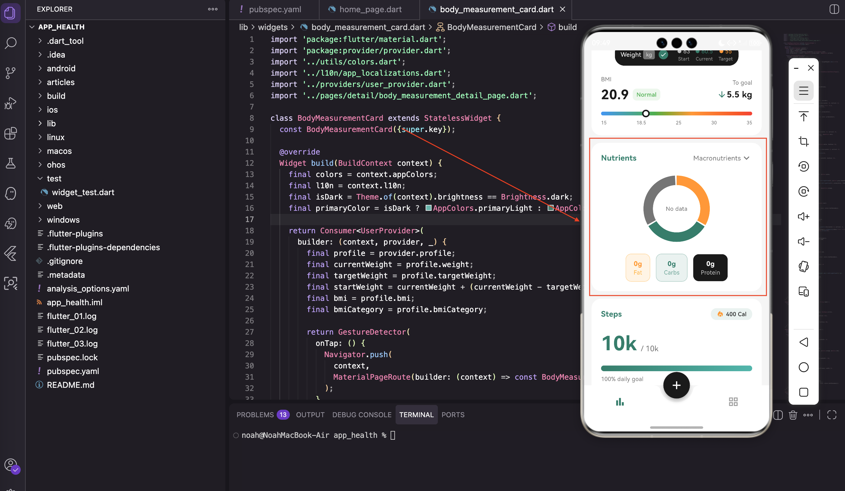
身体数据卡片是健康管理App中信息量最大的组件之一。它需要展示当前体重、目标体重、BMI指数、BMI分类,还要有一个可视化的BMI指示器。同时还得支持快速记录体重和跳转到详情页。这个组件的难点在于如何在有限的空间里清晰地展示这么多信息,同时保持界面的美观和易用性。我们来一步步实现它。@override身体数据卡片是无状态组件,所有数据都来自Provider。卡片本身不维护任何状态,逻辑清晰当Pro
写在前面
身体数据卡片是健康管理App中信息量最大的组件之一。它需要展示当前体重、目标体重、BMI指数、BMI分类,还要有一个可视化的BMI指示器。同时还得支持快速记录体重和跳转到详情页。
这个组件的难点在于如何在有限的空间里清晰地展示这么多信息,同时保持界面的美观和易用性。我们来一步步实现它。
导入依赖
import 'package:flutter/material.dart';
import 'package:provider/provider.dart';
import '../utils/colors.dart';
import '../l10n/app_localizations.dart';
import '../providers/user_provider.dart';
import '../pages/detail/body_measurement_detail_page.dart';
关于这些导入的说明:
除了常规的Provider和主题相关的导入,还引入了 BodyMeasurementDetailPage,点击卡片时跳转到这个详情页。
这样的设计让卡片只展示关键信息,详细信息放在单独的页面里,避免卡片过于拥挤。
组件定义
class BodyMeasurementCard extends StatelessWidget {
const BodyMeasurementCard({super.key});
Widget build(BuildContext context) {
final colors = context.appColors;
final l10n = context.l10n;
final isDark = Theme.of(context).brightness == Brightness.dark;
final primaryColor = isDark ? AppColors.primaryLight : AppColors.primary;
为什么选择StatelessWidget:
身体数据卡片是无状态组件,所有数据都来自Provider。这样做的好处是:
- 卡片本身不维护任何状态,逻辑清晰
- 当Provider数据变化时,自动重建卡片
- 代码简洁,不需要处理生命周期
老规矩,先获取主题色和国际化对象。这几行代码在几乎每个组件里都会出现,形成了统一的模式。
数据获取
用 Consumer 监听用户数据:
    return Consumer<UserProvider>(
      builder: (context, provider, _) {
        final profile = provider.profile;
        final currentWeight = profile.weight;
        final targetWeight = profile.targetWeight;
        final startWeight = currentWeight + (currentWeight - targetWeight).abs() * 0.5;
        final bmi = profile.bmi;
        final bmiCategory = profile.bmiCategory;
数据的计算逻辑:
startWeight 是估算的起始体重,用当前体重和目标体重的差值来推算。这只是个展示用的数值,实际应用中应该从历史记录里取。
bmi 和 bmiCategory 是 UserProfile 模型里的计算属性,根据身高体重自动算出来的。这样可以避免在UI层重复计算。
整体容器
整个卡片用 GestureDetector 包裹,点击跳转到详情页:
        return GestureDetector(
          onTap: () {
            Navigator.push(
              context,
              MaterialPageRoute(builder: (context) => const BodyMeasurementDetailPage()),
            );
          },
          child: Container(
            padding: const EdgeInsets.all(20),
            decoration: BoxDecoration(
              color: colors.cardBackground,
              borderRadius: BorderRadius.circular(20),
            ),
容器的设计:
用 GestureDetector 而不是 InkWell,是因为我们不需要水波纹效果,卡片本身的视觉反馈已经足够了。
20像素的内边距和20像素的圆角,保持了整个App的视觉一致性。
标题栏
标题栏左边是"身体数据",右边是记录体重的按钮:
            child: Column(
              children: [
                Row(
                  mainAxisAlignment: MainAxisAlignment.spaceBetween,
                  children: [
                    Text(
                      l10n.bodyMeasurement,
                      style: TextStyle(
                        fontSize: 16,
                        fontWeight: FontWeight.w600,
                        color: primaryColor,
                      ),
                    ),
标题的设计:
标题用主题色,字号16,加粗(w600)。这样可以让用户快速识别这是一个卡片的标题。
记录体重按钮:
                    GestureDetector(
                      onTap: () => _showWeightInput(context, provider),
                      child: Container(
                        padding: const EdgeInsets.symmetric(horizontal: 12, vertical: 4),
                        decoration: BoxDecoration(
                          color: primaryColor.withOpacity(isDark ? 0.2 : 0.1),
                          borderRadius: BorderRadius.circular(12),
                        ),
                        child: Row(
                          children: [
                            Icon(Icons.add, size: 16, color: primaryColor),
                            const SizedBox(width: 4),
                            Text(
                              l10n.logWeight,
                              style: TextStyle(fontSize: 12, color: primaryColor),
                            ),
                          ],
                        ),
                      ),
                    ),
                  ],
                ),
记录体重按钮的设计:
加号图标配"记录体重"文字,点击弹出输入对话框。这个按钮的设计和步数卡片里的卡路里标签类似,保持了视觉一致性。
半透明背景加边框的设计,让按钮看起来轻量但又有明确的可点击区域。
体重指示器条
这是一个横向滚动的深色条,展示起始体重、当前体重和目标体重:
                const SizedBox(height: 16),
                SingleChildScrollView(
                  scrollDirection: Axis.horizontal,
                  child: Container(
                    padding: const EdgeInsets.symmetric(horizontal: 12, vertical: 8),
                    decoration: BoxDecoration(
                      color: isDark ? AppColors.darkSurface : AppColors.dark,
                      borderRadius: BorderRadius.circular(20),
                    ),
为什么用SingleChildScrollView:
用 SingleChildScrollView 是因为内容可能超出屏幕宽度,允许用户横向滑动查看。这样可以在小屏幕上也能显示所有信息。
深色背景让这个区域从卡片中脱颖而出,用户能够快速识别这是一个特殊的区域。
条内的内容:
                    child: Row(
                      mainAxisSize: MainAxisSize.min,
                      children: [
                        Text(
                          l10n.weight,
                          style: const TextStyle(color: Colors.white, fontSize: 13),
                        ),
                        const SizedBox(width: 4),
                        Container(
                          padding: const EdgeInsets.symmetric(horizontal: 6, vertical: 2),
                          decoration: BoxDecoration(
                            color: Colors.grey.shade600,
                            borderRadius: BorderRadius.circular(4),
                          ),
                          child: const Text(
                            'kg',
                            style: TextStyle(color: Colors.white70, fontSize: 11),
                          ),
                        ),
内容的组织:
“Weight"文字后面跟一个小标签显示单位"kg”。这样可以让用户知道这个区域是关于体重的。
接着是一个勾选图标表示当前选中的是体重视图:
                        const SizedBox(width: 8),
                        Container(
                          width: 20,
                          height: 20,
                          decoration: BoxDecoration(
                            color: primaryColor,
                            shape: BoxShape.circle,
                          ),
                          child: Icon(
                            Icons.check,
                            color: isDark ? Colors.black : Colors.white,
                            size: 14,
                          ),
                        ),
勾选图标的作用:
这个勾选图标暗示用户可以切换不同的视图(比如体重、BMI、体脂率等)。虽然当前版本只有体重视图,但这样的设计为将来的扩展留下了空间。
然后是三个体重指示器:
                        const SizedBox(width: 20),
                        _buildWeightIndicator(startWeight.toStringAsFixed(0), Colors.grey.shade400, 'Start'),
                        const SizedBox(width: 12),
                        _buildWeightIndicator(currentWeight.toStringAsFixed(1), primaryColor, l10n.currentWeight),
                        const SizedBox(width: 12),
                        _buildWeightIndicator(
                          targetWeight.toStringAsFixed(0),
                          isDark ? AppColors.orangeLight : AppColors.orange,
                          l10n.targetWeight,
                        ),
                      ],
                    ),
                  ),
                ),
三个指示器的设计:
三个指示器分别用不同颜色:灰色表示起始、主色表示当前、橙色表示目标。这样用户能够快速区分三个数值。
起始体重和目标体重用整数显示,当前体重用一位小数显示,这样可以突出当前体重的精确性。
体重指示器组件
Widget _buildWeightIndicator(String value, Color color, String label) {
  return Column(
    children: [
      Row(
        children: [
          Container(
            width: 8,
            height: 8,
            decoration: BoxDecoration(color: color, shape: BoxShape.circle),
          ),
          const SizedBox(width: 4),
          Text(value, style: TextStyle(color: color, fontSize: 12)),
        ],
      ),
      Text(
        label,
        style: TextStyle(color: Colors.grey.shade500, fontSize: 10),
      ),
    ],
  );
}
指示器组件的设计:
一个小圆点加数值,下面是标签文字。结构简单但信息清晰。
小圆点的颜色和数值文字的颜色一致,这样可以形成视觉关联。
BMI显示区域
                const SizedBox(height: 20),
                Row(
                  children: [
                    Expanded(
                      child: Column(
                        crossAxisAlignment: CrossAxisAlignment.start,
                        children: [
                          Text(
                            l10n.bmi,
                            style: TextStyle(fontSize: 12, color: colors.textSecondary),
                          ),
                          const SizedBox(height: 4),
                          Row(
                            children: [
                              Text(
                                bmi.toStringAsFixed(1),
                                style: TextStyle(
                                  fontSize: 28,
                                  fontWeight: FontWeight.bold,
                                  color: colors.textPrimary,
                                ),
                              ),
BMI数值的显示:
BMI数值用大字号(28)显示,这是卡片的视觉焦点。旁边加一个分类标签:
                              const SizedBox(width: 8),
                              Container(
                                padding: const EdgeInsets.symmetric(horizontal: 8, vertical: 4),
                                decoration: BoxDecoration(
                                  color: _getBmiColor(bmiCategory).withOpacity(isDark ? 0.2 : 0.1),
                                  borderRadius: BorderRadius.circular(8),
                                ),
                                child: Text(
                                  bmiCategory,
                                  style: TextStyle(
                                    fontSize: 12,
                                    color: _getBmiColor(bmiCategory),
                                    fontWeight: FontWeight.w500,
                                  ),
                                ),
                              ),
                            ],
                          ),
                        ],
                      ),
                    ),
BMI分类标签的设计:
BMI分类(Underweight、Normal、Overweight、Obese)用不同颜色的标签展示。这样用户能够快速了解自己的BMI状态。
标签的背景色是分类颜色的10%透明度(深色模式下是20%),这样既能区分不同的分类,又不会显得太突兀。
右侧显示距离目标还差多少:
                    Column(
                      crossAxisAlignment: CrossAxisAlignment.end,
                      children: [
                        Text(
                          'To goal',
                          style: TextStyle(fontSize: 12, color: colors.textSecondary),
                        ),
                        const SizedBox(height: 4),
                        Row(
                          children: [
                            Icon(
                              (currentWeight - targetWeight) > 0
                                  ? Icons.arrow_downward
                                  : Icons.arrow_upward,
                              size: 20,
                              color: primaryColor,
                            ),
                            Text(
                              '${(currentWeight - targetWeight).abs().toStringAsFixed(1)} kg',
                              style: TextStyle(
                                fontSize: 18,
                                fontWeight: FontWeight.w600,
                                color: colors.textPrimary,
                              ),
                            ),
                          ],
                        ),
                      ],
                    ),
                  ],
                ),
距离目标的显示:
根据当前体重和目标体重的差值,显示向下或向上的箭头。如果需要减重就显示向下箭头,需要增重就显示向上箭头。
这样的设计让用户能够快速了解自己的进度方向。
BMI指示器
这是整个卡片最复杂的部分,用渐变色条展示BMI的健康范围:
                const SizedBox(height: 16),
                _buildBmiIndicator(context, bmi),
指示器的实现:
Widget _buildBmiIndicator(BuildContext context, double bmi) {
  final colors = context.appColors;
  final position = ((bmi - 15) / 20).clamp(0.0, 1.0);
位置计算的逻辑:
BMI的正常范围大约是15到35,所以用 (bmi - 15) / 20 把BMI值映射到0-1的范围。clamp 确保位置在0到1之间。
  return Column(
    children: [
      LayoutBuilder(
        builder: (context, constraints) {
          final indicatorLeft = position * constraints.maxWidth - 8;
          return Stack(
            clipBehavior: Clip.none,
            children: [
              Container(
                height: 8,
                decoration: BoxDecoration(
                  borderRadius: BorderRadius.circular(4),
                  gradient: const LinearGradient(
                    colors: [Colors.blue, Colors.green, Colors.orange, Colors.red],
                    stops: [0.0, 0.35, 0.6, 1.0],
                  ),
                ),
              ),
渐变色条的设计:
渐变色条从蓝色(偏瘦)到绿色(正常)到橙色(偏胖)到红色(肥胖)。stops 控制每个颜色的位置,让绿色区域(正常范围)占比更大。
这样的设计让用户能够直观地看到自己的BMI在健康范围的哪个位置。
指示器小圆点:
              Positioned(
                left: indicatorLeft.clamp(0, constraints.maxWidth - 16),
                top: -4,
                child: Container(
                  width: 16,
                  height: 16,
                  decoration: BoxDecoration(
                    color: colors.cardBackground,
                    shape: BoxShape.circle,
                    border: Border.all(color: colors.textPrimary, width: 3),
                  ),
                ),
              ),
            ],
          );
        },
      ),
指示器位置的计算:
用 LayoutBuilder 获取可用宽度,然后计算指示器的位置。clamp 确保指示器不会超出边界。
指示器是一个白色的圆点,有深色的边框,这样在任何背景上都能清晰可见。
底部的刻度标签:
      const SizedBox(height: 8),
      Row(
        mainAxisAlignment: MainAxisAlignment.spaceBetween,
        children: ['15', '18.5', '25', '30', '35'].map((v) {
          return Text(v, style: TextStyle(fontSize: 10, color: colors.textSecondary));
        }).toList(),
      ),
    ],
  );
}
刻度标签的设计:
显示BMI的关键数值:15(偏瘦)、18.5(正常下限)、25(正常上限)、30(肥胖下限)、35(肥胖)。
这样用户能够快速了解BMI的分类标准。
BMI颜色映射
Color _getBmiColor(String category) {
  switch (category) {
    case 'Underweight':
      return Colors.blue;
    case 'Normal':
      return Colors.green;
    case 'Overweight':
      return Colors.orange;
    case 'Obese':
      return Colors.red;
    default:
      return AppColors.grey;
  }
}
颜色映射的设计:
根据BMI分类返回对应的颜色,和渐变条的颜色保持一致。这样可以形成视觉关联,让用户更容易理解。
体重输入对话框
void _showWeightInput(BuildContext context, UserProvider provider) {
  final l10n = context.l10n;
  final controller = TextEditingController(
    text: provider.profile.weight.toStringAsFixed(1),
  );

  showDialog(
    context: context,
    builder: (context) => AlertDialog(
      title: Text(l10n.logWeight),
      content: TextField(
        controller: controller,
        keyboardType: const TextInputType.numberWithOptions(decimal: true),
        decoration: InputDecoration(
          hintText: l10n.weight,
          suffixText: 'kg',
        ),
      ),
对话框的设计:
TextEditingController 的初始值设成当前体重,用户可以在此基础上修改。
TextInputType.numberWithOptions(decimal: true) 弹出带小数点的数字键盘,因为体重通常需要精确到小数点后一位。
保存逻辑:
      actions: [
        TextButton(
          onPressed: () => Navigator.pop(context),
          child: Text(l10n.cancel),
        ),
        TextButton(
          onPressed: () {
            final weight = double.tryParse(controller.text);
            if (weight != null && weight > 0) {
              provider.recordWeight(weight);
              Navigator.pop(context);
              ScaffoldMessenger.of(context).showSnackBar(
                SnackBar(
                  content: Text('${l10n.weightUpdated}: ${weight.toStringAsFixed(1)} kg'),
                  behavior: SnackBarBehavior.floating,
                ),
              );
            }
          },
          child: Text(l10n.save),
        ),
      ],
    ),
  );
}
保存逻辑的设计:
double.tryParse 安全地解析用户输入,如果输入的不是有效数字就返回null。
检查体重是否大于0,防止用户输入无效的数据。
保存成功后显示一个 SnackBar 提示用户。behavior: SnackBarBehavior.floating 让提示条悬浮在底部,不会遮挡底部导航栏。
关于BMI的计算
BMI(Body Mass Index)的计算公式是:
BMI = 体重(kg) / (身高(m))²
BMI分类标准:
- Underweight(偏瘦) - BMI < 18.5
- Normal(正常) - 18.5 ≤ BMI < 25
- Overweight(偏胖) - 25 ≤ BMI < 30
- Obese(肥胖) - BMI ≥ 30
这是世界卫生组织(WHO)的标准分类。不同国家可能有略微不同的标准,但这个是最通用的。
数据持久化
体重数据需要保存到本地存储,这样用户下次打开App时能看到之前的数据:
Future<void> recordWeight(double weight) async {
  _profile = _profile.copyWith(weight: weight);

  // 保存到历史记录
  _weightHistory.add(WeightRecord(
    date: DateTime.now(),
    weight: weight,
  ));

  await _saveProfile();
  await _saveWeightHistory();
  notifyListeners();
}
数据保存的逻辑:
更新当前体重,同时把这条记录添加到历史记录中。这样用户可以查看自己的体重变化趋势。
交互体验的优化
身体数据卡片的交互设计有几个细节值得注意:
第一,快速记录体重
右上角的"记录体重"按钮让用户可以快速添加新的体重数据,不用进入详情页。
第二,视觉反馈
BMI指示器用颜色和位置直观地展示用户的健康状态,用户一眼就能了解自己的情况。
第三,多维度展示
同时显示当前体重、目标体重、BMI、距离目标的距离,让用户能够从多个角度了解自己的身体状况。
第四,历史对比
体重指示器条显示起始体重、当前体重和目标体重,让用户能够看到自己的进度。
可能的改进方向
当前实现已经能满足基本需求,但还有一些可以改进的地方:
第一,支持多个测量指标
除了体重和BMI,还可以添加体脂率、腰围等指标。用户可以通过勾选图标切换不同的视图。
第二,添加趋势图表
显示过去30天的体重变化趋势,让用户能够看到自己的长期进度。
第三,添加提醒功能
定期提醒用户测量体重,帮助用户养成定期测量的习惯。
第四,支持多个目标
允许用户设置多个阶段性目标,比如先减到80kg,再减到75kg。
第五,添加分享功能
让用户可以分享自己的进度,增加社交互动。
性能考虑
在实现身体数据卡片时,有几个性能方面的考虑:
第一,避免频繁的重建
使用 Selector 而不是 Consumer,只监听需要的数据。这样可以减少不必要的重建。
第二,缓存计算结果
BMI、BMI分类等计算结果可以缓存在模型中,避免每次build都重新计算。
第三,优化渐变色的绘制
LinearGradient 的绘制可能比较耗时,特别是在低端设备上。可以考虑使用预先生成的图片代替。
小结
这篇文章我们实现了一个功能完整的身体数据卡片组件。主要涉及:
- LayoutBuilder - 获取父容器尺寸,用于计算指示器位置
- LinearGradient - 配合
stops实现不均匀的渐变效果 - SingleChildScrollView - 处理可能超出屏幕的内容
- 动态颜色和图标 - 根据数据动态改变样式
- 数据验证 - 确保用户输入的数据有效
身体数据卡片的设计思路是把复杂的健康数据用直观的可视化方式呈现出来,让用户一眼就能了解自己的身体状况。
下一篇我们来实现搜索栏组件,虽然看起来简单,但里面有一些交互细节值得探讨。敬请期待!
欢迎加入开源鸿蒙跨平台社区:https://openharmonycrossplatform.csdn.net

开源鸿蒙跨平台开发社区汇聚开发者与厂商,共建“一次开发,多端部署”的开源生态,致力于降低跨端开发门槛,推动万物智联创新。
更多推荐

 20
20 0
0- 0


 已为社区贡献72条内容

所有评论(0)