Flutter for OpenHarmony移动数据使用监管助手App实战 - 省流模式实现
省流模式功能设计摘要:流量监控App的省流模式通过限制后台流量、降低图片质量等策略帮助用户节省流量。页面包含主开关控制、子选项配置、节省流量统计和使用说明。UI设计采用卡片式布局,主开关突出显示,带有状态图标和动画效果,节省流量统计使用渐变背景展示。代码结构清晰,使用GetX状态管理,支持灵活配置和直观的效果展示,适合流量套餐有限的用户使用。
省流模式是流量监控App的核心功能之一,通过限制后台流量、降低图片质量、禁止视频自动播放等方式,帮助用户节省流量消耗。这个功能对于流量套餐有限的用户特别有价值,尤其是在月底流量即将用尽的时候,开启省流模式可以有效延长流量的使用时间。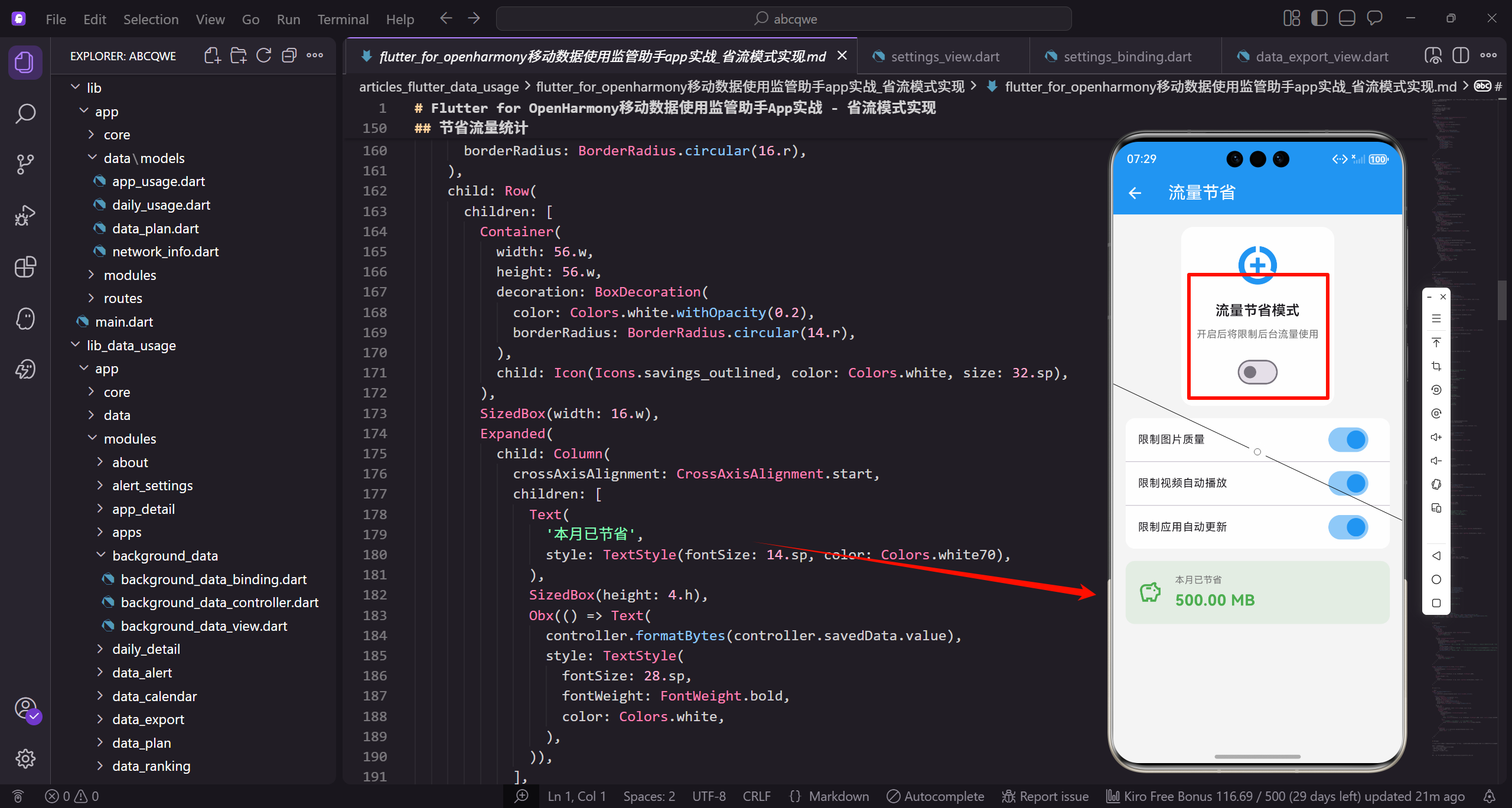
功能设计
省流模式页面需要实现以下核心功能:
- 主开关控制省流模式的启用/禁用,一键开启或关闭所有省流策略
- 多个子选项控制具体的省流策略,用户可以根据自己的需求灵活配置
- 显示已节省的流量统计,让用户直观看到省流效果
- 省流效果说明和使用提示,帮助用户理解各选项的作用
页面整体结构
class DataSaverView extends GetView<DataSaverController> {
const DataSaverView({super.key});
Widget build(BuildContext context) {
return Scaffold(
backgroundColor: AppTheme.backgroundColor,
appBar: AppBar(
DataSaverView继承GetView,通过controller属性访问控制器。Scaffold提供页面基础结构。
backgroundColor设置统一背景色,AppBar是顶部导航栏。
        title: const Text('省流模式'),
        actions: [
          IconButton(
            icon: Icon(Icons.help_outline),
            onPressed: () => _showHelpDialog(),
          ),
        ],
      ),
title设置页面标题。actions添加帮助按钮,点击弹出帮助对话框。
帮助对话框向用户解释省流模式的工作原理和注意事项。
      body: SingleChildScrollView(
        padding: EdgeInsets.all(16.w),
        child: Column(
          children: [
            _buildMainSwitch(),
            SizedBox(height: 16.h),
            _buildSavedInfo(),
body使用SingleChildScrollView支持滚动,padding设置16.w内边距。
Column垂直排列各区域:主开关、节省统计、省流选项、使用提示。
            SizedBox(height: 16.h),
            _buildOptions(),
            SizedBox(height: 16.h),
            _buildTips(),
          ],
        ),
      ),
    );
  }
}
SizedBox添加16.h间距分隔各区域。_buildOptions构建省流选项列表,_buildTips构建使用提示。
页面结构清晰,用户能快速找到主开关和各项设置。
主开关卡片
主开关是页面的视觉焦点:
Widget _buildMainSwitch() {
  return Container(
    padding: EdgeInsets.all(24.w),
    decoration: BoxDecoration(
      color: Colors.white,
      borderRadius: BorderRadius.circular(20.r),
      boxShadow: [
Container创建卡片,内边距24.w比其他卡片大,突出主开关的重要性。
白色背景,圆角20.r,boxShadow添加阴影。
        BoxShadow(
          color: Colors.black.withOpacity(0.03),
          blurRadius: 10.r,
          offset: Offset(0, 4.h),
        ),
      ],
    ),
    child: Column(
      children: [
        _buildSwitchIcon(),
阴影3%透明度黑色,模糊半径10,向下偏移4像素。Column垂直排列内容。
_buildSwitchIcon构建状态图标,根据开关状态变化颜色。
        SizedBox(height: 20.h),
        Text(
          '省流模式',
          style: TextStyle(
            fontSize: 22.sp,
            fontWeight: FontWeight.bold,
            color: AppTheme.textPrimary,
          ),
        ),
SizedBox添加20.h间距。标题"省流模式"22sp粗体,是卡片的主标题。
大字号和粗体让标题醒目。
        SizedBox(height: 8.h),
        Text(
          '开启后将限制后台流量使用,帮助您节省流量',
          style: TextStyle(
            fontSize: 14.sp,
            color: AppTheme.textSecondary,
          ),
          textAlign: TextAlign.center,
        ),
        SizedBox(height: 24.h),
        _buildMainSwitchButton(),
      ],
    ),
  );
}
说明文字14sp次要颜色,居中对齐。_buildMainSwitchButton构建开关按钮。
整个卡片结构:图标、标题、说明、按钮,层次分明。
开关图标实现:
Widget _buildSwitchIcon() {
  return Obx(() {
    final isEnabled = controller.dataSaverEnabled.value;
    return AnimatedContainer(
      duration: const Duration(milliseconds: 300),
      width: 80.w,
      height: 80.w,
Obx响应dataSaverEnabled变化。AnimatedContainer在状态变化时有300毫秒的平滑过渡动画。
容器大小80x80,是图标的背景。
      decoration: BoxDecoration(
        color: isEnabled
            ? AppTheme.primaryColor.withOpacity(0.1)
            : Colors.grey.shade100,
        shape: BoxShape.circle,
      ),
      child: Icon(
        Icons.data_saver_on,
背景色根据状态变化:启用时浅蓝色,禁用时浅灰色。shape设为圆形。
AnimatedContainer让颜色变化有动画效果。
        size: 48.sp,
        color: isEnabled ? AppTheme.primaryColor : Colors.grey,
      ),
    );
  });
}
图标使用data_saver_on,大小48sp。颜色同样根据状态变化。
图标和背景颜色协调,启用时蓝色系,禁用时灰色系。
主开关按钮实现:
Widget _buildMainSwitchButton() {
  return Obx(() {
    final isEnabled = controller.dataSaverEnabled.value;
    return GestureDetector(
      onTap: () => controller.dataSaverEnabled.value = !isEnabled,
      child: AnimatedContainer(
        duration: const Duration(milliseconds: 300),
Obx响应状态变化。GestureDetector处理点击,切换dataSaverEnabled的值。
AnimatedContainer让按钮颜色变化有动画效果,时长300毫秒。
        width: 120.w,
        height: 48.h,
        decoration: BoxDecoration(
          color: isEnabled ? AppTheme.primaryColor : Colors.grey.shade300,
          borderRadius: BorderRadius.circular(24.r),
        ),
        child: Center(
按钮宽120高48,圆角24(高度的一半)形成胶囊形状。
颜色根据状态变化:启用时主色调,禁用时灰色。
          child: Text(
            isEnabled ? '已开启' : '已关闭',
            style: TextStyle(
              fontSize: 16.sp,
              fontWeight: FontWeight.w600,
              color: Colors.white,
            ),
          ),
        ),
      ),
    );
  });
}
文字根据状态显示"已开启"或"已关闭",16sp半粗体白色。
Center让文字居中显示。
节省流量统计
用渐变背景卡片展示省流效果:
Widget _buildSavedInfo() {
  return Container(
    padding: EdgeInsets.all(20.w),
    decoration: BoxDecoration(
      gradient: LinearGradient(
        colors: [AppTheme.wifiColor, AppTheme.wifiColor.withOpacity(0.8)],
      ),
Container使用渐变背景,从绿色到80%透明度绿色。绿色代表"节省"、“环保”。
内边距20.w,渐变让卡片更有视觉吸引力。
      borderRadius: BorderRadius.circular(16.r),
    ),
    child: Row(
      children: [
        Container(
          width: 56.w,
          height: 56.w,
          decoration: BoxDecoration(
圆角16.r。Row横向排列图标和数据。
左侧图标容器56x56。
            color: Colors.white.withOpacity(0.2),
            borderRadius: BorderRadius.circular(14.r),
          ),
          child: Icon(Icons.savings_outlined, color: Colors.white, size: 32.sp),
        ),
        SizedBox(width: 16.w),
        Expanded(
图标背景20%透明度白色,在深色背景上形成柔和对比。savings_outlined是存钱罐图标。
SizedBox添加间距,Expanded让中间区域占据剩余空间。
          child: Column(
            crossAxisAlignment: CrossAxisAlignment.start,
            children: [
              Text(
                '本月已节省',
                style: TextStyle(fontSize: 14.sp, color: Colors.white70),
              ),
              SizedBox(height: 4.h),
Column垂直排列标签和数值,左对齐。"本月已节省"标签70%白色。
SizedBox添加4.h间距。
              Obx(() => Text(
                controller.formatBytes(controller.savedData.value),
                style: TextStyle(
                  fontSize: 28.sp,
                  fontWeight: FontWeight.bold,
                  color: Colors.white,
                ),
              )),
            ],
          ),
        ),
Obx响应savedData变化。formatBytes格式化字节数为可读字符串。
数值28sp大字号粗体白色,是视觉焦点。
        Column(
          crossAxisAlignment: CrossAxisAlignment.end,
          children: [
            Text('累计节省', style: TextStyle(fontSize: 12.sp, color: Colors.white70)),
            SizedBox(height: 4.h),
            Obx(() => Text(
              controller.formatBytes(controller.totalSaved.value),
右侧显示累计节省数据,右对齐。标签12sp小字号。
Obx响应totalSaved变化。
              style: TextStyle(
                fontSize: 16.sp,
                fontWeight: FontWeight.w600,
                color: Colors.white,
              ),
            )),
          ],
        ),
      ],
    ),
  );
}
累计数值16sp,比本月数值小,形成主次关系。
左侧本月数据是重点,右侧累计数据是补充。
省流选项列表
提供多个可独立控制的省流策略:
Widget _buildOptions() {
  return Container(
    decoration: BoxDecoration(
      color: Colors.white,
      borderRadius: BorderRadius.circular(16.r),
    ),
    child: Column(
      children: [
Container创建白色圆角卡片。Column垂直排列各选项。
所有选项放在同一个卡片内,视觉上更整洁。
        _buildOptionItem(
          icon: Icons.image,
          title: '限制图片质量',
          subtitle: '自动加载低分辨率图片,节省约30%流量',
          value: controller.limitImageQuality,
        ),
        Divider(height: 1, indent: 72.w),
_buildOptionItem构建单个选项,传入图标、标题、副标题、绑定的响应式变量。
Divider分隔线,indent: 72.w让分隔线从图标右侧开始,不切断图标区域。
        _buildOptionItem(
          icon: Icons.play_circle_outline,
          title: '限制视频自动播放',
          subtitle: '视频需手动点击播放,节省约50%流量',
          value: controller.limitVideoAutoplay,
        ),
        Divider(height: 1, indent: 72.w),
第二个选项:限制视频自动播放,预计节省50%流量。
每个选项都有说明预计节省比例,帮助用户决策。
        _buildOptionItem(
          icon: Icons.system_update,
          title: '限制应用自动更新',
          subtitle: '仅在WiFi下自动更新应用',
          value: controller.limitAutoUpdate,
        ),
        Divider(height: 1, indent: 72.w),
第三个选项:限制应用自动更新,只在WiFi下更新。
这个选项不会影响用户体验,只是改变更新时机。
        _buildOptionItem(
          icon: Icons.cloud_sync,
          title: '限制后台同步',
          subtitle: '减少后台数据同步频率',
          value: controller.limitBackgroundSync,
        ),
        Divider(height: 1, indent: 72.w),
        _buildOptionItem(
          icon: Icons.download,
          title: '限制预加载',
          subtitle: '禁止应用预加载内容',
          value: controller.limitPreload,
        ),
      ],
    ),
  );
}
后台同步和预加载选项,都是减少后台流量消耗的策略。
五个选项覆盖了主要的省流场景。
单个选项的实现:
Widget _buildOptionItem({
  required IconData icon,
  required String title,
  required String subtitle,
  required RxBool value,
}) {
  return Obx(() {
    final isMainEnabled = controller.dataSaverEnabled.value;
_buildOptionItem接收图标、标题、副标题、响应式布尔值四个参数。
Obx响应状态变化,isMainEnabled缓存主开关状态。
    final isEnabled = value.value && isMainEnabled;

    return ListTile(
      contentPadding: EdgeInsets.symmetric(horizontal: 16.w, vertical: 8.h),
      leading: Container(
        width: 44.w,
        height: 44.w,
isEnabled综合判断:子选项开启且主开关开启才算真正启用。
ListTile是标准列表项组件,contentPadding设置内边距。
        decoration: BoxDecoration(
          color: isEnabled
              ? AppTheme.primaryColor.withOpacity(0.1)
              : Colors.grey.shade100,
          borderRadius: BorderRadius.circular(12.r),
        ),
        child: Icon(
          icon,
图标容器背景色根据启用状态变化:启用时浅蓝色,禁用时浅灰色。
圆角12.r,和其他地方的图标容器风格一致。
          color: isEnabled ? AppTheme.primaryColor : Colors.grey,
          size: 24.sp,
        ),
      ),
      title: Text(
        title,
        style: TextStyle(
          fontSize: 15.sp,
          fontWeight: FontWeight.w500,
图标颜色同样根据状态变化。title是ListTile的主标题。
15sp字号,中等粗细。
          color: isMainEnabled ? AppTheme.textPrimary : Colors.grey,
        ),
      ),
      subtitle: Text(
        subtitle,
        style: TextStyle(
          fontSize: 12.sp,
          color: AppTheme.textSecondary,
        ),
      ),
标题颜色根据主开关状态变化:主开关关闭时标题变灰。
subtitle是副标题,12sp次要颜色,说明选项的作用。
      trailing: Switch(
        value: value.value,
        onChanged: isMainEnabled ? (v) => value.value = v : null,
        activeColor: AppTheme.primaryColor,
      ),
    );
  });
}
trailing放置Switch开关。onChanged在主开关启用时更新值,禁用时传null使开关不可操作。
这种联动逻辑让用户明确:要使用子选项必须先开启主开关。
使用提示
在页面底部提供使用建议:
Widget _buildTips() {
  return Container(
    padding: EdgeInsets.all(16.w),
    decoration: BoxDecoration(
      color: AppTheme.primaryColor.withOpacity(0.05),
      borderRadius: BorderRadius.circular(12.r),
      border: Border.all(color: AppTheme.primaryColor.withOpacity(0.2)),
    ),
Container使用5%透明度主色调背景,20%透明度主色调边框。
这种设计既能引起注意又不会太突兀。
    child: Column(
      crossAxisAlignment: CrossAxisAlignment.start,
      children: [
        Row(
          children: [
            Icon(Icons.tips_and_updates, color: AppTheme.primaryColor, size: 20.sp),
            SizedBox(width: 8.w),
Column垂直排列内容,左对齐。Row横向排列图标和标题。
tips_and_updates是灯泡图标,表示"提示"、“建议”。
            Text(
              '使用提示',
              style: TextStyle(
                fontSize: 15.sp,
                fontWeight: FontWeight.w600,
                color: AppTheme.primaryColor,
              ),
            ),
          ],
        ),
        SizedBox(height: 12.h),
标题"使用提示"15sp半粗体主色调。SizedBox添加12.h间距。
标题和图标同色,形成统一的视觉风格。
        _buildTipItem('省流模式可能影响部分应用的使用体验'),
        _buildTipItem('建议在流量紧张时开启省流模式'),
        _buildTipItem('连接WiFi时可以关闭省流模式'),
        _buildTipItem('重要应用可以单独设置后台流量权限'),
      ],
    ),
  );
}
四条使用提示,涵盖注意事项和使用建议。
_buildTipItem封装单条提示的样式。
Widget _buildTipItem(String text) {
  return Padding(
    padding: EdgeInsets.only(bottom: 8.h),
    child: Row(
      crossAxisAlignment: CrossAxisAlignment.start,
      children: [
        Text('• ', style: TextStyle(fontSize: 14.sp, color: AppTheme.textSecondary)),
Padding添加底部8.h间距。Row横向排列圆点和文字。
crossAxisAlignment设为start,圆点和文字顶部对齐。
        Expanded(
          child: Text(
            text,
            style: TextStyle(fontSize: 13.sp, color: AppTheme.textSecondary, height: 1.4),
          ),
        ),
      ],
    ),
  );
}
Expanded让文字占据剩余空间,支持换行。height: 1.4增加行高,多行文字更易阅读。
圆点作为列表标记,13sp次要颜色。
Controller实现
class DataSaverController extends GetxController {
  final dataSaverEnabled = false.obs;
  final limitImageQuality = true.obs;
  final limitVideoAutoplay = true.obs;
  final limitAutoUpdate = true.obs;
  final limitBackgroundSync = true.obs;
  final limitPreload = true.obs;
声明响应式变量:主开关默认关闭,子选项默认开启。
这样用户开启主开关后,所有省流策略立即生效。
final savedData = (500 * 1024 * 1024).obs;
final totalSaved = (2 * 1024 * 1024 * 1024).obs;
void onInit() {
super.onInit();
loadSettings();
setupListeners();
}
savedData是本月节省字节数,totalSaved是累计节省字节数。
onInit中加载设置和设置监听器。
  void setupListeners() {
    ever(dataSaverEnabled, (enabled) {
      if (enabled) {
        _applyDataSaverMode();
      } else {
        _disableDataSaverMode();
      }
      saveSettings();
    });
ever监听dataSaverEnabled变化,每次变化时执行回调。
根据新状态应用或关闭省流模式,然后保存设置。
    ever(limitImageQuality, (_) => saveSettings());
    ever(limitVideoAutoplay, (_) => saveSettings());
    ever(limitAutoUpdate, (_) => saveSettings());
    ever(limitBackgroundSync, (_) => saveSettings());
    ever(limitPreload, (_) => saveSettings());
  }
监听所有子选项变化,变化时保存设置。
统一的保存逻辑,避免代码重复。
  String formatBytes(int bytes) {
    if (bytes < 1024) return '$bytes B';
    if (bytes < 1024 * 1024) return '${(bytes / 1024).toStringAsFixed(1)} KB';
    if (bytes < 1024 * 1024 * 1024) return '${(bytes / (1024 * 1024)).toStringAsFixed(2)} MB';
    return '${(bytes / (1024 * 1024 * 1024)).toStringAsFixed(2)} GB';
  }
}
formatBytes格式化字节数,根据大小自动选择单位。
KB保留1位小数,MB和GB保留2位小数。
写在最后
省流模式是帮助用户节省流量的有效工具。通过直观的主开关、灵活的子选项、清晰的节省统计,让用户可以根据自己的需求控制流量消耗。在实现过程中,主开关和子选项的联动逻辑是关键,要确保状态变化时UI能正确响应。
可以继续优化的方向:
- 添加智能省流,根据网络类型自动切换
- 支持按应用设置省流策略
- 添加省流效果对比图表
- 支持定时开启/关闭省流模式
欢迎加入开源鸿蒙跨平台社区:https://openharmonycrossplatform.csdn.net

开源鸿蒙跨平台开发社区汇聚开发者与厂商,共建“一次开发,多端部署”的开源生态,致力于降低跨端开发门槛,推动万物智联创新。
更多推荐

 14
14 0
0- 0


 已为社区贡献30条内容

所有评论(0)