React Native for OpenHarmony 实战:抛硬币实现
这篇文章介绍了如何使用React Native实现一个抛硬币工具,包含3D翻转动画和历史记录统计功能。文章详细讲解了状态设计、核心逻辑、动画实现和统计计算等关键部分。 核心实现要点包括: 使用Animated API实现硬币弹起、旋转和落下的三阶段动画 通过随机数生成抛硬币结果 记录并统计最近20次抛掷结果 使用插值转换实现10圈3600度的旋转效果 添加阴影和弹跳效果增强视觉体验 该实现充分利用
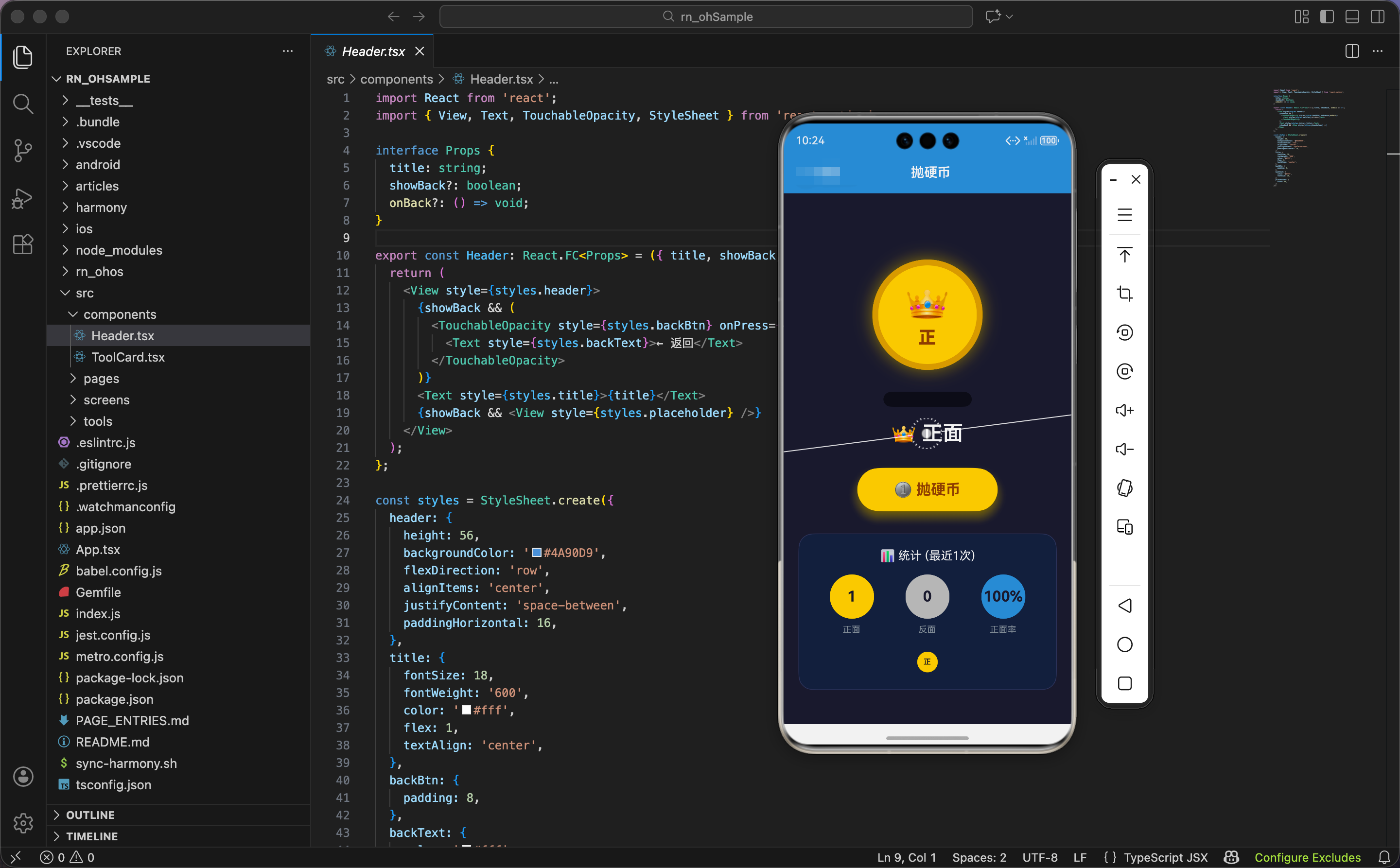
今天我们用 React Native 实现一个抛硬币工具,支持 3D 翻转动画、历史记录统计。
状态设计
import React, { useState, useRef } from 'react';
import { View, Text, TouchableOpacity, StyleSheet, Animated, Easing } from 'react-native';

export const CoinFlipper: React.FC = () => {
  const [result, setResult] = useState<'heads' | 'tails' | null>(null);
  const [isFlipping, setIsFlipping] = useState(false);
  const [history, setHistory] = useState<('heads' | 'tails')[]>([]);
  const flipAnim = useRef(new Animated.Value(0)).current;
  const scaleAnim = useRef(new Animated.Value(1)).current;
  const bounceAnim = useRef(new Animated.Value(0)).current;
状态设计包含结果、抛掷状态、历史记录。
结果状态:result 是当前硬币的面,'heads'(正面)或 'tails'(反面)。初始值是 null,显示提示文字。
抛掷状态:isFlipping 标记是否正在抛掷。抛掷过程中禁用按钮,防止重复点击。
历史记录:history 是一个数组,存储最近 20 次的结果。每次抛掷后,新结果插入数组开头,超过 20 个的旧记录被删除。
三个动画值:
flipAnim:硬币的翻转动画,从 0 到 10,后面会用插值映射到旋转角度 0-3600 度(10 圈)scaleAnim:硬币的缩放动画(代码中定义但未使用,预留扩展)bounceAnim:硬币的弹跳动画,从 0 到 -150 再回到 0,模拟"抛起来再落下"的效果
为什么用 'heads' | 'tails' 类型?因为 TypeScript 的字面量类型让代码更安全。result 只能是 'heads'、'tails' 或 null,不能是其他字符串。如果写错(比如 'head'),TypeScript 会报错。
抛硬币核心逻辑
  const flip = () => {
    if (isFlipping) return;
    setIsFlipping(true);

    // 重置动画
    flipAnim.setValue(0);
    bounceAnim.setValue(0);

    // 3D翻转动画
    Animated.sequence([
      // 弹起
      Animated.timing(bounceAnim, {
        toValue: -150,
        duration: 300,
        easing: Easing.out(Easing.cubic),
        useNativeDriver: true,
      }),
      // 旋转
      Animated.timing(flipAnim, {
        toValue: 10,
        duration: 1500,
        easing: Easing.out(Easing.cubic),
        useNativeDriver: true,
      }),
      // 落下
      Animated.timing(bounceAnim, {
        toValue: 0,
        duration: 200,
        easing: Easing.bounce,
        useNativeDriver: true,
      }),
    ]).start(() => {
      const final = Math.random() > 0.5 ? 'heads' : 'tails';
      setResult(final);
      setHistory([final, ...history.slice(0, 19)]);
      setIsFlipping(false);
    });
抛硬币函数包含三个阶段的动画:弹起、旋转、落下。
防重复点击:如果正在抛掷,直接返回。设置 isFlipping 为 true,标记开始抛掷。
重置动画值:每次抛掷前,把两个动画值重置为 0,确保动画从初始状态开始。
三阶段动画:用 Animated.sequence 串联三个动画,依次执行。
第一阶段:弹起
bounceAnim从 0 到 -150(向上移动 150 像素)- 时长 300ms
Easing.out(Easing.cubic):缓出曲线,开始快,结束慢,模拟"抛起来"的减速效果
第二阶段:旋转
flipAnim从 0 到 10- 时长 1500ms
- 同样用缓出曲线,旋转速度逐渐减慢,模拟空气阻力
为什么旋转值是 10 而不是 3600?因为 10 是动画值,后面会用插值映射到 3600 度。用 0-10 而不是 0-3600,是因为小数值更容易控制,插值更灵活。
第三阶段:落下
bounceAnim从 -150 回到 0(落回原位)- 时长 200ms
Easing.bounce:弹跳曲线,硬币落地时有回弹效果,更真实
为什么落下比弹起快?因为重力加速度。弹起是减速运动(300ms),落下是加速运动(200ms)。这符合物理规律,让动画更真实。
动画完成回调:
- 生成随机结果:
Math.random() > 0.5有 50% 概率是正面,50% 概率是反面 - 更新结果状态
- 更新历史记录:
[final, ...history.slice(0, 19)]把新结果插入数组开头,保留前 19 个旧记录,总共 20 个 - 解除抛掷状态,启用按钮
为什么保留 20 个历史记录?因为 20 个刚好,既能显示足够的统计信息,又不会占用太多内存。如果保留太多(比如 100 个),数组会很长,渲染性能下降;如果太少(比如 5 个),统计信息不够准确。
随机显示动画
    // 中间随机显示
    let count = 0;
    const interval = setInterval(() => {
      setResult(Math.random() > 0.5 ? 'heads' : 'tails');
      count++;
      if (count > 15) clearInterval(interval);
    }, 100);
  };
抛掷过程中,硬币的面快速切换,营造"翻转"的视觉效果。
定时器:每 100ms 随机切换一次正反面。
切换 15 次后停止:15 次 × 100ms = 1500ms,和旋转动画的时长一致。切换停止时,旋转动画也结束,硬币停在最终结果上。
为什么要快速切换?因为快速切换让用户看到硬币在"翻转"。如果不切换,硬币只是在旋转,看不出正反面的变化。切换配合旋转,营造真实的抛硬币效果。
为什么用 100ms 间隔?因为 100ms 刚好,既能让用户看到变化,又不会太快导致看不清。10 次/秒的切换速度,人眼能清楚感知。
旋转插值
  const rotateY = flipAnim.interpolate({
    inputRange: [0, 10],
    outputRange: ['0deg', '3600deg'],
  });
插值把动画值 0-10 映射到旋转角度 0-3600 度。
为什么旋转 3600 度?因为 3600 度是 10 圈(360 × 10)。10 圈的旋转让硬币充分翻转,用户能清楚看到正反面的切换。如果只旋转 1-2 圈,翻转不够明显;如果旋转太多(比如 20 圈),用户会觉得晕。
为什么用 rotateY 而不是 rotateZ?因为 rotateY 是绕 Y 轴(垂直轴)旋转,硬币像"翻书"一样翻转,能看到正反面。rotateZ 是绕 Z 轴(垂直屏幕)旋转,硬币像"转盘"一样旋转,看不到正反面的变化。
统计计算
  const headsCount = history.filter(h => h === 'heads').length;
  const tailsCount = history.filter(h => h === 'tails').length;
统计正面和反面的次数。filter 过滤出所有正面(或反面),length 得到数量。
示例:['heads', 'tails', 'heads', 'heads'] → 正面 3 次,反面 1 次
硬币渲染:阴影和硬币
  return (
    <View style={styles.container}>
      <View style={styles.coinContainer}>
        <Animated.View
          style={[
            styles.coinShadow,
            {
              transform: [
                { translateY: bounceAnim.interpolate({ inputRange: [-150, 0], outputRange: [50, 0] }) },
                { scaleX: bounceAnim.interpolate({ inputRange: [-150, 0], outputRange: [1.5, 1] }) },
              ],
              opacity: bounceAnim.interpolate({ inputRange: [-150, 0], outputRange: [0.2, 0.5] }),
            },
          ]}
        />
        <Animated.View
          style={[
            styles.coin,
            {
              transform: [
                { translateY: bounceAnim },
                { rotateY },
                { perspective: 1000 },
              ],
            },
          ]}
        >
          <View style={[styles.coinFace, styles.coinHeads]}>
            <Text style={styles.coinEmoji}>👑</Text>
            <Text style={styles.coinLabel}>正</Text>
          </View>
        </Animated.View>
      </View>
硬币渲染包含阴影和硬币本体两部分。
阴影动画:
translateY:阴影的垂直位移,硬币在最高点(-150)时,阴影向下移动 50 像素;硬币在最低点(0)时,阴影在原位。这模拟"硬币离地面越远,阴影越远"的效果scaleX:阴影的水平缩放,硬币在最高点时,阴影放大到 1.5 倍;硬币在最低点时,阴影是原始大小。这模拟"硬币离地面越远,阴影越大"的效果opacity:阴影的透明度,硬币在最高点时,阴影透明度 0.2(很淡);硬币在最低点时,阴影透明度 0.5(较深)。这模拟"硬币离地面越远,阴影越淡"的效果
为什么阴影要动画化?因为动态阴影让硬币的弹跳更真实。静态阴影看起来像硬币在"飘",动态阴影让硬币有"重量感"。
硬币动画:
translateY: bounceAnim:垂直位移,硬币上下弹跳rotateY:绕 Y 轴旋转,硬币翻转perspective: 1000:透视距离,营造 3D 效果
硬币内容:
- 👑 皇冠图标,表示"正面"
- "正"字,文字说明
为什么只渲染正面?因为硬币旋转时,正反面会自动切换(通过快速切换 result 状态)。只需要渲染一个面,内容根据 result 动态更新。
结果显示和按钮
      <Text style={styles.resultText}>
        {result === 'heads' ? '👑 正面' : result === 'tails' ? '🌙 反面' : '点击抛硬币'}
      </Text>

      <TouchableOpacity
        style={[styles.btn, isFlipping && styles.btnDisabled]}
        onPress={flip}
        disabled={isFlipping}
        activeOpacity={0.8}
      >
        <View style={styles.btnInner}>
          <Text style={styles.btnText}>{isFlipping ? '🪙 抛掷中...' : '🪙 抛硬币'}</Text>
        </View>
      </TouchableOpacity>
结果文字:
- 正面:👑 正面
- 反面:🌙 反面
- 初始状态:点击抛硬币
为什么用不同的图标?因为图标能快速传达信息。👑 皇冠表示"赢"、“好”,🌙 月亮表示"夜"、“另一面”。用户看到图标就知道结果,不需要读文字。
按钮状态:
disabled={isFlipping}:抛掷过程中禁用按钮isFlipping && styles.btnDisabled:抛掷过程中降低透明度到 0.6
按钮文字:抛掷中显示"🪙 抛掷中…“,空闲时显示"🪙 抛硬币”。
统计区域:头部和数据
      {history.length > 0 && (
        <View style={styles.stats}>
          <View style={styles.statsHeader}>
            <Text style={styles.statsTitle}>📊 统计 (最近{history.length}次)</Text>
          </View>
          <View style={styles.statsRow}>
            <View style={styles.statItem}>
              <View style={[styles.statCircle, styles.statHeads]}>
                <Text style={styles.statValue}>{headsCount}</Text>
              </View>
              <Text style={styles.statLabel}>正面</Text>
            </View>
            <View style={styles.statItem}>
              <View style={[styles.statCircle, styles.statTails]}>
                <Text style={styles.statValue}>{tailsCount}</Text>
              </View>
              <Text style={styles.statLabel}>反面</Text>
            </View>
            <View style={styles.statItem}>
              <View style={[styles.statCircle, styles.statPercent]}>
                <Text style={styles.statValue}>{history.length > 0 ? ((headsCount / history.length) * 100).toFixed(0) : 0}%</Text>
              </View>
              <Text style={styles.statLabel}>正面率</Text>
            </View>
          </View>
统计区域只在有历史记录时显示(history.length > 0)。
统计头部:显示"📊 统计 (最近X次)",X 是历史记录的数量。
三个统计项:
- 正面次数:金色圆圈,显示正面的次数
- 反面次数:银色圆圈,显示反面的次数
- 正面率:蓝色圆圈,显示正面占比的百分比
正面率计算:(headsCount / history.length) * 100,结果保留整数(toFixed(0))。
示例:20 次抛掷,12 次正面,8 次反面 → 正面率 60%
为什么显示正面率而不是反面率?因为正面率和反面率是互补的(相加等于 100%),只需要显示一个。习惯上显示"成功率"、"命中率"等正向指标,所以显示正面率。
历史记录显示
          <View style={styles.historyRow}>
            {history.map((h, i) => (
              <Animated.View
                key={i}
                style={[styles.historyItem, h === 'heads' ? styles.historyHeads : styles.historyTails]}
              >
                <Text style={styles.historyText}>{h === 'heads' ? '正' : '反'}</Text>
              </Animated.View>
            ))}
          </View>
        </View>
      )}
    </View>
  );
};
历史记录用小圆圈显示,金色表示正面,银色表示反面。
遍历历史记录:history.map 遍历数组,每个结果渲染一个小圆圈。
圆圈颜色:正面用金色(historyHeads),反面用银色(historyTails)。
圆圈内容:显示"正"或"反",字号 10,很小。
为什么用小圆圈而不是列表?因为小圆圈更紧凑,能在有限的空间显示更多历史记录。20 个小圆圈排成几行,一眼就能看到所有记录。如果用列表,需要滚动才能看完。
为什么用不同颜色?因为颜色能快速传达信息。用户看到金色和银色的分布,就能直观感受到正反面的比例,不需要数数。
鸿蒙 ArkTS 对比:动画实现
@State result: string = ''
@State isFlipping: boolean = false
@State history: string[] = []

private bounceY: number = 0
private rotateY: number = 0

flip() {
  if (this.isFlipping) return
  this.isFlipping = true

  // 弹起
  animateTo({ duration: 300, curve: Curve.EaseOut }, () => {
    this.bounceY = -150
  })

  // 旋转
  setTimeout(() => {
    animateTo({ duration: 1500, curve: Curve.EaseOut }, () => {
      this.rotateY = 3600
    })
  }, 300)

  // 落下
  setTimeout(() => {
    animateTo({ duration: 200, curve: Curve.Bounce }, () => {
      this.bounceY = 0
    })
  }, 1800)

  // 随机显示
  let count = 0
  const interval = setInterval(() => {
    this.result = Math.random() > 0.5 ? 'heads' : 'tails'
    count++
    if (count > 15) clearInterval(interval)
  }, 100)

  // 完成回调
  setTimeout(() => {
    const final = Math.random() > 0.5 ? 'heads' : 'tails'
    this.result = final
    this.history = [final, ...this.history.slice(0, 19)]
    this.isFlipping = false
    this.rotateY = 0
  }, 2000)
}
ArkTS 中的抛硬币逻辑类似,核心是动画 + 定时器 + 随机数。区别在于动画 API:React Native 用 Animated.sequence 串联动画,ArkTS 用 setTimeout 延迟启动。Animated.sequence 更优雅,自动处理时序;setTimeout 需要手动计算延迟时间。
样式定义:容器和硬币
const styles = StyleSheet.create({
  container: { flex: 1, backgroundColor: '#1a1a2e', padding: 20, alignItems: 'center' },
  coinContainer: { height: 250, justifyContent: 'center', alignItems: 'center', marginVertical: 20 },
  coinShadow: {
    position: 'absolute',
    bottom: 0,
    width: 120,
    height: 20,
    borderRadius: 60,
    backgroundColor: '#000',
  },
  coin: {
    width: 150,
    height: 150,
    borderRadius: 75,
    backgroundColor: '#ffd700',
    justifyContent: 'center',
    alignItems: 'center',
    shadowColor: '#ffd700',
    shadowOffset: { width: 0, height: 0 },
    shadowOpacity: 0.5,
    shadowRadius: 20,
    elevation: 20,
    borderWidth: 8,
    borderColor: '#daa520',
  },
容器用深蓝黑色背景(#1a1a2e),营造"夜空"的感觉。
硬币容器:高度 250,确保硬币弹起时不会超出容器。
阴影:
- 绝对定位,底部对齐
- 椭圆形(120×20,圆角 60),模拟硬币在地面的投影
- 黑色,半透明
硬币:
- 圆形(150×150,圆角 75)
- 金色背景(#ffd700),金光闪闪
- 金色阴影,向外扩散(
shadowOffset: { width: 0, height: 0 }),营造"发光"效果 - 深金色边框(#daa520,8 像素),增加立体感
为什么硬币用金色?因为金色是硬币的经典颜色,用户一看就知道是硬币。金色也有"珍贵"、"幸运"的寓意,符合抛硬币的场景。
样式定义:结果和按钮
  coinFace: { alignItems: 'center' },
  coinHeads: {},
  coinEmoji: { fontSize: 50 },
  coinLabel: { fontSize: 24, color: '#8b4513', fontWeight: '800', marginTop: 4 },
  resultText: { fontSize: 28, color: '#fff', marginBottom: 30, fontWeight: '600' },
  btn: {
    backgroundColor: '#ffd700',
    borderRadius: 30,
    shadowColor: '#ffd700',
    shadowOffset: { width: 0, height: 8 },
    shadowOpacity: 0.4,
    shadowRadius: 15,
    elevation: 10,
  },
  btnDisabled: { opacity: 0.6 },
  btnInner: { paddingVertical: 18, paddingHorizontal: 50 },
  btnText: { color: '#8b4513', fontSize: 20, fontWeight: '700' },
硬币图标字号 50,标签字号 24,棕色(#8b4513),粗体 800。
结果文字字号 28,白色,粗体 600,醒目。
按钮用金色背景,和硬币颜色一致。金色阴影,向下偏移 8 像素,模拟"悬浮"效果。按钮文字用棕色,和金色背景形成对比。
为什么按钮用金色而不是其他颜色?因为金色和硬币颜色一致,保持视觉统一。如果按钮用红色或蓝色,会和硬币的金色冲突,视觉上不协调。
样式定义:统计区域
  stats: {
    marginTop: 30,
    width: '100%',
    backgroundColor: '#16213e',
    borderRadius: 20,
    padding: 20,
    borderWidth: 1,
    borderColor: '#30365d',
  },
  statsHeader: { marginBottom: 16 },
  statsTitle: { color: '#fff', textAlign: 'center', fontSize: 16 },
  statsRow: { flexDirection: 'row', justifyContent: 'space-around', marginBottom: 20 },
  statItem: { alignItems: 'center' },
  statCircle: {
    width: 60,
    height: 60,
    borderRadius: 30,
    justifyContent: 'center',
    alignItems: 'center',
    marginBottom: 8,
  },
  statHeads: { backgroundColor: '#ffd700' },
  statTails: { backgroundColor: '#c0c0c0' },
  statPercent: { backgroundColor: '#4A90D9' },
  statValue: { fontSize: 20, fontWeight: '700', color: '#1a1a2e' },
  statLabel: { color: '#8b949e', fontSize: 12 },
统计区域用深蓝色背景(#16213e),比容器背景稍浅,形成层次。圆角 20,边框。
统计圆圈:
- 正面:金色(#ffd700)
- 反面:银色(#c0c0c0)
- 正面率:蓝色(#4A90D9)
为什么反面用银色?因为银色和金色是经典的"第一名"和"第二名"的颜色。金色表示"正面"、“主要”,银色表示"反面"、“次要”。
样式定义:历史记录
  historyRow: { flexDirection: 'row', flexWrap: 'wrap', justifyContent: 'center' },
  historyItem: {
    width: 28,
    height: 28,
    borderRadius: 14,
    margin: 3,
    justifyContent: 'center',
    alignItems: 'center',
  },
  historyHeads: { backgroundColor: '#ffd700' },
  historyTails: { backgroundColor: '#c0c0c0' },
  historyText: { fontSize: 10, fontWeight: '600', color: '#1a1a2e' },
});
历史记录用小圆圈(28×28,圆角 14),金色或银色。flexWrap: 'wrap' 让圆圈自动换行。
圆圈内文字字号 10,很小,深色(#1a1a2e),和背景形成对比。
为什么圆圈这么小?因为要在有限的空间显示 20 个圆圈。如果圆圈太大(比如 50×50),一行只能放 3-4 个,需要很多行,占用太多空间。28×28 刚好,一行能放 7-8 个,3 行就能显示完。
小结
这个抛硬币工具展示了三阶段动画的实现。弹起、旋转、落下三个动画串联,配合动态阴影,营造真实的抛掷效果。历史记录和统计让用户看到长期的结果分布。
欢迎加入开源鸿蒙跨平台社区:https://openharmonycrossplatform.csdn.net

开源鸿蒙跨平台开发社区汇聚开发者与厂商,共建“一次开发,多端部署”的开源生态,致力于降低跨端开发门槛,推动万物智联创新。
更多推荐

 3
3 0
0- 0


 已为社区贡献9条内容

所有评论(0)