Flutter for OpenHarmony 健康管理App应用实战 - 卡路里卡片实现
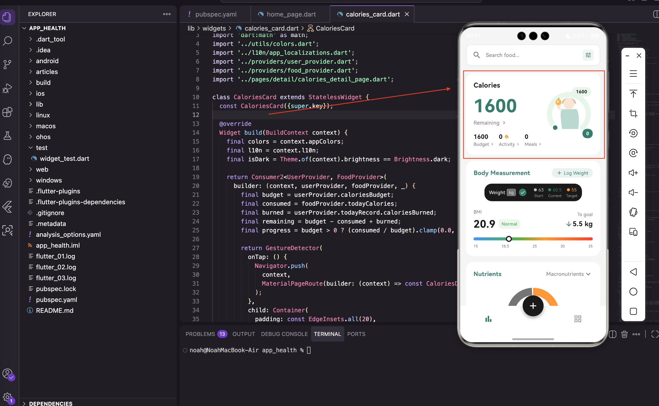
卡路里卡片是首页最重要的组件,它展示了用户今日的卡路里预算、已摄入、已消耗和剩余量。右侧还有一个漂亮的环形进度条和一个正在吃东西的小人插画。这个卡片涉及到的知识点比较多:Provider数据绑定、自定义绘制、Canvas绘制、深色模式适配等。我们一步步来实现。
写在前面
卡路里卡片是首页最重要的组件,它展示了用户今日的卡路里预算、已摄入、已消耗和剩余量。右侧还有一个漂亮的环形进度条和一个正在吃东西的小人插画。
这个卡片涉及到的知识点比较多:Provider数据绑定、自定义绘制、Canvas绘制、深色模式适配等。我们一步步来实现。
导入依赖
import 'package:flutter/material.dart';
import 'package:provider/provider.dart';
import 'dart:math' as math;
import '../utils/colors.dart';
import '../l10n/app_localizations.dart';
import '../providers/user_provider.dart';
import '../providers/food_provider.dart';
import '../pages/detail/calories_detail_page.dart';
关于这些导入的说明:
dart:math用来做数学计算,画环形进度条需要用到pi和三角函数user_provider提供用户数据(卡路里预算、消耗)food_provider提供食物数据(摄入卡路里)app_localizations用于国际化,支持多语言colors.dart包含应用的主题颜色定义
创建卡片组件
class CaloriesCard extends StatelessWidget {
  const CaloriesCard({super.key});
为什么选择StatelessWidget:
卡路里卡片是无状态的,所有数据都来自Provider。这样做的好处是:
- 卡片本身不维护任何状态,逻辑清晰
- 当Provider数据变化时,自动重建卡片
- 代码简洁,不需要处理生命周期
获取主题和国际化
在 build 方法开头获取主题颜色和国际化字符串:
Widget build(BuildContext context) {
final colors = context.appColors;
final l10n = context.l10n;
final isDark = Theme.of(context).brightness == Brightness.dark;
这些变量的作用:
context.appColors是我们定义的扩展方法,方便获取主题颜色context.l10n获取国际化文本,支持多语言isDark判断当前是否是深色模式,用于调整颜色
使用Consumer监听数据
用 Consumer2 同时监听两个Provider:
return Consumer2<UserProvider, FoodProvider>(
  builder: (context, userProvider, foodProvider, _) {
    final budget = userProvider.caloriesBudget;
    final consumed = foodProvider.todayCalories;
    final burned = userProvider.todayRecord.caloriesBurned;
    final remaining = budget - consumed + burned;
    final progress = budget > 0 ? (consumed / budget).clamp(0.0, 1.0) : 0.0;
数据计算的逻辑:
budget- 每日卡路里预算,从用户设置中获取consumed- 今日已摄入卡路里,从食物数据库中累加burned- 今日已消耗卡路里(运动),从运动记录中获取remaining- 剩余卡路里 = 预算 - 摄入 + 消耗progress- 进度百分比,用于环形进度条
clamp(0.0, 1.0) 确保进度值在0到1之间,防止超出范围。比如用户摄入超过预算,进度也只显示100%。
为什么用Consumer2
你可能会问,为什么不用一个Provider来管理所有数据?这是个很好的问题。
使用多个Provider的好处:
- 职责分离 - UserProvider管理用户信息,FoodProvider管理食物数据,各司其职
- 灵活性 - 其他页面可能只需要FoodProvider,不需要加载UserProvider
- 性能 - 只监听需要的数据,避免不必要的重建
- 可测试性 - 每个Provider可以独立测试
Consumer2 是Provider提供的工具,可以同时监听两个Provider。如果需要监听三个或更多,可以用 Consumer3、Consumer4 等。
卡片容器
整个卡片是一个可点击的容器:
return GestureDetector(
  onTap: () {
    Navigator.push(
      context,
      MaterialPageRoute(builder: (context) => const CaloriesDetailPage()),
    );
  },
  child: Container(
    padding: const EdgeInsets.all(20),
    decoration: BoxDecoration(
      color: colors.cardBackground,
      borderRadius: BorderRadius.circular(20),
    ),
容器的设计细节:
GestureDetector用来检测点击事件,点击卡片跳转到卡路里详情页padding: EdgeInsets.all(20)给卡片内容留出20像素的内边距borderRadius: BorderRadius.circular(20)让卡片四个角都是圆角,看起来更柔和color: colors.cardBackground使用主题色作为背景,支持深色模式
左右布局结构
卡片内部用 Row 分成左右两部分:
child: Row(
  children: [
    Expanded(
      flex: 3,
      child: Column(...), // 左侧文字信息
    ),
    Expanded(
      flex: 2,
      child: SizedBox(...), // 右侧环形图
    ),
  ],
),
布局的比例设计:
- 左侧占3份宽度,右侧占2份,比例是3:2
Expanded会根据flex值分配剩余空间- 这样的比例让左侧有足够的空间显示文字,右侧有足够的空间显示图形
左侧文字信息
左侧显示标题、剩余卡路里数字和详细信息:
Column(
  crossAxisAlignment: CrossAxisAlignment.start,
  children: [
    Text(
      l10n.calories,
      style: TextStyle(
        fontSize: 18,
        fontWeight: FontWeight.w600,
        color: colors.textPrimary,
      ),
    ),
    const SizedBox(height: 8),
    Text(
      '$remaining',
      style: TextStyle(
        fontSize: 48,
        fontWeight: FontWeight.bold,
        color: remaining >= 0
            ? (isDark ? AppColors.primaryLight : AppColors.primary)
            : Colors.red,
      ),
    ),
文字样式的设计:
- 标题用18号字体,加粗(w600),颜色是主文字色
- 剩余卡路里用48号大字体,加粗,这是卡片的视觉焦点
- 剩余卡路里的颜色会根据正负值变化:正数显示主题色,负数(超标)显示红色
- 深色模式下使用
primaryLight颜色,确保在深色背景上清晰可见
详细信息行
用 Wrap 显示预算、活动、餐食三个信息:
Wrap(
  spacing: 12,
  runSpacing: 8,
  children: [
    _buildCalorieInfo(context, '$budget', l10n.budget),
    _buildCalorieInfo(context, '$burned', l10n.activity, hasIcon: true),
    _buildCalorieInfo(context, '$consumed', l10n.meals),
  ],
),
为什么用Wrap而不是Row:
Row如果内容超过一行会报错Wrap会自动换行,如果一行放不下就换到下一行spacing: 12是水平间距,runSpacing: 8是行间距- 这样的设计让卡片在不同屏幕宽度上都能正常显示
信息项组件
Widget _buildCalorieInfo(BuildContext context, String value, String label, {bool hasIcon = false}) {
  final colors = context.appColors;

  return Column(
    crossAxisAlignment: CrossAxisAlignment.start,
    children: [
      Row(
        mainAxisSize: MainAxisSize.min,
        children: [
          Text(
            value,
            style: TextStyle(
              fontSize: 16,
              fontWeight: FontWeight.w600,
              color: colors.textPrimary,
            ),
          ),
          if (hasIcon) ...[
            const SizedBox(width: 4),
            const Icon(Icons.local_fire_department, size: 14, color: AppColors.orange),
          ],
        ],
      ),
      Row(
        mainAxisSize: MainAxisSize.min,
        children: [
          Text(label, style: TextStyle(fontSize: 12, color: colors.textSecondary)),
          const SizedBox(width: 2),
          Icon(Icons.chevron_right, size: 12, color: colors.textSecondary),
        ],
      ),
    ],
  );
}
这个组件的设计思路:
- 每个信息项包含数值和标签两行
- 活动项有个火焰图标(
Icons.local_fire_department),表示消耗的卡路里 - 每个项目后面都有个小箭头(
Icons.chevron_right),暗示可以点击查看详情 - 使用
if (hasIcon)条件判断,只在需要时显示火焰图标 mainAxisSize: MainAxisSize.min让Row只占用必要的宽度,不会撑满整行
右侧环形图的结构
右侧是一个 Stack,包含环形进度条、小人插画和两个数字标签:
Expanded(
  flex: 2,
  child: SizedBox(
    height: 160,
    child: Stack(
      alignment: Alignment.center,
      children: [
        CustomPaint(
          size: const Size(140, 140),
          painter: _CaloriesRingPainter(
            progress: progress,
            isDark: isDark,
          ),
        ),
        Positioned(
          child: CustomPaint(
            size: const Size(70, 90),
            painter: _PersonIllustrationPainter(),
          ),
        ),
为什么用Stack:
Stack可以让多个Widget重叠显示- 环形进度条在底层,小人插画在中间
- 这样可以实现环形进度条包围小人的效果
alignment: Alignment.center让所有子Widget都居中对齐
环形进度条绘制
class _CaloriesRingPainter extends CustomPainter {
final double progress;
final bool isDark;
_CaloriesRingPainter({required this.progress, this.isDark = false});
void paint(Canvas canvas, Size size) {
final center = Offset(size.width / 2, size.height / 2);
final radius = size.width / 2 - 12;
const strokeWidth = 14.0;
const startAngle = math.pi * 0.75;
const sweepAngle = math.pi * 1.5;
环形进度条的参数说明:
center- 圆心位置,在Canvas的中心radius- 圆的半径,比Canvas宽度的一半小12像素,留出边距strokeWidth- 弧线的宽度,14像素startAngle- 起始角度,0.75π 表示从左下角开始sweepAngle- 扫过的角度,1.5π 表示270度,不是完整的圆
环形不是完整的圆,而是从左下角开始,顺时针画270度。这样设计是为了让进度条看起来更像一个进度指示器。
绘制背景弧
final bgPaint = Paint()
  ..color = isDark ? const Color(0xFF2E4A42) : const Color(0xFFE8F5E9)
  ..style = PaintingStyle.stroke
  ..strokeWidth = strokeWidth
  ..strokeCap = StrokeCap.round;

canvas.drawArc(
  Rect.fromCircle(center: center, radius: radius),
  startAngle,
  sweepAngle,
  false,
  bgPaint,
);
背景弧的设计:
- 先画一个浅色的背景弧,作为进度条的底层
- 深色模式用深绿色(
0xFF2E4A42),浅色模式用浅绿色(0xFFE8F5E9) strokeCap = StrokeCap.round让弧线两端是圆头,看起来更柔和PaintingStyle.stroke表示只画轮廓,不填充内部
绘制进度弧
final progressSweep = sweepAngle * progress;
final rect = Rect.fromCircle(center: center, radius: radius);

final colors = isDark
    ? const [Color(0xFF80CBC4), Color(0xFF4DB6AC), Color(0xFF26A69A)]
    : const [Color(0xFF4DB6AC), Color(0xFF26A69A), Color(0xFF2E7D6B)];

final gradient = SweepGradient(
  startAngle: startAngle,
  endAngle: startAngle + progressSweep,
  colors: colors,
  stops: const [0.0, 0.5, 1.0],
  transform: const GradientRotation(math.pi * 0.75),
);

final progressPaint = Paint()
  ..shader = gradient.createShader(rect)
  ..style = PaintingStyle.stroke
  ..strokeWidth = strokeWidth
  ..strokeCap = StrokeCap.round;

canvas.drawArc(rect, startAngle, progressSweep, false, progressPaint);
进度弧的渐变设计:
progressSweep是实际要画的弧长,根据进度百分比计算SweepGradient是扫描渐变,颜色沿着弧线方向变化- 深色模式用三种绿色,浅色模式也用三种绿色,但深度不同
stops: [0.0, 0.5, 1.0]表示三种颜色均匀分布GradientRotation旋转渐变方向,让颜色变化更自然
绘制端点圆点
final endAngle = startAngle + progressSweep;
final endX = center.dx + radius * math.cos(endAngle);
final endY = center.dy + radius * math.sin(endAngle);

canvas.drawCircle(Offset(endX, endY), 10, Paint()..color = isDark ? AppColors.darkCard : Colors.white);
canvas.drawCircle(Offset(endX, endY), 6, Paint()..color = isDark ? AppColors.primaryLight : AppColors.primary);
圆点的设计细节:
- 计算进度弧末端的坐标,使用三角函数
- 先画一个大的外圈圆点(半径10),颜色是卡片背景色
- 再画一个小的内圈圆点(半径6),颜色是主题色
- 这样看起来像一个滑块,增加了视觉效果
小人插画绘制
小人插画比较复杂,包括头发、脸、身体、手臂、手和食物。我们分步骤来实现:
class _PersonIllustrationPainter extends CustomPainter {
void paint(Canvas canvas, Size size) {
final centerX = size.width / 2;
// 头发
final hairPaint = Paint()
..color = const Color(0xFFD4C4B0)
..style = PaintingStyle.fill;
final hairPath = Path();
hairPath.moveTo(centerX - 18, size.height * 0.22);
hairPath.quadraticBezierTo(centerX - 22, size.height * 0.05, centerX, size.height * 0.02);
hairPath.quadraticBezierTo(centerX + 22, size.height * 0.05, centerX + 18, size.height * 0.22);
hairPath.quadraticBezierTo(centerX + 15, size.height * 0.15, centerX, size.height * 0.12);
hairPath.quadraticBezierTo(centerX - 15, size.height * 0.15, centerX - 18, size.height * 0.22);
canvas.drawPath(hairPath, hairPaint);
头发的绘制方法:
- 用贝塞尔曲线(
quadraticBezierTo)画头发的轮廓 - 颜色是浅棕色(
0xFFD4C4B0) - 使用相对坐标(
size.height * 0.22等),这样在不同尺寸下都能正确显示 Path是一个路径对象,可以包含多条曲线和直线
绘制脸和身体
    // 脸
    final facePaint = Paint()
      ..color = const Color(0xFFFAE5D3)
      ..style = PaintingStyle.fill;
    canvas.drawOval(
      Rect.fromCenter(center: Offset(centerX, size.height * 0.2), width: 28, height: 32),
      facePaint,
    );

    // 身体
    final bodyPaint = Paint()
      ..color = const Color(0xFFB8D8D0)
      ..style = PaintingStyle.fill;

    final bodyPath = Path();
    bodyPath.moveTo(centerX - 20, size.height * 0.35);
    bodyPath.quadraticBezierTo(centerX - 25, size.height * 0.5, centerX - 18, size.height * 0.95);
    bodyPath.lineTo(centerX + 25, size.height * 0.95);
    bodyPath.quadraticBezierTo(centerX + 30, size.height * 0.5, centerX + 20, size.height * 0.35);
    bodyPath.quadraticBezierTo(centerX, size.height * 0.38, centerX - 20, size.height * 0.35);
    canvas.drawPath(bodyPath, bodyPaint);
脸和身体的设计:
- 脸是一个肤色的椭圆(
drawOval),宽28像素,高32像素 - 身体是浅绿色的不规则形状,用贝塞尔曲线绘制
- 身体的形状像一个梯形,上面窄,下面宽,看起来像穿着衣服
绘制手臂和食物
    // 手臂
    final armPaint = Paint()
      ..color = const Color(0xFFFAE5D3)
      ..style = PaintingStyle.fill;

    final leftArmPath = Path();
    leftArmPath.moveTo(centerX - 18, size.height * 0.4);
    leftArmPath.quadraticBezierTo(centerX - 35, size.height * 0.35, centerX - 30, size.height * 0.25);
    leftArmPath.quadraticBezierTo(centerX - 28, size.height * 0.2, centerX - 25, size.height * 0.25);
    leftArmPath.quadraticBezierTo(centerX - 20, size.height * 0.35, centerX - 18, size.height * 0.4);
    canvas.drawPath(leftArmPath, armPaint);

    // 手
    canvas.drawCircle(Offset(centerX - 28, size.height * 0.24), 6, armPaint);

    // 食物(橙子)
    final foodPaint = Paint()..style = PaintingStyle.fill;
    foodPaint.color = const Color(0xFFFFB74D);
    canvas.drawCircle(Offset(centerX - 28, size.height * 0.15), 8, foodPaint);

    // 食物高光
    foodPaint.color = const Color(0xFFFFE0B2);
    canvas.drawCircle(Offset(centerX - 30, size.height * 0.13), 3, foodPaint);

    // 叶子
    final leafPaint = Paint()
      ..color = const Color(0xFF81C784)
      ..style = PaintingStyle.fill;

    final leafPath = Path();
    leafPath.moveTo(centerX - 28, size.height * 0.08);
    leafPath.quadraticBezierTo(centerX - 32, size.height * 0.04, centerX - 26, size.height * 0.02);
    leafPath.quadraticBezierTo(centerX - 24, size.height * 0.04, centerX - 28, size.height * 0.08);
    canvas.drawPath(leafPath, leafPaint);
手臂和食物的设计细节:
- 手臂伸向上方,用贝塞尔曲线绘制,看起来自然弯曲
- 手是一个小圆点,肤色
- 食物是一个橙色的圆形(橙子),代表健康的食物
- 食物上有一个高光(浅橙色的小圆点),增加立体感
- 叶子是绿色的,贴在橙子上面,看起来像真的橙子
shouldRepaint方法
bool shouldRepaint(covariant _CaloriesRingPainter oldDelegate) =>
oldDelegate.progress != progress || oldDelegate.isDark != isDark;
这个方法的作用:
- 判断是否需要重新绘制
- 只有当
progress或isDark变化时才需要重绘 - 避免不必要的性能开销,提高帧率
- 这是CustomPainter的最佳实践
性能优化建议
在实现卡路里卡片时,有几个性能优化的要点:
第一,合理使用Consumer
// 好的做法:只监听需要的数据
Consumer2<UserProvider, FoodProvider>(
  builder: (context, userProvider, foodProvider, _) {
    // ...
  },
)

// 不好的做法:监听整个Provider
Consumer<UserProvider>(
  builder: (context, provider, child) {
    // ...
  },
)
第二,避免在build中做复杂计算
// 不好的做法
Widget build(BuildContext context) {
var complexData = expensiveCalculation(); // 这会阻塞UI
return ...;
}
// 好的做法
final progress = budget > 0 ? (consumed / budget).clamp(0.0, 1.0) : 0.0;
第三,使用const优化
// 好的做法
const SizedBox(height: 8),
const Icon(Icons.local_fire_department, size: 14),

// 不好的做法
SizedBox(height: 8),
Icon(Icons.local_fire_department, size: 14),
深色模式适配
卡路里卡片在深色模式下需要调整颜色,确保可读性:
颜色适配的原则:
- 背景色 - 浅色模式用浅色,深色模式用深色
- 文字色 - 浅色模式用深色,深色模式用浅色
- 强调色 - 两种模式都用主题色,但深色模式可能需要用更亮的版本
- 进度条 - 两种模式都用绿色,但深度不同
这样的设计让应用在任何模式下都能舒适使用。
小结
这篇文章我们实现了卡路里卡片,主要涉及:
- Provider数据绑定 - 使用Consumer2同时监听多个Provider
- CustomPaint绘制 - 用Canvas绘制自定义图形
- SweepGradient渐变 - 实现渐变色弧线
- 贝塞尔曲线 - 绘制复杂的曲线形状
- 深色模式适配 - 根据主题调整颜色
卡路里卡片是首页最复杂的组件,掌握了它的实现方法,其他卡片就简单多了。下一篇我们来实现营养素卡片,它的设计思路类似,但展示的数据不同。
欢迎加入开源鸿蒙跨平台社区:https://openharmonycrossplatform.csdn.net

开源鸿蒙跨平台开发社区汇聚开发者与厂商,共建“一次开发,多端部署”的开源生态,致力于降低跨端开发门槛,推动万物智联创新。
更多推荐
 21
21 0
0- 0


 已为社区贡献72条内容

所有评论(0)