Flutter for OpenHarmony轻量级开源记事本App实战:发现主界面
发现页面是应用的功能集合中心,它汇集了统计数据、快捷功能和特色功能的入口。一个好的发现页面应该提供清晰的导航和有价值的信息概览。本文将详细介绍如何实现发现主界面。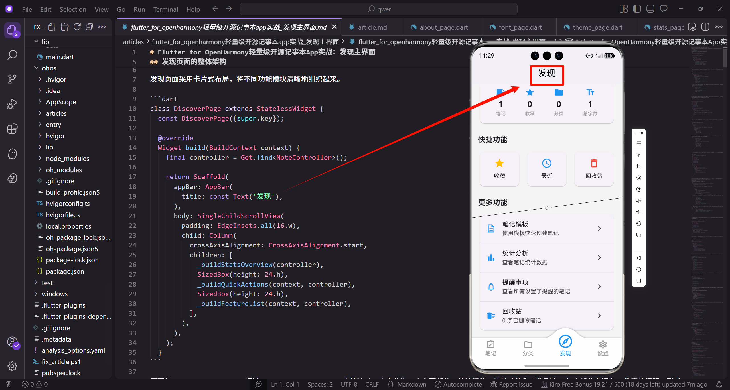
发现页面的整体架构
发现页面采用卡片式布局,将不同功能模块清晰地组织起来。
class DiscoverPage extends StatelessWidget {
const DiscoverPage({super.key});
Widget build(BuildContext context) {
final controller = Get.find<NoteController>();
return Scaffold(
appBar: AppBar(
title: const Text('发现'),
),
body: SingleChildScrollView(
padding: EdgeInsets.all(16.w),
child: Column(
crossAxisAlignment: CrossAxisAlignment.start,
children: [
_buildStatsOverview(controller),
SizedBox(height: 24.h),
_buildQuickActions(context, controller),
SizedBox(height: 24.h),
_buildFeatureList(context, controller),
],
),
),
);
}
页面使用StatelessWidget,通过SingleChildScrollView支持滚动。内容分为三个主要部分:统计概览、快捷功能和功能列表。每个部分之间有24像素的间距,形成清晰的视觉层次。crossAxisAlignment设置为start让内容左对齐。这种模块化的布局让用户可以快速找到需要的功能。
统计概览卡片
统计概览卡片展示应用的核心数据指标,让用户快速了解使用情况。
  Widget _buildStatsOverview(NoteController controller) {
    return Obx(() => Card(
      child: Padding(
        padding: EdgeInsets.all(16.w),
        child: Row(
          mainAxisAlignment: MainAxisAlignment.spaceAround,
          children: [
            _StatItem(
              icon: Icons.note,
              value: '${controller.activeNotes.length}',
              label: '笔记',
            ),
            _StatItem(
              icon: Icons.star,
              value: '${controller.favoriteNotes.length}',
              label: '收藏',
            ),
统计卡片使用Obx包裹,实现响应式更新。Row布局包含四个统计项,mainAxisAlignment设置为spaceAround让它们均匀分布。第一个统计项显示笔记总数,第二个显示收藏数。每个统计项使用_StatItem组件展示。
            _StatItem(
              icon: Icons.folder,
              value: '${controller.categories.length}',
              label: '分类',
            ),
            _StatItem(
              icon: Icons.text_fields,
              value: '${controller.totalWordCount}',
              label: '总字数',
            ),
          ],
        ),
      ),
    ));
  }
统计卡片使用Obx包裹,实现响应式更新。Row布局包含四个统计项,mainAxisAlignment设置为spaceAround让它们均匀分布。第一个统计项显示笔记总数,第二个显示收藏数。第三个统计项显示分类数量,第四个显示总字数。这四个指标是用户最关心的核心数据,放在页面顶部让用户一进入就能看到。不同的图标帮助用户快速识别不同的指标。这种紧凑的展示方式能够在有限的空间内提供丰富的信息。
统计项组件
_StatItem是一个自定义组件,用于展示单个统计指标。
class _StatItem extends StatelessWidget {
final IconData icon;
final String value;
final String label;
const _StatItem({
required this.icon,
required this.value,
required this.label,
});
Widget build(BuildContext context) {
return Column(
children: [
Icon(icon, color: const Color(0xFF2196F3), size: 24.sp),
SizedBox(height: 4.h),
Text(
value,
style: TextStyle(fontSize: 20.sp, fontWeight: FontWeight.bold),
),
Text(
label,
style: TextStyle(fontSize: 12.sp, color: Colors.grey),
),
],
);
}
}
组件使用Column垂直布局,从上到下依次是图标、数值和标签。图标使用蓝色,数值使用大字号粗体,标签使用小字号灰色。这种层次分明的设计让用户可以快速获取信息。组件的参数化设计让它可以灵活复用。
快捷功能区域
快捷功能区域提供常用功能的快速访问入口。
  Widget _buildQuickActions(BuildContext context, NoteController controller) {
    return Column(
      crossAxisAlignment: CrossAxisAlignment.start,
      children: [
        Text(
          '快捷功能',
          style: TextStyle(fontSize: 18.sp, fontWeight: FontWeight.bold),
        ),
        SizedBox(height: 12.h),
        Row(
          children: [
            Expanded(
              child: _ActionCard(
                icon: Icons.star,
                title: '收藏',
                color: Colors.amber,
                onTap: () => Get.to(() => const FavoritesPage()),
              ),
            ),
快捷功能区域包含标题和三个操作卡片。标题使用粗体大字号,与其他区域保持一致。Row布局包含三个等宽的卡片,第一个是收藏功能,使用黄色主题和星标图标。Expanded让卡片平分可用空间。点击卡片跳转到收藏列表页面。
            SizedBox(width: 12.w),
            Expanded(
              child: _ActionCard(
                icon: Icons.access_time,
                title: '最近',
                color: Colors.blue,
                onTap: () => Get.to(() => const RecentPage()),
              ),
            ),
            SizedBox(width: 12.w),
            Expanded(
              child: _ActionCard(
                icon: Icons.delete_outline,
                title: '回收站',
                color: Colors.red,
                onTap: () => Get.to(() => const TrashPage()),
              ),
            ),
          ],
        ),
      ],
    );
  }
第二个卡片是最近编辑,使用蓝色主题和时钟图标。第三个卡片是回收站,使用红色主题和删除图标。卡片之间有12像素的间距。这三个功能是用户最常用的,放在快捷区域方便访问。不同的颜色帮助用户快速识别不同的功能。
操作卡片组件
_ActionCard是一个自定义组件,用于展示快捷功能入口。
class _ActionCard extends StatelessWidget {
final IconData icon;
final String title;
final Color color;
final VoidCallback onTap;
const _ActionCard({
required this.icon,
required this.title,
required this.color,
required this.onTap,
});
Widget build(BuildContext context) {
return Card(
child: InkWell(
onTap: onTap,
borderRadius: BorderRadius.circular(12),
child: Padding(
padding: EdgeInsets.symmetric(vertical: 16.h),
child: Column(
children: [
Icon(icon, color: color, size: 28.sp),
SizedBox(height: 8.h),
Text(
title,
style: TextStyle(fontSize: 14.sp),
),
],
),
),
),
);
}
}
组件使用Card提供卡片样式,InkWell添加点击效果。Column垂直布局包含图标和标题。图标使用传入的颜色和较大的尺寸,标题使用中等字号。padding设置垂直方向的内边距,让卡片内容不会太拥挤。这种简洁的设计让卡片既美观又易用。
功能列表区域
功能列表区域展示更多的功能入口,使用列表形式。
  Widget _buildFeatureList(BuildContext context, NoteController controller) {
    return Column(
      crossAxisAlignment: CrossAxisAlignment.start,
      children: [
        Text(
          '更多功能',
          style: TextStyle(fontSize: 18.sp, fontWeight: FontWeight.bold),
        ),
        SizedBox(height: 12.h),
        Card(
          child: Column(
            children: [
              _FeatureListTile(
                icon: Icons.description_outlined,
                title: '笔记模板',
                subtitle: '使用模板快速创建笔记',
                onTap: () => Get.to(() => const TemplatesPage()),
              ),
              const Divider(height: 1),
功能列表区域包含标题和一个Card。Card内部是多个ListTile,每个代表一个功能。第一个功能是笔记模板,使用文档图标。subtitle提供简短的功能描述。Divider分隔不同的功能项,height设置为1让分隔线更细。这种列表形式能够展示更多的功能和详细信息。
              _FeatureListTile(
                icon: Icons.bar_chart,
                title: '统计分析',
                subtitle: '查看笔记统计数据',
                onTap: () => Get.to(() => const StatsPage()),
              ),
              const Divider(height: 1),
              _FeatureListTile(
                icon: Icons.notifications_outlined,
                title: '提醒事项',
                subtitle: '查看所有设置了提醒的笔记',
                onTap: () => Get.to(() => const RemindersPage()),
              ),
              const Divider(height: 1),
第二个功能是统计分析,使用柱状图图标。第三个功能是提醒事项,使用通知图标。每个功能都有清晰的标题和描述,让用户知道点击后会看到什么。这种详细的说明能够降低用户的学习成本。
              Obx(() => _FeatureListTile(
                icon: Icons.delete_sweep,
                title: '回收站',
                subtitle: '${controller.trashedNotes.length} 条已删除笔记',
                onTap: () => Get.to(() => const TrashPage()),
              )),
            ],
          ),
        ),
      ],
    );
  }
}
最后一个功能是回收站,使用Obx包裹实现响应式更新。subtitle动态显示已删除笔记的数量,让用户了解回收站的状态。这种动态信息能够提供更有价值的反馈。
功能列表项组件
_FeatureListTile是一个自定义组件,用于展示功能列表项。
class _FeatureListTile extends StatelessWidget {
final IconData icon;
final String title;
final String subtitle;
final VoidCallback onTap;
const _FeatureListTile({
required this.icon,
required this.title,
required this.subtitle,
required this.onTap,
});
Widget build(BuildContext context) {
return ListTile(
leading: Icon(icon, color: const Color(0xFF2196F3)),
title: Text(title),
subtitle: Text(subtitle),
trailing: const Icon(Icons.chevron_right),
onTap: onTap,
);
}
}
组件使用ListTile,这是Material Design的标准列表项组件。leading显示功能图标,使用蓝色。title显示功能名称,subtitle显示功能描述。trailing显示右箭头图标,提示用户可以点击。onTap绑定点击事件。这种标准的列表项设计让用户感到熟悉。
发现页面的数据刷新
发现页面的数据需要实时更新,反映最新的应用状态。
Widget build(BuildContext context) {
final controller = Get.find<NoteController>();
return Scaffold(
appBar: AppBar(
title: const Text('发现'),
),
body: Obx(() => SingleChildScrollView(
padding: EdgeInsets.all(16.w),
child: Column(
crossAxisAlignment: CrossAxisAlignment.start,
children: [
_buildStatsOverview(controller),
SizedBox(height: 24.h),
_buildQuickActions(context, controller),
SizedBox(height: 24.h),
_buildFeatureList(context, controller),
],
),
)),
);
}
将整个body用Obx包裹,确保当控制器中的数据变化时,整个页面都能更新。这种响应式设计让发现页面始终显示最新的数据,无需手动刷新。
发现页面的导航
发现页面作为应用的功能中心,需要提供清晰的导航路径。
void navigateToFeature(String feature) {
  switch (feature) {
    case 'favorites':
      Get.to(() => const FavoritesPage());
      break;
    case 'recent':
      Get.to(() => const RecentPage());
      break;
    case 'trash':
      Get.to(() => const TrashPage());
      break;
    case 'templates':
      Get.to(() => const TemplatesPage());
      break;
    case 'stats':
      Get.to(() => const StatsPage());
      break;
    case 'reminders':
      Get.to(() => const RemindersPage());
      break;
  }
}
navigateToFeature方法根据功能名称跳转到对应的页面。使用switch语句处理不同的功能。这种集中的导航管理让代码更加清晰,便于维护。
发现页面的个性化
可以根据用户的使用习惯个性化显示功能。
List<String> getRecommendedFeatures() {
  final features = <String>[];

  if (controller.favoriteNotes.length > 10) {
    features.add('favorites');
  }

  if (controller.trashedNotes.isNotEmpty) {
    features.add('trash');
  }

  if (controller.activeNotes.length > 50) {
    features.add('stats');
  }

  return features;
}
getRecommendedFeatures方法根据用户数据推荐功能。如果收藏笔记很多,推荐收藏功能。如果有删除的笔记,推荐回收站。如果笔记数量很多,推荐统计分析。这种智能推荐能够提升用户体验。
发现页面的搜索
在发现页面添加搜索功能,让用户可以快速找到需要的功能。
Widget buildSearchBar() {
  return TextField(
    decoration: InputDecoration(
      hintText: '搜索功能...',
      prefixIcon: const Icon(Icons.search),
      border: OutlineInputBorder(
        borderRadius: BorderRadius.circular(24),
      ),
      filled: true,
      fillColor: Colors.grey.withOpacity(0.1),
    ),
    onChanged: (query) {
      // 搜索功能
    },
  );
}
搜索栏使用TextField,prefixIcon显示搜索图标。border设置圆角,filled和fillColor设置背景色。onChanged回调在用户输入时触发,可以实时过滤功能列表。这种搜索功能在功能很多时特别有用。
发现页面的快捷操作
提供快捷操作,让用户可以直接在发现页面完成常用任务。
Widget buildQuickCreate() {
  return Row(
    children: [
      Expanded(
        child: ElevatedButton.icon(
          onPressed: () {
            final note = controller.createNote();
            Get.to(() => NoteEditorPage(note: note));
          },
          icon: const Icon(Icons.add),
          label: const Text('新建笔记'),
        ),
      ),
      SizedBox(width: 12.w),
      Expanded(
        child: OutlinedButton.icon(
          onPressed: () {
            // 从模板创建
          },
          icon: const Icon(Icons.description),
          label: const Text('使用模板'),
        ),
      ),
    ],
  );
}
快捷创建区域包含两个按钮:新建笔记和使用模板。第一个按钮使用ElevatedButton,表示主要操作。第二个按钮使用OutlinedButton,表示次要操作。这种快捷操作让用户无需离开发现页面就能开始创作。
发现页面的提示信息
根据用户的使用情况显示提示信息,引导用户使用功能。
Widget buildTips() {
  if (controller.activeNotes.isEmpty) {
    return Card(
      color: Colors.blue.withOpacity(0.1),
      child: Padding(
        padding: EdgeInsets.all(16.w),
        child: Row(
          children: [
            Icon(Icons.lightbulb_outline, color: Colors.blue),
            SizedBox(width: 12.w),
            Expanded(
              child: Text(
                '点击右下角按钮创建第一条笔记',
                style: TextStyle(color: Colors.blue),
              ),
            ),
          ],
        ),
      ),
    );
  }
  return const SizedBox.shrink();
}
buildTips方法根据用户状态显示不同的提示。如果没有笔记,提示用户创建第一条笔记。使用浅蓝色背景和灯泡图标,让提示更加醒目。这种引导性的提示能够帮助新用户快速上手。
发现页面的动画效果
添加动画效果,让页面更加生动。
class DiscoverPage extends StatefulWidget {
const DiscoverPage({super.key});
State<DiscoverPage> createState() => _DiscoverPageState();
}
class _DiscoverPageState extends State<DiscoverPage>
with SingleTickerProviderStateMixin {
late AnimationController _controller;
late Animation<double> _fadeAnimation;
void initState() {
super.initState();
_controller = AnimationController(
duration: const Duration(milliseconds: 500),
vsync: this,
);
_fadeAnimation = Tween<double>(begin: 0, end: 1).animate(_controller);
_controller.forward();
}
void dispose() {
_controller.dispose();
super.dispose();
}
}
使用AnimationController创建淡入动画,页面打开时内容从透明渐变到不透明。duration设置为500毫秒,提供平滑的过渡效果。这种动画让页面显得更加精致。
发现页面的下拉刷新
添加下拉刷新功能,让用户可以手动刷新数据。
return RefreshIndicator(
  onRefresh: () async {
    await controller.loadData();
  },
  child: SingleChildScrollView(
    padding: EdgeInsets.all(16.w),
    child: Column(
      crossAxisAlignment: CrossAxisAlignment.start,
      children: [
        _buildStatsOverview(controller),
        SizedBox(height: 24.h),
        _buildQuickActions(context, controller),
        SizedBox(height: 24.h),
        _buildFeatureList(context, controller),
      ],
    ),
  ),
);
RefreshIndicator包裹ScrollView,onRefresh回调在用户下拉时触发。调用controller.loadData重新加载数据。这种下拉刷新是移动应用的标准交互,用户很容易理解。
发现页面作为应用的功能中心,汇集了统计数据、快捷功能和特色功能的入口。通过清晰的模块划分和直观的卡片布局,用户可以快速找到需要的功能。统计概览让用户了解使用情况,快捷功能提供常用操作的快速访问,功能列表展示更多的高级功能。这种设计让发现页面既实用又美观,成为用户探索应用功能的起点。
欢迎加入开源鸿蒙跨平台社区:https://openharmonycrossplatform.csdn.net

开源鸿蒙跨平台开发社区汇聚开发者与厂商,共建“一次开发,多端部署”的开源生态,致力于降低跨端开发门槛,推动万物智联创新。
更多推荐
 16
16 0
0- 0


 已为社区贡献19条内容

所有评论(0)