Flutter for OpenHarmony高级闹钟App实战:主页Tab实现
做过移动应用的朋友都知道,主页是用户打开App后的第一印象。一个好的主页不仅要好看,还得实用。今天咱们就来聊聊DeepWake这款闹钟应用的主页是怎么做出来的。
说实话,刚开始做这个页面的时候,我也纠结了好久。到底该放哪些功能?怎么排版才合理?后来想明白了,主页就是要让用户一眼看到最重要的信息,同时能快速完成常用操作。所以最终确定了天气展示、快速闹钟、快捷入口这几个核心模块。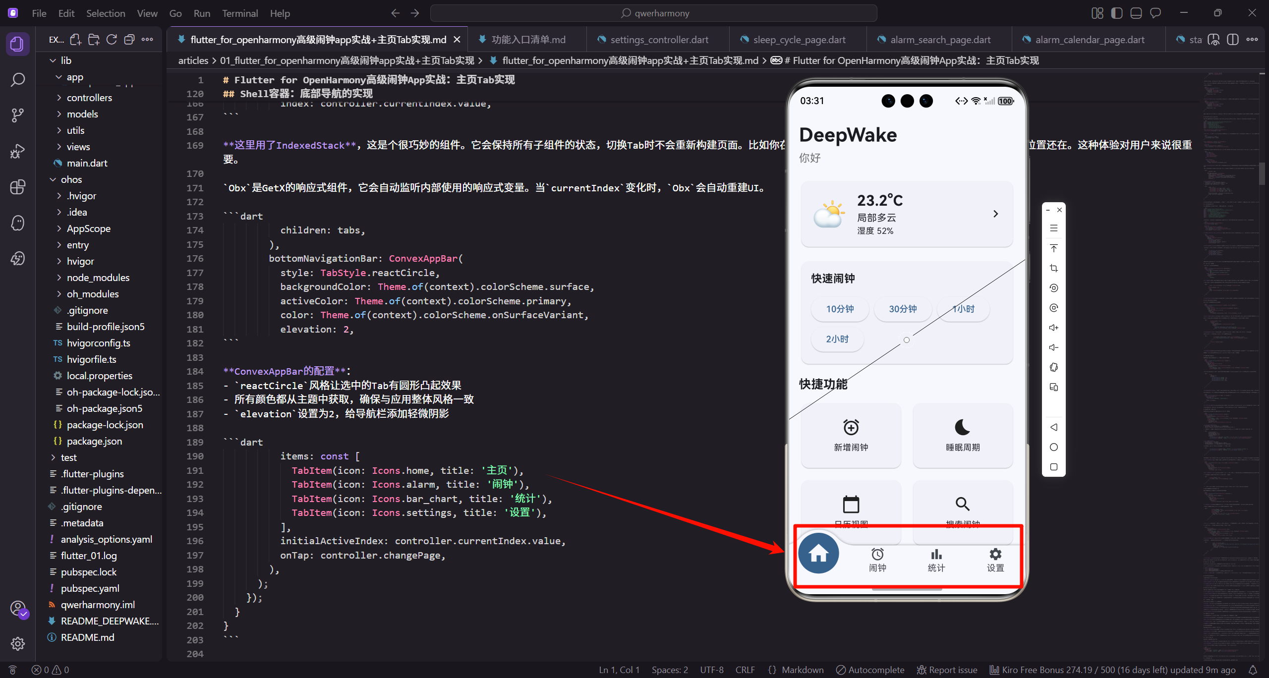
先说说整体架构
在动手写代码之前,咱们得先理清楚整个应用的结构。DeepWake采用的是MVC架构,状态管理用的是GetX,布局适配用的是flutter_screenutil。整个应用分成4个Tab:主页、闹钟列表、统计和设置。
为什么选GetX? 说实话,试过Provider和Bloc之后,还是觉得GetX最顺手。依赖注入简单,路由管理方便,响应式状态更新也很直观。对于这种中小型应用来说,GetX真的够用了。
关于响应式布局,flutter_screenutil这个库真的是救星。只要设定好设计稿尺寸,所有的尺寸单位都会自动适配,再也不用担心在不同设备上显示不一致的问题了。
从入口开始
咱们先看看应用是怎么启动的。main.dart文件非常简洁:
import 'package:flutter/material.dart';
import 'package:habithm/app/deepwake_app.dart';

void main() {
  runApp(const DeepWakeApp());
}
就这么几行代码,简单明了。runApp是Flutter的入口方法,把DeepWakeApp作为根组件启动。我喜欢这种简洁的设计,所有复杂的初始化逻辑都封装在DeepWakeApp里面,main函数只负责启动,职责单一。
接下来看看DeepWakeApp的实现:
import 'package:flutter/material.dart';
import 'package:flutter_screenutil/flutter_screenutil.dart';
import 'package:get/get.dart';
import '../controllers/alarm_controller.dart';
import '../controllers/settings_controller.dart';
import '../views/shell/deepwake_shell.dart';

class DeepWakeApp extends StatelessWidget {
  const DeepWakeApp({super.key});
这里导入了几个关键的依赖:
flutter_screenutil负责响应式布局GetX负责状态管理和路由- 两个核心控制器:
AlarmController管理闹钟数据,SettingsController管理应用设置 DeepWakeShell是主容器,包含底部导航栏
Widget build(BuildContext context) {
Get.put(SettingsController());
Get.put(AlarmController());
return ScreenUtilInit(
designSize: const Size(390, 844),
minTextAdapt: true,
splitScreenMode: true,
这里有个小技巧:用Get.put注册全局控制器。这样做的好处是,在应用的任何地方都能通过Get.find获取到这些控制器,不用层层传递。
ScreenUtilInit的配置也很重要:
designSize设置为390x844,这是iPhone 12的尺寸,也是我们设计稿的基准minTextAdapt确保文字大小能自适应splitScreenMode支持分屏模式
      builder: (context, child) {
        return GetMaterialApp(
          title: 'DeepWake 深度睡眠闹钟',
          debugShowCheckedModeBanner: false,
          theme: _buildLightTheme(),
          darkTheme: _buildDarkTheme(),
          themeMode: ThemeMode.system,
          home: const DeepWakeShell(),
        );
      },
    );
  }
GetMaterialApp是GetX提供的增强版MaterialApp,除了Material的所有功能,还集成了GetX的路由和状态管理。
关于主题:我配置了浅色和深色两套主题,并设置为跟随系统。现在用户都习惯了深色模式,特别是晚上用手机的时候,深色主题对眼睛更友好。
主题的实现代码:
  ThemeData _buildLightTheme() {
    return ThemeData(
      colorScheme: ColorScheme.fromSeed(
        seedColor: Colors.blue,
        brightness: Brightness.light,
      ),
      useMaterial3: true,
    );
  }
Material 3的魅力:用ColorScheme.fromSeed从一个种子颜色就能生成整套配色方案。不用再一个个定义primary、secondary这些颜色了,系统会自动生成协调的配色。这个特性真的省了不少事。
  ThemeData _buildDarkTheme() {
    return ThemeData(
      colorScheme: ColorScheme.fromSeed(
        seedColor: Colors.blue,
        brightness: Brightness.dark,
      ),
      useMaterial3: true,
    );
  }
}
深色主题的配置几乎一样,只是brightness改成dark。Material 3会自动处理深色模式下的颜色调整,比如降低对比度、调整阴影等,这些细节都不用我们操心。
Shell容器:底部导航的实现
Shell容器负责管理4个Tab的切换,用的是convex_bottom_bar这个库,效果挺酷的,选中的Tab会有个凸起的圆形效果。
import 'package:convex_bottom_bar/convex_bottom_bar.dart';
import 'package:flutter/material.dart';
import 'package:get/get.dart';
import '../home/home_tab.dart';
import '../alarms/alarms_tab.dart';
import '../statistics/statistics_tab.dart';
import '../settings/settings_tab.dart';

class ShellController extends GetxController {
  final RxInt currentIndex = 0.obs;
控制器很简单:就一个currentIndex变量记录当前选中的Tab索引。RxInt是GetX的响应式整数类型,.obs后缀表示这是个可观察的变量。当它的值变化时,所有监听它的UI都会自动更新。
void changePage(int index) {
currentIndex.value = index;
}
}
class DeepWakeShell extends StatelessWidget {
const DeepWakeShell({super.key});
Widget build(BuildContext context) {
final controller = Get.put(ShellController());
changePage方法就是切换Tab用的,底部导航栏点击时会调用这个方法。在build方法里用Get.put注册控制器,这样整个Shell生命周期内都能访问到它。
    final tabs = [
      const HomeTab(),
      const AlarmsTab(),
      const StatisticsTab(),
      const SettingsTab(),
    ];

    return Obx(() {
      return Scaffold(
        body: IndexedStack(
          index: controller.currentIndex.value,
这里用了IndexedStack,这是个很巧妙的组件。它会保持所有子组件的状态,切换Tab时不会重新构建页面。比如你在主页滚动到某个位置,切到其他Tab再切回来,滚动位置还在。这种体验对用户来说很重要。
Obx是GetX的响应式组件,它会自动监听内部使用的响应式变量。当currentIndex变化时,Obx会自动重建UI。
          children: tabs,
        ),
        bottomNavigationBar: ConvexAppBar(
          style: TabStyle.reactCircle,
          backgroundColor: Theme.of(context).colorScheme.surface,
          activeColor: Theme.of(context).colorScheme.primary,
          color: Theme.of(context).colorScheme.onSurfaceVariant,
          elevation: 2,
ConvexAppBar的配置:
reactCircle风格让选中的Tab有圆形凸起效果- 所有颜色都从主题中获取,确保与应用整体风格一致
elevation设置为2,给导航栏添加轻微阴影
          items: const [
            TabItem(icon: Icons.home, title: '主页'),
            TabItem(icon: Icons.alarm, title: '闹钟'),
            TabItem(icon: Icons.bar_chart, title: '统计'),
            TabItem(icon: Icons.settings, title: '设置'),
          ],
          initialActiveIndex: controller.currentIndex.value,
          onTap: controller.changePage,
        ),
      );
    });
  }
}
4个TabItem分别对应主页、闹钟、统计和设置。图标和文字都很直观,用户一看就知道是什么功能。onTap回调直接传入controller.changePage,代码简洁明了。
主页Tab的核心实现
终于到重点了!主页Tab包含了好几个功能模块,咱们一个个来看。
import 'package:flutter/material.dart';
import 'package:flutter_screenutil/flutter_screenutil.dart';
import 'package:get/get.dart';
import '../../controllers/alarm_controller.dart';
import '../../controllers/settings_controller.dart';
import '../../models/weather.dart';
import '../weather/weather_detail_page.dart';
import '../sleep_cycle/sleep_cycle_page.dart';
import '../alarms/alarm_editor_page.dart';
导入的依赖挺多的,但都是必需的。除了基础的Flutter和GetX,还有两个控制器、天气模型,以及几个页面组件。
class HomeTab extends StatelessWidget {
const HomeTab({super.key});
Widget build(BuildContext context) {
final alarmCtl = Get.find<AlarmController>();
final settingsCtl = Get.find<SettingsController>();
final weather = Weather.mock();
注意这里用的是Get.find而不是Get.put。因为这两个控制器已经在DeepWakeApp里注册过了,这里只是获取引用。Weather.mock()是模拟数据,实际项目中应该从天气API获取真实数据。
    return SafeArea(
      child: ListView(
        padding: EdgeInsets.all(16.w),
        children: [
          _buildHeader(settingsCtl),
          SizedBox(height: 20.h),
          _buildWeatherCard(context, weather),
          SizedBox(height: 16.h),
SafeArea很重要:它确保内容不会被系统状态栏或导航栏遮挡。特别是在刘海屏或挖孔屏上,没有SafeArea的话内容可能会被遮住一部分。
ListView作为容器,内容超出屏幕时可以滚动。padding用的是响应式单位16.w,会根据屏幕尺寸自动缩放。
          _buildQuickAlarmCard(context),
          SizedBox(height: 16.h),
          _buildQuickActions(context),
          SizedBox(height: 20.h),
          _buildRecentAlarms(alarmCtl),
        ],
      ),
    );
  }
页面内容从上到下依次是:标题栏、天气卡片、快速闹钟、快捷操作、最近闹钟。每个模块之间用SizedBox添加间距,让页面看起来有呼吸感,不会太拥挤。
标题栏:个性化问候
标题栏虽然简单,但细节很重要。
  Widget _buildHeader(SettingsController settingsCtl) {
    return Obx(() {
      final name = settingsCtl.userName.value.isEmpty
          ? '你好'
          : '你好,${settingsCtl.userName.value}';
      return Column(
        crossAxisAlignment: CrossAxisAlignment.start,
        children: [
          Text(
            'DeepWake',
个性化问候:如果用户设置了名字,就显示"你好,用户名",否则就显示"你好"。这种小细节能让用户感觉应用更贴心。
用Obx包裹是为了响应用户名的变化。当用户在设置里修改名字后,这里会自动更新,不需要手动刷新。
            style: TextStyle(fontSize: 32.sp, fontWeight: FontWeight.bold),
          ),
          SizedBox(height: 4.h),
          Text(
            name,
            style: TextStyle(fontSize: 18.sp, color: Colors.grey[600]),
          ),
        ],
      );
    });
  }
字体大小的选择:应用名称用32sp的大字号加粗,视觉上很突出。问候语用18sp的灰色,形成主次分明的层次。crossAxisAlignment.start让文字左对齐,符合阅读习惯。
天气卡片:信息展示的艺术
天气卡片是主页的重要信息展示模块。
  Widget _buildWeatherCard(BuildContext context, Weather weather) {
    return Card(
      child: InkWell(
        onTap: () => Get.to(() => WeatherDetailPage(weather: weather)),
        child: Padding(
          padding: EdgeInsets.all(16.w),
          child: Row(
            children: [
              Text(weather.conditionIcon, style: TextStyle(fontSize: 48.sp)),
Card + InkWell的组合:Card提供卡片容器,InkWell添加点击水波纹效果。点击后跳转到天气详情页面,这种交互设计让用户知道卡片是可以点击的。
天气图标用emoji表示,48sp的大小足够醒目。这种方式比用图片资源更灵活,而且不用担心适配问题。
              SizedBox(width: 16.w),
              Expanded(
                child: Column(
                  crossAxisAlignment: CrossAxisAlignment.start,
                  children: [
                    Text(
                      '${weather.temperature.toStringAsFixed(1)}°C',
                      style: TextStyle(fontSize: 24.sp, fontWeight: FontWeight.bold),
                    ),
Expanded的妙用:让中间的信息区域占据剩余空间,确保布局的灵活性。无论屏幕多大,布局都不会乱。
温度显示保留一位小数,24sp加粗,作为卡片中最重要的信息。
                    Text(weather.conditionText, style: TextStyle(fontSize: 16.sp)),
                    Text('湿度 ${weather.humidity}%', style: TextStyle(fontSize: 14.sp)),
                  ],
                ),
              ),
              Icon(Icons.chevron_right),
            ],
          ),
        ),
      ),
    );
  }
信息层级:温度24sp、天气状况16sp、湿度14sp,从大到小形成清晰的层级。右侧的右箭头图标暗示用户可以点击查看更多详情。
这种左图标、中信息、右箭头的三段式布局在移动应用中很常见,用户一看就懂。
快速闹钟:效率至上
快速闹钟是我最喜欢的功能之一,一键就能设置定时闹钟。
  Widget _buildQuickAlarmCard(BuildContext context) {
    return Card(
      child: Padding(
        padding: EdgeInsets.all(16.w),
        child: Column(
          crossAxisAlignment: CrossAxisAlignment.start,
          children: [
            Text('快速闹钟', style: TextStyle(fontSize: 18.sp, fontWeight: FontWeight.bold)),
            SizedBox(height: 12.h),
卡片标题用18sp粗体,让用户一眼就能识别这个功能区域。crossAxisAlignment.start让内容左对齐,看起来更整齐。
            Wrap(
              spacing: 8.w,
              children: [
                _quickAlarmButton('10分钟', 10),
                _quickAlarmButton('30分钟', 30),
                _quickAlarmButton('1小时', 60),
                _quickAlarmButton('2小时', 120),
              ],
            ),
          ],
        ),
      ),
    );
  }
Wrap组件的优势:当按钮宽度超过屏幕宽度时会自动换行,不用担心在小屏设备上显示不全。spacing设置按钮之间的间距。
时间选项的选择也是经过考虑的:10分钟适合短暂休息,30分钟适合午休,1小时和2小时适合更长的休息。基本覆盖了日常使用场景。
  Widget _quickAlarmButton(String label, int minutes) {
    return ElevatedButton(
      onPressed: () {
        Get.snackbar('快速闹钟', '$label后响铃');
      },
      child: Text(label),
    );
  }
按钮的实现:点击后显示Snackbar提示。实际项目中这里应该调用AlarmController创建真实的闹钟,这里为了演示简化了。
ElevatedButton是Material Design的凸起按钮,有明显的阴影效果,用户一看就知道可以点击。
快捷操作面板:功能入口
快捷操作面板提供了4个常用功能的入口,用网格布局呈现。
  Widget _buildQuickActions(BuildContext context) {
    return Column(
      crossAxisAlignment: CrossAxisAlignment.start,
      children: [
        Text('快捷功能', style: TextStyle(fontSize: 20.sp, fontWeight: FontWeight.bold)),
        SizedBox(height: 12.h),
        GridView.count(
          shrinkWrap: true,
          physics: const NeverScrollableScrollPhysics(),
GridView的配置很关键:
shrinkWrap: true让GridView只占用实际需要的高度physics: NeverScrollableScrollPhysics禁用GridView自身的滚动
为什么要禁用滚动?因为外层已经有ListView了,如果GridView也能滚动,就会出现滚动冲突,用户体验很差。
          crossAxisCount: 2,
          mainAxisSpacing: 12.h,
          crossAxisSpacing: 12.w,
          childAspectRatio: 1.5,
          children: [
            _actionCard(Icons.add_alarm, '新增闹钟', () => Get.to(() => const AlarmEditorPage())),
            _actionCard(Icons.bedtime, '睡眠周期', () => Get.to(() => const SleepCyclePage())),
网格参数的选择:
crossAxisCount: 2表示2列布局mainAxisSpacing和crossAxisSpacing设置间距childAspectRatio: 1.5设置宽高比,让卡片看起来更舒展
前两个功能用Get.to直接导航,适合需要传递参数的场景。
            _actionCard(Icons.calendar_today, '日历视图', () => Get.toNamed('/calendar')),
            _actionCard(Icons.search, '搜索闹钟', () => Get.toNamed('/search')),
          ],
        ),
      ],
    );
  }
后两个功能用Get.toNamed命名路由导航。命名路由的好处是可以在应用的任何地方通过路由名称导航,不需要导入具体的Widget类。
功能选择的考虑:新增闹钟、睡眠周期、日历视图、搜索闹钟,这4个是用户最常用的功能。把它们放在主页,能大大提升操作效率。
  Widget _actionCard(IconData icon, String label, VoidCallback onTap) {
    return Card(
      child: InkWell(
        onTap: onTap,
        child: Column(
          mainAxisAlignment: MainAxisAlignment.center,
          children: [
            Icon(icon, size: 32.sp),
可复用的组件设计:_actionCard接收图标、标签和点击回调作为参数,可以灵活定制。这种组件化的思想能减少重复代码。
图标32sp的大小,既足够大方便点击,又不会显得过于突兀。
            SizedBox(height: 8.h),
            Text(label, style: TextStyle(fontSize: 14.sp)),
          ],
        ),
      ),
    );
  }
图标和文字垂直居中排列,mainAxisAlignment.center让内容在卡片中垂直居中,视觉效果更平衡。
最近闹钟列表:状态管理的实践
最近闹钟列表展示用户最近创建或即将响铃的闹钟。
  Widget _buildRecentAlarms(AlarmController controller) {
    return Obx(() {
      if (controller.alarms.isEmpty) {
        return Card(
          child: Padding(
            padding: EdgeInsets.all(32.w),
            child: Column(
              children: [
                Icon(Icons.alarm_off, size: 64.sp, color: Colors.grey),
空状态的设计:当没有闹钟数据时,显示一个友好的空状态提示。64sp的灰色图标足够大,能吸引用户注意。
空状态设计很重要,如果只显示空白,用户可能不知道该做什么。
                SizedBox(height: 16.h),
                Text('还没有闹钟', style: TextStyle(fontSize: 16.sp, color: Colors.grey)),
                SizedBox(height: 8.h),
                ElevatedButton(
                  onPressed: () => Get.to(() => const AlarmEditorPage()),
                  child: const Text('创建第一个闹钟'),
                ),
              ],
            ),
          ),
        );
      }
引导式设计:提示文字加上操作按钮,引导用户创建第一个闹钟。这种设计能降低用户的学习成本,提升首次使用体验。
按钮文字"创建第一个闹钟"清晰地告诉用户下一步该做什么。
      return Column(
        crossAxisAlignment: CrossAxisAlignment.start,
        children: [
          Text('最近闹钟', style: TextStyle(fontSize: 20.sp, fontWeight: FontWeight.bold)),
          SizedBox(height: 12.h),
          ...controller.alarms.take(3).map((alarm) => Card(
                child: ListTile(
                  leading: Icon(Icons.alarm, size: 32.sp),
只显示3个闹钟:用take(3)限制显示数量,避免列表过长影响主页布局。如果用户想查看所有闹钟,可以切换到闹钟Tab。
扩展运算符...将map返回的Iterable展开为多个Widget,这是Dart的语法糖。
                  title: Text(alarm.label),
                  subtitle: Text('${alarm.time.hour.toString().padLeft(2, '0')}:${alarm.time.minute.toString().padLeft(2, '0')}'),
                  trailing: Switch(
                    value: alarm.enabled,
                    onChanged: (_) => controller.toggleAlarm(alarm.id),
                  ),
                ),
              )),
        ],
      );
    });
  }
}
ListTile的使用:Flutter提供的标准列表项组件,包含leading、title、subtitle、trailing几个区域,布局很规范。
时间格式化用padLeft确保两位数显示,比如"09:05"而不是"9:5"。Switch开关让用户可以直接在主页启用或禁用闹钟,无需进入详情页面。
响应式布局的实战经验
说说flutter_screenutil的使用心得。这个库真的是响应式布局的神器。
基本原理:设定设计稿尺寸(我们用的是390x844),然后所有尺寸都用.w、.h、.sp后缀。库会自动计算缩放比例,在不同设备上保持一致的视觉效果。
三种单位的区别:
.w用于宽度,根据屏幕宽度缩放.h用于高度,根据屏幕高度缩放.sp用于字体,不仅根据屏幕缩放,还考虑用户的字体大小设置
实际使用中的坑:刚开始用的时候,我把所有尺寸都用.w,结果在长屏设备上布局被压扁了。后来才明白,宽度用.w,高度用.h,字体用.sp,这样才能保证在各种屏幕比例的设备上都显示正常。
GetX状态管理的优势
用了GetX之后,真的回不去了。
依赖注入简单粗暴:Get.put注册,Get.find获取,就这么简单。不像Provider那样需要在Widget树上层层包裹,也不像Bloc那样需要写一堆模板代码。
响应式更新很直观:用Obx包裹需要响应的Widget,当响应式变量变化时自动更新。比如标题栏的用户名,用户在设置里改了名字,主页的问候语自动更新,不需要手动刷新。
路由管理也很方便:Get.to直接导航,Get.toNamed命名路由导航,不需要BuildContext。还支持传参、接收返回值,用起来很顺手。
性能方面:Obx只会重建必要的部分,不像setState会重建整个Widget树。在复杂界面中,这种细粒度的更新能显著提升性能。
Material Design 3的应用
Material 3(Material You)是Google最新的设计语言,强调个性化和动态色彩。
动态配色的魅力:用ColorScheme.fromSeed从一个种子颜色就能生成整套配色方案。不用再一个个定义颜色了,系统会自动生成primary、secondary、tertiary等一系列颜色,而且保证协调统一。
卡片效果更现代:Material 3的Card组件默认带有轻微的阴影和圆角,看起来更有层次感。我们在主页大量使用Card来组织内容,每个功能模块都被包裹在卡片中,视觉上很清晰。
水波纹反馈:InkWell提供的水波纹效果是Material Design的标志性交互。用户点击时,从点击位置扩散的水波纹动画,这种即时反馈让用户知道操作被接收了。
可访问性内置:Material 3强调可访问性,比如更大的触摸目标、更高的对比度、对屏幕阅读器的支持。这些特性Flutter的Material组件都内置了,我们不用额外处理。
性能优化的几个技巧
做应用不能只关注功能,性能也很重要。
const构造函数:能用const的地方就用const。比如const HomeTab()、const AlarmEditorPage()。const Widget会被Flutter缓存,避免重复创建,提升性能。
细粒度更新:用Obx进行细粒度的状态更新。比如标题栏,只有用户名变化时才重建,其他部分不受影响。这比setState高效多了。
IndexedStack的权衡:在Shell中用IndexedStack保持所有Tab的状态,切换时不重建页面。这提升了用户体验,但也会占用更多内存。如果Tab页面很复杂,需要权衡一下。
避免嵌套滚动:GridView的shrinkWrap和physics配置很重要。禁用GridView自身的滚动,让外层ListView统一管理,避免滚动冲突和性能问题。
ListView的优势:ListView只渲染可见区域的Widget,未显示的Widget不会被构建。虽然HomeTab内容不多,但这种设计为未来扩展留下了空间。
用户体验设计的思考
做主页的时候,我一直在想:用户打开应用后,最想看到什么?最想做什么?
信息架构:把内容分成几个清晰的层次。标题栏、信息展示区(天气)、快速操作区(快速闹钟、快捷功能)、内容列表区(最近闹钟)。每个层次都有明确的功能定位。
渐进式披露:主页只展示最重要的信息,详细内容需要用户主动点击。比如天气卡片只显示温度、天气状况和湿度,点击后才能看到更详细的信息。这样避免了信息过载。
空状态引导:第一次打开应用时没有闹钟数据,如果只显示空白,用户可能不知道该做什么。我们设计了友好的空状态提示,包含图标、文字和操作按钮,引导用户创建第一个闹钟。
快速操作:快速闹钟功能体现了"减少操作步骤"的理念。传统的闹钟设置需要多个步骤,而快速闹钟只需要一次点击。这种设计在用户需要临时设置闹钟时特别有用。
代码组织的心得
代码组织好了,后期维护会轻松很多。
单一职责原则:每个方法只负责一件事。_buildHeader构建标题栏,_buildWeatherCard构建天气卡片,职责清晰。如果需要修改某个模块,只需要找到对应的方法,不会影响其他部分。
私有方法的使用:用下划线前缀表示私有方法,只在HomeTab内部使用。这是Dart的约定,虽然不是强制的,但能帮助理解代码的可见性。
组件复用:_quickAlarmButton和_actionCard都是可复用的小组件,接收参数来定制外观和行为。这种组件化的思想能减少重复代码。
参数传递:将控制器作为参数传递给需要的方法,而不是在每个方法内部都调用Get.find。这样方法的依赖关系更明确,也便于单元测试。
导航与路由的实践
HomeTab中用了两种导航方式。
Get.to的使用:直接导航到一个Widget,比如Get.to(() => const AlarmEditorPage())。箭头函数让页面延迟创建,只有在真正需要导航时才创建页面实例。这种方式适合需要传递复杂参数的场景。
Get.toNamed的使用:命名路由导航,比如Get.toNamed('/calendar')。优势是可以在应用的任何地方通过路由名称导航,不需要导入具体的Widget类。在大型应用中特别有用,可以避免循环依赖。
路由配置:实际项目中需要在GetMaterialApp中配置所有命名路由:
GetMaterialApp(
  getPages: [
    GetPage(name: '/calendar', page: () => const AlarmCalendarPage()),
    GetPage(name: '/search', page: () => const AlarmSearchPage()),
  ],
)
GetX的路由管理还支持路由参数传递、路由守卫、过渡动画定制等高级特性。路由守卫可以在导航前进行权限检查,过渡动画可以定制页面切换效果。
主题切换的实现
虽然HomeTab没有直接处理主题切换,但应用已经支持了浅色和深色两种主题。
实现原理:在SettingsController中定义响应式的主题模式变量:
class SettingsController extends GetxController {
  final Rx<ThemeMode> themeMode = ThemeMode.system.obs;

  void changeTheme(ThemeMode mode) {
    themeMode.value = mode;
    Get.changeThemeMode(mode);
  }
}
Rx<ThemeMode>包装任何类型的数据,.obs创建可观察变量。changeTheme方法不仅更新状态,还调用Get.changeThemeMode立即应用新主题。
即时生效:用户切换主题时,Get.changeThemeMode会立即更新应用的主题,无需重启。这种即时反馈让用户能立即看到效果。
动态配色的优势:Material 3的动态配色方案让主题切换更优雅。无论浅色还是深色,所有颜色都从种子颜色生成,保持视觉一致性。
数据持久化的考虑
实际项目中,用户数据需要保存到本地存储。
持久化方案的选择:
shared_preferences适合简单的键值对数据,比如用户设置、主题偏好sqflite适合复杂的关系型数据hive提供更快的读写速度,适合频繁访问的数据
实现示例:在AlarmController中,初始化时加载数据,数据变化时保存:
class AlarmController extends GetxController {
final RxList<Alarm> alarms = <Alarm>[].obs;
void onInit() {
super.onInit();
_loadAlarms();
}
Future<void> _loadAlarms() async {
final prefs = await SharedPreferences.getInstance();
final alarmsJson = prefs.getString('alarms');
if (alarmsJson != null) {
// 解析JSON并更新alarms列表
}
}
onInit在控制器创建时自动调用,这里加载数据。SharedPreferences.getInstance()获取持久化存储实例,getString读取JSON字符串。
  Future<void> _saveAlarms() async {
    final prefs = await SharedPreferences.getInstance();
    final alarmsJson = jsonEncode(alarms.map((a) => a.toJson()).toList());
    await prefs.setString('alarms', alarmsJson);
  }
}
_saveAlarms将闹钟列表序列化为JSON并保存。这个方法应该在闹钟数据变化时调用,比如添加、删除或修改闹钟时。
错误处理的实践
实际开发中,错误处理很重要。
网络请求的错误处理:天气数据获取可能失败,需要优雅地处理:
class WeatherController extends GetxController {
  final Rx<Weather?> weather = Rx<Weather?>(null);
  final RxBool isLoading = false.obs;
  final RxString error = ''.obs;

  Future<void> fetchWeather() async {
    try {
      isLoading.value = true;
      error.value = '';
三个状态变量:
weather存储天气数据,可空类型isLoading表示是否正在加载error存储错误信息
这种状态管理方式让UI能根据不同状态显示不同内容。
      final data = await weatherApi.getCurrentWeather();
      weather.value = Weather.fromJson(data);
    } catch (e) {
      error.value = '获取天气信息失败';
      weather.value = null;
    } finally {
      isLoading.value = false;
    }
  }
}
try-catch-finally的使用:
- try块执行请求
- catch块捕获异常并设置错误信息
- finally块确保无论成功失败都会将isLoading设置为false
UI中的状态处理:
Obx(() {
  if (weatherCtl.isLoading.value) {
    return CircularProgressIndicator();
  }
  if (weatherCtl.error.value.isNotEmpty) {
    return Text(weatherCtl.error.value);
  }
  if (weatherCtl.weather.value == null) {
    return Text('暂无天气信息');
  }
  return _buildWeatherCard(context, weatherCtl.weather.value!);
})
分层处理:正在加载显示加载指示器,有错误显示错误信息,数据为空显示提示,只有数据正常时才显示天气卡片。这样用户始终能了解应用的当前状态。
输入验证:对用户输入进行验证,防止非法数据:
void setQuickAlarm(int minutes) {
  if (minutes <= 0) {
    Get.snackbar('错误', '时间必须大于0');
    return;
  }
  if (minutes > 1440) {
    Get.snackbar('错误', '时间不能超过24小时');
    return;
  }
  // 创建闹钟
}
验证逻辑简单明了,不合法的输入直接返回并提示用户。Get.snackbar提供友好的错误提示,不会打断用户操作。
可访问性的优化
可访问性(Accessibility)让应用能被更多人使用。
Material组件的内置支持:Flutter的Material组件已经内置了很多可访问性特性。比如按钮的触摸目标至少48x48逻辑像素,文字和背景有足够对比度,支持屏幕阅读器。
语义标签的添加:为图标添加语义描述:
Icon(
  Icons.alarm,
  size: 32.sp,
  semanticLabel: '闹钟图标',
)
semanticLabel让屏幕阅读器能读出图标的含义,而不是"图标"。对于纯装饰性的图标,可以将semanticLabel设置为空字符串。
Tooltip的使用:为可点击元素添加提示:
Tooltip(
  message: '点击查看天气详情',
  child: InkWell(
    onTap: () => Get.to(() => WeatherDetailPage()),
    child: _buildWeatherCard(context, weather),
  ),
)
Tooltip不仅对普通用户有帮助,对使用辅助技术的用户也很重要。屏幕阅读器会读出Tooltip的内容。
动画效果的添加
适当的动画能提升用户体验。
列表动画:当闹钟列表更新时,添加淡入动画:
AnimatedList(
  initialItemCount: alarms.length,
  itemBuilder: (context, index, animation) {
    return FadeTransition(
      opacity: animation,
      child: _buildAlarmCard(alarms[index]),
    );
  },
)
AnimatedList支持动画的列表组件,新添加的项会淡入显示,而不是突然出现。animation参数由AnimatedList提供,控制动画进度。
按钮动画:点击按钮时添加缩放动画:
class _QuickAlarmButtonState extends State<_QuickAlarmButton>
with SingleTickerProviderStateMixin {
late AnimationController _controller;
void initState() {
super.initState();
_controller = AnimationController(
duration: Duration(milliseconds: 200),
vsync: this,
);
}
SingleTickerProviderStateMixin提供动画所需的Ticker。AnimationController控制动画播放,时长200毫秒。
void _onPressed() {
_controller.forward().then((_) => _controller.reverse());
widget.onPressed();
}
Widget build(BuildContext context) {
return ScaleTransition(
scale: Tween<double>(begin: 1.0, end: 0.95).animate(_controller),
child: ElevatedButton(
onPressed: _onPressed,
child: Text(widget.label),
),
);
}
}
点击时先播放动画(forward),然后反向播放(reverse),创建按下-弹起的效果。ScaleTransition根据动画值缩放按钮,Tween定义缩放范围。
动画使用的原则:不要过度使用动画,否则会让应用显得花哨。动画应该有目的,比如引导用户注意、提供反馈、展示状态变化。
测试策略
测试能保证代码质量。
单元测试:测试控制器的业务逻辑:
test('AlarmController toggleAlarm should change alarm enabled state', () {
  final controller = AlarmController();
  final alarm = Alarm(
    id: '1',
    label: 'Test',
    time: TimeOfDay.now(),
    enabled: true
  );
  controller.alarms.add(alarm);
创建控制器实例和测试数据,将alarm添加到列表中。单元测试专注于业务逻辑,不涉及UI,运行速度快。
  controller.toggleAlarm('1');

  expect(controller.alarms.first.enabled, false);
});
调用方法后用expect断言验证结果。如果断言失败,测试会报错,帮助快速发现问题。
Widget测试:测试UI的渲染和交互:
testWidgets('HomeTab should display weather card', (WidgetTester tester) async {
  await tester.pumpWidget(
    GetMaterialApp(
      home: HomeTab(),
    ),
  );

  expect(find.text('DeepWake'), findsOneWidget);
  expect(find.byIcon(Icons.chevron_right), findsWidgets);
});
WidgetTester渲染Widget,find查找特定元素,expect验证是否找到。Widget测试能验证UI是否正确渲染。
性能监控
开发过程中需要关注性能。
Flutter DevTools:可以查看Widget重建次数、帧率、内存使用等。如果发现某个Widget频繁重建,可能需要优化状态管理或使用const构造函数。
Performance Overlay:监控帧率:
MaterialApp(
  showPerformanceOverlay: true,
  // ...
)
屏幕上会显示两个图表,上面是GPU线程帧率,下面是UI线程帧率。绿色表示性能良好,红色表示需要优化。
Isolate的使用:如果有耗时操作,可以移到Isolate中执行:
Future<Weather> parseWeatherInIsolate(String json) async {
  return await compute(parseWeather, json);
}

Weather parseWeather(String json) {
  return Weather.fromJson(jsonDecode(json));
}
compute在单独的Isolate中执行函数,不会阻塞UI线程。适合处理大量数据解析、图像处理等耗时任务。
内存泄漏的预防:手动创建的资源需要在onClose中释放:
class HomeController extends GetxController {
late StreamSubscription _subscription;
void onInit() {
super.onInit();
_subscription = someStream.listen((data) {
// 处理数据
});
}
void onClose() {
_subscription.cancel();
super.onClose();
}
}
onClose在控制器销毁时调用,这里取消Stream订阅,避免内存泄漏。
代码规范
遵循规范能提升代码质量。
命名规范:
- 类名用大驼峰:
HomeTab、AlarmController - 变量和方法名用小驼峰:
alarmCtl、_buildHeader - 私有成员用下划线前缀:
_buildWeatherCard
文件组织:
- 页面放在views目录
- 控制器放在controllers目录
- 模型放在models目录
清晰的目录结构让项目易于导航和维护。
Widget拆分:如果build方法超过100行,考虑拆分成多个小Widget。每个Widget应该有单一职责。
注释原则:公共API写文档注释,复杂逻辑写行内注释。但不要过度注释,好的代码应该是自解释的。注释应该解释"为什么"而不是"是什么"。
总结
通过这篇文章,我们完整实现了DeepWake闹钟应用的主页Tab。从技术角度看,我们用了Flutter for OpenHarmony、GetX状态管理、flutter_screenutil响应式布局等现代化技术栈。从设计角度看,我们遵循了Material Design 3规范,注重信息架构和用户体验。
几个关键点:
- 响应式布局让应用在不同设备上都能正常显示
- GetX的依赖注入和响应式状态管理简化了代码
- 卡片式布局让功能模块清晰分明
- 空状态设计引导用户进行首次操作
- 快速闹钟功能提升了操作效率
主页作为应用的门面,承载着用户的第一印象。一个设计良好的主页能让用户快速了解应用功能,方便地完成常用操作。希望这篇文章能帮助你理解如何设计和实现一个优秀的主页界面。
在实际开发中,不要害怕迭代和改进。第一版可能不完美,但通过收集用户反馈、分析使用数据、持续优化,最终能打造出用户喜爱的产品。记住,优秀的应用是迭代出来的。
Flutter for OpenHarmony为开发者提供了强大的跨平台开发能力,让我们能用一套代码同时支持多个平台。随着鸿蒙生态的发展,相信会有越来越多优秀的应用涌现。
欢迎加入开源鸿蒙跨平台社区:https://openharmonycrossplatform.csdn.net

开源鸿蒙跨平台开发社区汇聚开发者与厂商,共建“一次开发,多端部署”的开源生态,致力于降低跨端开发门槛,推动万物智联创新。
更多推荐


 17
17 0
0- 0


 已为社区贡献39条内容

所有评论(0)