Flutter for OpenHarmony移动数据使用监管助手App实战 - 后台流量实现
后台流量管理功能帮助用户监控和控制应用在后台的流量消耗。页面包含说明区域、统计摘要和应用列表三部分。说明区域解释关闭后台流量的影响;统计摘要展示应用总数、已开启数量和总流量;应用列表提供每个应用的后台流量开关。通过Obx实现数据动态更新,界面采用Material Design风格,包含圆角卡片、渐变背景等元素,确保视觉一致性和操作直观性。
后台流量管理是流量监控App的重要功能。很多应用在后台默默消耗流量,用户往往不知情。这个页面让用户可以查看和控制每个应用的后台流量权限。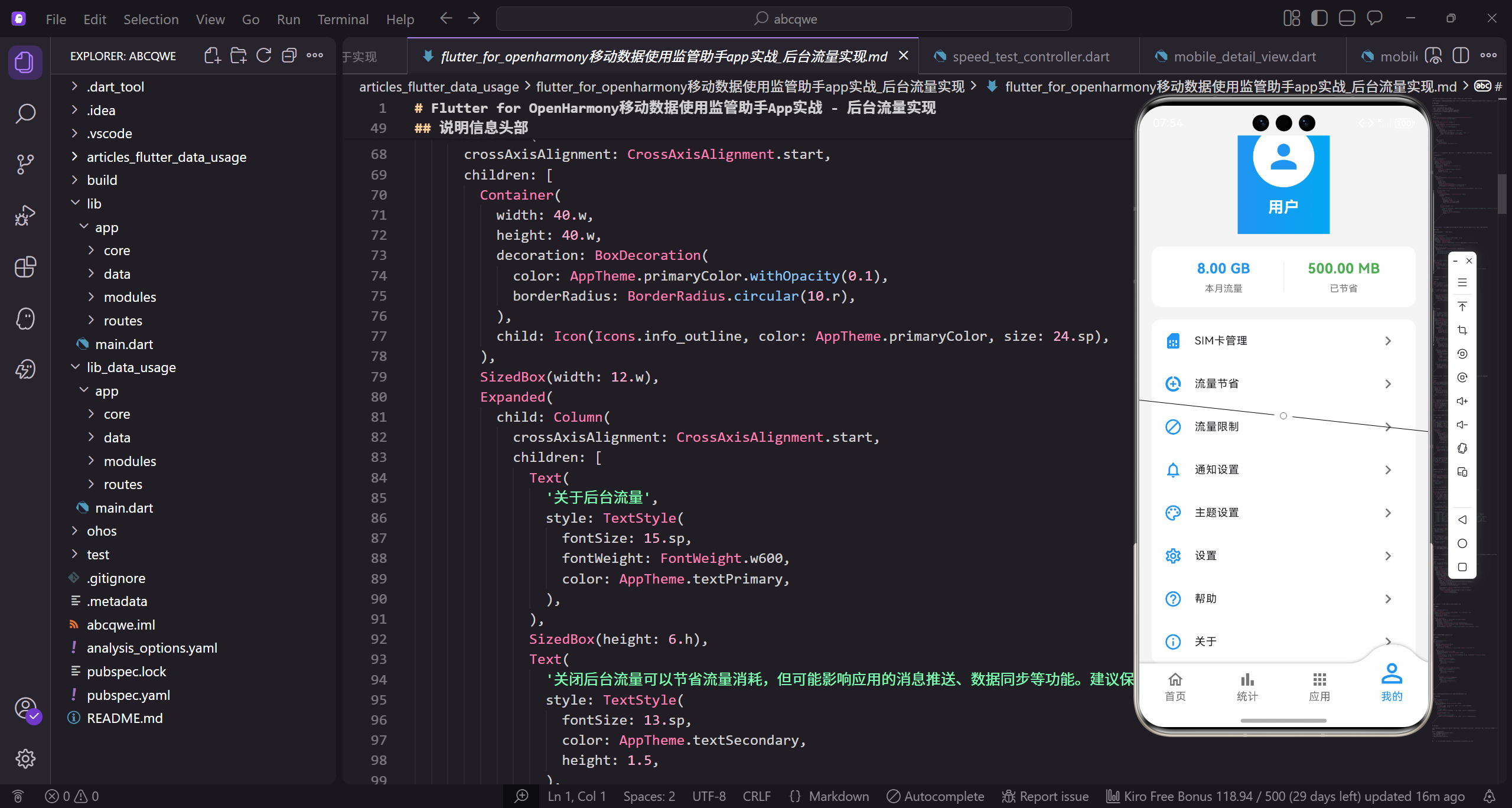
功能需求
后台流量管理页面需要实现:
- 展示所有应用的后台流量使用情况
- 提供开关控制每个应用的后台流量权限
- 显示后台流量使用量,帮助用户判断是否需要限制
- 提供说明信息,让用户了解关闭后台流量的影响
页面整体结构
首先定义后台流量管理页面的基本框架:
class BackgroundDataView extends GetView<BackgroundDataController> {
const BackgroundDataView({super.key});
Widget build(BuildContext context) {
return Scaffold(
继承GetView自动注入BackgroundDataController控制器。
const构造函数优化widget重建性能。
build方法返回页面的完整UI结构。
      backgroundColor: AppTheme.backgroundColor,
      appBar: AppBar(
        title: const Text('后台流量管理'),
        actions: [
          TextButton(
            onPressed: () => controller.toggleAll(),
Scaffold提供Material Design页面框架。
统一背景色保持视觉一致性。
AppBar右侧放置批量操作按钮。
            child: Obx(() => Text(
              controller.isAllEnabled ? '全部关闭' : '全部开启',
              style: TextStyle(color: Colors.white),
            )),
          ),
        ],
      ),
Obx监听isAllEnabled状态动态显示按钮文字。
全部开启时显示"全部关闭",反之亦然。
白色文字与AppBar背景对比明显。
      body: Column(
        children: [
          _buildHeader(),
          Expanded(child: _buildAppList()),
        ],
      ),
    );
  }
}
Column垂直排列头部说明和应用列表。
_buildHeader构建固定的说明信息头部。
Expanded让应用列表占据剩余空间。
说明信息头部
帮助用户理解后台流量的作用:
Widget _buildHeader() {
  return Container(
    margin: EdgeInsets.all(16.w),
    padding: EdgeInsets.all(16.w),
    decoration: BoxDecoration(
      color: Colors.white,
Container作为说明信息的容器。
margin和padding设置外边距和内边距。
白色背景与页面灰色背景对比。
      borderRadius: BorderRadius.circular(12.r),
      boxShadow: [
        BoxShadow(
          color: Colors.black.withOpacity(0.03),
          blurRadius: 8.r,
          offset: Offset(0, 2.h),
        ),
      ],
12.r圆角保持视觉一致。
轻微阴影让卡片有悬浮感。
透明度0.03的阴影非常柔和。
    ),
    child: Row(
      crossAxisAlignment: CrossAxisAlignment.start,
      children: [
        Container(
          width: 40.w,
          height: 40.w,
Row横向排列图标和文字。
crossAxisAlignment让内容顶部对齐。
图标容器尺寸40.w。
          decoration: BoxDecoration(
            color: AppTheme.primaryColor.withOpacity(0.1),
            borderRadius: BorderRadius.circular(10.r),
          ),
          child: Icon(Icons.info_outline, color: AppTheme.primaryColor, size: 24.sp),
        ),
浅色背景让图标区域柔和。
info_outline图标表示说明信息。
主色调图标与App风格一致。
        SizedBox(width: 12.w),
        Expanded(
          child: Column(
            crossAxisAlignment: CrossAxisAlignment.start,
            children: [
              Text(
间距12.w让图标和文字不挤。
Expanded让文字区域占据剩余空间。
Column垂直排列标题和说明。
                '关于后台流量',
                style: TextStyle(
                  fontSize: 15.sp,
                  fontWeight: FontWeight.w600,
                  color: AppTheme.textPrimary,
                ),
              ),
标题"关于后台流量"说明区域内容。
15.sp字号,w600加粗突出标题。
主要文字颜色确保可读性。
              SizedBox(height: 6.h),
              Text(
                '关闭后台流量可以节省流量消耗,但可能影响应用的消息推送、数据同步等功能。建议保留常用通讯应用的后台流量权限。',
                style: TextStyle(
小间距6.h后显示说明文字。
详细说明关闭后台流量的影响。
提醒用户保留通讯应用的权限。
                  fontSize: 13.sp,
                  color: AppTheme.textSecondary,
                  height: 1.5,
                ),
              ),
            ],
          ),
        ),
      ],
    ),
  );
}
13.sp小字号作为辅助信息。
height: 1.5增加行高提升可读性。
闭合所有组件完成头部构建。
统计摘要
展示后台流量的整体情况:
Widget _buildSummary() {
  return Container(
    margin: EdgeInsets.symmetric(horizontal: 16.w),
    padding: EdgeInsets.all(16.w),
    decoration: BoxDecoration(
      gradient: LinearGradient(
Container作为统计摘要的容器。
水平方向16.w的外边距。
LinearGradient创建渐变背景。
        colors: [AppTheme.mobileColor, AppTheme.mobileColor.withOpacity(0.8)],
      ),
      borderRadius: BorderRadius.circular(12.r),
    ),
    child: Obx(() => Row(
      mainAxisAlignment: MainAxisAlignment.spaceAround,
橙色系渐变与后台流量主题相关。
12.r圆角保持视觉一致。
Row均匀分布三个统计项。
      children: [
        _buildSummaryItem('应用数', '${controller.appList.length}'),
        _buildSummaryItem('已开启', '${controller.enabledCount}'),
        _buildSummaryItem('后台总流量', controller.totalBackgroundUsage),
      ],
    )),
  );
}
显示应用总数、已开启数、总流量。
Obx监听数据变化自动更新。
三个统计项让用户快速了解整体情况。
统计项组件
单个统计项的显示:
Widget _buildSummaryItem(String label, String value) {
  return Column(
    children: [
      Text(label, style: TextStyle(fontSize: 12.sp, color: Colors.white70)),
      SizedBox(height: 4.h),
Column垂直排列标签和数值。
标签用12.sp小字号,白色70%透明度。
小间距4.h让标签和数值紧凑。
      Text(
        value,
        style: TextStyle(fontSize: 18.sp, fontWeight: FontWeight.bold, color: Colors.white),
      ),
    ],
  );
}
数值用18.sp大字号加粗突出。
白色文字与渐变背景对比明显。
整体设计简洁直观。
应用列表
展示所有应用的后台流量状态:
Widget _buildAppList() {
  return Obx(() {
    if (controller.isLoading.value) {
      return const Center(child: CircularProgressIndicator());
    }

    if (controller.appList.isEmpty) {
Obx监听状态变化自动更新UI。
加载中显示转圈动画。
数据为空时显示空状态。
      return _buildEmptyState();
    }

    return ListView.builder(
      padding: EdgeInsets.all(16.w),
      itemCount: controller.appList.length,
_buildEmptyState构建空状态页面。
ListView.builder懒加载列表项。
padding设置列表内边距。
      itemBuilder: (context, index) {
        final app = controller.appList[index];
        return _buildAppItem(app, index);
      },
    );
  });
}
itemBuilder构建每个列表项。
获取当前索引的应用数据。
_buildAppItem构建应用项组件。
应用项组件
单个应用的后台流量控制项:
Widget _buildAppItem(Map<String, dynamic> app, int index) {
  final isEnabled = app['enabled'] as bool;
  final usage = app['usage'] as String;
  final name = app['name'] as String;

  return Container(
从app中提取启用状态、使用量、名称。
isEnabled判断后台流量是否开启。
Container作为应用项的容器。
    margin: EdgeInsets.only(bottom: 10.h),
    decoration: BoxDecoration(
      color: Colors.white,
      borderRadius: BorderRadius.circular(14.r),
      border: isEnabled
          ? Border.all(color: AppTheme.primaryColor.withOpacity(0.2))
底部margin让列表项之间有间距。
白色背景与页面灰色背景对比。
启用时显示浅蓝色边框高亮。
          : null,
      boxShadow: [
        BoxShadow(
          color: Colors.black.withOpacity(0.02),
          blurRadius: 6.r,
          offset: Offset(0, 2.h),
        ),
      ],
未启用时不显示边框。
轻微阴影让卡片有层次感。
透明度0.02的阴影非常柔和。
    ),
    child: ListTile(
      contentPadding: EdgeInsets.symmetric(horizontal: 16.w, vertical: 8.h),
      leading: _buildAppIcon(name),
      title: Text(
ListTile是Flutter内置的列表项组件。
contentPadding设置内边距。
leading放置应用图标。
        name,
        style: TextStyle(
          fontSize: 15.sp,
          fontWeight: FontWeight.w500,
          color: AppTheme.textPrimary,
        ),
      ),
显示应用名称。
15.sp字号,w500稍微加粗。
主要文字颜色确保可读性。
      subtitle: Column(
        crossAxisAlignment: CrossAxisAlignment.start,
        children: [
          SizedBox(height: 4.h),
          Text(
            usage,
subtitle放置使用量和进度条。
Column垂直排列子元素。
crossAxisAlignment让内容左对齐。
            style: TextStyle(fontSize: 13.sp, color: AppTheme.textSecondary),
          ),
          SizedBox(height: 4.h),
          _buildUsageBar(app),
        ],
      ),
使用量用13.sp小字号显示。
间距4.h后显示进度条。
_buildUsageBar构建使用量进度条。
      trailing: Switch(
        value: isEnabled,
        onChanged: (v) => controller.toggleApp(index, v),
        activeColor: AppTheme.primaryColor,
      ),
    ),
  );
}
trailing放置开关控件。
Switch控制后台流量开关。
主色调作为开关激活颜色。
应用图标
根据应用名称生成不同颜色的图标:
Widget _buildAppIcon(String name) {
  final color = _getAppColor(name);

  return Container(
    width: 48.w,
    height: 48.w,
_getAppColor根据名称获取颜色。
Container作为图标容器。
48.w的尺寸适合列表项。
    decoration: BoxDecoration(
      color: color.withOpacity(0.1),
      borderRadius: BorderRadius.circular(12.r),
    ),
    child: Icon(Icons.apps, color: color, size: 28.sp),
  );
}
浅色背景让图标区域柔和。
12.r圆角让容器更圆润。
图标颜色与背景色系一致。
Color _getAppColor(String name) {
  final colors = [
    AppTheme.primaryColor,
    AppTheme.wifiColor,
    AppTheme.mobileColor,
定义可用的颜色数组。
包含主色、WiFi色、移动数据色。
不同颜色增加视觉区分度。
    Colors.purple,
    Colors.pink,
  ];
  return colors[name.hashCode % colors.length];
}
紫色和粉色作为补充颜色。
hashCode取模确保同一应用颜色一致。
简单有效的颜色映射算法。
使用量进度条
直观显示后台流量使用程度:
Widget _buildUsageBar(Map<String, dynamic> app) {
  final usageStr = app['usage'] as String;
  final usageMB = _parseUsage(usageStr);
  final maxUsage = 200.0;
  final percentage = (usageMB / maxUsage).clamp(0.0, 1.0);
从app中获取使用量字符串。
_parseUsage解析出数值。
计算使用百分比,clamp限制在0-1之间。
  return Row(
    children: [
      Expanded(
        child: ClipRRect(
          borderRadius: BorderRadius.circular(2.r),
          child: LinearProgressIndicator(
Row横向排列进度条和百分比。
Expanded让进度条占据剩余空间。
ClipRRect给进度条添加圆角。
            value: percentage,
            backgroundColor: Colors.grey.shade200,
            valueColor: AlwaysStoppedAnimation(
              percentage > 0.8 ? Colors.orange : AppTheme.primaryColor,
            ),
            minHeight: 4.h,
value是0-1的进度值。
灰色背景作为进度条底色。
超过80%时变成橙色警告。
          ),
        ),
      ),
      SizedBox(width: 8.w),
      Text(
        '${(percentage * 100).toStringAsFixed(0)}%',
        style: TextStyle(fontSize: 11.sp, color: AppTheme.textSecondary),
      ),
    ],
  );
}
间距8.w后显示百分比数字。
百分比用11.sp小字号显示。
进度条和数字让用户直观了解使用程度。
解析使用量
从字符串中提取数值:
double _parseUsage(String usage) {
  final match = RegExp(r'(\d+)').firstMatch(usage);
  if (match != null) {
    return double.parse(match.group(1)!);
  }
  return 0;
}
正则表达式匹配数字。
从"后台使用 50 MB"中提取50。
匹配失败返回0作为默认值。
Controller实现
控制器管理后台流量相关的状态和逻辑:
class BackgroundDataController extends GetxController {
final appList = <Map<String, dynamic>>[].obs;
final isLoading = false.obs;
void onInit() {
appList存储所有应用的后台流量数据。
isLoading控制加载状态显示。
onInit在控制器初始化时调用。
    super.onInit();
    loadApps();
  }

  bool get isAllEnabled => appList.every((app) => app['enabled'] == true);

  int get enabledCount => appList.where((app) => app['enabled'] == true).length;
loadApps加载应用列表。
isAllEnabled判断是否全部开启。
enabledCount计算已开启的应用数。
  String get totalBackgroundUsage {
    int total = 0;
    for (var app in appList) {
      final usage = app['usage'] as String;
      final match = RegExp(r'(\d+)').firstMatch(usage);
totalBackgroundUsage计算总后台流量。
遍历所有应用累加使用量。
正则表达式提取数值。
      if (match != null) {
        total += int.parse(match.group(1)!);
      }
    }
    return '$total MB';
  }
累加所有应用的后台流量。
返回格式化的总流量字符串。
单位统一为MB。
  void loadApps() async {
    isLoading.value = true;

    await Future.delayed(const Duration(milliseconds: 300));

    appList.value = [
设置加载状态为true。
模拟网络延迟300毫秒。
构造模拟的应用数据。
      {'name': '微信', 'usage': '后台使用 50 MB', 'enabled': true, 'category': '通讯'},
      {'name': '抖音', 'usage': '后台使用 120 MB', 'enabled': true, 'category': '视频'},
      {'name': 'QQ', 'usage': '后台使用 30 MB', 'enabled': true, 'category': '通讯'},
微信、抖音、QQ的模拟数据。
包含名称、使用量、启用状态、分类。
通讯应用默认开启后台流量。
      {'name': '哔哩哔哩', 'usage': '后台使用 80 MB', 'enabled': false, 'category': '视频'},
      {'name': '淘宝', 'usage': '后台使用 25 MB', 'enabled': false, 'category': '购物'},
      {'name': '支付宝', 'usage': '后台使用 15 MB', 'enabled': true, 'category': '金融'},
哔哩哔哩、淘宝默认关闭后台流量。
支付宝作为金融应用默认开启。
不同分类的应用有不同默认设置。
      {'name': '美团', 'usage': '后台使用 35 MB', 'enabled': false, 'category': '生活'},
      {'name': '网易云音乐', 'usage': '后台使用 60 MB', 'enabled': true, 'category': '音乐'},
    ];

    isLoading.value = false;
  }
美团默认关闭,网易云音乐默认开启。
加载完成后设置isLoading为false。
实际项目中从系统API获取真实数据。
  void toggleApp(int index, bool value) {
    appList[index]['enabled'] = value;
    appList.refresh();
    saveSettings();
  }
toggleApp切换单个应用的后台流量状态。
更新列表中对应项的enabled值。
refresh通知UI更新,saveSettings保存设置。
  void toggleAll() {
    final newValue = !isAllEnabled;
    for (var app in appList) {
      app['enabled'] = newValue;
    }
    appList.refresh();
    saveSettings();
  }
toggleAll批量切换所有应用状态。
newValue取当前状态的反值。
遍历所有应用设置新状态。
  void saveSettings() {
    // 保存设置到本地存储
    // 通知系统更新后台流量权限
  }
}
saveSettings保存设置到本地。
通知系统更新后台流量权限。
实际项目中调用系统API。
空状态处理
当没有应用数据时显示友好提示:
Widget _buildEmptyState() {
  return Center(
    child: Column(
      mainAxisAlignment: MainAxisAlignment.center,
      children: [
        Icon(Icons.apps, size: 80.sp, color: Colors.grey.shade300),
Center让内容居中显示。
Column垂直排列图标和文字。
大图标作为视觉焦点。
        SizedBox(height: 16.h),
        Text(
          '暂无应用数据',
          style: TextStyle(fontSize: 16.sp, color: AppTheme.textSecondary),
        ),
        SizedBox(height: 8.h),
间距16.h后显示主提示文字。
16.sp字号作为主要信息。
次要颜色让提示不会太突兀。
        Text(
          '安装应用后会自动显示在这里',
          style: TextStyle(fontSize: 14.sp, color: AppTheme.textSecondary),
        ),
      ],
    ),
  );
}
副提示说明数据来源。
14.sp小字号作为辅助信息。
引导用户了解数据获取方式。
写在最后
后台流量管理帮助用户控制应用的后台流量消耗。通过清晰的列表展示、便捷的开关控制、直观的使用量显示,用户可以轻松管理每个应用的后台流量权限。
可以继续优化的方向:
- 添加智能推荐,自动识别高耗流量应用
- 支持设置后台流量限额
- 添加后台流量使用趋势图
- 支持按时间段查看后台流量
欢迎加入开源鸿蒙跨平台社区:https://openharmonycrossplatform.csdn.net

开源鸿蒙跨平台开发社区汇聚开发者与厂商,共建“一次开发,多端部署”的开源生态,致力于降低跨端开发门槛,推动万物智联创新。
更多推荐
 22
22 0
0- 0


 已为社区贡献31条内容

所有评论(0)