Flutter for OpenHarmony 盲盒抽奖App应用实战:登录页面开发
忘记密码跳转到忘记密码页,用户可以返回立即注册跳转到注册页,用户可以返回登录成功跳转到主页,用户无法返回前两个用 push 是因为用户可能想返回登录页。登录成功用 pushReplacement 是因为不应该让用户返回登录页。
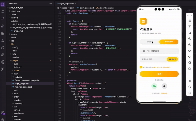
上一篇我们完成了注册和忘记密码功能,这篇来搞定登录页面。登录页面支持两种方式:密码登录和验证码登录,用户可以通过 Tab 切换。另外还有第三方登录入口和跳转注册的链接。
整体设计思路
登录页面的核心是一个 TabBar 加 TabBarView 的组合。但这个 TabBar 不是放在顶部的,而是放在页面中间位置,这样视觉上更舒服。
页面从上到下依次是:
- Logo 区域 - 品牌图标和欢迎语
- Tab 切换区 - 密码登录 / 验证码登录
- 表单区 - 根据 Tab 显示不同的输入框
- 协议勾选 - 用户协议和隐私政策
- 登录按钮 - 主操作按钮
- 第三方登录 - 微信、Apple 登录
- 注册入口 - 跳转注册页面
状态管理
先看看需要管理哪些状态:
class _LoginPageState extends State<LoginPage> with SingleTickerProviderStateMixin {
  late TabController _tabController;
  final _phoneController = TextEditingController();
  final _passwordController = TextEditingController();
  final _codeController = TextEditingController();

  bool _obscurePassword = true;
  bool _agreeTerms = false;
  int _countdown = 0;
  Timer? _timer;
这里用了 SingleTickerProviderStateMixin,为什么?因为 TabController 需要一个 TickerProvider 来驱动动画。这个 mixin 就是提供这个能力的。
小知识:如果页面里有多个需要 Ticker 的动画,就要用
TickerProviderStateMixin(注意没有 Single)。我们这里只有一个 TabController,所以用 Single 版本就够了,性能更好。
初始化的时候预置了测试用的手机号和密码:
void initState() {
super.initState();
_tabController = TabController(length: 2, vsync: this);
_phoneController.text = '15122378745';
_passwordController.text = '12345678';
}
length: 2 表示有两个 Tab,vsync: this 就是把当前 State 作为 TickerProvider 传进去。预置账号密码是为了方便调试,上线前记得删掉。
dispose 方法里把所有资源都释放掉:
void dispose() {
_tabController.dispose();
_phoneController.dispose();
_passwordController.dispose();
_codeController.dispose();
_timer?.cancel();
super.dispose();
}
这是个好习惯,能避免内存泄漏。特别是 Timer,如果不 cancel,页面销毁后它还会继续跑,然后调用 setState 就会报错。
页面布局
整体布局用 Column 垂直排列:
Widget build(BuildContext context) {
return Scaffold(
backgroundColor: Colors.white,
body: SafeArea(
child: Padding(
padding: const EdgeInsets.symmetric(horizontal: 24),
child: Column(
crossAxisAlignment: CrossAxisAlignment.start,
children: [
const SizedBox(height: 60),
_buildHeader(),
const SizedBox(height: 40),
_buildTabBar(),
const SizedBox(height: 30),
Expanded(
child: TabBarView(
controller: _tabController,
children: [
_buildPasswordLogin(),
_buildCodeLogin(),
],
),
),
],
),
),
),
);
}
几个布局要点:
SafeArea保证内容不会被刘海屏遮挡- 左右各留 24 的 padding,顶部留 60 的空白,让页面不会太拥挤
TabBarView放在Expanded里,占据剩余空间
为什么 TabBarView 要用 Expanded 包裹?因为 Column 的子组件如果没有明确高度,TabBarView 不知道自己该多高。Expanded 告诉它"你就占满剩下的空间吧"。
Logo 和欢迎语
头部区域放一个带渐变色的 Logo 图标:
Widget _buildHeader() {
  return Column(
    crossAxisAlignment: CrossAxisAlignment.start,
    children: [
      Container(
        width: 60,
        height: 60,
        decoration: BoxDecoration(
          gradient: const LinearGradient(
            colors: [AppColors.primary, AppColors.primaryDark],
          ),
          borderRadius: BorderRadius.circular(16),
        ),
        child: const Icon(Icons.card_giftcard, color: Colors.white, size: 32),
      ),
      const SizedBox(height: 20),
      const Text(
        '欢迎登录',
        style: TextStyle(fontSize: 28, fontWeight: FontWeight.bold, color: AppColors.black),
      ),
      const SizedBox(height: 8),
      const Text(
        '登录后享受更多精彩盲盒体验',
        style: TextStyle(fontSize: 14, color: AppColors.grey),
      ),
    ],
  );
}
用 card_giftcard 图标代表盲盒,配合金黄色渐变背景,整体感觉比较活泼。
标题用 28 号字加粗,副标题用 14 号灰色字。这种大小和颜色的对比能形成视觉层次,让用户一眼就知道哪个是主信息。
Tab 切换器
Tab 切换器是这个页面的亮点,选中状态用渐变色背景加阴影:
Widget _buildTabBar() {
  return Container(
    height: 48,
    padding: const EdgeInsets.all(4),
    decoration: BoxDecoration(
      color: const Color(0xFFF5F5F5),
      borderRadius: BorderRadius.circular(24),
    ),
    child: TabBar(
      controller: _tabController,
      indicator: BoxDecoration(
        gradient: const LinearGradient(
          colors: [AppColors.primary, AppColors.primaryDark],
        ),
        borderRadius: BorderRadius.circular(20),
        boxShadow: [
          BoxShadow(
            color: AppColors.primary.withOpacity(0.3),
            blurRadius: 8,
            offset: const Offset(0, 2),
          ),
        ],
      ),
      indicatorSize: TabBarIndicatorSize.tab,
      dividerColor: Colors.transparent,
      labelColor: Colors.white,
      unselectedLabelColor: AppColors.grey,
      tabs: const [
        Tab(text: '密码登录'),
        Tab(text: '验证码登录'),
      ],
    ),
  );
}
这段代码有几个关键点:
外层 Container 的设计:浅灰色背景 0xFFF5F5F5,圆角 24(接近胶囊形状),内部留 4 的 padding。这样选中的 Tab 和边框之间有间距,看起来像是"浮"在背景上。
indicator 的自定义:用 BoxDecoration 而不是默认的下划线。设置渐变色、圆角 20、还有阴影。阴影用主题色的 30% 透明度,模糊半径 8,向下偏移 2 像素。
其他属性:
indicatorSize: TabBarIndicatorSize.tab让指示器填满整个 Tab 宽度dividerColor: Colors.transparent去掉 TabBar 默认的底部分割线- 选中文字白色加粗,未选中灰色正常粗细
踩坑提醒:Flutter 3.0 之后 TabBar 默认会显示一条底部分割线,很多人不知道怎么去掉。设置
dividerColor: Colors.transparent就行了。
密码登录表单
密码登录表单包含手机号、密码、忘记密码链接:
Widget _buildPasswordLogin() {
  return SingleChildScrollView(
    child: Column(
      children: [
        _buildPhoneInput(),
        const SizedBox(height: 16),
        _buildPasswordInput(),
        const SizedBox(height: 12),
        Align(
          alignment: Alignment.centerRight,
          child: TextButton(
            onPressed: () {
              Navigator.push(context, MaterialPageRoute(builder: (_) => const ForgotPasswordPage()));
            },
            child: const Text('忘记密码?', style: TextStyle(fontSize: 13, color: AppColors.primaryDark)),
          ),
        ),
        const SizedBox(height: 20),
        _buildAgreement(),
        const SizedBox(height: 24),
        _buildLoginButton(),
        const SizedBox(height: 20),
        _buildOtherLogin(),
      ],
    ),
  );
}
用 SingleChildScrollView 包裹是为了防止键盘弹起时内容溢出。忘记密码用 Align 靠右对齐,点击跳转到忘记密码页面。
手机号输入框
手机号输入框前面带 +86 区号:
Widget _buildPhoneInput() {
  return Container(
    height: 56,
    decoration: BoxDecoration(
      color: const Color(0xFFF5F5F5),
      borderRadius: BorderRadius.circular(12),
    ),
    child: Row(
      children: [
        const SizedBox(width: 16),
        const Text('+86', style: TextStyle(fontSize: 16, fontWeight: FontWeight.w500)),
        const SizedBox(width: 8),
        Container(width: 1, height: 20, color: const Color(0xFFDDDDDD)),
        const SizedBox(width: 12),
        Expanded(
          child: TextField(
            controller: _phoneController,
            keyboardType: TextInputType.phone,
            decoration: const InputDecoration(
              hintText: '请输入手机号',
              hintStyle: TextStyle(color: AppColors.grey, fontSize: 15),
              border: InputBorder.none,
            ),
          ),
        ),
      ],
    ),
  );
}
keyboardType: TextInputType.phone 让系统弹出数字键盘,方便用户输入手机号。border: InputBorder.none 去掉 TextField 默认的下划线,用外层 Container 的背景色和圆角来定义输入框样式。
中间那个 1 像素宽的 Container 是分隔线,把 +86 和输入区域分开。
密码输入框
密码输入框右边有个眼睛图标:
Widget _buildPasswordInput() {
  return Container(
    height: 56,
    decoration: BoxDecoration(
      color: const Color(0xFFF5F5F5),
      borderRadius: BorderRadius.circular(12),
    ),
    padding: const EdgeInsets.symmetric(horizontal: 16),
    child: Row(
      children: [
        Expanded(
          child: TextField(
            controller: _passwordController,
            obscureText: _obscurePassword,
            decoration: const InputDecoration(
              hintText: '请输入密码',
              border: InputBorder.none,
            ),
          ),
        ),
        GestureDetector(
          onTap: () => setState(() => _obscurePassword = !_obscurePassword),
          child: Icon(
            _obscurePassword ? Icons.visibility_off : Icons.visibility,
            color: AppColors.grey,
            size: 22,
          ),
        ),
      ],
    ),
  );
}
obscureText 控制密码是否显示为圆点。点击眼睛图标时调用 setState 切换状态,图标也会跟着变化:
visibility_off- 划掉的眼睛,表示密码当前是隐藏的visibility- 正常的眼睛,表示密码当前是显示的
这个交互很常见,用户都习惯了。
验证码登录表单
验证码登录和密码登录的区别就是把密码框换成验证码框:
Widget _buildCodeLogin() {
  return SingleChildScrollView(
    child: Column(
      children: [
        _buildPhoneInput(),
        const SizedBox(height: 16),
        _buildCodeInput(),
        const SizedBox(height: 32),
        _buildAgreement(),
        const SizedBox(height: 24),
        _buildLoginButton(),
        const SizedBox(height: 20),
        _buildOtherLogin(),
      ],
    ),
  );
}
手机号输入框是复用的,验证码输入框右边带获取验证码按钮:
GestureDetector(
  onTap: _countdown == 0 ? _startCountdown : null,
  child: Container(
    padding: const EdgeInsets.symmetric(horizontal: 16, vertical: 10),
    decoration: BoxDecoration(
      color: _countdown == 0 ? AppColors.primary : const Color(0xFFDDDDDD),
      borderRadius: BorderRadius.circular(20),
    ),
    child: Text(
      _countdown == 0 ? '获取验证码' : '${_countdown}s',
      style: TextStyle(
        fontSize: 13,
        color: _countdown == 0 ? AppColors.black : AppColors.grey,
        fontWeight: FontWeight.w500,
      ),
    ),
  ),
),
按钮有两种状态:可点击时是金黄色背景,倒计时期间是灰色背景且不可点击。onTap 传 null 就相当于禁用点击事件。
倒计时逻辑:
void _startCountdown() {
  setState(() => _countdown = 60);
  _timer = Timer.periodic(const Duration(seconds: 1), (timer) {
    setState(() {
      if (_countdown > 0) {
        _countdown--;
      } else {
        _timer?.cancel();
      }
    });
  });
}
Timer.periodic 每秒执行一次回调,在回调里把 _countdown 减一,然后 setState 触发 UI 更新。减到 0 就取消定时器。
用户协议勾选
协议勾选框用自定义样式:
GestureDetector(
  onTap: () => setState(() => _agreeTerms = !_agreeTerms),
  child: Container(
    width: 20,
    height: 20,
    decoration: BoxDecoration(
      color: _agreeTerms ? AppColors.primary : Colors.transparent,
      borderRadius: BorderRadius.circular(4),
      border: Border.all(
        color: _agreeTerms ? AppColors.primary : AppColors.grey,
        width: 1.5,
      ),
    ),
    child: _agreeTerms ? const Icon(Icons.check, size: 14, color: Colors.white) : null,
  ),
),
选中后显示主题色背景和白色勾,未选中就是透明背景加灰色边框。
协议文字用 Text.rich 实现富文本效果:
Text.rich(
  TextSpan(
    text: '我已阅读并同意',
    style: const TextStyle(fontSize: 12, color: AppColors.grey),
    children: [
      TextSpan(text: '《用户协议》', style: TextStyle(color: AppColors.primaryDark)),
      const TextSpan(text: '和'),
      TextSpan(text: '《隐私政策》', style: TextStyle(color: AppColors.primaryDark)),
    ],
  ),
),
TextSpan 可以嵌套,每个 span 设置不同的样式。协议链接用橙色,和普通灰色文字区分开,暗示这是可以点击的。
登录按钮和验证逻辑
登录按钮用渐变色背景:
GestureDetector(
  onTap: _login,
  child: Container(
    width: double.infinity,
    height: 50,
    decoration: BoxDecoration(
      gradient: const LinearGradient(
        colors: [AppColors.primary, AppColors.primaryDark],
      ),
      borderRadius: BorderRadius.circular(25),
    ),
    child: const Center(
      child: Text('登录', style: TextStyle(fontSize: 16, color: Colors.white, fontWeight: FontWeight.bold)),
    ),
  ),
),
width: double.infinity 让按钮撑满父容器宽度,borderRadius: 25 配合 height: 50 形成胶囊形状。
点击登录时做表单验证:
void _login() {
  if (!_agreeTerms) {
    ScaffoldMessenger.of(context).showSnackBar(
      const SnackBar(content: Text('请先同意用户协议和隐私政策')),
    );
    return;
  }

  if (_phoneController.text.isEmpty) {
    ScaffoldMessenger.of(context).showSnackBar(
      const SnackBar(content: Text('请输入手机号')),
    );
    return;
  }

  Navigator.pushReplacement(
    context,
    MaterialPageRoute(builder: (_) => const MainTabPage()),
  );
}
验证通过后用 pushReplacement 跳转到主页。
为什么用 pushReplacement 而不是 push? push 会把新页面压入栈顶,用户按返回键会回到登录页。pushReplacement 会替换当前页面,用户按返回键就直接退出 App 了。登录成功后不应该让用户返回登录页,所以用 pushReplacement。
第三方登录和注册入口
底部放第三方登录图标和注册链接:
Widget _buildOtherLogin() {
  return Column(
    children: [
      Row(
        children: [
          Expanded(child: Divider(color: Colors.grey.shade300)),
          const Padding(
            padding: EdgeInsets.symmetric(horizontal: 16),
            child: Text('其他登录方式', style: TextStyle(fontSize: 12, color: AppColors.grey)),
          ),
          Expanded(child: Divider(color: Colors.grey.shade300)),
        ],
      ),
      const SizedBox(height: 20),
      Row(
        mainAxisAlignment: MainAxisAlignment.center,
        children: [
          _buildSocialButton(Icons.wechat, const Color(0xFF07C160)),
          const SizedBox(width: 40),
          _buildSocialButton(Icons.apple, AppColors.black),
        ],
      ),
      const SizedBox(height: 30),
      Row(
        mainAxisAlignment: MainAxisAlignment.center,
        children: [
          const Text('还没有账号?', style: TextStyle(fontSize: 13, color: AppColors.grey)),
          GestureDetector(
            onTap: () {
              Navigator.push(context, MaterialPageRoute(builder: (_) => const RegisterPage()));
            },
            child: const Text('立即注册', style: TextStyle(fontSize: 13, color: AppColors.primaryDark, fontWeight: FontWeight.w500)),
          ),
        ],
      ),
    ],
  );
}
分割线的实现挺巧妙的:两个 Expanded 包裹的 Divider,中间放文字。Expanded 会让两条线平分剩余空间,文字就自然居中了。
第三方登录图标的实现:
Widget _buildSocialButton(IconData icon, Color color) {
  return Container(
    width: 50,
    height: 50,
    decoration: BoxDecoration(
      color: color.withOpacity(0.1),
      shape: BoxShape.circle,
    ),
    child: Icon(icon, color: color, size: 28),
  );
}
用圆形背景,颜色取图标颜色的 10% 透明度。微信用绿色 0xFF07C160,Apple 用黑色。这样看起来比较协调,不会太突兀。
页面跳转总结
登录页涉及到三个跳转:
- 忘记密码 -
Navigator.push跳转到忘记密码页,用户可以返回 - 立即注册 -
Navigator.push跳转到注册页,用户可以返回 - 登录成功 -
Navigator.pushReplacement跳转到主页,用户无法返回
前两个用 push 是因为用户可能想返回登录页。登录成功用 pushReplacement 是因为不应该让用户返回登录页。
小结
这篇文章实现了一个完整的登录页面,代码都是从实际项目里拿出来的,可以直接用。
主要涉及这些知识点:
- TabController + TabBarView - 实现 Tab 切换效果
- 自定义 TabBar indicator - 用 BoxDecoration 替代默认下划线
- TextEditingController - 管理输入框内容
- Timer.periodic - 实现验证码倒计时
- GestureDetector - 处理点击事件
- Navigator - 页面跳转,push vs pushReplacement 的区别
整个登录模块加上之前的注册和忘记密码,用户认证系统就完整了。下一篇我们来实现首页和盲盒开箱功能,敬请期待。
欢迎加入开源鸿蒙跨平台社区:https://openharmonycrossplatform.csdn.net

开源鸿蒙跨平台开发社区汇聚开发者与厂商,共建“一次开发,多端部署”的开源生态,致力于降低跨端开发门槛,推动万物智联创新。
更多推荐


 19
19 0
0- 0


 已为社区贡献25条内容

所有评论(0)