Flutter for OpenHarmony移动数据使用监管助手App实战 - 个人中心实现
本文介绍了Flutter个人中心页面的设计与实现,采用三段式布局:顶部头像区(渐变背景+用户信息)、数据统计卡片(流量使用情况)和功能菜单列表。技术实现上,使用CircleAvatar组件实现圆形头像,数据统计卡片采用等宽布局,菜单项通过数据驱动方式生成。页面逻辑通过GetX状态管理,包含用户数据加载和格式化显示等功能。整体设计注重用户体验,通过视觉层次和色彩区分提升信息可读性,同时采用心理学技巧
个人中心是App的设置入口和功能导航中心,用户在这里可以查看账户信息、管理套餐、调整各种设置。虽然功能看起来简单,但一个设计良好的个人中心能大大提升用户体验。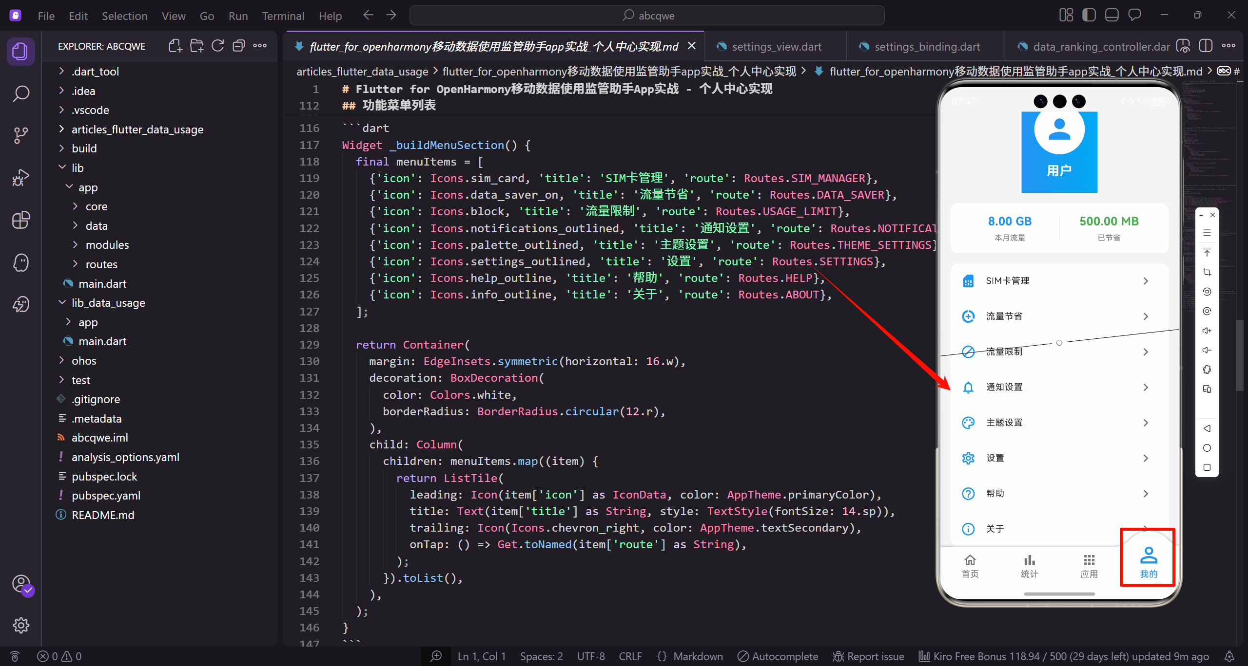
页面结构设计
个人中心页面采用经典的三段式布局:
- 顶部头像区:渐变背景,展示用户头像和名称
- 数据统计卡片:本月流量和节省流量的快速预览
- 功能菜单列表:各种设置和功能的入口
顶部头像区实现
用渐变背景让头像区域更有视觉冲击力:
Widget _buildHeader() {
  return Container(
    padding: EdgeInsets.all(20.w),
    decoration: const BoxDecoration(
      gradient: LinearGradient(
        colors: [AppTheme.primaryColor, AppTheme.secondaryColor],
      ),
    ),
    child: Column(
      children: [
        CircleAvatar(
          radius: 40.r,
          backgroundColor: Colors.white,
          child: Icon(Icons.person, size: 50.sp, color: AppTheme.primaryColor),
        ),
        SizedBox(height: 12.h),
        Obx(() => Text(
          controller.userName.value,
          style: TextStyle(
            fontSize: 20.sp,
            fontWeight: FontWeight.bold,
            color: Colors.white,
          ),
        )),
      ],
    ),
  );
}
CircleAvatar的使用:Flutter内置的圆形头像组件,设置radius控制大小,backgroundColor设为白色和渐变背景形成对比。里面放一个人物图标作为默认头像。
实际项目中,头像应该支持用户上传自定义图片,可以用NetworkImage或FileImage替换Icon。
数据统计卡片
展示本月流量使用和节省的流量:
Widget _buildStatsCard() {
  return Container(
    margin: EdgeInsets.all(16.w),
    padding: EdgeInsets.all(16.w),
    decoration: BoxDecoration(
      color: Colors.white,
      borderRadius: BorderRadius.circular(12.r),
    ),
    child: Row(
      children: [
        Expanded(
          child: Column(
            children: [
              Obx(() => Text(
                controller.formatBytes(controller.totalUsageThisMonth.value),
                style: TextStyle(
                  fontSize: 18.sp,
                  fontWeight: FontWeight.bold,
                  color: AppTheme.primaryColor,
                ),
              )),
              SizedBox(height: 4.h),
              Text('本月流量', style: TextStyle(fontSize: 12.sp, color: AppTheme.textSecondary)),
            ],
          ),
        ),
        Container(width: 1, height: 40.h, color: Colors.grey.shade200),
        Expanded(
          child: Column(
            children: [
              Obx(() => Text(
                controller.formatBytes(controller.savedData.value),
                style: TextStyle(
                  fontSize: 18.sp,
                  fontWeight: FontWeight.bold,
                  color: AppTheme.wifiColor,
                ),
              )),
              SizedBox(height: 4.h),
              Text('已节省', style: TextStyle(fontSize: 12.sp, color: AppTheme.textSecondary)),
            ],
          ),
        ),
      ],
    ),
  );
}
两个数据项用Expanded等宽排列,中间用一条灰色竖线分隔。本月流量用主题色蓝色,节省流量用绿色,颜色区分让信息更直观。
为什么要显示"已节省"?
这是一个心理学技巧。用户看到自己节省了多少流量,会有成就感,更愿意继续使用App的省流功能。
功能菜单列表
菜单项用数据驱动的方式生成,方便维护:
Widget _buildMenuSection() {
  final menuItems = [
    {'icon': Icons.sim_card, 'title': 'SIM卡管理', 'route': Routes.SIM_MANAGER},
    {'icon': Icons.data_saver_on, 'title': '流量节省', 'route': Routes.DATA_SAVER},
    {'icon': Icons.block, 'title': '流量限制', 'route': Routes.USAGE_LIMIT},
    {'icon': Icons.notifications_outlined, 'title': '通知设置', 'route': Routes.NOTIFICATION_SETTINGS},
    {'icon': Icons.palette_outlined, 'title': '主题设置', 'route': Routes.THEME_SETTINGS},
    {'icon': Icons.settings_outlined, 'title': '设置', 'route': Routes.SETTINGS},
    {'icon': Icons.help_outline, 'title': '帮助', 'route': Routes.HELP},
    {'icon': Icons.info_outline, 'title': '关于', 'route': Routes.ABOUT},
  ];

  return Container(
    margin: EdgeInsets.symmetric(horizontal: 16.w),
    decoration: BoxDecoration(
      color: Colors.white,
      borderRadius: BorderRadius.circular(12.r),
    ),
    child: Column(
      children: menuItems.map((item) {
        return ListTile(
          leading: Icon(item['icon'] as IconData, color: AppTheme.primaryColor),
          title: Text(item['title'] as String, style: TextStyle(fontSize: 14.sp)),
          trailing: Icon(Icons.chevron_right, color: AppTheme.textSecondary),
          onTap: () => Get.toNamed(item['route'] as String),
        );
      }).toList(),
    ),
  );
}
数据驱动的好处:
- 添加新菜单项只需要往数组里加一条数据
- 调整顺序只需要移动数组元素
- 代码简洁,不会有大量重复的ListTile
ListTile的使用:Flutter内置的列表项组件,自带leading、title、trailing三个位置,还有内置的点击效果,非常适合做菜单列表。
图标的选择:用_outlined后缀的线条图标,风格统一且不会太重。所有图标都用主题色,保持视觉一致性。
Controller层实现
个人中心的Controller比较简单,主要是加载用户数据:
class ProfileController extends GetxController {
final userName = '用户'.obs;
final totalUsageThisMonth = 0.obs;
final savedData = 0.obs;
void onInit() {
super.onInit();
loadData();
}
void loadData() {
totalUsageThisMonth.value = 1024 * 1024 * 1024 * 8; // 8 GB
savedData.value = 1024 * 1024 * 500; // 500 MB
}
String formatBytes(int bytes) {
if (bytes < 1024) return '$bytes B';
if (bytes < 1024 * 1024) return '${(bytes / 1024).toStringAsFixed(1)} KB';
if (bytes < 1024 * 1024 * 1024) return '${(bytes / (1024 * 1024)).toStringAsFixed(2)} MB';
return '${(bytes / (1024 * 1024 * 1024)).toStringAsFixed(2)} GB';
}
}
实际项目中,userName应该从用户登录信息中获取,totalUsageThisMonth和savedData应该从统计数据中计算得出。
页面整体结构
把三个区块组合起来:
Widget build(BuildContext context) {
return Scaffold(
backgroundColor: AppTheme.backgroundColor,
body: SafeArea(
child: SingleChildScrollView(
child: Column(
children: [
_buildHeader(),
_buildStatsCard(),
_buildMenuSection(),
],
),
),
),
);
}
没有AppBar:个人中心页面通常不需要AppBar,头像区域本身就起到了标题的作用。用SafeArea处理状态栏区域。
SingleChildScrollView:虽然当前内容不会超出一屏,但加上滚动容器是个好习惯,万一以后菜单项变多了也不会出问题。
可以扩展的功能
个人中心还可以加入这些功能:
登录/退出:如果App有账户系统,头像区域可以显示登录状态,点击跳转登录页或显示退出按钮。
会员等级:如果有会员体系,可以在头像下方显示会员等级和特权。
消息中心入口:右上角可以加个消息图标,显示未读消息数量。
快捷操作:统计卡片可以做成可点击的,点击跳转到对应的详情页。
个人中心看似简单,但它是用户使用频率很高的页面,值得花心思打磨细节。
欢迎加入开源鸿蒙跨平台社区:https://openharmonycrossplatform.csdn.net

开源鸿蒙跨平台开发社区汇聚开发者与厂商,共建“一次开发,多端部署”的开源生态,致力于降低跨端开发门槛,推动万物智联创新。
更多推荐

 11
11 0
0- 0


 已为社区贡献6条内容

所有评论(0)