rn_for_openharmony_收藏列表:从需求到实现的完整拆解
本文介绍了如何实现一个用户收藏文章列表功能,重点解决四个关键问题:未登录状态处理、空收藏提示、列表长度控制和刷新机制。采用条件渲染方式处理三种状态(未登录/无收藏/有收藏),通过slice(0,5)限制展示5条最新收藏,并实现点击跳转详情功能。文章详细解析了代码结构,包括卡片容器样式、刷新按钮条件显示、提示文字处理和列表项渲染逻辑,特别强调了key值的重要性。该方案既满足功能需求,又保持了界面简洁
案例项目开源地址:https://atomgit.com/nutpi/wanandroid_rn_openharmony
产品经理说:用户要能看到自己收藏的文章。
听起来简单,但要考虑的事情不少:未登录怎么办?没有收藏怎么办?列表太长怎么办?怎么刷新?
我们来一个一个解决。
需求分析
收藏列表要满足这些场景:
用户未登录时,提示"登录后查看收藏"。
用户已登录但没有收藏时,提示"暂无收藏"。
用户已登录且有收藏时,展示收藏列表。
列表要能刷新,因为用户可能在其他页面收藏了新文章。
点击列表项要能跳转到文章详情。
整体结构
<View style={[styles.collectCard, {backgroundColor: theme.card, borderColor: theme.border}]}>
<View style={styles.collectHeader}>
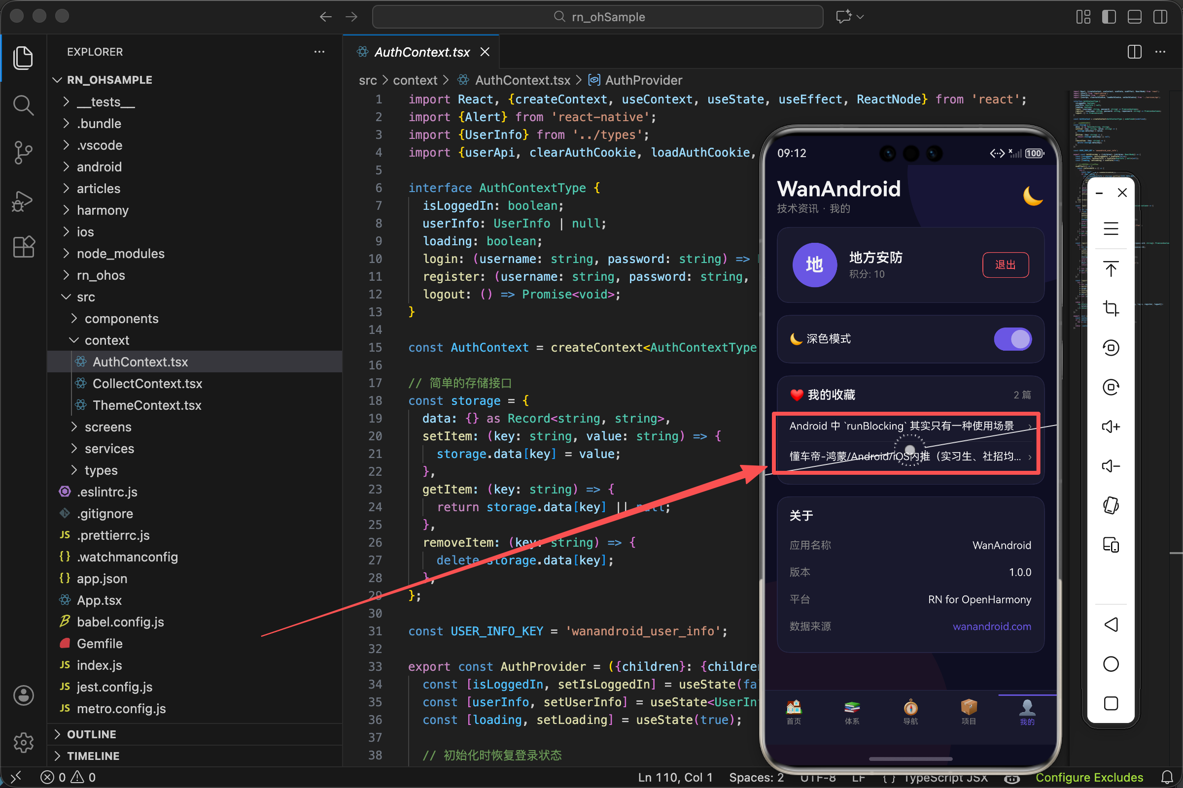
<Text style={[styles.collectTitle, {color: theme.text}]}>❤️ 我的收藏</Text>
{isLoggedIn && (
<TouchableOpacity onPress={loadCollectList}>
<Text style={{color: theme.accent}}>刷新</Text>
</TouchableOpacity>
)}
</View>
{!isLoggedIn ? (
<Text style={[styles.collectTip, {color: theme.subText}]}>登录后查看收藏</Text>
) : collectArticles.length === 0 ? (
<Text style={[styles.collectTip, {color: theme.subText}]}>暂无收藏</Text>
) : (
collectArticles.slice(0, 5).map(item => (
<TouchableOpacity key={item.id} style={styles.collectItem} onPress={() => openLink(item.link)}>
<Text style={[styles.collectItemTitle, {color: theme.text}]} numberOfLines={1}>
{item.title.replace(/<[^>]+>/g, '')}
</Text>
<Text style={{color: theme.subText}}>›</Text>
</TouchableOpacity>
))
)}
</View>
卡片容器
最外层是一个 View,样式用了 collectCard。这个卡片和页面上其他卡片(用户信息卡片、设置卡片)保持一致的视觉风格:圆角、边框、内边距。
backgroundColor: theme.card 和 borderColor: theme.border 让卡片在深色和浅色主题下都能正常显示。深色主题下背景是深灰色,浅色主题下是白色。
卡片头部
头部包含标题和刷新按钮,用 flexDirection: 'row' 横向排列,justifyContent: 'space-between' 让它们分别靠左和靠右。
标题前面加了一个红心 emoji ❤️,让用户一眼就知道这是收藏相关的内容。emoji 比图标更轻量,不需要额外加载资源。
刷新按钮的条件显示
{isLoggedIn && (
  <TouchableOpacity onPress={loadCollectList}>
    <Text style={{color: theme.accent}}>刷新</Text>
  </TouchableOpacity>
)}
为什么只有登录后才显示刷新按钮
未登录时,收藏列表是空的,刷新没有意义。显示一个点不了的按钮(或者点了提示"请先登录")会让用户困惑。干脆不显示,界面更清爽。
isLoggedIn && (...) 是 React 的条件渲染写法。当 isLoggedIn 为 true 时,渲染括号里的内容;为 false 时,整个表达式返回 false,React 会忽略它(不渲染任何东西)。
刷新按钮的样式
用 theme.accent(强调色)让按钮更醒目。没有加背景色和边框,看起来像一个文字链接,和标题在视觉上有区分。
TouchableOpacity 提供点击反馈,点击时文字会变透明,告诉用户"我点到了"。
三种状态的条件渲染
{!isLoggedIn ? (
  <Text style={[styles.collectTip, {color: theme.subText}]}>登录后查看收藏</Text>
) : collectArticles.length === 0 ? (
  <Text style={[styles.collectTip, {color: theme.subText}]}>暂无收藏</Text>
) : (
  collectArticles.slice(0, 5).map(...)
)}
嵌套的三元表达式
这是一个嵌套的三元表达式,逻辑是:
- 先判断
!isLoggedIn,如果未登录,显示"登录后查看收藏" - 如果已登录,再判断
collectArticles.length === 0,如果没有收藏,显示"暂无收藏" - 如果已登录且有收藏,渲染收藏列表
嵌套三元表达式可读性不太好,但对于简单的三种状态还能接受。如果状态更多,建议抽成单独的函数或组件。
提示文字的样式
collectTip: {fontSize: 14, textAlign: 'center', paddingVertical: 20},
textAlign: 'center' 让文字居中,paddingVertical: 20 上下留白,让提示文字不会贴着卡片边缘,看起来更舒服。
颜色用 theme.subText(次要文字颜色),比主要文字颜色淡,表示这是辅助信息。
收藏列表的渲染
collectArticles.slice(0, 5).map(item => (
  <TouchableOpacity key={item.id} style={styles.collectItem} onPress={() => openLink(item.link)}>
    <Text style={[styles.collectItemTitle, {color: theme.text}]} numberOfLines={1}>
      {item.title.replace(/<[^>]+>/g, '')}
    </Text>
    <Text style={{color: theme.subText}}>›</Text>
  </TouchableOpacity>
))
slice(0, 5) 的作用
slice(0, 5) 只取前 5 条数据。为什么不全部显示?
因为这个收藏列表是在"我的"页面的一个卡片里,不是独立的页面。如果用户收藏了 100 篇文章,全部显示会让页面很长,其他内容(设置、关于)都被挤到下面去了。
只显示最近 5 条,既能让用户看到自己的收藏,又不会占用太多空间。如果要看全部收藏,可以做一个"查看更多"跳转到独立的收藏列表页面。
slice 方法返回一个新数组,不会修改原数组。参数是起始索引和结束索引(不包含),slice(0, 5) 就是取索引 0、1、2、3、4 的元素。
map 遍历渲染
map 是数组的方法,对每个元素执行回调函数,返回一个新数组。在 React 里常用来渲染列表。
回调函数接收当前元素 item,返回一个 JSX 元素。React 会把这些元素渲染成列表。
key 的重要性
key={item.id} 给每个列表项一个唯一标识。React 用 key 来追踪列表项的变化,决定哪些需要更新、哪些需要删除、哪些需要新增。
如果不加 key,React 会警告,而且列表更新时可能出现奇怪的问题(比如状态错乱)。
key 要稳定且唯一。用 item.id 是最佳选择,因为每条收藏记录的 ID 是唯一的。不要用数组索引作为 key,因为列表顺序变化时索引会变,导致 React 误判。
列表项的结构
<TouchableOpacity key={item.id} style={styles.collectItem} onPress={() => openLink(item.link)}>
  <Text style={[styles.collectItemTitle, {color: theme.text}]} numberOfLines={1}>
    {item.title.replace(/<[^>]+>/g, '')}
  </Text>
  <Text style={{color: theme.subText}}>›</Text>
</TouchableOpacity>
TouchableOpacity 包裹
整个列表项用 TouchableOpacity 包裹,点击任何位置都能触发跳转。onPress={() => openLink(item.link)} 点击时打开文章链接。
注意这里用了箭头函数 () => openLink(item.link) 而不是直接写 openLink(item.link)。因为 onPress 需要一个函数,而 openLink(item.link) 是函数调用的结果。箭头函数创建了一个新函数,点击时才会执行 openLink。
标题的处理
item.title.replace(/<[^>]+>/g, '') 用正则表达式去掉 HTML 标签。WanAndroid 的接口返回的标题可能包含 <em> 等标签(用于搜索高亮),直接显示会很丑。
numberOfLines={1} 限制标题只显示一行,超出部分用省略号截断。收藏列表是简洁展示,不需要显示完整标题。
右箭头
› 是一个特殊字符(右单引号),看起来像箭头,暗示"点击可以进入"。用字符而不是图标,简单轻量。
颜色用 theme.subText,比标题淡,不抢眼。
列表项的样式
collectItem: {
  flexDirection: 'row',
  justifyContent: 'space-between',
  alignItems: 'center',
  paddingVertical: 12,
  borderBottomWidth: 0.5,
  borderBottomColor: 'rgba(255,255,255,0.1)'
},
collectItemTitle: {flex: 1, fontSize: 14, marginRight: 8},
横向布局
flexDirection: 'row' 让标题和箭头横向排列。justifyContent: 'space-between' 让标题靠左、箭头靠右。alignItems: 'center' 垂直居中对齐。
分隔线
borderBottomWidth: 0.5 加一条很细的底部边框作为分隔线。0.5 像素在高清屏上刚好是一条细线,不会太粗。
borderBottomColor: 'rgba(255,255,255,0.1)' 用半透明白色,在深色背景上能看到,在浅色背景上也不会太突兀。
标题占满剩余空间
flex: 1 让标题占据除箭头外的所有空间。marginRight: 8 和箭头保持间距,不然标题太长时会贴着箭头。
数据加载
const [collectArticles, setCollectArticles] = useState<Article[]>([]);

useEffect(() => {
  if (isLoggedIn) {
    loadCollectList();
  }
}, [isLoggedIn]);

const loadCollectList = async () => {
  try {
    const res = await collectApi.getList(0);
    if (res.errorCode === 0) {
      setCollectArticles(res.data.datas);
    }
  } catch (e) {}
};
状态定义
useState<Article[]>([]) 定义一个状态,类型是 Article 数组,初始值是空数组。
TypeScript 的泛型 <Article[]> 告诉编译器这个状态的类型,后续使用时会有类型检查和自动补全。
useEffect 的触发时机
useEffect 的依赖数组是 [isLoggedIn],意味着:
- 组件首次渲染后执行一次
isLoggedIn变化时再执行一次
所以用户登录后,isLoggedIn 从 false 变成 true,会触发 loadCollectList 加载收藏列表。
条件判断
if (isLoggedIn) 确保只有登录后才加载。未登录时调用收藏列表接口会返回错误,没必要浪费这个请求。
接口调用
collectApi.getList(0) 获取第一页收藏列表。参数 0 是页码,WanAndroid 的分页从 0 开始。
res.data.datas 是收藏文章的数组。WanAndroid 的分页接口都是这个结构:data 里面有 datas(数据数组)、curPage(当前页)、pageCount(总页数)等字段。
打开文章链接
const openLink = (url: string) => {
  Linking.openURL(url).catch(() => Alert.alert('错误', '无法打开链接'));
};
Linking API
Linking 是 React Native 提供的 API,用于打开外部链接。openURL 方法会调用系统浏览器打开指定的 URL。
这个方法返回一个 Promise,成功时 resolve,失败时 reject。我们用 .catch() 捕获失败的情况,弹窗提示用户。
可能失败的原因
URL 格式不正确、系统不支持打开这种类型的链接、用户没有安装浏览器(极少见)等。
大多数情况下都会成功,但加上错误处理是好习惯,避免程序崩溃或用户困惑。
完整的收藏列表代码
// 状态
const [collectArticles, setCollectArticles] = useState<Article[]>([]);

// 加载数据
useEffect(() => {
  if (isLoggedIn) {
    loadCollectList();
  }
}, [isLoggedIn]);

const loadCollectList = async () => {
  try {
    const res = await collectApi.getList(0);
    if (res.errorCode === 0) {
      setCollectArticles(res.data.datas);
    }
  } catch (e) {}
};

// 打开链接
const openLink = (url: string) => {
  Linking.openURL(url).catch(() => Alert.alert('错误', '无法打开链接'));
};

// 渲染
<View style={[styles.collectCard, {backgroundColor: theme.card, borderColor: theme.border}]}>
  <View style={styles.collectHeader}>
    <Text style={[styles.collectTitle, {color: theme.text}]}>❤️ 我的收藏</Text>
    {isLoggedIn && (
      <TouchableOpacity onPress={loadCollectList}>
        <Text style={{color: theme.accent}}>刷新</Text>
      </TouchableOpacity>
    )}
  </View>
  {!isLoggedIn ? (
    <Text style={[styles.collectTip, {color: theme.subText}]}>登录后查看收藏</Text>
  ) : collectArticles.length === 0 ? (
    <Text style={[styles.collectTip, {color: theme.subText}]}>暂无收藏</Text>
  ) : (
    collectArticles.slice(0, 5).map(item => (
      <TouchableOpacity key={item.id} style={styles.collectItem} onPress={() => openLink(item.link)}>
        <Text style={[styles.collectItemTitle, {color: theme.text}]} numberOfLines={1}>
          {item.title.replace(/<[^>]+>/g, '')}
        </Text>
        <Text style={{color: theme.subText}}>›</Text>
      </TouchableOpacity>
    ))
  )}
</View>

// 样式
const styles = StyleSheet.create({
  collectCard: {borderRadius: 16, borderWidth: 1, padding: 16, marginBottom: 16},
  collectHeader: {flexDirection: 'row', justifyContent: 'space-between', alignItems: 'center', marginBottom: 12},
  collectTitle: {fontSize: 16, fontWeight: '600'},
  collectTip: {fontSize: 14, textAlign: 'center', paddingVertical: 20},
  collectItem: {flexDirection: 'row', justifyContent: 'space-between', alignItems: 'center', paddingVertical: 12, borderBottomWidth: 0.5, borderBottomColor: 'rgba(255,255,255,0.1)'},
  collectItemTitle: {flex: 1, fontSize: 14, marginRight: 8},
});
从需求到实现,收藏列表就是这样一步步做出来的。
欢迎加入开源鸿蒙跨平台社区:https://openharmonycrossplatform.csdn.net

开源鸿蒙跨平台开发社区汇聚开发者与厂商,共建“一次开发,多端部署”的开源生态,致力于降低跨端开发门槛,推动万物智联创新。
更多推荐
 14
14 0
0- 0


 已为社区贡献27条内容

所有评论(0)