rn_for_openharmony_我是怎么实现左右分栏布局的
本文介绍了在React Native中实现左右独立滚动导航页面的解决方案。主要解决了五个关键问题:1) 使用flexDirection: 'row'实现两个ScrollView横向排列;2) 左侧固定宽度90px,右侧flex:1自适应;3) 通过边框+背景色组合实现选中状态高亮;4) 右侧标签云使用flexWrap: 'wrap实现自动换行布局;5) 计算maxWidth限制标签宽度避免变形。文
案例项目开源地址:https://atomgit.com/nutpi/wanandroid_rn_openharmony
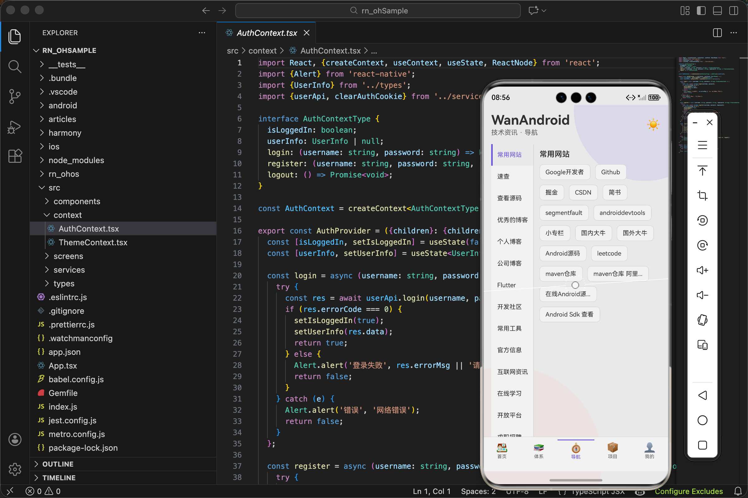
做导航页面的时候遇到一个问题:左边是分类列表,右边是对应的内容,两边要能独立滚动。这种布局在电商 App 的商品分类页很常见,京东、淘宝都是这个套路。
一开始我想得很简单,两个 ScrollView 并排放不就行了?结果发现没那么简单。
第一个坑:两个 ScrollView 怎么并排
React Native 的默认布局是纵向排列,子元素从上到下。要让两个元素左右并排,需要设置 flexDirection: 'row'。
<View style={styles.container}>
  <View style={styles.leftPanel}>
    <ScrollView>{/* 左侧内容 */}</ScrollView>
  </View>
  <View style={styles.rightPanel}>
    <ScrollView>{/* 右侧内容 */}</ScrollView>
  </View>
</View>

const styles = StyleSheet.create({
  container: {
    flex: 1,
    flexDirection: 'row',
  },
});
flexDirection: 'row' 让子元素横向排列。flex: 1 让容器撑满整个屏幕。
第二个坑:左侧宽度怎么定
左侧是分类列表,宽度应该固定。右侧是内容区,宽度应该自适应。
const NAV_LEFT_WIDTH = 90;

const styles = StyleSheet.create({
  leftPanel: {
    width: NAV_LEFT_WIDTH,
    borderRightWidth: 1,
  },
  rightPanel: {
    flex: 1,
    paddingHorizontal: 12,
    paddingTop: 12,
  },
});
左侧用固定宽度 width: 90,右侧用 flex: 1 占据剩余空间。
为什么左侧是 90 像素?试出来的。太窄了文字显示不全,太宽了右侧空间不够。90 刚好能显示 4-5 个汉字,大多数分类名都能放下。
borderRightWidth: 1 加一条分割线,让左右两边有明确的边界。
第三个坑:选中状态怎么表示
左侧列表需要高亮当前选中的分类。我用了左边框 + 背景色的组合:
<TouchableOpacity
  style={[
    styles.navItem,
    selectedNav?.cid === item.cid && {
      backgroundColor: theme.bg,
      borderLeftColor: theme.accent,
      borderLeftWidth: 3
    },
  ]}
  onPress={() => setSelectedNav(item)}
>
  <Text
    style={[
      styles.navItemText,
      {color: selectedNav?.cid === item.cid ? theme.accent : theme.text}
    ]}
    numberOfLines={2}
  >
    {item.name}
  </Text>
</TouchableOpacity>
选中时:
- 背景色变成页面背景色
theme.bg,和右侧内容区融为一体 - 左边框变成紫色
theme.accent,3 像素宽 - 文字颜色也变成紫色
未选中时:
- 背景色是卡片色
theme.card - 左边框透明(通过默认样式设置)
- 文字是普通颜色
这种设计让选中项看起来像是"凸出来"的,和右侧内容连成一片。
默认样式里要设置透明的左边框,否则选中和未选中时宽度会变化,导致文字跳动:
navItem: {
  paddingVertical: 14,
  paddingHorizontal: 10,
  borderLeftWidth: 3,
  borderLeftColor: 'transparent',
},
第四个坑:右侧内容怎么布局
右侧不是普通的列表,而是标签云。每个标签宽度不固定,要自动换行。
<View style={styles.tagsWrap}>
  {selectedNav.articles.map(article => (
    <TouchableOpacity
      key={article.id}
      style={[styles.tag, {backgroundColor: theme.card, borderColor: theme.border}]}
      onPress={() => openLink(article.link)}
    >
      <Text style={[styles.tagText, {color: theme.text}]} numberOfLines={1}>
        {article.title}
      </Text>
    </TouchableOpacity>
  ))}
</View>
关键是 tagsWrap 的样式:
tagsWrap: {
  flexDirection: 'row',
  flexWrap: 'wrap',
  gap: 10,
},
flexDirection: 'row' 让标签横向排列。
flexWrap: 'wrap' 是关键,允许换行。没有这个属性,标签会挤在一行,超出屏幕。
gap: 10 设置标签之间的间距,比用 margin 更简洁。
第五个坑:标签宽度怎么限制
标签的文字长度不一,有的很短,有的很长。如果不限制宽度,长标签会撑满整行,很丑。
const {width} = Dimensions.get('window');
const NAV_LEFT_WIDTH = 90;

tag: {
  paddingHorizontal: 12,
  paddingVertical: 8,
  borderRadius: 8,
  borderWidth: 1,
  maxWidth: (width - NAV_LEFT_WIDTH - 24 - 10) / 2,
},
maxWidth 限制标签最大宽度。计算方式:
width是屏幕宽度- 减去左侧面板宽度
NAV_LEFT_WIDTH(90) - 减去右侧的左右 padding(12 * 2 = 24)
- 减去标签之间的 gap(10)
- 除以 2,让每行最多放两个标签
这样即使标签文字很长,也不会超过半行宽度,超出部分用省略号显示(numberOfLines={1})。
数据结构
导航页面的数据结构和体系页面不同:
export interface NavItem {
  cid: number;
  name: string;
  articles: Article[];
}
每个导航分类直接包含文章数组,不需要再请求。这是 WanAndroid API 的设计,导航数据一次性返回所有内容。
好处是切换分类时不需要网络请求,响应很快。坏处是首次加载数据量大,如果分类很多、每个分类文章很多,可能会慢。
数据加载
const [navData, setNavData] = useState<NavItem[]>([]);
const [selectedNav, setSelectedNav] = useState<NavItem | null>(null);

useEffect(() => {
  loadNavData();
}, []);

const loadNavData = async () => {
  try {
    const res = await navApi.getNav();
    if (res.errorCode === 0) {
      setNavData(res.data);
      if (res.data.length > 0) {
        setSelectedNav(res.data[0]);
      }
    }
  } catch (e) {}
};
只需要一次请求,拿到所有数据。自动选中第一个分类,用户一进来就能看到内容。
切换分类时只需要更新 selectedNav,不需要网络请求:
onPress={() => setSelectedNav(item)}
点击标签打开链接
const openLink = (url: string) => {
  Linking.openURL(url).catch(() => Alert.alert('错误', '无法打开链接'));
};

<TouchableOpacity onPress={() => openLink(article.link)}>
  {/* ... */}
</TouchableOpacity>
点击标签用系统浏览器打开文章链接。和文章卡片的处理方式一样。
空状态
{selectedNav ? (
  <>
    <Text style={[styles.sectionTitle, {color: theme.text}]}>{selectedNav.name}</Text>
    <View style={styles.tagsWrap}>
      {/* 标签列表 */}
    </View>
  </>
) : (
  <View style={styles.empty}>
    <Text style={[styles.emptyText, {color: theme.subText}]}>请选择导航分类</Text>
  </View>
)}
如果没有选中任何分类,显示提示文字。正常情况下不会出现,因为加载完数据就自动选中第一个了。但代码要考虑边界情况。
完整代码
import React, {useState, useEffect} from 'react';
import {View, Text, ScrollView, TouchableOpacity, StyleSheet, Linking, Alert, Dimensions} from 'react-native';
import {NavItem} from '../types';
import {navApi} from '../services/api';
import {useTheme} from '../context/ThemeContext';

const {width} = Dimensions.get('window');
const NAV_LEFT_WIDTH = 90;

export const NavPage = () => {
  const {theme} = useTheme();
  const [navData, setNavData] = useState<NavItem[]>([]);
  const [selectedNav, setSelectedNav] = useState<NavItem | null>(null);

  useEffect(() => {
    loadNavData();
  }, []);

  const loadNavData = async () => {
    try {
      const res = await navApi.getNav();
      if (res.errorCode === 0) {
        setNavData(res.data);
        if (res.data.length > 0) {
          setSelectedNav(res.data[0]);
        }
      }
    } catch (e) {}
  };

  const openLink = (url: string) => {
    Linking.openURL(url).catch(() => Alert.alert('错误', '无法打开链接'));
  };

  return (
    <View style={styles.container}>
      <View style={[styles.leftPanel, {backgroundColor: theme.card, borderRightColor: theme.border}]}>
        <ScrollView showsVerticalScrollIndicator={false}>
          {navData.map(item => (
            <TouchableOpacity
              key={item.cid}
              style={[
                styles.navItem,
                selectedNav?.cid === item.cid && {backgroundColor: theme.bg, borderLeftColor: theme.accent, borderLeftWidth: 3},
              ]}
              onPress={() => setSelectedNav(item)}
            >
              <Text
                style={[styles.navItemText, {color: selectedNav?.cid === item.cid ? theme.accent : theme.text}]}
                numberOfLines={2}
              >
                {item.name}
              </Text>
            </TouchableOpacity>
          ))}
        </ScrollView>
      </View>

      <View style={styles.rightPanel}>
        <ScrollView showsVerticalScrollIndicator={false} contentContainerStyle={styles.tagsContainer}>
          {selectedNav ? (
            <>
              <Text style={[styles.sectionTitle, {color: theme.text}]}>{selectedNav.name}</Text>
              <View style={styles.tagsWrap}>
                {selectedNav.articles.map(article => (
                  <TouchableOpacity
                    key={article.id}
                    style={[styles.tag, {backgroundColor: theme.card, borderColor: theme.border}]}
                    onPress={() => openLink(article.link)}
                  >
                    <Text style={[styles.tagText, {color: theme.text}]} numberOfLines={1}>
                      {article.title}
                    </Text>
                  </TouchableOpacity>
                ))}
              </View>
            </>
          ) : (
            <View style={styles.empty}>
              <Text style={[styles.emptyText, {color: theme.subText}]}>请选择导航分类</Text>
            </View>
          )}
        </ScrollView>
      </View>
    </View>
  );
};

const styles = StyleSheet.create({
  container: {flex: 1, flexDirection: 'row'},
  leftPanel: {width: NAV_LEFT_WIDTH, borderRightWidth: 1},
  navItem: {paddingVertical: 14, paddingHorizontal: 10, borderLeftWidth: 3, borderLeftColor: 'transparent'},
  navItemText: {fontSize: 13, lineHeight: 18},
  rightPanel: {flex: 1, paddingHorizontal: 12, paddingTop: 12},
  tagsContainer: {paddingBottom: 100},
  sectionTitle: {fontSize: 16, fontWeight: '600', marginBottom: 12},
  tagsWrap: {flexDirection: 'row', flexWrap: 'wrap', gap: 10},
  tag: {paddingHorizontal: 12, paddingVertical: 8, borderRadius: 8, borderWidth: 1, maxWidth: (width - NAV_LEFT_WIDTH - 24 - 10) / 2},
  tagText: {fontSize: 13},
  empty: {flex: 1, justifyContent: 'center', alignItems: 'center', paddingVertical: 60},
  emptyText: {fontSize: 14},
});
第六个坑:左右两边独立滚动
左侧分类列表可能很长,右侧标签也可能很多,两边都需要能滚动。关键是两边要独立滚动,滑动左边不影响右边。
<View style={styles.container}>
  <View style={styles.leftPanel}>
    <ScrollView showsVerticalScrollIndicator={false}>
      {/* 左侧内容 */}
    </ScrollView>
  </View>
  <View style={styles.rightPanel}>
    <ScrollView showsVerticalScrollIndicator={false} contentContainerStyle={styles.tagsContainer}>
      {/* 右侧内容 */}
    </ScrollView>
  </View>
</View>
每个面板里都有自己的 ScrollView,它们是独立的。滑动左边的 ScrollView,只有左边的内容会动;滑动右边的 ScrollView,只有右边的内容会动。
showsVerticalScrollIndicator={false} 隐藏滚动条。左侧面板比较窄,滚动条会占空间,而且不好看。
右侧的 contentContainerStyle={styles.tagsContainer} 设置了 paddingBottom: 100,给底部留白,避免最后的标签被 Tab 栏遮挡。
第七个坑:Dimensions 获取屏幕尺寸
计算标签最大宽度时需要知道屏幕宽度:
import {Dimensions} from 'react-native';

const {width} = Dimensions.get('window');
Dimensions.get('window') 返回屏幕的宽高。这里只用了宽度。
有个问题:如果用户旋转屏幕,宽度会变,但这个值不会自动更新。对于我们这个 App,不支持横屏,所以没关系。如果要支持横屏,需要监听 Dimensions 的变化事件。
第八个坑:分类名太长怎么办
有些分类名可能很长,比如"跨平台开发框架"。左侧面板只有 90 像素宽,显示不下。
<Text
  style={[styles.navItemText, {color: selectedNav?.cid === item.cid ? theme.accent : theme.text}]}
  numberOfLines={2}
>
  {item.name}
</Text>
numberOfLines={2} 允许最多显示两行。如果两行还显示不下,会用省略号截断。
样式里设置了 lineHeight: 18,两行就是 36 像素高。加上 paddingVertical: 14(上下各 14),每个分类项总高度是 36 + 28 = 64 像素左右。
第九个坑:右侧标题的显示
右侧顶部显示当前选中分类的名称:
<Text style={[styles.sectionTitle, {color: theme.text}]}>{selectedNav.name}</Text>
样式:
sectionTitle: {
  fontSize: 16,
  fontWeight: '600',
  marginBottom: 12,
},
字号比标签大一点,加粗,和下面的标签形成层次。marginBottom: 12 和标签保持距离。
这个标题的作用是确认当前在哪个分类。虽然左侧已经有高亮了,但右侧再显示一次,用户不用左右看,更方便。
第十个坑:主题适配
整个页面都用了主题色:
const {theme} = useTheme();

// 左侧面板
{backgroundColor: theme.card, borderRightColor: theme.border}

// 选中状态
{backgroundColor: theme.bg, borderLeftColor: theme.accent}

// 文字颜色
{color: selectedNav?.cid === item.cid ? theme.accent : theme.text}

// 标签
{backgroundColor: theme.card, borderColor: theme.border}
深色模式和浅色模式下,这些颜色会自动切换。组件不需要关心当前是什么模式,只管用 theme.xxx。
选中项的背景色用 theme.bg(页面背景色)而不是 theme.card(卡片背景色),是为了让选中项和右侧内容区"融为一体"。视觉上,选中的分类像是从左侧"延伸"到了右侧。
和体系页面的对比
体系页面用的是上下布局:一级分类在上,二级分类在中,文章列表在下。
导航页面用的是左右布局:分类在左,内容在右。
为什么不同?因为数据结构不同。
体系页面是两级分类,每级都有很多选项,横向滚动更合适。
导航页面是一级分类,但每个分类下有很多文章链接,用标签云展示更直观。左右布局能同时看到分类和内容,切换更方便。
性能考虑
导航页面的数据是一次性加载的,所有分类和文章都在内存里。如果数据量很大,可能会有性能问题。
但 WanAndroid 的导航数据不多,几十个分类,每个分类几十篇文章,总共也就几百条数据。现代手机处理这点数据毫无压力。
如果数据量真的很大,可以考虑:
- 左侧用 FlatList 代替 ScrollView,实现虚拟化
- 右侧的标签也用 FlatList
- 或者改成按需加载,切换分类时再请求数据
但对于当前的数据量,没必要过度优化。
踩过的坑总结
- 左右布局要用
flexDirection: 'row' - 固定宽度和自适应宽度配合使用
- 选中状态的边框要预留空间,避免跳动
- 标签云用
flexWrap: 'wrap'实现自动换行 - 标签宽度要限制,避免撑满整行
- 两边独立滚动,各自有 ScrollView
- 分类名太长用 numberOfLines 限制
- 主题色要统一使用,方便深浅模式切换
这些坑踩过一次就记住了。下次再做类似布局,直接套用就行。
欢迎加入开源鸿蒙跨平台社区:https://openharmonycrossplatform.csdn.net

开源鸿蒙跨平台开发社区汇聚开发者与厂商,共建“一次开发,多端部署”的开源生态,致力于降低跨端开发门槛,推动万物智联创新。
更多推荐

 7
7 0
0- 0


 已为社区贡献27条内容

所有评论(0)