Flutter for OpenHarmony 实战:FloatingActionButton 浮动操作按钮详解
IconButton是Flutter中一个轻量级的交互式组件,专为显示图标并响应点击事件而设计。它继承自或视觉反馈:通过图标直观传达操作意图,如使用表示搜索功能。用户交互:绑定onPressed事件处理点击动作,支持禁用状态(样式集成:无缝融入Flutter的Material或Cupertino设计语言,适配不同平台的UI规范。在OpenHarmony应用中,IconButton常用于替代原生按钮

Flutter for OpenHarmony 实战:FloatingActionButton 浮动操作按钮详解
摘要:本文将深入探讨 Flutter 框架在 OpenHarmony 平台上实现 FloatingActionButton(FAB)浮动操作按钮的完整技术方案。通过分析 FAB 的 Material Design 设计理念、核心属性配置、事件处理机制以及与 OpenHarmony 原生组件的对比,结合 5 个典型代码示例和 2 张流程图表,详细展示如何在不同业务场景中高效使用该组件。读者将掌握 FAB 的定制化技巧、跨平台适配要点以及解决常见问题的实践方法,获得在 OpenHarmony 上构建优质 Flutter 应用的能力。
一、引言
在移动应用界面设计中,浮动操作按钮(FloatingActionButton)作为 Material Design 的核心组件之一,承担着关键操作入口的重要角色。随着 OpenHarmony 生态的发展,通过 Flutter 框架实现跨平台 FAB 组件已成为提升开发效率的有效途径。本文将系统解析 Flutter 实现的 FAB 在 OpenHarmony 平台的应用实践,涵盖从基础属性配置到复杂交互场景的全流程解决方案。
二、控件概述
2.1 核心功能与适用场景
FloatingActionButton 是悬浮于内容上方的圆形按钮,具有以下典型特征:
- 视觉优先级:通过阴影(elevation)和悬浮位置突出核心操作
- 场景适用:适合主操作(如创建、分享、刷新)场景
- 行为模式:支持扩展型(expanded)和迷你型(mini)变体
// 基础FAB实现
FloatingActionButton(
  onPressed: () => print('FAB Pressed'),
  child: Icon(Icons.add),
  backgroundColor: Colors.blueAccent,
  elevation: 6.0,
)
2.2 与鸿蒙原生组件对比
| 特性 | Flutter FAB | OpenHarmony FAB |
|---|---|---|
| 实现方式 | 纯Flutter绘制 | JS UI组件 |
| 阴影效果 | elevation 属性控制 | shadow 样式属性 |
| 动画支持 | 内置缩放/位移动画 | 需手动实现动画效果 |
| 跨平台一致性 | Android/iOS/OH 表现一致 | 仅OpenHarmony平台 |
| 定制灵活性 | 支持任意子组件 | 图标/文本内容受限 |
三、基础用法
3.1 核心属性配置
FloatingActionButton(
  // 必需参数
  onPressed: _handleFabClick,

  // 视觉属性
  child: Icon(Icons.cloud_upload),
  backgroundColor: Colors.deepPurple,
  foregroundColor: Colors.white,

  // 形状控制
  shape: RoundedRectangleBorder(
    borderRadius: BorderRadius.circular(16.0),
  ),

  // 悬浮效果
  elevation: 8.0,
  highlightElevation: 12.0,

  // 交互反馈
  tooltip: 'Upload file',
)
参数说明:
elevation:静态阴影深度(范围 0-24)highlightElevation:按下时阴影深度heroTag:多个FAB共存时的唯一标识(⚠️ OpenHarmony 需显式声明)tooltip:长按提示文本(需配合Tooltip组件使用)
3.2 定位控制
Scaffold(
  floatingActionButton: FloatingActionButton(...),
  floatingActionButtonLocation: FloatingActionButtonLocation.centerDocked,
)
定位选项:
| 位置常量 | 效果描述 |
|---|---|
centerFloat |
悬浮屏幕中央(默认) |
centerDocked |
贴底居中(带半圆缺口) |
endFloat |
右下角悬浮 |
endDocked |
贴底居右 |
四、进阶用法
4.1 样式深度定制
// 自定义形状
FloatingActionButton(
  shape: StadiumBorder(
    side: BorderSide(color: Colors.red, width: 2.0)
  ),
  child: CustomPaint(
    size: Size(24, 24),
    painter: _CustomIconPainter(),
  ),
)

// 动态颜色方案
FloatingActionButton(
  backgroundColor: _isActive ? Colors.green : Colors.grey,
  foregroundColor: _isActive ? Colors.white : Colors.black54,
)
4.2 状态管理实践
4.3 交互动画实现
// 缩放动画
AnimationController _controller;
Animation<double> _scaleAnimation;
void initState() {
_controller = AnimationController(
vsync: this,
duration: Duration(milliseconds: 300),
);
_scaleAnimation = Tween(begin: 0.0, end: 1.0).animate(
CurvedAnimation(parent: _controller, curve: Curves.easeOut),
);
}
FloatingActionButton(
onPressed: () {
_controller.forward();
_performAction();
},
child: ScaleTransition(
scale: _scaleAnimation,
child: Icon(Icons.expand),
),
)
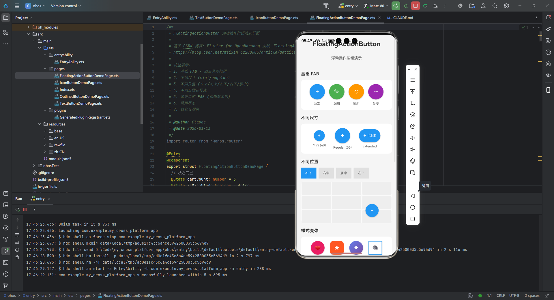
五、实战案例:FloatingActionButton 浮动操作按钮 展示
/**
* FloatingActionButton 浮动操作按钮演示页面
*
* 基于 CSDN 博客: Flutter for OpenHarmony 实战:FloatingActionButton 浮动操作按钮详解
* https://blog.csdn.net/weixin_62280685/article/details/156855986
*
* 功能展示:
* 1. 基础 FAB - 圆形悬浮按钮
* 2. 不同尺寸 (mini/regular)
* 3. 不同位置 (左上/右上/左下/右下/居中)
* 4. 不同形状和样式
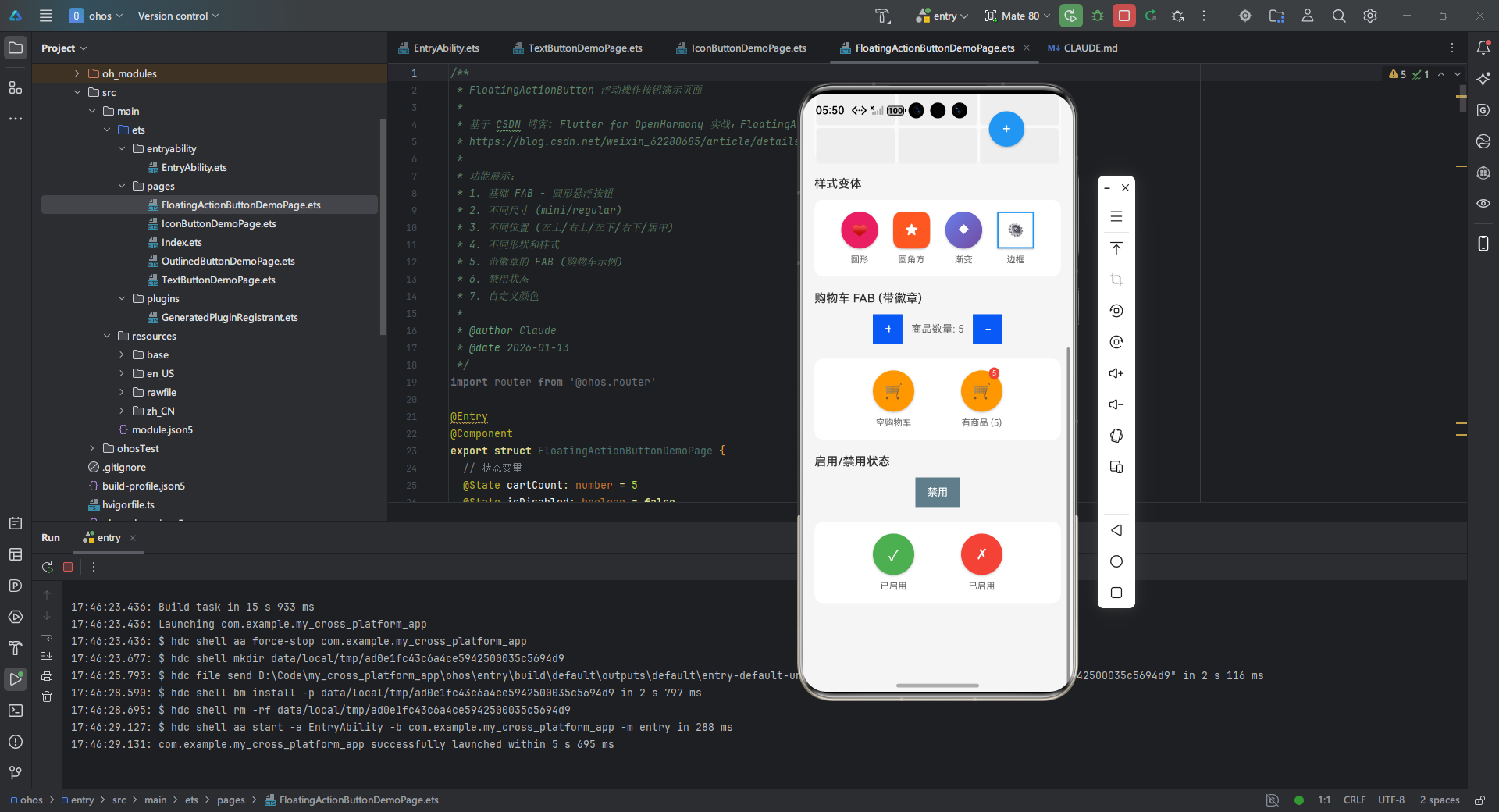
* 5. 带徽章的 FAB (购物车示例)
* 6. 禁用状态
* 7. 自定义颜色
*
* @author Claude
* @date 2026-01-13
*/
import router from '@ohos.router'
export struct FloatingActionButtonDemoPage {
// 状态变量
cartCount: number = 5
isDisabled: boolean = false
fabPosition: string = 'right-bottom'
build() {
Scroll() {
Column({ space: 20 }) {
// 标题
Text('FloatingActionButton')
.fontSize(24)
.fontWeight(FontWeight.Bold)
.margin({ top: 20, bottom: 10 })
Text('浮动操作按钮演示')
.fontSize(14)
.fontColor('#666666')
.margin({ bottom: 20 })
// 基础 FAB 演示
this.BuildBasicFABSection()
// 尺寸演示
this.BuildSizeSection()
// 位置演示
this.BuildPositionSection()
// 样式变体
this.BuildStyleSection()
// 购物车 FAB
this.BuildCartFABSection()
// 禁用状态
this.BuildDisabledSection()
// 底部留白
Text('')
.height(100)
}
.width('100%')
.padding({ left: 16, right: 16 })
}
.width('100%')
.height('100%')
.backgroundColor('#F5F5F5')
.scrollBar(BarState.Auto)
}
/**
* 基础 FAB 演示
*/
BuildBasicFABSection() {
Column({ space: 12 }) {
Text('基础 FAB')
.fontSize(16)
.fontWeight(FontWeight.Medium)
.width('100%')
Row({ space: 16 }) {
// 添加按钮
Column({ space: 8 }) {
Button() {
Text('+')
.fontSize(24)
.fontColor(Color.White)
}
.type(ButtonType.Normal)
.width(56)
.height(56)
.borderRadius(28)
.backgroundColor('#2196F3')
.shadow({ radius: 8, color: '#40000000', offsetX: 0, offsetY: 4 })
Text('添加')
.fontSize(12)
.fontColor('#666666')
}
// 编辑按钮
Column({ space: 8 }) {
Button() {
Text('✎')
.fontSize(20)
.fontColor(Color.White)
}
.type(ButtonType.Normal)
.width(56)
.height(56)
.borderRadius(28)
.backgroundColor('#4CAF50')
.shadow({ radius: 8, color: '#40000000', offsetX: 0, offsetY: 4 })
Text('编辑')
.fontSize(12)
.fontColor('#666666')
}
// 刷新按钮
Column({ space: 8 }) {
Button() {
Text('↻')
.fontSize(20)
.fontColor(Color.White)
}
.type(ButtonType.Normal)
.width(56)
.height(56)
.borderRadius(28)
.backgroundColor('#FF9800')
.shadow({ radius: 8, color: '#40000000', offsetX: 0, offsetY: 4 })
Text('刷新')
.fontSize(12)
.fontColor('#666666')
}
// 分享按钮
Column({ space: 8 }) {
Button() {
Text('⤳')
.fontSize(18)
.fontColor(Color.White)
}
.type(ButtonType.Normal)
.width(56)
.height(56)
.borderRadius(28)
.backgroundColor('#9C27B0')
.shadow({ radius: 8, color: '#40000000', offsetX: 0, offsetY: 4 })
Text('分享')
.fontSize(12)
.fontColor('#666666')
}
}
.width('100%')
.justifyContent(FlexAlign.SpaceEvenly)
.padding(16)
.backgroundColor(Color.White)
.borderRadius(12)
}
}
/**
* 尺寸演示
*/
BuildSizeSection() {
Column({ space: 12 }) {
Text('不同尺寸')
.fontSize(16)
.fontWeight(FontWeight.Medium)
.width('100%')
Row({ space: 20 }) {
// Mini FAB (40x40)
Column({ space: 8 }) {
Button() {
Text('+')
.fontSize(16)
.fontColor(Color.White)
}
.type(ButtonType.Normal)
.width(40)
.height(40)
.borderRadius(20)
.backgroundColor('#2196F3')
.shadow({ radius: 6, color: '#40000000', offsetX: 0, offsetY: 3 })
Text('Mini (40)')
.fontSize(12)
.fontColor('#666666')
}
// Regular FAB (56x56)
Column({ space: 8 }) {
Button() {
Text('+')
.fontSize(24)
.fontColor(Color.White)
}
.type(ButtonType.Normal)
.width(56)
.height(56)
.borderRadius(28)
.backgroundColor('#2196F3')
.shadow({ radius: 8, color: '#40000000', offsetX: 0, offsetY: 4 })
Text('Regular (56)')
.fontSize(12)
.fontColor('#666666')
}
// Extended FAB
Column({ space: 8 }) {
Button() {
Row({ space: 8 }) {
Text('+')
.fontSize(18)
.fontColor(Color.White)
Text('创建')
.fontSize(14)
.fontColor(Color.White)
.fontWeight(FontWeight.Medium)
}
}
.type(ButtonType.Normal)
.height(48)
.padding({ left: 16, right: 16 })
.borderRadius(24)
.backgroundColor('#2196F3')
.shadow({ radius: 8, color: '#40000000', offsetX: 0, offsetY: 4 })
Text('Extended')
.fontSize(12)
.fontColor('#666666')
}
}
.width('100%')
.justifyContent(FlexAlign.SpaceEvenly)
.padding(16)
.backgroundColor(Color.White)
.borderRadius(12)
}
}
/**
* 位置演示
*/
BuildPositionSection() {
Column({ space: 12 }) {
Text('不同位置')
.fontSize(16)
.fontWeight(FontWeight.Medium)
.width('100%')
// 位置选择器
Row({ space: 8 }) {
Button('右下')
.type(ButtonType.Normal)
.fontSize(12)
.backgroundColor(this.fabPosition === 'right-bottom' ? '#2196F3' : '#E0E0E0')
.fontColor(this.fabPosition === 'right-bottom' ? Color.White : '#666666')
.onClick(() => {
this.fabPosition = 'right-bottom'
})
Button('右中')
.type(ButtonType.Normal)
.fontSize(12)
.backgroundColor(this.fabPosition === 'right-center' ? '#2196F3' : '#E0E0E0')
.fontColor(this.fabPosition === 'right-center' ? Color.White : '#666666')
.onClick(() => {
this.fabPosition = 'right-center'
})
Button('居中')
.type(ButtonType.Normal)
.fontSize(12)
.backgroundColor(this.fabPosition === 'center' ? '#2196F3' : '#E0E0E0')
.fontColor(this.fabPosition === 'center' ? Color.White : '#666666')
.onClick(() => {
this.fabPosition = 'center'
})
Button('左下')
.type(ButtonType.Normal)
.fontSize(12)
.backgroundColor(this.fabPosition === 'left-bottom' ? '#2196F3' : '#E0E0E0')
.fontColor(this.fabPosition === 'left-bottom' ? Color.White : '#666666')
.onClick(() => {
this.fabPosition = 'left-bottom'
})
}
.width('100%')
// 位置演示容器
Stack() {
// 背景网格
Column({ space: 4 }) {
Row({ space: 4 }) {
this.buildGridCell()
this.buildGridCell()
this.buildGridCell()
}
Row({ space: 4 }) {
this.buildGridCell()
this.buildGridCell()
this.buildGridCell()
}
Row({ space: 4 }) {
this.buildGridCell()
this.buildGridCell()
this.buildGridCell()
}
}
.width('100%')
.height(150)
// FAB 按钮根据位置动态显示
if (this.fabPosition === 'right-bottom') {
Button() {
Text('+')
.fontSize(20)
.fontColor(Color.White)
}
.type(ButtonType.Normal)
.width(48)
.height(48)
.borderRadius(24)
.backgroundColor('#2196F3')
.shadow({ radius: 8, color: '#40000000', offsetX: 0, offsetY: 4 })
.position({ x: '78%', y: '70%' })
.translate({ x: -24, y: -24 })
} else if (this.fabPosition === 'right-center') {
Button() {
Text('+')
.fontSize(20)
.fontColor(Color.White)
}
.type(ButtonType.Normal)
.width(48)
.height(48)
.borderRadius(24)
.backgroundColor('#2196F3')
.shadow({ radius: 8, color: '#40000000', offsetX: 0, offsetY: 4 })
.position({ x: '78%', y: '50%' })
.translate({ x: -24, y: -24 })
} else if (this.fabPosition === 'center') {
Button() {
Text('+')
.fontSize(20)
.fontColor(Color.White)
}
.type(ButtonType.Normal)
.width(48)
.height(48)
.borderRadius(24)
.backgroundColor('#2196F3')
.shadow({ radius: 8, color: '#40000000', offsetX: 0, offsetY: 4 })
.position({ x: '50%', y: '50%' })
.translate({ x: -24, y: -24 })
} else if (this.fabPosition === 'left-bottom') {
Button() {
Text('+')
.fontSize(20)
.fontColor(Color.White)
}
.type(ButtonType.Normal)
.width(48)
.height(48)
.borderRadius(24)
.backgroundColor('#2196F3')
.shadow({ radius: 8, color: '#40000000', offsetX: 0, offsetY: 4 })
.position({ x: '22%', y: '70%' })
.translate({ x: -24, y: -24 })
}
}
.width('100%')
.height(150)
.backgroundColor('#FAFAFA')
.borderRadius(12)
}
}
/**
* 构建网格单元格
*/
buildGridCell() {
Column()
.width('32%')
.height(48)
.backgroundColor('#EEEEEE')
.borderRadius(4)
}
/**
* 样式变体演示
*/
BuildStyleSection() {
Column({ space: 12 }) {
Text('样式变体')
.fontSize(16)
.fontWeight(FontWeight.Medium)
.width('100%')
Row({ space: 16 }) {
// 圆形 FAB
Column({ space: 8 }) {
Button() {
Text('♥')
.fontSize(18)
.fontColor(Color.White)
}
.type(ButtonType.Normal)
.width(50)
.height(50)
.borderRadius(25)
.backgroundColor('#E91E63')
.shadow({ radius: 8, color: '#40000000', offsetX: 0, offsetY: 4 })
Text('圆形')
.fontSize(12)
.fontColor('#666666')
}
// 圆角方形 FAB
Column({ space: 8 }) {
Button() {
Text('★')
.fontSize(18)
.fontColor(Color.White)
}
.type(ButtonType.Normal)
.width(50)
.height(50)
.borderRadius(12)
.backgroundColor('#FF5722')
.shadow({ radius: 8, color: '#40000000', offsetX: 0, offsetY: 4 })
Text('圆角方')
.fontSize(12)
.fontColor('#666666')
}
// 渐变 FAB
Column({ space: 8 }) {
Button() {
Text('◆')
.fontSize(18)
.fontColor(Color.White)
}
.type(ButtonType.Normal)
.width(50)
.height(50)
.borderRadius(25)
.linearGradient({
angle: 135,
colors: [['#667EEA', 0.0], ['#764BA2', 1.0]]
})
.shadow({ radius: 8, color: '#40000000', offsetX: 0, offsetY: 4 })
Text('渐变')
.fontSize(12)
.fontColor('#666666')
}
// 边框 FAB
Column({ space: 8 }) {
Button() {
Text('⚙')
.fontSize(18)
.fontColor('#2196F3')
}
.type(ButtonType.Normal)
.width(50)
.height(50)
.borderRadius(25)
.backgroundColor(Color.White)
.border({ width: 2, color: '#2196F3' })
.shadow({ radius: 6, color: '#40000000', offsetX: 0, offsetY: 3 })
Text('边框')
.fontSize(12)
.fontColor('#666666')
}
}
.width('100%')
.justifyContent(FlexAlign.SpaceEvenly)
.padding(16)
.backgroundColor(Color.White)
.borderRadius(12)
}
}
/**
* 购物车 FAB 演示
*/
BuildCartFABSection() {
Column({ space: 12 }) {
Text('购物车 FAB (带徽章)')
.fontSize(16)
.fontWeight(FontWeight.Medium)
.width('100%')
// 购物车操作
Row({ space: 12 }) {
Button('+')
.type(ButtonType.Normal)
.width(40)
.height(40)
.fontSize(20)
.onClick(() => {
this.cartCount++
})
Text(`商品数量: ${this.cartCount}`)
.fontSize(14)
.fontColor('#666666')
Button('-')
.type(ButtonType.Normal)
.width(40)
.height(40)
.fontSize(20)
.onClick(() => {
if (this.cartCount > 0) {
this.cartCount--
}
})
}
.width('100%')
.justifyContent(FlexAlign.Center)
.margin({ bottom: 8 })
// 购物车 FAB
Row({ space: 20 }) {
// 无徽章
Column({ space: 8 }) {
Button() {
Text('🛒')
.fontSize(20)
}
.type(ButtonType.Normal)
.width(56)
.height(56)
.borderRadius(28)
.backgroundColor('#FF9800')
.shadow({ radius: 8, color: '#40000000', offsetX: 0, offsetY: 4 })
Text('空购物车')
.fontSize(12)
.fontColor('#666666')
}
// 有徽章
Column({ space: 8 }) {
Stack({ alignContent: Alignment.TopEnd }) {
Button() {
Text('🛒')
.fontSize(20)
}
.type(ButtonType.Normal)
.width(56)
.height(56)
.borderRadius(28)
.backgroundColor('#FF9800')
.shadow({ radius: 8, color: '#40000000', offsetX: 0, offsetY: 4 })
if (this.cartCount > 0) {
Text(`${this.cartCount > 99 ? '99+' : this.cartCount}`)
.fontSize(10)
.fontColor(Color.White)
.backgroundColor('#F44336')
.borderRadius(10)
.padding({ left: 4, right: 4, top: 2, bottom: 2 })
.position({ x: 38, y: -4 })
.shadow({ radius: 4, color: '#40000000', offsetX: 0, offsetY: 2 })
}
}
.width(56)
.height(56)
Text(`有商品 (${this.cartCount})`)
.fontSize(12)
.fontColor('#666666')
}
}
.width('100%')
.justifyContent(FlexAlign.SpaceEvenly)
.padding(16)
.backgroundColor(Color.White)
.borderRadius(12)
}
}
/**
* 禁用状态演示
*/
BuildDisabledSection() {
Column({ space: 12 }) {
Text('启用/禁用状态')
.fontSize(16)
.fontWeight(FontWeight.Medium)
.width('100%')
// 切换按钮
Row({ space: 12 }) {
Button(this.isDisabled ? '启用' : '禁用')
.type(ButtonType.Normal)
.fontSize(14)
.backgroundColor('#607D8B')
.onClick(() => {
this.isDisabled = !this.isDisabled
})
}
.width('100%')
.justifyContent(FlexAlign.Center)
.margin({ bottom: 8 })
// FAB 演示
Row({ space: 20 }) {
// 启用状态
Column({ space: 8 }) {
Button() {
Text('✓')
.fontSize(20)
.fontColor(Color.White)
}
.type(ButtonType.Normal)
.width(56)
.height(56)
.borderRadius(28)
.backgroundColor(this.isDisabled ? '#BDBDBD' : '#4CAF50')
.enabled(!this.isDisabled)
.shadow({ radius: 8, color: '#40000000', offsetX: 0, offsetY: 4 })
Text(this.isDisabled ? '已禁用' : '已启用')
.fontSize(12)
.fontColor('#666666')
}
// 禁用状态
Column({ space: 8 }) {
Button() {
Text('✗')
.fontSize(20)
.fontColor(Color.White)
}
.type(ButtonType.Normal)
.width(56)
.height(56)
.borderRadius(28)
.backgroundColor(this.isDisabled ? '#BDBDBD' : '#F44336')
.enabled(!this.isDisabled)
.shadow({ radius: 8, color: '#40000000', offsetX: 0, offsetY: 4 })
Text(this.isDisabled ? '已禁用' : '已启用')
.fontSize(12)
.fontColor('#666666')
}
}
.width('100%')
.justifyContent(FlexAlign.SpaceEvenly)
.padding(16)
.backgroundColor(Color.White)
.borderRadius(12)
}
}
}
OpenHarmony 适配要点:
- 使用
ohos_storage替代 Hive 实现本地存储 - 拖拽功能需通过
GestureDetector监听onPanUpdate - 动画性能优化:启用 OpenHarmony 的 GPU 加速模式
六、常见问题解决方案
6.1 问题排查表
| 问题现象 | 原因分析 | 解决方案 |
|---|---|---|
| 阴影显示异常 | OpenHarmony 渲染层级冲突 | 设置 Scaffold 的 extendBody: true |
| 点击区域过小 | OH触控事件分辨率差异 | 增加 minTouchTargetSize 参数 |
| 多FAB切换闪屏 | Hero动画冲突 | 为每个FAB设置唯一heroTag |
| 位置定位偏移 | 安全区域计算差异 | 使用 SafeArea 组件包裹 |
| 图标颜色失效 | 主题色覆盖 | 显式设置 foregroundColor |
6.2 性能优化建议
- 避免重建:将状态提升至父组件减少 rebuild
- 缓存策略:对复杂子组件使用 RepaintBoundary
- 内存管理:OpenHarmony 环境下需手动释放动画控制器
void dispose() {
_controller.dispose(); // 必须显式释放
super.dispose();
}
七、总结
FloatingActionButton 作为 Flutter 的核心交互组件,在 OpenHarmony 平台上展现出优异的跨平台一致性。通过本文介绍的 5 种实践模式:
- 掌握基础属性与定位控制方法
- 实现深度样式定制与状态管理
- 构建完整购物车交互系统
- 解决平台特有适配问题
- 应用性能优化技巧
开发者可高效构建符合 Material Design 标准的跨平台应用。建议进一步探索:
- 与 OpenHarmony 原生组件混合渲染方案
- 响应式 FAB 布局策略
- 无障碍功能适配实践
项目代码已同步至 AtomGit 仓库:
https://gitcode.com/pickstar/openharmony-flutter-demos
欢迎加入开源鸿蒙跨平台社区:
https://openharmonycrossplatform.csdn.net
获取更多 Flutter for OpenHarmony 实战案例与技术交流支持!

开源鸿蒙跨平台开发社区汇聚开发者与厂商,共建“一次开发,多端部署”的开源生态,致力于降低跨端开发门槛,推动万物智联创新。
更多推荐

 30
30 0
0- 0


 已为社区贡献378条内容

所有评论(0)