React Native for OpenHarmony 实战:Steam 资讯 App 设置页面
本文介绍了如何实现一个功能完整的App设置页面,包括主题切换、语言选择和通知设置等核心功能。文章重点讲解了全局状态管理方案,通过定义AppState接口存储用户设置,并使用动态键名更新函数实现灵活配置。在UI实现方面,详细展示了主题切换按钮组、语言选项列表和通知开关组件的代码实现,强调使用条件样式和状态绑定来提升用户体验。此外,文章还提供了设置项分组的设计思路,通过ScrollView和分组标题使
案例开源地址:https://atomgit.com/nutpi/rn_openharmony_steam
设置页面是 App 中最容易被忽视但又很重要的一个功能。用户在这里可以调整 App 的各种参数,比如主题、语言、通知等。这篇文章来实现一个功能完整的设置页面。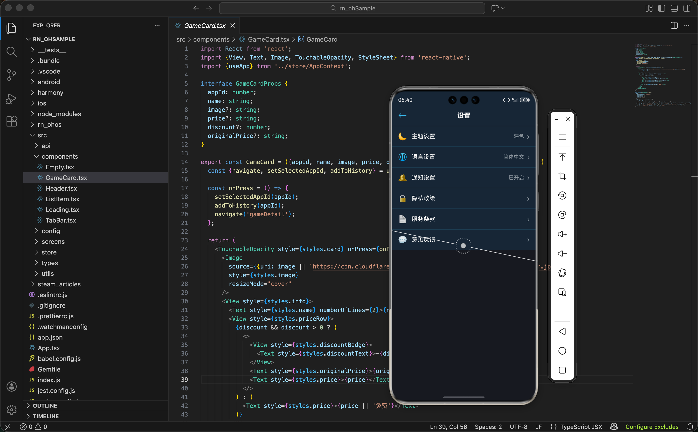
设置数据的全局管理
设置数据需要存储在全局状态中,这样用户的设置才能在整个 App 中生效。先看一下 AppContext 中设置相关的实现。
首先定义设置的类型结构:
interface AppState {
  theme: 'dark' | 'light';
  language: string;
  notifications: boolean;
  // ... 其他状态
}
这个接口定义了几个关键的设置项:
theme- 主题设置,支持深色和浅色两种模式language- 语言设置,用于国际化notifications- 通知开关,控制是否接收通知
然后实现更新设置的函数:
const updateSettings = (key: string, value: any) => {
  setState(prev => ({
    ...prev,
    [key]: value,
  }));
};
这个函数用动态键名来更新设置。这样的设计很灵活,无论添加多少个设置项,都可以用这个函数来更新。
动态更新 - 用
[key]: value这种方式可以动态地更新对象的任意属性。这样就不需要为每个设置项都写一个单独的函数。
设置页面的状态管理
设置页面需要从全局状态中获取当前的设置值,然后提供 UI 让用户修改。先看状态的获取:
export const SettingsScreen = () => {
  const {theme, language, notifications, updateSettings} = useApp();
这里获取了四个东西:
theme- 当前的主题设置language- 当前的语言设置notifications- 当前的通知设置updateSettings- 更新设置的函数
为什么不用本地状态? 设置数据应该存在全局状态中,而不是页面的本地状态。这样用户修改设置后,其他页面能立即看到效果。比如用户在设置页面改了主题,返回首页时首页的主题也会跟着改变。
主题切换功能
主题切换是设置页面最常见的功能。用户可以在深色和浅色主题之间切换。
先看主题切换的 UI:
<View style={styles.settingGroup}>
  <Text style={styles.groupTitle}>外观</Text>
  <View style={styles.settingItem}>
    <Text style={styles.settingLabel}>主题</Text>
    <View style={styles.themeButtons}>
      <TouchableOpacity
        style={[styles.themeBtn, theme === 'dark' && styles.themeBtnActive]}
        onPress={() => updateSettings('theme', 'dark')}
      >
        <Text style={styles.themeBtnText}>🌙 深色</Text>
      </TouchableOpacity>
      <TouchableOpacity
        style={[styles.themeBtn, theme === 'light' && styles.themeBtnActive]}
        onPress={() => updateSettings('theme', 'light')}
      >
        <Text style={styles.themeBtnText}>☀️ 浅色</Text>
      </TouchableOpacity>
    </View>
  </View>
</View>
这里用两个按钮来表示主题选择。关键点:
- 条件样式 -
[styles.themeBtn, theme === 'dark' && styles.themeBtnActive]这种写法可以根据条件应用不同的样式 - 点击处理 - 点击按钮时调用
updateSettings('theme', 'dark')来更新主题 - 视觉反馈 - 当前选中的主题按钮会显示不同的样式,让用户知道当前选择
条件样式 - React Native 中可以用数组来组合多个样式。如果条件为真,就应用额外的样式;如果为假,就忽略。这样可以实现动态样式。
然后看样式部分:
themeButtons: {flexDirection: 'row', gap: 8},
themeBtn: {flex: 1, paddingVertical: 8, paddingHorizontal: 12, backgroundColor: '#2a475e', borderRadius: 6},
themeBtnActive: {backgroundColor: '#66c0f4'},
themeBtnText: {fontSize: 14, color: '#fff', textAlign: 'center'},
- 按钮布局 -
flexDirection: 'row'让两个按钮水平排列,gap: 8让它们之间有 8 的间距 - 活跃状态 - 选中的按钮背景色改为 Steam 蓝
#66c0f4,未选中的是灰色#2a475e - 文字对齐 -
textAlign: 'center'让文字居中显示
语言设置
语言设置用于国际化。用户可以选择不同的语言,App 会根据选择显示对应的文字。
先看语言设置的 UI:
<View style={styles.settingGroup}>
  <Text style={styles.groupTitle}>语言</Text>
  <View style={styles.settingItem}>
    <Text style={styles.settingLabel}>应用语言</Text>
    <View style={styles.languageOptions}>
      {['中文', '英文', '日文'].map(lang => (
        <TouchableOpacity
          key={lang}
          style={[styles.optionBtn, language === lang && styles.optionBtnActive]}
          onPress={() => updateSettings('language', lang)}
        >
          <Text style={styles.optionBtnText}>{lang}</Text>
        </TouchableOpacity>
      ))}
    </View>
  </View>
</View>
这里用 map 遍历语言列表,为每个语言生成一个按钮。这样的设计很灵活,如果要添加新的语言,只需要在数组中添加就行。
可扩展设计 - 用数组 + map 的方式来生成 UI,比硬编码多个按钮要灵活得多。如果要添加新的语言或修改语言列表,只需要改数组就行。
然后看样式:
languageOptions: {flexDirection: 'row', gap: 8, flexWrap: 'wrap'},
optionBtn: {paddingVertical: 6, paddingHorizontal: 12, backgroundColor: '#2a475e', borderRadius: 6},
optionBtnActive: {backgroundColor: '#66c0f4'},
optionBtnText: {fontSize: 12, color: '#fff'},
- 换行 -
flexWrap: 'wrap'让按钮在空间不足时自动换行 - 样式 - 和主题按钮类似,选中的按钮显示蓝色,未选中的显示灰色
通知设置
通知设置用开关来表示,用户可以打开或关闭通知。
先看通知设置的 UI:
<View style={styles.settingGroup}>
  <Text style={styles.groupTitle}>通知</Text>
  <View style={styles.settingItem}>
    <Text style={styles.settingLabel}>接收通知</Text>
    <Switch
      value={notifications}
      onValueChange={(value) => updateSettings('notifications', value)}
      trackColor={{false: '#2a475e', true: '#66c0f4'}}
      thumbColor={notifications ? '#fff' : '#8f98a0'}
    />
  </View>
</View>
这里用 React Native 内置的 Switch 组件来实现开关。关键点:
- 值绑定 -
value={notifications}让开关显示当前的通知设置 - 变化处理 -
onValueChange在用户切换开关时调用,更新全局状态 - 颜色定制 -
trackColor定制轨道颜色,thumbColor定制滑块颜色
Switch 组件 - React Native 的
Switch组件是实现开关的标准方式。它提供了很好的用户体验,用户可以直观地看到开关的状态。
设置分组
为了让设置页面看起来更有组织,我们把相关的设置项分组。先看分组的结构:
<ScrollView style={styles.content}>
  <View style={styles.settingGroup}>
    <Text style={styles.groupTitle}>外观</Text>
    {/* 主题设置 */}
  </View>

  <View style={styles.settingGroup}>
    <Text style={styles.groupTitle}>语言</Text>
    {/* 语言设置 */}
  </View>

  <View style={styles.settingGroup}>
    <Text style={styles.groupTitle}>通知</Text>
    {/* 通知设置 */}
  </View>
</ScrollView>
每个分组都有一个标题,下面是相关的设置项。这样用户可以快速找到想要的设置。
信息组织 - 通过分组来组织设置项,可以让页面看起来更清晰。用户不需要在一长串设置中寻找,而是可以按分类查找。
然后看分组的样式:
settingGroup: {marginBottom: 24, paddingHorizontal: 16},
groupTitle: {fontSize: 14, fontWeight: 'bold', color: '#8f98a0', marginBottom: 12},
settingItem: {flexDirection: 'row', justifyContent: 'space-between', alignItems: 'center', paddingVertical: 12, borderBottomWidth: 1, borderBottomColor: '#2a475e'},
settingLabel: {fontSize: 14, color: '#fff'},
- 分组间距 -
marginBottom: 24让各个分组之间有足够的间距 - 标题样式 - 用灰色和较小的字体来显示分组标题,不抢设置项的风头
- 项目布局 -
flexDirection: 'row'让标签和控件水平排列,justifyContent: 'space-between'让它们分别靠左和靠右
页面的整体结构
设置页面的整体布局分为三层:
return (
  <View style={styles.container}>
    <Header title="设置" showBack />
    <ScrollView style={styles.content}>
      {/* 各个设置分组 */}
    </ScrollView>
    <TabBar />
  </View>
);
页面结构很清晰:
- Header - 顶部导航栏,显示"设置"标题,并开启返回按钮
- ScrollView - 内容区域,包含各个设置分组
- TabBar - 底部导航栏,方便用户切换到其他页面
为什么用 ScrollView? 设置项可能很多,超出屏幕高度。用
ScrollView包裹内容区域,用户可以滚动查看所有设置。
设置的持久化
目前设置数据存储在内存中,应用关闭后会丢失。如果要实现持久化,可以使用 AsyncStorage。
首先导入 AsyncStorage:
import AsyncStorage from '@react-native-async-storage/async-storage';
然后实现保存设置的函数:
const saveSettings = async (settings: any) => {
  try {
    await AsyncStorage.setItem('settings', JSON.stringify(settings));
  } catch (error) {
    console.error('Error saving settings:', error);
  }
};
这个函数的作用:
- 序列化 - 用
JSON.stringify()将设置对象转换成字符串 - 存储 - 用
AsyncStorage.setItem()将字符串存储到本地 - 错误处理 - 用 try-catch 捕获可能的错误
接下来实现加载设置的函数:
const loadSettings = async () => {
  try {
    const data = await AsyncStorage.getItem('settings');
    return data ? JSON.parse(data) : {};
  } catch (error) {
    console.error('Error loading settings:', error);
    return {};
  }
};
这个函数的逻辑:
- 读取数据 - 用
AsyncStorage.getItem()从本地读取数据 - 反序列化 - 用
JSON.parse()将字符串转换回对象 - 兜底处理 - 如果没有数据或出错,返回空对象
集成方式 - 在 AppContext 中,每当设置变化时,调用
saveSettings()保存数据。应用启动时,调用loadSettings()恢复数据。这样用户的设置就能在应用关闭后保留。
设置的实时生效
设置修改后需要立即生效。比如用户改了主题,App 的颜色应该立即改变。这需要在 AppContext 中实现:
useEffect(() => {
  // 当主题改变时,更新 App 的样式
  if (theme === 'dark') {
    // 应用深色主题
  } else {
    // 应用浅色主题
  }
}, [theme]);
通过 useEffect 监听主题的变化,当主题改变时执行相应的操作。
响应式设计 - 通过
useEffect和依赖数组,可以实现设置的实时生效。用户修改设置后,App 会立即响应,提供更好的用户体验。
样式汇总
设置页面的样式采用 Steam 的深色主题。先看容器和基本样式:
const styles = StyleSheet.create({
  container: {flex: 1, backgroundColor: '#171a21'},
  content: {flex: 1, paddingVertical: 16},
  settingGroup: {marginBottom: 24, paddingHorizontal: 16},
  groupTitle: {fontSize: 14, fontWeight: 'bold', color: '#8f98a0', marginBottom: 12},
  settingItem: {flexDirection: 'row', justifyContent: 'space-between', alignItems: 'center', paddingVertical: 12, borderBottomWidth: 1, borderBottomColor: '#2a475e'},
  settingLabel: {fontSize: 14, color: '#fff'},
然后是按钮和开关的样式:
  themeButtons: {flexDirection: 'row', gap: 8},
  themeBtn: {flex: 1, paddingVertical: 8, paddingHorizontal: 12, backgroundColor: '#2a475e', borderRadius: 6},
  themeBtnActive: {backgroundColor: '#66c0f4'},
  themeBtnText: {fontSize: 14, color: '#fff', textAlign: 'center'},
  languageOptions: {flexDirection: 'row', gap: 8, flexWrap: 'wrap'},
  optionBtn: {paddingVertical: 6, paddingHorizontal: 12, backgroundColor: '#2a475e', borderRadius: 6},
  optionBtnActive: {backgroundColor: '#66c0f4'},
  optionBtnText: {fontSize: 12, color: '#fff'},
});
配色说明:
#171a21- 最深的背景色,用于页面底色#2a475e- 未选中按钮的背景色#66c0f4- Steam 标志蓝,用于选中状态#8f98a0- 灰色,用于分组标题和次要文字#fff- 白色,用于主要文字
小结
设置页面展示了如何实现一个功能完整的设置系统:
- 全局状态管理 - 设置数据存储在全局状态中,确保整个 App 都能访问
- 分组组织 - 通过分组来组织设置项,让页面看起来更清晰
- 多种控件 - 使用按钮、开关等不同的控件来实现不同类型的设置
- 实时生效 - 设置修改后立即生效,提供更好的用户体验
- 持久化存储 - 使用 AsyncStorage 实现设置的持久化,用户的设置能在应用关闭后保留
- 可扩展设计 - 通过数组 + map 的方式来生成 UI,方便添加新的设置项
欢迎加入开源鸿蒙跨平台社区:https://openharmonycrossplatform.csdn.net

开源鸿蒙跨平台开发社区汇聚开发者与厂商,共建“一次开发,多端部署”的开源生态,致力于降低跨端开发门槛,推动万物智联创新。
更多推荐

 10
10 0
0- 0


 已为社区贡献14条内容

所有评论(0)