rn_for_openharmony商城项目app实战-个人资料编辑实现
本文详细介绍了个人资料编辑页面的实现过程,主要包括头像区域、表单区域和信息展示区域的设计与开发。作者分享了使用React Native实现表单输入的细节处理,如独立状态管理、表单校验、键盘类型适配等实用技巧。文章还特别强调了用户体验优化点,包括头像更换交互设计、输入框样式统一、保存成功反馈等。通过清晰的代码示例和样式说明,展示了如何构建一个功能完善且用户友好的个人资料编辑界面。
案例开源地址:https://atomgit.com/nutpi/rn_openharmony_buy
写在前面
个人资料编辑这个页面,看起来简单,但细节还挺多的。用户名、邮箱、手机号这些基本信息的编辑,头像更换,还有一些只读信息的展示。这篇文章记录一下我实现这个功能的过程。
说实话,表单类的页面我一直觉得挺无聊的,但做好了用户体验会很舒服。做不好的话,用户改个名字都要骂娘。
页面结构分析
个人资料编辑页面主要分三块:
- 头像区域:展示当前头像,点击可以更换
- 表单区域:可编辑的用户名、邮箱、手机号
- 信息展示区域:用户ID、注册时间这些只读信息
先把需要的东西引入进来:
import React, {useState} from 'react';
import {View, Text, StyleSheet, TextInput, TouchableOpacity, Image, ScrollView, Alert} from 'react-native';
import {useApp} from '../store/AppContext';
import {Header} from '../components/Header';
这里用到了 TextInput 来做输入框,Alert 用来弹提示。useApp 是我们的全局状态 hook,里面有用户信息和更新用户的方法。
状态初始化
export const ProfileEditScreen = () => {
  const {user, setUser, goBack} = useApp();
  const [username, setUsername] = useState(user?.username || '');
  const [email, setEmail] = useState(user?.email || '');
  const [phone, setPhone] = useState(user?.phone || '');
这里有个小细节,我用了三个独立的 state 来管理表单字段,而不是一个对象。
为什么不用一个对象来管理所有字段?
用对象的话每次更新都要展开再合并,写起来麻烦。而且 React 的 state 更新是异步的,用对象容易出现状态覆盖的问题。三个字段分开管理,简单直接。
初始值从 user 对象里取,用 || 给个空字符串兜底,防止 undefined 导致输入框变成非受控组件。
保存逻辑
const handleSave = () => {
  if (!username.trim()) {
    Alert.alert('提示', '请输入用户名');
    return;
  }
  if (user) {
    setUser({...user, username: username.trim(), email: email.trim(), phone: phone.trim()});
    Alert.alert('成功', '资料已更新', [{text: '确定', onPress: goBack}]);
  }
};
保存之前先校验用户名不能为空。这里用 trim() 去掉首尾空格,防止用户输入一堆空格蒙混过关。
关于表单校验
实际项目中校验会更复杂,比如邮箱格式、手机号格式等。这里为了演示简化了,只校验用户名必填。正式项目建议用
yup或者zod这类库来做表单校验,代码会更清晰。
保存成功后弹个提示,用户点确定自动返回上一页。这个交互比直接返回要友好,让用户知道操作成功了。
更换头像
const handleChangeAvatar = () => {
  Alert.alert('更换头像', '选择头像来源', [
    {text: '拍照', onPress: () => Alert.alert('提示', '功能开发中')},
    {text: '从相册选择', onPress: () => Alert.alert('提示', '功能开发中')},
    {text: '取消', style: 'cancel'},
  ]);
};
更换头像这里我用 Alert.alert 做了个简单的选择弹窗。实际项目中需要接入 react-native-image-picker 这类库来实现拍照和相册选择。
为什么不直接实现?
图片选择涉及到原生模块,不同平台配置不一样,而且还要处理权限申请、图片裁剪、上传等一系列问题。这里先用占位实现,后面有需要再补上。
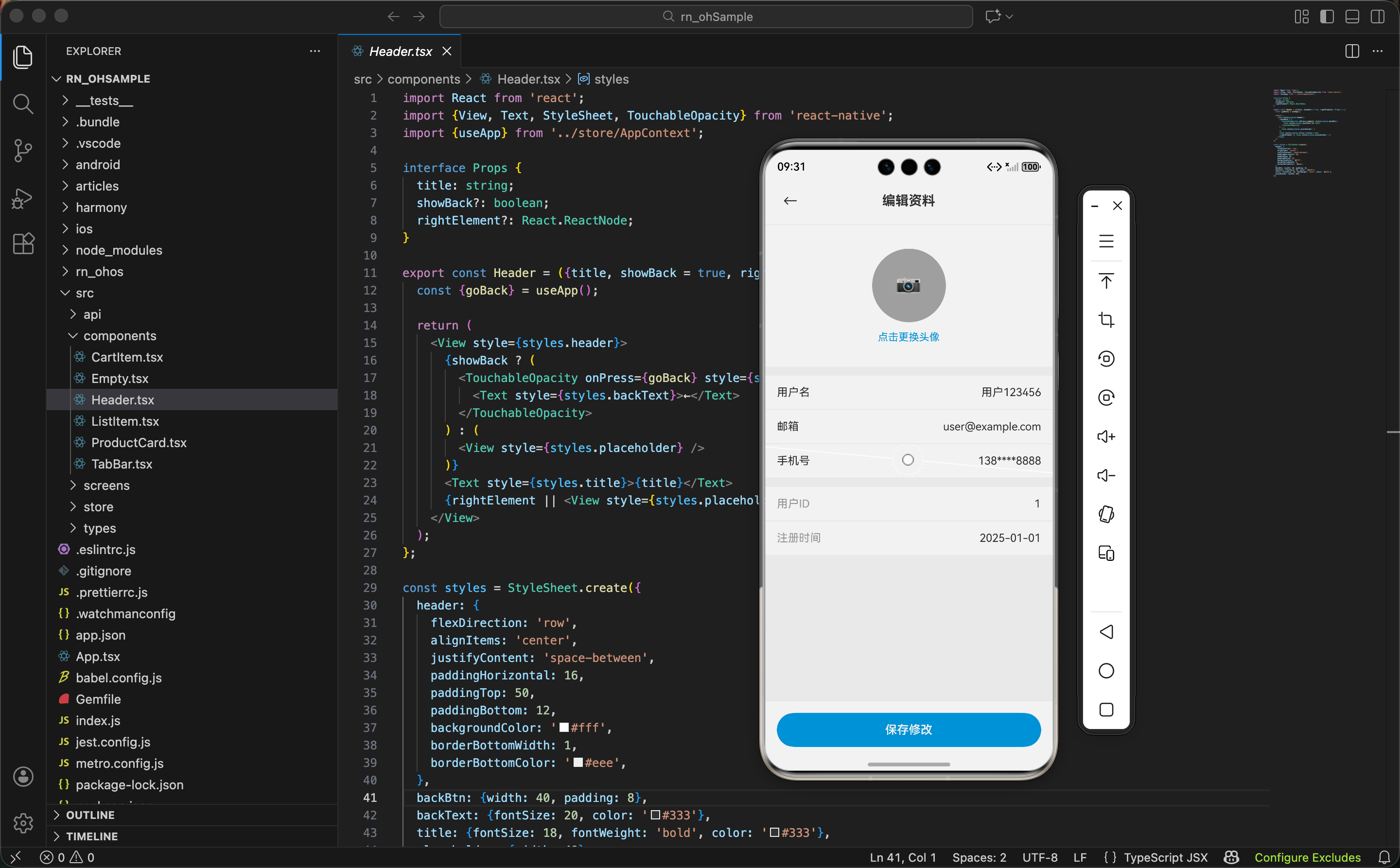
头像区域 UI
<TouchableOpacity style={styles.avatarSection} onPress={handleChangeAvatar}>
  <Image source={{uri: user?.avatar}} style={styles.avatar} />
  <View style={styles.avatarOverlay}>
    <Text style={styles.avatarIcon}>📷</Text>
  </View>
  <Text style={styles.changeAvatar}>点击更换头像</Text>
</TouchableOpacity>
头像上面盖了一层半透明遮罩,中间放个相机图标,让用户知道这里可以点击。这个设计在很多 App 里都能看到,算是约定俗成的交互方式了。
头像区域的样式:
avatarSection: {alignItems: 'center', paddingVertical: 32, backgroundColor: '#fff'},
avatar: {width: 100, height: 100, borderRadius: 50, backgroundColor: '#f0f0f0'},
avatarOverlay: {
  position: 'absolute',
  top: 32,
  width: 100,
  height: 100,
  borderRadius: 50,
  backgroundColor: 'rgba(0,0,0,0.3)',
  justifyContent: 'center',
  alignItems: 'center'
},
遮罩层用 position: 'absolute' 定位,top: 32 是因为父容器有 paddingVertical: 32,要对齐头像的位置。rgba(0,0,0,0.3) 是 30% 透明度的黑色,不会太暗也不会看不出来。
表单区域
<View style={styles.formSection}>
  <View style={styles.formItem}>
    <Text style={styles.label}>用户名</Text>
    <TextInput
      style={styles.input}
      value={username}
      onChangeText={setUsername}
      placeholder="请输入用户名"
      placeholderTextColor="#999"
      maxLength={20}
    />
  </View>
每个表单项是一行,左边标签右边输入框。maxLength={20} 限制用户名最多 20 个字符,防止有人输入一大串。
placeholderTextColor 的坑
在某些平台上,placeholder 的颜色默认是黑色或者很浅的灰色,不太明显。显式设置
placeholderTextColor="#999"可以保证各平台表现一致。
邮箱和手机号的输入框:
<View style={styles.formItem}>
  <Text style={styles.label}>邮箱</Text>
  <TextInput
    style={styles.input}
    value={email}
    onChangeText={setEmail}
    placeholder="请输入邮箱"
    placeholderTextColor="#999"
    keyboardType="email-address"
  />
</View>
<View style={styles.formItem}>
  <Text style={styles.label}>手机号</Text>
  <TextInput
    style={styles.input}
    value={phone}
    onChangeText={setPhone}
    placeholder="请输入手机号"
    placeholderTextColor="#999"
    keyboardType="phone-pad"
    maxLength={11}
  />
</View>
keyboardType 这个属性很重要。设置成 email-address 键盘会带 @ 符号,设置成 phone-pad 会弹出数字键盘。这些小细节能让用户输入更方便。
表单样式:
formSection: {backgroundColor: '#fff', marginTop: 12},
formItem: {
  flexDirection: 'row',
  alignItems: 'center',
  paddingHorizontal: 16,
  paddingVertical: 14,
  borderBottomWidth: 1,
  borderBottomColor: '#f0f0f0'
},
label: {width: 80, fontSize: 15, color: '#333'},
input: {flex: 1, fontSize: 15, color: '#333', textAlign: 'right', padding: 0},
标签固定宽度 80,输入框 flex: 1 占满剩余空间。输入框文字右对齐,这是很多 App 的常见做法,看起来更整齐。
input 的 padding: 0
TextInput 在某些平台上有默认的 padding,会导致文字位置不对。显式设置
padding: 0可以去掉这个默认值。
只读信息展示
<View style={styles.infoSection}>
  <View style={styles.infoItem}>
    <Text style={styles.infoLabel}>用户ID</Text>
    <Text style={styles.infoValue}>{user?.id}</Text>
  </View>
  <View style={styles.infoItem}>
    <Text style={styles.infoLabel}>注册时间</Text>
    <Text style={styles.infoValue}>2025-01-01</Text>
  </View>
</View>
用户 ID 和注册时间这些信息用户不能改,只做展示。用 Text 而不是 TextInput,样式上标签用灰色,值用黑色,区分开来。
infoSection: {backgroundColor: '#fff', marginTop: 12},
infoItem: {
  flexDirection: 'row',
  justifyContent: 'space-between',
  paddingHorizontal: 16,
  paddingVertical: 14,
  borderBottomWidth: 1,
  borderBottomColor: '#f0f0f0'
},
infoLabel: {fontSize: 15, color: '#999'},
infoValue: {fontSize: 15, color: '#333'},
底部保存按钮
<View style={styles.bottomBar}>
  <TouchableOpacity style={styles.saveBtn} onPress={handleSave}>
    <Text style={styles.saveBtnText}>保存修改</Text>
  </TouchableOpacity>
</View>
保存按钮固定在底部,这样不管页面内容多长,用户都能方便地点击保存。
bottomBar: {
  padding: 16,
  paddingBottom: 32,
  backgroundColor: '#fff',
  borderTopWidth: 1,
  borderTopColor: '#eee'
},
saveBtn: {
  backgroundColor: '#3498db',
  paddingVertical: 14,
  borderRadius: 25,
  alignItems: 'center'
},
saveBtnText: {fontSize: 16, fontWeight: '600', color: '#fff'},
paddingBottom: 32 是给底部安全区域留的空间,防止按钮被手机底部的横条挡住。
完整组件结构
把所有部分组合起来:
return (
  <View style={styles.container}>
    <Header title="编辑资料" />

    <ScrollView style={styles.content}>
      <TouchableOpacity style={styles.avatarSection} onPress={handleChangeAvatar}>
        {/* 头像区域 */}
      </TouchableOpacity>

      <View style={styles.formSection}>
        {/* 表单区域 */}
      </View>

      <View style={styles.infoSection}>
        {/* 只读信息 */}
      </View>
    </ScrollView>

    <View style={styles.bottomBar}>
      {/* 保存按钮 */}
    </View>
  </View>
);
用 ScrollView 包裹内容区域,这样如果内容超出屏幕可以滚动。底部按钮放在 ScrollView 外面,保持固定位置。
一些优化建议
做完这个页面,我想到几个可以优化的点:
1. 表单校验增强
可以加上邮箱格式校验、手机号格式校验。用正则表达式或者校验库都行。
2. 防重复提交
保存按钮点击后可以加个 loading 状态,防止用户连续点击导致重复提交。
3. 未保存提示
如果用户修改了内容但没保存就返回,可以弹个确认框提醒一下。
4. 头像裁剪
选择图片后最好能裁剪成正方形,不然头像可能会变形。
这些功能这里就不实现了,有兴趣的可以自己加上。
小结
个人资料编辑页面虽然简单,但有不少细节需要注意:
- 表单状态管理要考虑初始值和空值处理
- 输入框的
keyboardType能提升用户体验 - 保存前要做必要的校验
- 底部按钮固定定位,方便用户操作
- 只读信息和可编辑信息要区分开
下一篇写关于我们页面,敬请期待。
欢迎加入开源鸿蒙跨平台社区:https://openharmonycrossplatform.csdn.net

开源鸿蒙跨平台开发社区汇聚开发者与厂商,共建“一次开发,多端部署”的开源生态,致力于降低跨端开发门槛,推动万物智联创新。
更多推荐
 28
28 0
0- 0


 已为社区贡献28条内容

所有评论(0)