Flutter for OpenHarmony 教育百科实战:图书详情
本文介绍了图书详情页的实现方案,采用CustomScrollView和SliverAppBar实现滚动折叠效果。页面包含图书封面、标题、作者等完整信息,并支持收藏功能。通过状态变量管理加载状态,使用备用数据确保页面可用性。SliverAppBar设置300像素高度,滚动时头部折叠固定标题栏,右侧收藏按钮可切换状态并显示1秒操作提示。页面结构清晰,包含标题、副标题等关键信息,提供良好的用户体验。
Flutter for OpenHarmony 教育百科实战:图书详情
图书详情页面是用户深入了解一本书的地方,需要展示封面、标题、作者、简介等完整信息。这个页面还要支持收藏功能,让用户可以保存感兴趣的书籍。
做这个页面的时候,我用了CustomScrollView配合SliverAppBar,实现了滚动时头部折叠的效果。封面图片作为头部背景,滚动时会逐渐收起,只留下标题栏。这种设计在很多App里都能看到,用户体验很好。
状态变量设计
详情页需要加载图书数据并处理各种状态:
class BookDetailScreen extends StatefulWidget {
final String bookKey;
const BookDetailScreen({super.key, required this.bookKey});
State<BookDetailScreen> createState() => _BookDetailScreenState();
}
class _BookDetailScreenState extends State<BookDetailScreen> {
Map<String, dynamic>? _book;
bool _isLoading = true;
String? _error;
void initState() {
super.initState();
_loadBook();
StatsService.recordBookView();
}
}
bookKey是图书的唯一标识,从列表页或搜索页传入。initState中除了加载数据,还调用StatsService记录浏览行为,用于统计用户的学习情况。
为什么在initState里记录浏览? 因为initState只会调用一次,确保每次进入详情页只记录一次浏览。如果放在build里,每次重建都会记录,数据就不准了。
加载图书数据
从API获取图书详情,失败时使用备用数据:
Future<void> _loadBook() async {
  try {
    final book = await ApiService.getBookDetails(widget.bookKey);
    if (mounted) {
      setState(() {
        _book = book;
        _isLoading = false;
        _error = null;
      });
    }
  } catch (e) {
    print('Load book error: $e');
    if (mounted) {
      setState(() {
        _book = _getFallbackBook();
        _isLoading = false;
        _error = null;
      });
    }
  }
}
注意看,加载失败时我没有显示错误,而是使用备用数据。这是一个设计决策——与其让用户看到一个错误页面,不如显示一些基本信息,至少页面不是空的。
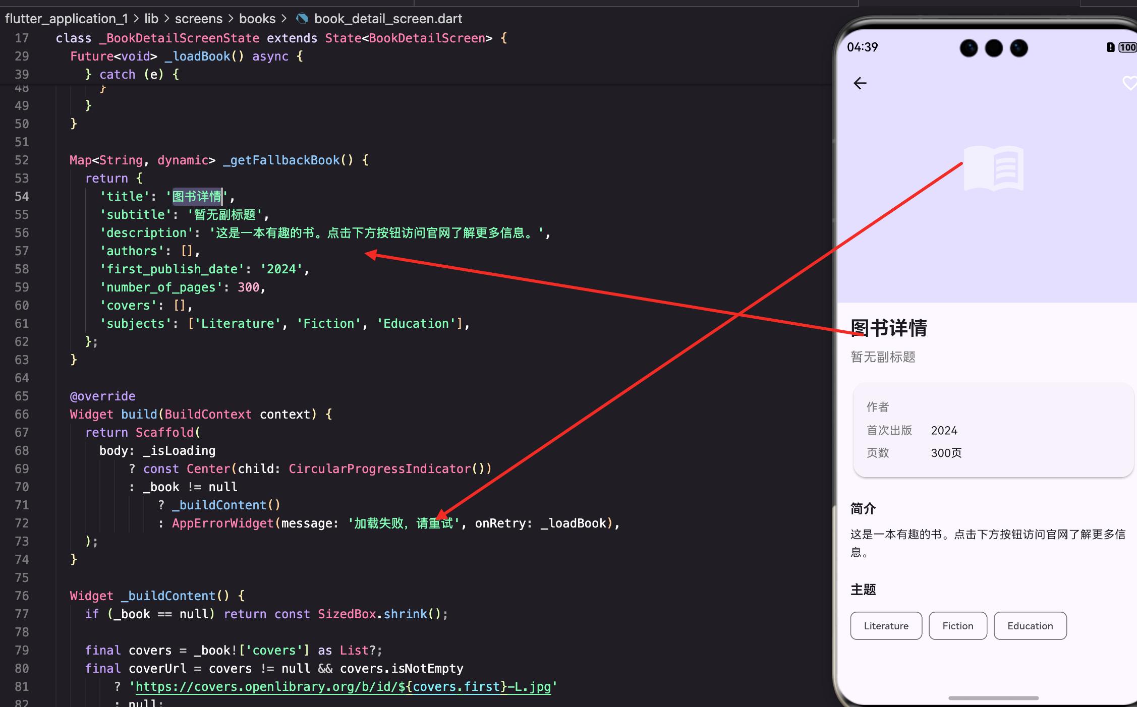
Map<String, dynamic> _getFallbackBook() {
  return {
    'title': '图书详情',
    'subtitle': '暂无副标题',
    'description': '这是一本有趣的书。点击下方按钮访问官网了解更多信息。',
    'authors': [],
    'first_publish_date': '2024',
    'number_of_pages': 300,
    'covers': [],
    'subjects': ['Literature', 'Fiction', 'Education'],
  };
}
备用数据提供了基本的结构,让页面能正常渲染。当然,这种做法有利有弊,用户可能会误以为这是真实数据。如果你觉得不妥,也可以改成显示错误提示。
页面整体结构
使用CustomScrollView实现可折叠的头部:
Widget build(BuildContext context) {
return Scaffold(
body: _isLoading
? const Center(child: CircularProgressIndicator())
: _book != null
? _buildContent()
: AppErrorWidget(message: '加载失败,请重试', onRetry: _loadBook),
);
}
没有使用Scaffold的appBar属性,而是把AppBar放在CustomScrollView中,这样可以实现滚动时头部折叠的效果。
内容构建
详情页的主体内容:
Widget _buildContent() {
  if (_book == null) return const SizedBox.shrink();

  final covers = _book!['covers'] as List?;
  final coverUrl = covers != null && covers.isNotEmpty
      ? 'https://covers.openlibrary.org/b/id/${covers.first}-L.jpg'
      : null;

  final favProvider = Provider.of<FavoritesProvider>(context);
  final isFav = favProvider.isFavorite(widget.bookKey);
先提取需要的数据:封面URL和收藏状态。封面用L尺寸(大图),因为详情页有足够的空间展示高清图片。
  return CustomScrollView(
    slivers: [
      SliverAppBar(
        expandedHeight: 300,
        pinned: true,
        flexibleSpace: FlexibleSpaceBar(
          background: coverUrl != null
              ? NetworkImageWidget(
                  imageUrl: coverUrl,
                  fit: BoxFit.cover,
                  borderRadius: 0,
                )
              : Container(
                  color: Theme.of(context).colorScheme.primaryContainer,
                  child: const Icon(Icons.menu_book, size: 80, color: Colors.white54),
                ),
        ),
SliverAppBar的
expandedHeight设为300,展开时显示大图封面。pinned: true让标题栏在滚动后固定在顶部。没有封面时显示一个带图标的占位背景。
收藏按钮
AppBar右侧的收藏按钮:
        actions: [
          IconButton(
            icon: Icon(
              isFav ? Icons.favorite : Icons.favorite_border,
              color: isFav ? Colors.red : Colors.white,
            ),
            onPressed: () async {
              await favProvider.toggleFavorite(FavoriteItem(
                id: widget.bookKey,
                title: _book!['title'] ?? '未知标题',
                type: 'book',
                imageUrl: coverUrl,
              ));
              if (mounted) {
                ScaffoldMessenger.of(context).showSnackBar(
                  SnackBar(
                    content: Text(isFav ? '已取消收藏' : '已添加收藏'),
                    duration: const Duration(seconds: 1),
                  ),
                );
              }
            },
          ),
        ],
      ),
根据收藏状态显示不同的图标和颜色:已收藏显示红色实心爱心,未收藏显示白色空心爱心。点击后调用
toggleFavorite切换收藏状态,并显示SnackBar提示用户操作结果。
为什么SnackBar的duration设为1秒? 默认的4秒太长了,用户只是想知道操作成功了,不需要看那么久。1秒刚好,看到了就消失,不会打扰用户继续浏览。
图书信息展示
标题和副标题:
      SliverToBoxAdapter(
        child: Padding(
          padding: const EdgeInsets.all(16),
          child: Column(
            crossAxisAlignment: CrossAxisAlignment.start,
            children: [
              Text(
                _book!['title'] ?? '未知标题',
                style: Theme.of(context).textTheme.headlineSmall?.copyWith(fontWeight: FontWeight.bold),
              ),
              const SizedBox(height: 8),
              if (_book!['subtitle'] != null)
                Text(
                  _book!['subtitle'],
                  style: TextStyle(color: Colors.grey[600], fontSize: 16),
                ),
              const SizedBox(height: 16),
              _buildInfoSection(),
SliverToBoxAdapter把普通Widget转换成Sliver,可以放在CustomScrollView中。标题使用headlineSmall样式,副标题用灰色小字。
基本信息卡片
展示作者、出版日期、页数等信息:
Widget _buildInfoSection() {
  return Card(
    child: Padding(
      padding: const EdgeInsets.all(16),
      child: Column(
        children: [
          if (_book!['authors'] != null)
            _buildInfoRow('作者', (_book!['authors'] as List).map((a) => a['author']?['key'] ?? '').join(', ')),
          if (_book!['first_publish_date'] != null)
            _buildInfoRow('首次出版', _book!['first_publish_date']),
          if (_book!['number_of_pages'] != null)
            _buildInfoRow('页数', '${_book!['number_of_pages']}页'),
        ],
      ),
    ),
  );
}
用Card包裹,让信息区域有明显的边界。每行信息用
_buildInfoRow方法生成,保持样式统一。
Widget _buildInfoRow(String label, String value) {
  return Padding(
    padding: const EdgeInsets.symmetric(vertical: 4),
    child: Row(
      crossAxisAlignment: CrossAxisAlignment.start,
      children: [
        SizedBox(
          width: 80,
          child: Text(label, style: TextStyle(color: Colors.grey[600])),
        ),
        Expanded(child: Text(value)),
      ],
    ),
  );
}
每行信息用固定宽度的标签和自适应宽度的值组成。
crossAxisAlignment: CrossAxisAlignment.start让多行文本顶部对齐,如果作者名字很长换行了,标签还是在顶部。
图书简介
展示图书的描述信息:
              const SizedBox(height: 24),
              if (_book!['description'] != null) ...[
                Text('简介', style: Theme.of(context).textTheme.titleMedium?.copyWith(fontWeight: FontWeight.bold)),
                const SizedBox(height: 8),
                Text(
                  _book!['description'] is String ? _book!['description'] : _book!['description']['value'] ?? '',
                  style: const TextStyle(height: 1.6),
                ),
              ],
description可能是字符串,也可能是包含value字段的对象,需要做类型判断。这是因为Open Library的API返回格式不太统一,有时候是简单字符串,有时候是复杂对象。
关于行高: height: 1.6增加行高,让长文本更易阅读。默认的行高对于大段文字来说太紧凑了,1.6是比较舒适的阅读行高。
主题标签
展示图书的主题分类:
              const SizedBox(height: 24),
              if (_book!['subjects'] != null) ...[
                Text('主题', style: Theme.of(context).textTheme.titleMedium?.copyWith(fontWeight: FontWeight.bold)),
                const SizedBox(height: 8),
                Wrap(
                  spacing: 8,
                  runSpacing: 8,
                  children: (_book!['subjects'] as List).take(10).map((subject) {
                    final text = subject is String ? subject : subject['name'] ?? '';
                    return Chip(label: Text(text, style: const TextStyle(fontSize: 12)));
                  }).toList(),
                ),
              ],
              const SizedBox(height: 100),
            ],
          ),
        ),
      ),
    ],
  );
}
Wrap组件让标签自动换行,spacing和runSpacing分别控制水平和垂直间距。take(10)限制最多显示10个标签,避免标签过多影响页面布局。
为什么要限制标签数量? 有些书的subjects字段可能有几十个标签,全部显示会让页面很长。10个标签足够让用户了解这本书的主题了,想看更多可以去官网。
底部留白
最后加了100像素的留白:
const SizedBox(height: 100),
这是为了让用户滚动到底部时,最后的内容不会被遮挡。如果以后要加底部操作栏(比如"立即阅读"按钮),这个空间也够用。
关于数据结构的处理
Open Library的API返回的数据结构比较复杂,而且不同字段的格式可能不一样。比如:
description可能是字符串,也可能是{value: "..."}对象subjects可能是字符串数组,也可能是对象数组authors是对象数组,每个对象里有author字段,author里又有key字段
处理这种不规范的API数据,需要做很多类型判断和空值处理。虽然代码看起来有点啰嗦,但这是必要的,否则很容易崩溃。
小结
图书详情页面展示了如何使用CustomScrollView和SliverAppBar实现可折叠的头部效果。收藏功能通过Provider实现数据共享,让用户的收藏操作能即时反映到收藏页面。备用数据的使用保证了即使网络请求失败,页面也能正常显示。
下一篇我们来看国家列表页面的实现,了解如何展示和搜索世界各国的信息。
本文是Flutter for OpenHarmony教育百科实战系列的第八篇。
欢迎加入开源鸿蒙跨平台社区:https://openharmonycrossplatform.csdn.net

开源鸿蒙跨平台开发社区汇聚开发者与厂商,共建“一次开发,多端部署”的开源生态,致力于降低跨端开发门槛,推动万物智联创新。
更多推荐


 18
18 0
0- 0


 已为社区贡献24条内容

所有评论(0)