RN for OpenHarmony 实战 TodoList 项目:任务优先级标签
本文介绍了如何在待办清单应用中通过彩色侧边条实现优先级可视化设计。优先级分为高(红)、中(黄)、低(绿)三档,利用人类对颜色的本能反应建立直观认知。详细讲解了侧边条的实现方式、卡片布局的细节处理(如圆角裁剪)、优先级选择器的交互设计,以及状态管理策略。默认选中中等优先级的设计平衡了用户体验与功能有效性。该设计通过简洁的视觉元素有效传达了任务优先级信息。
案例开源地址:https://gitcode.com/lqjmac/rn_openharmony_todolist
写在前面
“这个任务很重要!”
“那个也很重要!”
“全都很重要!!!”
如果你的待办清单里所有任务都同等重要,那其实就等于没有一个是重要的。优先级的存在,就是为了帮助我们在众多任务中做出选择——先做什么,后做什么,什么可以暂时放一放。
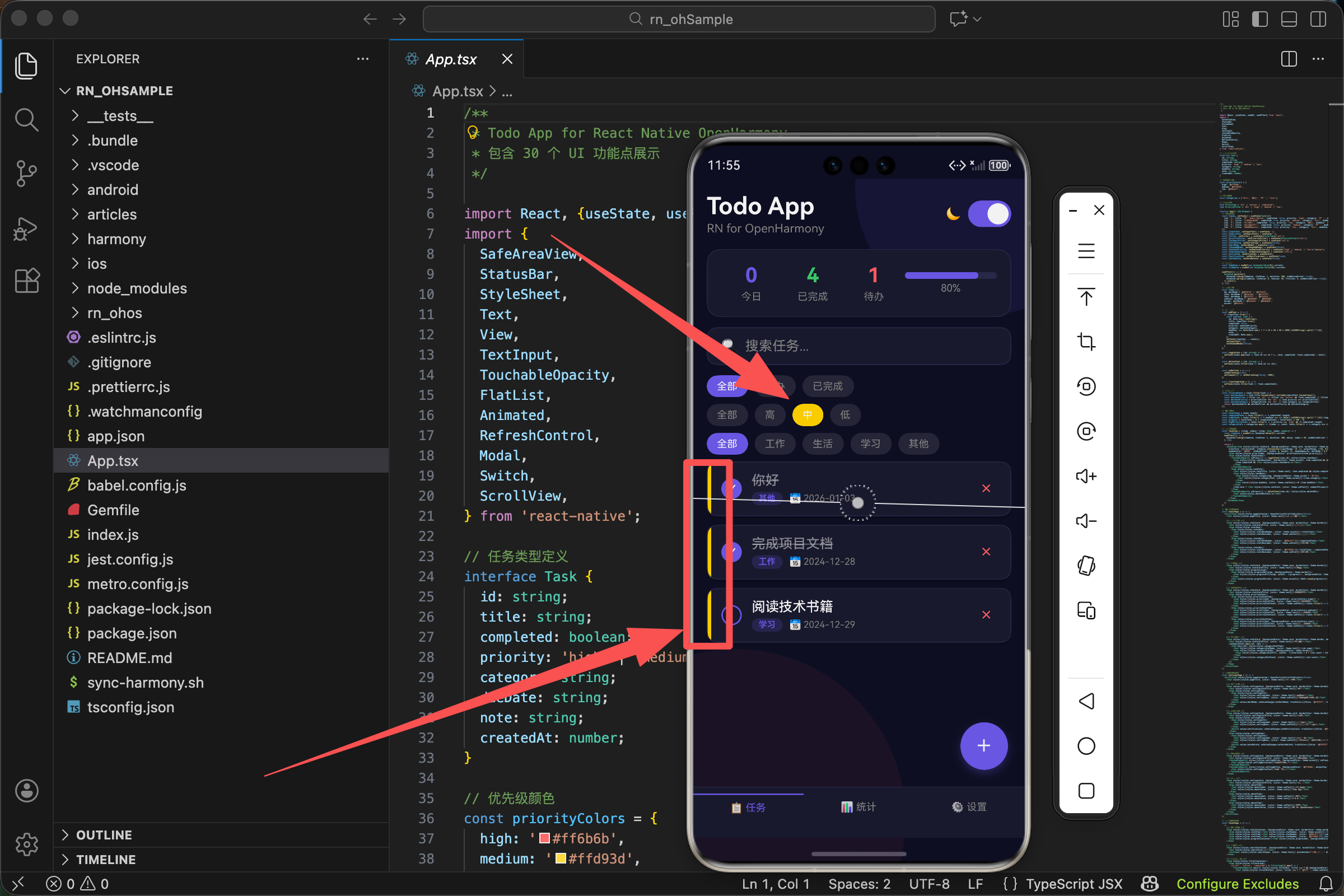
在我们的 TodoList 应用中,优先级通过一个彩色的侧边条来表示。红色代表紧急,黄色代表一般,绿色代表可以稍后处理。这种设计简洁直观,用户扫一眼就能抓住重点。
颜色的语言
在开始看代码之前,我们先聊聊颜色。
颜色不仅仅是装饰,它是一种语言。红色让人警觉,绿色让人放松,黄色介于两者之间。这不是设计师的主观臆断,而是人类长期进化形成的本能反应——红色像血液、像火焰,意味着危险;绿色像草地、像森林,意味着安全。
我们的优先级颜色选择正是基于这个原理:
const priorityColors = {
  high: '#ff6b6b',    // 红色 - 紧急,需要立即处理
  medium: '#ffd93d',  // 黄色 - 重要,但不紧急
  low: '#6bcb77',     // 绿色 - 可以稍后处理
};
这三个颜色不是随便选的。#ff6b6b 是一个柔和的红色,比纯红 #ff0000 更舒适,不会让人感到刺眼。#ffd93d 是一个明亮的黄色,足够醒目但不会与红色混淆。#6bcb77 是一个清新的绿色,给人轻松的感觉。
三个颜色放在一起,形成了一个自然的视觉梯度:从紧张到放松,从紧急到从容。
侧边条的实现
在任务卡片中,优先级通过左侧的一个细长色条来表示:
<Animated.View style={[styles.taskCard, {backgroundColor: theme.card, borderColor: theme.border, opacity: itemAnim,
  transform: [{translateX: itemAnim.interpolate({inputRange: [0, 1], outputRange: [-50, 0]})}],
  shadowColor: '#000', shadowOffset: {width: 0, height: 2}, shadowOpacity: darkMode ? 0.3 : 0.1, shadowRadius: 4, elevation: 3}]}>
  <View style={[styles.priorityBar, {backgroundColor: priorityColors[item.priority]}]} />
  <View style={styles.taskContent}>
    {/* 任务内容 */}
  </View>
</Animated.View>
注意看这个结构。卡片使用 flexDirection: 'row' 布局(虽然这个属性定义在 taskCard 样式中),所以 priorityBar 和 taskContent 是水平排列的。priorityBar 在左边,taskContent 在右边。
priorityBar 的样式非常简单:
priorityBar: {width: 4},
只定义了宽度,没有定义高度。这意味着它的高度会自动撑满父容器。4 像素的宽度刚刚好——足够被注意到,又不会喧宾夺主。
颜色通过内联样式动态设置:
{backgroundColor: priorityColors[item.priority]}
item.priority 的值是 'high'、'medium' 或 'low',正好对应 priorityColors 对象的键。这种设计让代码非常简洁,不需要写 if-else 或 switch-case。
卡片布局的细节
让我们仔细看看卡片的样式:
taskCard: {flexDirection: 'row', borderRadius: 12, borderWidth: 1, marginBottom: 10, overflow: 'hidden'},
这里有一个关键属性:overflow: 'hidden'。
为什么需要它?因为我们给卡片设置了 borderRadius: 12 的圆角,但 priorityBar 是一个矩形。如果没有 overflow: 'hidden',priorityBar 的左上角和左下角会超出卡片的圆角边界,看起来很不协调。
overflow: 'hidden' 告诉系统:任何超出容器边界的内容都要被裁剪掉。这样 priorityBar 的角落就会被圆角"切掉",与卡片完美融合。
这是一个很容易被忽略的细节,但正是这些细节决定了应用的品质感。
优先级选择器
用户在添加任务时需要选择优先级。我们提供了三个按钮:
<Text style={[styles.modalLabel, {color: theme.subText}]}>优先级</Text>
<View style={styles.prioritySelector}>
  {(['high', 'medium', 'low'] as const).map(p => (
    <TouchableOpacity
      key={p}
      style={[styles.priorityOption, {borderColor: priorityColors[p]}, newTaskPriority === p && {backgroundColor: priorityColors[p]}]}
      onPress={() => setNewTaskPriority(p)}>
      <Text style={{color: newTaskPriority === p ? '#fff' : priorityColors[p]}}>
        {p === 'high' ? '高' : p === 'medium' ? '中' : '低'}
      </Text>
    </TouchableOpacity>
  ))}
</View>
这段代码有几个值得注意的地方。
数组遍历生成按钮
{(['high', 'medium', 'low'] as const).map(p => (
我们没有手写三个按钮,而是用数组的 map 方法动态生成。这样做的好处是:如果将来要增加一个优先级(比如"紧急"),只需要修改数组和 priorityColors 对象,不需要复制粘贴按钮代码。
as const 是 TypeScript 的语法,它告诉编译器这个数组的元素是字面量类型 'high' | 'medium' | 'low',而不是宽泛的 string 类型。这样在后面使用 p 时,TypeScript 能提供更好的类型检查。
动态样式
style={[styles.priorityOption, {borderColor: priorityColors[p]}, newTaskPriority === p && {backgroundColor: priorityColors[p]}]}
三层样式叠加:
- 基础样式
styles.priorityOption - 边框颜色,始终使用对应优先级的颜色
- 背景颜色,只有选中时才有
未选中的按钮:有彩色边框,透明背景
选中的按钮:有彩色边框,彩色背景
文字颜色切换
<Text style={{color: newTaskPriority === p ? '#fff' : priorityColors[p]}}>
选中时文字是白色(与彩色背景形成对比),未选中时文字是对应的优先级颜色(与透明背景形成对比)。
中文标签
{p === 'high' ? '高' : p === 'medium' ? '中' : '低'}
把英文的 high、medium、low 转换成中文的"高"、“中”、“低”。这里用了嵌套的三元运算符,虽然不太优雅,但对于只有三个选项的情况还是可以接受的。
如果选项更多,可以考虑用一个映射对象:
const priorityLabels = {
  high: '高',
  medium: '中',
  low: '低',
};

// 使用
{priorityLabels[p]}
选择器的样式
prioritySelector: {flexDirection: 'row', gap: 12, marginBottom: 16},
priorityOption: {flex: 1, paddingVertical: 10, borderRadius: 8, borderWidth: 2, alignItems: 'center'},
prioritySelector
flexDirection: 'row'- 三个按钮水平排列gap: 12- 按钮之间的间距marginBottom: 16- 与下方内容的间距
priorityOption
flex: 1- 三个按钮平分可用空间,宽度相等paddingVertical: 10- 上下内边距,让按钮有足够的点击区域borderRadius: 8- 圆角borderWidth: 2- 边框宽度,比较粗以便显示颜色alignItems: 'center'- 文字水平居中
为什么边框要 2 像素而不是 1 像素?因为优先级颜色是按钮的核心信息,需要足够醒目。1 像素的边框在某些屏幕上可能显得太细,2 像素更稳妥。
状态管理
优先级的选择状态存储在 newTaskPriority 中:
const [newTaskPriority, setNewTaskPriority] = useState<'high' | 'medium' | 'low'>('medium');
默认值是 'medium'。为什么选择中等优先级作为默认值?
这是一个产品设计的考量。如果默认是高优先级,用户可能会懒得修改,导致所有任务都是高优先级,失去了优先级的意义。如果默认是低优先级,用户可能会觉得应用不够重视他们的任务。中等优先级是一个中性的选择,既不会让用户觉得被忽视,也不会导致优先级通胀。
当用户点击某个优先级按钮时:
onPress={() => setNewTaskPriority(p)}
状态更新,触发重新渲染,按钮的样式随之改变。
在筛选中使用优先级
优先级不仅用于显示,还用于筛选。用户可以只查看某个优先级的任务:
<View style={styles.filterContainer}>
  <View style={styles.filterGroup}>
    {(['all', 'high', 'medium', 'low'] as PriorityFilter[]).map(p => (
      <TouchableOpacity
        key={p}
        style={[styles.filterBtn, priorityFilter === p && {backgroundColor: p === 'all' ? theme.accent : priorityColors[p as keyof typeof priorityColors]}]}
        onPress={() => setPriorityFilter(p)}>
        <Text style={[styles.filterBtnText, {color: priorityFilter === p ? '#fff' : theme.subText}]}>
          {p === 'all' ? '全部' : p === 'high' ? '高' : p === 'medium' ? '中' : '低'}
        </Text>
      </TouchableOpacity>
    ))}
  </View>
</View>
筛选按钮比选择器多了一个"全部"选项。当选择"全部"时,显示所有任务;当选择某个优先级时,只显示该优先级的任务。
筛选逻辑在这里:
const filteredTasks = tasks.filter(task => {
  const matchesSearch = task.title.toLowerCase().includes(searchText.toLowerCase());
  const matchesFilter = filter === 'all' || (filter === 'active' && !task.completed) || (filter === 'completed' && task.completed);
  const matchesPriority = priorityFilter === 'all' || task.priority === priorityFilter;
  const matchesCategory = categoryFilter === 'all' || task.category === categoryFilter;
  return matchesSearch && matchesFilter && matchesPriority && matchesCategory;
});
关键的一行:
const matchesPriority = priorityFilter === 'all' || task.priority === priorityFilter;
如果 priorityFilter 是 'all',条件直接为 true,所有任务都匹配。否则,只有优先级相等的任务才匹配。
统计页面的优先级分布
在统计页面,我们展示了各优先级任务的数量:
<View style={[styles.statsCard, {backgroundColor: theme.card, borderColor: theme.border}]}>
  <Text style={[styles.statsCardTitle, {color: theme.text}]}>优先级分布</Text>
  <View style={styles.priorityStats}>
    <View style={styles.priorityStatItem}>
      <View style={[styles.priorityDot, {backgroundColor: priorityColors.high}]} />
      <Text style={[styles.priorityStatText, {color: theme.text}]}>高优先级</Text>
      <Text style={[styles.priorityStatCount, {color: theme.subText}]}>{tasks.filter(t => t.priority === 'high').length}</Text>
    </View>
    <View style={styles.priorityStatItem}>
      <View style={[styles.priorityDot, {backgroundColor: priorityColors.medium}]} />
      <Text style={[styles.priorityStatText, {color: theme.text}]}>中优先级</Text>
      <Text style={[styles.priorityStatCount, {color: theme.subText}]}>{tasks.filter(t => t.priority === 'medium').length}</Text>
    </View>
    <View style={styles.priorityStatItem}>
      <View style={[styles.priorityDot, {backgroundColor: priorityColors.low}]} />
      <Text style={[styles.priorityStatText, {color: theme.text}]}>低优先级</Text>
      <Text style={[styles.priorityStatCount, {color: theme.subText}]}>{tasks.filter(t => t.priority === 'low').length}</Text>
    </View>
  </View>
</View>
每一行包含三个元素:
- 一个彩色圆点,表示优先级颜色
- 优先级名称
- 该优先级的任务数量
圆点的样式:
priorityDot: {width: 12, height: 12, borderRadius: 6, marginRight: 12},
12x12 像素的正方形,borderRadius 设为 6(宽度的一半),形成圆形。
数量的计算:
{tasks.filter(t => t.priority === 'high').length}
遍历所有任务,筛选出高优先级的,然后取数组长度。
这种写法简洁但有性能隐患——每次渲染都会执行三次 filter。如果任务很多,可以考虑提前计算好:
const highCount = tasks.filter(t => t.priority === 'high').length;
const mediumCount = tasks.filter(t => t.priority === 'medium').length;
const lowCount = tasks.filter(t => t.priority === 'low').length;
或者用 reduce 一次遍历完成:
const priorityCounts = tasks.reduce((acc, task) => {
  acc[task.priority] = (acc[task.priority] || 0) + 1;
  return acc;
}, {} as Record<string, number>);
设计思考:为什么用侧边条而不是标签?
你可能会问,为什么用一个细细的侧边条来表示优先级,而不是用一个更明显的标签(比如"高优先级"的文字标签)?
几个原因:
1. 空间效率
侧边条只占用 4 像素的宽度,几乎不影响内容区域。而文字标签需要更多空间,可能会挤压任务标题。
2. 视觉简洁
侧边条是一个纯粹的颜色信号,不需要阅读文字就能理解。在快速浏览列表时,颜色比文字更容易被大脑处理。
3. 一致性
每个任务卡片的结构保持一致,只是侧边条的颜色不同。这种一致性让界面看起来更整洁。
4. 不干扰主要信息
任务标题是最重要的信息,侧边条作为辅助信息存在于边缘,不会分散用户对标题的注意力。
当然,这不是唯一的设计方案。有些应用会用背景色来表示优先级,有些会用图标,有些会用标签。每种方案都有其适用场景,关键是要与整体设计风格保持一致。
扩展思考
如果产品经理说:“我们需要支持自定义优先级,用户可以自己定义优先级的名称和颜色。”
你会怎么设计?
一些思路:
- 把
priorityColors从常量改成状态,存储在用户设置中 - 提供一个颜色选择器让用户自定义颜色
- 任务的
priority字段从固定的三个值改成优先级的 ID - 需要处理用户删除某个优先级后,已有任务的迁移问题
这就超出了本文的范围,但值得思考。好的代码设计应该为未来的扩展留有余地。
欢迎加入开源鸿蒙跨平台社区:https://openharmonycrossplatform.csdn.net

开源鸿蒙跨平台开发社区汇聚开发者与厂商,共建“一次开发,多端部署”的开源生态,致力于降低跨端开发门槛,推动万物智联创新。
更多推荐

 20
20 0
0- 0


 已为社区贡献9条内容

所有评论(0)