Flutter&OpenHarmony商城App搜索框组件开发
本文介绍了Flutter和OpenHarmony平台上搜索框组件的实现方法。Flutter部分详细讲解了搜索框的基础结构、状态管理、UI构建以及输入框实现,采用Material Design风格,具有响应式设计和资源管理机制。OpenHarmony部分展示了ArkUI框架下的搜索框组件开发,使用响应式状态变量和条件渲染,确保跨平台视觉一致性。两者都实现了核心功能:搜索图标、文本输入、清除按钮和搜索
#
前言
搜索功能是商城应用中不可或缺的核心功能之一,用户通过搜索框可以快速定位到自己想要购买的商品。一个优秀的搜索框组件不仅需要具备基本的文本输入功能,还需要支持搜索历史记录、热门搜索推荐、语音搜索等高级特性。本文将详细介绍如何在Flutter和OpenHarmony平台上开发一个功能完善的搜索框组件,帮助开发者构建用户体验出色的商城搜索功能。
在电商应用的用户行为分析中,搜索是转化率最高的入口之一。用户主动搜索意味着明确的购买意图,因此搜索框的设计直接影响用户能否快速找到目标商品。我们需要考虑搜索框的视觉设计、交互体验、性能优化等多个方面,确保用户能够获得流畅的搜索体验。
Flutter搜索框基础实现
首先定义搜索框组件的基础结构:
class SearchBar extends StatefulWidget {
final String? hintText;
final ValueChanged<String>? onSearch;
final VoidCallback? onTap;
const SearchBar({
Key? key,
this.hintText,
this.onSearch,
this.onTap,
}) : super(key: key);
State<SearchBar> createState() => _SearchBarState();
}
SearchBar组件采用StatefulWidget实现,因为搜索框需要管理输入状态和焦点状态等内部状态。组件接收三个可选参数:hintText用于设置输入框的占位提示文字,引导用户进行搜索操作;onSearch回调函数在用户提交搜索时触发,将搜索关键词传递给父组件进行处理;onTap回调在用户点击搜索框时触发,可用于跳转到专门的搜索页面或展开搜索面板。这种设计将搜索框的UI展示与业务逻辑分离,提高了组件的复用性和可维护性。
接下来实现搜索框的状态管理类:
class _SearchBarState extends State<SearchBar> {
final TextEditingController _controller = TextEditingController();
final FocusNode _focusNode = FocusNode();
bool _showClear = false;
void initState() {
super.initState();
_controller.addListener(_onTextChanged);
}
void _onTextChanged() {
setState(() {
_showClear = _controller.text.isNotEmpty;
});
}
void dispose() {
_controller.dispose();
_focusNode.dispose();
super.dispose();
}
}
状态管理类中定义了三个关键成员:TextEditingController用于控制和监听输入框的文本内容,FocusNode用于管理输入框的焦点状态,_showClear布尔值控制清除按钮的显示与隐藏。在initState生命周期方法中,我们为控制器添加了文本变化监听器,当用户输入内容时自动更新清除按钮的显示状态。dispose方法中及时释放控制器和焦点节点资源,避免内存泄漏。这种资源管理方式是Flutter开发中的最佳实践,确保组件在销毁时正确清理所有资源。
搜索框UI构建
Widget build(BuildContext context) {
return Container(
height: 40,
decoration: BoxDecoration(
color: const Color(0xFFF5F5F5),
borderRadius: BorderRadius.circular(20),
),
child: Row(
children: [
const SizedBox(width: 12),
const Icon(
Icons.search,
size: 20,
color: Color(0xFF999999),
),
const SizedBox(width: 8),
Expanded(child: _buildTextField()),
if (_showClear) _buildClearButton(),
const SizedBox(width: 12),
],
),
);
}
搜索框的整体布局采用Container包裹Row的结构。Container设置了40像素的固定高度和浅灰色背景,20像素的圆角使搜索框呈现胶囊形状,这是现代移动应用中常见的搜索框设计风格。Row组件水平排列搜索图标、输入框和清除按钮。搜索图标使用Material Design的search图标,灰色配色表明这是一个可交互的输入区域。Expanded组件包裹输入框使其占据剩余空间,清除按钮通过条件渲染只在有输入内容时显示。这种布局结构清晰,各元素职责明确。
输入框组件的具体实现:
Widget _buildTextField() {
  return TextField(
    controller: _controller,
    focusNode: _focusNode,
    decoration: InputDecoration(
      hintText: widget.hintText ?? '搜索商品',
      hintStyle: const TextStyle(
        fontSize: 14,
        color: Color(0xFF999999),
      ),
      border: InputBorder.none,
      contentPadding: EdgeInsets.zero,
      isDense: true,
    ),
    style: const TextStyle(
      fontSize: 14,
      color: Color(0xFF333333),
    ),
    textInputAction: TextInputAction.search,
    onSubmitted: widget.onSearch,
    onTap: widget.onTap,
  );
}
TextField组件是搜索框的核心,通过InputDecoration配置输入框的外观样式。hintText显示占位提示文字,当输入框为空时引导用户操作。border设置为InputBorder.none移除默认边框,因为我们已经在外层Container中定义了边框样式。isDense设置为true减少输入框的默认内边距,使布局更加紧凑。textInputAction设置为TextInputAction.search,这会将软键盘的回车键显示为搜索图标,提升用户体验。onSubmitted回调在用户点击搜索按钮时触发,将输入的关键词传递给父组件处理。
OpenHarmony搜索框实现
@Component
struct SearchBar {
  @State searchText: string = ''
  @State isFocused: boolean = false
  private placeholder: string = '搜索商品'
  private onSearch: (text: string) => void = () => {}

  build() {
    Row() {
      Image($r('app.media.search'))
        .width(20)
        .height(20)
        .margin({ left: 12, right: 8 })

      this.SearchInput()

      if (this.searchText.length > 0) {
        this.ClearButton()
      }
    }
    .height(40)
    .width('100%')
    .backgroundColor('#F5F5F5')
    .borderRadius(20)
  }
}
OpenHarmony的搜索框组件使用@Component装饰器定义。@State装饰器标记的变量具有响应式特性,当searchText或isFocused发生变化时,UI会自动更新。Row容器水平排列搜索图标、输入框和清除按钮,与Flutter的实现结构一致。Image组件加载本地搜索图标资源,通过margin设置与相邻元素的间距。条件渲染使用if语句,当搜索文本不为空时显示清除按钮。整体样式设置与Flutter版本保持一致,确保跨平台的视觉统一性。
输入框组件的ArkUI实现:
@Builder
SearchInput() {
  TextInput({ placeholder: this.placeholder, text: this.searchText })
    .layoutWeight(1)
    .height('100%')
    .backgroundColor(Color.Transparent)
    .placeholderColor('#999999')
    .placeholderFont({ size: 14 })
    .fontSize(14)
    .fontColor('#333333')
    .onChange((value: string) => {
      this.searchText = value
    })
    .onSubmit((enterKey: EnterKeyType) => {
      this.onSearch(this.searchText)
    })
}
@Builder装饰器定义了可复用的UI构建方法。TextInput是ArkUI提供的文本输入组件,通过placeholder参数设置占位提示文字,text参数绑定当前输入值。layoutWeight(1)使输入框占据Row中的剩余空间,相当于Flutter中的Expanded。backgroundColor设置为透明,因为背景色已在外层Row中定义。placeholderColor和placeholderFont分别设置占位文字的颜色和字体样式。onChange回调在文本变化时更新searchText状态,onSubmit回调在用户提交时触发搜索操作。ArkUI的API设计简洁直观,链式调用使代码更加流畅。
清除按钮实现
Widget _buildClearButton() {
  return GestureDetector(
    onTap: () {
      _controller.clear();
      _focusNode.requestFocus();
    },
    child: Container(
      padding: const EdgeInsets.all(8),
      child: const Icon(
        Icons.cancel,
        size: 18,
        color: Color(0xFF999999),
      ),
    ),
  );
}
清除按钮是提升搜索体验的重要细节。GestureDetector包装器为图标添加点击事件处理,点击时调用controller.clear()清空输入内容,同时调用focusNode.requestFocus()保持输入框的焦点状态,方便用户继续输入新的搜索词。Container的padding增加了点击热区,使按钮更容易被点击。图标使用cancel样式,灰色配色与整体设计风格协调。这个小细节体现了对用户体验的关注,避免用户需要手动删除已输入的文字。
OpenHarmony清除按钮:
@Builder
ClearButton() {
  Image($r('app.media.clear'))
    .width(18)
    .height(18)
    .margin({ right: 12 })
    .onClick(() => {
      this.searchText = ''
    })
}
ArkUI的清除按钮实现更加简洁。Image组件加载清除图标,设置固定尺寸和右边距。onClick事件处理器直接将searchText重置为空字符串,由于@State的响应式特性,UI会自动更新,清除按钮也会随之隐藏。这种声明式的状态管理方式减少了手动操作DOM的复杂性,代码更加简洁易维护。
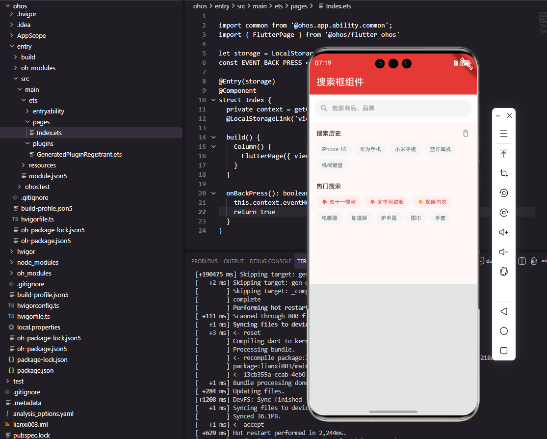
搜索历史功能
class SearchHistory extends StatelessWidget {
final List<String> historyList;
final ValueChanged<String> onSelect;
final VoidCallback onClear;
const SearchHistory({
Key? key,
required this.historyList,
required this.onSelect,
required this.onClear,
}) : super(key: key);
Widget build(BuildContext context) {
return Column(
crossAxisAlignment: CrossAxisAlignment.start,
children: [
_buildHeader(),
const SizedBox(height: 12),
_buildHistoryTags(),
],
);
}
}
搜索历史组件帮助用户快速访问之前的搜索记录,提高搜索效率。组件接收三个参数:historyList是历史记录列表,onSelect回调在用户选择某条历史记录时触发,onClear回调用于清空所有历史记录。Column组件垂直排列标题栏和历史标签区域,crossAxisAlignment设置为start使内容左对齐。这种组件设计将数据和事件处理交给父组件管理,保持了组件的纯净性和可复用性。
历史标签的流式布局实现:
Widget _buildHistoryTags() {
  return Wrap(
    spacing: 8,
    runSpacing: 8,
    children: historyList.map((item) {
      return GestureDetector(
        onTap: () => onSelect(item),
        child: Container(
          padding: const EdgeInsets.symmetric(
            horizontal: 12,
            vertical: 6,
          ),
          decoration: BoxDecoration(
            color: const Color(0xFFF5F5F5),
            borderRadius: BorderRadius.circular(14),
          ),
          child: Text(
            item,
            style: const TextStyle(
              fontSize: 12,
              color: Color(0xFF666666),
            ),
          ),
        ),
      );
    }).toList(),
  );
}
Wrap组件实现了流式布局,当一行放不下时自动换行显示。spacing设置水平间距,runSpacing设置行间距,两者都设为8像素保持视觉平衡。每个历史标签使用Container包装,设置水平和垂直内边距以及圆角背景。GestureDetector为标签添加点击事件,用户点击后触发onSelect回调,将选中的历史记录填入搜索框。这种标签式的历史记录展示方式直观高效,用户可以一目了然地看到所有历史搜索词。
总结
本文详细介绍了Flutter和OpenHarmony平台上搜索框组件的开发过程。搜索框作为商城应用的核心入口,其设计质量直接影响用户的搜索体验和商品发现效率。通过合理的组件拆分和状态管理,我们实现了一个功能完善、交互流畅的搜索框组件。在实际项目中,还可以进一步扩展语音搜索、图片搜索、搜索建议等高级功能,为用户提供更加智能的搜索体验。
欢迎加入开源鸿蒙跨平台社区:https://openharmonycrossplatform.csdn.net

开源鸿蒙跨平台开发社区汇聚开发者与厂商,共建“一次开发,多端部署”的开源生态,致力于降低跨端开发门槛,推动万物智联创新。
更多推荐

 19
19 0
0- 0


 已为社区贡献28条内容

所有评论(0)