RN for OpenHarmony 实战 TodoList 项目:添加任务输入框
本文介绍了在RN for OpenHarmony TodoList应用中使用TextInput组件的实践方法。主要内容包括: 输入框的基础实现,采用受控组件方式管理状态,通过Modal弹窗提供专注的输入环境 详细解析了TextInput的核心属性配置,包括样式、占位提示、值绑定和变化回调 对比了添加任务输入框和搜索输入框的不同设计特点: 添加任务采用弹窗形式 搜索框内联显示并带图标 两种输入框都支
案例开源地址:https://atomgit.com/lqjmac/rn_openharmony_todolist
在任何待办事项应用中,输入框都是用户与应用交互的第一入口。用户通过输入框告诉应用他们想要记录什么任务,这个看似简单的组件背后其实有很多值得深入探讨的细节。如何让输入框既好用又好看?如何处理用户输入的各种边界情况?如何在不同主题下保持一致的体验?
本文是 RN for OpenHarmony 实战 TodoList 系列的第二篇,我们将详细讲解 TextInput 组件的使用方法,以及如何在实际项目中打造一个体验优秀的任务输入框。
TextInput 组件基础
TextInput 是 React Native 中用于接收用户文本输入的核心组件。它类似于 Web 开发中的 input 元素,但针对移动端做了很多优化和适配。
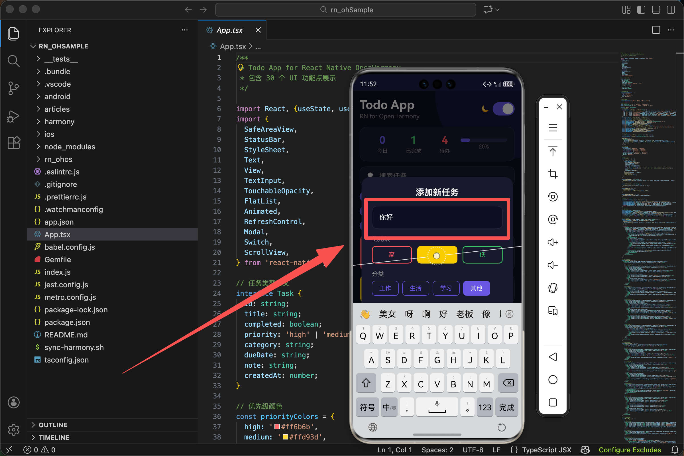
在我们的 TodoList 项目中,输入框被放置在一个 Modal 弹窗中,当用户点击浮动添加按钮时弹出。这种设计的好处是不会占用主界面的空间,同时给用户一个专注输入的环境。
首先,我们需要引入必要的组件:
import React, {useState, useRef, useEffect} from 'react';
import {
  SafeAreaView,
  StatusBar,
  StyleSheet,
  Text,
  View,
  TextInput,
  TouchableOpacity,
  FlatList,
  Animated,
  RefreshControl,
  Modal,
  Switch,
  ScrollView,
} from 'react-native';
这里我们从 react-native 中引入了 TextInput 组件。同时引入的还有 Modal 组件,因为我们的输入框是在弹窗中展示的。useState 用于管理输入框的值,这是实现受控组件的关键。
状态管理设计
在 React 和 React Native 中,表单输入通常有两种处理方式:受控组件和非受控组件。我们选择使用受控组件的方式,因为它能让我们完全掌控输入框的状态。
const [inputText, setInputText] = useState('');
const [searchText, setSearchText] = useState('');
这里我们定义了两个输入相关的状态:
- inputText - 用于添加新任务时的输入内容
- searchText - 用于搜索任务时的输入内容
为什么使用受控组件
受控组件的核心思想是:组件的值完全由 React 状态控制。每次用户输入时,我们通过 onChangeText 回调更新状态,然后状态的变化又会反映到输入框的显示上。
这种方式的优点包括:
- 可以在用户输入时进行实时验证
- 可以方便地对输入内容进行格式化处理
- 可以轻松实现输入内容的清空、重置等操作
- 状态集中管理,便于调试和维护
虽然受控组件会带来一些性能开销(每次输入都会触发重新渲染),但对于大多数应用场景来说,这点开销是完全可以接受的。
添加任务输入框实现
让我们来看看添加任务输入框的完整实现:
<Modal visible={showAddModal} transparent animationType="fade">
  <View style={styles.modalOverlay}>
    <View style={[styles.modalContent, {backgroundColor: theme.card}]}>
      <Text style={[styles.modalTitle, {color: theme.text}]}>添加新任务</Text>
      <TextInput
        style={[styles.modalInput, {backgroundColor: theme.bg, color: theme.text, borderColor: theme.border}]}
        placeholder="输入任务内容..."
        placeholderTextColor={theme.subText}
        value={inputText}
        onChangeText={setInputText}
      />
      <Text style={[styles.modalLabel, {color: theme.subText}]}>优先级</Text>
      <View style={styles.prioritySelector}>
        {(['high', 'medium', 'low'] as const).map(p => (
          <TouchableOpacity key={p} style={[styles.priorityOption, {borderColor: priorityColors[p]}, newTaskPriority === p && {backgroundColor: priorityColors[p]}]} onPress={() => setNewTaskPriority(p)}>
            <Text style={{color: newTaskPriority === p ? '#fff' : priorityColors[p]}}>{p === 'high' ? '高' : p === 'medium' ? '中' : '低'}</Text>
          </TouchableOpacity>
        ))}
      </View>
      <Text style={[styles.modalLabel, {color: theme.subText}]}>分类</Text>
      <View style={styles.categorySelector}>
        {categories.map(c => (
          <TouchableOpacity key={c} style={[styles.categoryOption, {borderColor: theme.accent}, newTaskCategory === c && {backgroundColor: theme.accent}]} onPress={() => setNewTaskCategory(c)}>
            <Text style={{color: newTaskCategory === c ? '#fff' : theme.accent}}>{c}</Text>
          </TouchableOpacity>
        ))}
      </View>
      <View style={styles.modalButtons}>
        <TouchableOpacity style={[styles.modalBtn, {backgroundColor: theme.border}]} onPress={() => setShowAddModal(false)}><Text style={{color: theme.text}}>取消</Text></TouchableOpacity>
        <TouchableOpacity style={[styles.modalBtn, {backgroundColor: theme.accent}]} onPress={addTask}><Text style={{color: '#fff'}}>添加</Text></TouchableOpacity>
      </View>
    </View>
  </View>
</Modal>
Modal 弹窗配置
弹窗使用了三个关键属性:
- visible - 控制弹窗的显示和隐藏,绑定到 showAddModal 状态
- transparent - 设置为 true 让弹窗背景透明,这样我们可以自定义半透明遮罩效果
- animationType - 设置为 “fade” 实现淡入淡出的动画效果
TextInput 核心属性解析
输入框组件使用了以下属性:
style
style={[styles.modalInput, {backgroundColor: theme.bg, color: theme.text, borderColor: theme.border}]}
样式采用数组形式,将静态样式和动态主题样式组合在一起。这样做的好处是静态样式可以被 StyleSheet 优化,而动态样式可以根据主题实时变化。
placeholder
placeholder="输入任务内容..."
占位提示文字,当输入框为空时显示。好的占位文字应该简洁明了,告诉用户这里应该输入什么内容。
placeholderTextColor
placeholderTextColor={theme.subText}
占位文字的颜色。我们使用主题中的次要文字颜色,让它比正常文字稍浅,既能起到提示作用,又不会喧宾夺主。
value
value={inputText}
输入框的当前值,绑定到 inputText 状态。这是受控组件的关键,输入框显示的内容完全由这个状态决定。
onChangeText
onChangeText={setInputText}
文本变化时的回调函数。每当用户输入或删除字符时,这个函数都会被调用,参数是输入框的新值。我们直接将 setInputText 作为回调,简洁高效。
搜索输入框实现
除了添加任务的输入框,我们的应用还有一个搜索输入框,用于快速筛选任务列表:
<View style={[styles.searchContainer, {backgroundColor: theme.card, borderColor: theme.border}]}>
  <Text style={styles.searchIcon}>🔍</Text>
  <TextInput
    style={[styles.searchInput, {color: theme.text}]}
    placeholder="搜索任务..."
    placeholderTextColor={theme.subText}
    value={searchText}
    onChangeText={setSearchText}
  />
</View>
搜索框的设计特点
搜索框与添加任务输入框有一些不同之处:
1. 内联显示而非弹窗
搜索框直接显示在主界面上,方便用户随时进行搜索。这种设计让搜索操作更加便捷,用户不需要额外的点击就能开始搜索。
2. 带有搜索图标
在输入框左侧添加了一个放大镜 emoji 作为视觉提示,让用户一眼就能识别这是一个搜索框。
3. 实时搜索
搜索框采用实时搜索的方式,用户每输入一个字符,列表就会立即更新显示匹配的结果。这种即时反馈能够大大提升用户体验。
搜索逻辑实现
搜索功能的核心逻辑在筛选函数中:
const filteredTasks = tasks.filter(task => {
  const matchesSearch = task.title.toLowerCase().includes(searchText.toLowerCase());
  const matchesFilter = filter === 'all' || (filter === 'active' && !task.completed) || (filter === 'completed' && task.completed);
  const matchesPriority = priorityFilter === 'all' || task.priority === priorityFilter;
  const matchesCategory = categoryFilter === 'all' || task.category === categoryFilter;
  return matchesSearch && matchesFilter && matchesPriority && matchesCategory;
});
搜索匹配的关键代码是:
const matchesSearch = task.title.toLowerCase().includes(searchText.toLowerCase());
这行代码做了以下几件事:
- 将任务标题转换为小写
- 将搜索关键词转换为小写
- 检查标题是否包含搜索关键词
通过统一转换为小写,我们实现了大小写不敏感的搜索。用户输入 “react”、“React” 或 “REACT” 都能匹配到包含 “React” 的任务。
输入框样式设计
好的样式设计能够让输入框既美观又易用。让我们来看看两种输入框的样式定义:
添加任务输入框样式
const styles = StyleSheet.create({
  modalOverlay: {flex: 1, backgroundColor: 'rgba(0,0,0,0.5)', justifyContent: 'center', alignItems: 'center', padding: 20},
  modalContent: {width: '100%', borderRadius: 20, padding: 24},
  modalTitle: {fontSize: 20, fontWeight: 'bold', marginBottom: 20, textAlign: 'center'},
  modalInput: {borderWidth: 1, borderRadius: 12, padding: 16, fontSize: 16, marginBottom: 16},
  modalLabel: {fontSize: 14, marginBottom: 8},
  prioritySelector: {flexDirection: 'row', gap: 12, marginBottom: 16},
  priorityOption: {flex: 1, paddingVertical: 10, borderRadius: 8, borderWidth: 2, alignItems: 'center'},
  categorySelector: {flexDirection: 'row', flexWrap: 'wrap', gap: 8, marginBottom: 24},
  categoryOption: {paddingHorizontal: 16, paddingVertical: 8, borderRadius: 8, borderWidth: 1},
  modalButtons: {flexDirection: 'row', gap: 12},
  modalBtn: {flex: 1, paddingVertical: 14, borderRadius: 12, alignItems: 'center'},
});
modalOverlay 样式解析
flex: 1- 占满整个屏幕backgroundColor: 'rgba(0,0,0,0.5)'- 半透明黑色遮罩,让用户注意力集中在弹窗上justifyContent: 'center'和alignItems: 'center'- 让弹窗内容在屏幕中央显示padding: 20- 四周留出边距,防止弹窗贴边
modalContent 样式解析
width: '100%'- 宽度占满父容器(减去 padding 后的宽度)borderRadius: 20- 较大的圆角让弹窗看起来更加柔和现代padding: 24- 内部留出足够的空间,让内容不会显得拥挤
modalInput 样式解析
borderWidth: 1- 细边框勾勒出输入框的轮廓borderRadius: 12- 圆角与整体设计风格保持一致padding: 16- 足够的内边距让文字不会贴边,也让点击区域更大fontSize: 16- 适中的字号,既清晰又不会太大
搜索输入框样式
const styles = StyleSheet.create({
  searchContainer: {flexDirection: 'row', alignItems: 'center', paddingHorizontal: 16, paddingVertical: 12, borderRadius: 12, borderWidth: 1, marginBottom: 12},
  searchIcon: {fontSize: 16, marginRight: 8},
  searchInput: {flex: 1, fontSize: 16, padding: 0},
});
searchContainer 样式解析
flexDirection: 'row'- 水平布局,让图标和输入框并排显示alignItems: 'center'- 垂直居中对齐paddingHorizontal: 16和paddingVertical: 12- 水平方向留更多空间,让输入框看起来更宽敞borderRadius: 12- 圆角设计marginBottom: 12- 与下方内容保持间距
searchInput 样式解析
flex: 1- 占据剩余空间,让输入框尽可能宽padding: 0- 移除默认内边距,因为外层容器已经有了足够的 padding
注意搜索输入框没有设置 borderWidth,因为边框是在外层容器上设置的。这样做可以让图标和输入框看起来是一个整体。
主题适配
输入框需要在深色和浅色两种主题下都能正常显示。我们通过动态样式来实现这一点:
const theme = {
  bg: darkMode ? '#0f0f23' : '#f5f5f5',
  card: darkMode ? '#1a1a2e' : '#ffffff',
  text: darkMode ? '#ffffff' : '#333333',
  subText: darkMode ? '#888888' : '#666666',
  border: darkMode ? '#2a2a4a' : '#e0e0e0',
  accent: '#6c5ce7',
};
深色模式下的输入框
在深色模式下:
- 背景色使用
#0f0f23(深蓝色) - 文字颜色使用
#ffffff(白色) - 边框颜色使用
#2a2a4a(深灰蓝色) - 占位文字使用
#888888(灰色)
浅色模式下的输入框
在浅色模式下:
- 背景色使用
#f5f5f5(浅灰色) - 文字颜色使用
#333333(深灰色) - 边框颜色使用
#e0e0e0(浅灰色) - 占位文字使用
#666666(中灰色)
应用主题样式
<TextInput
  style={[styles.modalInput, {backgroundColor: theme.bg, color: theme.text, borderColor: theme.border}]}
  placeholderTextColor={theme.subText}
  // ...其他属性
/>
通过将主题颜色作为内联样式传入,输入框可以在用户切换主题时自动更新外观。这种方式简单直接,不需要额外的主题管理库。
输入验证与处理
在实际应用中,我们需要对用户输入进行验证和处理。来看看添加任务时的处理逻辑:
const addTask = () => {
  if (inputText.trim()) {
    const newTask: Task = {
      id: Date.now().toString(),
      title: inputText.trim(),
      completed: false,
      priority: newTaskPriority,
      category: newTaskCategory,
      dueDate: new Date(Date.now() + 7 * 24 * 60 * 60 * 1000).toISOString().split('T')[0],
      note: '',
      createdAt: Date.now(),
    };
    setTasks([newTask, ...tasks]);
    setInputText('');
    setShowAddModal(false);
  }
};
输入验证
if (inputText.trim()) {
这行代码做了两件事:
- trim() - 去除输入内容首尾的空白字符
- 条件判断 - 只有当去除空白后还有内容时才继续执行
这样可以防止用户只输入空格就提交任务,确保每个任务都有实际的标题内容。
创建新任务
const newTask: Task = {
  id: Date.now().toString(),
  title: inputText.trim(),
  completed: false,
  priority: newTaskPriority,
  category: newTaskCategory,
  dueDate: new Date(Date.now() + 7 * 24 * 60 * 60 * 1000).toISOString().split('T')[0],
  note: '',
  createdAt: Date.now(),
};
新任务对象的各字段说明:
- id - 使用当前时间戳作为唯一标识
- title - 使用 trim() 处理后的输入内容
- completed - 新任务默认未完成
- priority - 使用用户选择的优先级
- category - 使用用户选择的分类
- dueDate - 默认设置为 7 天后
- note - 默认为空
- createdAt - 记录创建时间
状态更新
setTasks([newTask, ...tasks]);
setInputText('');
setShowAddModal(false);
添加任务后的三个操作:
- 将新任务添加到列表开头(最新的任务显示在最上面)
- 清空输入框内容
- 关闭弹窗
注意我们使用
[newTask, ...tasks]而不是[...tasks, newTask],这样新任务会出现在列表顶部,符合用户的直觉预期。
键盘处理
在移动端,键盘的弹出和收起会影响界面布局。虽然我们的输入框在 Modal 中,Modal 组件已经帮我们处理了大部分键盘相关的问题,但了解一些键盘处理的知识还是很有必要的。
常用的键盘相关属性
TextInput 提供了多个与键盘相关的属性:
keyboardType
指定键盘类型,常用值包括:
default- 默认键盘numeric- 数字键盘email-address- 邮箱键盘(带 @ 符号)phone-pad- 电话键盘
returnKeyType
指定键盘回车键的显示文字:
done- 完成go- 前往next- 下一项search- 搜索send- 发送
autoCapitalize
自动大写设置:
none- 不自动大写sentences- 句首大写words- 每个单词首字母大写characters- 所有字符大写
autoCorrect
是否启用自动纠错,布尔值。
键盘事件处理
<TextInput
  onSubmitEditing={addTask}
  blurOnSubmit={true}
/>
- onSubmitEditing - 用户按下键盘回车键时触发
- blurOnSubmit - 提交后是否自动失去焦点
在我们的应用中,用户可以通过点击"添加"按钮或按下键盘回车键来提交任务,提供了多种交互方式。
无障碍支持
为了让应用对所有用户都友好,我们应该为输入框添加无障碍支持:
<TextInput
  accessible={true}
  accessibilityLabel="任务输入框"
  accessibilityHint="在此输入新任务的标题"
/>
无障碍属性说明
- accessible - 标记该元素为可访问元素
- accessibilityLabel - 屏幕阅读器会朗读的标签
- accessibilityHint - 提供额外的使用提示
虽然这些属性在日常开发中容易被忽略,但它们对于使用辅助技术的用户来说非常重要。
性能优化建议
1. 避免不必要的重新渲染
由于我们使用受控组件,每次输入都会触发状态更新和重新渲染。如果输入框所在的组件很复杂,可以考虑将输入框提取为独立组件,并使用 React.memo 包裹。
2. 防抖处理
对于搜索输入框,如果搜索逻辑比较复杂(比如需要请求服务器),可以添加防抖处理:
import {useMemo} from 'react';
import debounce from 'lodash/debounce';

const debouncedSetSearchText = useMemo(
  () => debounce((text: string) => setSearchText(text), 300),
  []
);

<TextInput
  onChangeText={debouncedSetSearchText}
/>
这样用户快速输入时不会频繁触发搜索,而是在停止输入 300 毫秒后才执行搜索。
3. 合理使用 maxLength
如果任务标题有长度限制,可以使用 maxLength 属性:
<TextInput
  maxLength={100}
/>
这样可以在输入时就限制长度,而不是在提交时才验证。
常见问题与解决方案
问题 1:输入框获取焦点时页面被键盘遮挡
解决方案:使用 KeyboardAvoidingView 包裹内容
import {KeyboardAvoidingView, Platform} from 'react-native';

<KeyboardAvoidingView
  behavior={Platform.OS === 'ios' ? 'padding' : 'height'}
  style={{flex: 1}}
>
  {/* 内容 */}
</KeyboardAvoidingView>
问题 2:输入中文时出现问题
解决方案:某些情况下需要处理输入法的组合输入
const [composing, setComposing] = useState(false);

<TextInput
  onCompositionStart={() => setComposing(true)}
  onCompositionEnd={() => setComposing(false)}
/>
问题 3:清空输入框后光标位置异常
解决方案:在清空时同时重置选择范围
const inputRef = useRef<TextInput>(null);

const clearInput = () => {
  setInputText('');
  inputRef.current?.setNativeProps({selection: {start: 0, end: 0}});
};
总结
输入框虽然是一个基础组件,但要做好并不简单。好的输入框设计能够显著提升用户体验,让用户愿意使用你的应用。
在下一篇文章中,我们将继续探讨 TodoList 项目中的按钮组件,包括添加按钮、删除按钮等各种交互按钮的实现,敬请期待。
欢迎加入开源鸿蒙跨平台社区:https://openharmonycrossplatform.csdn.net

开源鸿蒙跨平台开发社区汇聚开发者与厂商,共建“一次开发,多端部署”的开源生态,致力于降低跨端开发门槛,推动万物智联创新。
更多推荐

 16
16 0
0- 0


 已为社区贡献29条内容

所有评论(0)