RN for OpenHarmony 实战 TodoList 项目:FlatList 任务列表展示
案例开源地址:https://atomgit.com/lqjmac/rn_openharmony_todolist
在移动应用开发中,列表是最常见也是最重要的 UI 组件之一。无论是社交应用的消息列表、电商应用的商品列表,还是我们今天要实现的待办事项列表,都离不开高效的列表渲染方案。React Native 提供了 FlatList 组件来解决这个问题,它采用了虚拟化列表的技术,能够高效地渲染大量数据。
本文是 RN for OpenHarmony 实战 TodoList 系列的第一篇,我们将从零开始,详细讲解如何使用 FlatList 构建一个功能完善的任务列表。
为什么选择 FlatList 而不是 ScrollView
在开始编码之前,我们需要理解为什么要使用 FlatList。很多初学者可能会想,既然 ScrollView 也能实现滚动列表,为什么还要专门学习 FlatList 呢?
答案在于性能。两者的核心区别如下:
- ScrollView 会一次性渲染所有子组件,当列表项很多时,会占用大量内存
- FlatList 采用"窗口化"的渲染策略,只渲染当前可见区域附近的列表项
举个例子:如果你有 1000 条待办事项,ScrollView 会同时渲染 1000 个组件,而 FlatList 可能只渲染 10-20 个可见的组件。这种差异在数据量大的时候会非常明显。
项目数据结构设计
在实现列表之前,我们需要先设计好数据结构。一个好的数 结构设计能让后续的开发工作事半功倍。
interface Task {
  id: string;
  title: string;
  completed: boolean;
  priority: 'high' | 'medium' | 'low';
  category: string;
  dueDate: string;
  note: string;
  createdAt: number;
}
这个 Task 接口定义了一个待办事项的完整结构,各字段的作用如下:
- id - 唯一标识每个任务,FlatList 需要通过它来追踪每个列表项的变化
- title - 任务的标题,用户最关注的信息
- completed - 任务是否已完成,后续会根据这个字段显示不同的样式
- priority - 三个优先级等级,帮助用户区分任务的重要程度
- category - 任务分类,方便用户按类型筛选任务
- dueDate - 截止日期
- note - 备注信息
- createdAt - 创建时间
接下来我们准备一些初始数据用于测试:
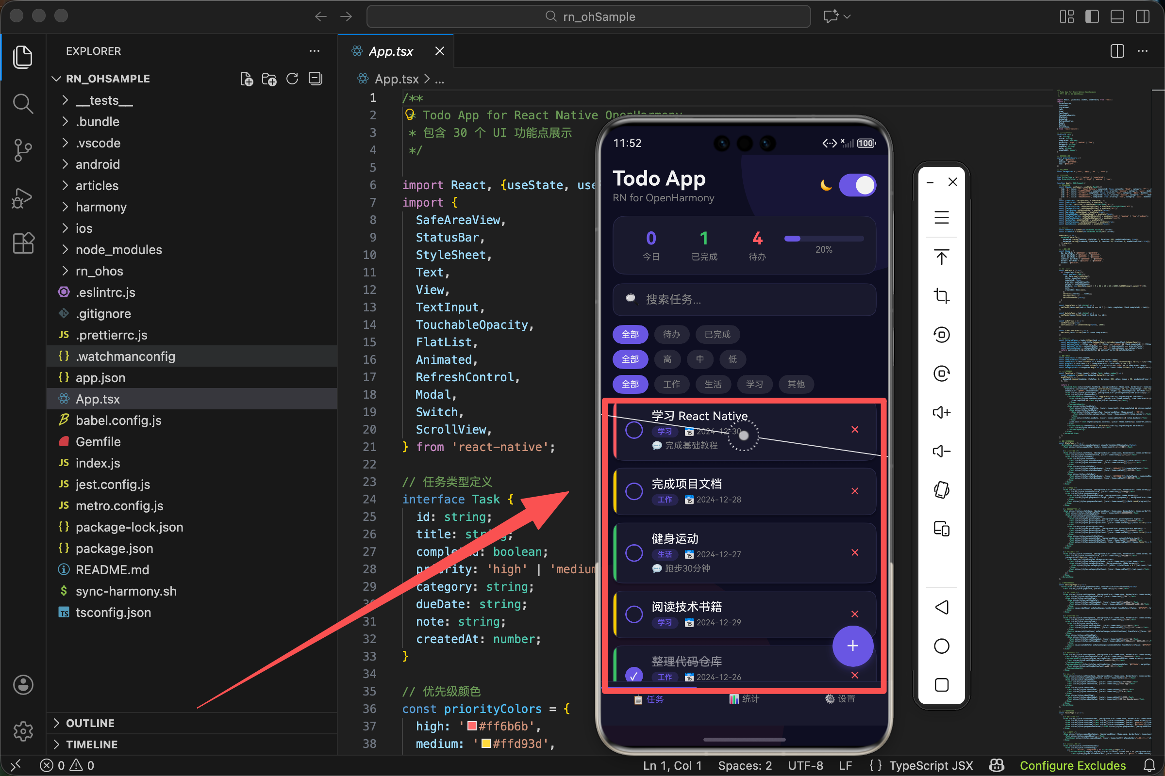
const [tasks, setTasks] = useState<Task[]>([
  {id: '1', title: '学习 React Native', completed: false, priority: 'high', category: '学习', dueDate: '2024-12-30', note: '完成基础教程', createdAt: Date.now()},
  {id: '2', title: '完成项目文档', completed: true, priority: 'medium', category: '工作', dueDate: '2024-12-28', note: '', createdAt: Date.now()},
  {id: '3', title: '健身运动', completed: false, priority: 'low', category: '生活', dueDate: '2024-12-27', note: '跑步30分钟', createdAt: Date.now()},
  {id: '4', title: '阅读技术书籍', completed: false, priority: 'medium', category: '学习', dueDate: '2024-12-29', note: '', createdAt: Date.now()},
  {id: '5', title: '整理代码仓库', completed: true, priority: 'low', category: '工作', dueDate: '2024-12-26', note: '清理无用分支', createdAt: Date.now()},
]);
这里我们使用 useState 来管理任务列表的状态。初始数据的设计考虑了以下几点:
- 包含 5 个不同类型的任务
- 涵盖高、中、低三种优先级
- 包含已完成和未完成两种状态
- 覆盖工作、生活、学习三种分类
这样的测试数据能够帮助我们验证各种场景下的显示效果。
实现任务列表项组件
有了数据结构,接下来我们需要实现单个任务项的渲染组件。这是整个列表的核心,每个任务项需要展示任务的各种信息,并提供交互功能。
const TaskItem = ({item, index}: {item: Task; index: number}) => {
  const itemAnim = useRef(new Animated.Value(0)).current;
  useEffect(() => {
    Animated.timing(itemAnim, {toValue: 1, duration: 300, delay: index * 50, useNativeDriver: true}).start();
  }, []);

  return (
    <Animated.View style={[styles.taskCard, {backgroundColor: theme.card, borderColor: theme.border, opacity: itemAnim,
      transform: [{translateX: itemAnim.interpolate({inputRange: [0, 1], outputRange: [-50, 0]})}],
      shadowColor: '#000', shadowOffset: {width: 0, height: 2}, shadowOpacity: darkMode ? 0.3 : 0.1, shadowRadius: 4, elevation: 3}]}>
      <View style={[styles.priorityBar, {backgroundColor: priorityColors[item.priority]}]} />
      <View style={styles.taskContent}>
        <TouchableOpacity onPress={() => toggleTask(item.id)} style={styles.checkbox}>
          <View style={[styles.checkboxInner, {borderColor: theme.accent}, item.completed && {backgroundColor: theme.accent}]}>
            {item.completed && <Text style={styles.checkmark}>✓</Text>}
          </View>
        </TouchableOpacity>
        <View style={styles.taskInfo}>
          <Text style={[styles.taskTitle, {color: theme.text}, item.completed && styles.completedText]}>{item.title}</Text>
          <View style={styles.taskMeta}>
            <View style={[styles.categoryTag, {backgroundColor: theme.accent + '30'}]}>
              <Text style={[styles.categoryText, {color: theme.accent}]}>{item.category}</Text>
            </View>
            <Text style={[styles.dueDate, {color: theme.subText}]}>📅 {item.dueDate}</Text>
          </View>
          {item.note ? <Text style={[styles.noteText, {color: theme.subText}]} numberOfLines={1}>💬 {item.note}</Text> : null}
        </View>
        <TouchableOpacity onPress={() => deleteTask(item.id)} style={styles.deleteBtn}>
          <Text style={styles.deleteBtnText}>×</Text>
        </TouchableOpacity>
      </View>
    </Animated.View>
  );
};
组件参数说明
TaskItem 组件接收两个参数:
- item - 当前任务的数据
- index - 当前任务在列表中的索引位置,用于实现错开的入场动画效果
动画实现原理
组件内部的动画逻辑如下:
- 创建动画值
itemAnim,初始值为 0 - 在 useEffect 中启动 timing 动画,将值从 0 变化到 1
- 动画持续 300 毫秒
delay参数等于index * 50毫秒
这意味着第一个列表项立即开始动画,第二个延迟 50 毫秒,第三个延迟 100 毫秒,以此类推。这样就创造出了瀑布流般的入场效果。
动画效果应用
在 Animated.View 上应用了两种动画效果:
- opacity - 直接使用 itemAnim 的值,从 0 到 1 实现淡入
- translateX - 使用 interpolate 将动画值映射到位移值,从 -50 到 0 实现左侧滑入
卡片结构设计
任务卡片包含以下几个部分:
- 左侧优先级指示条 - 通过不同颜色表示优先级(红/黄/绿)
- 勾选框 - 点击切换任务完成状态
- 任务信息区 - 显示标题、分类标签、截止日期和备注
- 删除按钮 - 点击删除任务
配置 FlatList 组件
有了数据和列表项组件,现在我们来配置 FlatList:
<FlatList
  data={filteredTasks}
  keyExtractor={item => item.id}
  renderItem={({item, index}) => <TaskItem item={item} index={index} />}
  contentContainerStyle={styles.listContent}
  showsVerticalScrollIndicator={false}
  refreshControl={<RefreshControl refreshing={refreshing} onRefresh={onRefresh} tintColor={theme.accent} />}
  ListEmptyComponent={
    <View style={styles.emptyContainer}>
      <Text style={styles.emptyIcon}>📝</Text>
      <Text style={[styles.emptyText, {color: theme.subText}]}>暂无任务</Text>
      <Text style={[styles.emptySubText, {color: theme.subText}]}>点击下方按钮添加新任务</Text>
    </View>
  }
/>
核心属性详解
data
传入要渲染的数据数组。这里使用 filteredTasks 而不是原始的 tasks,因为应用支持搜索和筛选功能。当用户进行搜索或筛选操作时,列表会自动更新显示匹配的任务。
keyExtractor
告诉 FlatList 如何为每个列表项生成唯一的 key。React 使用 key 来追踪列表项的变化,正确的 key 设置能够显著提升列表的更新性能。
⚠️ 千万不要使用数组索引作为 key,因为当列表项顺序变化时,索引会导致错误的组件复用。
renderItem
定义如何渲染每个列表项。它接收一个对象参数,包含:
item- 当前数据项index- 当前索引
contentContainerStyle
设置列表内容容器的样式。我们添加了底部内边距,确保最后一个列表项不会被底部的 Tab 栏遮挡。
showsVerticalScrollIndicator
设置为 false 隐藏垂直滚动条,获得更简洁的视觉效果。
refreshControl
配置下拉刷新功能。RefreshControl 组件接收:
refreshing- 是否正在刷新onRefresh- 下拉触发的回调函数tintColor- 加载指示器颜色
ListEmptyComponent
定义列表为空时显示的内容,提供友好的用户引导。
实现数据筛选逻辑
在实际应用中,用户通常需要对列表进行筛选。我们的 TodoList 支持多种筛选方式。
const filteredTasks = tasks.filter(task => {
  const matchesSearch = task.title.toLowerCase().includes(searchText.toLowerCase());
  const matchesFilter = filter === 'all' || (filter === 'active' && !task.completed) || (filter === 'completed' && task.completed);
  const matchesPriority = priorityFilter === 'all' || task.priority === priorityFilter;
  const matchesCategory = categoryFilter === 'all' || task.category === categoryFilter;
  return matchesSearch && matchesFilter && matchesPriority && matchesCategory;
});
四种筛选条件
这段筛选逻辑使用数组的 filter 方法,对每个任务进行多条件判断:
1. matchesSearch - 关键词搜索
检查任务标题是否包含搜索关键词。将标题和搜索词都转换为小写,实现大小写不敏感的搜索。
用户输入 “react” 或 “React” 都能匹配到 “学习 React Native”
2. matchesFilter - 完成状态筛选
all- 所有任务都匹配active- 只有未完成的任务匹配completed- 只有已完成的任务匹配
3. matchesPriority - 优先级筛选
all- 匹配所有优先级- 其他值 - 只匹配指定的优先级
4. matchesCategory - 分类筛选
all- 匹配所有分类- 其他值 - 只匹配指定的分类
组合筛选
最后使用逻辑与运算符将四个条件组合起来。只有当所有条件都为 true 时,任务才会出现在筛选结果中。
这种设计让用户可以灵活地组合多种筛选条件,快速找到想要的任务。
列表项样式设计
一个好看的列表不仅需要正确的功能实现,还需要精心设计的样式。
const styles = StyleSheet.create({
  listContent: {paddingBottom: 160},
  taskCard: {flexDirection: 'row', borderRadius: 12, borderWidth: 1, marginBottom: 10, overflow: 'hidden'},
  priorityBar: {width: 4},
  taskContent: {flex: 1, flexDirection: 'row', alignItems: 'center', padding: 12},
  checkbox: {marginRight: 12},
  checkboxInner: {width: 24, height: 24, borderRadius: 12, borderWidth: 2, justifyContent: 'center', alignItems: 'center'},
  checkmark: {color: '#fff', fontSize: 14, fontWeight: 'bold'},
  taskInfo: {flex: 1},
  taskTitle: {fontSize: 16, fontWeight: '500', marginBottom: 4},
  completedText: {textDecorationLine: 'line-through', opacity: 0.5},
  taskMeta: {flexDirection: 'row', alignItems: 'center', gap: 8},
  categoryTag: {paddingHorizontal: 8, paddingVertical: 2, borderRadius: 8},
  categoryText: {fontSize: 10, fontWeight: '600'},
  dueDate: {fontSize: 11},
  noteText: {fontSize: 12, marginTop: 4},
  deleteBtn: {width: 32, height: 32, justifyContent: 'center', alignItems: 'center'},
  deleteBtnText: {fontSize: 24, color: '#ff6b6b', fontWeight: '300'},
});
关键样式解析
listContent
底部内边距 160 像素,确保最后一个列表项不会被底部 Tab 栏和浮动按钮遮挡。
taskCard
flexDirection: 'row'- 子元素水平排列,优先级指示条显示在左侧borderRadius: 12- 圆角效果,让卡片更柔和overflow: 'hidden'- 确保圆角效果正确应用到子元素
priorityBar
只设置 4 像素宽度,高度自动撑满。这个细长的彩色条既不占用太多空间,又能清晰传达优先级信息。
checkboxInner
- 24x24 像素的尺寸适合手指点击
borderRadius: 12(宽度的一半)创建圆形效果- 任务完成时动态添加背景色变成实心
completedText
textDecorationLine: 'line-through'- 添加删除线opacity: 0.5- 降低透明度
这两个效果组合起来,让用户一眼就能区分已完成和未完成的任务。
主题适配
现代应用通常需要支持深色和浅色两种主题。我们通过一个主题对象来管理所有颜色:
const theme = {
  bg: darkMode ? '#0f0f23' : '#f5f5f5',
  card: darkMode ? '#1a1a2e' : '#ffffff',
  text: darkMode ? '#ffffff' : '#333333',
  subText: darkMode ? '#888888' : '#666666',
  border: darkMode ? '#2a2a4a' : '#e0e0e0',
  accent: '#6c5ce7',
};
颜色配置说明
- bg - 背景色:深色模式用深蓝色,浅色模式用浅灰色
- card - 卡片背景:深色模式用稍浅的深蓝色,浅色模式用纯白色
- text - 主要文字颜色
- subText - 次要文字颜色
- border - 边框颜色
- accent - 强调色,两种模式下保持一致
动态应用主题
在组件中通过内联样式动态应用:
<View style={[styles.taskCard, {backgroundColor: theme.card, borderColor: theme.border}]}>
这种方式的好处:
- 静态样式定义在 StyleSheet 中获得性能优化
- 动态样式通过内联方式应用
- 用户切换主题时,组件自动重新渲染
性能优化建议
虽然 FlatList 本身已经做了很多性能优化,但我们还可以采取额外措施进一步提升性能。
1. 避免在 renderItem 中创建新函数
每次渲染时创建新的引用会导致不必要的重新渲染。我们的代码中,TaskItem 是一个独立的组件,而不是在 renderItem 中定义的内联函数。
2. 合理使用 React.memo
如果列表项组件的渲染开销较大,可以使用 React.memo 包裹,避免在 props 没有变化时重新渲染。
3. 使用 getItemLayout
对于固定高度的列表项,可以使用 getItemLayout 属性。这让 FlatList 能够直接计算出任意位置的偏移量,而不需要实际渲染来测量。
4. 控制 initialNumToRender
使用 initialNumToRender 控制首次渲染的数量。如果列表项比较复杂,可以适当减少这个数值,加快首次渲染速度。
5. 调整 windowSize
使用 windowSize 控制渲染窗口的大小。较大的值可以减少滚动时的白屏,但会增加内存占用。根据实际情况找到平衡点。
空状态处理
当列表为空时,显示一个友好的空状态提示是很重要的用户体验设计:
ListEmptyComponent={
  <View style={styles.emptyContainer}>
    <Text style={styles.emptyIcon}>📝</Text>
    <Text style={[styles.emptyText, {color: theme.subText}]}>暂无任务</Text>
    <Text style={[styles.emptySubText, {color: theme.subText}]}>点击下方按钮添加新任务</Text>
  </View>
}
空状态组件的三个部分
- 大号 emoji 图标 - 吸引用户注意
- 简短标题 - 说明当前状态
- 引导文字 - 告诉用户下一步该做什么
这种设计比显示一片空白要友好得多,能够有效降低用户的困惑感。
对应样式
emptyContainer: {alignItems: 'center', paddingVertical: 60},
emptyIcon: {fontSize: 64, marginBottom: 16},
emptyText: {fontSize: 18, fontWeight: '600'},
emptySubText: {fontSize: 14, marginTop: 8},
样式设计要点:
alignItems: 'center'- 内容水平居中paddingVertical: 60- 上下添加足够空白,让空状态显示在屏幕中间- emoji 使用 64 像素字号足够醒目
- 主标题加粗突出显示
- 副标题使用较小字号作为辅助说明
总结
FlatList 是 React Native 中最常用的组件之一,熟练掌握它的使用方法和优化技巧,对于开发高质量的移动应用至关重要。
在后续的文章中,我们将继续深入探讨 TodoList 项目的其他功能点,包括输入框、按钮、动画效果等,敬请期待。
欢迎加入开源鸿蒙跨平台社区:https://openharmonycrossplatform.csdn.net

开源鸿蒙跨平台开发社区汇聚开发者与厂商,共建“一次开发,多端部署”的开源生态,致力于降低跨端开发门槛,推动万物智联创新。
更多推荐

 27
27 0
0- 0


 已为社区贡献14条内容

所有评论(0)